Chapters
- 1. The opportunity for using open source information and user-generated content in investigative work
- Foreword
- Investigating Disinformation and Media Manipulation
- Introduction
- For the Great Unnamed
- 2. Using online research methods to investigate the Who, Where and When of a person
- Contributor List
- 3. Online research tools and investigation techniques
- What This Book Is (And What It Isn’t)
- 4. Corporate Veils, Unveiled: Using databases, domain records and other publicly available material to investigate companies
- 1. When Emergency News Breaks
- 5. Investigating with databases: Verifying data quality
- 1.1. Separating Rumor From Fact in a Nigerian Conflict Zone
- From Coffee to Colonialism: Data Investigations into How the Poor Feed the Rich
- The Handbook At A Glance
- 6. Building expertise through UGC verification
- The Age of Information Disorder
- Repurposing Census Data to Measure Segregation in the United States
- 7. Using UGC in human rights and war crimes investigations
- 2. Verification Fundamentals: Rules to Live By
- What Is Data Journalism?
- 8. Applying ethical principles to digital age investigation
- 2.1. Using Social Media as a Police Scanner
- The Lifecycle of Media Manipulation
- Multiplying Memories While Discovering Trees in Bogotá
- Why Journalists Should Use Data
- 9. Presenting UGC in investigative reporting
- Behind the Numbers: Home Demolitions in Occupied East Jerusalem
- Why Is Data Journalism Important?
- Mapping Crash Incidents to Advocate for Road Safety in the Philippines
- 10. Organizing the newsroom for better and accurate investigative reporting
- Tracking Worker Deaths in Turkey
- Some Favorite Examples
- Case Study 1. Combing through 324,000 frames of cellphone video to help prove the innocence of an activist in Rio
- 3. Verifying User-Generated Content
- 1. Investigating Social Media Accounts
- Data Journalism in Perspective
- Case Study 2. Tracking back the origin of a critical piece of evidence from the #OttawaShooting
- 3.1. Monitoring and Verifying During the Ukrainian Parliamentary Election
- Building Your Own Data Set: Documenting Knife Crime in the United Kingdom
- The ABC’s Data Journalism Play
- Case Study 3. Navigating multiple languages (and spellings) to search for companies in the Middle East
- Narrating a Number and Staying with the Trouble of Value
- Data Journalism at the BBC
- 4. Verifying Images
- Indigenous Data Sovereignty: Implications for Data Journalism
- How the News Apps Team at Chicago Tribune Works
- 4.1. Verifying a Bizarre Beach Ball During a Storm
- 1a. Case Study: How investigating a set of Facebook accounts revealed a coordinated effort to spread propaganda in the Philippines
- Behind the Scenes at the Guardian Datablog
- 4.2. Verifying Two Suspicious “Street Sharks” During Hurricane Sandy
- 1b. Case Study: How we proved that the biggest Black Lives Matter page on Facebook was fake
- Alternative Data Practices in China
- Data Journalism at the Zeit Online
- 2. Finding patient zero
- Making a Database to Document Land Conflicts Across India
- 5. Verifying Video
- Reassembling Public Data in Cuba: Collaborations When Information Is Missing, Outdated or Scarce
- How to Hire a Hacker
- 5.1. Verifying a Key Boston Bombing Video
- 3. Spotting bots, cyborgs and inauthentic activity
- Making Data with Readers at La Nación
- Harnessing External Expertise Through Hackthons
- 5.2. Investigating a Reported ‘Massacre’ in Ivory Coast
- Running Surveys for Investigations
- 5.3. Confirming the Location and Content of a Video
- 3a. Case study: Finding evidence of automated Twitter activity during the Hong Kong protests
- Following the Money: Cross-Border Collaboration
- 4. Monitoring for fakes and information operations during breaking news
- Data Journalism: What’s Feminism Got to Do With I.T.?
- Our Stories Come As Code
- 6. Putting the Human Crowd to Work
- 5. Verifying and questioning images
- Infrastructuring Collaborations Around the Panama and Paradise Papers
- 6.1. Tripped Up by Arabic Grammar
- Text as Data: Finding Stories in Text Collections
- Business Models for Data Journalism
- 6. How to think about deepfakes and emerging manipulation technologies
- Coding With Data in the Newsroom
- Accounting for Methods in Data Journalism: Spreadsheets, Scripts and Programming Notebooks
- Kaas & Mulvad: Semi-finished Content for Stakeholder Groups
- 7. Adding the Computer Crowd to the Human Crowd
- 7. Monitoring and Reporting Inside Closed Groups and Messaging Apps
- 7.1. How OpenStreetMap Used Humans and Ma- chines to Map Affected Areas After Typhoon Haiyan
- 7a. Case Study: Bolsonaro at the Hospital
- Working Openly in Data Journalism
- 8. Investigating websites
- Making Algorithms Work for Reporting
- 9. Analyzing ads on social networks
- Journalism With Machines? From Computational Thinking to Distributed Cognition
- The Opportunity Gap
- 8. Preparing for Disaster Coverage
- 10. Tracking actors across platforms
- A 9 Month Investigation into European Structural Funds
- 8.1. How NHK News Covered, and Learned From, the 2011 Japan Earthquake
- Ways of Doing Data Journalism
- The Eurozone Meltdown
- Data Visualisations: Newsroom Trends and Everyday Engagements
- 11. Network analysis and attribution
- Covering the Public Purse with OpenSpending.org
- Sketching With Data
- 9. Creating a Verification Process and Checklist(s)
- Finnish Parliamentary Elections and Campaign Funding
- 9.1. Assessing and Minimizing Risks When Using UGC
- The Web as Medium for Data Visualization
- 11a. Case study: Attributing Endless Mayfly
- Electoral Hack in Realtime
- 9.2. Tips for Coping With Traumatic Imagery
- Four Recent Developments in News Graphics
- 11b. Case Study: Investigating an Information Operation in West Papua
- Data in the News: Wikileaks
- Searchable Databases as a Journalistic Product
- Mapa76 Hackathon
- 10. Verification Tools
- The Guardian Datablog’s Coverage of the UK Riots
- Credits
- Illinois School Report Cards
- “VISUALIZE JUSTICE: A Field Guide to Enhanc- ing the Evidentiary Value of Video for Human Rights”
- Hospital Billing
- Care Home Crisis
- Verification and Fact Checking
- The Tell-All Telephone
- Narrating Water Conflict With Data and Interactive Comics
- Data Journalism Should Focus on People and Stories
- Creating a Verification Workflow
- Which Car Model? MOT Failure Rates
- Bus Subsidies in Argentina
- Tracking Back a Text Message: Collaborative Verification with Checkdesk
- The Algorithms Beat: Angles and Methods for Investigation
- Citizen Data Reporters
- The Fake Football Reporter
- The Big Board for Election Results
- The Story of Jasmine Tridevil: Getting around Roadblocks to Verification
- Telling Stories with the Social Web
- Crowdsourcing the Price of Water
- Stolen Batmobile: How to Evaluate the Veracity of a Rumor
- Digital Forensics: Repurposing Google Analytics IDs
- Russian Bear Attack: Tracking Back the Suspect Origin of a Viral Story
- Apps and Their Affordances for Data Investigations
- A Five Minute Field Guide
- Educator’s Guide: Types of Online Fakes
- Algorithms in the Spotlight: Collaborative Investigations at Spiegel Online
- Your Right to Data
- The #ddj Hashtag on Twitter
- Wobbing Works. Use it!
- Archiving Data Journalism
- From The Guardian to Google News Lab: A Decade of Working in Data Journalism
- Getting Data from the Web
- Data Journalism’s Ties With Civic Tech
- The Web as a Data Source
- Open-Source Coding Practices in Data Journalism
- Crowdsourcing Data at the Guardian Datablog
- Data Feudalism: How Platforms Shape Cross-border Investigative Networks
- How the Datablog Used Crowdsourcing to Cover Olympic Ticketing
- Data-Driven Editorial? Considerations for Working With Audience Metrics
- Using and Sharing Data: the Black Letter, Fine Print, and Reality
- Data Journalism, Digital Universalism and Innovation in the Periphery
- Become Data Literate in 3 Simple Steps
- The Datafication of Journalism: Strategies for Data-Driven Storytelling and Industry–Academy Collaboration
- Data Journalism by, about and for Marginalized Communities
- Tips for Working with Numbers in the News
- Teaching Data Journalism
- Basic Steps in Working with Data
- Organizing Data Projects With Women and Minorities in Latin America
- The £32 Loaf of Bread
- Start With the Data, Finish With a Story
- Genealogies of Data Journalism
- Data Stories
- Data-Driven Gold-Standards: What the Field Values as Award-Worthy Data Journalism and How Journalism Co-Evolves with the Datafication of Society
- Data Journalists Discuss Their Tools of Choice
- Beyond Clicks and Shares: How and Why to Measure the Impact of Data Journalism Projects
- Using Data Visualization to Find Insights in Data
- Data Journalism: In Whose Interests?
- Data Journalism With Impact
- Presenting Data to the Public
- What is Data Journalism For? Cash, Clicks, and Cut and Trys
- How to Build a News App
- Data Journalism and Digital Liberalism
- News Apps at ProPublica
- Visualization as the Workhorse of Data Journalism
- Using visualizations to Tell Stories
- Designing With Data
- Different Charts Tell Different Tales
- Data visualization DIY: Our Top Tools
- How We Serve Data at Verdens Gang
- Public Data Goes Social
- Engaging People Around Your Data
1. The opportunity for using open source information and user-generated content in investigative work
Written by Craig Silverman and Rina Tsubaki
With close to 18,000 followers, the Twitter account @ShamiWitness has been a major source of proIslamic State propaganda. In their investigation of the account, British broadcaster Channel 4 reported that ShamiWitness’ tweets “were seen two million times each month, making him perhaps the most influential Islamic State Twitter account.” Channel 4 also reported that two-thirds of Islamic State foreign fighters on Twitter follow the account.
Channel 4 set out to investigate who was behind the account. All it had to go on was the account and its tweets — the person behind ShamiWitness had never shared personal information or anything that might indicate where they were based.
Simon Israel, the Channel 4 correspondent who led the investigation, said in the report that there were no known photos of ShamiWitness.
“But there are moments — and there are always moments — when the hidden trip up,” he said.
Israel said an analysis of the ShamiWitness account revealed that it used to go by a different handle on Twitter: @ElSaltador. At some point, the account owner changed it to @ShamiWitness.
Channel 4 investigators took that previous Twitter handle and searched other social networks to see if they could find anyone using it. That led them to a Google+ account, and then to a Facebook page. There they found photos and other details about a man living in Bangalore who worked as a marketing executive for an Indian company. Soon, they had him on the phone: He confirmed that he was behind the ShamiWitness account.
The result was an investigative story broadcast in December 2014. That report caused the man behind the Twitter account to stop tweeting.
Channel 4 used publicly available data and information to produce journalism that shut down a key source of propaganda and recruitment for the Islamic State.
Journalists, human rights workers and others are constantly making use of open data, user-generated content and other open source information to produce critically important investigations of everything from conflict zones to human rights abuse cases and international corruption.
“Open source information, which is information freely available to anyone through the Internet — think YouTube, Google Maps, Reddit — has made it possible for ANYONE to gather information and source others, through social media networks,” wrote Eliot Higgins on the Kickstarter campaign page for his open source investigations website, Bellingcat. “Think the Syrian Civil War. Think the Arab Spring.”
The abundance of open source information available online and in databases means that just about any investigation today should incorporate the search, gathering and verification of open source information. This has become inseparable from the work of cultivating sources, securing confidential information and other investigative tactics that rely on hidden or less-public information. Journalists and other who develop and maintain the ability to properly search, discover, analyze and verify this material will deliver better, more comprehensive investigations.
Higgins, who also goes by the pseudonym Brown Moses, is living proof of the power of open source information when combined with dedication and strong verification practices. He has become an internationally recognized expert in the Syrian conflict and the downing of Flight MH17 in Ukraine, to name but two examples. His website, Bellingcat, is where he and others now use open source materials to produce unique and credible investigate work.
In February 2015, Bellingcat launched a project to track the vehicles being used in the conflict in Ukraine. They invited the public to submit images or footage of military vehicles spotted in the conflict zone, and to help analyze images and footage that had been discovered from social networks and other sources. In its first week of operation, the project added 71 new entries to the vehicles database, almost doubling the amount of information they had previously collected. These were photos, videos and other pieces of evidence that were gathered from publicly available sources, and they told the story of the conflict in a way no one had before.
It’s all thanks to open source information and user-generated content. As chapters and case studies in this Handbook detail, this same material is being used by investigative journalists in Africa and by groups such as Amnesty International and WITNESS to expose fraud, document war crimes and to help the wrongly accused defend themselves in court.
This companion to the original Verification Handbook offers detailed guidance and illustrative case studies to help journalists, human rights workers and others verify and use open source information and user-generated content in service of investigative projects.
With so much information circulating and available on social networks, in public databases and via other open sources, it’s essential that journalists and others are equipped with the skills and knowledge to search, research and verify this information in order to use it in accurate and ethical ways.
This Handbook provides the fundamentals of online search and research techniques for investigations; details techniques for UGC investigations; offers best practices for evaluating and verifying open data; provides workflow advice for fact-checking investigative projects; and outlines ethical approaches to incorporating UGC in investigations.
The initial Verification Handbook focused on verification fundamentals and offered step-by-step guidance on how to verify user-generated content for breaking news coverage. This companion Handbook goes deeper into search, research, fact-checking and data journalism techniques and tools that can aid investigative projects. At the core of each chapter is a focus on enabling you to surface credible information from publicly available sources, while at the same time offering tips and techniques to help test and verify what you’ve found.
As with the verification of user-generated content in breaking news situations, some fundamentals of verification apply in an investigative context. Some of those fundamentals, which were detailed in the original Handbook, are:
- Develop human sources.
- Contact people, and talk to them.
- Be skeptical when something looks, sounds or seems too good to be true.
- Consult multiple, credible sources.
- Familiarize yourself with search and research methods, and new tools.
- Communicate and work together with other professionals — verification is a team sport.
Journalist Steve Buttry, who wrote the Verification Fundamentals chapter in the original Handbook, said that verification is a mix of three elements:
- A person’s resourcefulness, persistence, skepticism and skill
- Sources’ knowledge, reliability and honesty, and the number, variety and reliability of sources you can find and persuade to talk
- Documentation
This Handbook has a particular focus on the third element: documentation. Whether it is using search engines more effectively to gather documentation, examining videos uploaded to YouTube for critical evidence, or evaluating data gathered from an entity or database, it’s essential that investigators have the necessary skills to acquire and verify documentation.
Just as we know that human memory is faulty and that sources lie, we must also remember that documents and data aren’t always what they appear. This Handbook offers some fundamental guidance and case studies to help anyone use open source information and user-generated content in investigations — and to verify that information so that it buttresses an investigation and helps achieve the goal of bringing light to hidden truths.
Foreword
“In today’s digital environment, where rumors and false contents circulate, journal- ists need to be able to actively sort out true, authentic materials from the fakes. This groundbreaking handbook is a must-read for journalists dealing with all types of user generated contents.”
- Wilfried Ruetten, Director, The European Journalism Centre (EJC)
“Accurate information can be a life-saving resource during a humanitarian crisis, but the circumstances from which these crises emerge are typically the most difficult in which to gather reliable information. This book will help not only journalists but anyone working in humanitarian situations in the field to verify facts on the ground.”
- William Spindler, Spokesman, The United Nations High Commissioner for Refugees (UNHCR)
“This handbook will be essential for journalists covering interreligious and intereth- nic conflicts to report in a more balanced, transparent and accurate way, and ulti- mately help defuse tensions across and within communities.”
- Matthew Hodes, Director, The United Nations Alliance of Civilizations (UNAOC)
“In these times, knowing what is real and how to verify news and other information is essential. This handbook provides essential tools for everyone, journalism and con- sumer.”
- Howard Finberg, Director of Training Partnerships and Alliances, The Poynter Institute
“Getting the facts right is a cardinal principle of journalism but media struggle to be ethical when a big story is breaking. This handbook helps news makers keep faith with truth-telling - even when online speculation is rampant.”
- Aidan White, Director, The Ethical Journalism Network (EJN)
“It’s all about the right information at the right time in the right place. When there is limited access to the disaster-affected areas, it’s crucial for aid workers to gather information via social networks effectively. This handbook would be useful for aid workers working on the ground, as well as online volunteers.”
- Christoph Dennenmoser, Team Lead Urgent Needs, Humanity Road Inc.
Investigating Disinformation and Media Manipulation
Written by: Craig Silverman
Craig Silverman is the media editor of BuzzFeed News, where he leads a global beat covering platforms, online misinformation and media manipulation. He previously edited the “Verification Handbook” and the “Verification Handbook for Investigative Reporting,” and is the author of, "Lies, Damn Lies, and Viral Content: How News Websites Spread (and Debunk) Online Rumors, Unverified Claims and Misinformation."
In December 2019, Twitter user @NickCiarelli shared a video he said showed a dance routine being adopted by supporters of Michael Bloomberg’s presidential campaign. The video’s lackluster enthusiasm and choreography immediately helped it rack up retweets and likes, mostly from people who delighted in mocking it. The video eventually attracted more than 5 million views on Twitter.

Ciarelli’s Twitter bio said he was an intern for the Bloomberg campaign, and his subsequent tweets included proof points such as a screenshot of an email from an alleged Bloomberg campaign staffer approving budget for the video.
But a quick Google search of Ciarelli’s name showed he’s a comedian who has created humor videos in the past. And that email from a Bloomberg staffer? It was sent by Ciarelli’s frequent comedic partner, Brad Evans. That information was also just a Google search away.
But in the first minutes and hours, some believed the cringeworthy video was an official Bloomberg production.
Maggie Haberman, a prominent New York Times political reporter, tweeted that journalists who covered Bloomberg’s previous mayoral campaigns had reason to not dismiss it right away:

Knowledge can take many forms, and in this new digital environment, journalists have to be wary of relying too much on any given source of information — even if it’s their own firsthand experience.
Apparently, some reporters who knew Bloomberg and his style of campaigning felt the video could be real. At the same time, journalists who knew nothing about Bloomberg and chose to judge the video by its source could have found the correct answer immediately — in this case, simply Googling the name of the man who shared it.
The point isn’t that experience covering Bloomberg is bad. It’s that at any given moment we can be led astray by what we think we know. And in some cases our base of knowledge and experience can even be a negative. We can also be fooled by digital signals such as retweets and views, or by efforts to manipulate them.
As the Bloomberg video showed, it takes little effort to create misleading signals like a Twitter bio or a screenshot of an email that appears to back up the content and claim. These in turn help content go viral. And the more retweets and likes it racks up, the more those signals will convince some that the video could be real.
Of course, there are far more devious examples than this one. Unlike Ciarelli, the people behind information operations and disinformation campaigns rarely reveal the ruse. But this case study shows how confusing and frustrating it is for everyone, journalists included, to navigate an information environment filled with easily manipulated signals of quality and trust.
Trust is the foundation of society. It informs and lubricates all transactions and is key to human connection and relationships. But it’s dangerous to operate with default trust in our digital environment.
If your default is to trust that the Twitter accounts retweeting a video are all amplifying it organically, you will get gamed. If you trust that the reviews on a product are all from real customers, you’ll waste your money. If you trust that every news article in your news feed represent an unbiased collection of what you most need to see, you will end up misinformed.
This reality is important for every person to recognize, but it’s essential for journalists. We are being targeted by coordinated and well-funded campaigns to capture our attention, trick us into amplifying messages, and bend us to the will of states and other powerful forces.
The good news is this creates an opportunity — and imperative — for investigation.
This handbook draws on the knowledge and experience of top journalists and researchers to provide guidance on how to execute investigations of digital media manipulation, disinformation and information operations.
We are operating in a complex and rapidly evolving information ecosystem. It requires an equally evolving approach built on testing our assumptions, tracking and anticipating adversaries, and applying the best of open-source investigation and traditional reporting techniques. The vulnerabilities in our digital and data-driven world require journalists to question and scrutinize every aspect of it and apply our skills to help guide the public to accurate, trustworthy information. It also requires journalists to think about how we can unwittingly give oxygen to bad actors and campaigns designed to exploit us, and rush to point fingers at state actors when the evidence does not support it.
The goal of this handbook is to equip journalists with the skills and techniques needed to do this work effectively and responsibly. It also offers basic grounding in the theory, context and mindset that enable journalists to deliver work of high quality that informs the public, exposes bad actors, and helps improve our information environment. But the first thing to understand is that hands-on knowledge and tools are useless unless you approach this work with the right mindset.
This means understanding that everything in the digital environment can be gamed and manipulated, and to recognize the wide variety of people and entities with incentive to do so. The beauty of this environment is that there is often, though not always, a trail of data, interactions, connections and other digital breadcrumbs to follow. And much of it can be publicly available if you know where and how to look.
Investigating the digital means taking nothing at face value. It means understanding that things which appear to be quantifiable and data-driven — likes, shares, retweets, traffic, product reviews, advertising clicks — are easily and often manipulated. It means recognizing that journalists are a key focus of media manipulation and information operations, both in terms of being targeted and attacked, as well as being seen as a key channel to spread mis- and disinformation. And it means equipping yourself and your colleagues with the mindset, techniques and tools necessary to ensure that you’re offering trusted, accurate information — and not amplifying falsehoods, manipulated content or troll campaigns.
At the core of the mindset is the digital investigation paradox: By trusting nothing at first, we can engage in work that reveals what we should and should not trust. And it enables us to produce work that the communities we serve are willing and able to trust.
Along with that, there are some fundamentals that you will see emphasized repeatedly in chapters and case studies:
- Think like an adversary. Each new feature of a platform or digital service can be exploited in some way. It’s critical to put yourself in the shoes of someone looking to manipulate the environment for ideological, political, financial or other reasons. When you look at digital content and messages, you should consider the motivations driving its creation and propagation. It’s also essential to stay abreast of the latest techniques being used by bad actors, digital marketers and others whose livelihood relies on finding new ways to gain attention and earn revenue the digital environment.
- Focus on actors, content, behavior and networks. The goal is to analyze the actors, content and behavior and how they are to document how they might be working in unison as a network. By comparing and contrasting these four things with each other, you can begin to understand what you’re seeing. As you’ll see in multiple chapters and case studies, a fundamental approach is to start with one piece of content or an entity such as a website and pivot on it to identify a larger network through behavior and other connections. This can involve examining the flow of content and actors across platforms, and occasionally into different languages.
- Monitor and collect. The best way to identify media manipulation and disinformation is to look for it all the time. Ongoing monitoring and tracking of known actors, topics and communities of interest is essential. Keep and organize what you find, whether in spreadsheets, screenshot folders or by using paid tools like Hunchly.
- Be careful with attribution. It’s sometimes impossible to say exactly who’s behind a particular account, piece of content, or a larger information operation. One reason is that actors with different motives can behave in similar ways, and produce or amplify the same kind of content. Even the platforms themselves — which have far better access to data and more resources — make attribution mistakes. The most successful and compelling evidence usually combines digital proof with information from inside sources — an ideal mix of online and traditional investigative work. That’s becoming even more difficult as state actors and others evolve and find new ways to hide their fingerprints. Attribution is difficult; getting it wrong will undermine all of the careful work that led up to it.
Finally, a note on the two handbooks that preceded this edition. This work builds on the foundations of the first edition of the Verification Handbook and the Verification Handbook for Investigative Reporting. Each offers fundamental skills for monitoring social media, verifying images, video and social media accounts, and using search engines to identify people, companies and other entities.
Many of the chapters and case studies in this handbook are written with the assumption that readers possess the basic knowledge laid out in these previous publications, particularly the first handbook. If you are struggling to follow along, I encourage you to start with the first handbook.
Now, let’s get to work.
Introduction
Written by: Jonathan W. Y. Gray Liliana Bounegru
Data Journalism in Question
What is data journalism? What is it for? What might it do? What opportunities and limitations does it present? Who and what is involved in making and making sense of it? This book is a collaborative experiment responding to these and other questions.
It follows on from another edited book, The Data Journalism Handbook: How Journalists Can Use Data to Improve the News (O’Reilly Media, 2012). Both books assemble a plurality of voices and perspectives to account for the evolving field of data journalism.
The first edition started through a “book sprint” at MozFest in London in 2011, which brought together journalists, technologists, advocacy groups and others in order to write about how data journalism is done. As we wrote in the introduction, it aimed to “document the passion and enthusiasm, the vision and energy of a nascent movement”, to provide “stories behind the stories” and to let “different voices and views shine through”(Gray et al., 2012).

The 2012 edition is now translated into over a dozen languages – including Arabic, Chinese, Czech, French, Georgian, Greek, Italian, Macedonian, Portuguese, Russian, Spanish and Ukrainian – and is used for teaching at many leading universities, as well as teaching and training centres around the world, as well as being a well-cited source for researchers studying the field.
While the 2012 book is still widely used (and this book is intended to complement rather than to replace it), a great deal has happened since 2012.
On the one hand, data journalism has become more established. In 2011 data journalism as such was very much a field “in the making”, with only a handful of people using the term. It has subsequently become socialised and institutionalised through dedicated organisations, training courses, job posts, professional teams, awards, anthologies, journal articles, reports, tools, online communities, hashtags, conferences, networks, meetups, mailing lists and more.
There is also broader awareness of the term through events which are conspicuously data-related, such as the Panama Papers, which whistleblower Edward Snowden then characterised as the “biggest leak in the history of data journalism”(Snowden, 2016).
On the other hand, data journalism has become more contested. The 2013 Snowden leaks helped to establish a transnational surveillance apparatus of states and technology companies as a matter of fact rather than speculation. These leaks suggested how citizens were made knowable through big data practices, showing a darker side to familiar data-making devices, apps and platforms (Gray & Bounegru, 2019).
In the United States the launch of Nate Silver’s dedicated data journalism outlet FiveThirtyEight in 2014 was greeted by a backlash for its overconfidence in particular kinds of quantitative methods and its disdain for “opinion journalism” (Byers, 2014).
While Silver was acclaimed as “lord and god of the algorithm” by The Daily Show’s Jon Stewart for successfully predicting the outcome of the 2012 elections, the statistical methods that he advocated were further critiqued and challenged after the election of Donald Trump in 2016.
These elections along with the Brexit vote in the UK and the rise of populist right-wing leaders around the world, were said to correspond with a “post-truth” moment (Davies, 2016), characterised by a widespread loss of faith in public institutions, expert knowledge and the facts associated with them, and the mediation of public and political life by online platforms which left their users vulnerable to targeting, manipulation and misinformation.1
Whether the so-called “post-truth” moment is taken as evidence of failure or as a call to action, one thing is clear: Data can no longer be taken for granted, and nor can data journalism. Data does not just provide neutral and straightforward representations of the world, but is rather entangled with politics and culture, money and power. Institutions and infrastructures underpinning the production of data – from surveys to statistics, climate science to social media platforms – have been called into question.
At the time of writing, as the COVID-19 pandemic continues to roll on around the world, numbers, graphs and rankings have become widely shared, thematized, politicized and depoliticized—as exemplified by daily circulating epidemiological charts referred to by the now ubiquitous public health strategy to “flatten the curve.”
At the same time, the fragility and provisionality of such data has been widely reported on, with concerns around the under-reporting, non-reporting and classification of cases, as well as growing awareness of the societal and political implications of different kinds of data from sources—from hospital figures to research estimates to self-reporting to transactional data from tracing apps. The pandemic has broadened awareness of not just using but also critically reporting on numbers and data.
Thus one might ask of the use of data in journalism:
-Which data, whose data and by which means?
-Data about which issues and to what end?
-Which kinds of issues are data-rich and which are data-poor, and why?
-Who has the capacity to benefit from data and who doesn’t?
-What kinds of publics does data assemble, which kinds of capacities does it support, what kinds of politics does it enact and what kinds of participation does it engender?
Towards a Critical Data Practice
Rather than bracketing such questions and concerns, this book aims to “stay with the trouble” as the prominent feminist scholar Donna Haraway (2016) puts it.2
Instead of treating the relevance and importance of data journalism as an assertion, we treat this as a question which can be addressed in multiple ways. The collection of chapters gathered in the book aim to provide a richer story about what data journalism does, with and for whom.
Through our editorial work we have encouraged both reflection and a kind of modesty in articulating what data journalism projects can do, and the conditions under which they can succeed.
This entails the cultivation of a different kind of precision in accounting for data journalism practice: specifying the situations in which it develops and operates. Such precision requires broadening the scope of the book to include not just the ways in which data is analysed, created and used in the context of journalism but also more about the social, cultural, political and economic circumstances in which such practices are embedded.
The subtitle of this new book is “towards a critical data practice”, and reflects both our aspiration as editors to bring critical reflection to bear on data journalism practices, as well as reflecting the increasingly critical stances of data journalism practitioners.
The notion of “critical data practice” is a nod to Philip E. Agre’s notion of “critical technical practice”, which he describes in terms of having “one foot planted in the craft work of design and the other foot planted in the reflexive work of critique” (Agre, 1997, p. 155).
As we have written about elsewhere, our interest in this book is understanding how critical engagements with data might modify data practices, making space for public imagination and interventions around data politics (Gray, 2018; Gray et al., 2018).
Alongside contributions from data journalists and practitioners writing about what they do, the book also includes chapters from researchers whose work may advance critical reflection on data journalism practices, from fields such as anthropology, science and technology studies, (new) media studies, internet studies, platform studies, the sociology of quantification, journalism studies, indigenous studies, feminist studies, digital methods and digital sociology.
Rather than assuming a more traditional division of labour such that researchers provide critical reflection and practitioners offer more instrumental tips and advice, we have sought to encourage researchers to consider the practical salience of their work, and to provide practitioners with space to reflect on what they do outside of their day-to-day deadlines.
None of these different perspectives exhaust the field, and our objective is to encourage readers to attend to the different aspects of how data journalism is done. In other words, this book is intended to function as an multidisciplinary conversation starter, and – we hope – a catalyst for collaborations.
We do not assume that “data journalism” refers to a unified set of practices. Rather it is a prominent label which refers to a diverse set of practices which can be empirically studied, specified and experimented with. As one recent review puts it, we need to interrogate the “how of quantification as much as the mere fact of it”, the effects of which “depend on intentions and implementation” (Berman & Hirschman, 2018).
Our purpose is not to stabilise how data journalism is done, but rather to draw attention to its manifold aspects and open up space for doing it differently.
A Collective Experiment
It is worth briefly noting what this book is not. It is not just a textbook or handbook in the conventional sense: the chapters don’t add up to an established body of knowledge, but are rather intended to indicate interesting directions for further inquiry and experimentation.
The book is not just a practical guidebook of tutorials or “how tos”: There are already countless readily available materials and courses on different aspects of data practice (e.g. data analysis and data visualisation). It is not just a book of “behind the scenes” case studies: There are plenty of articles and blog posts showing how projects were done, including interviews with their creators.
It is not just a book of recent academic perspectives: there is an emerging body of literature on data journalism scattered across numerous books and journals.3
Rather, the book has been designed as a collective experiment in accounting for data journalism practices and a collective invitation to explore how such practices may be modified.
It is collective in that, as with the first edition, we have been able to assemble a comparatively large number of contributors (over 70) for a short book. The editorial process has benefitted from recommendations from contributors during email exchanges.
A workshop with a number of contributors at the International Journalism Festival in Perugia in 2018 provided an opportunity for exchanges and reflection. A “beta” version of the book has been released online to provide an opportunity to publicly preview a selection of chapters before the printed version of the book is published and to elicit comments and encounters before the book takes its final shape.
Through what could be considered a kind of curated “snowball editorial”, we have sought to follow how data journalism is done by different actors, in different places, around different topics, through different means. Through the process we have trawled through many shortlists, longlists, outlets and datasets to curate different perspectives on data journalism practices. Although there were many, many more contributors we would have liked to include, we had to operate within the constraints of a printable book, as well as giving voice to a diversity of geographies, themes, concerns and genders.
It is experimental in that the chapters provide different perspectives and provocations on data journalism, which we invite readers to further explore through actively configuring their own blends of tools, data sets, methods, texts, publics and issues. Rather than inheriting the ways of seeing and ways of knowing that have been “baked into” elements such as official data sets or social media data, we encourage readers to enrol them into the service of their own lines of inquiry.
This follows the spirit of “critical analytics” and “inventive methods” which aim to modify the questions which are asked and the way problems are framed (Lury & Wakeford, 2012; Rogers, 2018).
Data journalism can be viewed not just in terms of how things are represented, but in terms of how it organises relations – such that it is not just a matter of producing data stories (through collecting, analysing, visualising and narrating data), but also attending to who and what these stories bring together (including audiences, sources, methods, institutions and social media platforms). Thus we may ask, as Noortje Marres recently put it: “What are the methods, materials, techniques and arrangements that we curate in order to create spaces where problems can be addressed differently?”4.
The chapters in this book show how data journalism can be an inventive, imaginative, collaborative craft, highlighting how data journalists interrogate official data sources, make and compile their own data, try new visual and interactive formats, reflect on the effects of their work and make their methods accountable and code re-usable.
If the future of data journalism is uncertain, then we hope that readers of this book will join us in both critically taking stock of what journalism is and has been, as well as intervening to shape its future. As with all works, the success, failure and ultimate fate of this book-as-experiment ultimately lies with you, its readers, what you do with it, what it prompts and the responses it elicits.
The cover image of this book is a photograph of Sarah Sze’s Fixed Points Finding a Home in the modern art museum Mudam Luxembourg, for which we are most grateful to the artist, her gallery and the museum for their permission to reproduce.5
While it might not seem an obvious choice to put a work of sculpture on the cover of a book about journalism, we thought this image might encourage a relational perspective on data journalism as a kind of curatorial craft, assembling and working with diverse materials, communities and infrastructures to generate different ways of knowing, narrating and seeing the world at different scales and temporalities.
Rather than focusing on the outputs of data journalism (e.g., with screenshots of visualizations or interactives), we wanted to reflect the different kinds of processes and collectives involved in doing journalism with data. Having both serendipitously encountered and been deeply absorbed by Sze’s exhibitions at the Mudam, Venice Biennale, ZKM, the Tate and beyond, we thought her work could provide a different (and hopefully less familiar) vantage point on the practice of data journalism which would resonate with relational perspectives on information infrastructures and “data assemblages.”6

Her installations embody a precise and playful sensibility towards repurposing found materials that visually paralleled what we were hoping to emphasize with our editorial of different accounts of data journalism for the book. Bruno Latour recently wrote that Sze’s approach to assembling materials can be considered to affirm “compositional discontinuities” (Latour, 2020) —which sits well with our hopes to encourage “critical data practice” and to tell stories both with and about the diverse materials and actors involved in data journalism, as we discuss further below, as well as with our editorial approach in supporting the different styles, voices, vernaculars and interests of the chapters in this book.
An Overview of the Book
To stay true to our editorial emphasis on specifying the setting, we note that the orientation of the book and its selection of chapters is coloured by our interests and those of our friends, colleagues and networks at this particular moment—including growing concerns about climate change, environmental destruction, air pollution, tax avoidance, (neo)colonialism, racism, sexism, inequality, extractivism, authoritarianism, algorithmic injustice and platform labour.
The chapters explore how data journalism makes such issues intelligible and experienceable, as well as the kinds of responses it can mobilize. The selection of chapters also reflects our own oscillations between academic research, journalism and advocacy, as well as the different styles of writing and data practice associated with each of these.
We remain convinced of the generative potential of encounters between colleagues in these different fields, and several of the chapters attest to successful cross-field collaborations. As well as exploring synergies and commonalities, it is also worth noting at the outset (as astute readers will notice) that there are differences, tensions and frictions between the perspectives presented in the various chapters, including different histories and origin stories; different views on methods, data and emerging technologies; different views on the desirability of conventionalization and experimentation with different approaches; and different perspectives on what data journalism is, what it is for, its conditions and constraints, how it is organized and the possibilities it presents.
After this introduction, the book starts with a “taster menu” on doing issues with data. This includes a variety of different formats for making sense of different themes in different places—including tracing connections between agricultural commodities, crime, corruption and colonialism across several countries (Sánchez and Villagrán), mapping segregation in the United States (Williams), multiplying memories of trees in Bogotá (Magaña), looking at the people and scenes behind the numbers for home demolitions in occupied East Jerusalem (Haddad), mobilizing for road safety in the Philippines (Rey) and tracking worker deaths in Turkey (Dağ). The chapters in this section illustrate a breadth of practices from visualization techniques to building campaigns to repurposing official data with different analytical priorities.
The second section focuses on how journalists assemble data—an important emerging area which we have sought to foreground in the book and associated research (Gray et al., 2018; Gray & Bounegru, 2019). This includes exploring the making of projects on themes such as knife crime (Barr) and land conflicts (Shrivastava and Paliwal) as well as accounts of how to obtain and work with data in countries where it may be less easy to come by, such as in Cuba (Reyes, Almeida and Guerra) and China (Ma). Assembling data may also be a way of engaging with readers (Coelho) and assembling interested actors around an issue, which may in itself constitute an important outcome of a project. Gathering data may involve the modification of other forms of knowledge production, such as polls and surveys, to the context of journalism (Boros). A chapter on Indigenous data sovereignty (Kukutai and Walter) explores social, cultural and political issues around official data and how to bring other marginalized perspectives to bear on the organization of collective life with data. As well as using numbers as material for telling stories, data journalists may also tell stories about how numbers are made (Verran).
The third section is concerned with different ways of working with data. This includes with algorithms (Stray), code (Simon) and machines (Borges-Rey). Contributors examine emerging issues and opportunities arising from working with sources such as text data (Maseda). Others look at practices for making data journalistic work transparent, accountable and reproducible (Leon; Mazotte). Databases may also afford opportunities for collaborative work on large investigative projects (Díaz-Struck, Gallego and Romera). Feminist thought and practice may also inspire different ways of working with data (D’Ignazio).
The fourth section is dedicated to examining different ways in which data can be experienced, starting with a look at the different formats that data journalism can take (Cohen). Several pieces reflect on contemporary visualization practices (Aisch and Rost), as well as how readers respond to and participate in making sense with visualizations (Kennedy et al.). Other pieces look at how data is mediated and presented to readers through databases (Rahman and Wehrmeyer), web-based interactives (Bentley), TV and radio (de Jong), comics (Luna), and sketching with data (Chalabi and Gray).
The fifth section is dedicated to emerging approaches for investigating data, platforms and algorithms.
Recent journalism projects take the digital as not only offering new techniques and opportunities for journalists, but also new objects for investigation. Examples of this are Bellingcat and BuzzFeed News’ widely shared work on viral content, misinformation and digital culture. 7
Chapters in this section examine different ways of reporting on algorithms (Diakopoulous), as well as how to conduct longer-term collaborations in this area (Elmer). Other chapters look at how to work with social media data to explore how platforms participate in shaping debate, including storytelling approaches (Vo) as well as affinities between digital methods research and data journalism, including how “born digital” data can be used for investigations into web tracking infrastructures (Rogers) as well as about apps and their associated platforms (Weltevrede).
The sixth section is on organizing data journalism, and attends to different types of work in the field which are considered indispensable but not always prominently recognized. This includes how data journalism has changed over the past decade (Rogers); how platforms and the gig economy shape cross-border investigative networks (Cândea); entanglements between data journalism and movements for open data and civic tech (Baack); open-source coding practices (Pitts and Muscato); audience-measurement practices (Petre); archiving data journalism (Broussard); and the role of the #ddj hashtag in connecting data journalism communities on Twitter (Au and Smith).
The seventh section focuses on learning about data journalism as a collaborative process, including data journalism training programmes and the development of data journalism around the world. This includes chapters on teaching data journalism at universities in the United States (Phillips); empowering marginalized communities to tell their stories (Constantaras; Vaca); caution against “digital universalism” and underestimating innova- tion in the “periphery” (Chan); and different approaches for collaborations between journalists and researchers (Radcliffe and Lewis).
Data journalism does not happen in a vacuum. The eighth and final section focuses on situating this practice in relation to its various social, political, cultural and economic settings. A chapter on the genealogies of data journalism in the United States serves to encourage reflection on the various historical practices and ideas which shape it (Anderson). Other chapters look at how data journalism projects are valued through awards (Loosen); different approaches to measuring the impact of data journalism projects (Bradshaw; Green-Barber); issues around data journalism and colonialism (Young and Callison); whether data journalism can live up to its earlier aspirations to become a field of inspired experimentation, interactivity and play (Usher); and data journalism and digital liberalism (Boyer).
Twelve Challenges for Critical Data Practice
Drawing on the time that we have spent exploring data journalism practices through the development of this book, we would like to conclude this introduction to the book with twelve challenges for “critical data practice.”
These consider data journalism in terms of its capacities to shape relations between different actors as well as to produce representations about the world. Having been tested in the context of our “engaged research-led teaching” collaborations at King’s College London and the Public Data Lab,8 they are intended as a prompt for aspiring data journalists, student group projects and investigations, researcher–journalist collaborations, and other activities which aspire to organize collective inquiry with data without taking for granted the infrastructures, environments and practices through which it is produced.
- How can data journalism projects tell stories both with and about data including the various actors, processes, institutions, infrastructures and forms of knowledge through which data is made?
- How can data journalism projects tell stories about big issues at scale (e.g., climate change, inequality, multinational taxation, migration) while also affirming the provisionality and acknowledging the models, assumptions and uncertainty involved in the production of numbers?
- How can data journalism projects account for the collective character of digital data, platforms, algorithms and online devices, including the interplay between digital technologies and digital cultures?
- How can data journalism projects cultivate their own ways of making things intelligible, meaningful and relatable through data, without simply uncritically advancing the ways of knowing “baked into” data from dominant institutions, infrastructures and practices?
- How can data journalism projects acknowledge and experiment with the visual cultures and aesthetics that they draw on, including through combinations of data visualizations and other visual materials?
- How can data journalism projects make space for public participation and intervention in interrogating established data sources and re-imagining which issues are accounted for through data, and how?
- How might data journalists cultivate and consciously affirm their own styles of working with data, which may draw on, yet remain distinct from, areas such as statistics, data science and social media analytics?
- How can the field of data journalism develop memory practices to archive and preserve their work, as well as situating it in relation to practices and cultures that they draw on?
- How can data journalism projects collaborate around transnational issues in ways which avoid the logic of the platform and the colony, and affirm innovations at the periphery?
- How can data journalism support marginalized communities to use data to tell their own stories on their own terms, rather than telling their stories for them?
- How can data journalism projects develop their own alternative and inventive ways of accounting for their value and impact in the world, beyond social media metrics and impact methodologies established in other fields?
- How might data journalism develop a style of objectivity which affirms, rather than minimizes, its own role in intervening in the world and in shaping relations between different actors in collective life?
Words of Thanks
We are most grateful to Amsterdam University Press (AUP), and in particular to Maryse Elliott, for being so supportive with this experimental project, including the publication of an online beta as well as their support for an open access digital version of the book. AUP is perhaps also an apt choice, given that several of the contributors gathered at an early international conference on data journalism which took place in Amsterdam in 2010. Open access funding is supported by a grant from the Netherlands Organisation for Scientific Research (NWO, 324-98-014), thanks to Richard Rogers at the University of Amsterdam.
The vision for the book was germinated through discussions with friends and colleagues associated with the Public Data Lab. We particularly benefited from conversations about different aspects of this book with Andreas Birkbak, Erik Borra, Noortje Marres, Richard Rogers, Tommaso Venturini, Esther Weltevrede, Michele Mauri, Gabriele Colombo and Angeles Briones.
We were also provided with space to develop the direction of this book through events and visits to Columbia University (in discussion with Bruno Latour); Utrecht University; the University of California, Berkeley; Stanford University; the University of Amsterdam; the University of Miami; Aalborg University Copenhagen; Sciences Po, Paris; the University of Cambridge; London School of Economics; Cardiff University; Lancaster University; and the International Journalism Festival in Perugia.
Graduate students taking the MA course in data journalism at King’s College London helped us to test the notion of “critical data practice” which lies at the heart of this book. Our longstanding hope to do another edition was both nurtured and materialized thanks to Rina Tsubaki, who helped to facilitate support from the European Journalism Centre and the Google News Lab. We are grateful to Adam Thomas, Bianca Lemmens, Biba Klomp, Letizia Gambini, Arne Grauls and Simon Rogers for providing us with both editorial independence and enduring support to scale up our efforts.
The editorial assistance of Daniela Demarchi and Oana Bounegru has been tremendously valuable in helping us to chart a clear course through sprawling currents of texts, footnotes, references, emails, shared documents, version histories, spreadsheets and other materials.
Most of all, we would like to thank all of the data journalism practitioners and researchers who were involved in the project (whether through writing, correspondence or discussion) for accompanying us, and for supporting this experiment with their contributions of time, energy, materials and ideas without which the project would not have been possible. This book is, and continues to be, a collective undertaking.
Footnotes
1. For a critical perspective on this term, see Jasanoff, S., & Simmet, H. R. (2017). No funeral bells: Public reason in a “post-truth” age. Social Studies of Science, 47(5), 751–770.
2. Alluding to this work, Verran’s chapter in this book explores how data journalists might stay with the trouble of value and numbers.
3. www.zotero.org/groups/data_journalism_research
4. A question that Noortje Marres asked in her plenary contribution to EASST 2018 in Lancaster: twitter.com/jwyg/status/1023200997668204544
5. Sarah Sze,Fixed Points Finding a Home, 2012 (details). Mixed media. Dimensions variable. Mudam Luxembourg Commission and Collection. Donation 2012—Les Amis des Musées d’Art et d’Histoire Luxembourg. © Artwork: Sarah Sze. Courtesy the artist and Victoria Miro. © Photo: Andrés Lejona/Mudam Luxembourg.
6. For relational perspectives on data infrastructures see, for example, the seminal work of Susan Leigh Star: Star, S. L., & Ruhleder, K. (1996). Steps toward an ecology of infrastructure: Design and access for large information spaces.Information Systems Research, 7, 111–134; Star, S. L. (1999). The ethnography of infrastructure. American Behavioral Scientist, 43, 377–391. For more recent work on “data assemblages,” see, for example: Kitchin, R. (2014). The data Big data, open data, data infrastructures and their consequences. SAGE; Kitchin, R., & Lauriault,T. (2018). Towards critical data studies: Charting and unpacking data assemblages and their work. In J. Thatcher, A. Shears, & J. Eckert (Eds.), Thinking big data in geography: New regimes, new research (pp. 3–20). University of Nebraska Press.
7. www.buzzfeednews.com/topic/fake-news, www.bellingcat.com
8. www.kcl.ac.uk/research/engaged-research-led-teaching and publicdatalab.org
Works Cited
Agre, P. E. (1997). Toward a critical technical practice: Lessons learned in trying to reform AI. In G. Bowker, S. L. Star, B. Turner, & L. Gasser (Eds.), Social science, techni- cal systems, and cooperative work: Beyond the great divide (pp. 130–157). Erlbaum.
Berman, E. P., & Hirschman, D. (2018). The sociology of quantif ication: Where are we now? Contemporary Sociology, 47(3), 257–266. doi.org/10.1177/0094306118767649
Byers, D. (2014, March 19). Knives out for Nate Silver. Politico. www.politico.com/blogs/media/2014/03/knives-out-for-nate-silver-185394.html
Davies, W. (2016, August 24). The age of post-truth politics. The New York Times. www.nytimes.com/2016/08/24/opinion/campaign-stops/the-age-of-post-truth-politics.html
Gray, J. (2018). Three aspects of data worlds. Krisis: Journal for Contemporary Philosophy, 1.
Gray, J., & Bounegru, L. (2019). What a difference a dataset makes? Data journalism and/as data activism. In J. Evans, S. Ruane, & H. Southall (Eds.), Data in society: Challenging statistics in an age of globalisation (pp. 365-374). The Policy Press. doi.org/10.5281/zenodo.1415450
Gray, J., Chambers, L., & Bounegru, L. (Eds.). (2012). The data journalism handbook: How journalists can use data to improve the news. O’Reilly Media.
Gray, J., Gerlitz, C., & Bounegru, L. (2018). Data infrastructure literacy. Big Data & Society, 5(2), 1–13. doi.org/10.1177/2053951718786316
Haraway, D. J. (2016). Staying with the trouble: Making kin in the Chthulucene. Duke University Press. doi.org/10.1215/9780822373780
Latour, B. (2020) Sarah Sze as the sculptor of Critical Zones. In B. Latour & P. Weibel (Eds.), Critical zones: The science and politics of landing on earth (pp. 158–159). The MIT Press.
Lury, C., & Wakeford, N. (Eds.). (2012). Inventive methods: The happening of the social. Routledge.
Rogers, R. (2018). Otherwise engaged: Social media from vanity metrics to critical analytics. International Journal of Communication, 12, 450–472. dare.uva.nl/search?identifier=e7a7c11b-b199-4d7c-a9cb-fdf1dd74d493
Snowden, E. (2016, April 3). Biggest leak in the history of data journalism just went live, and it’s about corruption. Twitter. twitter.com/Snowden/status/716683740903247873
For the Great Unnamed
Written by: Liliana Bounegru , Lucy Chambers , Jonathan W. Y. Gray

The Data Journalism Handbook was born at a 48 hour workshop at MozFest 2011 in London. It subsequently spilled over into an international, collaborative effort involving dozens of data journalism’s leading advocates and best practitioners.
In the 6 months that passed between the book’s inception to its first full release, hundreds of people have contributed in various ways. While we have done our best to keep track of them all, we have had our fair share of anonymous, pseudonymous and untraceable edits.
To all of those people who have contributed and are not listed below, we say two things. Firstly, thank you. Secondly, can please tell us who you are so that we can give credit where credit is due.
2. Using online research methods to investigate the Who, Where and When of a person
Written by Henk van Ess
Online research is often a challenge for traditional investigative reporters, journalism lecturers and students. Information from the web can be fake, biased, incomplete or all of the above.
Offline, too, there is no happy hunting ground with unbiased people or completely honest governments. In the end, it all boils down to asking the right questions, digital or not. This chapter gives you some strategic advice and tools for digitizing three of the biggest questions in journalism: who, where and when?
1. Who?
Let’s do a background profile with Google on Ben van Beurden, CEO of the Shell Oil Co.
a. Find facts and opinions

The simple two-letter word “is” reveals opinions and facts about your subject. To avoid clutter, include the company name of the person or any other detail you know, and tell Google that both words should be not that far from each other.
The AROUND() operator MUST BE IN CAPITALS. It sets the maximum distance in words between the two terms.
b. What do others say?

This search is asking Google to “Show me PDF documents with the name of the CEO of Shell in it, but exclude documents from Shell.” This will find documents about your subject, but not from the company of the subject itself. This helps you to see what opponents, competitors or opinionated people say about your subject. If you are a perfectionist, go for
inurl:pdf “ben van beurden” –site:shell.*
because you will find also PDFs that are not visible with filetype.
c. Official databases

Search for worldwide official documents about this person. It searches for gov.uk (United Kingdom) but also .gov.au (Australia), .gov.cn (China), .gov (U.S.) and other governmental websites in the world. If you don’t have a .gov website in your country, use the local word for it with the site: operator. Examples would be site:bund.de (Germany) or site:overheid.nl (The Netherlands).
With this query, we found van Beurden’s planning permission for his house in London, which helped us to find his full address and other details.
d. United Nations

You are now searching in any United Nations-related organization. In this example, we find the Shell CEO popping up in a paper about “Strategic Approach to International Chemicals Management.” And we found his full name, the name of his wife, and his passport number at the time when we did this search. Amazing.
e. Find the variations

With this formula you can find result that use different spellings of the name. You will receive documents with the word Shell, but not those that include “Ben” as the first name. With this, you will find out that he is also referred to as Bernardus van Beurden. (You don’t need to enter a dot [.] because Google will ignore points.) Now repeat steps a, b, c and d with this new name.
2. Where
a. Use photo search in Topsy

You can use http://topsy.thisisthebrigade.com to find out where your subject was, by analyzing his mentions (1) over time (2) and by looking at the photos (3) that others posted on Twitter. If you’d rather research a specific period, go for “Specific Range” in the time menu.
b. Use Echosec

With Echosec, you can search social media for free. In this example, I entered the address of Shell HQ (1) in hopes of finding recent (2) postings from people who work there (3).
c. Use photo search in Google Images
Combine all you know about your subject in one mighty phrase. In the below example, I’m searching for a jihadist called @MuhajiriShaam (1) but not the account @MuhajiriShaam01 (2) on Twitter (3). I just want to see the photos he posted on Twitter between Sept. 25 and Sept. 29, 2014 (4).

3. When
a. Date search
Most of the research you do is not based on today, but an earlier period. Always tell your search engine this. Go back in time.

Let’s investigate a fire in a Dutch chemical plant called Chemie-Pack. The fire happened on Jan. 5, 2011. Perhaps you want to investigate if dangerous chemicals were stored at the plant. Go to images.google.com, type in Chemie-pack (1) and just search before January 2011 (2). The results offer hundreds of photos from a youth fire department that visited the company days before the fire. In some photos, you can see barrels with names of chemicals on them. We used this to establish which chemicals were stored in the plant days before the fire.
b. Find old data with archive.org
Websites often cease to exist. There is a chance you can still view them by using archive.org. This tool can do its work only if you know the URL of the webpage you want to see. The problem is that often the link is gone and therefore you don’t know it. So how do you find a seemingly disappeared URL?
Let’s assume we want to find the home page of a dead actress called Lana Clarkson.
Step One: Find an index
Find a source about the missing page. In this case, we can use her Wikipedia page.
Step Two: Put the index in the time machine
Go to archive.org and enter the URL of her Wikipedia page, http://en.wikipedia.org/wiki/Lana_Clarkson. Choose the oldest available version, March 10, 2004. There it says the home page was http://www.lanaclarkson.com.
Step Three: Find the original website
Now type the link in archive.org, but add a backslash and an asterisk to the URL: https://web.archive.org/web/*/http://www.lanaclarkson.com/*
All filed links are now visible. Unfortunately, in this case, you won’t find that much. Clarkson became famous only after her death. She was shot and killed by famed music producer Phil Spector in February 2003.
Contributor List
The following people have drafted or otherwise directly contributed to text which is in the current version of the book. The illustrations are by graphic designer Kate Hudson.
-
Gregor Aisch, Open Knowledge Foundation
-
Brigitte Alfter, Journalismfund.eu
-
David Anderton, Freelance Journalist
-
James Ball, The Guardian
-
Caelainn Barr, Citywire
-
Mariana Berruezo, Hacks/Hackers Buenos Aires
-
Michael Blastland, Freelance Journalist
-
Mariano Blejman, Hacks/Hackers Buenos Aires
-
John Bones, Verdens Gang
-
Marianne Bouchart, Bloomberg News
-
Liliana Bounegru, European Journalism Centre
-
Brian Boyer, Chicago Tribune
-
Paul Bradshaw, Birmingham City University
-
Wendy Carlisle, Australian Broadcasting Corporation
-
Lucy Chambers, Open Knowledge Foundation
-
Sarah Cohen, Duke University
-
Alastair Dant, The Guardian
-
Helen Darbishire, Access Info Europe
-
Chase Davis, Center for Investigative Reporting
-
Steve Doig, Walter Cronkite School of Journalism of Arizona State University
-
Lisa Evans, The Guardian
-
Tom Fries, Bertelsmann Stiftung
-
Duncan Geere, Wired UK
-
Jack Gillum, Associated Press
-
Jonathan Gray, Open Knowledge Foundation
-
Alex Howard, O’Reilly Media
-
Bella Hurrell, BBC
-
Nicolas Kayser-Bril, Journalism++
-
John Keefe, WNYC
-
Scott Klein, ProPublica
-
Alexandre Léchenet, Le Monde
-
Mark Lee Hunter, INSEAD
-
Andrew Leimdorfer, BBC
-
Friedrich Lindenberg, Open Knowledge Foundation
-
Mike Linksvayer, Creative Commons
-
Mirko Lorenz, Deutsche Welle
-
Esa Mäkinen, Helsingin Sanomat
-
Pedro Markun, Transparência Hacker
-
Isao Matsunami, Tokyo Shimbun
-
Lorenz Matzat, OpenDataCity
-
Geoff McGhee, Stanford University
-
Philip Meyer, Professor Emeritus, University of North Carolina at Chapel Hill
-
Claire Miller, WalesOnline
-
Cynthia O’Murchu, Financial Times
-
Oluseun Onigbinde, BudgIT
-
Djordje Padejski, Knight Journalism Fellow, Stanford University
-
Jane Park, Creative Commons
-
Angélica Peralta Ramos, La Nacion (Argentina)
-
Cheryl Phillips, The Seattle Times
-
Aron Pilhofer, New York Times
-
Lulu Pinney, Freelance Infographic Designer
-
Paul Radu, Organised Crime and Corruption Reporting Project
-
Simon Rogers, The Guardian
-
Martin Rosenbaum, BBC
-
Amanda Rossi, Friends of Januária
-
Martin Sarsale, Hacks/Hackers Buenos Aires
-
Fabrizio Scrollini, London School of Economics and Political Science
-
Sarah Slobin, Wall Street Journal
-
Sergio Sorin, Hacks/Hackers Buenos Aires
-
Jonathan Stray, The Overview Project
-
Brian Suda, (optional.is)
-
Chris Taggart, OpenCorporates
-
Jer Thorp, The New York Times R&D Group
-
Andy Tow, Hacks/Hackers Buenos Aires
-
Luk N. Van Wassenhove, INSEAD
-
Sascha Venohr, Zeit Online
-
Jerry Vermanen, NU.nl
-
César Viana, University of Goiás
-
Farida Vis, University of Leicester
-
Pete Warden, Independent Data Analyst and Developer
-
Chrys Wu, Hacks/Hackers
3. Online research tools and investigation techniques
Written by Paul Myers
Search engines are an intrinsic part of the array of commonly used “open source” research tools. Together with social media, domain name look-ups and more traditional solutions such as newspapers and telephone directories, effective web searching will help you find vital information to support your investigation.
Many people find that search engines often bring up disappointing results from dubious sources. A few tricks, however, can ensure that you corner the pages you are looking for, from sites you can trust. The same goes for searching social networks and other sources to locate people: A bit of strategy and an understanding of how to extract what you need will improve results.
This chapter focuses on three areas of online investigation:
1. Effective web searching.
2. Finding people online.
3. Identifying domain ownership.
1. Effective web searching
Search engines like Google don’t actually know what web pages are about. They do, however, know the words that are on the pages. So to get a search engine to behave itself, you need to work out which words are on your target pages.
First off, choose your search terms wisely. Each word you add to the search focuses the results by eliminating results that don’t include your chosen keywords.
Some words are on every page you are after. Other words might or might not be on the target page. Try to avoid those subjective keywords, as they can eliminate useful pages from the results.
Use advanced search syntax.
Most search engines have useful so-called hidden features that are essential to helping focus your search and improve results.
Optional keywords
If you don’t have definite keywords, you can still build in other possible keywords without damaging the results. For example, pages discussing heroin use in Texas might not include the word “Texas”; they may just mention the names of different cities. You can build these into your search as optional keywords by separating them with the word OR (in capital letters).

You can use the same technique to search for different spellings of the name of an individual, company or organization.

Search by domain
You can focus your search on a particular site by using the search syntax “site:” followed by the domain name.
For example, to restrict your search to results from Twitter:

To add Facebook to the search, simply use “OR” again:

You can use this technique to focus on a particular company’s website, for example. Google will then return results only from that site.
You can also use it to focus your search on municipal and academic sources, too. This is particularly effective when researching countries that use unique domain types for government and university sites

Note: When searching academic websites, be sure to check whether the page you find is written or maintained by the university, one of its professors or one of the students. As always, the specific source matters.
Searching for file types
Some information comes in certain types of file formats. For instance, statistics, figures and data often appear in Excel spreadsheets. Professionally produced reports can often be found in PDF documents. You can specify a format in your search by using “filetype:” followed by the desired data file extension (xls for spreadsheet, docx for Word documents, etc.).

2. Finding people
Groups can be easy to find online, but it’s often trickier to find an individual person. Start by building a dossier on the person you’re trying to locate or learn more about. This can include the following:
- The person’s name, bearing in mind:
- Different variations (does James call himself “James,” “Jim,” “Jimmy” or “Jamie”?).
- The spelling of foreign names in Roman letters (is Yusef spelled “Yousef” or “Yusuf”?).
- Did the names change when a person married?
- Do you know a middle name or initial?
- The town the person lives in and or was born in.
- The person’s job and company.
- Their friends and family members’ names, as these may appear in friends and follower lists.
- The person’s phone number, which is now searchable in Facebook and may appear on web pages found in Google searches.
- Any of the person’s usernames, as these are often constant across various social networks.
- The person’s email address, as these may be entered into Facebook to reveal linked accounts. If you don’t know an email address, but have an idea of the domain the person uses, sites such as email-format can help you guess it.
- A photograph, as this can help you find the right person, if the name is common.
Advanced social media searches: Facebook
Facebook’s newly launched search tool is amazing. Unlike previous Facebook searches, it will let you find people by different criteria including, for the first time, the pages someone has Liked. It also enables you to perform keyword searches on Facebook pages.
This keyword search, the most recent feature, sadly does not incorporate any advanced search filters (yet). It also seems to restrict its search to posts from your social circle, their favorite pages and from some high-profile accounts.
Aside from keywords in posts, the search can be directed at people, pages, photos, events, places, groups and apps. The search results for each are available in clickable tabs.
For example, a simple search for Chelsea will find bring up related pages and posts in the Posts tab:

The People tab brings up people named Chelsea. As with the other tabs, the order of results is weighted in favor of connections to your friends and favorite pages.

The Photos tab will bring up photos posted publicly, or posted by friends that are related to the word Chelsea (such as Chelsea Clinton, Chelsea Football Club or your friends on a night out in the Chelsea district of London).

The real investigative value of Facebook’s search becomes apparent when you start focusing a search on what you really want.
For example, if you are investigating links between extremist groups and football, you might want to search for people who like The English Defence League and Chelsea Football Club. To reveal the results, remember to click on the “People” tab.

This search tool is new and Facebook are still ironing out the creases, so you may need a few attempts at wording your search. That said, it is worth your patience.
Facebook also allows you to add all sorts of modifiers and filters to your search. For example, you can specify marital status, sexuality, religion, political views, pages people like, groups they have joined and areas they live or grew up in. You can specify where they studied, what job they do and which company they work for. You can even find the comments that someone has added to uploaded photos. You can find someone by name or find photos someone has been tagged in. You can list people who have participated in events and visited named locations. Moreover, you can combine all these factors into elaborate, imaginative, sophisticated searches and find results you never knew possible. That said, you may find still better results searching the site via search engines like Google (add “site:facebook.com” to the search box).
Advanced social media searches: Twitter
Many of the other social networks allow advanced searches that often go far beyond the simple “keyword on page” search offered by sites such as Google. Twitter’s advanced search, for example, allows you to trace conversations between users and add a date range to your search.

Twitter allows third-party sites to use its data and create their own exciting searches.
Followerwonk, for example, lets you search Twitter bios and compare different users. Topsy has a great archive of tweets, along with other unique functionality.
Advanced social media searches: LinkedIn
LinkedIn will let you search various fields including location, university attended, current company, past company or seniority.
You have to log in to LinkedIn in order to use the advanced search, so remember to check your privacy settings. You wouldn’t want to leave traceable footprints on the profile of someone you are investigating!
You can get into LinkedIn’s advanced search by clicking on the link next to the search box. Be sure, also, to select “3rd + Everyone Else” under relationship. Otherwise , your search will include your friends and colleagues and their friends.

LinkedIn was primarily designed for business networking. Its advanced search seems to have been designed primarily for recruiters, but it is still very useful for investigators and journalists. Personal data exists in clearly defined subject fields, so it is easy to specify each element of your search.

You can enter normal keywords, first and last names, locations, current and previous employers, universities and other factors. Subscribers to their premium service can specify company size and job role.
LinkedIn will let you search various fields including location, university attended, current company, past company and seniority.
Other options
Sites like Geofeedia and Echosec allow you to find tweets, Facebook posts, YouTube videos, Flickr and Instagram photos that were sent from defined locations. Draw a box over a region or a building and reveal the social media activity. Geosocialfootprint.com will plot a Twitter user’s activity onto a map (all assuming the users have enabled location for their accounts).
Additionally, specialist “people research” tools like Pipl and Spokeo can do a lot of the hard legwork for your investigation by searching for the subject on multiple databases, social networks and even dating websites. Just enter a name, email address or username and let the search do the rest. Another option is to use the multisearch tool from Storyful. It’s a browser plugin for Chrome that enables you to enter a single search term, such as a username, and get results from Twitter, Instagram, YouTube, Tumblr and Spokeo. Each site opens in a new browser tab with the relevant results.
Searching by profile pic
People often use the same photo as a profile picture for different social networks. This being the case, a reverse image search on sites like TinEye and Google Images, will help you identify linked accounts.

3. Identifying domain ownership
Many journalists have been fooled by malicious websites. Since it’s easy for anyone to buy an unclaimed .com, .net or .org site, we should not go on face value. A site that looks well produced and has authentic-sounding domain name may still be a political hoax, false company or satirical prank.
Some degree of quality control can be achieved by examining the domain name itself. Google it and see what other people are saying about the site. A “whois” search is also essential. DomainTools.com is one of many sites that offers the ability to perform a whois search. It will bring up the registration details given by the site owner the domain name was purchased.
For example, the World Trade Organization was preceded by the General Agreement on Tariffs and Trades (GATT). There are, apparently, two sites representing the WTO. There’s wto.org (genuine) and gatt.org (a hoax). A mere look at the site hosted at gatt.org should tell most researchers that something is wrong, but journalists have been fooled before.
A whois search dispels any doubt by revealing the domain name registration information. Wto.org is registered to the International Computing Centre of the United Nations. Gatt.org, however, is registered to “Andy Bichlbaum” from the notorious pranksters the Yes Men.

Whois is not a panacea for verification. People can often get away with lying on a domain registration form. Some people will use an anonymizing service like Domains by Proxy, but combining a whois search with other domain name and IP address tools forms a valuable weapon in the battle to provide useful material from authentic sources
What This Book Is (And What It Isn’t)
This book is intended to be a useful resource for anyone who thinks that they might be interested in becoming a data journalist, or dabbling in data journalism.
Lots of people have contributed to writing it, and through our editorial we have tried to let their different voices and views shine through. We hope that it reads like a rich and informative conversation about what data journalism is, why it is important, and how to do it.
Lamentably the act of reading this book will not supply you with a comprehensive repertoire of all if the knowledge and skills you need to become a data journalist. This would require a vast library manned by hundreds of experts able to help answer questions on hundreds of topics. Luckily this library exists and it is called the internet. Instead, we hope this book will give you a sense of how to get started and where to look if you want to go further. Examples and tutorials serve to be illustrative rather than exhaustive.
We count ourselves very lucky to have had so much time, energy, and patience from all of our contributors and have tried our best to use this wisely. We hope that - in addition to being a useful reference source - the book does something to document the passion and enthusiasm, the vision and energy of a nascent movement. The book attempts to give a sense of what happens behind the scenes, the stories behind the stories.
The Data Journalism Handbook is a work in progress. If you think there is anything which needs to be amended or is conspicuously absent, then please flag it for inclusion in the next version. It is also freely available under a Creative Commons Attribution-ShareAlike license, and we strongly encourage you to share it with anyone that you think might be interested in reading it.
Jonathan Gray (@jwyg)
Liliana Bounegru (@bb_liliana)
Lucy Chambers (@lucyfedia)
March 2012
4. Corporate Veils, Unveiled: Using databases, domain records and other publicly available material to investigate companies
Written by Khadija Sharife
Everything has a paper trail, a lead that exposes the systemic underwire of a network, company, or person’s illicit or illegal activities. The trick is to find it.
Recently, the African Network of Centers for Investigative Reporting (ANCIR) investigated a global Ponzi scheme controlled by a U.K.-based director, Renwick Haddow. He was the man at the top of an entity called Capital Organisation, which used a network of more than 30 shell companies to sell more than $180 million in fraudulent investments over five years.
It was a global network of interconnected entities, and our organization had a total budget of $500 to investigate and expose it. That budget was entirely invested in our Sierra Leone journalist who was needed to visit a farm related to the scam, meet the locals, and to extract documents from the relevant ministries. That left us with zero budget for other aspects of the story, including the financial trail.
How did we unravel the scam? By finding and following the paper trail, which in this case involved accessing a range of information from databases, corporate brochures, court records and other publicly available sources. All of the evidence we gathered is accessible here, and you can read our full investigation, “Catch and Release”, in the Spring 2015 issue of World Policy Journal.
Anatomy of a scam
The scam used the shell companies to peddle fabricated investments in far-off locations to investors, particularly U.K. pensioners. The purported investments ranged from agricultural (farms producing palm oil, rice, cocoa and wheat) to minerals (gold, platinum, diamonds) as well as properties, water bonds, Voice Over Internet Protocol, and more. High returns were promised, often with guaranteed exit strategies, which assured investors they could recoup their money with a profit.
Shell entities with names such as Agri Firma, Capital Carbon Credits and Voiptel International had no staff, bank accounts, offices or other components of real business. Instead, Haddow and his crew channeled money to financial receiving agents who then deposited it into tax havens such as Cyprus. Then final remittance was made to British Virgin Islands holding companies such as Rusalka and Glenburnie Investment.
The shell entities promoted investment schemes that were unregulated or lightly regulated by the U.K.’s Financial Conduct Authority (FCA). The investments were then promoted through fictitious brokers carrying names such as Capital Alternatives, Velvet Assets, Premier Alternatives, Able Alternatives and others. These entities were based in the U.K. and eventually spread around the world from Gibraltar to Dubai. They often consisted of nothing more than short-term or mailbox offices. Many even shared the same telephone number or address.
On the front line of the scam were often unscrupulous sales agents who were incentivized with commissions of between 25 and 40 percent of what they sold as new investments. The rest would be transferred as “investment arrangement fees” to the private offshore accounts of architects such as Renwick Haddow, Robert McKendrick and other key players.
Following the trail
The most important aspects of any investigation are to dig, listen and ask pertinent questions. But asking questions requires context, and listening to the right sources means finding the core of the story. Data, free or otherwise, can never replace good investigative research. In order to do good investigative research, these days, one must become familiar with how and where knowledge can be found, and how best to access and develop it.
Court documents showed us that this was not the first time that some of the people and entities in this scam had been investigated. Though the court document in question only looked at a seemingly minor question — whether it was a collective or individual scheme — the process often yields evidence and leads that may otherwise not be available.
We gathered corporate brochures that listed financial receiving agents, brokers, auditors, physical offices and other details that detailed connections between seemingly independent companies.
Our work made use of free public databases such as Duedil that allow for individual and corporate director searches. These enable users to identify the number of companies — current, dissolved, etc. — that a director is involved in. It can also provide other important information: Shareholders, registered offices and a timeline of retired and current individuals involved. We also used LinkedIn to probe prior personal and corporate connections.
Some free resources such as Duedil worked well for the U.K.-connected companies in this investigation. We followed up specific aspects with Companies House, Orbis and other corporate data sites, all of which are accessible for free to journalists via the Investigative Dashboard. The Dashboard “links to more than 400 online databases in 120 jurisdictions where you can search for information on persons and businesses of interest.”
The African Network of Centers for Investigative Reporting plays a role in coordinating the Dashboard’s Africa department. Unlike other jurisdictions, African countries often do not have digitized or electronically accessible data. To this end, we train and deploy in-country researchers to physically obtain not just the updated and accurate corporate, land, court and other data, but also to visit critical locations, conduct basic interviews and take relevant photos, among other things.
Along with databases, we used Whois Internet searches where possible to determine the date of creation and ownership information of websites that were connected to the network. We then cross- referenced the contact details of the websites with the information listed in corporate databases for the brokers and shell entities. Using specific search phrases, we were able to draw out mentions of certain names, companies, products etc. from various files on the Internet. We also searched for news articles about the people and companies identified in the network. We soon discovered that their ranks included murderers, money launderers and the like.
As part of the investigation, we also created dummy profiles on social media to enable us to connect with relevant companies and individuals, and to engage in email communication. We posed as potential investors to gain firsthand access to the push and pull of the scam.
A critical aspect of reporting was done in person. Once it was clear that Sierra Leone was a focal point of the story, we invested the $500 allocated from Open Society West Africa (OSIWA) to secure an in- country researcher, Silas Gbandia. He physically double-checked whether land leases were correctly entered, and if not, which sections or aspects were excluded.
Most investors in our story presumed the land leases were legitimate. Yet in all cases, the right to sublease by investors was not legal. Some land leases were not entered into the Sierra Leone official registry and therefore were not legitimate (such as those involving palm oil). At least one land lease was totally fraudulent; others were only partially legitimate. The use of in-country researchers to pull the registered land leases could not have more invaluable.
We used sourceAfrica, a free service by ANCIR, to annotate, redact and publish critical documents, including those sent to us by carefully cultivated and trusted sources.
Finally, with all of our information collected, we connected with Heinrich Böhmke, a South African prosecutor and an in-house expert at ANCIR, to “cross-examine” our evidence. This is a process Böhmke took from the legal world and adapted for investigative journalism. We looked for bias, contradictions, consistency and probability within evidence, resources, interviews and sources. A detailed guide to cross-examination for journalists is available here. (Along with Böhmke, we relied on Giovanni Pellerano, ANCIR’s in-house tech specialist, to help extract metadata from multiple electronic sources and documents.)
In the end, by identifying the broad relations within, and between, people, companies, jurisdictions, receiving agents and products, and by studying the corporate data from Duedil, Companies House and others, we were able to visualize the network’s structure. This told us how the scheme functioned and who was involved.
Much of this work was enabled by the analysis and investigation of publicly accessible information and documents. This data helped map the activity, people and entities in question and gave us the information we needed to further this investigation.
Key Questions
The bottom line is that it doesn’t take a genius to develop a good investigation or to lift the corporate veil — it simply takes curiosity, technique and a commitment to read as much and as far into the issue as possible. Scour as many data sources as possible: Corporate, media, NGO, shipping, sanctions, land... Look for what is not obvious, seems illogical, or that just plain sticks out to you. Follow your instinct. Ask as many questions as possible. For example, when investigating a corporate entity pursue questions such as:
- What does the company do?
- How many employees does it have? Who are they?
- In which countries does it operate?
- In which countries is it incorporated?
- What are the names of linked companies in each country of operation?
- Where does it pay taxes?
- Where does it report its profits?
- What is the extent of transfer pricing among its subsidiaries?
- Which companies use this practice and why? (And where?)
Remember, everything has a paper trail.
1. When Emergency News Breaks
Written by Craig Silverman and Rina Tsubaki
“... There is a need on the part of all journalists to never assume anything and to always cross-check and verify in order to remain trusted sources of news and information.”
- Santiago Lyon, vice president and director of photography, The Associated Press
After an 8.1 magnitude earthquake struck northern India, it wasn’t long before word circulated that 4,000 buildings had collapsed in one city, causing “innumerable deaths.” Other reports said a college’s main building, and that of the region’s High Court, had also collapsed.
It was a similar situation when a 9.0 magnitude earthquake hit northeastern Japan. People heard that toxic rain would fall because of an explosion at an oil company’s facilities, and that it was not possible for aid agencies to air drop supplies within the country.
They were false rumors, every single one of them.
It’s a fundamental truth that rumors and misinformation accompany emergency situations. That earthquake in India? It occurred in 1934, long before the Internet and social media. The earthquake in Japan came in 2011.
Both quakes resulted in rumors because uncertainty and anxiety - two core elements of crises and emergency situations - cause people invent and repeat questionable information.
“In short, rumors arise and spread when people are uncertain and anxious about a topic of personal relevance and when the rumor seems credible given the sensibilities of the people involved in the spread,” write the authors of “Rumor Mills: The Social Impact of Rumor and Legend.”
An article in Psychology Today put it another way: “Fear breeds rumor. The more collective anxiety a group has, the more inclined it will be to start up the rumor mill.”
In today’s networked world, people also intentionally spread fake information and rumors as a joke, to drive “likes” and followers, or simply to cause panic.
As a result, the work of verification is perhaps most difficult in the very situations when providing accurate information is of utmost importance. In a disaster, whether its cause is natu- ral or human, the risks of inaccuracy are amplified. It can literally be a matter of life and death.

Yet amid the noise and hoaxes there is always a strong signal, bringing valuable, important information to light. When a US Airways flight was forced to land on the Hudson River, a man on a ferry was the source of an urgent, eye-opening image that only a bystander could have captured at that moment:

People on the ground are even more valuable in places where journalists have little or no access, and aid agencies have not been able to operate. Today, these witnesses and participants often reach for a phone to document and share what they see. It could be a bystander on a boat in a river - or a man who just walked away from a plane crash, as with this example from 2013:

The public relies on official sources such as news organizations, emergency services and government agencies to provide cred- ible, timely information.
But, at the same time, these organizations and institutions increasingly look to the public, the crowd, to help source new information and bring important perspective and context. When it works, this creates a virtuous cycle: Official and established sources of information - government agencies, NGOs, news organizations - provide critical information in times of need, and work closely with the people on the ground who are first to see and document an emergency.
To achieve this, journalists and humanitarian and emergency workers must become adept at using social media and other sources to gather, triangulate and verify the often conflicting information emerging during a disaster. They require proven processes, trustworthy tools, and tried and true techniques. Most of all, they need to gain all of the aforementioned before a disaster occurs.
A disaster is no time to try to verify on the fly. It’s not the moment to figure out what your standards and practices are for handling crowdsourced information. Yet it’s what many - too many - newsrooms and other organizations do.
Fortunately, an abundance of tools, technologies and best practices have emerged in recent years that enable anyone to master the new art of verification, and more are being developed all the time.
It is, in the end, about achieving a harmony of two core elements: Preparing, training and coordinating people in advance and during an emergency; and providing them with access and resources to enable them to take full advantage of the ever-evolving tools that can help with verification.
The combination of the human and the technological with a sense of direction and diligence is ultimately what helps speed and perfect verification. Admittedly, however, this is a new combination, and the landscape of tools and technologies can change quickly.
This book synthesizes the best advice and experience by drawing upon the expertise of leading practitioners from some of the world’s top news organizations, NGOs, volunteer and technical communities, and even the United Nations. It offers essential guidance, tools and processes to help organizations and professionals serve the public with reliable, timely information when it matters most.
The truth is that good professionals often fall for bad information, and that technology can lead us astray just as much as it can help. This can be even more true when so much information is moving at such a fast pace, and when so many newsrooms and organizations lack formal verification training programs and processes.
“The business of verifying and debunking content from the public relies far more on journalistic hunches than snazzy technology,” wrote David Turner in a Nieman Reports article about the BBC’s User Generated Content Hub. “While some call this new specialization in journalism ‘information forensics,’ one does not need to be an IT expert or have special equipment to ask and answer the fundamental questions used to judge whether a scene is staged or not.”
This realization that there is no silver bullet, no perfect test, is the starting point for any examination of verification, and for the work of providing reliable information in a disaster. This requires journalists and others to first look to the fundamentals of verification that have existed for decades and that won’t become obsolete.
Steve Buttry focuses on a core question at the heart of verification in his chapter. Joining that is this list of fundamentals:
- Put a plan and procedures in place before disasters and breaking news occurs.
- Develop human sources.
- Contact people, talk to them.
- Be skeptical when something looks, sounds or seems too good to be true.
- Consult credible sources.
- Familiarize yourself with search and research methods, and new tools.
- Communicate and work together with other professionals - verification is a team sport.
One other maxim that has been added to the above list in recent years is that when trying to evaluate information - be it an image, tweet, video or other type of content - you must verify the source and the content.
When The Associated Press promoted Fergus Bell to take the lead in creating and practicing its process for confirming user-generated video, he first looked to the organization’s long- standing guidance on verification, rather than to new tools and technology.
“AP has always had its standards and those really haven’t changed, and it was working with those standards that we were able to specifically set up workflows and best practices for dealing with social media,” Bell said. “So AP has always strived to find the original source so that we can do the reporting around it. And that’s always the way that we go about verifying UGC. We can’t verify something unless we speak to the person that created it, in most cases.”
By starting with these fundamentals, organizations can begin to build a reliable, repeatable process for verifying information during emergency situations. Verifying information on social networks, be it claims of fact, photos or video, becomes easier once you know your standards, and know how to apply them.
That’s when it’s possible to make the best use of tools such as EXIF readers, photo analysis plug-ins, advanced Twitter search, whois domain lookups and the other tools outlined in this book.
Along with that toolkit, and the standards and processes that inform how we use the tools, there is also the critical element of crowdsourcing: bringing the public into the process and working with them to ensure we all have better information when it matters most.
Andy Carvin, who recently left the job of senior social strategist at NPR, is perhaps the most celebrated and experienced practitioner of crowdsourced verification. He said the key is to work with the crowd to, as the NPR motto goes, “create a more informed public.”
“When a big story breaks, we shouldn’t just be using social media to send out the latest headlines or ask people for their feedback after the fact,” he said in a keynote address at the International Journalism Festival.
He continued:
We shouldn’t even stop at asking for their help when trying to cover a big story. We should be more transparent about what we know and don’t know. We should actively address rumors being circulated online. Rather than pretending they’re not circulating, or that they’re not our concern, we should tackle them head-on, challenging the public to question them, scrutinize them, understand where they might have come from, and why.
This book is a guide to help all of us - journalists, emergency responders, citizen reporters and everyone else - gain the skills and knowledge necessary to work together during critical events to separate news from noise, and ultimately to improve the quality of information available in our society, when it matters most.
5. Investigating with databases: Verifying data quality
Written by Giannina Segnini
Never before have journalists had so much access to information. More than three exabytes of data — equivalent to 750 million DVDs — are created every day, and that number duplicates every 40 months. Global data production is today being measured in yottabytes. (One yottabye is equivalent to 250 trillion DVDs of data.) There are already discussions underway about the new measurement needed once we surpass the yottabyte.
The rise in the volume and speed of data production might be overwhelming for many journalists, many of whom are not used to using large amounts of data for research and storytelling. But the urgency and eagerness to make use of data, and the technology available to process it, should not distract us from our underlying quest for accuracy. To fully capture the value of data, we must be able to distinguish between questionable and quality information, and be able to find real stories amid all of the noise.
One important lesson I’ve learned from two decades of using data for investigations is that data lies — just as much as people, or even more so. Data, after all, is often created and maintained by people.
Data is meant to be a representation of the reality of a particular moment of time. So, how do we verify if a data set corresponds to reality?
Two key verification tasks need to be performed during a data-driven investigation: An initial evaluation must occur immediately after getting the data; and findings must be verified at the end of the investigation or analysis phase.
A. Initial verification
The first rule is to question everything and everyone. There is no such thing as a completely reliable source when it comes to using data to make meticulous journalism.
For example, would you completely trust a database published by the World Bank? Most of the journalists I’ve asked this question say they would; they consider the World Bank a reliable source. Let’s test that assumption with two World Bank datasets to demonstrate how to verify data, and to reinforce that even so-called trustworthy sources can provide mistaken data. I’ll follow the process outlined in the below graphic.

1. Is the data complete?
One first practice I recommend is to explore the extreme values (highest or lowest) for each variable in a dataset, and to then count how many records (rows) are listed within each of the possible values.
For example, the World Bank publishes a database with more than 10,000 independent evaluations performed on more than 8,600 projects developed worldwide by the organization since 1964.
Just by sorting the Lending Cost column in ascending order in a spreadsheet, we can quickly see how multiple records have a zero in the cost column.

If we create a pivot table to count how many projects have a zero cost, in relation to the total records, we can see how more than half of those (53 percent) cost zero.

This means that anyone who performs a calculation or analysis per country, region or year involving the cost of the projects would be wrong if they failed to account for all of the entries with no stated cost. The dataset as it’s provided will lead to an inaccurate conclusion.
The Bank publishes another database that supposedly contains the individual data for each project funded (not only evaluated) by the organization since 1947.

Just by opening the api.csv file in Excel (version as of Dec. 7, 2014), it’s clear that the data is dirty and contains many variables combined into one cell (such as sector names or country names). But even more notable is the fact that this file does not contain all of the funded projects since 1947.
The database in fact only includes 6,352 out of the more than 15,000 projects funded by the World Bank since 1947. (Note: The Bank eventually corrected this error. By Feb. 12, 2015, the same file included 16,215 records.)

After just a little bit of time spent examining the data, we see that the World Bank does not include the cost of all projects in its databases, it publishes dirty data, and it failed to include all of its projects in at least one version of the data. Given all of that, what would you now expect about the quality of data published by seemingly less reliable institutions?
Another recent example of database inconsistency I found came during a workshop I was giving in Puerto Rico for which we used the public contracts database from the Comptroller’s Office. Some 72 public contracts, out of all last year’s contracts, had negative values ($–10,000,000) in their cost fields.
Open Refine is an excellent tool to quickly explore and evaluate the quality of databases.
In the first image below, you can see how Open Refine can be used to run a numeric “facet” in the Cuantía (Amount) field. A numeric facet groups numbers into numeric range bins. This enables you to select any range that spans a consecutive number of bins.
The second image below shows that you can generate a histogram with the values range included in the database. Records can then be filtered by values by moving the arrows inside the graph. The same can be done for dates and text values.

2. Are there duplicate records?
One common mistake made when working with data is to fail to identify the existence of duplicate records.
Whenever processing disaggregated data or information about people, companies, events or transactions, the first step is to search for a unique identification variable for each item. In the case of the World Bank’s projects evaluation database, each project is identified through a unique code or “Project ID.” Other entities’ databases might include a unique identification number or, in the case of public contracts, a contract number.
If we count how many records there are in the database for each project, we see that some of them are duplicated up to three times. Therefore, any calculation on a per country, region or date basis using the data, without eliminating duplicates, would be wrong.

In this case, records are duplicated because multiple evaluation types were performed for each one. To eliminate duplicates, we have to choose which of all the evaluations made is the most reliable. (In this case, the records known as Performance Assessment Reports [PARs] seem to be the most reliable because they offer a much stronger picture of the evaluation. These are developed by the Independent Evaluation Group, which independently and randomly samples 25 percent of World Bank projects per year. IEG sends its experts to the field to evaluate the results of these projects and create independent evaluations.)
3. Are the data accurate?
One of the best ways to assess a dataset’s credibility is to choose a sample record and compare it against reality.
If we sort the World Bank’s database — which supposedly contained all the projects developed by the institution — in descending order per cost, we find a project in India was the most costly. It is listed with a total amount of US$29,833,300,000.
If we search the project’s number on Google (P144447), we can access the original approval documentation for both the project and its credit, which effectively features a cost of US$29,833 million. This means the figure is accurate.
It’s always recommended to repeat this validation exercise on a significant sample of the records.

4. Assessing data integrity
From the moment it’s first entered in a computer to the time when we access it, data goes through several input, storage, transmission and registry processes. At any stage, it may be manipulated by people and information systems.
It’s therefore very common that relations between tables or fields get lost or mixed up, or that some variables fail to get updated. This is why it’s essential to perform integrity tests.
For example, it would not be unusual to find projects listed as “active” in the World Bank’s database many years after the date of approval, even if it’s likely that many of these are no longer active.
To check, I created a pivot table and grouped projects per year of approval. Then I filtered the data to show only those marked as “active” in the “status” column. We now see that 17 projects approved in 1986, 1987 and 1989 are still listed as active in the database. Almost all of them are in Africa.


In this case, it’s necessary to clarify directly with the World Bank if these projects are still active after almost 30 years.
We could, of course, perform other tests to evaluate the World Bank’s data consistency. For example, it would be a good idea to examine whether all loan recipients (identified as “borrowers” in the database) correspond to organizations and/or to the actual governments from the countries listed in the “Countryname” field, or whether the countries are classified within the correct regions (“regionname”).
5. Deciphering codes and acronyms
One of the best ways to scare a journalist away is to show him or her complex information that’s riddled with special codes and terminology. This is a preferred trick by bureaucrats and organizations who offer little transparency. They expect that we won’t know how to make sense of what they give us. But codes and acronyms can also be used to reduce characters and leverage storage capacities. Almost every database system, either public or private, uses codes or acronyms to classify information.
In fact, many of the people, entities and things in this world have one or several codes assigned. People have identification numbers, Social Security numbers, bank client numbers, taxpayer numbers, frequent flyer numbers, student numbers, employee numbers, etc.
A metal chair, for example, is classified under the code 940179 in the world of international commerce. Every ship in the world has a unique IMO number. Many things have a single, unique number: Properties, vehicles, airplanes, companies, computers, smartphone, guns, tanks, pill, divorces, marriages...
It is therefore mandatory to learn how to decrypt codes and to understand how they are used to be able to understand the logic behind databases and, more importantly, their relations.
Each one of the 17 million cargo containers in the world has a unique identifier, and we can track them if we understand that the first four letters of the identifier are related to the identity of its owner. You can query the owner in this database. Now those four letters of a mysterious code become a means to gain more information.
The World Bank database of evaluated projects is loaded with codes and acronyms and, surprisingly, the institution does not publish a unified glossary describing the meaning of all these codes. Some of the acronyms are even obsolete and cited only in old documents.
The “Lending Instrument” column, for example, classifies all projects depending on 16 types of credit instruments used by the World Bank to fund projects: APL, DPL, DRL, ERL, FIL, LIL, NA, PRC, PSL, RIL, SAD, SAL, SIL, SIM, SSL and TAL. To make sense of the data, it’s essential to research the meaning of these acronyms. Otherwise you won’t know that ERL corresponds to emergency loans given to countries that have just undergone an armed conflict or natural disaster.
The codes SAD, SAL, SSL and PSL refer to the disputed Structural Adjustment Program the World Bank applied during the ’80s and ’90s. It provided loans to countries in economic crises in exchange for those countries’ implementation of changes in their economic policies to reduce their fiscal deficits. (The program was questioned because of the social impact it had in several countries.)
According to the Bank, since the late ’90s it has been more focused on loans for “development,” rather than on loans for adjustments. But, according to the database, between the years 2001 and 2006, more than 150 credits were approved under the Structural Adjustment code regime.
Are those database errors, or has the Structural Adjustment Program been extended into this century?
This example shows how decoding acronyms is not only a best practice for evaluating the quality of the data, but, more important, to finding stories of public interest.
B. Verifying data after the analysis
The final verification step is focused on your findings and analysis. It is perhaps the most important verification piece, and the acid test to know if your story or initial hypothesis is sound.
In 2012, I was working as an editor for a multidisciplinary team at La Nación in Costa Rica. We decided to investigate one of the most important public subsidies from the government, known as “Avancemos.” The subsidy paid a monthly stipend to poor students in public schools to keep them from leaving school.
After obtaining the database of all beneficiary students, we added the names of their parents. Then we queried other databases related to properties, vehicles, salaries and companies in the country. This enabled us to create an exhaustive inventory of the families’ assets. (This is public data in Costa Rica, and is made available by the Supreme Electoral Court.)
Our hypothesis was that some of the 167,000 beneficiary students did not live in poverty conditions, and so should not have been receiving the monthly payment.
Before the analysis, we made sure to evaluate and clean all of the records, and to verify the relationships between each person and their assets.
The analysis revealed, among other findings, that the fathers of roughly 75 students had monthly wages of more than US$2,000 (the minimum wage for a nonskilled worker in Costa Rica is $500), and that over 10,000 of them owned expensive properties or vehicles.
But it was not until we went to visit their homes that we could prove what the data alone could have never told us: These kids lived in real poverty with their mothers because they had been abandoned by their fathers.
No one ever asked about their fathers before granting the benefit. As a result, the state financed, over many years and with public funds, the education of many children who had been abandoned by an army of irresponsible fathers .
This story summarizes the best lesson I have learned in my years of data investigations: Not even the best data analysis can replace on-the-ground journalism and field verification.
1.1. Separating Rumor From Fact in a Nigerian Conflict Zone
Written by Stéphanie Durand
The region of Jos in Central Nigeria is traditionally known as the “Home of Peace and Tourism.” Today, and for some time now, it is home to an ongoing war along religious and sectarian lines.
Jos straddles the north-south border of Nigeria. The northern part of the country is predominantly Muslim; the south is predominantly Christian.
The crisis in Jos has led to alarming headlines such as “Islamic Assailants Kill Hundreds of Christians near Jos” and “Muslims Slaughter Christians in Central Nigeria.” Those headlines and others like it prompted some religious leaders to blame the media for inciting religious violence because of the provocative nature of the reports.
But there is deadly violence in Jos and the press must accurately tell that story. To do so, they must sift through an increasing number of rumors that spread via text messages, social media and blogs - and be careful to avoid publishing false information that further enflames the situation.
Local journalists are also exposed to intimidation, self-censorship and fear of retribution from state authorities or militants. International media face challenges from decreasing resources that result in foreign reporters’ working alone to cover an entire region
This can affect their knowledge of the local context and sensitivity to it. It also increases their reliance on content gathered and distributed by (often unknown) witnesses on the ground.
Journalists must be careful to verify what they discover, or risk increasing tensions and generating reprisal attacks based on nothing more than rumors.
In January 2010, when news outlets started reporting another major conflict in Jos, rumors began to spread about mobs armed with knives and machetes around houses, mosques and churches. Witnesses reported different causes of the conflict: Some said it was because of the rebuilding of houses destroyed by riots in 2008, others a fight during a football match, or the burning of a church.
Text messages also played a significant role in directly inciting violence with messages such as “slaughter them before they slaughter you. Kill them before they kill you.”
At the same time, blogs regularly displayed photos of the victims of violence.
The verification process is more crucial than ever in a situation where misperception and fear pervade all sides. It is essential for journalists to remove themselves from the passions of those involved, and verify the accuracy of accounts that narrate or visually feature ethnic or religious violence. Debunking a false rumor about a murderous rampage, or impending crisis, can literally save lives.
As is the case elsewhere, in Jos social media perpetuate misinformation, while at the same time enabling journalists to connect and interact with members of the public as part of their work. Social media also provide a platform to respond to rumors, and verify information that ultimately creates the type of trust and transparency necessary to avoid an escalation of conflict.
In Jos, the application of verification, in collaboration with the public, helps the media play a role in diffusing tension and containing conflict. It results in, and encourages, fair and accurate reporting that is sorely needed.
While this is certainly not the only response needed to alleviate tensions, such reporting goes a long way towards dissipating the fear, suspicion and anger that is at the heart of ethnic and religious conflicts.
From Coffee to Colonialism: Data Investigations into How the Poor Feed the Rich
Written by: Raúl Sánchez Ximena Villagrán
Abstract
How we used data to reveal illegal business practices, sustained environmental damage and slave-like conditions for workers in developing countries’ agroindustries.
Keywords: cross-border investigations, agriculture, colonialism, data journalism, environmental damage
At the beginning of 2016, a small group of journalists decided to investigate the journey of a chocolate bar, banana and cup of coffee from the original plantations to their desks.
Our investigation was prompted by reports that all of these products were produced in poor countries and mostly consumed in rich countries.
Starting from that data we decided to ask some questions:
-What are the labour conditions on these plantations like?
-Is there a concentration of land ownership by a small group?
-What kinds of environmental damage do these products cause in these countries?
So El Diario and El Faro (two digital and independent media outlets in Spain and El Salvador) joined forces to investigate the dark side of the agroindustry business model in developing countries.1
The resulting “Enslaved Land” project is a one-year cross-border and data-driven investigation that comes with a subheading that gets straight to the point: “This is how poor countries are used to feed rich countries”.2
In fact, colonialism is the main issue of this project. As journalists, we didn’t want to tell the story of the poor indigenous people without examining a more systemic picture.
We wanted to explain how land property, corruption, organized crime, local conflicts and supply chains of certain products are still part of a system of colonialism.
In this project, we investigated five crops consumed widely in Europe and the US: sugar, coffee, cocoa, banana and palm oil in Guatemala, Colombia, Ivory Coast and Honduras. As a data driven investigation, we used the data to get from pattern to story.
The choice of crops and countries was made based on a previous data analysis of 68 million records of United Nations World Trade Database (Fig. 1.1).

This investigation shows how balance of power between rich and poor countries has changed from the 15th century to present and prove that these crops are produced thanks to exploitative, slave-like conditions for workers, illegal business practices and sustained environmental damage.
The focus of our stories was shaped by the data we used. In Honduras, the key was to use geographic information to tell the story. We compiled the land use map of the country and overlaid the surface of palm plantations with protected areas. We found that 7,000 palm oil hectares were illegally planted in protected areas of the country.
As a result, our reporter could investigate the specific zones with palm plantations in protected areas. The story uses individual cases to highlight and narrate systemic abuse, such as the case of Monchito, a Honduran peasant who grows African palm in the Jeannette Kawas National Park.
This project is not only about land use. In Guatemala, we created a database of all the sugar mills in the country. We dived into the local company registry to find out the owners and directors of the mills. Next we used public business records to link these individuals and entities with offshore companies in Panama, Virgin Islands and the Bahamas.
To find out how they create and manage the offshore structure, El Faro had access to the Panama Papers database, so we used that information to reconstruct how one of the biggest mills of the country worked with the Mossack Fonseca law firm to avoid taxes.
A transnational investigation aiming to uncover corruption and business malpractice in poor countries is challenging in many ways. We had to work in rural areas where there is no governmental presence, and in most cases the reporting posed some risk. We dealt with countries where there is a considerable lack of transparency, where open data is absent, and, in some cases, where public administrations do not know what information they hold.
Honduras and Guatemala were only one aspect of our investigation. More than 10 people worked together to produce this material. All this work was coordinated from the offices of El Diario in Spain and El Faro in El Salvador, working alongside journalists in Colombia, Guatemala, Honduras and Ivory Coast.
This work was undertaken not only by journalists, but also by editors, photographers, designers and developers who participated in the development and production process to develop an integrated web product. This project would not have been possible without them.
We used an integrated scrollytelling narrative for each of the investigations. For us, the way that users read and interact with the stories is as important as the investigation itself. We chose to combine satellite images, photos, data visualizations and narrative because we wanted the reader to understand the link between the products they consumed and the farmers, companies, and other actors involved in their production.
This structure allowed us to combine personal stories with data analysis in a compelling narrative. One example is the story of John Pérez, a Colombian peasant whose land was stolen by paramilitary groups and banana corporations during the armed conflict. To tell this story we used a zoomable map that takes you from his plantation to the final destination of Colombian banana production.
This project showed that data journalism can enrich traditional reporting techniques to connect stories about individuals to broader social, economic and political contexts.
Our investigation was also published by Plaza Pública in Guatemala and Ciper in Chile, and was included in the Guatemalan radio show “ConCriterio.” The latter led to a public statement from the Guatemalan Tax Agency asking for resources to fight against tax fraud in the sugar mill business.
Footnotes
1. www.eldiario.es (Spanish language), elfaro.net (Spanish language)
2. latierraesclava.eldiario.es (Spanish language)
The Handbook At A Glance
Infographic impresario Lulu Pinney created this superb poster, which gives an overview of the contents of the Data Journalism Handbook.

6. Building expertise through UGC verification
Written by Eliot Higgins
During the later stages of the Libyan civil war in 2011, rebel groups pushed out from the Nafusa Mountain region and began to capture towns. There were many contradictory reports of the capture of towns along the base of the mountain range. One such claim was made about the small town of Tiji, just north of the mountains. A video was posted online that showed a tank driving through what was claimed to be the center of the town.
At the time, I was examining user-generated content coming from the Libyan conflict zone. My interest was in understanding the situation on the ground, beyond what was being reported in the press. There were constant claims and counterclaims about what was happening on the ground. There was really only one question I was interested in answering: How do we know if a report is accurate?
This is why and how I first learned to use geolocation to verify the location where videos were filmed. This work helped me sharpen the open source investigation techniques that are now used by myself and others to investigate everything from international corruption to war zones and plane crashes.
The video in Tiji showed a tank driving down a wide road, right next to a mosque. Tiji was a small town; I thought it might be easy to find that road and the mosque.

Until that point, I hadn’t even considered that you could use satellite maps to look for landmarks visible in videos to confirm where they had been filmed. The satellite map imagery below clearly showed only one major road running through the town, and on that road there was one mosque. I compared the position of the minaret, the dome and a nearby wall on the satellite map imagery to that in the video, and it was clear it was a perfect match.

Now that the likely position of the camera in the town was established, I could watch the whole video, comparing other details to what was visible on satellite map imagery. This further confirmed the positions matched.
Building expertise in satellite map based geolocation was something I did over time, using new tricks and techniques as I moved onto new videos.
Matching roads
After the Tiji video, I examined a video purportedly filmed in another Libyan town, Brega, which featured rebel fighters taking a tour of the streets. At first, it appeared there were no large features, such as mosques, on a satellite map imagery. But I realized there was one very large feature visible in the video. As they walked through the streets, it was possible to map out the roads along the route they took, and then match that pattern to what was visible in satellite map imagery. Below is a hand-drawn map of the roads, as I saw them represented on the video.

I scanned the satellite imagery of the town, looking for a similar road pattern. I soon found a match:

Hunting shadows
As you become more familiar with geolocating based on satellite map imagery, you’ll learn how to spot smaller objects as well. For example, while things like billboards and streetlights are small objects, the shadows they cast can actually indicate their presence. Shadows can also be used to reveal information about the comparative height of buildings, and the shape of those buildings:

Shadows can also be used to tell the time of day an image was recorded. After the downing of Flight MH17 in Ukraine, the following image was shared showing a Buk missile launcher in the town of Torez:

It was possible to establish the exact position of the camera, and from that, it was possible to establish the direction of the shadows. I used the website Sun Calc, which allows users to calculate the position of the sun throughout the day using a Google Maps based interface. It was then possible to establish the time of day as approximately 12:30 p.m. local time, which was later supported by interviews with civilians on the ground, and with social media sightings of the missile launcher traveling through the town.
In the case of July 17, 2014, and the downing of MH17, it was possible to do this by analyzing several videos and photographs of the Buk missile launcher. I and others were able to create a map of the missile launcher’s movements on the day, as well as a timeline of sightings.

By bringing together different sources, tools and techniques, it was possible to connect these individual pieces of information and establish critical facts about this incident.
A key element of working with user-generated content in investigations is understanding how that content is shared. With Syria, a handful of opposition social media pages are the main sources of information from certain areas. This obviously limits the perspective on the conflict from different regions, but also means it’s possible to collect, organize and systematically review those accounts for the latest information.
In the case of Ukraine, there’s few limits on Internet access, so information is shared everywhere. This creates new challenges for collecting information, but it also means there’s more unfiltered content that may contain hidden gems.
During Bellingcat’s research on the Buk missile launcher linked to the downing of MH17, it was possible to find multiple videos of a convoy traveling through Russia to the Ukrainian border that had the same missile launcher filmed and photographed on July 17 inside Ukraine.
These videos were on social media accounts and several different websites, all of which belonged to different individuals. They were uncovered by first geolocating the initial videos we found, then using that to predict the likely route those vehicles would have taken to get from each geolocated site. Then we could keyword search on various social media sites for the names of locations that were along the route the vehicle would have to had to travel. We also searched for keywords such as “convoy,” “missile,” etc. that could be associated with sightings.
Although this was very time consuming, it allowed us to build a collection of sightings from multiple sources that would have otherwise been overlooked, and certainly not pieced together.
If there’s one final piece of advice, it would be to give this work and approach a try in any investigation. It’s remarkable what you can turn up when you approach UGC and open source information in a systematic way. You tend to learn quickly by just doing it. Even something as simple as double- checking the geolocation someone else has done can teach you a lot about comparing videos and photographs to satellite map imagery.
The Age of Information Disorder
Written by: Claire Wardle
Claire Wardle leads the strategic direction and research for First Draft, a global nonprofit that supports journalists, academics and technologists working to address challenges relating to trust and truth in the digital age. She has been a Fellow at the Shorenstein Center for Media, Politics and Public Policy at Harvard's Kennedy School, the Research Director at the Tow Center for Digital Journalism at Columbia University's Graduate School of Journalism and head of social media for UNHR, the United Nations Refugee Agency.
As we all know, lies, rumors and propaganda are not new concepts. Humans have always had the ability to be deceptive, and there are some glorious historical examples of times when fabricated content was used to mislead the public, destabilize governments or send stock markets soaring. What’s new now is the ease with which anyone can create compelling false and misleading content, and the speed with which that content can ricochet around the world.
We’ve always understood that there was complexity in deception. One size does not fit all. For example, a white lie told to keep the peace during a family argument is not the same as a misleading statement by a politician trying to win over more voters. A state-sponsored propaganda campaign is not the same as a conspiracy about the moon landing.
Unfortunately, over the past few years, anything that might fall into the categories described here has been labeled “fake news,” a simple term that has taken off globally, often with no need for translation.
I say unfortunate, because it is woefully inadequate to describe the complexity we’re seeing. Most content that is deceptive in some way does not even masquerade as news. It is memes, videos, images or coordinated activity on Twitter, YouTube, Facebook or Instagram. And most of it isn’t fake; it’s misleading or, more frequently, genuine, but used out of context.
The most impactful disinformation is that which has a kernel of truth to it: taking something that is true and mislabeling it, or sharing something as new when actually it’s three years old.
Perhaps most problematic is that the term fake news has been weaponized, mostly by politicians and their supporters to attack the professional news media around the world.
My frustration at the phrase led me to coin the term “information disorder” with my co-author Hossein Derakhshan. We wrote a report in 2017 entitled “Information Disorder,” and explored the challenges of the terminology that exists on this topic. In this chapter, I will explain some of the key definitional aspects to understanding this subject, and critically talking about it.
7 Types of Information Disorder
Back in 2017, I created the following typology to underscore the different types of information disorder that exist.

Satire/Parody
Understandably, many people have pushed back against my including satire in this typology, and I certainly struggled with including this category. But unfortunately, agents of disinformation deliberately label content as satire to ensure that it will not be “fact-checked,” and as a way of excusing any harm that comes from the content. In an informational ecosystem, where context and cues, or mental shortcuts (heuristics) have been stripped away, satirical content is more likely to confuse the reader. An American might know that The Onion is a satirical site, but did you know that, according to Wikipedia, there are 57 satirical news websites globally? If you don’t know the website is satirical, and it’s speeding past you on a Facebook feed, it’s easy to be fooled.
Recently, Facebook took the decision not to fact-check satire, but those who work in this space know how the satire label is used as a deliberate ploy. In fact, in August 2019, the U.S. debunking organization Snopes wrote a piece about why they fact-check satire. Content purporting to be satire will evade the fact-checkers, and frequently over time, the original context gets lost: people share and re-share not realizing the content is satire and believing that it is true.
False Connection
This is old-fashioned clickbait: the technique of making claims about content via a sensational headline, only to find the headline is horribly disconnected from the actual article or piece of content. While it’s easy for the news media to think about the problem of disinformation as being caused by bad actors, I argue that it’s important to recognize that poor practices within journalism add to the challenges of information disorder.
Misleading Content
This is something that has always been a problem in journalism and politics. Whether it’s the selection of a partial segment from a quote, creating statistics that support a particular claim but don’t take into account how the data set was created, or cropping a photo to frame an event in a particular way, these types of misleading practices are certainly not new.
False Context
This is the category where we see the most content: It almost always occurs when genuine imagery is re-shared as new. It often happens during a breaking news event when old imagery is re-shared, but it also happens when old news articles are re-shared as new, when the headline still potentially fits with contemporary events.
Imposter Content
This is when the logo of a well-known brand or name is used alongside false content. This tactic is strategic because it plays on the importance of heuristics. One of the most powerful ways we judge content is if it has been created by an organization or person that we already trust. So by taking a trusted news organization’s logo and adding it to a photo or a video, you’re automatically increasing the chance that people will trust the content without checking.
Manipulated Content
This is when genuine content is tampered with or doctored in some way. The video of Nancy Pelosi from May 2019 is an example of this. The Speaker of the U.S. House of Representatives was filmed giving a speech. Just a few hours later, a video emerged of her speaking that made her sound drunk. The video had been slowed down, and by doing so, it made it appear like she was slurring her words. This is a powerful tactic, because it’s based on genuine footage. If people know she gave that speech with that backdrop, it makes them more trusting of the output.
Fabricated Content
This category is for when content is 100% fabricated. This might be making a completely new fake social media account and spreading new content from it. This category includes deepfakes, where artificial intelligence is used to manufacture a video or audio file in which someone is made to say or do something that they never did.
Understanding Intent and Motivation
These types are useful for explaining the complexity of the polluted information environment, but it doesn’t tackle the question of intent. This is a crucial part of understanding this phenomenon.
To do that, Derakhshan and I created this Venn diagram as a way of explaining the difference between misinformation, disinformation and a third term we created, malinformation. Misinformation and disinformation are both examples of false content. But disinformation is created and shared by people who hope to do harm, whether that’s financial, reputational, political or physical harm. Misinformation is also false, but people who share the content don’t realize it’s false. This is often the case during breaking news events when people share rumors or old photos not realizing that they’re not connected to the events.
Malinformation is genuine information, but the people who share it are trying to cause harm. The leaking of Hillary Clinton’s emails during the 2016 U.S. presidential election is an example of that. So is sharing revenge porn.

These terms matter, as intent is part of how we should understand a particular piece of information. There are three main motivations for creating false and misleading content. The first is political, whether foreign or domestic politics. It might be a case of a foreign government’s attempting to interfere with the election of another country. It might be domestic, where one campaign engages in “dirty” tactics to smear their opponent. The second is financial. It is possible to make money from advertising on your site. If you have a sensational, false article with a hyperbolic headline, as long as you can get people to click on your URL, you can make money. People on both sides of the political spectrum have talked about how they created fabricated “news” sites to drive clicks and therefore revenue. Finally, there are social and psychological factors. Some people are motivated simply by the desire to cause trouble and to see what they can get away with; to see if they can fool journalists, to create an event on Facebook that drives people out on the streets to protest, to bully and harass women. Others end up sharing misinformation, for no other reason than their desire to present a particular identity. For example, someone who says, “I don’t care if this isn’t true, I just want to underline to my friends on Facebook, how much I hate [insert candidate name].”
The Trumpet of Amplification
To truly understand this wider ecosystem, we need to see how intertwined it all is. Too often, someone sees a piece of misleading or false content somewhere, and believes it was created there. Unfortunately, those who are most effective when it comes to disinformation understand how to take advantage of its fragmented nature.
Remember also, that if rumors, conspiracies or false content weren’t shared, they would do no harm. It’s the sharing that is so damaging. I therefore created this image, which I call the Trumpet of Amplification, as a way of describing how agents of disinformation use coordination to move information through the ecosystem.

Too often, content is posted in spaces like 4Chan or Discord (an app used by gamers to communicate). These spaces are anonymous and allow people to post without recourse. Often these spaces are used to share specific details about coordination, such as "we’re going to try to get this particular hashtag to trend,” or “use this meme to respond to today’s events on Facebook.”
The coordination often then moves into large Twitter DM groups or WhatsApp groups, where nodes within a network spread content to a wider group of people. It might then move into communities on sites like Gab, Reddit or YouTube. From there, the content will often be shared into more mainstream sites like Facebook, Instagram or Twitter.
From there, it will often get picked up by the professional media, either because they don’t realize the provenance of the content and decide to use it in their reporting, without sufficient checks, or they decide to debunk the content. Either way, the agents of disinformation see it as a success. Poor headlines where the rumor or misleading claim is reported, or debunks where the false content is embedded in the story, play into the original plan: to drive amplification, to fan the rumor with oxygen.
At First Draft, we talk about the concept of the tipping point. For journalists, reporting on falsehoods too early provides additional and potentially damaging oxygen to a rumor. Reporting too late means it has taken hold and there is little that can be done. Working out that tipping point is challenging. It differs by location, topic and platform.
Conclusion
Language matters. This phenomenon is complex and the words we use makes a difference. We already have academic research that shows that increasingly audiences equate the description “fake news” with poor reporting practices from the professional media.
Describing everything as disinformation, when it might not actually be false content, or is being shared unknowingly by people who don’t think is false, are other crucial elements of understanding what is happening.
We live in an age of information disorder. It is creating new challenges for journalists, researchers and information professionals. To report or not to report? How to word headlines? How to debunk videos and images effectively? How to know when to debunk? How does one measure the tipping point? They are all new challenges that exist today for those working in the information environment. It’s complicated.
Repurposing Census Data to Measure Segregation in the United States
Written by Aaron Williams
Abstract
Visualizing racial segregation in the US with census data.
Keywords: programming, mapping, racial segregation, census, data visualization, data journalism
How do you measure segregation by race?
In the United States in particular, there has been a historical effort to separate people since its founding. As the country changed, and racist policies like segregation were outlawed, new laws emerged that aimed to keep African Americans as well as other groups separate from White Americans. Many Americans have experienced the lingering effects of these laws, but I wanted to know if there was a way to measure the impact based on where people live.
I was inspired after reading We Gon’ Be Alright: Notes on Race and Resegregation by Jeff Chang, a book of essays where the author explores the connecting themes of race and place. I was struck by chapters that talked about the demographic changes of places like San Francisco, Los Angeles and New York City and wanted to work on a project that quantified the ideas Chang wrote about.
Many maps that show segregation actually don’t. These maps often show a dot for each member of a specific race or ethnicity within a geography and colour that dot by the person’s race. They end up showing fascinating population maps about where people live but do not measure how diverse or segregated these areas are.
How do we know this? Well, segregation and diversity are two terms that have wildly different definitions depending on who you talk to. And while many people may perceive where they live as segregated, that answer can change depending on how one measures segregation. I didn’t want to act on anecdote alone.
Thus, I looked for ways to measure segregation in an academic sense and base my reporting from there.

I interviewed Michael Bader, an associate professor of sociology at American University in Washington, DC, who showed me the Multigroup Entropy Index (or Theil Index), a statistical measure that determines the spatial distribution of multiple racial groups simultaneously. We used this to score every single census block group in the United States compared to the racial population of the county it inhabited.
This project took roughly a year to complete. Most of the time before then was spent exploring the data and various measures of segregation.
During my research, I learned that there are several ways to measure segregation. For example, the Multigroup Entropy Index is a measure of evenness, which compares the spatial distribution of populations within a given geography. And there are other measures like the Exposure Index, which measures how likely it is that two groups will make contact with each other in the same geography. There is no single measure that will prove or not prove segregation, but the measures can work together to explain how a community is comprised.
I read a lot of research on census demographics and tried to mirror my categories to existing literature on the topic. Thus, I chose the six race categories included in this project based on existing research about race and segregation that was commissioned by the Census Bureau, and chose the Multigroup Entropy Index because it allowed me to compare multiple racial groups in a single analysis.
I decided to compare the makeup of each census block group to the racial makeup of its surrounding county.
Then, my colleague Armand Emamdjomeh and I spent months working on the pipeline that powered the data analysis. In the past, I’ve seen a lot of census demographic research done in tools like Python, R or SPSS but I was curious if I could do this work using JavaScript. I found JavaScript and the node.js ecosystem to provide a rich set of tools to work with data and then display it on the web.
One challenge was that I had to write several of my analysis functions by hand, but in return I was able to understand every step of my analysis and use the same functions on the web. Mapbox and d3.js both have very powerful and mature tools for working with geospatial data that I leveraged at each stage of my analysis.
About two months before the story was published, we went back and forth on the story design and layout. An early version of this project implemented the scrollytelling approach, where the map took over the entire screen and the text scrolled over the map.
While this approach is well established and used heavily by my team at the Post, it prevented us from including the beautiful static graphics we generated in a holistic way. In the end, we opted for a traditional story layout that explored the history of segregation and housing discrimination in the United States, complete with case studies on three cities, and then included the full, historical interactive map at the bottom.1
The story is the most read project I have ever published as a journalist. I think letting readers explore the data after the story added a layer of personalization that allowed readers to situate themselves in the narrative. Data journalism allows us to tell stories that go beyond words, beyond ideas. We can put the reader directly into the story and let them tell their own.
Footnotes
1.www.washingtonpost.com/graphics/2018/national/segregation-us-cities
7. Using UGC in human rights and war crimes investigations
Written by Christoph Koettl
In the early summer of 2014, Amnesty International received a video depicting Nigerian soldiers slitting the throats of suspected Boko Haram supporters, and then dumping them into a mass grave. The video, which circulated widely in the region and on YouTube, implicated Nigerian soldiers in a war crime. However, in order to draw that conclusion, we undertook an extensive investigation involving video analysis and field research. This resulted in the publication of Amnesty International’s (AI) findings of this incident.
This incident is a powerful example of how user-generated content can contribute to in-depth investigations. It also demonstrates the importance of digging deeper and going beyond the basic facts gathered from standard UGC verification. This is particularly important for human rights investigations. UGC not only aids in determining the place and time of a violation; it can also help with identifying responsible individuals or units (linkage evidence) that can establish command responsibility, or with providing crucial crime base evidence that proves the commission of a crime.
While there are differences between human rights and war crimes investigations and journalistic reporting, there is also immense overlap, both in regards to the verification tools used and in terms of the benefits of relying on UGC. In fact, the British media outlet Channel 4 conducted an investigation into the conflict in northeastern Nigeria that was largely built on the same UGC footage.
Principles of human rights investigations
While a lot of UGC might have immense news value, human rights groups are of course primarily interested in its probative value. In a human rights investigation, we compare all facts gathered with relevant human rights norms and laws (such as human rights and humanitarian, refugee and criminal law) to make determinations of violations or abuses. Consequently, a single analyst who looks at UGC, such as myself, must be part of a team comprising relevant country, policy and legal experts.
Our ultimate goal is to achieve a positive human rights impact, such as when our work contributes to establishing an international inquiry, or the indictment of a suspected perpetrator. Today we are achieving the best results when combining a variety of evidence, such as testimony, official documents, satellite imagery and UGC.
This requires the close collaboration of researchers who possess country expertise, trusted contacts on the ground, and highly specialized analysts who do not focus on a specific region or country, but are able to provide analysis based on satellite imagery or UGC.
In some instances, one piece of evidence does not corroborate some of the information gathered during the investigation, such as when satellite imagery does not support eyewitness claims of a large mass grave. We then exercise caution and hold back on making statements of fact or determinations of violations.
This close collaboration among a range of experts becomes even more relevant when going beyond war crime investigations, which can be based on a single incident caught on camera. Crimes against humanity, for example, are characterized by a systematic and widespread nature that is part of a state or organizational policy. Research solely based on UGC will hardly be able to make such a complex (legal) determination. It usually provides only a snapshot of a specific incident. However, it can still play a crucial role in the investigation, as the following example will show.
War crimes on camera
In 2014, AI reviewed dozens of videos and images stemming from the escalating conflict in northeastern Nigeria. Human rights groups and news organizations have extensively documented abuses by Boko Haram in the country. But this content proved especially interesting, as the majority of it depicts violations by Nigerian armed forces and the state-sponsored militia Civilian Joint Task Force (CJTF).
The most relevant content related to events March 14, 2014, when Boko Haram attacked the Giwa military barracks in Maiduguri, the state capital of Borno state. The attack was captured on camera and shared on YouTube by Boko Haram for propaganda purposes. It resulted in the escape of several hundred detainees. The response by authorities can only be described as shocking: Within hours, Nigerian armed forces and the CJTF extra-judicially executed more than 600 people, mostly recaptured detainees, often in plain sight, and often on camera.
Thorough research over several months allowed us to connect different video and photographs to paint a disturbing picture of the behavior of Nigerian armed forces. For example, one grainy cellphone video showed a soldier dragging an unarmed man into the middle of a street and executing him, next to a pile of corpses.
We first performed standard content analysis. This involved extracting the specifications of the road and street lamps, buildings and vegetation, as well as details related to the people seen in the video, such as clothes and military equipment. Reviewing the video frame by frame greatly aided with this process. The geographic features were then compared to satellite images of the area on Google Earth.
Based on this work, it was possible to pinpoint the likely location within Maiduguri, a large city of around a million people.
Several months later, additional photographs, both open source and directly collected from local sources, were used to paint a more comprehensive and even more worrisome picture of the incident. For example, at least two of the victims had their hands tied behind their backs. It is noteworthy that several photographs in our possession were actually geotagged. We discovered this by using a EXIf reader to examine the metadata in the photo. This location data proved a perfect match to the street corner we identified as part of the content analysis of the initial video.
Other videos from the same day documented an even more gruesome scene, which suggested another war crime. They show the killing of several unarmed men, as detailed earlier in this chapter. The videos were a textbook example of how UGC can be a powerful tool in longterm investigations when combined with traditional investigative methods.
We slowed the video to perform a content analysis in order to identify distinctive markings on the soldiers and victims, or anything that could indicate location, time or date. This revealed two important details: a soldier wearing a black flak jacket stating “Borno State. Operation Flush,” the name of the military operation in northeastern Nigeria; and, for a split second, an ID number on a rifle (“81BN/SP/407”) became visible. No distinctive geographic features were visible that could be used to identify the exact location.

AI subsequently interviewed several military sources who independently confirmed the incident, including the date and general location outside of Maiduguri. An AI researcher was also able to secure the actual video files while on a field mission to the area. This allowed us to conduct metadata analysis that is often not possible with online content, since social media sites regularly modify or remove metadata during the upload process.
The data corroborated that the footage had been created March 14, 2014. Obtaining the original files is often possible only through well-established local contacts and networks, who might share content in person or via email (ideally encrypted). Savvy news desk researchers and journalists who might be inclined to contact local sources via Twitter or other public platform should consider the risk implications for asking for such sensitive footage from contacts in insecure environments.
In this case, two sources stated that the perpetrators may be part of the 81 Battalion, which operates in Borno state, and that the rifle ID number refers to a “Support Company” of that battalion. Most important, several sources, who had to remain anonymous, separately stated that this specific rifle had not been reported stolen, disqualifying the predictable response by Nigerian authorities that the soldiers were actually impostors using stolen equipment.
After an initial public statement about the most dramatic footage, AI continued its investigation for several months, bringing together traditional research, such as testimony, with satellite imagery and the video footage and photographs detailed above. This UGC supported the overall conclusion of the investigation that both Boko Haram and Nigerian armed forces were also implicated in crimes against humanity. These findings can have serious implications, as the violations detailed are crimes under international law, and are therefore subject to universal jurisdiction and fall under the jurisdiction of the International Criminal Court.
2. Verification Fundamentals: Rules to Live By
Written by Steve Buttry
In 1996, I did a project on an American high school girls basketball team that had won the Iowa state championship 25 years earlier. I interviewed all 12 members of the Farragut team, as well as the star and coach of Mediapolis, the team Farragut beat for the championship.
I asked them all how Farragut won the game. They gave different, often vivid, accounts of the same story: Mediapolis star Barb Wischmeier, who was 6 feet tall, scored easily on the shorter Farragut girls early in the game, and Mediapolis took the lead.
The Farragut coach sent Tanya Bopp, who was barely 5 feet, into the game to guard Wischmeier. Bopp drew several charging fouls (some remembered specifically that it was three or four fouls) on the larger girl, who became flustered and less aggressive. Farragut came back to win the game.
I didn’t question these consistent memories in my reporting, but learned almost by accident that they were exaggerated. One of the girls loaned me a video of the game. I watched the whole game, looking for details that would help my story. I wasn’t challenging anyone’s memory, but when I finished the tape, I thought I must have missed something. So I watched it again.
Tiny Tanya Bopp drew only one foul on the larger girl. It did fluster the Mediapolis star and was the turning point of the game, but it happened only once. All those firsthand accounts I had heard were inaccurate, fueled by the emotions (joy or anguish) of an important moment in their lives, and shaped by a legend that grew from the game.
The legend - and the opportunity to honor it by debunking it - gave me a great narrative thread for my article but also taught me a lesson in verification: Don’t trust even honest witnesses. Seek documentation.
Legends are fine, and even fun, for athletes and fans reliving the glory days of a legendary sports team. But journalists, activists or human rights workers must deal with the truth and must be committed to finding and telling the truth, especially in an emergency situation.
Whether we’re assembling the tale of a natural disaster, a breaking news story or a bit of popular lore, storytellers must remember that we hear the product of faulty memory or limited perspective. If telling the truth is our goal, verification must be our standard.
We need to look and listen earnestly to the stories of our sources, watching for opportunities to verify. Does the source have a (new or old) video, photograph, letter or document that can offer verification or detail, or perhaps correct a foggy memory? And when we’re supplied with this material, especially in emergency situations where time is tight, we need to investigate it and apply the fundamentals of verification.
Regardless of the moment and your role in it, the principles of verification are timeless and can be applied to any situation, be it breaking news, a natural disaster or the retelling of a apocryphal tale from a quarter century earlier.
The Essence of Verification
One of journalism’s most treasured clichés, spouted by seasoned editors who ruthlessly slash other clichés from stories, is: “If your mother says she loves you, check it out.”
But the cliché doesn’t tell the journalist, or humanitarian professional, how to check it out. Verification is the essence of journalism, but it also illustrates the difficulty of journalism and the need for high standards: The path to verification can vary with each fact.
So this handbook won’t present journalists, human rights workers and other emergency responders with one-size-fits-all simple steps to verification, but with strategies to check it out - whatever “it” is, and whatever motivation or role you have.
The question at the heart of verification is: “How do you know that?”
Reporters need to ask this question of their sources; editors need to ask it of reporters. Reporters, editors, producers and human rights workers need to ask the question in the third person about sources they can’t ask directly: How do they know that?
Newsroom coach Rosalie Stemer adds a second question that illustrates the multilayered process of verification and the ethic of persistence and resourcefulness that verification demands: How else do you know that?
As we question sources and material, and as colleagues question us, we need to seek multiple sources of verification, multiple paths to the truth. (Or, to finding holes in the data or story before we act on it.)
Verification employs a mix of three factors:
- A person’s resourcefulness, persistence, skepticism and skill
- Sources’ knowledge, reliability and honesty, and the number, variety and reliability of sources you can find and persuade to talk
- Documentation
Technology has changed how we apply all three factors: The 24/7 news cycle and rise of social media and user-generated content require us to gather and report as events unfold, making swift decisions about whether information has been sufficiently verified; digital tools give us new ways to find and reach sources; databases and ubiquitous cellphones with cameras give us massive amounts of documentation to seek and assess. Successful verification results from effective use of technology, as well as from commitment to timeless standards of accuracy.
The need for verification starts with the simple fact that many of our information sources are wrong. They may be lying maliciously or innocently passing along misinformation. They may have faulty memories or lack context or understanding. They may be in harm’s way and unable to provide everything they know, or unable to see the full picture of events as they unfold.
Our job is not to parrot sources and the material they provide, but to challenge them, triangulate what they provide with other credible sources and verify what is true, weeding from our work (before we publish, map or broadcast) what is false or not adequately verified.
Each of the many verification paths that we might take has its flaws: In many cases, and especially in emergency situations, we are increasingly presented with an abundance of official sources and can find firsthand sources, the people who actually saw - or even participated - in the events in question. But those accounts can be flawed.
West Virginia Gov. Joe Manchin told reporters in 2006 that 12 of 13 miners trapped underground had been rescued from the Sago mine. What reporter wouldn’t run with that story?
But the governor was wrong. Twelve of the miners died; only one was rescued. The governor relied on second- and thirdhand accounts, and was not challenged on how he knew the miners were alive. We need to question seemingly authoritative sources as aggressively as we challenge any source.
New Tools
Documentation has changed with technology. The video that helped me debunk the legend in 1996 wouldn’t have been available from one of the team members if I’d tried doing that story 15 years earlier (though I still could have watched it by going to the archives of the TV station). And in the years since I used that video for verification, the availability of cellphones and security cameras has increased the amount and importance of video documentation. But the ease of digital video editing raises the importance of skepticism. And, of course, any video catches only part of the story.
Technology has also changed how we find and deal with sources and information. As participants and witnesses to news events share their accounts in words, photos and videos on social media and blogs, journalists can more quickly find and connect with people who saw news unfold both by using digital search tools and other technologies, and by crowdsourcing.
We can use new tools most effectively by employing them with those old questions: How do they know that? How else do they know that?
That old cliché about checking out Mom’s love? I verified the source (the old Chicago City News Bureau) from multiple online sources: the Chicago Tribune, AJR and The New York Times. Even there, though, legend complicates verification. A 1999 Baltimore Sun article by Michael Pakenham said legend attributes the admonition to the bureau’s longtime night city editor, Arnold Dornfeld (as three of the articles linked above do), but “Dornie said it was another longtime editor there, Ed Eulenberg, who actually said it first.”
What Is Data Journalism?
Written by: Paul Bradshaw

What is data journalism? I could answer, simply, that it is journalism done with data. But that doesn’t help much.
Both ‘data’ and ‘journalism’ are troublesome terms. Some people think of ‘data’ as any collection of numbers, most likely gathered on a spreadsheet. 20 years ago, that was pretty much the only sort of data that journalists dealt with. But we live in a digital world now, a world in which almost anything can be — and almost everything is — described with numbers.
Your career history, 300,000 confidential documents, who knows who in your circle of friends can all be (and are) described with just two numbers: zeroes, and ones. Photos, video and audio are all described with the same two numbers: zeroes and ones. Murders, disease, political votes, corruption and lies: zeroes and ones.
What makes data journalism different to the rest of journalism? Perhaps it is the new possibilities that open up when you combine the traditional ‘nose for news’ and ability to tell a compelling story, with the sheer scale and range of digital information now available.
And those possibilities can come at any stage of the journalist’s process: using programming to automate the process of gathering and combining information from local government, police, and other civic sources, as Adrian Holovaty did with ChicagoCrime and then EveryBlock.
Or using software to find connections between hundreds of thousands of documents, as The Telegraph did with MPs' expenses.
Data journalism can help a journalist tell a complex story through engaging infographics. Hans Rosling’s spectacular talks on visualizing world poverty with Gapminder, for example, have attracted millions of views across the world. And David McCandless’s popular work in distilling big numbers — such as putting public spending into context, or the pollution generated and prevented by the Icelandic volcano — shows the importance of clear design at Information is Beautiful.
Or it can help explain how a story relates to an individual, as the BBC and the Financial Times now routinely do with their budget interactives (where you can find out how the budget affects you, rather than ‘Joe Public’). And it can open up the news gathering process itself, as The Guardian do so successfully in sharing data, context, and questions with their Datablog.
Data can be the source of data journalism, or it can be the tool with which the story is told — or it can be both. Like any source, it should be treated with scepticism; and like any tool, we should be conscious of how it can shape and restrict the stories that are created with it.
8. Applying ethical principles to digital age investigation
Written by Fergus Bell
User-generated content (UGC) is taking an increasingly prominent role in daily news coverage, with audiences choosing to share their stories and experiences through the content they create themselves. Our treatment of the people who share this compelling content has a direct impact on the way that we, and other organizations, can work with them in the future.
It is essential to determine what ethical standards will work for you and your audience, and what actions will allow you to establish and preserve a relationship with them. Our approach must be ethical so that it can be sustainable.
Individuals contribute to news coverage in two typical ways. In one, journalists can invite and encourage people to participate in programming and reporting. This type of contributor will often be loyal, create content in line with the organization’s style, and will be conscientious with any contributions.
The second type of contributor is the “accidental journalist.” This could be an eyewitness to an event, or someone sharing details that will aid your investigation, even if that person may not be doing so with the idea of assisting journalists. These types of contributor often have little or no idea that what they have to offer, or are inadvertently already offering, may be of value or interest to journalists. This is especially true in the context of investigative reporting.
This chapter highlights some key questions and approaches when applying ethics and standards to newsgathering from social media, and when working with user-generated content.
Entering private communities
Private communities can be extremely fruitful for generating investigative leads. Obvious examples of private communities are blogs, subreddits and Facebook groups. A less-obvious private community might be when an individual uses a YouTube page to share videos with friends and family. It’s a public account, but the user assumes a level of privacy because the material is being shared with specific people. The key takeaway here is to consider how the content creator sees their activity, rather than how you see it. This will help you apply the most sensitive and the most ethical approach.
The main issue is likely to be how you identify yourself to and within that community. Within your organization, you need to consider two questions about how transparent you should be.
1. When is anonymity acceptable? — Users on platforms such as Reddit and 4Chan are mostly anonymous, and it might be acceptable to start interactions without first identifying yourself as a journalist. However, if you are more than just conversation-watching, there will likely be a time when it’s appropriate to identify yourself and your profession. Reddit recently issued guidance on how to approach its community when working on stories. These should be consulted when utilizing that platform.
2. When is anonymity unlikely to be an option? — Networks such as Facebook and Twitter are often more useful for breaking news because people are more likely to use real names and identities. In this kind of environment, anonymity as a journalist is less of an option. Again, if you are just watching rather than engaging with individuals, then being open and honest about who you are is often going to be the best way forward.
There are always going to be exceptions to the rule. This is also the case when it comes to deciding when it’s acceptable for journalists to go undercover in the real world. Working out your policy before you need it is always going to yield the best results. You can then act with the confidence that your approach has been properly thought through.
Securing Permission
Seeking permission to use content from creators of UGC helps establish and maintain the reputation of your organization as one that gives fair treatment. Securing permission will also help you ensure you are using content from an original source. This may save you legal headaches in the long run. All of the principal social platforms have simple methods for communicating quickly and directly with users.
Communication with individuals is, of course, an important part of any verification process. This means the act of asking for permission also opens up a potential source of additional information or even content that you otherwise wouldn’t have had.
The question of payment for content is a separate issue that your organization needs to determine for itself. But it’s clear that securing permission and then crediting is the new currency for user-generated content. Claire Wardle covers this in the next chapter.
Contributor management and safety
Audience contributions/assignments
If you are gathering content from your audience through requests or assignments, then there are several ethical issues to take into account. At the top of the list is your responsibility to keep them safe.
When devising standards in this area, you should discuss the following issues:
- Does an assignment put someone at risk?
- Could an individual get too close to a dangerous event or to people who may cause them harm?
- What is your responsibility to a person who is harmed while carrying out an assignment set by you?
- How will you identify this person in the publication or broadcast?
- What impact does an assignment have on the honesty/authenticity of the content being produced versus something that was created unprompted?
Discovered content
The above issues also apply to those people whose contributions you’ve discovered, as opposed to having them sent to you. However, in the case of accidental journalists, there are additional questions you need to ask within your organization. These help establish your policy for communicating with them and for using their content:
- Does the person realize how they might be affected by sharing this content with the media?
- Do you think the owner/uploader knew that their content was discoverable by organizations like yours? Do you think they intended it for their personal network of friends and family?
- For something that is particularly newsworthy, how can you seek permission or contact with them without bombarding them as an industry?
- How can you sensitively communicate with individuals who have something newsworthy but are perhaps in a situation which has caused them distress, or loss?
- Does the publication or broadcast of their content identify their location or any personal information that might cause them to be harmed or otherwise affected?
Charting an ethical course for the future
The Online News Association has several initiatives to address many of the issues raised in this chapter. The aim is to create resources that will allow journalists at all types of news organizations to chart an ethical course for the future.
The ONA’s DIY ethics code project allows newsrooms to devise a personalized code of ethics. The ONA’s UGC working group was established to bring leaders together from across the journalism community to freely discuss challenges and possible solutions to the ethical issues raised by the increased use of social newsgathering and UGC.
The group is focusing on three specific areas:
- Can the industry agree on an ethical charter for UGC?
- Can we work with the audience to understand their needs, frustrations and fears?
- How can we further protect our own journalists working with UGC?
Those interested in becoming a member of this working group can join our Google+ community.
2.1. Using Social Media as a Police Scanner
Written by Anthony de Rosa
The medium by which we’re gathering information may change, but the principles of verification always apply. Challenging what you see and hear, seeking out and verifying the source, and talking to official and primary sources remain the best methods for accurate reporting.
At Circa, we track breaking news from all over the world - but we publish only what we can confirm. That requires that we use social media to monitor breaking news as it happens so we can apply verification
Remember that the information on social media should be treated the same as any other source: with extreme skepticism.
For the most part, I view the information the same way I would something I heard over a police scanner. I take in a lot and I put back out very little. I use the information as a lead to follow in a more traditional way. I make phone calls, send emails and contact primary sources who can confirm what I’m hearing and seeing (or not).
In the case of the 2013 shooting at the Los Angeles airport, for example, we observed reports from the airport coming from eyewitnesses and contacted LAPD, the LA FBI field office and the LA county coroner. If we couldn’t independently verify what we saw and heard, we held it until we could.
Even in cases where major news organizations were reporting information, we held back until we could confirm with primary sources. Often these organizations cite unnamed law enforcement sources, and as we’ve seen with the Boston Marathon bombing, the Navy Yard shooting, the Newtown shooting and other situations, anonymous law enforcement sourcing is often unreliable.
Using TweetDeck to monitor updates
If social media is a police scanner, TweetDeck is your radio. There are a few ways you can create a dashboard for yourself to monitor the flow of updates.
I build Twitter lists ahead of time for specific uses. My list topics include law enforcement for major cities, reliable local reporters and news organizations for major cities, and specialized reporters. I can plug these lists into columns on TweetDeck and run searches against them, or simply leave them up as a monitoring feed.
Small plane lands in the Bronx
Here’s how I used searches on TweetDeck during the January 2014 emergency landing of a small plane on a Bronx expressway to unearth breaking news reports and to triangulate and verify what I saw.
I noticed several tweets appear in my main timeline mentioning a plane landing on the Ma- jor Deegan Expressway in the Bronx section of New York, which is not a normal occurrence.

The plane landed around 3:30 p.m. local time in New York. (The tweet is dated in Pacific Standard Time.) This was one of the first tweets to report the landing. I follow a couple of NYC area accounts like, which act as a sort of police scanner for what’s going on in the area. I won’t report it until I can back it up, but it’s useful to have as a potential alert to dig deeper.
After seeing the initial reports, I proceeded to run a search on TweetDeck using its ability to show tweets that only have images or video. I used the search terms “small plane” and “Bronx.”
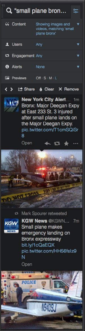
The above results showed that credible local news sources were reporting the plane landing, and they had images. I also found additional information and images from a wider search of all tweets that used a location filter (within 5 miles of New York City) and the keywords “small plane” and “bronx”:

I also searched within my specialized list of verified accounts belonging to New York State and City agencies, and used the location filter again. These credible sources (below) helped confirm the event.

At this point I contacted the public information office for the FDNY to confirm what I saw and ask for any other details they might have. I was told there were three people on board, two passengers and a pilot. We were later told the make/model of the plane, the name of the person the plane was registered to, and the hospital the pilot and pas- sengers were taken to. Social media led us to the event - but we had to track the details down the old-fashioned way.
Feeling we had properly run down enough credible information to get started, we filed our story (see below). The Circa app offers readers an option to “follow” a story and receive push updates as more information is added. Our process is to get a story up as soon as possible with verified reports and continue to push out updates. TweetDeck allows us to get a jump on a developing story and seek out reliable people (law enforcement, primary sources) we can contact to confirm the validity of social media updates. In some cases we contact the person who sent the information to Twitter and try to determine if they’re reliable.

Building a body of evidence
The information you’re seeing on social media should be the first step toward trying to verify what actually occurred, rather than the final word.
The key is to observe as much as you can, take in information and compare it to other content and information to build up a body of evidence. Find ways to corroborate what you find by directly contacting and verifying the people who are connected to the content you find.
As I said, treat social media as a police scanner.
The Lifecycle of Media Manipulation
Written by: Joan Donovan
Dr. Joan Donovan is the Research Director at Harvard Kennedy’s Shorenstein Center on Media, Politics and Public Policy
In an age where a handful of powerful global tech platforms have disrupted the traditional means by which society is informed, media manipulation and disinformation campaigns now challenge all political and social institutions. Hoaxes and fabrications are propagated by a mixed group of political operatives, brands, social movements and unaffiliated “trolls” who have developed and refined new techniques to influence public conversation, wreaking havoc on a local, national and global scale. There’s widespread agreement that media manipulation and disinformation are important problems facing society. But defining, detecting, documenting and debunking disinformation and media manipulation remains difficult, especially as attacks cross professional sectors such as journalism, law and technology. Therefore, understanding media manipulation as a patterned activity is an essential first step in working to investigate, expose and mitigate them.
Defining media manipulation and disinformation
To define media manipulation, we first split the term in two parts. In its most general form, media is an artifact of communication. Examples include text, images, audio and video in material and digital mediums. When studying media, any relic can be used as recorded evidence of an event. Crucially, media is created by individuals for the purpose of communicating. In this way, media conveys some meaning across individuals, but interpreting that meaning is always relational and situated within a context of distribution.
To claim media is manipulated is to go beyond simply saying that media is fashioned by individuals to transmit some intended meaning. The Merriam-Webster dictionary defines manipulation as “to change by artful or unfair means so as to serve one’s purpose.” While it can sometimes be difficult to know the exact purpose a single artifact was created to serve, investigators can determine the who, what, where and how of its communication to help determine if manipulative tactics were used as part of the distribution process. Manipulation tactics can include cloaking one’s identity or the source of the artifact, editing to conceal or change the meaning or context of an artifact, and tricking algorithms by using artificial coordination, such as bots or spamming tools.
In this context, disinformation is a subgenre of media manipulation, and refers to the creation and distribution of intentionally false information for political ends. Technologists, experts, academics, journalists and policymakers must agree on the distinctive category of disinformation because efforts to fight against disinformation require the cooperation of these groups.
For our part, the Technology and Social Change research team (TaSC) at Harvard Kennedy School’s Shorenstein Center is using a case study approach to map the life cycle of media manipulation campaigns. This methodological approach seeks to analyze the order, scale and scope of manipulation campaigns by following media artifacts through space and time, drawing together multiple relationships to sort through the tangled mess. As part of this work, we’ve developed an overview of the life cycle of a media manipulation campaign, which is useful for journalists as they attempt to identify, track and expose media manipulation and disinformation.

The life cycle has five points of action, where the tactics of media manipulators can be documented using qualitative and quantitative methods. Note that most manipulation campaigns are not “discovered” in this order. Instead when researching, look for any one of these points of action and then trace the campaign backward and forward through the life cycle.
Case study: ‘Blow the Whistle’
Let’s examine the social media activity around the whistleblower complaint made about the activity of President Donald Trump related to Ukraine to see how a media manipulation campaign unfolds, and how ethical action by journalists and platforms early in the life cycle can help thwart manipulation efforts.

Planning and Seeding (Stages 1 & 2) — In the conspiracy theory media ecosystem, the whistleblower’s identity is already known and his name is circulating on blogs, Twitter, Facebook, YouTube videos and discussion forums. Importantly, unique names can substitute for keywords and hashtags, which function as discrete searchable data points. There was a concerted push to spread the alleged name and the person’s photo. Yet, the name seems to be locked in this online media echo chamber of right-wing and conspiracy accounts and entities. Even with this coordinated effort by conspiracy-themed influencers to push the alleged whistleblower’s name into the mainstream, they were not able to break out of their own filter bubbles. Why is that?
Responses by journalists, activists etc. (Stage 3) — In contrast, leftist and centrist media did not print the name of the alleged whistleblower or amplify claims that he was outed. Mainstream media outlets refrained from calling attention to the circulation of this person’s name in the social media ecosystem, even though it’s a newsworthy story for reporters on the tech and politics beat. Those that did cover it often emphasized how the act of circulating this name was an attempt to manipulate the discussion around the whistleblower’s complaint, and avoided spreading the name. This is due in large part to the ethics of journalism, where reporters have a special duty to protect the anonymity of sources, which extends to whistleblowers.
Changes to information ecosystem (Stage 4) — While mainstream journalists were omitting his name, the alleged name of the whistleblower, “Eric Ciaramella,” is a unique keyword. This meant that people who searched for it could pull up a wide variety of content rooted in the conspiracy-influenced point of view. In addition to ethical journalists effectively turning down a story that could attract significant traffic, each platform company began actively moderating content that used the alleged whistleblower’s name as a keyword. YouTube and Facebook removed content that used his name, while Twitter prevented his name from trending. Google’s search did allow for his name to be queried and returned thousands of links to conspiracy blogs.

Adjustments by manipulators (Stage 5) — Manipulators were aggravated by these attempts to prevent the spread of misinformation and changed their tactics. Instead of pushing content with the alleged whistleblower's name, manipulators began circulating images of a different white man (with glasses and a beard) that resembled the image they previously circulated with his name. These new images were coupled with a “deep state” conspiracy narrative that the whistleblower was a friend of establishment Democrats, and therefore had partisan motives. However, this was an image of Alexander Soros, the son of billionaire investor and philanthropist George Soros, a frequent target of conspiracies.
When that failed to generate media attention, President Trump’s Twitter account, @RealDonaldTrump, retweeted an article giving the alleged whistleblower’s name, emphasizing that “The CIA whistleblower is not a real whistleblower!” to his 68 million followers. The original tweet came from @TrumpWarRoom, which is his campaign’s official and verified account. A cascade of media coverage followed, including many major mainstream outlets, all of which took pains to remove or cover the alleged whistleblower’s name. Many people called on social media for the whistleblower to testify in the Senate impeachment hearings, where his name was invoked alongside other important potential witnesses, broadening the possibility that others will stumble on it when searching for other names. And thus begins a new cycle of media manipulation.
Queries for the name of the whistleblower are on the rise and conspiracies abound on blogs about his personal and professional motivations for informing on Trump’s activities. Journalists reporting on these tweets oscillate between discussions of witness intimidation, citing that an act like this can deter future whistleblowers, while also tipping into lurid curiosity by reporting on the gossip surrounding Trump’s motive for outing the alleged whistleblower. As such, it is laudable that some media organizations are trying to hold elites to account, but the task is impossible without the platform companies’ addressing how their products have become useful political tools for media manipulation and spreading disinformation.

Documenting the life cycle
Media manipulators attempted to “trade up the chain” by seeding a name and photos on social media in order to eventually cause large, legitimate media to amplify it, where platforms would allow it to trend and become easily discoverable. But decisions and actions by platforms and journalists meant the attempt to push the alleged identity of the whistleblower into mainstream consciousness largely failed until a newsworthy figure pushed the issue. While many media organizations strive to abide by ethical guidelines, social media has become a weapon of the already powerful to set media agendas and drive dangerous conspiracies.
Generally speaking though, this case study is a significant improvement over prior efforts to stop the spread of disinformation, where journalists amplified disinformation campaigns as they tried to debunk them, and platform companies felt no duty to provide accurate information to audiences. This overall shift is promising, but accountability for elites is still lacking. For journalists and researchers alike, the stakes of detecting, documenting and debunking media manipulation campaigns are high. In this hyperpartisan moment, any claim to name a disinformation campaign may also bring hordes of trolls and unwanted attention. Grappling with the content and the context of disinformation requires us all to forensically document with rigor how campaigns start, change and end. And to recognize that every perceived ending of a campaign may very well be a new beginning.
Multiplying Memories While Discovering Trees in Bogotá
Written by: Maria Isabel Magaña
Abstract
How we used data about trees to create memories, promote transparency and include citizens in storytelling in Bogotá, Colombia.
Keywords: data journalism, citizenship, transparency, open government, multimodal storytelling, trees
Bogotá holds almost 16% of the population of Colombia in just 1.775 km².
You get the idea, it’s crowded, it’s furious. But it’s also a green city, surrounded by mountains and many different trees planted.
Most of the times, trees go unnoticed by its citizens in the midst of their daily life. Or at least that’s what happened to the members of our data team except for one of our coders, who loves trees and can’t walk down the street without noticing them. She knows all the species and the facts about them. Her love for nature in the midst of the chaos of the city is what got us thinking: has anybody, ever, talked about the trees that are planted all over town?
And that simple question was the catalyst for so many others:
-What do we know about them?
-Who is in charge of taking care of them?
-Are they really useful to clean the city’s pollution?
-Do we need more trees in the city?
-Is it true that only the rich neighborhoods have tall trees?
-Are there any historical trees in town?
We began our investigation aiming to do two different things: Firstly, to connect the citizens with the green giants they see everyday; and secondly, to understand the reality of the city’s tree planting and conservation plans.1
To do so, we analyzed the urban census of tree planting in Bogotá that the Botanical Garden conducted in 2007, the only set of information available, and which is updated every month.
The Botanical Garden refused to give us the full data even after we submitted multiple freedom of information requests filled with legal arguments. Their position was simple: The data was already available in their DataViz portal.
Our argument: You can only download 10,000 entries and the database is made up of 1.2 million entries. It’s public data, just give it to us! Their answer: We won’t give it to you but we will improve our app so you can download 50,000 entries.
Our solution? Reach out to other organizations that had helped the Botanical Garden collect the data. One of those entities was Ideca, which collects all the information related to the city’s cadastre.
They gave us the whole data set in no time. We, obviously, decided to publish it so that everyone can access it (call it our little revenge against opacity). The Botanical Garden realized this and stopped any further conversation with us, and we decided not to continue a legal battle.
In addition, we included public data from the Mayor’s Office of Bogotá and the National Census, to cross-reference information that we could analyze in relation to trees.
Finally, we conducted interviews with environmental experts and forestry engineers that allowed us to understand the challenges the city faces. They had done so much work and so many investigations analyzing not only the reality of tree planting schemes, but also the history behind the trees in the city. And most of this work was largely unnoticed by authorities, journalists and many others.
The final product was an eight-piece data project that showed the reality of the tree planting plans of the city. It mapped every single tree—with information about its height, species and benefits for the city—debunked many myths around tree planting, and told the stories of some of the city’s historical trees.

We used Leaflet and SoundCloud for the interactive elements. The design was implemented by our talented group of coders. We also used StoryMapJS to allow users to explore the historic trees of the city.
We decided how and which pieces were important for the story after researching many other similar projects and then partnered with a designer to create a good user experience. It was our first big data project and a lot of it involved trial and error as well as exploration.
More importantly, we involved citizens by inviting them to help us build a collaborative tree catalogue and to share their own stories about the trees we had mapped.
We did so through social media, inviting them to add information about tree species to a spreadsheet. Bogotá’s residents continue to help us enrich the catalogue to this day.
In addition, we shared a WhatsApp number where people could send voice notes with their stories about trees. We received almost a hundred voice messages from people telling stories of trees where they had their first kiss, that taught them how to climb, that protected them from thieves or that were missed because they were cut down.
We decided to include these audio files as an additional layer in the visualization app, so users could also get to know the city’s trees through people’s stories.
The main article and visual was then republished by a national newspaper (both in print and online), and shared by local authorities and many residents who wanted to tell their stories and transform the relationship that other residents have with their environment.
So far, people have used the map to investigate the city’s nature and to support their own research on the city’s trees.
For our organization, this has been one of the most challenging projects we have ever developed. But it is also one of the most valuable, because it shows how data journalism can be about more than just numbers: It can also play a role in creating, collecting and sharing culture and memories, help people notice things about the places they live (beyond graphs and charts), and multiply and change the relations between people, plants and stories in urban spaces.
Footnotes
Why Journalists Should Use Data
Written by: Mirko Lorenz
Journalism is under siege. In the past we, as an industry, relied on being the only ones operating a technology to multiply and distribute what had happened over night. The printing press served as a gateway, if anybody wanted reach the people of a city or region the next morning, they would turn to newspapers. This is over.
Today news stories are flowing in as they happen, from multiple sources, eye-witnesses, blogs and what has happened is filtered through a vast network of social connections, being ranked, commented and more often than not: ignored.
This is why data journalism is so important. Gathering, filtering and visualizing what is happening beyond what the eye can see has a growing value. The orange juice you drink in the morning, the coffee you brew — in today’s global economy there are invisible connections between these products, other people and you. The language of this network is data: little points of information that are often not relevant in a single instance, but massively important when viewed from the right angle.
Right now, a few pioneering journalists already demonstrate how data can be used to create deeper insights into what is happening around us and how it might affect us.
Data analysis can reveal “a story’s shape” (Sarah Cohen), or provides us with a “new camera” (David McCandless). Using data the job of journalists shifts its main focus from being the first ones to report to being the ones telling us what a certain development might actually mean. The range of topics can be far and wide. The next financial crisis that is in the making. The economics behind the products we use. The misuse of funds or political blunders, presented in a compelling data visualization that leaves little room to argue with it.
This is why journalists should see data as an opportunity. They can, for example, reveal how some abstract threat such as unemployment affects people based on their age, gender, education. Using data transforms something abstract into something everyone can understand and relate to.
They can create personalized calculators to help people to make decisions, be this buying a car, a house, deciding on an education or professional path in life or doing a hard check on costs to keep out of debt.
They can analyze the dynamics of a complex situation like riots or political debates, show the fallacies and help everyone to see possible solutions to complex problems.
Becoming knowledgeable in searching, cleaning, and visualizing data is transformative for the profession of information gathering, too. Journalists who master this will experience that building articles on facts and insights is a relief. Less guessing, less looking for quotes — instead, a journalist can build a strong position supported by data and this can affect the role of journalism greatly.
Additionally, getting into data journalism offers a future perspective. Today, when newsrooms cut down, most journalists hope to switch to public relations. Data journalists or data scientists though are already a sought-after group of employees, not only in the media. Companies and institutions around the world are looking for “sensemakers” and professionals, who know how to dig through data and transform it into something tangible.
There is a promise in data and this is what excites newsrooms, making them look for a new type of reporter. For freelancers proficiency with data provides a route to new offerings and stable pay, too. Look at it this way: instead of hiring journalists to quickly fill pages and websites with low value content the use of data could create demand for interactive packages, where spending a week on solving one question is the only way to do it. This is a welcome change in many parts of the media.
There is one barrier keeping journalists from using this potential: training in order to learn how to work with data through all the steps from a first question to a big data-driven scoop.
Working with data is like stepping into vast, unknown territory. At first look, raw data is puzzling to the eyes and to the mind. Data as such is unwieldy. It is quite hard to shape it correctly for visualization. It needs experienced journalists, who have the stamina to look at often confusing, often boring raw data and “see” the hidden stories in there.

9. Presenting UGC in investigative reporting
Written by: Claire Wardle
Ten years ago, a huge earthquake in the Indian Ocean unleashed a devastating tsunami across the region. At first, there were no pictures of the wave; it took a couple of days for the first images to surface. And when they did appear, most were shaky footage, captured mostly by tourists pressing record on their camcorders as they ran to safety. None of them expected their home videos of a family holiday to become eyewitness footage of a terrible tragedy.
Today, it’s a completely different situation. During almost every news event, bystanders use their mobile phones to share text updates in real-time on social media, as well as to capture and post pictures and videos straight to Twitter, Facebook, Instagram or YouTube.
But just because we now take this behavior for granted doesn’t mean we’ve worked out the rules for how to use this material legally, ethically or even logistically. Organizations are still working through the most appropriate ways to use this type of content. This is true whether it’s news outlets, brands, human rights groups or educators.
There are important differences between footage that has been sent directly to a particular organization versus material that has been uploaded publicly on a social network. The most important point to remember is that when someone uploads a photograph or video to a social network, the copyright remains with them. So if you want to download the picture or video to use elsewhere, you must first seek permission. If you simply want to embed the material, using the embed code provided by all of the social networks, legally you don’t need to seek permission. Ethically, however, it might be appropriate to contact the person who created the content to let them know how and where you intend to use it.
Seeking permission
A lawyer would always prefer an agreement to be conducted formally via a signed contract; however, in the heat of a breaking news event, seeking permission on the social network itself has become the norm. This has many benefits, not the least of which is that it provides an opportunity for immediate dialogue with the user who has shared the material.
Asking the right questions at the point of contact will help with your verification processes. The most important question to ask is whether the person actually captured the material him or herself. It is amazing how many people upload other people’s content on their own channels. They will often “give permission” for use even though they have no right to do so. You also want to ask basic questions about their location, and what else they could see, to help you authenticate what they claim to have witnessed.
If the person has just experienced a traumatic or shocking event, they could possibly still be in a dangerous situation. Establishing that they are safe and able to respond is also a crucial step. When seeking permission, it’s also important to be as transparent as possible about how you intend to use the footage. If you intend to license the video globally, this should be explained in a way that ensures that the uploader understands what that means.
Here’s one example of how to do it:

However, if you want a watertight legal agreement, you would need to arrange something more substantial over email. If you do seek permission on the social network itself, make sure that you take a screenshot of the exchange. People will sometimes provide permission for use, and then, after negotiating an exclusive deal with another organization, they will delete any exchanges on social media that show them giving permission to others.
Payment
There isn’t an industry standard for payment. Some people want payment for their material, and others don’t. Some people are happy for organizations to use their photo or video, as long as they are credited. Other people don’t want to be credited.
This is why you should ask these questions when you are seeking permission. You should also think about the implications of using the material. For example, a person might have captured a piece of content and in their mind, they’ve only shared it with their smallish network of friends and family. But they didn’t expect a journalist to find it. They captured it when they were perhaps somewhere they shouldn’t have been, or they captured something illegal and they don’t want to be involved. Or they simply don’t want a picture, quickly uploaded for their friends to see, to end up embedded on an online news site with millions of readers.
Here’s an example of a response from a person who uploaded a picture to Instagram during the shooting at the Canadian parliament in October 2014.

As part of ongoing monitoring and research, Eyewitness Media Hub has analyzed hundreds of exchanges between journalists and uploaders over 18 months in 2013, 2014 and 2015, and the responses of the people who created the material are not always what you would expect. This piece by Eyewitness Media Hub, of which I’m a co-founder, reflects on the content that emerged during the Paris shootings in early 2015, and the people who found themselves and their material unexpectedly at the center of the news coverage.
Crediting
Our experience and analysis show that the vast majority of people don’t want payment; they simply want a credit. This isn’t just a case of what’s right: It’s also a question of being transparent with the audience. There isn’t an industry standard when it comes to crediting, as every uploader wants to be credited in a different way. Especially if you’re not paying to use their material, you have a legal right to follow their instructions.
With television news, without the opportunity to embed content, a credit should be added onscreen. The most appropriate form of credit is to include two pieces of information. First, the social network where the footage was originally shared, and, second, the person’s name, in the way they asked to be credited. That might be their real name or their username, e.g., Twitter / C. Wardle or Instagram / cward1e or YouTube / Claire Wardle.
Online, the content should be embedded from the platform that it was originally posted, whether that’s Twitter, Instagram or YouTube. That means the credit is there as part of the embed. If a screen grab is taken of a picture or a video sourced from a social network, the same approach should be used. In the caption, it would be appropriate to hyperlink to the original post.
Be aware that embedded content will disappear from your site if it is removed from the social network by the original uploader. So you should ultimately try to procure the original file, especially if you are planning to run the content for a long time.
In certain situations, it’s necessary to use your judgment. If a situation is ongoing, then sharing the information of the person who created the content might not be the most sensible thing to do, as shown by this BBC News journalist:

Labeling
It is best practice to “label” who has captured the content. If we take this picture of a woman in the snowstorm in the Bekaa Valley in Lebanon, it’s important that the audience knows who took this. Was it a UNHCR staff member? Was it a freelance journalist? Was it a citizen journalist? Was it a refugee?

In this case a refugee took the photograph, but it was distributed by UNHCR to news organizations via a Flickr account. When someone unrelated to the newsroom takes a picture that is used by the newsroom, for reasons of transparency, any affiliation should be explained to the audience. Simply labeling this type of material as “Amateur Footage” or something similar doesn’t provide the necessary context.
Verification
There is no industry standard when it comes to labeling something as verified or not. The AP will not distribute a photograph or video unless it passes its verification procedures. While other news outlets try not to run unverified footage, it is difficult to be 100 percent sure about a photo or video that has been captured by someone unrelated to the newsroom.
As a result, many news organizations will run pictures or videos with the caveat that “this cannot be independently verified.” This is problematic, as the truth is that the newsroom may have run many verification checks, or relied on agencies to do these checks, before broadcasting or publishing a photo or video. So this phrase is being used as an insurance policy.
While research needs to explore the impact of this phrase on the audience, repeating it undermines the verification processes that are being carried out. Best practice is to label any content with the information you can confirm, whether that’s source, date or location. If you can confirm only two out of the three, add this information over the photo or video. We live in an age where audiences can often access the same material as the journalist; the audience is being exposed to the same breaking news photos and images in their social feeds. So the most important role for journalists is to provide the necessary context about the content that is being shared: debunk what is false, and provide crucial information about time, date or location, as well as showing how this content relates to other material that is circulating.
Being ethical
Overall, remember that when you work with material captured by others, you have to treat the content owner with respect, you need to work hard to verify what is being claimed, and you need to be as transparent as possible with your audience.
The people uploading this phone-taken footage are mostly eyewitnesses to a news event. They are not freelancers. The majority wouldn’t identify themselves as citizen journalists. They often have little knowledge of how the news industry works. They don’t understand words like exclusively, syndication or distribution.
Journalists have a responsibility to use the content ethically. Just because someone posted a piece of content publicly on a social network does not mean that they have considered the implications of its appearing on a national or international news outlet.
You must seek informed consent, not just consent, meaning: Does the uploader understand what they’re giving permission for? And when it comes to crediting, you must talk to them about whether and how they would like credit. The responses are constantly surprising.
Behind the Numbers: Home Demolitions in Occupied East Jerusalem
Written by Mohammed Haddad
When you look at the chart below (Figure 4.1), you will see a series of steady orange and black bars followed by a large spike in 2016.
Once you take a closer look at the caption you will understand that this chart shows the number of structures destroyed and people affected by Israel’s policy of home demolitions.
As Nathan Yau, author of Flowing Data, put it, “data is an abstraction of real life” (2013). Each number represents a family, and each number tells a story.
“Broken Homes” is the most comprehensive project to date tracking home demolitions in East Jerusalem, a Palestinian neighbourhood that has been occupied by Israel for 50 years.1
Working closely with the United Nations, Al Jazeera tracked every single home demolition in East Jerusalem in 2016. It turned out to be a record year, with 190 structures destroyed and more than 1,200 Palestinians displaced or affected.
We decided to tackle this project after witnessing an escalation in violence between Israelis and Palestinians in late 2015.
The goal was twofold: To understand how Israel's home demolitions policy would be affected by the increased tensions, and to tell readers the human stories behind the data.
The project reveals the impact on Palestinian families through video testimony, 360-degree photos and an interactive map that highlights the location, frequency and impact of each demolition.

Our producer in Doha began coordinating with the UN in late 2015 to develop a framework for the project. The UN routinely gathers data on home demolitions, and while some of it is available online, other aspects—including GPS coordinates—are only recorded internally.
We wanted to be able to show every demolition site on a map, so we began obtaining monthly data sets from the UN. For each incident, we included the demolition date, number of people and structures affected, a brief description of what happened, and a point on our East Jerusalem map showing the location.
We cross-checked these with news reports and other local information about home demolitions. We then selected a case to highlight each month, as a way of showing different facets of the Israeli policy—from punitive to administrative demolitions, affecting everyone from young children to elderly residents.
Our reporter on the ground travelled throughout East Jerusalem over the course of the year to speak with many of the affected families, in order to explore their losses in greater depth and to photograph and record the demolition sites.

There was a broad range of responses from the affected families. The interviews had to take place in the physical location of the demolition, which could be a difficult experience for those affected, so sensitivity and patience were required at all stages, from setting up the meetings to recording the material.
On the whole, the families responded well to the project. They were very generous with their time and in sharing their experiences.
In one instance, a man had written down a list of things he wanted to say to us. In another case, it took a few attempts to convince the family to take part. One family declined to meet with us and so we had to liaise with the UN and f ind another family willing to speak about their home demolition.
Many news organizations, including Al Jazeera, have reported on individual home demolitions over the years. One of the main reasons for taking a data-driven approach this time was to clearly contextualize the scale of the story by counting each and every demolition. This context and fresh perspective are especially important when reporting on an ongoing topic to keep readers engaged.
A word of advice for aspiring data journalists: Taking a data-driven approach to a story doesn’t need to be technical or expensive.
Sometimes simply following and counting occurrences of an event over time tells you a lot about the scale of a problem. As long as your data-gathering methodology remains consistent, there are many stories that you can tell using data that you might not otherwise report on. Also, be patient. We gathered data for an entire year to tell this story.
The most important thing is to thoroughly storyboard exactly what data you need before sending any reporters out into the field. Most of the time you won’t need any special equipment either.
We used an iPhone to take all the 360-degree images and capture the specific GPS coordinates.
The project—released in January 2017 in English, Arabic and Bosnian— presents a grim warning about what lies ahead as Israel continues to deny building permits to 98% of Palestinian applicants, ramping up the pressure on a large and growing population.
Footnotes
1. interactive.aljazeera.com/aje/2017/jerusalem-2016-home-demolitions/index.html
Works Cited
Yau, N. (2013, June 28). Understanding data—Context. Big Think. bigthink.com/experts-corner/understanding-data-context
Why Is Data Journalism Important?
Written by: Nicolas Kayser-Bril David Anderton-Yang , Nicolas Kayser-Bril , Alexander Howard , César Viana Teixeira , Sarah Slobin , Jerry Vermanen Sarah Slobin
We asked some of data journalism’s leading practitioners and proponents why they think data journalism is an important development. Here is what they said.
Filtering the Flow of Data
When information was scarce, most of our efforts were devoted to hunting and gathering. Now that information is abundant, processing is more important. We process at two levels: (1) analysis to bring sense and structure out of the never-ending flow of data and (2) presentation to get what’s important and relevant into the consumer’s head. Like science, data journalism discloses its methods and presents its findings in a way that can be verified by replication.
New Approaches to Storytelling
Data journalism is an umbrella term that, to my mind, encompasses an ever-growing set of tools, techniques and approaches to storytelling. It can include everything from traditional computer-assisted reporting (using data as a ‘source’) to the most cutting edge data visualization and news applications. The unifying goal is a journalistic one: providing information and analysis to help inform us all about important issues of the day.
Like Photo Journalism with a Laptop
‘Data journalism’ only differs from ‘words journalism’ in that we use a different kit. We all sniff out, report, and relate stories for a living. It’s like ‘photo journalism’; just swap the camera for a laptop.
Data Journalism is the Future
Data-driven journalism is the future. Journalists need to be data-savvy. It used to be that you would get stories by chatting to people in bars, and it still might be that you’ll do it that way some times. But now it’s also going to be about poring over data and equipping yourself with the tools to analyze it and picking out what’s interesting. And keeping it in perspective, helping people out by really seeing where it all fits together, and what’s going on in the country.
Number-Crunching Meets Word-Smithing
Data journalism is bridging the gap between stat technicians and wordsmiths. Locating outliers and identifying trends that are not just statistically significant, but relevant to de-compiling the inherently complex world of today.
Updating Your Skills Set
Data journalism is a new set of skills for searching, understanding and visualizing digital sources in a time that basic skills from traditional journalism just aren’t enough. It’s not a replacement of traditional journalism, but an addition to it.
In a time where sources go digital, journalists can and have to be closer to those sources. The Internet opened up possibilities beyond our current understanding. Data journalism is just the beginning of evolving our past practices to adapt to the online.
Data journalism serves two important purposes for news organizations: finding unique stories (not from news wires) and execute your watchdog function. Especially in times of financial peril, these are important goals for newspapers to achieve.
From the standpoint of a regional newspaper, data journalism is crucial. We have the saying ‘a loose tile in front of your door is considered more important than a riot in a far-away country’. It’s hits you in the face and impacts your life more directly. At the same time, digitisation is everywhere. Because local newspapers have this direct impact in their neighbourhood and sources become digitalised, a journalist must know how to find, analyze and visualise a story from data.
A Remedy for Information Asymmetry
Information asymmetry — not the lack of information, but the inability to take in and process it with the speed and volume that it comes to us — is one of the most significant problems that citizens face in making choices about how to live their lives. Information taken in from print, visual and audio media influence citizens' choices and actions. Good data journalism helps to combat information asymmetry.
An Answer to Data-driven PR
The availability of measurement tools and their decreasing prices, in a self-sustaining combination with a focus on performance and efficiency in all aspects of society, have led decision-makers to quantify the progresses of their policies, monitor trends and identify opportunities.
Companies keep coming up with new metrics showing how well they perform. Politicians love to brag about reductions in unemployment numbers and increases in GDP. The lack of journalistic insight in the Enron, Worldcom, Madoff or Solyndra affairs is proof of many a journalist’s inability to clearly see through numbers. Figures are more likely to be taken at face value than other facts as they carry an aura of seriousness, even when they are entirely fabricated.
Fluency with data will help journalists sharpen their critical sense when faced with numbers and will hopefully help them gain back some terrain in their exchanges with PR departments.
Providing Independent Interpretations of Official Information
After the devastating earthquake and subsequent Fukushima nuclear plants disaster in 2011, the importance of data journalism has been driven home to media people in Japan, a country which is generally lagging behind in digital journalism.
We were at a loss when the government and experts had no credible data about the damage. When officials hid SPEEDI data (predicted diffusion of radioactive materials) from the public, we were not prepared to decode it even if it were leaked. Volunteers began to collect radioactive data by using their own devices but we were not armed with the knowledge of statistics, interpolation, visualization and so on. Journalists need to have access to raw data, and to learn not to rely on official interpretations of it.
Dealing with the Data Deluge
The challenges and opportunities presented by the digital revolution continue to disrupt journalism. In an age of information abundance, journalists and citizens alike all need better tools, whether we’re curating the samizdat of the 21st century in the Middle East, processing a late night data dump, or looking for the best way to visualise water quality for a nation of consumers. As we grapple with the consumption challenges presented by this deluge of data, new publishing platforms are also empowering everyone to gather and share data digitally, turning it into information. While reporters and editors have been the traditional vectors for information gathering and dissemination, the flattened information environment of 2012 now has news breaking first online, not on the news desk.
Around the globe, in fact, the bond between data and journalism is growing stronger. In an age of big data, the growing importance of data journalism lies in the ability of its practitioners to provide context, clarity and, perhaps most important, find truth in the expanding amount of digital content in the world. That doesn’t mean that the integrated media organizations of today don’t play a crucial role. Far from it. In the information age, journalists are needed more than ever to curate, verify, analyze and synthesise the wash of data. In that context, data journalism has profound importance for society.
Today, making sense of big data, particularly unstructured data, will be a central goal for data scientists around the world, whether they work in newsrooms, Wall Street or Silicon Valley. Notably, that goal will be substantially enabled by a growing set of common tools, whether they’re employed by government technologists opening Chicago, healthcare technologists or newsroom developers.
Our Lives are Data
Good data journalism is hard, because good journalism is hard. It means figuring out how to get the data, how to understand it, and how to find the story. Sometimes there are dead ends, and sometimes there’s no great story. After all if it were just a matter of pressing the right button, it wouldn’t be journalism. But that’s what makes it worthwhile, and — in a world where our lives are increasingly data — essential for a free and fair society.
A Way to Save Time
Journalists don’t have time to waste transcribing things by hand and messing around trying to get data out of PDFs, so learning a little bit of code, or knowing where to look for people who can help, is incredibly valuable.
One reporter from Folha de São Paulo was working with the local budget and called me to thank us for putting up the accounts of the municipality of São Paolo online (two days work from a single hacker!). He said he had been transcribing them by hand for the past three months, trying to build up a story. I also remember solving a ‘PDF issue’ for ‘Contas Abertas’, a parliamentary monitoring news organisation: 15 minutes and 15 lines of code solved a months worth of work.
An Essential Part of the Journalists' Toolkit
I think it’s important to stress the “journalism” or reporting aspect of ‘data journalism’. The exercise should not be about just analyzing data or visualizing data for the sake of it, but to use it as a tool to get closer to the truth of what is going on in the world. I see the ability to be able to analyze and interpret data as an essential part of today’s journalists' toolkit, rather than a separate discipline. Ultimately, it is all about good reporting, and telling stories in the most appropriate way.
Data journalism is another way to scrutinise the world and hold the powers that be to account. With an increasing amount of data available, now more than ever it is important that journalists are of aware of data journalism techniques. This should be a tool in the toolkit of any journalist: whether learning how to work with data directly, or collaborating with someone who can.
Its real power is in helping you to obtain information that would otherwise be very difficult to find or to prove. A good example of this is Steve Doig’s story that analyzed damage patterns from Hurricane Andrew. He joined two different datasets: one mapping the level of destruction caused by the hurricane and one showing wind speeds. This allowed him to pinpoint areas where weakened building codes and poor construction practices contributed to the impact of the disaster. He won a Pulitzer Prize for the story in 1993 and it’s great inspiration of what is possible.
Ideally you use the data to pinpoint outliers, areas of interest, or things which are surprising. In this sense data can act as a lead or a tip off. While numbers can be interesting, just writing about the data is not enough. You still need to do the reporting to explain what it means.
Adapting to Changes in Our Information Environment
New digital technologies bring new ways of producing and disseminating knowledge in society. Data journalism can be understood as the media’s attempt to adapt and respond to the changes in our information environment — including more interactive, multi-dimensional story-telling, enabling readers to explore the sources underlying the news and encouraging them to participate in the process of creating and evaluating stories.
A Way to See Things You Might Not Otherwise See
Some stories can only be understood and explained through analyzing — and sometimes visualizing — the data. Connections between powerful people or entities would go unrevealed, deaths caused by drug policies that would remain hidden, environmental policies that hurt our landscape would continue unabated. But each of the above was changed because of data that journalists have obtained, analyzed and provided to readers. The data can be as simple as a basic spreadsheet or a log of cell phone calls, or complex as school test scores or hospital infection data, but inside it all are stories worth telling.
A Way To Tell Richer Stories
We can paint pictures of our entire lives with our digital trails. From what we consume and browse, to where and when we travel, to our musical preferences, our first loves, our children’s milestones, even our last wishes – it all can be tracked, digitised, stored in the cloud and disseminated. This universe of data can be surfaced to tell stories, answer questions and impart an understanding of life in ways that is currently surpassing even the most rigorous and careful reconstruction of anecdotes.
Mapping Crash Incidents to Advocate for Road Safety in the Philippines
Written by Aika Rey
Abstract
How a data story on road crash incidents in the Cagayan province in the Philippines led to positive policy and social change.
Keywords: data journalism, road safety, community engagement, mapping, Philippines, policy and social change
Data shows that fatalities from vehicular crash incidents in the Philippines have been increasing steadily over the years. Injuries from road crash incidents are now a top cause of death among Filipino youth.
Because of this, we built a microsite that compiled relevant information on road safety. We gathered and analyzed data, derived insights, published stories, and designed civic engagement opportunities—both on the ground and on digital—in order to educate the public about road safety.1
We also started running a video series entitled “Right of Way” which tackles motorist and commuter issues in Metro Manila. That is how Rappler’s #SaferRoadsPH campaign was born.
Compiling relevant data about road traffic deaths and injuries was a challenge. With no comprehensive national database on road crash numbers, we knocked on doors and gathered data from over a dozen national and local government units, including police offices in various cities and provinces.
Data acquired from these repositories are not standardized. A significant part of the work involved cleaning the data for analysis. One big challenge was how to map data when location information is either incomplete or not consistently recorded.2
Using the open-source data-cleaning application OpenRefine, we were able to come up with a normalized database of information acquired from the different government agencies. This allowed us to determine locations, dates and the number of people affected by crash incidents. Although still incomplete, our collection is probably the biggest single compilation of data on road crash incidents in the Philippines at the moment.
But what made our approach distinctive is that on top of stories, analysis and visualizations based on our collection of data, we made the effort to present them directly to communities concerned not just online but in on-the-ground activities. In the process, data analytics led to civic engagement activities.
One particular story that stood out in our coverage was the in-depth story on the Cagayan province, located roughly 600 km north of Manila, which is the area most affected by vehicular crash fatalities. We visited key offices in the province to get road crash incident data, as well as to conduct interviews with victims, local police and public service officials.
Following this exercise, in June 2017, Rappler conducted a road safety awareness forum in the province’s capital city Tuguegarao to present our findings. The forum sought to educate the public about road safety concerns in the province, as well as influence key officials to address the policy gap.3
Apart from graphs showing the times of day when critical incidents occur the most, at the forum we presented a heat map, created using Google Fusion Tables, which shows the locations with the greatest number of incidents in the Cagayan province (Figure 5.1).
Officials present attributed these numbers, among others, to the absence of pedestrian lanes. A check of schools in the city showed no pedestrian lanes in front of schools. After the forum, a social experiment was conducted where locals sketched pedestrian lanes using chalk in front of a school. Law enforcement officials wanted to see if motorists would stop at pedestrian lanes as students cross. Rappler later posted a video story on Facebook about this experiment.4

The video generated a lot of interest. A Rappler reader who saw the video reached out to us and volunteered to provide paint for pedestrian lanes within the city. Months later, through the combined efforts of local government and volunteers, schools within the city finally got pedestrian lanes. The painting project was completed on 30 September 2017. Two years later, the city government approved a local ordinance on road safety.
This project showed that data-driven reporting need not end when the editor clicks publish. It is proof that combining data journalism with online and offline community engagement can lead to positive policy and social change.
Footnotes
1. www.rappler.com/saferroadsph
2. We published a full explanation of our data sources here: r3.rappler.com/move-ph/issues/road-safety/171657-road-crash-numbers-data-sources
3. r3.rappler.com/move-ph/issues/road-safety/171778-road-crash-incidents-cagayan-valley
4. r3.rappler.com/move-ph/issues/road-safety/172432-cagayan-police-pedestrian-lane-chalk
10. Organizing the newsroom for better and accurate investigative reporting
Written by Dr. Hauke Janssen
It began with a cardboard box full of newspaper clippings. In 1947, Rudolf Augstein, the founder and publisher of Der Spiegel, mandated that his publication should gather and maintain an archive of previously published work.
That box soon grew to become an archive spanning hundreds, then thousands of meters of shelves. Newspapers, magazines and other news media were catalogued, along with original documents from government departments and other sources. Augstein praised his archive, which he said “can conjure up the most extravagant information.” He died in 2002.
More than any other republisher in Germany, Augstein believed in the power and value of maintaining an archive, and in the importance of applying it to a fact-checking process.
Up to the late 1980s, Spiegel’s archive was purely paper based. Beginning in the 1990s, the classic archives expanded into the virtual space. Today, the archive adds 60,000 new articles each week in its custom Digital Archive System (Digas). This information is collected from over 300 sources reviewed on a regular basis, which includes the entire national German press as well as several international publications. Digas currently stores more than 100 million text files and 10 million illustrations.
From an archive to a documentation department
A mistake led Der Spiegel to the realization that fact-checking is necessary. When an archivist pointed out a serious error in an article that had already been printed, Augstein answered gruffly, “Well, check that in the future earlier, then.“
From that point forward, fact-checking became a part of the duties of archive employees. In June 1949, Spiegel issued guidelines to all its journalists that outlined the necessity that every fact be checked. The guidelines read in part:
"Spiegel must contain more personal, more intimate and more background information than the daily press does ... All news, information and facts that Spiegel uses and publishes must be correct without fail. Each piece of news and each fact must be checked thoroughly before it is passed on to the news staff. All sources must be identified. When in doubt, it is better not to use a piece of information rather than to run the risk of an incorrect report."
Hans D. Becker, the magazine’s managing editor in the 1950s, described the change from a traditional archive to a documentation department.
“Originally, the news library was only supposed to collect information (mostly in the form of press clippings),” he said. “What started as collecting on the dragnet principle imperceptibly became information-gathering through research. Amidst the ‘chaos of the battlefield’ of a newsroom, collecting and researching information for use in reporting imperceptibly became the exploitation of what was collected and gathered to prove what was claimed ...”
How Spiegel does fact-checking today
The Dok, as we call it, is today organized into sections, called “referats,” that correspond to the various desks in the news departments, such as politics, economy, culture, science, etc. It employs roughly 70 “documentation journalists.” These are specialists who often possess a doctorate in their respective fields, and include biologists, physicists, lawyers, economists, MBAs, historians, scholars of Islam, military experts and more.
They are charged with checking facts and with supporting our journalists by providing relevant research. As soon as the author’s manuscript is edited, the page proof is transferred to the relevant Dok-Referat. Then the fact-checking starts.
Spiegel has very specific and detailed guidelines for fact-checking. This process ensures we apply the same standard to all work, and helps ensure we do not overlook key facts or aspects of a story. Dok- Referats use the same markings on manuscripts, creating a level of consistency that ensures adherence to our standards.
This approach can be applied to any story, and is particularly useful in investigative work, which must meet the highest standards.
Some of the key elements of our guidelines:
- Any fact that is to be published will be checked to see if it is correct on its own and in context, employing the resources at hand and dependent on the time available.
- Every verifiable piece of information will be underlined.
- Standardized marks will be used to denote statements as correct, incorrect, not verifiable, etc.
- Correct facts and figures will be checked off. If corrections are necessary, they will be noted in red ink in the margin, using standard proofreading marks.
- The source of factual corrections and quotations must be given.
- Corrections accepted by the author(s) will be checked off, the others will be marked n.ü. (not accepted).
- When fact-checking a manuscript, other and if possible more accurate sources than the author‘s sources should be used.
- A statement is considered verified only if confirmed by reliable sources or experts.
- If a piece of research contradicts an author’s statement, the author must be notified of the contradiction during the discussion of the manuscript. If a fact is unverifiable, the author must also be notified.
- A journalist’s source who is the object of an article may be contacted only with permission from the author. (In practice, we often speak with sources to check facts.)
- Complex passages will be double-checked by the documentation department specialized in the subject matter.
- Sometimes the limited time available means that priorities must be set. In such cases, facts that are the clear responsibility of the fact-checker must be checked first, particularly:
-Are the times and dates correct?
-Does the text contradict itself?
-Are the names and offices/jobs correct?
-Are the quotations correct (in wording and in context)? How current and trustworthy are the sources used?
-How current and trustworthy are the sources used?
The above list represents the most critical elements to be verified in an article when there is limited time for fact-checking. Newsrooms that do not have a similar documentation department should emphasize that reporters and editors double-check all of these items in any story prior to publication.
Evaluating Sources
Fact-checking starts with comparing a story draft with the research materials provided by the author. The fact-checker then seeks to verify the facts and assertions by gathering additional sources that are independent of each other. For crucial passages, the checker examines a wide variety of sources in order to examine what is commonly accepted and believed and what is a more subjective or biased point of view. They determine what is a matter of fact and what is controversial or, in some cases, a myth.
We use our Digas database to surface relevant and authoritative sources. It’s also the responsibility of every Spiegel fact-checker to study the relevant papers, journals, studies, blogs, etc. in their field, daily. This ensures that they have current knowledge on relevant topics, and that they know the trustworthiness of different sources.
This form of domain expertise is essential when evaluating the credibility of sources. However, there are some general guidelines that can be followed when evaluating sources:
- Prefer original documents. If an academic study is quoted, obtain the original, full text. If company earnings are cited, obtain their financials. Do not reply on press summaries and press releases when the original document can be obtained.
- Prefer sources that delineate between facts and opinion, and that supply facts in their work.
- Prefer sources that clearly indicate the source of their information, as this enables you to verify their work. (Media outlets or other entities that overly rely on anonymous sources should be treated with caution.)
- Beware of sources that make factual errors about basic facts, or that confuse basic concepts about a subject matter.
Examples of checked manuscripts
After an article has been checked at Spiegel, the documentarist and the author discuss possible corrections until they agree on the final version. The author makes the corrections to the manuscript. The fact-checker checks the corrections a second time and also any other changes that may have been made in the meantime.


Accuracy is the basic prerequisite for good journalism and objective reportage. Journalists make mistakes, intended or not. Mistakes damage the most valuable asset of journalism: credibility. That is, after all, the quality to which journalists refer most frequently to distinguish their journalism.
One method to reduce the probability of mistakes is verification; that is, checking facts before publication.
A 2008 thesis produced at the University of Hamburg counted all the corrections made by the documentation department in a single issue of Der Spiegel. The final count was 1,153. Even if we exclude corrections related to spelling and style, there were still 449 mistakes and 400 imprecise passages, of which more than 85 percent were considered to be relevant or very relevant.
Tracking Worker Deaths in Turkey
Written by: pinar dag
Abstract
Documenting worker deaths in Turkey to advocate for improved working conditions.
Keywords: Turkey, Soma, labour conditions, data journalism, open data, freedom of information (FOI)
In the wake of the Soma mine disaster in Turkey in 2014, it transpired that it was extremely difficult to document the conditions of workers.
There were discrepancies with figures on worker unionization and a scarcity of data on worker deaths over previous decades. What was available was often disorganized and lacking in detail. We wanted to make this data widely accessible and shed light on the deaths of workers in other sectors.
With this in mind, a programmer, an editor and myself developed the “Open Database of Deceased Workers in Turkey,” a project hosted by the data journalism portal Dağ Medya, that gathered data from multiple sources, verified it, and made it available for everyone to access and use.1
In Turkey at least 130 workers die per month from a variety of causes. The most important goal of the project was to raise awareness of these deaths and their frequency, as well as to publicly recognize victims and the poor working conditions that they endured.
The project comprised embeddable maps, graphs and data in different formats.2
It covered the deaths of workers in over 20 sectors from 2011 to 2014. After the project was completed, we continued to report the death of workers through regular media monitoring each month. Crucially, the database includes the names of the companies that employed them (Figure 6.1).

The project began in 2015. We started by submitting freedom of information (FOI) requests and collecting data from trusted NGOs that were extracting data from various sources and were making it publicly accessible.
The first challenge we encountered was that it was not easy to get open data through FOI requests. Sometimes it took two weeks, sometimes four months, to obtain data through our requests.
Next, a more unexpected challenge arose, which I am recounting because it surfaces conflicting perspectives on this type of work. When we announced the project, one of the projects whose data we were using—İSİG Meclisi (Health and Safety Labour Watch)—became unhappy about us using it.3
The reason was, they claimed, that our project simply republished data that they had gathered. They understood our using of their data in this way as taking advantage of their labour.
The opposition to the project persisted, in spite of our asking for permission and the fact that their data is publicly available. While they accused us of “pornifying” workers’ deaths with our visualizations and tables, we saw our project as creating public value by increasing the outreach of the data they had collected, through visually accessible and readily downloadable formats.
While human stories are vital, we believed that unstructured, raw data was important in order to provide a more systematic view of these injustices. We found it difficult to reach consensus around this logic and struggled to make the case for the value of collaborative open data-sharing practices. We ended up publishing monthly worker deaths by comparing official data gathered through FOI requests with the data that we collected through our own monitoring of these cases.
Following this project, the institutions that we petitioned with FOI requests began to share their data in a more structured way and visualize it.
We took this as evidence that we had accomplished one of our goals: To make this information more widely accessible.
Ultimately, the project was recognized as a finalist in the 2015 Data Journalism Awards.
Footnotes
1.http://community.globaleditorsnetwork.org/content/open-database-deceased-workers-turkey-0
2. platform24.org/veri-gazeteciligi/451/turkiyede-isci-olumleri-veritabani-hazirlandi (Turkish language)
3. www.isigmeclisi.org(Turkish language)
Some Favorite Examples
Written by: Angelica Peralta Ramos Simon Rogers , Steve Doig , Angelica Peralta Ramos , Sarah Slobin Steve Doig Sarah Slobin , Angelica Peralta Ramos
We asked some of our contributors for their favorite examples of data journalism and what they liked about them. Here they are.
Do No Harm in the Las Vegas Sun

My favourite example is the Las Vegas Sun’s 2010 Do No Harm series on hospital care (see Figure 5). The Sun analyzed more than 2.9 million hospital billing records, which revealed more than 3600 preventable injuries, infections and surgical mistakes. They obtained data through a public records request and identified more than 300 cases in which patients died because of mistakes that could have been prevented. It contains different elements, including: an interactive graphic which allows the reader to see by hospital, where surgical injuries happened more often than would be expected; a map with a timeline that shows infections spreading hospital by hospital; and an interactive graphic that allows users to sort data by preventable injuries or by hospital to see where people are getting hurt. I like it because it is very easy to understand and navigate. Users can explore the data in a very intuitive way. Also it had a real impact: the Nevada legislature responded with six pieces of legislation. The journalists involved worked very hard to acquire and clean up the data. One of the journalists, Alex Richards, sent data back to hospitals and to the state at least a dozen times to get mistakes corrected.
Government Employee Salary Database

I love the work that small independent organizations are performing every day, such as ProPublica or the Texas Tribune who have a great data reporter in Ryan Murphy. If I had to choose, I’d pick the Government Employee Salary Database project from the Texas Tribune (Figure 6). This project collects 660,000 government employee salaries into a database for users to search and help generate stories from. You can search by agency, name or salary. It’s simple, meaningful and is making inaccessible information public. It is easy to use and automatically generates stories. It is a great example of why the Texas Tribune gets most of its traffic from the data pages.
Full-text visualization of the Iraqi War Logs, Associated Press

Jonathan Stray and Julian Burgess’ work on Iraq War Logs is an inspiring foray into text analysis and visualization using experimental techniques to gain insight into themes worth exploring further within a large textual dataset (Figure 7).
By means of text-analytics techniques and algorithms, Jonathan and Julian created a method that showed clusters of keywords contained in thousands of US-government reports on the Iraq war leaked by Wikileaks in visual form.
Though there are limitations to the methods presented and the approach is experimental, it presents an innovative approach. Rather than trying to read all the files or reviewing the War Logs with a preconceived notion of what may be found by inputting particular keywords and reviewing the output, this technique calculates and visualises topics/keywords of particular relevance.
With increasing amounts of data — both textual (emails, reports, etc.) and numeric — coming into the public domain, finding ways to pinpoint key areas of interest will become more and more important — it is an exciting sub-field of data journalism.
Murder Mysteries

One of my favorite pieces of data journalism is the “Murder Mysteries” project by Tom Hargrove of the Scripps Howard News Service (Figure 8). He built from government data and public records requests a demographically-detailed database of more than 185,000 unsolved murders, and then designed an algorithm to search it for patterns suggesting the possible presence of serial killers. This project has it all: hard work gathering a database better than the government’s own, clever analysis using social science techniques, and interactive presentation of the data online so readers can explore it themselves.
Message Machine

I love ProPublica’s Message Machine story and nerd blog post (Figure 9). It all got started when some Twitterers expressed their curiosity about having received different emails from the Obama campaign. The folks at ProPublica noticed, and asked their audience to forward any emails they got from the campaign. The presentation is elegant, a visual diff of several different emails that were sent out that evening. It’s awesome because they gathered their own data (admittedly a small sample, but big enough to tell the story). But it’s even more awesome because they’re telling the story of an emerging phenomena, big data used in political campaigns to target messages to specific individuals. It is just a taste of things to come.
Chartball

One of my favourite data journalism projects is Andrew Garcia Phillips' work on Chartball (Figure 10). Andrew is a huge sports fan with a voracious appetite for data, a terrific eye for design and the capacity to write code. With Chartball he visualises not only the sweep of history, but details the success and failures of individual players and teams. He makes context, he makes an inviting graphic and his work is deep and fun and interesting – and I don’t even care much for sports!
Case Study 1. Combing through 324,000 frames of cellphone video to help prove the innocence of an activist in Rio
Written by Victor Ribeiro
On Oct 15, 2013, a 37-year-old activist named Jair Seixas (aka Baiano) was arrested as a protest supporting striking teachers was winding down in Rio de Janeiro. Seixas had been marching peacefully with eight human rights lawyers when police officers approached and accused him of setting fire to a police vehicle and minibus.

As he was being taken away, police refused to tell the lawyers which precinct he was being taken to, or what evidence they had of his alleged crimes.
Seixas was held in prison for 60 days and released. He continues to fight the charges brought against him. When his lawyers began to plan their defense strategy, they looked for videos that might help prove Seixas’ innocence. Their search involved looking on social networks, asking those who were at the event, and obtaining footage from the prosecution and courts.
They found five pieces of footage they felt had evidentiary value to their case. Two videos were official court records of the police officers’ testimonies under oath; two were videos submitted by the prosecution that were confirmed to have been filmed by undercover police officers who had infiltrated protesters; and the final clip was filmed by a media activist who was covering the protest and was present at the time of Seixas’ arrest. This activist used a cellphone to livestream the event, which provided a huge amount of critical first-hand footage of the event.
By putting these videos together, the lawyers found critical evidence of Seixas’ innocence. The filmed testimonies of the officers were full of contradictions and helped prove that the officers didn’t actually see Seixas set fire to the bus, contrary to what they had claimed earlier. The prosecution’s videos captured audio of undercover officers inciting protesters to violence. This helped demonstrate that, in some instances, the violence the protesters were being accused of had originated with undercover officers.
The final clip, filmed by a media activist, was the smoking gun: In a frame-by-frame analysis of roughly three hours of an archived livestream of the protest (324,000 frames!) the defense team uncovered a single frame of video that showed that the police vehicle Seixas was being accused of having set ablaze was the exact same vehicle that drove him away after he was detained. This was proven by comparing the identifying characteristics of the vehicle in the video with the one that Seixas was transported in.
We at WITNESS helped the defense identify and prepare this evidence, both by assembling screenshots of these videos into a storyboard as well as by editing a 10-minute evidentiary submission of video that was delivered to the judge, along with the accompanying documentation.
Though the case is still continuing, the evidence is clear and undeniable. This is an inspiring example of how video from both official and citizen sources can serve justice and protect the innocent from false accusations.
3. Verifying User-Generated Content
Written by: Claire Wardle
In less than a decade, newsgathering has been transformed by two significant developments.
The first is mobile technology. In the summer of 2013 an important tipping point was reached. For the first time, more than half (55 percent) of all new mobile phone handsets sold were smartphones.
By definition a smartphone has a high-quality camera with video capability, and it allows the user to easily connect to the Web to disseminate the pictures. As a result, more and more people have the technology in their pockets to very quickly film events they see around them, and share them directly with people who might be interested, as well as more widely via social networks.
The second, connected development is the social Web. When the BBC’s User Generated Content Hub started its work in early 2005, they were reliant on people sending content to one central email address. At that point Facebook had just over 5 million users, rather than the more than one billion today. YouTube and Twitter hadn’t launched. Now, every minute of the day, 100 hours of content is uploaded to YouTube, 250,000 tweets are sent and 2.4 million pieces of content are shared on Facebook. Audience behavior has shifted substantially.
Rather than film something and, when prompted, send it to a news organization, people shoot what they see and upload it to Facebook, YouTube or Twitter. Research has shown very few audience members have enough understanding of the news process to think of their footage as valuable enough to send it, unprompted, to a news organization or other entity. Essentially, they’re uploading the content to share the experience with their friends and family.
Increasingly, at any news event around the world there are “accidental journalists”: people standing in the right place at the right time with a smartphone in their hands. As Anthony De Rosa, the former social media editor for Reuters and current editor-in-chief of Circa, writes: “The first thought of the shooter is usually not: ‘I need to share this with a major TV news network’ because they don’t care about traditional television news networks or more likely they’ve never heard of them. They have, however, heard of the Internet and that’s where they decide to share it with the world.”
Similarly, during breaking news events, the audience is often more likely to turn to social networks for information, meaning first responders and emergency organizations are using social networks themselves. Unfortunately, these news events invite false information to circulate, either deliberately or by accident. Therefore, journalists and humanitarian professionals should always start from a position that the content is incorrect. During emergencies, when information can literally affect lives, verification is a critical part of the newsgathering and information dissemination process.
The importance of verification
The ability for anyone to upload content, and to label or describe it as being from a certain event, leaves many journalists, and particularly editors, terrified about being hoaxed or running with false content.

Some people go out of their way to deliberately hoax news organizations and the public by creating fake websites, inventing Twitter accounts, Photoshopping images or editing videos. More often, the mistakes that happen aren’t deliberate. People, trying to be helpful, often find mislabeled content from previous news events and share it. Below is an example of a man apologizing after tweeting a photo emailed to him by his wife. She had told him it showed Typhoon Usagi as it headed toward Hong Kong; in fact it was an old image of an- other event.
People downloading content from YouTube and uploading it to their own accounts, claiming it as their own, cause other problems. This isn’t a hoax - it’s what is known as a “scrape” - but it means we have to work harder to find the original uploader of the content.
The difficulty of finding original footage was demonstrated when the U.S. Senate Intelligence Committee released a playlist of 13 videos that had originally appeared on YouTube, which they had used to look for evidence related to the 2013 chemical weapons attack on East Gouta in Syria. A number of these videos were taken from a well-known Syrian aggregator YouTube channel which regularly republishes videos from other people’s channels. This suggested the videos within the playlist were not the original videos and were in fact “scrapes.” Using a range of different verification techniques, Félim McMahon from Storyful was able to discover the original versions of these videos. He wrote up the process here. What this example shows is that these issues are no longer just a concern for the journalism community.
Verification checks
Verification is a key skill, made possible through free online tools and old-fashioned journalism techniques. No technology can automatically verify a piece of UGC with 100 percent certainty. However, the human eye or traditional investigations aren’t enough either. It’s the combination of the two.
When a journalist or humanitarian professional finds a piece of information or content via social media, or has it sent to her, there are four elements to check and confirm:
- Provenance: Is this the original piece of content?
- Source: Who uploaded the content?
- Date: When was the content created?
- Location: Where was the content created?
1. Provenance: Confirming the authenticity of the piece of content
If you find content on a social media profile, you have to run a number of checks on that profile to make sure it is real.
In the case of a tweet, be aware that the site lemmetweetthatforyou.com makes it shockingly easy to fake a tweet, which can be then shared as a picture.
Another way people spread fake information on Twitter is by presenting the fake information as a retweet. For example: “Really? RT@JoeBiden I’m announcing my retirement from politics.” That makes it appear as if you’re simply retweeting an original tweet.
Fakers also often add a Twitter blue verification check mark to the cover photo on a faked account to make it appear legitimate. To check whether an account is actually verified, hover over the blue tick, and you will see the text “verified account” pop up. If it’s not there, it is not a verified account.
Facebook introduced a similar verification program, using the same blue tick system, for celebrities, journalists and government officials. Verified ticks can appear on Facebook pages as well as personal profiles. (As with Twitter, Facebook manages the verification program, and decides which verification requests to accept.) On Facebook pages, such as Usain Bolt’s below, the tick appears underneath the cover photo, next to the person’s name.

On personal profiles, the tick appears on the cover photo. Here’s the profile of Liz Heron, editor of emerging media at The Wall Street Journal:

It’s worth noting that, as with Twitter, people have been known to Photoshop blue ticks onto cover photos. So, as with Twitter, if you hover your mouse over the blue tick, the phrase “verified profile” will appear.
But as with Twitter, remember the verification process is far from transparent, so with less famous people, it can be unclear whether an unverified account is a fake, or whether they’re just not famous enough to be verified!

But even with these official verification programs in place, there is no quick way of checking whether an account is real, other than painstaking checks on all of the details available on the profile. Items to review include linked websites, location, previous pictures and videos, previous status updates or tweets. Who are their friends or followers? Who are they following? Do they feature on anyone else’s lists?
If you’re looking at a piece of rich content, such as a photo or video, one of the first questions is whether this is the original piece of footage or picture. Using reverse image search tools such as TinEye or Google Images3 you can find out whether it has been posted online previ- ously. (For more detail on using these tools, see Chapter 4 of this book.)
While deliberate hoaxes are rare, they do happen. In recent years there have been relatively harmless hoax videos produced by PR companies looking for publicity, and by students completing an end-of-term assignment. There have also been deliberate attempts to create false content, particularly in Syria and Egypt, where discrediting the “enemy” can be achieved via reputable-looking content shared on social media channels.
Techniques include creating a false, but identical-looking website and claiming responsibility for a bomb attack, or staging a gruesome incident and blaming the other side. Manipulation is relatively easy to do today, and whether you’re Nancy Pelosi trying to create a photograph of all female Congresswomen even when some of them are late, or a Syrian activist group sharing video of a man appearing to be buried alive, any journalist or humanitarian professional has to start off by assuming a piece of UGC is false. (See Chapter 5 of this book for more detail about verifying video.)
2. Confirming the source
The ultimate goal when attempting to verify UGC is to identify the original uploader and get in touch with them.
In that conversation, the key questions involve discovering where someone was standing when they took the footage, what they could see, and the type of camera used to record the footage. (These questions provide the essential data to answer Steve Buttry’s essential “How do you know that?” test outlined in the previous chapter.)
If someone is attempting to pass along false information, either deliberately or not, asking direct questions will often result in the person’s admission that they did not actually film the footage themselves. Additionally, it is possible to cross-reference answers to some of these questions with available information by examining the EXIF data in a photo, or comparing video of a specific location to Google Street View, which we detail in subsequent chapters.
But first you have to find the person responsible for the content. Researching the history of an uploader can mimic the characteristics of an old-fashioned police investigation, and perhaps also make you feel more like a stalker rather than a journalist or researcher.
Some people list a great deal of information on their social profiles, and a real name (especially one that is not too common) can provide a wealth of information. As people live more of their lives on different social networks, they are often unaware how clues can be combined to build up a substantial dossier of information. A YouTube profile with little personal information listed but that includes a website URL can lead a journalist to a person’s address, email and personal telephone number, via the website who.is.
3. Confirming the date of the event
Verifying the date of a piece of video can be one of the most difficult elements of verification. Some activists are aware of this fact and will show a newspaper from that day, with the date clearly visible when they share their footage. This obviously isn’t foolproof, but if an uploader becomes known and trusted by organizations, be they news or humanitarian, this is a helpful additional piece of information.
Be aware that YouTube date stamps its video using Pacific Standard Time. This can sometimes mean that video appears to have been uploaded before an event took place.
Another way to help ascertain date is by using weather information. Wolfram Alpha is a computational knowledge engine that, among other things, allows you to check weather from a particular date. (Simply type in a phrase such as “What was the weather in Caracas on September 24, 2013” to get a result.) This can be combined with tweets and data from local weather forecasters, as well as other uploads from the same location on the same day, to cross-reference weather.
4. Confirming the location
Only a small percentage of content is automatically geolocated, but mapping platforms - Google Maps, Google Earth, Wikimapia - of the first checks that need to be performed for video and photos, and it is quite incredible what can be located.d Geolocation is always more difficult, however, when the imaging is out of date, for example in Syria, subject to damage from bombs or shelling, or on Long Island after Hurricane Sandy.
Activists who are aware of the challenges of verification often pan upward before or after filming some footage to identify a building that could be located on a map, whether that’s a tall tower, a minaret or cathedral, or signpost. This is partly a result of news organizations’ asking activist groups to do this, as well as activists themselves sharing advice about best practice when uploading UGC.
Verification as process
Unfortunately, people often see verification as a simple yes/no action: Something has been verified or not.
In practice, as described above and in subsequent chapters, verification is a process. It is relatively rare that all of these checks provide clear answers. It is therefore an editorial decision about whether to use a piece of content that originates from a witness.
Two recent academic studies performed content analysis of output on the BBC and Al Jazeera Arabic. They found that while these verification checks are undertaken by editorial staff, and considered absolutely necessary, the results of the checks are rarely shared with the audience.
As Juliette Harkin concluded in her 2012 study, “[n]either BBC Arabic nor Al Jazeera Arabic explicitly mentioned in any of the programs or video packages that were evaluated whether the sources were verified or were reliable. The common on air explanation of ‘this footage cannot be verified,’ was absent in all the content evaluated for this study.”f
There are recent moves to increase transparency with the audience about the verification checks made by journalists when a piece of UGC is used by a news organization. The AP and BBC are both working toward making their verification processes clearer; in August 2013, the BBC said that since a comprehensive study into the use of UGC during the Arab Spring, “the BBC has adopted new wording for all user-generated footage where independent verification has not been possible,” letting its audience know what it knows.
It is likely that within the next few years, a new grammar of verification will emerge, with the audience expecting to be told what is known and what isn’t known about a piece of UGC sourced from social media. With the audience able to see the same footage as the news organizations and others that gather material from the crowd, this level of transparency and accountability is required.
1. Investigating Social Media Accounts
Written by: Brandy Zadrozny
Brandy Zadrozny is an investigative reporter for NBC News, where she mostly covers misinformation, disinformation and extremism on the internet.
Nearly every story I report involves social media sleuthing. From profile backgrounding to breaking news to longer investigations, social media platforms offer some of the best ways to learn about a subject’s real life — their family, friends, jobs, personal politics and associations — as well as a window into secret thoughts and hidden online identities.
It’s an incredible time to be a journalist; people increasingly live their lives online and tools to find and search a subject’s social profiles are ubiquitous. At the same time, both normal folks and bad actors are getting smarter about hiding their tracks. Meanwhile, social media platforms like Facebook have reacted to negative press about privacy breaches and harmful ideologies spread on their platform by closing down the tools that journalists and researchers have become reliant on to uncover stories and identify people.
In the following chapter I’ll show some core approaches for investigating social accounts. The tools are the ones currently in my rotation, but before long they’ll be killed by Facebook or replaced by something better. The reporters who are best at this work have their own processes and gadgets to get there, but really, as in any brand of reporting, obsession and (virtual) shoe leather yield the best results. Be prepared to read thousands of tweets, click until the end of the Google results, and dive down a social media rabbit hole if you want to collect the tiny biographical clues that will help you answer the question, “Who is this?”
Usernames
A username is sometimes all we have, which is fine, because it’s almost always where we start. Such was the case of a then-New Hampshire Republican state representative who built one of Reddit’s most popular and odious men’s communities. The investigation behind the unmasking of the architect of Reddit’s The Red Pill, now a quarantined community, started with the username “pk_atheist.”

Some people hold on to usernames, using them with minimal variations, across various platforms and email providers. The more security-focused, like the New Hampshire state representative, create and ditch usernames with each new endeavor.

Whatever the case, there are a few sites that you should feed the username you’re searching into.
First, I plug the username into Google. People — especially younger ones who eschew the larger social platforms — tend to leave a trail even in more unexpected places, including comment sections, reviews and forums, that can lead you to information and other accounts.
Along with a Google search, use proprietary services. They cost money and depending on your newsroom’s budget, you may or may not have access. Most shops have Nexis, which is great for public records and court documents but sadly lacking in the email/username department. It’s also useful for researching people only in the United States. Pipl and Skopenow are among the best tools I’ve found for cross referencing “real world” information like phone numbers and property records with online records like emails and usernames, and both work globally. These paid search engines often provide phone and property records, but they can also identify Facebook and LinkedIn profiles that remain even after an account has been closed. They also connect accounts that people have largely forgotten about, such as old blogs and even Amazon wish lists — a gold mine for learning about what a person reads, buys and wants. You also get a lot of false positives with these, so I tend to start my investigation with their results and continue with other means of verification.

When I find a username or email I think might belong to my subject, I plug it into an online tool like namechk or namecheckr that looks for username availability across multiple platforms. These tools are designed to be an easy way for marketers to see if a given username they’re planning to register is available across platforms. But they’re also useful for checking whether a username you’re investigating also exists elsewhere. Obviously, just because a username has been registered on multiple platforms doesn’t mean these accounts all belong to the same person. But it’s a great starting point to looking across platforms.

For further username checking, there’s haveibeenpwned.com and Dehashed.com, which search data breaches for user information and can be a quick way to validate an email address and provide new leads.
Photos
A username isn’t always enough to go on, and nothing persuades like a picture. Profile photos are another way to verify the identity of a person across different accounts.
Google’s reverse image search is fine, but often other search engines — especially Russia’s Yandex — may deliver better results. I use the Reveye Chrome extension, which allows me to right click on an image and search for its match across multiple platforms including Google, Bing, Yandex and Tineye. The Search by Image extension also has a neat capture function that allows you to search from an image within an image.


There are problems with reverse image searching, of course. The search engines referenced above do a poor job finding images across Twitter and are all but useless for turning up results from sites like Instagram and Facebook.
What I’m most often looking at are different images of people. I can’t count how many times I’ve squinted at my monitor and asked my colleagues, “Is this the same person?”
I just don’t trust my eyes. Identifying characteristics across photos like moles or facial hair or features is helpful; lately, I also like to check it with a facial recognition tool like Face++, which allows you to upload two photos and then gives a probability that those belong to the same person. In these examples, the tool was able to positively identify me in photos 10 years apart. It also identified my colleague Ben across social media profile pics on Twitter and Facebook while correctly noting that he is not, in fact, Ben Stiller.


If you’re chasing trolls or scammers, you might find they’ve put more effort into obscuring their profile photo, or they may use fake photos. That’s when editing the photo and flipping it might help reverse engineer their process.
It’s not just profile photos that can be signposts, however. As people become more aware of and concerned with their own privacy and that of their family, they’re still inclined to share photos of things they’re proud of. I’ve identified people by connecting photos of things like cars, homes or pets. In this sense, photos become a means to connect accounts and the people behind them to one another, enabling you to build out the network around your target. This is a core practice when investigating social media accounts.
For example, we were looking to confirm the social accounts of a man who shot and killed nine people outside of a bar in Dayton, Ohio. His Twitter account offered clues to his political ideology but his handle, @iamthespookster, was unique and didn’t resemble his real name, which had been released by authorities. The fact that one of his victims was his sibling, a transgender man whose name was not in public records and hadn’t come out to the wider world yet, further complicated identifying the key figures. But throughout his and his family’s profiles were pictures of a dog, a pet that appeared as the banner image of his transgender brother’s unreported account.


The dog wasn’t the only helpful detail in the previous image. That image came from the Ohio shooter’s father, and helped us verify his personal accounts and those belonging to his family.
If you have an account on Facebook or Twitter, I can probably tell you the day you were born, even if you don’t share it on your profile or post about it yourself. Since a date of birth is often one of the first identifying pieces of police-provided information in breaking news situations, a reliable way to verify a social media account is by scrolling to the month and day in question on a suspected account and looking out for birthday wishes. Even if their own pages are empty, often moms and dads (like Connor Betts’ above) will post about their children’s birthdays.
The same is true for Twitter, because who doesn’t love a birthday?


But it’s even easier to find an identifying post on Twitter, because its advanced search tool is among the best offered by social platforms. Although I rarely announce my birthday, if ever, I was able to find a birthday tweet from a loving colleague who outed me.

Birthdays are just one example. Weddings, funerals, holidays, anniversaries, graduations — nearly every major life marker is celebrated on social media. These provide an opening for searching and investigating an account.
You can search for these keywords and by other filters with Facebook search tools. They don’t get as much mileage as they did before the platform’s pivot to privacy, but they exist. One of my favorites is whopostedwhat.com.
Relationships
You can judge a person by the company they keep on social media. We can tell a lot about a person’s life and leanings by examining the people with whom they interact online.
When I first joined Twitter, I made my husband and best friend sign up too, just so they could follow me. I think about that when I’m looking into accounts for work. The platforms don’t want you to be alone, either, so when you first open an account, an algorithm powers up. Influenced by the contacts list in your phone, your appearance in the contact lists of existing accounts, your location and other factors, a platform will suggest accounts to follow.
Because of that truth, it’s always illuminating to look at an account’s earliest followers and friends. TweetBeaver is a good tool for investigating the connections between large accounts and for downloading things like timelines and favorites of smaller accounts. For larger datasets, I rely on a developer with API access.

Let’s take The Columbia Bugle, a popular far-right anonymous Twitter account that boasts that it was retweeted twice by Donald Trump’s account.


The earliest follows of Max Delarge, an account claiming to be the editor of The Columbia Bugle, are San Diego-specific news sources and San Diego-specific sports accounts. Since many of Columbia Bugle’s tweets include videos from San Diego Trump rallies and events at the University of California, San Diego, we can be fairly confident that the person behind the account lives near San Diego.


With a new investigation, I like to start at the beginning of someone’s Twitter history and work forward in time. You can get there by hand, with an assist from an autoscroller chrome extension, or you can use Twitter’s advanced search to limit the time frame to the first few months of an account’s existence.

Curiously, the first six months of this account shows zero tweets.

This suggests that the person behind The Columbia Bugle might have deleted his earlier tweets. To find out why that might be, I can tweak my search. Instead of tweets from the account I’ll look for any tweets mentioning The Columbia Bugle.

These conversations confirm that ColumbiaBugle erased its first year of tweets, but doesn’t tell us why and the first accounts that the account interacted with don’t offer many clues.
To find recently deleted tweets, you can search Google’s cache; older deleted tweets can also sometimes be accessed in the Internet Archive’s Wayback Machine or another archive. The manual archive site archive.is turns up several deleted tweets from where ColumbiaBugle participated in an event where college students wrote pro-Trump messages on their campuses. To see all the tweets someone may have archived from that account, as I did to find this tweet, you can search by URL prefix, using an asterisk after the account name like this:


It’s rare for someone to successfully keep their real life separate from their online activities. For example, my NBC News colleague and I told the story of 2016’s most viral — and misleading — Election Day voter fraud claim, with an assist from a neighborhood acquaintance of the far-right troll who tweeted it.

Though the tweet originated with a man known to his followers as @lordaedonis, people from his actual neighborhood had responded to past tweets with his real name, which we included in a profile of an attention-hungry entrepreneur whose tweet was spread by a Kremlin-backed Twitter account, and eventually seen by millions and promoted by the soon-to-be president.

My favorite kind of stories are those that reveal the real people behind influential, anonymous social media accounts. These secret accounts are less reliant on the algorithm, and more carefully crafted to be an escape from public life. They allow someone to keep tabs on and communicate with family and friends apart from their public account, or to communicate the ideas and opinions that for personal or political reasons, they dare not say out loud.
Journalist Ashley Feinberg is the fairy godmother of these kind of juicy stories, ones that unmask the alt accounts of prominent figures like James Comey or Mitt Romney. Her secret was simply a matter of finding smaller accounts of family members that Comey and Romney would naturally want to follow, and then scrolling through them until she found an account that seemed inauthentic but whose content and friends/followers network matched that of these real people.
Be wary of fake accounts
Each platform has its own personality, search capabilities and usefulness in different news situations. But a word of caution with social media accounts: The same rule of trust but verify applies. Groups of people revel in tricking journalists. Especially in breaking news situations, fake accounts will always be born, many with ominous or threatening posts meant to attract reporters. This fake Instagram account used the name of a mass shooter and was created after a shooting at Saugus High School in California. It gained attention via screenshots on Twitter, but BuzzFeed News later revealed it did not belong to the shooter.
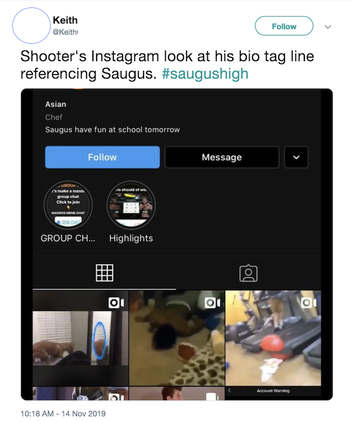
Confirming a social account with the subject, family and friends, law enforcement and/or social media PR are ways to protect yourself from being duped.
Finally, and perhaps the most important note: There’s no one right order in which to complete these steps. Often, I’m led down rabbit holes and have more tabs open than I’m proud of. Creating a system that you can replicate — whether it’s tracking your steps in a Google doc or letting a paid tool like Hunchly monitor as you search — is the key to clarifying connections between people and the lives they lead online, and turning those conclusions into stories.
Data Journalism in Perspective
Written by: Liliana Bounegru
In August 2010 some colleagues and I organised what we believe was one of the first international ‘data journalism’ conferences, which took place in Amsterdam. At this time there wasn’t a great deal of discussion around this topic and there were only a couple of organizations that were widely known for their work in this area.
The way that media organizations like Guardian and the New York Times handled the large amounts of data released by Wikileaks is one of the major steps that brought the term into prominence. Around that time the term started to enter into more widespread usage, alongside ‘computer-assisted reporting’, to describe how journalists were using data to improve their coverage and to augment in-depth investigations into a given topic.
Speaking to experienced data journalists and journalism scholars on Twitter it seems that one of the earliest formulations of what we now recognise as data journalism was in 2006 by Adrian Holovaty, founder of EveryBlock — an information service which enables users to find out what has been happening in their area, on their block. In his short essay “A fundamental way newspaper sites need to change”, he argues that journalists should publish structured, machine-readable data, alongside the traditional ‘big blob of text’:
For example, say a newspaper has written a story about a local fire. Being able to read that story on a cell phone is fine and dandy. Hooray, technology! But what I really want to be able to do is explore the raw facts of that story, one by one, with layers of attribution, and an infrastructure for comparing the details of the fire — date, time, place, victims, fire station number, distance from fire department, names and years experience of firemen on the scene, time it took for firemen to arrive — with the details of previous fires. And subsequent fires, whenever they happen.
But what makes this distinctive from other forms of journalism which use databases or computers? How — and to what extent — is data journalism different from other forms of journalism from the past?
‘Computer-Assisted Reporting’ and ‘Precision Journalism’
Using data to improve reportage and delivering structured (if not machine readable) information to the public has a long history. Perhaps most immediately relevant to what we now call data journalism is ‘computer-assisted reporting’ or ‘CAR’, which was the first organised, systematic approach to using computers to collect and analyze data to improve the news.
CAR was first used in 1952 by CBS to predict the result of the presidential election. Since the 1960s, (mainly investigative, mainly US-based) journalists, have sought to independently monitor power by analyzing databases of public records with scientific methods. Also known as ‘public service journalism’, advocates of these computer-assisted techniques have sought to reveal trends, debunk popular knowledge and reveal injustices perpetrated by public authorities and private corporations. For example, Philip Meyer tried to debunk received readings of the 1967 riots in Detroit — to show that it was not just less-educated Southerners who were participating. Bill Dedman’s “The Color of Money” stories in the 1980s revealed systemic racial bias in lending policies of major financial institutions. In his “What Went Wrong” Steve Doig sought to analyze the damage patterns from Hurricane Andrew in the early 1990s, to understand the effect of flawed urban development policies and practices. Data-driven reporting has brought valuable public service, and has won journalists famous prizes.
In the early 1970s the term ‘precision journalism’ was coined to describe this type of news-gathering: “the application of social and behavioral science research methods to the practice of journalism.” Precision journalism was envisioned to be practiced in mainstream media institutions by professionals trained in journalism and social sciences. It was born in response to “new journalism”, a form of journalism in which fiction techniques were applied to reporting. Meyer suggests that scientific techniques of data collection and analysis rather than literary techniques are what is needed for journalism to accomplish its search for objectivity and truth.
Precision journalism can be understood as a reaction to some of journalism’s commonly cited inadequacies and weaknesses: dependence on press releases (later described as “churnalism”), bias towards authoritative sources, and so on. These are seen by Meyer as stemming from a lack of application of information science techniques and scientific methods such as polls and public records. As practiced in the 1960s, precision journalism was used to represent marginal groups and their stories. According to Meyer:
Precision journalism was a way to expand the tool kit of the reporter to make topics that were previously inaccessible, or only crudely accessible, subject to journalistic scrutiny. It was especially useful in giving a hearing to minority and dissident groups that were struggling for representation.
An influential article published in the 1980s about the relationship between journalism and social science echoes current discourse around data journalism. The authors, two US journalism professors, suggest that in the 1970s and 1980s the public’s understanding of what news is broadens from a narrower conception of ‘news events’ to ‘situational reporting’, or reporting on social trends. By using databases of — for example — census data or survey data, journalists are able to “move beyond the reporting of specific, isolated events to providing a context which gives them meaning.”
As we might expect, the practise of using data to improve reportage goes back as far as ‘data’ has been around. As Simon Rogers points out, the first example of data journalism at the Guardian dates from 1821. It is a leaked table of schools in Manchester listing the number of students who attended it and the costs per school. According to Rogers this helped to show for the first time the real number of students receiving free education, which was much higher than what official numbers showed.

Another early example in Europe is Florence Nightingale and her key report, ‘Mortality of the British Army’, published in 1858. In her report to the parliament she used graphics to advocate improvements in health services for the British army. The most famous is her ‘coxcomb’, a spiral of sections, each representing deaths per month, which highlighted that the vast majority of deaths were from preventable diseases rather than bullets.

Data journalism and Computer-Assisted Reporting
At the moment there is a “continuity and change” debate going on around the label “data journalism” and its relationship with these previous journalistic practices which employ computational techniques to analyze datasets.
Some argue that there is a difference between CAR and data journalism. They say that CAR is a technique for gathering and analyzing data as a way of enhancing (usually investigative) reportage, whereas data journalism pays attention to the way that data sits within the whole journalistic workflow. In this sense data journalism pays as much — and sometimes more — attention to the data itself, rather than using data simply as a means to find or enhance stories. Hence we find the Guardian Datablog or the Texas Tribune publishing datasets alongside stories, or even just datasets by themselves for people to analyze and explore.
Another difference is that in the past investigative reporters would suffer from a poverty of information relating to a question they were trying to answer or an issue that they were trying to address. While this is of course still the case, there is also an overwhelming abundance of information that journalists don’t necessarily know what to do with. They don’t know how to get value out of data. A recent example is the Combined Online Information System, the UK’s biggest database of spending information — which was long sought after by transparency advocates, but which baffled and stumped many journalists upon its release. As Philip Meyer recently wrote to me: “When information was scarce, most of our efforts were devoted to hunting and gathering. Now that information is abundant, processing is more important.”
On the other hand, some argue that there is no meaningful difference between data journalism and computer-assisted reporting. It is by now common sense that even the most recent media practices have histories, as well as something new in them. Rather than debating whether or not data journalism is completely novel, a more fruitful position would be to consider it as part of a longer tradition, but responding to new circumstances and conditions. Even if there might not be a difference in goals and techniques, the emergence of the label “data journalism” at the beginning of the century indicates a new phase wherein the sheer volume of data that is freely available online combined with sophisticated user-centric tools, self-publishing and crowdsourcing tools enables more people to work with more data more easily than ever before.
Data journalism is about mass data literacy
Digital technologies and the web are fundamentally changing the way information is published. Data journalism is one part in the ecosystem of tools and practices that have sprung up around data sites and services. Quoting and sharing source materials is in the nature of the hyperlink structure of the web and the way we are accustomed to navigate information today. Going further back, the principle that sits at the foundation of the hyperlinked structure of the web is the citation principle used in academic works. Quoting and sharing the source materials and the data behind the story is one of the basic ways in which data journalism can improve journalism, what Wikileaks founder Julian Assange calls “scientific journalism”.
By enabling anyone to drill down into data sources and find information that is relevant to them, as well as to to verify assertions and challenge commonly received assumptions, data journalism effectively represents the mass democratisation of resources, tools, techniques and methodologies that were previously used by specialists — whether investigative reporters, social scientists, statisticians, analysts or other experts. While currently quoting and linking to data sources is particular to data journalism, we are moving towards a world in which data is seamlessly integrated into the fabric of media. Data journalists have an important role in helping to lower the barriers to understanding and interrogating data, and increasing the data literacy of their readers on a mass scale.
At the moment the nascent community of people who called themselves data journalists is largely distinct from the more mature CAR community. Hopefully in the future we will see stronger ties between these two communities, in much the same way that we see new NGOs and citizen media organizations like ProPublica and the Bureau of Investigative Journalism work hand in hand with traditional news media on investigations. While the data journalism community might have more innovative ways delivering data and presenting stories, the deeply analytical and critical approach of the CAR community is something that data journalism could certainly learn from.
Case Study 2. Tracking back the origin of a critical piece of evidence from the #OttawaShooting
Written by Micah Clark
“Fear has big eyes,” goes an old Russian folk saying. “What it sees is what is not there.”
This is a story about fear’s big eyes and the things that were not there.
At approximately 9:50 a.m. on Oct. 22, 2014, Michael Zehaf-Bibeau shot and killed a soldier guarding the Canadian War Memorial in Ottawa. In a scene reminiscent of a Hollywood thriller, Zehaf-Bibeau then charged into the halls of parliament, where he was eventually shot and killed.
Two days earlier, a Canadian soldier was killed when he was deliberately hit by a car driven by a man who had previously drawn the attention of Canadian security agencies. The ensuing shootout on Parliament Hill had Canadians on edge. Was this a terrorist attack? What motivated the attacker? Was ISIS involved?
The speculation reached fever pitch when a photo of the assailant, taken at the very moment of his attack, was posted by a Twitter account claiming affiliation with ISIS. Other Twitter accounts, and eventually Canadian journalists and the Canadian public, rapidly used the photo and the ISIS account that posted it to draw a completely imaginary connection between the assailant and ISIS.
All of this speculation, however, was based on fundamentally incorrect source attribution. The story of the photo’s actual provenance is a remarkable example of the new normal for modern journalism.
The photo was first posted by an unknown user to an Ottawa Police tweet, which asked for any information about the assailant. This occurred sometime before 2 p.m., when Montreal journalist William Reymond located the photo and took a screen capture (Reymond, who has reported extensively on his scoop, has not provided a link to the tweet from Ottawa Police. The time and content he describes suggest it was this tweet). The photo and the account that posted it were deleted almost instantly.
With this exceptional photo in his hands, and to his considerable credit, Reymond took a full two hours to verify its authenticity before posting it to his Twitter account, @Breaking3zero, at 4:16 p.m.
Reymond’s process of verification, which he describes here in detail, included comparing the facial features, clothes and weapon of the man in the photo with surveillance footage, as well as comparing it with details that emerged as witnesses and officials shared details of the attack.
Along with the rifle, two other key pieces of evidence were the fact that the man in the photo was wearing a keffieh, which witness had described, and the fact that he was carrying an umbrella. The shooter used an umbrella to conceal his weapon as he approached the War Memorial, according to reports.
Here is what Reymond tweeted:

It translates to, “After two hours of verification, a source confirmed to me that ‘it looks like the shooter.’ Proceed with caution.”
It was only after Reymond's tweet that an ISIS-related Twitter account, “Islamic Media” (@V_IMS), posted the photo, at approximately 4:45 p.m. This account too has since been suspended and deleted.
“Just twenty minutes after I published it, a French-language feed supporting the Islamic State picks up the photo and posts it,” wrote Reymond. “And that is how some media start to spread the wrong idea that ISIS is at the origin of the photo.”
Within minutes, another Twitter account, @ArmedResearch, posted the photo stating that, “#ISIS Media account posts picture claiming to be Michael Zehaf-Bibeau, dead #OttawaShooting suspect. #Canada.”
In spite of its failure to substantiate this claim or provide appropriate credit to @Breaking3zero, Canadian journalists seized upon @ArmedResearch’s claim, reporting the photo was “tweeted from an ISIS account,” with all the implications that accompany such an assertion.
But as the saying goes, facts are stubborn things. Technical data from @V_IMS’s Twitter page, captured before the account was suspended, show that @V_IMS sourced the photo from @Breaking3zero. The text in grey below shows the original source URL, from twitter.com/Breaking3zero:

The claim that the photo of Zehaf-Bibeau originated with an ISIS account is categorically false. The ISIS account that circulated the photo acquired it hours after it was originally posted to Twitter.
SecDev’s independent monitoring of ISIS’ social media shows that prominent ISIS accounts were reacting to events in Ottawa in much the same way that Ottawans and others were — posting contradictory and often incorrect information about the attack. There is no indication in social media that ISIS had prior knowledge of the attack, or that they were in any way directly affiliated with Zehaf- Bibeau.
Indeed, there is still no evidence to indicate ISIS involvement in the October attack in Ottawa. There is, however, a remarkable photo taken at an incredible moment, a testament to the game-changing power of mobile technology and social media.
The temptation to draw a connection between vivid photos like this one and our worst fears is enormous. Avoiding this temptation is one of the chief responsibilities of 21st century journalists.
3.1. Monitoring and Verifying During the Ukrainian Parliamentary Election
Written by Anahi Ayala Iacucci
During the Ukrainian parliamentary elections of fall 2012, Internews Ukraine, a local NGO supported by the global nonprofit media organization Internews, ran an election monitoring project called Elect.UA. It used a mix of crowdsourcing, mobile phones, social media, professional electoral monitoring and media monitoring to oversee the electoral campaign, and possible violations of or tampering with the results.
The project was built upon a fairly complex structure: 36 journalists around the country reported stories during the electoral campaign and on election day. At the same time, three different electoral monitoring organizations had workers reporting to the same platform using SMS, online forms and emails. Elect.UA also invited Ukrainians to report about their election experience using social media (Twitter and Facebook), mobile technology (SMS and a hotline number), a smartphone app, an online form or email.
All information coming from Internews-trained journalists and electoral monitors was automatically tagged as verified, while messages from the crowd were vetted by a team of 16 administrators in Kiev.
For the messages coming from the crowd, the admin team set up a verification protocol based on the source of the information: mobile technology, social media, online form or email.
For each source, the team would try to verify the sender of the information (when possible), the content of the information and the context. For each of those components the team would also try to establish if something could be 100 percent verified, or only partly verified.
For information coming via social media, this image shows the decision tree model used by administrators in the verification process.
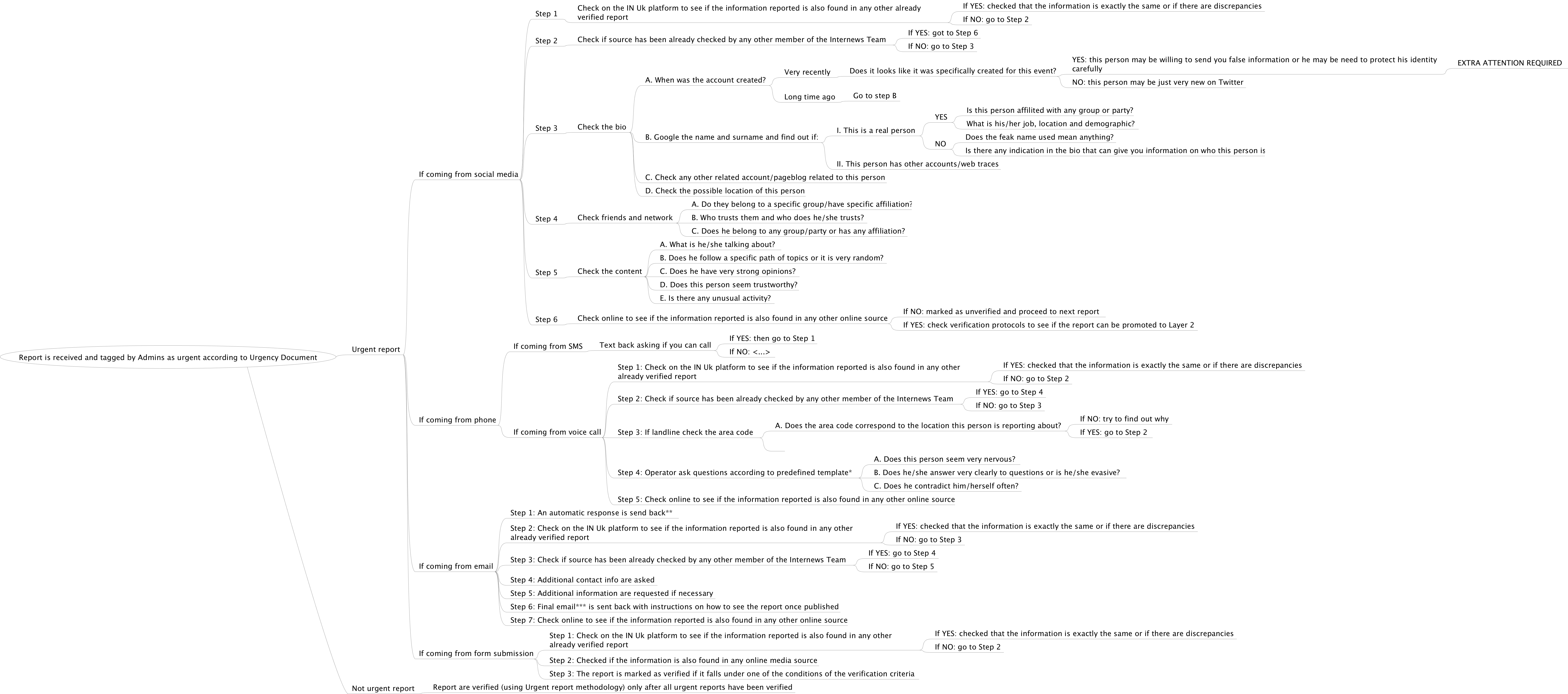
The first step was to perform an online search of the information and its source to identify all possible digital traces of that person, and the piece of content. (For example, we examined other social media accounts, mentions by media articles, information about university, affiliations, etc.). The search was aimed at determining if the person was a reliable source, and if there was a trace of the information they provided elsewhere online.
The second step was to use the information collected to build a profile of the person, as well as a profile of the content they provided. For each of the 5Ws - who, what, when, where and why - administrators had to carefully determine what they could prove, and what they could not.
For multimedia content, the source verification protocol was the same, but we had a different path for the content. Photos and video were verified by looking for any identifiable landmarks, and by performing an analysis of the audio (to listen for language, dialects, slang words, background noise, etc.), clothes and of light (artificial or natural), among other ele- ments in the content.
When a piece of information could not be verified with a sufficient degree of certainty, the report was sent back to an electoral monitor or a reporter on the ground for real-time, inperson verification.
For example, on September 28, 2012, Elect.UA received an anonymous message via its website that parliamentary candidate Leonid Datsenko had been invited for a discussion by a stranger, and then was intimidated in order to force him to withdraw from the elections.
The next day, the administrators of the platform found an article in a reliable media source that included a record of the exchange. We still held the report for verification, and then, on October 1, local journalists reported on a press conference about the incident. Elect. UA’s local journalists also conducted interviews with local law enforcement services, who acknowledged this case to be true.
Overall, the Elect.UA team managed to verify an incredible amount of information using these protocols, and also noticed that the more the administrators became familiar with the verification process, the faster they were able to work. This proves that the verification of user generated content is a skill that can be systematized and learned, resulting in efficient, reliable results.
The decision tree model:

Building Your Own Data Set: Documenting Knife Crime in the United Kingdom
Written by Caelainn Barr
Abstract
Building data sets for investigations and powerful storytelling.
Keywords: data journalism, crime, accountability, race, United Kingdom, databases
In early 2017 two colleagues, Gary Younge and Damien Gayle, approached me in The Guardian newsroom. They wanted to examine knife crime in the United Kingdom. While there was no shortage of write-ups detailing the deaths of victims of knife crime, follow-ups on the pursuit of suspects, and reports on the trials and convictions of the perpetrators, no one had looked at all the homicides as a whole.
My first question was, how many children and teenagers had been killed by knives in recent years?
It seemed a straightforward query but once I set out to find the data it soon became apparent—no one could tell me. The data existed, somewhere, but it wasn’t in the public domain. At this stage I had two options, give up or make a data set from scratch based on what I could access, build and verify myself. I decided to build my own data set.
Why Build Your Own Data Set?
Data journalism needn’t be solely based on existing data sets. In fact there is a great case for making your own data. There is a wealth of information in data that is not routinely published or in some cases not even collected.
In building your own data set you create a unique set of information, a one-off source, with which to explore your story. The data and subsequent stories are likely to be exclusive and it can give you a competitive edge to find stories other reporters simply can’t. Unique data sets can also help you identify what trends experts and policy makers haven’t been able to spot.
Data is a source of information in journalism. The basis for using data in journalism is structured thinking. In order to use data to its full potential, at the outset of a project the journalist needs to think structurally: What is the story I want to be able to tell and what do I need to be able to tell it?
The key to successfully building a data set for your story is to have a structured approach to your story and query every source of data with a journalistic sense of curiosity.
Building your own data set encompasses a lot of the vital skills of data journalism—thinking structurally, planned storytelling and finding data in creative ways. It also has a relatively low barrier to entry, as it can be done with or without programming skills. If you can type into a spreadsheet and sort a table, you’re on your way to building the basic skills of data journalism.
That’s not to say data journalism is straightforward. Solid and thorough data projects can be very complex and time-consuming work, but armed with a few key skills you can develop a strong foundation in using data for storytelling.
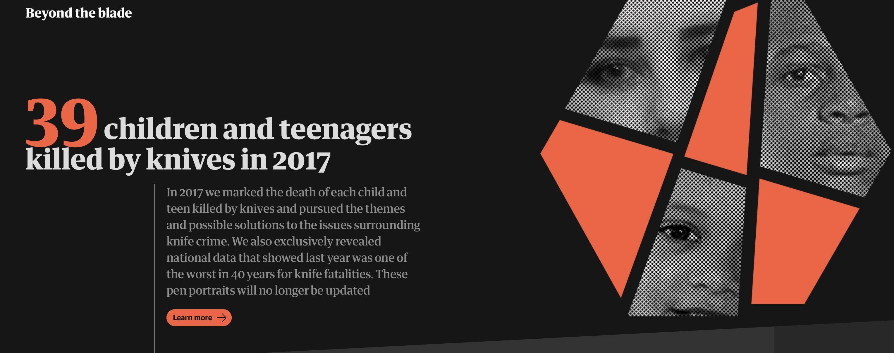
Building Your Own Data Set Step by Step
Plan what is required. The first step to making or gathering data for your analysis is assessing what is required and if it can be obtained. At the outset of any project it’s worth making a story memo which sketches out what you expect the story will attempt to tell, where you think the data is, how long it will take to find it and where the potential pitfalls are. The memo will help you assess how long the work will take and if the outcome is worth the effort. It can also serve as a something to come back to when you’re in the midst of the work at a later stage.
Think of the top line. At the outset of a data-driven story where the data does not exist you should ask what the top line of the story is. It’s essential to know what the data should contain as this sets the parameters for what questions you can ask of the data. This is essential as the data will only ever answer questions based on what it contains. Therefore, to make a data set that will fulfil your needs, be very clear about what you want to be able to explore and what information you need to explore it.
Where might the data be held? The next step is to think through where the data may be held in any shape or form. One way to do this is to retrace your steps. How do you know there is a potential story here? Where did the idea come from and is there a potential data source behind it?
Research will also help you clarify what exists, so comb through all of the sources of information that refer to the issue of interest and talk to academics, researchers and statisticians who gather or work with the data. This will help you identify shortcomings and possible pitfalls in using the data. It should also spark ideas about other sources and ways of getting the data. All of this preparation before you start to build your data set will be invaluable if you need to work with difficult government agencies or decide to take another approach to gathering the data.
Ethical concerns. In planning and sourcing any story we need to weigh up the ethical concerns and working with data is no different. When building a data set we need to consider if the source and method we’re using to collect the information is the most accurate and complete possible.
This is also the case with analysis—examine the information from multiple angles and don’t torture the data to get it to say something that is not a fair reflection of the reality. In presenting the story be prepared to be transparent about the sourcing, analysis and limitations of the data. All of these considerations will help build a stronger story and develop trust with the reader.
Get the data. Once a potential source has been identified, the next step is to get the data. This may be done manually through data entry into a spreadsheet, transforming information locked in PDFs into structured data you can analyze, procuring documents through a human source or the Freedom of Information Act (FOIA), programming to scrape data from documents or web pages or automating data capture through an application programming interface (API).
Be kind to yourself! Don’t sacrifice simplicity for the sake of it. Seek to find the most straightforward way of getting the information into a data set you can analyze. If possible, make your work process replicable, as this will help you check your work and add to the data set at a later stage, if needed.
In obtaining the data refer back to your story outline and ask, will the data allow me to fully explore this topic? Does it contain the information that might lead to the top lines I’m interested in?
Structure. The key difference between information contained in a stack of text-based paper documents and a data set is structure. Structure and repetition are essential to building a clean data set ready for analysis.
The first step is to familiarize yourself with the information. Ask yourself what the material contains—what will it allow you to say? What won’t you be able to say with the data? Is there another data set you might want to combine the information with? Can you take steps in building this data set which will allow you to combine it with others?
Think of what the data set should look like at the end of the process. Consider the columns or variables you would want to be able to analyze. Look for inspiration in the methodology and structure underlying other similar data sets.
Cast the net wide to begin with, taking account of all the data you could gather and then pare it back by assessing what you need for the story and how long it will take to get it. Make sure the data you collect will compare like with like. Choose a format and stick to it—this will save you time in the end! Also consider the dimensions of the data set you’re creating. Times and dates will allow you to analyze the information over time; geographic information will allow you to possibly plot the data to look for spatial trends.
Keep track of your work and check as you go. Keep notes of the sources you have used to create your data set and always keep a copy of the original documents and data sets. Write up a methodology and a data dictionary to keep track of your sources, how the data has been processed and what each column contains. This will help flag questions and shake out any potential errors as you gather and start to analyze the data.
Assume nothing and check all your findings with further reporting. Don’t hold off talking to experts and statisticians to sense–check your approach and findings. The onus to bulletproof your work is even greater when you have collated the data, so take every step to ensure the data, analysis and write-up are correct.
Case Study: Beyond the Blade
At the beginning of 2017 the data projects team alongside Gary Younge, Damian Gayle and The Guardian’s community journalism team set out to document the death of every child and teenager killed by a knife in the United Kingdom. In order to truly understand the issue and explore the key themes around knife crime the team needed data. We wanted to know—who are the young people dying in the United Kingdom as a result of stabbings? Are they young children or teenagers? What about sex and ethnicity? Where and when are these young people being killed?
After talking to statisticians, police officers and criminologists it became clear that the data existed but it was not public. Trying to piece together an answer to the question would consume much of my work over the next year.
The data I needed was held by the Home Office in a data set called the Homicide Index. The figures were reported to the Home Office by police forces in England and Wales. I had two potential routes to get the information—send a freedom of information request to the Home Office or send requests to every police force. To cover all eventualities, I did both. This would provide us with the historical figures back to 1977.
In order to track deaths in the current year we needed to begin counting the deaths as they happened. As there was no public or centrally collated data we decided to keep track of the information ourselves, through police reports, news clippings, Google Alerts, Facebook and Twitter.
We brainstormed what we wanted to know—name, age and date of the incident were all things we definitely wanted to record. But other aspects of the circumstances of the deaths were not so obvious. We discussed what we thought we already knew about knife crime—it was mostly male with a disproportionate number of Black male victims.
To check our assumptions we added columns for sex and ethnicity. We verified all the figures by checking the details with police forces across the United Kingdom. In some instances this revealed cases we hadn’t picked up and allowed us to cross-check our findings before reporting.
After a number of rejected FOI requests and lengthy delays the data was eventually released by the Home Office. It gave the age, ethnicity and sex of all people killed by knives by police force area for almost 40 years. This, combined with our current data set, allowed us to look at who was being killed and the trend over time.
The data revealed knife crime had killed 39 children and teenagers in England and Wales in 2017, making it one of the worst years for deaths of young people in nearly a decade. The figures raised concerns about a hidden public health crisis amid years of police cuts.
The figures also challenged commonly held assumptions about who knife crime affects. The data showed in England and Wales in the 10 years to 2015, one third of the victims were Black. However, outside the capital, stabbing deaths among young people were not mostly among Black boys, as in the same period less than one in five victims outside London were Black.
Although knife crime was a much-debated topic, the figures were not readily available to politicians and policy makers, prompting questions about how effective policy could be created when the basic details of who knife crime affects were not accessible.
The data provided the basis of our award-winning project which reframed the debate on knife crime. The project would not have been possible without building our own data set.
The ABC’s Data Journalism Play
Now in its 70th year the Australian Broadcasting Corporation is Australia’s national public broadcaster. Annual funding is around AUS$1bn which delivers seven radio networks, 60 local radio stations, three digital television services, a new international television service and an online platform to deliver this ever expanding offering of digital and user generated content. At last count there were in excess of 4,500 full time equivalent staff and nearly 70% of them make content.
We are a national broadcaster fiercely proud of our independence — because although funded by government — we are separated at arm’s length through law. Our traditions are independent public service journalism. The ABC is regarded the most trusted news organzation in the country.
These are exciting times and under a managing director — the former newspaper executive Mark Scott — content makers at the ABC have been encouraged to as the corporate mantra puts it — be ‘agile’.
Of course, that’s easier said than done.
But one initiative in recent times designed to encourage this has been a competitive staff pitch for money to develop multi-platform projects.
This is how the ABC’s first ever data journalism project was conceived.
Sometime early in 2010 I wandered into the pitch session to face with three senior ‘ideas’ people with my proposal.
I’d been chewing it over for some time. Greedily lapping up the data journalism that the now legendary Guardian data journalism blog was offering, and that was just for starters.
It was my argument that no doubt within 5 years the ABC would have its own data journalism unit. It was inevitable, I opined. But the question was how are we going to get there, and who’s going to start.
For those readers unfamiliar with the ABC, think of a vast bureaucracy built up over 70 years. Its primary offering was always radio and television. With the advent of online in the last decade this content offering unfurled into text, stills and a degree of interactivity previously unimagined. The web space was forcing the ABC to rethink how it cut the cake (money) and rethink what kind of cake it was baking (content).
It is of course a work in progress.
But something else was happening with data journalism. Government 2.0 (which as we discovered is largely observed in the breach in Australia) was starting to offer new ways of telling stories that were hitherto buried in the zero’s and dots.
All this I said to the folk during my pitch. I also said we needed to identify new skills sets, train journalists in new tools. We needed a project to hit play.
And they gave me the money.
On the 24th of November 2011 the ABC’s multi-platform project and ABC News Online went live with ‘Coal Seam Gas by the Numbers’.

It was five pages of interactive maps, data visualizations and text.
It wasn’t exclusively data journalism — but a hybrid of journalisms that was born of the mix of people on the team and the story, which to put in context is raging as one of the hottest issues in Australia.
The jewel was an interactive map showing coal seam gas wells and leases in Australia. Users could search by location and switch between modes to show leases or wells. By zooming in users could see who the explorer was, the status of the well and its drill date. Another map showed the location of coal Seam gas activity compared to the location of groundwater systems in Australia.

We had data visualizations which specifically addressed this issue of waste salt and water production that would be produced depending on the scenario that emerged.
Another section of the project investigated the release of chemicals into a local river system
Our team
-
A web developer and designer
-
A lead journalist
-
A part time researcher with expertise in data extraction, excel spread sheets and data cleaning
-
A part time junior journalist
-
A consultant executive producer
-
A academic consultant with expertise in data mining, graphic visualization and advanced research skills
-
The services of a project manager and the administrative assistance of the ABC’s multi-platform unit
-
Importantly we also had a reference group of journalists and others whom we consulted on a needs basis
Where did we get the data from?
The data for the interactive maps were scraped from shapefiles (a common kind of file for geospatial data) downloaded from government websites.
Other data on salt and water were taken from a variety of reports.
The data on chemical releases was taken from environmental permits issued by the government.
What did we learn?
‘Coal Seam Gas by the Numbers’ was an ambitious in content and scale. Uppermost in my mind was what did we learn and how might we do it differently next time?
The data journalism project brought a lot of people into the room who do not normally meet at the ABC. In lay terms — the hacks and the hackers. Many of us did not speak the same language or even appreciate what the other does. Data journalism is disruptive!
The practical things:
-
Co-location of the team is vital. Our developer and designer were off-site and came in for meetings. This is definitely not optimal! Place in the same room as the journalists.
-
Our consultant EP was also on another level of the building. We needed to be much closer, just for the drop-by factor
-
Choose a story that is solely data driven.
The big picture: some ideas
Big media organzations need to engage in capacity building to meet the challenges of data journalism. My hunch is there are a lot of geeks and hackers hiding in media technical departments desperate to get out. So we need ‘hack and hacker meets’ workshops where the secret geeks, younger journalists, web developers and designers come out to play with more experienced journalists for skill sharing and mentoring. Task: download this data set and go for it!
Ipso facto Data journalism is interdisciplinary. Data journalism teams are made of people who would not in the past have worked together. The digital space has blurred the boundaries.
We live in a fractured, distrustful body politic. The business model that formerly delivered professional independent journalism – imperfect as it is — is on the verge of collapse. We ought to ask ourselves — as many now are — what might the world look like without a viable fourth estate? The American journalist and intellectual Walter Lippman remarked in the 1920’s that “it is admitted that a sound public opinion cannot exist without access to news”. That statement is no less true now. In the 21st century everyone’s hanging out in the blogosphere. It’s hard to tell the spinners, liars, dissemblers and vested interest groups from the professional journalists. Pretty much any site or source can be made to look credible, slick and honest. The trustworthy mastheads are dying in the ditch. And in this new space of junk journalism, hyperlinks can endlessly take the reader to other more useless but brilliant looking sources that keep hyperlinking back into the digital hall of mirrors. The technical term for this is: bullshit baffles brains. In the digital space everyone’s a storyteller now — right? Wrong. If professional journalism – and by that I mean those who embrace ethical, balanced, courageous truth seeking storytelling – is to survive then the craft must reassert itself in the digital space. Data journalism is just another tool by which we will navigate the digital space. It’s where we will map, flip, sort, filter, extract and see the story amidst all those 0’s and 1’s. In the future we’ll be working side by side with the hackers, the developers the designers and the coders. It’s a transition that requires serious capacity building. We need news managers who “get” the digital/journalism connection to start investing in the build.
Case Study 3. Navigating multiple languages (and spellings) to search for companies in the Middle East
Written by Hamoud Almahmoud
Searching for names of companies or people in the Middle East presents some special challenges. Let us start with a real example I have worked on recently:
I recently received a request from a European reporter who was investigating a company, Josons, which had won a bid to supply weapons in Eastern Europe.
This company was registered in Lebanon. The reporter had come up empty when searching for information in online Lebanese business registries.
I immediately started to think about how this company would be spelled in Arabic, and especially with the Lebanese accent. Of course, I knew beforehand that this company name must be mentioned in English inside the online company records in Lebanon. But the search engine of the Lebanese commercial registry shows results only in Arabic. This was why the reporter had come up empty.
For example, a search for “Josons” in the official Commercial Register gives us this result:

As you can see, the results are (0), however, we should not give up and quit. The first step is to guess how Josons is written in Arabic. There could be a number of potential spellings. To start, I put did a Google search with the word
“Lebanon” in Arabic next to the English company name: josons !لبنا. The first page of search results shows that the company’s Arabic name is جوسانز as in this official directory:

That was also confirmed by searching in an online Lebanese business directory.
Now we have the company name in Arabic. A search with the name جوسانز in the Commercial Register
shows that the company was registered twice — once onshore and another offshore.
Cultures of writing
That was one example of how to deal with language challenges when gathering information about companies in the MENA region. Doing this work often requires working with Arabic, French, English and Kurdish, in addition to many different Arabic accents.
The first step is to determine which language to search for the information you need, and then to figure out the spelling in Arabic. However, keep in mind that the pronunciation of a single word can differ widely among Arabic- speaking countries.
For example, in order to search for a holding company, it’s useful to know how to write the word “group” in the Arabic database of business registries. However, there are three different ways of writing this word based on how the English word “group” is transliterated into Arabic. (Arabic has no letter for the “p” sound.).
1. In the Jordanian business registry, for example, it is written as:


2. In Lebanon, its:


3. The third spelling is shown in the Tunisian registry of commence:


Also be aware that even within the same registry you should search using multiple spellings of the same word. For example, the word “global” might be written like 0غلوبا or like غلوبل. You can find both spellings in the Bahraini business registry:
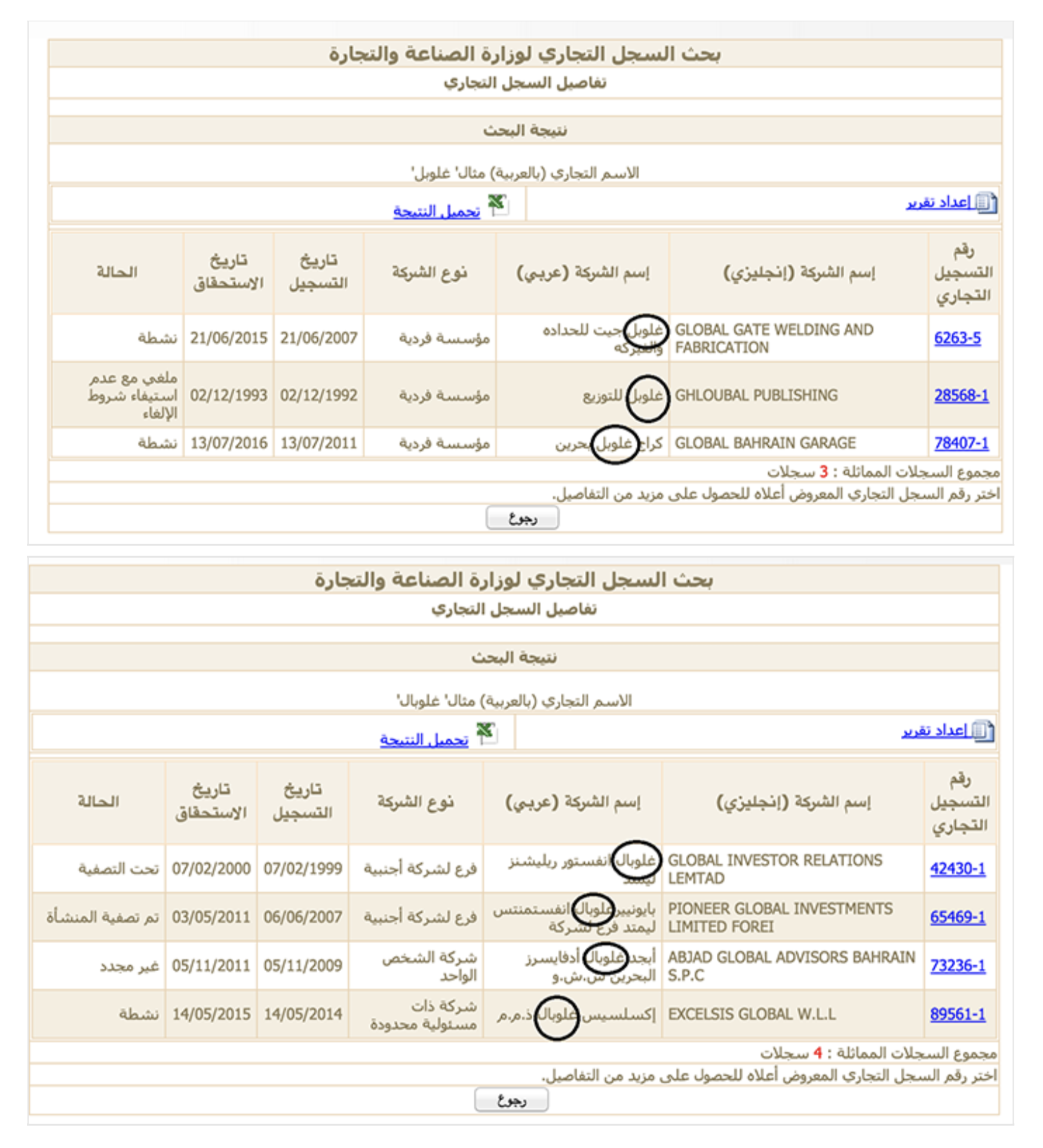
These examples demonstrate how an understanding of cultures, languages and other factors can play a role in ensuring how effectively you can make use of public data and information during an investigation.
Narrating a Number and Staying with the Trouble of Value
Written by: Helen Verran
Abstract
Numbers are seemingly uncomplicated and straightforward measures of value, but beware—numbers hide moral and political trouble.
Keywords: ecosystems value, Australian environmental governance, sociology of quantification, data journalism, science and technology studies
At the turn of the century the Australian state developed an environmental policy that saw it fully subsidizing labour costs incurred by landowners if they undertook specifically agreed upon landscape work that was designed to reverse environmental degradation.
However, given the almost total domination by neoliberal ideologues in this policy area at that time, the policy was described in the dizzying double-talk of value of ecosystems services. In policy documents it was described as “purchasing environmental interventions to enhance the state’s environmental value.”
Thus in 2009 a state government department would make this almost incomprehensible claim about the success of this policy: In 2009 the contribution to Australia’s GDP from transactions in which the state purchased environmental interventions to enhance ecosystems value from rural landholders in the Corangamite Natural Resource Management Region (NRMR) was calculated as AUD4.94 million.
The number that I narrate here emerged in a press statement issued by the government of the Australian state of Victoria in 2009.
The media release announced the success of investment by the state government in environmental conservation in one of Australia’s 57 NRMRs.
The environmental administrative region of grassy basalt plains that spreads east–west in south-central Victoria is named Corangamite, an Aboriginal term that replaced a name bestowed by the first British pastoralists who in the mid-19th century invaded this country from Tasmania.

They called the region “Australia Felix” and set about cutting down all the trees. The squatters, who subsequently became landowners here, would in less than a century become a sort of colonial landed gentry.
In 2008, in operating the EcoTender Programme in the Corangamite NRMR, the Victorian government purchased ecosystems services value from the descendants of those squatters in pay-as-bid auctions. In 2009 the contribution to Australia’s GDP from these transactions was calculated as AUD4.94 million. The announcement of this value was the occasion of the media release where I first met the number.
I doubt that any journalists picked up on the news promulgated in this brief, including its numbered value; this number is hardly hot news.
In the context of a press release the naming of a specific number value reassures. The national accounts are important and real, and if this regional government intervention features as a specified value contributing to the national economy, then clearly the government intervention is a good thing.
The specification of value here claims a realness for the improvements that the government interventions are having. The implication is that this policy leads to good environmental governance. Of course, the actual value the number name (AUD4.94 million) points to, what it implicitly claims to index, is not of much interest to anyone. That a number appears to correspond to something “out there” that can be valued, is good enough for purposes of reassuring.
My narration of this number offers a mind-numbingly detailed account of the sociotechnical means by which the number came to life. The story has the disturbing effect of revealing that this banal number in its workaday media release is a paper-thin cover-up. Profound troubles lurk.
Before I begin to tell my story and articulate the nature of these profound troubles that seem to shadow any doing of valuation, even such a banal doing, let me pre-emptively respond to some questions that I imagine might be beginning to emerge for readers of The Data Journalism Handbook.
First, I acknowledge that telling a story of how a number has come to life rather than finding some means to promote visualization of what that number means in a particular context, is rather an unusual approach in contemporary data journalism. I can imagine a data journalist doubting that such storytelling would work. Perhaps a first response is to remind you that it is not an either/or choice and that working by intertwining narrative and visualizing resources in decoding and interpreting is an effective way to get ideas across. In presenting such an intertwining, journalists should always remember that there are two basic speaking positions in mixing narratives and visuals.
One might proceed as if the visual is embedded within the narrative, in which case you are speaking to the visual, which seems to represent or illustrate something in the story. Or, you can proceed as if the narrative is embedded in the visual, in which case you are speaking from within, diagram. This is a less common strategy in data journalism, yet I can imagine that the story I tell here could well be used in that way. Of course, switching between these speaking positions within a single piece is perhaps the most effective strategy (for an account of such switching, see Verran & Winthereik, 2016).
Second, you might see it as odd to tell a story of a very particular number when what clearly has agency when it comes to decision–making and policy design, and what data journalists are interested in, is what can be made of data sets in mobilizing this algorithm or that. This worry might prompt you to ask about relations between numbers and data sets.
The answer to such a query is fairly straightforward and not very interesting. There are many numbers in a data set; the relation is a one–many relation albeit that numbers are assembled in very precise arrays. The more interesting question enquires about the relation between numbers and algorithms.
My answer would be that while algorithms mobilize a protocol that elaborates how to work relations embedded in a database, numbers express a protocol that lays out how to work relations of collective being. Numbering is a form of algorithming and vice versa.1
We could say that numbers are to algorithms as a seed is to the plant that might germinate from it; to mix metaphors, they have a chicken-and-egg relation. While there are certain interestingly different sociotechnical characteristics of generating enumerated value by analogue means (mixing cognitive, linguistic and graphic resources), of conventional enumeration as taught to primary school children, and of contriving enumerated value by digital computation, it is the sameness that matters here: AUD4.94 million has been generated algorithmically and expresses a particular set of relations embedded in a particular data set, but it still presents as just a number.2
So now, to turn to my story. The intimate account of number making I tell here as a story would enable a journalist to recognize that the good news story that the government is slyly soliciting with its media release is not a straightforward matter.
We see that perhaps a political exposé would be more appropriate. The details of how the number is made reveal that this public–private partnership environmental intervention programme involves the state paying very rich landowners to do work that will increase the value of their own property.
The question my story might precipitate is, how could a journalist either celebrate or expose this number in good faith? When I finish the story, I will suggest that that is not the right question.
Narrating a Number
What is the series of sociotechnical processes by which ecosystems services value comes into existence in this public-private partnership programme in order that this value might be traded between government as buyer and landowner as vendor? And exactly how does the economic value of the trade come to contribute to the total marginal gains achieved in the totality of Australian economic activity, Australia’s gross domestic product (GDP)?
I attend to this double-barrelled question with a step-by-step laying out of what is required for a landholder to create a product—“ecosystems services value”—that can compete in a government-organized auction for a contract to supply the government with ecosystem services value.
The messy work in which this product comes to life involves mucking around in the dirt, planting tree seedlings, fixing fences, and generally attempting to repair the damage done to the land perhaps by the landowner’s grandparents, who heedlessly and greedily denuded the country of trees and seeded it with water-hungry plants, in hopes of more grain or more wool and family fortune. Ecosystems services value is generated by intervening in environmental processes.
The value, which is the product to be traded, begins in the work of public servants employed by a Victorian state government department (at that time the Department of Sustainability and Environment, DSE). Collectively these officials decide the areas of the state within which the administration will “run” tenders. In doing this, EnSym, an environmental systems modelling platform, is a crucial tool. This computing capacity is a marvel; it knows “nature out there” as no scientist has ever known nature. Precise and focused representations can be produced—probably overnight.
This software has been developed by the ecoMarkets team and incorporates science, standards, metrics and information developed within DSE, as well as many leading international and national scientific models. EnSym contains three main tools—the “Site Assessment Tool'' for field work, the “Landscape Preference Tool” for asset prioritisation and metric building, and “BioSim'' for catchment planning. (DSE, 2018)
Prioritizing and mapping the areas of the state where auctions will be established, specifying and quantifying the environmental benefits, the ecological values, that might be enhanced through on-ground conservation and revegetation works, are recorded in numerical form. They represent ecosystem properties in the “out there” land.
And the computer program can do more than that, it can also produce a script for intervention by humans. Just as the script of a play calls for production, so too does this script. And, as that script comes to life, “nature out there” seems to draw closer. It ceases to be an entirely removed “nature out there” and becomes nature as an infrastructure of human lives, an infrastructure that we might poke around in so as to fix the “plumbing.”
When the script for a choreographed production of collective human effort is ready, the government calls for expressions of interest from landholders in the project area as the next step. In response to submitted expressions of interest, a government officer visits all properties. We can imagine this officer as taking the general script generated by EnSym along to an actual place at a given time. He or she has a formidable translation task ahead.
The field officer assesses possible sites for works that might become a stage for the production of the script. The aim is to enhance the generation of the specified ecosystems services, so the officer needs to assess the likelihood that specified actions in a particular place will produce an increase in services provision from the ecosystem, thus increasing the value of that particular ecosystems service generated by that property, and through adding together the many such increases generated in this intervention programme, by the state as a whole.
Together the landowner and the government officer hatch a plan. In ongoing negotiation, a formalized management plan for specified plots is devised. The field officer develops this plan in contractable terms. Landholders specify in detail the actual work they will do to carry out the plan. Thus, a product that takes the form of a particular “ecosystems services value” is designed and specified as a series of specified tasks to be completed in a specified time period: So many seedlings of this set of species, planted in this array, in this particular corner of this particular paddock, and fenced off to effect a conservation plot of such and such dimensions, using these materials.
Landholders calculate the cost of the works specified by the state, no doubt including a generous labour payment. They come up with a price the government must pay if it is to buy this product, a particular “ecosystems services value.” Here they are specifying the amount of money they are willing accept to undertake the specified works and hence deliver the ecosystems services value by the specified date. They submit relevant documents to the government in a sealed envelope.
So how does the subsequent auction work? Here EnSym becomes significant again in assessing the bids. Not only a knower of “nature out there,” and a writer of scripts for intervention in that “out there” imagined as infrastructure, EnSym is also a removed judging observer that can evaluate the bids that have been made to produce that script, much like a Warner Bros. might evaluate competing bids to produce a movie. Bids are ranked according to a calculated “environmental benefits index” and the price proposed by the landowner. We must suppose that the government buys the product which offers the highest “environmental benefits index” per unit cost.
Bid assessment. All bids are assessed objectively on the basis of the estimated change in environmental outcomes; the value of the change in environmental outcomes; the value of the assets affected by these changes (significance); dollar cost (price determined by the landholder). (DSE, 2018)
When the results of the auction are announced, selected bidders sign a final agreement based on the management plan and submitted schedule of works, as defined spatial and temporal organization. When all documents are signed, reporting arrangements are implemented and payment can begin: “DSE forwards payment to signed-up landholders on receipt of an invoice. Payments occur subject to satisfactory progress against actions as specified in the Management Agreement” (DSE, 2018).
This Is a Good Thing, Right?
What I have laid out is a precise description of how to buy and sell ecosystems services value. This takes me back to the press release. A quick reading of the media statement might leave a reader with the impression that AUD4.94 million is the value of the additional natural capital value that this govern- ment programme has generated. At first glance AUD4.94 million appears to be the marginal gain in Australia’s natural capital value that was achieved in the programme. But that is a mistake. AUD4.94 million is not the name of a natural capital value. I explain what this number name references below. At this point I want to stay with the product that has been bought and sold in this auction. This product is the trouble I want to stay with.
I want to ask about the value of the increase in “ecosystems services value” that this elaborate and rather costly government programme has achieved. A careful reading of the details of the work by which this increase in value comes into being reveals that nowhere and at no time in the process has that value ever been named or specified. The product that is so rigorously bought and sold is an absence. And worse, there is literally no way that it could ever be otherwise. The programme is a very elaborate accounting exercise for a means of giving away money. When this becomes clear to an outsider, it also becomes obvious that this actuality of what the exercise is has never been hidden. When it comes down to it, this programme is a legitimate means for shifting money from the state coffers into the hands of private landowners.
Recognizing that this is a programme of environmental governance in a liberal parliamentary democracy in which the social technology of the political party is crucial, let me as your narrator temporarily put on a party-political hat. Corangamite is an electorate that has a history of swinging between choosing a member of the left-of-centre party (Labour Party) or a member of the right-of-centre party (Liberal Party) to represent the people of the area in the Victorian Parliament. It is clearly in the interests of any government—left-leaning or right-leaning—to appeal to the voters of the electorate.
And there is no better way to do that than by finding ways to legitimately transfer resources from the state to the bank accounts of constituents. That there is no possibility of putting a number on the value of the product the state buys and the landowners sell here, is, on this reading, of no concern.
So, let me sum up. Economically this programme is justified as generating environmental services value. Described in this way this is a good news story. Taxpayer money used well to improve the environment and get trees planted to ameliorate Victoria’s excessive carbon dioxide generation. Problematically the increase in the value of Victoria’s natural capital cannot be named, articulated as a number, despite it being a product that is bought and sold. It seems that while there are still technical hitches, clearly, this is a good thing.
But equally, using a different economics this programme can just as legitimately be described as funding the labour of tree planting to enhance property values of private landowners. It is a means of intervening to put right damage caused by previous government programmes subsidizing the misallocated labour of land clearing that in all likelihood the landowner’s grandparents profited by, creating a benefit which the landowner continues to enjoy. On this reading the government policy effected in EcoTender is an expensive programme to legitimately give away taxpayer money. Clearly, this is a bad thing.
On Not Disrespecting Numbers and Algorithms: Staying With the Troubles of Value
So, what is a journalist to do? Writing as a scholar and not as a journalist, I can respond to that obvious question only vaguely. In the beginning I return to my claim that the number name used in the press release is a paper-thin cover-up to divert attention from lurking trouble. As I see it, valuation always brings moral trouble that can never be contained for long. The right question to ask I think is, “How might a data journalist respond to that moral trouble?” First, I clear up the matter of the AUD4.94 million. What is this figure?
Where does this neatly named monetary value come from? This is how it is described in an academic paper offering critical commentary on the EcoTender programme:
Under this market-based model economic value from ecosystems services is created when the per-unit costs of complying with the conservation contract are less than the per-unit price awarded to the successful participants in the auction. While [for these sellers] some economic value is lost through the possibility of foregone production of marketed commodities, the participation constraint of rational landowners ensures that there will be a net increase in [economic] value created in the conduct of the auction. (G. Stoneham et al., 2012)
Under the economic modelling of this policy, the assumption is that land- owners will efficiently calculate the costs they will incur in producing the government’s script for intervening in nature as infrastructure—in generating a more efficient performance of the workings of natural infrastructure. Everyone assumes that a profit will be made by the landowner, although, of course, it is always possible that instead of a profit the landowner will have miscalculated and made a loss, but that is of no interest to the government as the buyer of the value generated by the landowners’ labour.
What is of interest to the government is the issue of how this economic transaction can be articulated in a seemly manner.
This is quite a problem when the product bought and sold has an existence solely within the circuit of an auction. The solution to this problematic form of being of the product is the elaborate, complex and complicated technology of the national accounts system. Establishing a market for ecosystems services value, the government wants to show itself as making a difference in nature. And the national accounts are the very convenient place where this can be shown in monetary terms. The “environmental benefits index,” the particular value on the basis of which the government has purchased a particular product—an environmental services value—is ephemeral. It exists solely as a flash, a moment in the auction (Roffe, 2015).
Despite this difficulty in the form of its existence, by ingenious contrivance, both the means of buying and selling something that has a single ephemeral moment of existence is achieved, and evidence of the specific instance of economic activity can be incorporated into the national accounts, albeit that some economists have serious reservations about accuracy (G. Stoneham et al., 2012).
AUD4.94 million is remote from the action of the EcoTender programme and from the nature it is designed to improve. But clearly, if the government makes a statement that its programmes have successfully improved a degraded and damaged nature it is best to find a way to indicate the extent of that improvement. It seems any number is better than none in this situation. And certainly, this is a happy, positive number. An unhappy, negative number that no doubt is available to the government accountants—the value of the cost of running the government programme—would never do here.
Why go on about this oddly out of place number name? Surely this is going a bit far? What is the harm of a little sleight of hand that is relatively easily picked up? My worry here is that this is a misuse of a number that seems to be deliberate. It fails to respect numbers, and refuses to acknowledge the trouble that numbering, or in this case algorithming, always precipitates. It trashes a protocol.
My narrating of a number I found on a visit to a government website has unambiguously revealed a government programme that generates social goods and bads simultaneously. The sleight of hand number naming (using the precise value AUD4.94 million in the media release) that I also found in my narration, points off to the side, at something that is always threatening to overwhelm us: Valuation as a site of moral tension and trouble.
Is the big claim here that value is moral trouble that can never be contained for long? Value theory is a vast topic that has ancient roots in all philosophical traditions, and this is a rabbit warren of vast proportions that I decline to enter. I merely note that claims, often heard over the past 30 years, that the invisible hand of the market tames the moral trouble that tracks with value, are a dangerous exaggeration. Markets might f ind ways to momentarily and ephemerally tame value—as my story reveals. But the trouble with value always returns.
Attending to that is the calling of the data journalist.
Here are a few suggestions on how a data journalist might respect numbers and algorithms—as protocols.
When you are faced with an untroubled surface, where no hint of moral tension is to be found, but still something lurks, then “prick up” your ears and eyes.
-Attune yourself to numbers and algorithms in situ; work out how to think with a number that catches at you.
-Find ways to dilate the peepholes that number names cover.
-Cultivate respectful forms of address for numbers and algorithms in practicing curiosity in disciplined ways.
-Recognize that numbers have pre-established natures and special abilities that emerge in encounter; that the actualities of series of practices by which they come to be, matter.
-Be sure that when you can do these well enough, surprises lie in store. Interesting things happen inside numbers as they come to be.
Footnotes
1. The idea that numbers and algorithms have a sameness is possibly new for many readers, so used are they to thinking of numbers as “abstractions.” My (unusual) account of numbers has them as very ordinary material semiotic entities that inhabit the here and now. For an account of differing protocols mobilizing relations within a single moment of collective being, see Watson, H. (1990). Investigating the social foundations of mathematics: Natural number in culturally diverse forms of life.Social Studies of Science, 20(2), 283–312. doi.org/10.1177/030631290020002004, or Verran, H. (2001). Two consistent logics of numbering. In Science and an African logic (pp. 177–205). University of Chicago Press.
2. For an account of differing sociotechnical characteristics of three numbers that variously emerge in analogue or digital environments, see Verran, H. (2015). Enumerated entities in public policy and governance. In E. Davis & P. J. Davis (Eds.),Mathematics, substance and surmise: Views on the meaning and ontology of mathematics (pp. 365–379). Springer International Publishing. doi.org/10.1007/978-3-319-21473-3_18
Works Cited
DSE. (2018). Innovative market approaches: EcoMarkets. EcoTender and BushT- ender. Department of Sustainability and Environment [now Department of Environment, Land, Water and Planning (DELWP)], Victoria State Government, Australia. www.environment.vic.gov.au/innovative-market-approaches
Roffe, J. (2015). Abstract market theory. Palgrave Macmillan UK.
Stoneham, G., O’Keefe, A., Eigenraam, M., & Bain, D. (2012). Creating physical environmental asset accounts from markets for ecosystem conservation. Ecological Economics, 82, 114–122. doi.org/10.1016/j.ecolecon.2012.06.017
Verran, H., & Winthereik, B. R. (2016). Innovation with words and visuals. A baroque sensibility. In J. Law & E. Ruppert (Eds.), Modes of knowing (pp. 197–223). Mattering Press.
Data Journalism at the BBC
Written by: Andrew Leimdorfer

The term ‘data journalism’ can cover a range of disciplines and is used in varying ways in news organizations, so it may be helpful to define what we mean by ‘data journalism’ at the BBC. Broadly the term covers projects that use data to do one or more of the following:
-
Enable a reader to discover information that is personally relevant
-
Reveal a story that is remarkable and previously unknown
-
Help the reader to better understand a complex issue
These categories may overlap and in an online environment can often benefit from some level of visualization.
Make It Personal
On the BBC News website we have been using data to provide services and tools for our users for well over a decade.
The most consistent example, which we first published in 1999, is our school league tables, which use the data published annually by the government. Readers can find local schools by entering a postcode, and compare them on a range of indicators. Education journalists also work with the development team to trawl the data for stories ahead of publication.
When we started to do this there was no official site that provided a way for the public to interrogate the data. But now that the Department for Education has its own comparable service, our offering has shifted to focus more on the stories emerging from the data.
The challenge in this area must be to provide access to data in which there is a clear public interest. A recent example of a project where we exposed a large dataset not normally available to the wider public was the special report Every death on every road. We provided a postcode search allowing users to find the location of all road fatalities in the UK in the past decade.
We visualized some of the main facts and figures emerging from the police data and, to give the project a more dynamic feel and a human face, we teamed up with the London Ambulance Association and BBC London radio and TV to track crashes across the capital as they happened. This was reported live online, as well as via Twitter using the hashtag #crash24 and the collisions were mapped as they were reported.
Simple Tools
As well as providing ways to explore large data sets, we have also had success creating simple tools for users that provide personally relevant snippets of information. These tools appeal to the time-poor who may not choose to explore lengthy analysis. The ability to easily share a ‘personal’ fact is something we have begun to incorporate as standard.
A light-hearted example of this approach is our feature The world at 7 billion: What’s your number? published to coincide with the official date at which the world’s population exceeded 7 billion. By entering their birth date the user could find out what ‘number’ they were, in terms of the global population, when they were born and then share that number via twitter or Facebook. The application used data provided by the UN population development fund. It was very popular, and became the most shared link on Facebook in the UK in 2011.
Another recent example is the BBC budget calculator which enabled users to find out how better or worse off they will be when the Chancellor’s budget takes effect — and then share that figure. We teamed up with the accountancy firm KPMG LLP, who provided us with calculations based on the annual budget, and then we worked hard to create an appealing interface that would encourage users to complete the task.
Mining The Data
But where is the journalism in all this? Finding stories in data is a more traditional definition of data journalism. Is there an exclusive buried in the database? Are the figures accurate? Do they prove or disprove a problem? These are all questions a data journalist or computer assisted reporter must ask themselves. But a great deal of time can be taken up sifting through a massive data set in the hope of finding something remarkable.
In this area we have found it most productive to partner with investigative teams or programs which have the expertise and time to investigate a story. The BBC current affairs program Panorama spent months working with the Centre for Investigative Journalism, gathering data on public sector pay. The result was a TV documentary and online the special report Public Sector pay: The numbers where all the data was published and visualized with sector by sector analysis.
As well as partnering with investigative journalists, having access to numerate journalists with specialist knowledge is essential. When a business colleague on the team analyzed the spending review cuts data put out by the government he came to the conclusion that it was making them sound bigger than they actually were. The result was an exclusive story, Making sense of the data, complemented by a clear visualization which won a Royal Statistical Society award.
Understanding An Issue
But data journalism doesn’t have to be an exclusive no-one else has spotted. The job of the data visualization team is to combine great design with a clear editorial narrative to provide a compelling experience for the user. Engaging visualizations of the right data can be used to give a better understanding of an issue or story and we frequently use this approach in our story-telling at the BBC. Heat-mapping data over time to give clear view of change is one technique used here in our UK claimant count tracker.
The data feature Eurozone debt web explores the tangled web of intra-country lending. It helps to explain a complicated issue in a visual way, using colour and proportional arrows combined with clear text. An important consideration is to encourage the user to explore the feature, or follow a narrative, and never feel overwhelmed by the numbers.
Team Overview
The team that produces data journalism for the BBC News website is comprised of about 20 journalists, designers and developers.
As well as data projects and visualizations the team produces all the infographics and interactive multimedia features on the news website. Together these form a collection of story-telling techniques we have come to call ‘visual journalism’. We don’t have people who are specifically identified as ‘data’ journalists, but all editorial staff on the team have to be proficient at using basic spreadsheet applications such as Excel and Google Docs to analyze data.
Central to any data projects are the technical skills and advice of our developers and the visualization skills of our designers. While we are all either a journalist, designer or developer ‘first’ we continue to work hard to increase our understanding and proficiency in each other’s areas of expertise.
The core products for interrogating data are Excel, Google Docs and Fusion Tables. The team has also, but to a lesser extent, used MySQL and Access databases and Solr for interrogating larger data sets and used RDF and SPARQL to begin looking at ways in which we can model events using Linked Data technologies. Developers will also use their programming language of choice, whether that’s ActionScript, Python or Perl, to match, parse or generally pick apart a dataset we might be working on. Perl is used for some of the publishing.
We use Google and Bing Maps and Google Earth along with Esri’s ArcMAP for exploring and visualizing geographical data.
For graphics we use the Adobe Suite including After Effects, Illustrator, Photoshop and Flash, although we would rarely publish Flash files on the site these days as JavaScript, particularly JQuery and other JavaScript libraries like Highcharts, Raphael and D3 increasingly meet our data visualization requirements.
4. Verifying Images
Written by Trushar Barot
One powerful image can define a story.
That was certainly the case for BBC News’ User Generated Content hub in the beginning of July 2005. It had been one week since the initial pilot team was set up to help collate the content being sent to BBC News by its audiences, and help get the best of it shown across TV, radio and online.
Then the July 7 bombings in London happened.
That morning, as the BBC and other news organizations reported a power surge on the London Underground, the UGC team started seeing a very different story emerging via content sent to BBC News directly from its audience.

This was one of the first images the team received. Before it was broadcast, the image was examined closely and the originator was contacted to verify his story and the details of what he saw. The photo inadvertently became one of the first examples of the UGC image verification process that has since moved toward standard practice across the industry.
That image, and others like it, showed the terror and chaos in London during the moments immediately after the attacks. As a result, it ensured that the reporting of the story quickly changed. It was the first significant example of UGC’s proving critical to helping BBC News tell a major story more accurately, better and faster.
Today, the UGC team is embedded within the heart of the BBC newsroom. Its 20 journalists work across TV, radio, online and social media platforms to produce content sourced either directly from the BBC’s audiences or from the wider Web.
Verification is critical to the success of what the UGC team produces. Technology has moved on considerably since 2005, bringing an exponential rise in the use of social networks and the power of mobile phones. These changes offer great benefits in our newsgathering processes, particularly on breaking news; they also bring great challenges.
Whether a trusted global news organization like the BBC or a humanitarian professional on the ground, the need to be fast at collecting and disseminating key images on a breaking news story has to be balanced with the need to be sure the images are credible and genuine. We also have to ensure copyright is protected and appropriate permissions are sought.
Since that day in 2005, the UGC team has developed a number of approaches to help in this process. While the technology will continue to change - as will the tools we use - the basic principles of image verification remain the same:
- Establish the author/originator of the image.
- Corroborate the location, date and approximate time the image was taken.
- Confirm the image is what it is labeled/suggested to be showing.
- Obtain permission from the author/originator to use the image.
Let’s look at these points in more detail.
1. Establish the author/originator of the image
The obvious - and usually most effective - way of doing this is to contact the uploader and ask him directly if he is indeed the person who took the image.
Reaching out to the uploader via the social network account or email address the image was shared from is a first step, but it’s also important to try to ascertain as much about the uploader’s identity as possible. These details can help in determining whether he is in fact the original source of the image.
As outlined in the previous chapter, in many instances, people may try to be helpful by repost- ing images they have seen elsewhere. This happens frequently to news organizations - images are sent in by well-meaning members of the public to help report a story. Just by asking the sender to confirm if it’s his image or not can save a lot of time in the verification process.
While tracking down the source of an image begins with the person who uploaded it, it often ends with a different person – the one who actually captured the image.
As referenced in an earlier chapter, an important step is to use a service like Google Reverse Image Search or TinEye. Paste the image URL or a copy of the image into either and they will scan the web to see if there are any matches. If several links to the same image pop up, click on “view other sizes” to investigate further.
Usually, the image with the highest resolution/size should take you to the original source. (On Google Images, the resolution for each image result is listed just next to the image itself.) You can then check it against the image you have and see if the source appears authentic.
Quite often on a breaking news event, there will be no images of specific people that you want to illustrate the story with (particularly if they involve ordinary members of the public). Alternatively, you might want to confirm that an image you have of someone is actually them and not someone else with the same name.
I’ve found Pipl.com to be particularly helpful here as it allows you to cross-reference names, usernames, email address and phone numbers against online profiles of people. For interna- tional searches, WebMii is an additional resource that can help. LinkedIn is also proving to be a great way of verifying individuals and often provides additional leads for being able to track them down (through companies/organizations they are currently or previously associated with).
2. Corroborate the location, date and approximate time the image was taken
There are some useful journalistic and technical ways of establishing information such as date, location and other important details. One core way of gathering this information is when you speak to the creator/uploader of the image. These five questions continue to stand the test of time:
- Who are they?
- Where are they?
- When did they get there?
- What can they see (and what does their photo show)?
- Why are they there?
One important aspect to note here: If the image is from a dangerous location, always check that the person you are talking to is safe to speak to you. Also be aware of any issues about identifying the source through any details you broadcast about him or his images.
From our experience at the BBC, people who were really there will give visual answers, often describing the details in the present tense. (“I’m in the middle of X Street; I can see and hear Y.”) The more vague the answer, the more caution you should exercise about what the source is telling you.
Another useful technique is to ask the person to send any additional images shot at the same time. It’s rare that someone takes only one picture in a newsworthy situation. Having more than one image helps you learn more about how the events in question unfolded.
Once you’ve gathered the source’s account of how the image was taken, work to corroborate the information further. Two primary methods can be used to investigate the contents of the photo itself and triangulate that with what you were told by the source.
First, check if the image has any metadata. Metadata, also referred to as “EXIF” data when it comes to digital images, refers to information embedded in an image. If the image is an original, there’s a good chance you will see information about the make and model of the camera, the timestamp of the image (be careful though - if there is one, it could still be set to the manufacturer’s factory setting or another time zone), and the dimensions of the original image, among other details. You can use software like Photoshop (look at the file informa- tion) or look for or free online tools like Fotoforensics.com or Findexif.com to generate an EXIF report.
Upload the image and the EXIF reader will return out whatever information is contained on the image. Some of the information is useful to those who have a more technical understanding of digital photography. But for the average person, data such as the date the photo was originally taken or the type of camera that took the image can sometimes help expose a lying source.
One note of caution here: The majority of social media image sites such as Twitter, Facebook and Instagram strip out most of the original metadata from images when they are uploaded onto their platforms, if not all. (Flickr seems to be an exception to this.)
Second, cross-reference the image with other sources. Awaken your inner investigator by examining the image closely. Quite often there will be clues that can help you verify the location and time it was taken:
- License/number plates on vehicles
- Weather conditions
- Landmarks
- Type of clothing
- Signage/lettering
- Is there an identifiable shop or building?
- What is the type of terrain/environment in the shot?
3. Confirm the image is what it is labeled/suggested to be showing
An image may be authentic, but it could be inaccurately labeled. For example, during Hurricane Sandy, this image spread widely on Twitter and was described as being a shot of three soldiers standing guard at the Tomb of the Unknown Soldier during the storm:

The image was accurate in that it did show soldiers at the Tomb. But it had been taken a month earlier, not during Sandy. The picture had been posted on the Facebook page of the First Army Division East.
As part of verifying the date, time and approximate location of an image, it’s also important you confirm that the image is what it purports to be. An authentic image can still be placed in a false context.
Use Google Maps, Bing Maps or Wikimapia to help you verify locations. UGC images are increasingly being tagged on these services now, and they can also provide useful leads to follow up on, as well as different angles to locations you are investigating. (Learn more about using these mapping services for verification in Chapter 5: Verifying Video.)
Use weather sites that can give you accurate reports of conditions at that location on that date to confirm if the weather in the image matched. As noted in the previous chapter, Wolfram Alpha is very good at searching for weather reports at specific times and places.
If there is lettering (e.g. on a sign) in a different language within the image, use Google Translate to see if it can give you another clue to the location. The optical character reading tool free-ocr.com can also be helpful if you want to extract text from an image -which you can then run through an online translation.
Social media location services like Geofeedia and Ban.jo can also help establish the loca- tion from which an image was uploaded. These services use the GPS data from the mobile device that uploaded the image. While they currently capture only a small percentage of the social media content uploaded from a given location, they do provide a useful initial filter. The image below is an example of some of the photos captured by Geofeedia in the immedi- ate aftermath of the Boston marathon bombings:

Along with those tools and techniques, for images it’s also useful to check to see if similar images are being distributed by official news organizations or agencies. Are there any images from that location being uploaded on social media by others? If they show a similar scene from a different angle, that will also help establish credibility of the image.
Finally, on a big story, it’s always worth double checking if a particularly strong image you come across appears on Snopes, which specializes in debunking urban legends and misin- formation on the Internet.
4. Obtain permission from the author/originator for use of the image
It is always best practice to seek permission from the copyright holder of images. Adding to this, copyright laws in many countries are increasingly clear that damages can be sought by the originator if permission isn’t asked for or granted.
The terms and conditions with regards to the copyright of content uploaded on social media sites vary from service to service. Some, like Flickr, show clearly alongside the image if the photographer has retained all copyright, or if he allows Creative Commons usage. (It’s a good idea to read up on Creative Commons licenses so you are familiar with how they differ.)
When seeking permission, it’s important to keep a few details in mind:
- Be clear about the image(s) you wish to use.
- Explain how the image(s) will be used.
- Clarify how the photographer wishes to be credited (name, username, etc., keeping in mind that in some cases they may wish to remain anonymous).
Most importantly, remember that if you’ve gone through the above checks and processes and you’re still in doubt - don’t use the image!
Indigenous Data Sovereignty: Implications for Data Journalism
Written by Tahu Kukutai and Maggie Walter
Abstract
This chapter discusses some of the potential harms of digitalization and considers how Indigenous data sovereignty (ID-SOV), as an emerging site of science and activism, can mediate risks while providing pathways to benefit.
Keywords: Indigenous data sovereignty, activism, data journalism, statistical surveillance, Indigenous peoples
Digital technologies, including monitoring and information technologies and artificial intelligence (AI), are increasingly becoming a feature of Indigenous peoples’ lives, especially for peoples in developed and transition economies.
Yet, while data-driven technologies can drive innovation and improve human well-being, Indigenous peoples are unlikely to share equitably in these benefits given their nearly universal position of socio-economic, cultural and political marginalization.
The growing use of linked and integrated big data by governments and businesses also brings significant risks for Indigenous peoples. These include the appropriation of cultural knowledge and intellectual property; the exploitation of land and other natural resources; and the perpetuation of discrimination, stigma and ongoing marginalization.
These risks are amplified by journalistic storytelling practices that recycle well-rehearsed tropes about Indigenous dysfunction.
In this chapter we discuss some of the potential harms of digitalization and consider how Indigenous data sovereignty (ID-SOV), as an emerging site of science and activism, can mediate risks while providing pathways to benefit.
We conclude by suggesting that ID-SOV research and networks also represent valuable sources of data and data expertise that can inform more equitable, critical and just approaches to journalism involving Indigenous peoples and issues.
Indigenous Peoples and Data
There are an estimated 370 million Indigenous peoples globally, covering every continent and speaking thousands of distinct languages (United Nations, 2009). The actual global count is impossible to know as the majority of countries that encapsulate Indigenous peoples do not identify them in their national data collections (Mullane-Ronaki, 2017).
Notwithstanding these Indigenous “data deserts” and the significant global variation in Indigenous political autonomy and living standards, there is ample evidence that Indigenous people are often among the poorest population groups in their homelands, carrying the heaviest burden of disease, over-incarceration and broad spectrum inequality (Anderson et al., 2016; Stephens et al., 2006).
This shared positioning of marginalization is not coincidental; it is directly related to their history as colonized and dispossessed peoples. However, the devastating consequences of colonialism and its bedfellows, White supremacy and racism, are rarely acknowledged, let alone critiqued, in mainstream journalistic portrayals of Indigenous peoples and communities.
Indigenous peoples have always been active in what is now known as data, with ancient traditions of recording and protecting information and knowledge through, for example, art, carving, totem poles, song, chants, dance and prayers. Deliberate efforts to expunge these practices and knowledge systems were part and parcel of colonizing processes.
At the same time Indigenous peoples were made legible through the writings of European travellers, explorers and scientists who were presented as more objective, scientific and credible “knowers” of Indigenous peoples and their cultures.
Over time the racial hierarchies that justified and sustained colonialism became naturalized and embedded through ideological structures, institutional arrangements (e.g., slavery, segregation) and state classifying practices.
For example, Aboriginal and Torres Strait Islander people in Australia were specifically excluded from the national census until 1971 and this exclusion was linked to similar exclusions from basic citizenship rights such as the Age Pension (Chesterman & Galligan, 1997).
In modern times, the power to decide whether and how Indigenous peoples are counted, classified, analyzed and acted upon continues to lie with governments rather than Indigenous peoples themselves. Transforming the locus of power over Indigenous data from the nation state back to Indigenous peoples lies at the heart of ID-SOV.
Defining ID-SOV
The terminology of ID-SOV is relatively recent, with the first major publication on the topic only surfacing in 2015 (Kukutai & Taylor, 2016). ID-SOV is concerned with the rights of Indigenous peoples to own, control, access and possess data that derive from them, and which pertain to their members, knowledge systems, customs or territories (First Nations Information Governance Centre, 2016; Snipp, 2016).1
ID-SOV is supported by Indigenous peoples’ inherent rights of self-determination and governance over their peoples, country (including lands, waters and sky) and resources as described in the United Nations Declaration on the Rights of Indigenous Peoples (UNDRIP).2
Implicit in ID-SOV is the desire for data to be used in ways that support and enhance the collective well-being and self-determination of Indigenous peoples—a sentiment emphasized by Indigenous NGOs, communities and tribes (First Nations Information Governance Centre, 2016; Hudson et al., 2016).
In practice ID-SOV means that Indigenous peoples need to be the decision-makers around how data about them are used or deployed. ID-SOV thus begets questions such as:
-Who owns the data?
-Who has the power to make decisions about how data is accessed and under what circumstances?
-Who are the intended beneficiaries of the data and its application?
ID-SOV is also concerned with thorny questions about how to balance individuals’ rights (including privacy rights), risks and benefits with those of the groups of which they are a part.
The focus on collective rights and interests is an important one because it transcends the narrow focus on personal data protection and control that permeates policy and regulatory approaches such as the European Union’s General Data Protection Regulation (GDPR).
Anglo-European legal concepts of individual privacy and ownership translate poorly in Indigenous contexts where individuals are part of a broader group defined, for example, by shared genealogies or genes. In such contexts the sharing of data that encodes information about other group members cannot rest solely on personal consent but must also take account of collective rights and interests (Hudson et al., 2020).
Closely linked to ID-SOV is the concept of Indigenous data governance, which can be broadly defined as the principles, structures, accountability mechanisms legal instruments and policies through which Indigenous peoples exercise control over Indigenous data (Te Mana Raraunga, 2018a).
Indigenous data governance, at its essence, is a way of operationalizing ID-SOV (Carroll et al., 2017). It is through Indigenous data governance that Indigenous rights and interests in relation to data can be asserted (Walter, 2018).
Statistical Surveillance and Indigenous Peoples
The profiling of Indigenous populations and the targeting of services is not new; surveillance by the state, its institutions and agents have long been enduring characteristics of colonialism (Berda, 2013). Even through the official exclusion of Aboriginal and Torres Strait Islander peoples from the national census in Australia, surveillance of Aboriginal populations was a constant process (Briscoe, 2003).
What is new in the social policy arena are the opaque, complex and increasingly automated processes that shape targeting and profiling (Henman, 2018). As “data subjects” (Van Alsenoy et al., 2009), Indigenous peoples are included in a diverse range of data aggregations, from self-identified political and social groupings (e.g., tribes, ethnic/racial groups), to clusters of interest defined by data analysts on the basis of characteristics, behaviour and/or circumstances.
The position of Indigenous peoples within these data processes is not benign. Rather, while the sources of data about Indigenous peoples are rapidly evolving, the characteristics of those data as a relentless descriptive count of the various dire socio-economic and health inequalities borne by Indigenous peoples remains the same.
Walter (2016) has termed these data 5D data: Data that focus on Difference, Disparity, Disadvantage, Dysfunction and Deprivation.
Evidence to support this claim is easily found through a Google search of the term “Indigenous statistics” or by inserting the name of an Indigenous people into the search (i.e., Native American, Aboriginal and Torres Strait Islander, Maori, Native Hawaiian, First Nations, Alaskan Native). What comes up, invariably, is a sad list detailing Indigenous over-representation in negative health, education, poverty and incarceration rate data.
The impact of 5D data on Indigenous lives is also not benign. As the primary way that Indigenous peoples are positioned in the national narrative, such data shape the way the dominant non-Indigenous population understand Indigenous peoples.
These data stories that influence these narratives are frequently promulgated through media reporting. For example, Stoneham (2014) reports on a study of all articles relating to Aboriginal Health from four prominent Australian online and print media sources. Three quarters of these articles were negative, focusing on topics such as alcohol, child abuse, drugs, violence, suicide and crime, compared to just 15% of articles deemed positive (11% were rated as neutral); a ratio of seven negative articles to one positive.
Such narratives are also mostly decontextualized from their social and cultural context and simplistically analyzed, with the Indigenous population systematically compared to the (unstated) non-Indigenous norm (Walter & Andersen, 2013). The result is that in the national imagination Indigenous peoples are pejoratively portrayed as the problem rather than as peoples bearing an inordinate burden of historic and contemporary inequality.
There is growing evidence that the racial biases embedded in big data, and the algorithms developed to analyze them, will amplify, rather than reduce the impact of 5D data on Indigenous peoples (Henman, 2018).
So, while in highly developed settler states such as Aotearoa NZ and Australia the prejudicial outcomes of discriminatory policies have been unwound, to some extent, by Indigenous activism and social justice movements over many years, these emerging data practices may unintentionally entrench existing inequalities and reactivate older patterns.
With the detection (and amelioration) of social problems now increasingly deferred to algorithms, the likelihood of injustice reworking its way back into the system in ways that disadvantage Indigenous peoples rises exponentially. Reworking the old adage around data: If the algorithm data “rules” target problems where Indigenous peoples are over-represented; then the problematic Indigene will be the target.
ID-SOV in Practice
ID-SOV movements are active in the so-called CANZUS (Canada, Australia, New Zealand and the United States) states and have growing influence. The ID-SOV pioneers are First Nations in Canada.
Tired of non-Indigenous data users assuming the mantle of unbiased “experts” on First Nations peoples, community activists developed a new model which provided for First Nations collective control over their own data. The trademarked OCAP® principles assert their right to retain collective ownership of , control over, access to and possession of First Nations data and, 20 years on, have become the de facto standard for how to conduct research with First Nations (First Nations Information Governance Centre, 2016).
In Aotearoa NZ the Māori data sovereignty network Te Mana Raraunga (TMR) was established in 2015, drawing together more than a hundred Māori researchers, practitioners and entrepreneurs across the research, IT, community and NGO sectors.3
TMR has been very active in promoting the need for Māori data sovereignty and data governance across the public sector, and in 2018 took the national statistics agency to task over its handling of the New Zealand Census (Te Mana Raraunga, 2018b) which was widely reported by mainstream and Indigenous media.
TMR has also raised concerns relating to “social licence” for data use in the context of Māori data (Te Mana Raraunga, 2017) and developed its own set of Māori data sovereignty principles to guide the ethical use of Māori data (Te Mana Raraunga, 2018a).
For advocates of Māori data sovereignty, including TMR, the goal is not only to protect Māori individuals and communities from future harm and stigma, but also to safeguard Māori knowledge and intellectual property rights, and to ensure that public data investments create benefits and value in a fair and equitable manner that Māori can fully share in.
In Australia, the Maiam nayri Wingara Indigenous Data Sovereignty Collective was formed in 2016, and in 2018, in partnership with the Australian Institute of Indigenous Governance, issued a communique from a national meeting of Aboriginal and Torres Strait Islander leaders.

The communique stated the demand for Indigenous decision and control of the data ecosystem, including creation, development, stewardship, analysis, dissemination and infrastructure (Maiam nayri Wingara Indigenous Data Sovereignty Collective & Australian Indigenous Governance Institute, 2018).

Maiam nayri Wingara, alongside other Indigenous bodies, is actively advocating for changes in the way Indigenous data in Australia is conceptualized, purposed, deployed, constructed, analyzed and interpreted.
The aspiration is to activate the contribution data can make to Aboriginal and Torres Strait Islander well- being.
What is required for this to happen is a reinvention of the relationship between Indigenous data holders/generators and the Indigenous peoples to whom those data relate to one built around Indigenous data governance.
Towards a Greater Role for ID-SOV Initiatives in Data Journalism
Data journalism is well positioned to challenge rather than reinscribe the five Ds of Indigenous data. Data journalists have ample opportunities to rethink how they use data to represent Indigenous peoples and stories, and to expose the complex ways in which Indigenous data is produced, controlled, disseminated and “put to work” by government and industry.
In so doing data journalists ought not to rely on non-Indigenous data producers and users; the rise of ID-SOV networks means there are a growing number of Indigenous data experts to call on.
Many of those involved in ID-SOV work have close ties to their communities and are driven by a strong commitment to data justice and to finding ways for “good data” to empower “good outcomes.” The questions raised by ID-SOV, particularly around data ownership, control, harm and collective benefit, have wider application beyond Indigenous communities.
By engaging with ID-SOV approaches and principles, data journalists can open up meaningful spaces for Indigenous perspectives and concerns to frame their narratives, while also sharpening their lenses to hold those in power to account.
Footnotes
1. In Aotearoa New Zealand, the ID-SOV network Te Mana Raraunga defines Māori data as “digital or digitisable information of knowledge that is about or from Maori people, our language, cultures, resources or environments” (Te Mana Raraunga, 2018a).
2.www.un.org/esa/socdev/unpfii/documents/DRIPS_en.pdf
3. www.temanararaunga.maori.nz/tutohinga
Works Cited
Anderson, I., et al. (2016). Indigenous and tribal peoples’ health (The Lancet–Lowitja Institute Global Collaboration): A population study. The Lancet, 388(10040), 131–157. doi.org/10.1016/S0140-6736(16)00345-7
Berda, Y. (2013). Managing dangerous populations: Colonial legacies of security and surveillance. Sociological Forum, 28(3), 627–630.doi.org/10.1111/socf.12042
Briscoe, G. (2003). Counting, health and identity: A history of aboriginal health and demography in Western Australia and Queensland 1900–1940. Aboriginal Studies Press.
Carroll, R. S., Rodriguez-Lonebear, D., & Martinez, A. (2017). Policy brief (Ver- sion 2): Data governance for native nation rebuilding. Native Nations Institute. usindigenousdata.arizona.edu
Chesterman, J., & Galligan, B. (1997). Citizens without rights: Aborigines and Austral- ian citizenship. Cambridge University Press.
First Nations Information Governance Centre. (2016). Pathways to First Nations’ data and information sovereignty. In T. Kukutai & J. Taylor (Eds.), Indigenous data sovereignty: Toward an agenda (pp. 139–155). Australian National University Press. doi.org/10.22459/CAEPR38.11.2016.08
Henman, P. (2018). Of algorithms, apps and advice: Digital social policy and service delivery. Journal of Asian Public Policy, 12(2), 1–19. doi.org/10.1080/17516234.2018.1495885
Hudson, M., et al. (2020). Rights, interests and expectations: Indigenous perspectives on unrestricted access to genomic data. Nature Reviews Genetics, 21(6), 377–384. doi.org/10.1038/s41576-020-0228-x
Hudson, M., Farrar, D., & McLean, L. (2016). Tribal data sovereignty: Whakatōhea rights and interests. In T. Kukutai & J. Taylor (Eds.), Indigenous data sovereignty: Toward an agenda (pp. 157–178). Australian National University Press. doi.org/10.22459/CAEPR38.11.2016.09
Kukutai, T., & Taylor, J. (Eds.). (2016). Indigenous data sovereignty: Toward an agenda. Australian National University Press.
Maiam nayri Wingara Indigenous Data Sovereignty Collective & Australian Indigenous Governance Institute. (2018). Indigenous data sovereignty summit communique. web.archive.org/web/20190305225218/http://www.aigi.com.%20au/wp-content/uploads/2018/07/Communique-Indigenous-Data-Sovereignty-%20Summit.pdf
Mullane-Ronaki, M.-T. T. K. K. (2017). Indigenising the national census? A global study of the enumeration of indigenous peoples, 1985-2014 [Thesis]. University of Waikato.
Snipp, M. (2016). What does data sovereignty imply: What does it look like? In T. Kukutai & J. Taylor (Eds.), Indigenous data sovereignty: Toward an agenda(pp. 39–56). Australian National University Press.
Stephens, C., Porter, J., Nettleton, C., & Willis, R. (2006). Disappearing, displaced, and undervalued: A call to action for Indigenous health worldwide. The Lancet, 367(9527), 2019–2028. doi.org/10.1016/S0140-6736(06)68892-2
Stoneham, M. (2014, April 1). Bad news: Negative Indigenous health cover- age reinforces stigma. The Conversation.theconversation.com/bad-news-negative-indigenous-health-coverage-reinforces-stigma-24851
Te Mana Raraunga. (2017). Statement on social licence. www.temanararaunga.maori.nz/panui/
Te Mana Raraunga. (2018a). Principles of Māori data sovereignty.www.temanararaunga.maori.nz/new-page-2
Te Mana Raraunga. (2018b). Te Mana Raraunga statement on 2018 New Zealand Census of Population and Dwellings: A call for action on Māori census data. www.temanararaunga.maori.nz/panui/
United Nations. (2009). State of the world’s indigenous peoples. www.un.org/ esa/socdev/unpf ii/documents/SOWIP/en/SOWIP_web.pdf
Van Alsenoy, B., Ballet, J., Kuczerawy, A., & Dumortier, J. (2009). Social networks and web 2.0: Are users also bound by data protection regulations? Identity in the Information Society, 2(1), 65–79. doi.org/10.1007/s12394-009-0017-3
Walter, M. (2016). Data politics and Indigenous representation in Australian statistics. In T. Kukutai & J. Taylor (Eds.), Indigenous data sovereignty: Toward an agenda (pp. 79–98). Australian National University Press.
Walter, M. (2018). The voice of indigenous data: Beyond the markers of disadvantage. Griffith Review, 60, 256.
Walter, M., & Andersen, C. (2013). Indigenous statistics: A quantitative research methodology. Left Coast Press.
How the News Apps Team at Chicago Tribune Works
Written by:

The news applications team at the Chicago Tribune is a band of happy hackers embedded in the newsroom. We work closely with editors and reporters to help: (1) research and report stories, (2) illustrate stories online and (3) build evergreen web resources for the fine people of Chicagoland.
It’s important that we sit in the newsroom. We usually find work via face-to-face conversations with reporters. They know that we’re happy to help write a screen scraper for a crummy government website, tear up a stack of PDFs, or otherwise turn non-data into something you can analyze. It’s sort of our team’s loss leader — this way we find out about potential data projects at their outset.
Unlike many teams in this field, our team was founded by technologists for whom journalism was a career change. Some of us acquired a masters degree in journalism after several years coding for business purposes, and others were borrowed from the open government community.
We work in an agile fashion. To make sure we’re always in sync, every morning begins with a 5-minute stand up meeting. We frequently program in pairs — two developers at one keyboard are often more productive than two developers at two keyboards. Most projects don’t take more than a week to produce, but on longer projects we work in week-long iterations, and show our work to stakeholders — reporters and editors usually — every week. “Fail fast” is the mantra. If you’re doing it wrong, you need to know as soon as possible, especially when you’re coding on a deadline!
There’s a tremendous upside to hacking iteratively, on a deadline: We’re always updating our toolkit. Every week we crank out an app or two, then, unlike normal software shops, we can put it to the back of our mind and move on to the next project. It’s a joy we share with the reporters, every week we learn something new.
All app ideas come from the reporters and editors in the newsroom. This, I believe, sets us apart from apps teams in other newsrooms, who frequently spawn their own ideas. We’ve built strong personal and professional relationships in the newsroom, and folks know that when they have data, they come to us.
Much of our work in the newsroom is reporter support. We help reporters dig through data, turn PDFs back into spreadsheets, screen-scrape websites, etc. It’s a service that we like to provide because it gets us in early on the data work that’s happening in the newsroom. Some of that work becomes a news application — a map, table, or sometimes a larger-scale website.
Before, we linked to the app from the written story, which didn’t result in much traffic. These days apps run near the top of our website, and the app links through to the story, which works nicely for both the app and the story. There is a section of the website for our work, but it’s not well-trafficked. But that’s not surprising. “Hey, today I want some data” isn’t a very big use case.
We love page views, and we love the accolades of our peers, but that’s weak sauce. The motivation should always be impact — on people’s lives, on the law, on holding politicians to account, and so on. The written piece will speak to the trend and humanise it with a few anecdotes. But what’s the reader to do when they’ve finished the story? Is their family safe? Are their children being educated properly? Our work sings when it helps a reader find his or her own story in the data. Examples of impactful, personalised work that we’ve done include our Nursing Home Safety Reports and School Report Card apps.
4.1. Verifying a Bizarre Beach Ball During a Storm
Written by Philippa Law and Caroline Bannock
Storm force winds and rain brought flooding and power outages to the south of the U.K. in October 2013. This event affected a lot of people, so to widen and enrich the Guardian’s coverage, we asked our readers to share their photos, videos and stories of the disruption via our user-generated content platform, GuardianWitness.
Among the contributions we received was a bizarre photo of what appeared to be a giant multicolored beach ball, at least twice the height of a double decker bus, on the loose at Old Street roundabout in London. This was one of those images that immediately evokes the question, “Is this too good to be true?” We were very aware that it could be a hoax.

We started verifying the user’s photo by running it through Google reverse image search and TinEye to verify that the image hadn’t been borrowed from another website. Users often try to show us a news event by sending pictures that have been published on other news sites, or shared on Twitter and Facebook. So a reverse image search is always the first check we make.
In the case of the rampant inflatable, Google returned no hits - which suggested the photo was either original or very recent and hadn’t been picked up by any other news organizations - yet. Good content gets published very fast!
The most important verification tool we have is a direct conversation with the user. Every contributor to GuardianWitness has to share an email address, though there’s no guarantee it’s a correct one. So we emailed the user in question to try to make contact. In the meantime we continued with our verification checks.
Usually we would verify where a photo had been taken by comparing it with images on Google Street View, but as our team is familiar with the Old Street area, we recognized the view in the photo and felt reasonably confident the picture had been taken there. Although we knew the area, we didn’t recall seeing a giant beach ball - so we searched online for earlier evidence. We found it had previously been tethered to the top of a building nearby. This finding meant the image was looking less like a hoax than it had first appeared.
We checked Twitter for mentions of the beach ball that morning and were able to confirm that there had been other sightings around the time the user claimed to have taken the photo. Our Twitter search also revealed a later photo, taken by another user, after the ball had deflated.
Finally, the user got in contact with us and, by speaking to him on the phone, we were able to confirm that he had taken the photo himself.
Having taken all these steps to verify the image, we were happy that the story held up to scrutiny. The compelling image of a runaway beach ball in the driving rain was published on the Guardian’s live-blog and was shared widely on social media.
1a. Case Study: How investigating a set of Facebook accounts revealed a coordinated effort to spread propaganda in the Philippines
Written by: Vernise Tantuco
and Gemma Bagayaua-Mendoza
A professional journalist for roughly 20 years, Gemma Bagayaua-Mendoza is the head of research and strategy at Rappler. She leads the fact-check unit as well as Rappler's research into online disinformation and misinformation.
Vernise Tantuco is a member of Rappler's research team, where she works on fact checks and studies disinformation networks in the Philippines.
In the fall of 2016, John Victorino, an investment analyst, sent Rappler a list of what he said was 26 suspicious Facebook accounts from the Philippines. We began investigating and monitoring the accounts, and quickly found the details listed in their profiles were false. Over the course of weeks of investigation, these 26 accounts led us to uncover a much more extensive network of pages, groups and accounts.
These accounts, along with a set of pages and groups they were connected to, were eventually removed by Facebook. They also inspired Rappler to create Sharktank, a tool for monitoring how information flows on Facebook. That work formed the basis of a series of investigative stories about how propaganda and information operations on Facebook affect democracy in the Philippines. The series included an investigation into the activities of the 26 fake accounts, and kicked off our continued coverage of how Facebook has been weaponized in the Philippines to spread political disinformation, harass people and undermine democracy in the country.
This case study examines how we investigated the original 26 accounts and used them to uncover much larger networks.
Verifying identities, exposing sockpuppets
Our first step in investigating the set of accounts was to try to verify if they were connected to real people. This part required good old fashioned fact-checking and began with our creating spreadsheets to track details related to the accounts, including the personal details they listed, the pages they liked and other information.
For example, Facebook user Mutya Bautista described herself as a “software analyst” at ABS-CBN, the Philippines’ largest television network. Rappler checked with ABS-CBN, who confirmed that she did not work for them.

Using reverse image search tools, we found that many of 26 accounts used profile photos of celebrities or personalities.
Bautista, for example, used a picture of Im Yoona of the Korean pop group Girl’s Generation. The Lily Lopez account, shown below, used the image of Korean actress Kim Sa-rang.


Another account, Luvimin Cancio, used an image from softcorecams.com, a porn site, as its profile photo. We identified this website as the source of the photo through the reverse image search tool TinEye.

The accounts also used similar cover photos on their profiles. Below, the cover photo of the account of Jasmin De La Torre is the same as that of Lily Lopez.


We also noticed one curious thing about the 26 accounts: These users had more groups than friends.
This was unusual because, in the Philippines, most people have friends and family abroad. Facebook basically serves as the communication channel through which people keep in touch with family and friends. So they tend to have many friends as opposed to being members of a huge number of groups.
Bautista’s friends list, which was public at the time, showed she had only 17 friends. In fact, each of the 26 accounts that we identified each had fewer than 50 friends when we discovered them in 2016.
Bautista however, was a member of over a hundred groups, including groups campaigning for then-vice presidential candidate Ferdinand Marcos Jr., a number of communities of Filipinos overseas, as well as buy and sell groups, each with members ranging from tens of thousands to hundreds of thousands. Altogether, these groups have over 2.3 million members on Facebook. Below is a list of some of the biggest groups, including their follower counts. Also included is a list of the posts Bautista made to these groups.

By combining all of these observations and associated data, we concluded that the accounts were sockpuppets: fictional identities created to bolster a particular point of view.
Pro-Marcos network
We could see from the dates associated with the first profile photos and early posts of these 26 accounts that they appeared to have been created in the last quarter of 2015, leading up to the May 2016 elections. We also found that they consistently promoted content that denied the widely documented martial law abuses that took place in the 1970s under the Marcos regime. The accounts also attacked the rivals of the former dictator’s son, vice presidential candidate Ferdinand “Bongbong” Marcos Jr.
In the example below, user Mutya Bautista shared a now-debunked claim that Bongbong’s rival — then-newly proclaimed vice president Leni Robredo — was previously married to an activist before she married her second husband, the late Interior and local government secretary Jesse Robredo. Bautista posted the story headlined “Leni Robredo was married to an anti-Marcos teen before she met Jesse?” to the group “Pro Bongbong Marcos International Power,” with the comment: “Kaya ganun na lamang ang pamemersonal kay [Bongbong Marcos], may root cause pala.” (“That’s why it’s personal against [Bongbong Marcos], there’s a root cause.”)
Another suspicious account with the name Raden Alfaro Payas shared the same article to the group “Bongbong Marcos loyalist Facebook warriors” with the exact same caption — word for word, down to the last punctuation mark — on the same day.

Fake accounts are often used to spam groups with links, and you can sometimes catch them reusing the same text when they do it. At the time, it was possible to use Facebook Graph search to look at the public posts of users in groups. However, Facebook closed off many Graph search features in 2019, including this function. As a result, it’s now necessary to go into groups and search to see what specific users have been sharing.
Connected websites
By analyzing what content the accounts shared, we were able to see that the 26 sockpuppets were promoting the same websites: Okay Dito (OKD2.com), Ask Philippines (askphilippines.com) and why0why.com, among others.
OKD2.com has published a number of hoaxes and other propaganda material favoring the Marcos family and President Rodrigo Duterte. It now masquerades as a classified ads site. But in September 2016 we found that content from the site was shared 11,900 times on Facebook, thanks in part to the sockpuppets.
Through these websites, Rappler eventually traced the potential puppet master of the 26 accounts: someone named Raden Alfaro Payas.
Tracking the puppeteers
Like many sites that Rappler monitors, OKD2.com’s current domain registration records are private. The site also does not disclose its authors or owners, and has no contact information other than a web form.
Fortunately, we were able to use historical domain records to identify a person associated with the site. Using domaintools.com, we could see that as of July 2015, OKD2.com was registered in the name of one Raden Payas, a resident of Tanauan City, Batangas. We also found that OKD2.com shared the same Google AdSense ID as other websites, such as askphilippines.com and why0why.com, that the 26 accounts were sharing. We identified the AdSense IDs on these sites by viewing the source code of pages on them and looking for a series of numbers that began with the letters “ca-pub-.” Each Google AdSense account is given a unique ID that begins with “ca-pub-,” and each page of a site that is linked to an account will have this code on it.
Along with the domain record, we also saw that one of the 26 accounts was called Raden Alfaro Payas (Unofficial). We also found another account in his name with the username “realradenpayas,” which interacted with some of the sockpuppets.
For example, he commented on a post from Luvimin Cancio that linked to a story denying the martial law atrocities under Marcos. The “real” Payas account said he was in high school during the martial law years and he “never heard” of anybody being killed or tortured.

Jump-starting the Sharktank
These 26 fake accounts and their reach inspired Rappler to create its Sharktank database and automate data collection from public Facebook groups and pages. As of August 2019, Rappler has tracked roughly 40,000 pages with millions of followers.
What began as an investigation into a set of suspicious accounts turned into a continuing study of a network of thousands of fake and real accounts, groups and pages that spread disinformation and propaganda, distorting and politics and weakening the democracy of a nation.
Behind the Scenes at the Guardian Datablog
Written by: Simon Rogers

When we launched the Datablog, we had no idea who would be interested in raw data, statistics and visualizations. As someone pretty senior in my office said: “why would anyone want that?”.
The Guardian Datablog — which I edit — was to be a small blog offering the full datasets behind our news stories. Now it consists of a front page (guardian.co.uk/data); searches of world government and global development data; data visualizations by from around the web and Guardian graphic artists, and tools for exploring public spending data. Every day, we use Google spreadsheets to share the full data behind our work; we visualize and analyze that data, then use it to provides stories for the newspaper and the site.
As a news editor and journalist working with graphics, it was a logical extension of work I was already doing, accumulating new datasets and wrangling with them to try to make sense of the news stories of the day.
The question I was asked has been answered for us. It has been an incredible few years for public data. Obama opened up the US government’s data faults as his first legislative act, followed by government data sites around the world — Australia, New Zealand, the British government’s Data.gov.uk
We’ve had the MPs expenses scandal — Britain’s most unexpected piece of data journalism — the resulting fallout has meant Westminster is now committed to releasing huge amounts of data every year.
We had a general election where each of the main political parties was committed to data transparency, opening our own data vaults to the world. We’ve had newspapers devoting valuable column inches to the release of the Treasury’s COINS database.
At the same time, as the web pumps out more and more data, readers from around the world are more interested in the raw facts behind the news than ever before. When we launched the Datablog, we thought the audiences would be developers building applications. In fact, it’s people wanting to know more about carbon emissions or Eastern European immigration or the breakdown of deaths in Afghanistan — or even the number of times the Beatles used the word “love” in their songs (613).
Gradually, the Datablog’s work has reflected and added to the stories we faced. We crowdsourced 458,000 documents relating to MPs' expenses and we analyzed the detailed data of which MPs had claimed what. We helped our users explore detailed Treasury spending databases and published the data behind the news.
But the game-changer for data journalism happened in spring 2010, beginning with one spreadsheet: 92,201 rows of data, each one containing a detailed breakdown of a military event in Afghanistan. This was the WikiLeaks war logs. Part one, that is. There were to be two more episodes to follow: Iraq and the cables. The official term for the first two parts was SIGACTS: the US military Significant Actions Database.
News organizations are all about geography — and proximity to the news desk. If you’re close, it’s easy to suggest stories and become part of the process; conversely out of sight is literally out of mind. Before Wikileaks, we were sat on a different floor, with graphics. Since Wikileaks, we have sat on the same floor, next to the newsdesk. It means that it’s easier for us to suggest ideas to the desk, and for reporters across the newsroom to think of us to help with stories.
It’s not that long ago journalists were the gatekeepers to official data. We would write stories about the numbers and release them to a grateful public, who were not interested in the raw statistics. The idea of us allowing our raw information into our newspapers was anathema.
Now that dynamic has changed beyond recognition. Our role is becoming interpreters, helping people understand the data — and even just publishing it because it’s interesting in itself.
But numbers without analysis are just numbers, which is where we fit in. When Britain’s prime minister claims the riots in August 2011 were not about poverty, we were able to map the addresses of the rioters with poverty indicators to show the truth behind the claim.
Behind all our data journalism stories is a process. It’s changing all the time as use new tools and techniques. Some people say the answer is to become a sort of super hacker, write code and immerse yourself in SQL. You can decide to take that approach. But a lot of the work we do is just in Excel.
Firstly, we locate the data or receive it from a variety of sources, from breaking news stories, government data, journalists' research and so on. We then start looking at what we can do with the data — do we need to mash it up with another dataset? How can we show changes over time? Those spreadsheets often have to be seriously tidied up — all those extraneous columns and weirdly merged cells really don’t help. And that’s assuming it’s not a PDF, the worst format for data known to humankind.
Often official data comes with the official codes added in; each school, hospital, constituency and local authority has a unique identifier code.
Countries have them too (the UK’s code is GB, for instance). They’re useful because you may want to start mashing datasets together and it’s amazing how many different spellings and word arrangements can get in the way of that. There’s Burma and Myanmar, for instance, or Fayette County in the US — there are 11 in states from Georgia to West Virginia. Codes allow us to compare like with like.
At the end of that process is the output; will it be a story or a graphic or a visualization, and what tools will we use? Our top tools are the free ones that we can produce something quickly with. The more sophisticated graphics are produced by our dev team.
Which means we commonly use Google charts for small line graphs and pies, or Google Fusion Tables to create maps quickly and easily.
It may seem new, but really it’s not.
In the very first issue of the Manchester Guardian, Saturday 5 May, 1821, the news was on the back page, like all papers of the day. First item on the front page was an ad for a missing Labrador.
And, amid the stories and poetry excerpts, a third of that back page is taken up with, well, facts. A comprehensive table of the costs of schools in the area never before “laid before the public”, writes “NH”.
NH wanted his data published because otherwise the facts would be left to untrained clergymen to report. His motivation was that: “Such information as it contains is valuable; because, without knowing the extent to which education … prevails, the best opinions which can be formed of the condition and future progress of society must be necessarily incorrect.” In other words, if the people don’t know what’s going on, how can society get any better?
I can’t think of a better rationale now for what we’re trying to do. Now what once was a back page story can now make front page news.
4.2. Verifying Two Suspicious “Street Sharks” During Hurricane Sandy
Written by Tom Phillips
When Hurricane Sandy hit New York and New Jersey, I was running a blog called “Is Twitter Wrong?” an experiment at fact-checking viral images.
When a major natural disaster hits an area densely populated with heavy social media users - and media companies - one result is a huge number of images to sift through. Telling the good from the bad suddenly shot up the editorial agenda.
One particularly viral pair of images showed a shark supposedly swimming up a flooded New Jersey street. I teamed up with Alexis Madrigal from The Atlantic to try to verify these images.
One aspect of the images, shown below, is that they were strange enough to make you suspicious, yet they weren’t implausible enough to dismiss out of hand. In the end, and they proved very hard to definitively debunk.


Pre-existing images that have been misattributed (perhaps the most common form of “fake”) can often be debunked in a few seconds through a reverse image search. And pictures of major events can often be at least partly verified by finding mutually confirmatory images from multiple sources.
But neither of those work for a one-off chance sighting that’s either an original picture or an original hoax. (My experience is that verification of images that can’t be debunked/verified within a few minutes tends to take a lot longer.)
In the end, sometimes there’s no substitute for the time-consuming brute force approach of image verification: tracing an image’s spread back through social media to uncover the original; walking the streets of Google Street View to pinpoint a rough location; and/or scrolling through pages of Google Image results for a particular keyword, looking for possible source images.
In this case, the Google Image search approach paid off - we were able to find the exact image of a shark’s fin that had been Photoshopped into one of the pictures.
But even then, we were unable to say that the other image was definitively fake. It used a different shark.
Our attempts to find the origin of both shark images kept hitting the barrier of people saying, vaguely, that it was “from Facebook.” We eventually found the originating Facebook poster via a tweet directing us to a news site that credited the source. (Both the news report and Facebook posts have since vanished from the Web.) But even that didn’t entirely help, as the page owner’s other photos showed genuine flooding in the same Brigantine, New Jersey, location. He also insisted in replies to friends that the shark pictures were real. (In retrospect, he seemed to be intent mostly on pranking his social circle, rather than hoaxing the entire Internet.)
The fact that he was claiming one undoubted fake as real was enough for us to move the other shark image into the “almost certainly fake” category. But we still didn’t know for sure. It wasn’t until the next day, when the fact-checking site Snopes managed to identify the source image, that we were able to make that call with 100 percent certainty. This was the shark image that was used to create the fake:

That may be the main lesson from Sandy: Especially in rapidly developing situations, verifica- tion is often less about absolute certainty, and more about judging the level of acceptable plausibility. Be open about your uncertainties, show your work, and make it clear to the reader your estimate of error when you make a call on an image.
1b. Case Study: How we proved that the biggest Black Lives Matter page on Facebook was fake
Written by Donie O'Sullivan
Donie O’Sullivan is a CNN reporter covering the intersection of technology and politics. He is part of the CNN Business team and works closely with CNN's investigative unit tracking and identifying online disinformation campaigns targeting the American electorate.
In the summer and fall of 2017, as the world began learning the details of Russia’s expansive effort to influence American voters through social media, it became clear that African Americans and the Black Lives Matter movement were among the main targets of the Kremlin’s campaign to sow division.
My colleagues at CNN and I spent months reporting how Russia had been behind some of the biggest Black Lives Matter (BLM) accounts on social media. As I spoke to BLM activists, I would sometimes be asked, “Do you know who runs the biggest Black Lives Matter page on Facebook?”
Incredibly, no one — including the most prominent BLM activists in the country and organizers on the ground — knew the answer. Some had understandably suspected the page might be run from Russia. But our investigation found it wasn’t Russian, or American — it was run by a white man in Australia.
The page, simply titled “Black Lives Matter,” looked legitimate. As of April 2018 it had almost 700,000 followers. It consistently shared links to stories about police brutality and inequality; it ran online fundraisers; it even had an online store that sold BLM merchandise.

It’s not unusual for a page that size to be run anonymously. Some activists don’t want to put their names on a page and risk attracting attention from trolls or scrutiny from law enforcement looking to shut down protests. Outside the U.S., the ability for activists to run pages anonymously has been critical to digital activism and key to some movements. (It was also precisely what Russia exploited, adding to suspicions that this BLM was connected.)
Around the time I began paying attention to this mysterious page, Jeremy Massler, a freelance investigator and incredible online sleuth, reached out with a tip. Massler had looked at the domain registration records of websites that the huge BLM Facebook page was consistently linking to. Although the domains had been registered privately, he found one of them had, for a period in 2016, belonged to a person in Perth, Australia, named Ian MacKay — a white man.
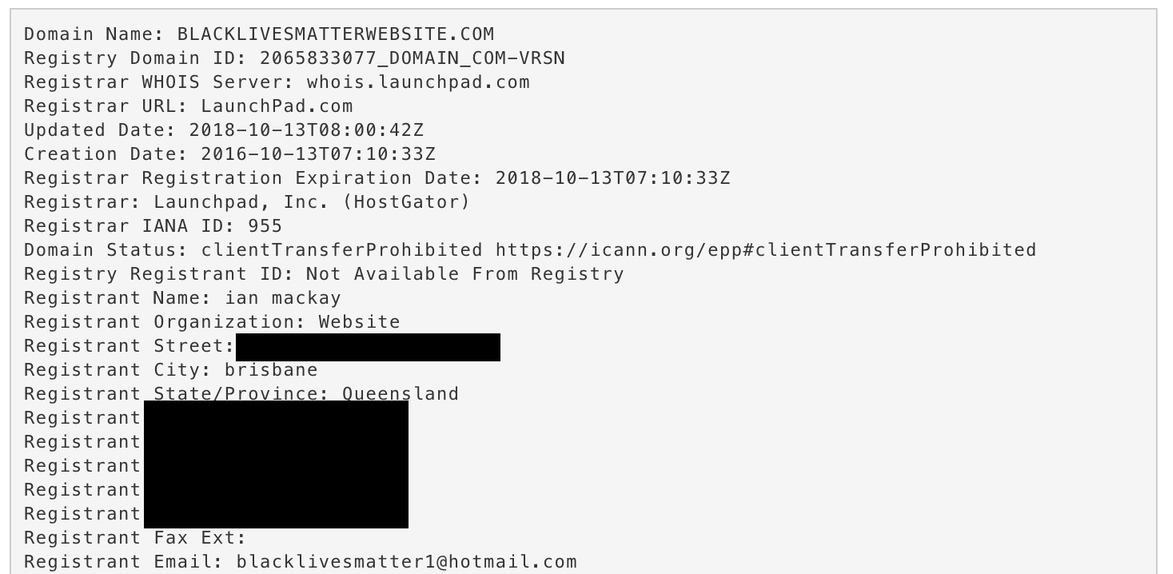
Massler contacted MacKay, who told him he bought and sold domains as a hobby and had nothing to do with the Facebook page. It was the same excuse MacKay, a middle-aged union official, gave me when I reached him by phone a few months later. But by that time we’d found that MacKay had registered dozens of website names, many relating to black activism.
Despite my concerns about the page and the fact that several activists told me they were suspicious of it, I didn’t find MacKay’s explanation unbelievable on its face. Domain names can be valuable, and people buy and sell them all the time. The fact he had also registered and sold domains that were not related to black activism made his case even more credible. But then something strange happened. A few minutes after I spoke to MacKay, the Facebook page came down. It hadn’t been taken down by Facebook, but by whoever was running it — and it hadn’t been deleted, only temporarily removed.
That seemed suspicious, so Massler and I began to dig more.
The Facebook page, which came back online in the weeks after my call with MacKay, had during its lifetime promoted fundraising campaigns ostensibly for BLM causes.
In one instance, it claimed to be raising money for activists in Memphis, Tennessee. But when I spoke to activists there, no one knew anything about the fundraiser or where the money might have gone. Other activists even told us that, suspecting it was a scam, they had reported the page to Facebook. But the company hadn’t taken any action.
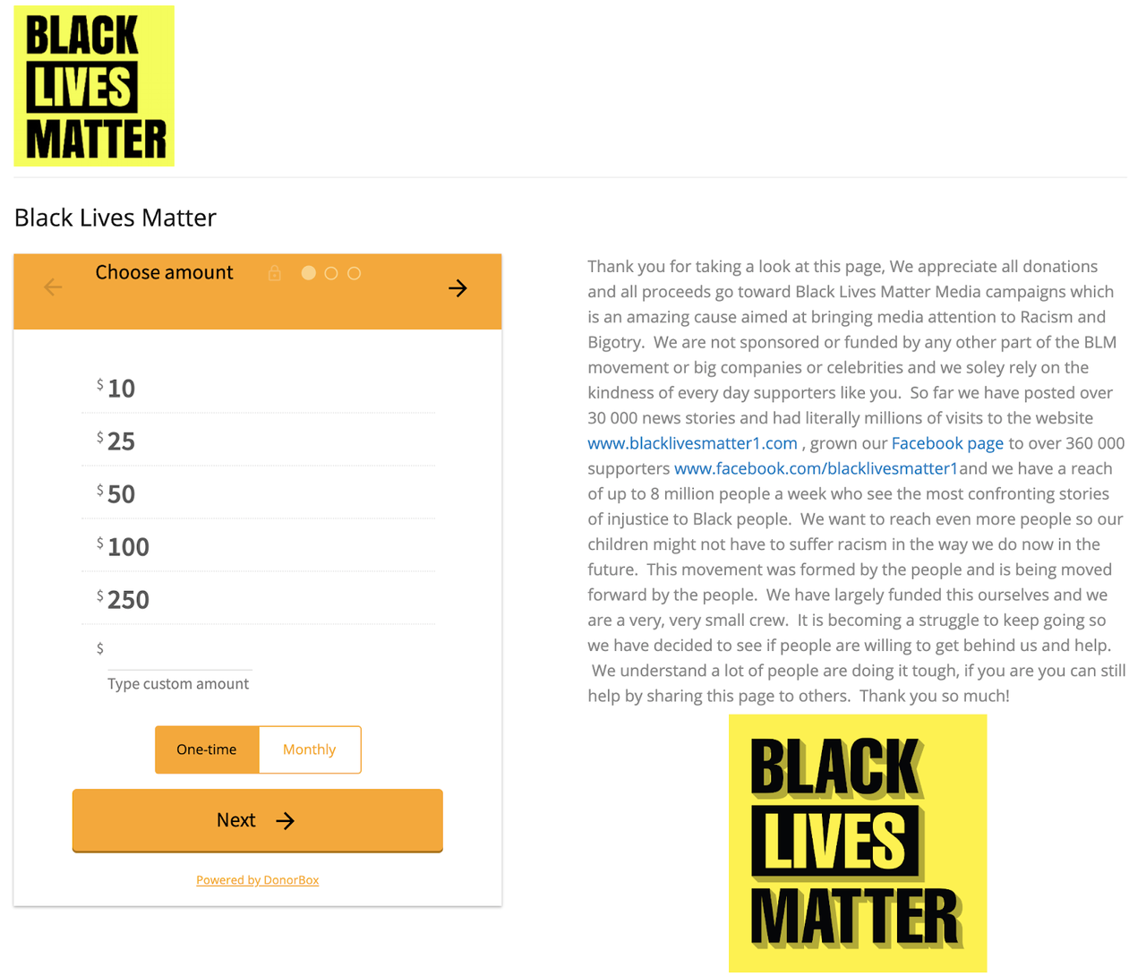
As I started to contact the multiple online payment and fundraising platforms the page had used, those companies began removing the fundraisers, saying they had broken their rules. Citing user privacy, none of the payment companies provided me with information on the record about where the money was going. This is a common challenge. Citing their privacy policies, platforms and digital services rarely reveal the names or contact information of account holders to the press.
I later learned from a source familiar with some of the payments processed that at least one account was tied to an Australian bank account and IP address. Another source told me that around $100,000 had been raised. Developing sources at tech companies who are willing to tell you more information than the company will say on the record is becoming increasingly important as many stories cannot be uncovered purely using open source information as scammers and bad actors become more sophisticated.
I brought this information to Facebook to comment for the story and told them I had evidence the page was linked to Australia, that payment companies had removed the campaigns after they investigated, and that we knew some of the money was going to Australia. A Facebook spokesperson said the social media platform’s investigation “didn't show anything that violated our Community Standards.”
It wasn’t until shortly before publishing our story — and only after I raised my concern about Facebook’s investigation and its spokesperson’s response to a more senior Facebook employee — that Facebook took action and removed the page.
The Australian workers’ union where MacKay worked launched an investigation of its own after CNN’s report. By the end of the week it had fired MacKay and a second official it said was also involved in the scam.
What was particularly notable about this story was the array of techniques that Massler and I used to get it over the line. We relied heavily on archive sites like the Wayback Machine that allowed us to see the look of websites the page had been linking to and the page itself before it came on our radar. This was particularly useful, as after Massler initially contacted MacKay the people behind the page began trying to cover some of their tracks.
We also used services that track domain registrations, including DomainTools.com, to investigate the sites MacKay had registered and also to find his direct contact details. Massler also extensively used Facebook Graph Search (a tool no longer available) to track the fake Facebook profile accounts that had been set up to promote the page in Facebook Groups. Interrogation of open source information and use of online research tools, like those used to access domain records, are vital instruments — but they are not the only ones.
The simple act of picking up the phone to talk to MacKay and developing sources to provide information that would otherwise not be made public — traditional journalism techniques — were critical in exposing this scam.
Alternative Data Practices in China
Written by: Jinxin Ma
Abstract
This chapter gives an insider view of the landscape of data journalism in China, its key players and data culture, as well as some practical tips.
Keywords: China, data culture, citizen participation, open data, data journalism, data visualization
A couple of years ago, I delivered a presentation introducing data journalism in China at the Google News Summit, organized by Google News Lab. It was a beautiful winter day in the heart of Silicon Valley, and the audience comprised a packed room of a hundred or so senior media professionals, mainly from Western countries.
I started by asking them to raise their hands if they think, firstly, that there is no good data in China, and secondly, that there is no real journalism in China. Both questions got quite some hands up, along with some laughter.
These are two common beliefs, if not biases, that I encounter often when I attend or speak at international journalism conferences. From my observations over the past six years, far from there being no data, in fact a vast quantity of data is generated every day in China, and of rapidly improving quality and broader societal relevance.
Instead of no “real” journalism being done, there are many journalists producing important stories every day, although not all of them are ultimately published.
Issue-driven Data Creation
Data stories were being produced even before the term “data journalism” was introduced in China. While nowadays we normally use the term “data-driven stories” in China, there was a period when we saw the contrary: Instead of data being the driver of stories, we witnessed stories, or particular issues, driving the production of data. This typically occurred in relation to issues that resonate with regular citizens, such as air pollution.
Since 2010, the Ministry of the Environment has published a real-time air pollution index, but one important figure was missing.1
The data on particulate matter (PM), or pollutants that measure less than 2.5 micrometres in diameter, which can cause irreversible harm to human bodies, was not published.
Given the severity of air pollution and the lack of official data on PM2.5, a nationwide campaign started in November 2011 called “I test the air for the motherland.” The campaign advocated for every citizen to contribute to monitoring air quality and to publish the results on social media platforms.2
The campaign was initiated by an environmental non-profit. The testing equipment was crowd-funded by citizens, and the non-profit organization provided training to interested volunteers.
This mobilization gained broader momentum after a few online influencers joined forces, including Pan Shiyi, a well-known business leader, who then had more than 7 million followers on Sina Weibo, one of China’s most widely used social media platforms (Page, 2011).
After two years of public campaigning, the data on PM2.5 was finally included in the government data release. It was a good start, but challenges remained. Doubts about the accuracy of the data were prompted by discrepancies between the data released by the government and that released by the U.S. embassy in China (Spegele, 2012).
The data was also not journalist-friendly. Despite hourly updates from more than a hundred cities, the information was only provided on a rolling basis on the web page, with no option to download a data set in any format. Although data has been centralized, historical data is not publicly accessible. In other words, without being able to write a script to scrape the data every hour and save it locally, it is impossible to do any analysis of trends over time or undertake comparisons between cities.
That is not the end of the story. Issue-driven data generation continues. When the data is not well structured and when data journalists struggle due to limited technical skills, civil society and “tech geeks” step in to provide support.
One early example back in 2011 was PM25.in, which scrapes air pollution data and releases it in a clean format. The site claims more than 1 billion search queries since they started operating.3
Another example is Qing Yue, a non-governmental organization which collects and cleans environmental data from government websites at all levels, and then releases it to the public in user-friendly formats. Their processed data is widely used not only by data teams in established media outlets but also by government agencies themselves for better policymaking.
The generation of data and the rising awareness around certain issues have gone hand in hand.
In 2015, a documentary investigating the severity of air pollution took the country by storm. The self-funded film, entitled Under the Dome, exposed the environmental crisis of noxious smog across the country and traced the roots of the problem and the various parties responsible (Jing, 2015).
The film has been compared with Al Gore’s An Inconvenient Truth in both style and impact. The storytelling featured a lot of scientific data, charts explaining yearly trends, and social network visualizations of corruption within environment and energy industries. As soon as it was released online, the film went viral and reached 200 million hits within three days, before it was censored and taken down within a week.
But it had successfully raised public awareness and ignited a national debate on the issue, including around the accessibility and quality of air pollution data. It has also successfully made the country’s leadership aware of the significance of the issue.
Two weeks after the release of the documentary, at a press conference held by the National People’s Congress, Premier Li Keqiang addressed a question about air pollution which referred to the film, admitting that the government was failing to satisfy public demands to halt pollution. He acknowledged some of the problems raised by the documentary, including lax enforcement of pollution restrictions, and emphasized that the government would impose heavier punishments to cut the toxic smog (Wong & Buckley, 2015). At the end of August 2015, the new Air Pollution Prevention and Control Law was issued, and it was implemented January 2016 (Lijian et al., 2015).
Air pollution is only one example illustrating that even when data availability or accessibility pose a challenge, public concern with issues can lead to citizen contributions to data generation, as well as to changes in government attitudes and in the availability of public sector data on the issues at hand. In more established ecosystems, data may be more readily available and easy to use, and the journalist’s job more straightforward: To find data and use it as a basis for stories.
In China the process can be less inear, and citizens, government, civil society and the media may interact at multiple stages in this process. Data, instead of just serving as the starting point for stories, can also come into the picture at a later stage to enable new kinds of relations between journalists and their publics.
Evolving Data Culture
The data environment in China has been changing rapidly in the past decade. This is partly driven by the dynamics described thus far in this chapter, and partly due to other factors, including the global open data movement, rapidly growing Internet companies and a surprisingly high mobile penetration rate. Data culture has been evolving around these trends as well.
Government legislation provides the policy backbone for data availability. To the surprise of many, China does have laws around freedom of information. The State Council Regulations on the Disclosure of Government Information was adopted in 2007 and came into force on May 1, 2008. The law has a disclosure mandate and affirms a commitment to government transparency. Following the regulation, government agencies at all levels set up dedicated web pages to disclose information they hold, including data sets.
However, although it gave journalists the right to request certain data or information from the authorities, in the first three years since the law was enforced, there are no publicly known cases of any media or journalists requesting data disclosure, according to a 2011 study published by Caixin, a media group based in Beijing and known for investigative journalism.4
The study revealed that, in 2010, the Southern Weekly, a leading newspaper, only got a 44% response rate to a request sent to 29 environmental bureaus to test their degree of compliance with the law. Media organizations do not usually have a legal team or other systems to support journalists to advance their investigations and further their information requests. In another instance, one journalist who, in his personal capacity, took the government to the court for not disclosing information, ended up losing his job. The difficulties and risks that Chinese journalists encounter when leveraging legal tools can be much greater than those experienced by their Western peers.
China is also responding to the global open data movement and increasing interest in big data. In 2012, both Shanghai and Beijing launched their own open data portals. Each of them holds hundreds of data sets on issues such as land usage, transportation, education and pollution monitoring. In the following years, more than a dozen open data portals have been set up, not only in the biggest cities, but also in local districts and less-developed provinces.
The development was rather bottom-up, without a template or standard structure for data release at the local level, which did not contribute to the broader comparability or usability of this data.
By 2015, the State Council had released the Big Data Development Action Plan, where open data was officially recognized as one of the ten key national projects, and a concrete timeline for opening government data was presented.5 However, official data is not always where journalists start, and also not always aligned with public interests and concerns.
On the other hand, the private sector, especially the technology giants such as Alibaba or Tencent, have over the years accumulated huge amounts of data.
According to its latest official results, Alibaba’s annual active consumers reached 601 million by September 30, 2018 (“Alibaba Group Announces,” 2018). The e-commerce data from such a strong user base—equivalent to the entire Southeast Asian population—can reveal lots of trading trends, demographic shifts, urban migration directions, consumer habit changes and so on. There are also vertical review sites where more specific data is available, such as Dianping, the Chinese equivalent of Yelp. Despite concerns around privacy and security, if used properly, those platforms provide rich resources for data journalists to mine.
One outstanding example in leveraging big data is the Rising Lab, a team under the Shanghai Media Group, specializing in data stories about urban life.6 The Lab was set up as an answer to the emerging trend of urbanization: China has more than 600 cities now, compared to 193 in 1978, with 56% of the population living in urban areas, according to a 2016 government report (“Gov’t Report: China’s Urbanization,” 2016). Shifting together with the rapid urbanization is the rise of Internet and mobile use, as well as lifestyle changes, such as the rapid adoption of sharing economy models. These trends are having a big impact on data aggregation.
With partnership agreements and technical support from tech companies, the Lab collected data from websites and apps frequently used by city dwellers. This data reflected various aspects of urban life, including property prices, numbers of coffee shops and bars, numbers of co-working spaces, and quality of public transportation.
Coupled with its original methodology, the Lab has produced a series of city rankings taking into account aspects such as commercial attractiveness, level of innovation and diversity of life (Figure 10.1). The rankings and the stories are updated every year based on new data, but follow the same methodology to ensure consistency. The concept and stories have been well received by the public and have begun to influence urban planning policies and companies’ business decisions, according to Shen Congle, director of the Lab (Shen, 2018).

The Lab’s success illustrates the new dynamics emerging between data providers, journalists, and citizens. It shows how softer topics have also become a playground for data journalism, alongside other pressing issues, such as the environmental crisis, corruption, judicial injustice, public health and money laundering. It also explores new potential business models for data journalism, as well as how data-based products can bring value to governments and businesses.
Readers’ news consumption practices have also had an impact on the development of data journalism. Two aspects deserve attention here, one being visual news consumption and the other, mobile news consumption. Since 2011, infographics have become popular thanks to a few major news portals’ efforts to build dedicated vertices with infographics stories, mostly driven by data. In 2014, the story of the downfall of the former security chief Zhou Yongkang, one of the nine most senior politicians in China, was the biggest news of the year.
Together with the news story, Caixin produced an interactive social network visualization (Figure 10.2) to illustrate the complex network around Zhou, including 37 people and 105 companies or projects connected to him, and the relationship between these entities, all based on the 60,000-word investigative piece produced by its reporting team. The interactive received 4 million hits within one week, and another 20 million views on social media, according to Caixin.7 The wide circulation of this project brought new kinds of data storytelling to new publics, and created an appetite for visual stories which didn’t exist before.

Almost at the same time, the media industry was welcoming the mobile era. More and more data stories, like any other online content in China, are now disseminated mostly on mobile. According to the China Internet Network Information Center (CNNIC), more than 95% of Internet users in the country used a mobile device to access the Internet in 2016 (Chung, 2017). WeChat, the domestic popular messaging app and social media platform, reached 1 billion users in March 2018 (Jao, 2018).
The dominance of mobile platforms means data stories in China are now not only mobile-first, but in many cases mobile-only. Such market demand led to a lot of lean, simple and sometimes creative interactives that are mobile friendly.
In short, the data culture in China has been evolving, driven by various factors from global movements to government legislation, from public demand to media requests, from new generations of data providers, to new generations of news consumers. The interdependent relationships between players have created very complex dynamics, where constraints and opportunities coexist. Data journalism has bloomed and advanced along its own path in China.
Practical Tips
This final section is aimed at readers of this book who are looking to work on China-related stories and wondering where to get started. It will not be easy. If you are not a Chinese language speaker, you will be faced with language barriers, as most data sources are only available in Chinese.
Next you will be faced with common issues pertaining to working with data: Data accuracy, data completeness, data inconsistency, etc., but we will assume that, as a reader of this book, you have the skills to deal with these issues, or at least a willingness to learn.
A good way to start would be to identify the biggest players in data journalism in China. Quite a few of the leading media outlets have data teams, and it is good to follow their stories and talk to their reporters for tips. Here are a few you should know: The Data Visualisation Lab (Caixin), Beautiful Data Channel (The Paper), The Rising Lab (Shanghai Media Group), and DT Finance.6
The second question pertains to where to find data. A comprehensive list of data sources would be a separate book, so here are just a few suggestions to get started. Start with government websites, both central ministries and local agencies.
You would need to know which department is the right one for the data you are looking for, and you should check both the thematic areas of ministries (for example, the Ministry of Environmental Protection) and the dedicated data website at the local level, if it exists.
There will be data that you don’t even expect—for example, would you expect that the Chinese government published millions of court judgements after 2014 in full text? Legal documents are relatively transparent in the United States but not in China. But the Supreme People’s Court (SPC) started a database called China Judgments Online doing just that.
Once you find some data that could be useful online, make sure to download a local copy. It is still common that data is not available online. Sometimes the data is published in the form of annual government reports which you can order online, or available only in paper archives. For example, certain government agencies have the records of private companies but not all of these are available online.
If the data is not released at all by the government, check if any user-generated content is available. For example, data on public health is very limited, but there are dedicated websites with information on hospital registrations or elderly centres, among others. Scraping and cleaning this data would help you gain a good overview of the topic.
It is also recommended to utilize databases in Hong Kong, anything from official ones like the Hong Kong Companies Registry, to independent ones such as Webb-site Reports. As mainland China and Hong Kong are becoming politically and financially closer, more information is available there, thanks to Hong Kong’s transparent environment and legal enforcement, which may be valuable for tracing money.
There is also data about China not necessarily held in China. There are international organizations or academic institutions that have rich China-related data sets. For example, The Paper used data from NASA and Harvard University in one of its latest stories.
Last but not least, while some challenges and experience are unique to China, a lot of them could potentially provide useful lessons for journalists in other countries, where the social, cultural and political arrangements have a different shape but similar constraints.
Footnotes
1. www.gov.cn/jrzg/2010-11/25/content_1753524.htm (Chinese language, Xinhua News Agency, National air quality real-time release system launched in Beijing, November 25, 2010)
2. www.bjep.org.cn/pages/Index/40-1699?rid=2782 .. (Chinese language)
3. chrome.google.com/webstore/detail/pm25b....
4.finance.ifeng.com/leadership/gdsp/20110901/4512444.html (Chinese language)
5. www.gov.cn/zhengce/content/2015-09/05/content_10137.htm (Chinese language)
6. zhuanlan.zhihu.com/therisinglab (Chinese language)
Works Cited
Alibaba Group announces September quarter 2018 results. (2018, November 2). Business Wire. www.businesswire.com/news/home/20181102005230/en/Alibaba-Group-Announces-September-Quarter-2018-Results
Edward Wong and Chris Buckley, ‘Chinese Premier Vows Tougher Regulation on Air Pollution’, New York Times, March 15, 2015
Chung, M.-C. (2017, February 2). More than 95% of Internet users in China use mobile devices to go online. EMarketer.www.emarketer.com/Article/ More-than-95-of-Internet-Users-China-Use-Mobile-Devices-Go-Online/1015155
Gov’t report: China’s urbanization level reached 56.1%. (2016, April 20). CNTV. english.www.gov.cn/news/video/2016/04/20/content_281475331447793.htm
Jao, N. (2018, March 5). WeChat now has over 1 billion active monthly users world-wide. TechNode. technode.com/2018/03/05/wechat-1-billion-users/
Jing, C. (2015, February 28). Chai Jing’s review: Under the dome—investigating China’s smog. www.youtube.com/watch?v=T6X2uwlQGQM
Lijian, Z., Xie, T., & Tang, J. (2015, December 30). How China’s new air law aims to curb pollution. China Dialogue. www.chinadialogue.net/article/show/ single/en/8512-How-China-s-new-air-law-aims-to-curb-pollution
Page, J. (2011, November 8). Microbloggers pressure Beijing to improve air pollution mon-itoring. The Wall Street Journal. blogs.wsj.com/chinarea... internet-puts-pressure-on-beijing-to-improve-air-pollution-monitoring/ internet-puts-pressure-on-beijing-to-improve-air-pollution-monitoring/
Shen, J. (2018, October). Data journalism in China panel. Uncovering Asia, Investiga- tive Journalism Conference, Seoul. 2018.uncoveringasia.org/schedule
Spegele, B. (2012, January 23). Comparing pollution data: Beijing vs. U.S. embassy on PM2.5. The Wall Street Journal. https://blogs.wsj.com/chinarealtime/2012/01/23/comparing-pollution-data-beijing-vs-u-s-embassy-on-pm2-5/
Wong, E., & Buckley, C. (2015, March 15). Chinese premier vows tougher regulation on air pollution. The New York Times. www.nytimes.com/2015/03/16/world/asia/chinese-premier-li-keqiang-vows-tougher-regulation-on-air-pollution.html
Data Journalism at the Zeit Online
Written by: Sascha Venohr

The PISA based Wealth Comparison project is an interactive visualization that enables comparison of standards of living in different countries. The interactive uses data from the OECD’s comprehensive world education ranking report, PISA 2009, published in December 2010. The report is based on a questionnaire which asks fifteen-year-old pupils about their living situation at home.
The idea was to analyze and visualize this data to provide a unique way of comparing standards of living in different countries.
First of all our in-house editorial team decided which facts seemed to be useful to make living standards comparable and should be visualized, including:
-
Wealth (number of owned TVs, cars and available bathrooms at home)
-
Family-situation (are there grandparents living with the family together, percentage share of families with only one child, unemployment of parents and mother’s job status)
-
Access to knowledge sources (internet at home, frequency of using e-mail and quantity of owned books)
-
Three additional indicators on the level of development of each country.
With the help of the internal design team these facts were translated into self-explanatory icons. A front end design was built to make comparison between the different countries like in a card-game possible.
Next we contacted people from the German Open Data Network to find developers who could help with the project. This community of highly motivated people suggested Gregor Aisch, a very talented information designer, to code the application that would make our dreams come true (without using Flash — which was very important to us!). Gregor created a very high quality and interactive visualization with a beautiful bubble-style, based on the Raphaël-Javascript Library.
The result of our collaboration was a very successful interactive which got a lot of traffic. It is easy to compare any two countries, which makes it useful as a reference tool. This means that we can re-use it in our daily editorial work. For example if we are covering something related to the living situation in Indonesia, we can quickly and easily embed a graphic comparing the living situation in Indonesia and Germany. The know-how transferred to our in house-team was a great investment for future projects.
At the Zeit Online, we’ve found that our data journalism projects have brought us a lot of traffic and have helped us to engage audiences in new ways. For example, there was a wide coverage about the situation at the nuclear plant in Fukushima after the Tsunami in Japan. After radioactive material escaped from the power plant, everyone within 30 kilometres of the plant was evacuated. People could read and see a lot about the evacuations. Zeit Online found a innovative way to explain the impact of this to our German audience. We asked: How many people live near a nuclear power plant in Germany? How many people live within a radius of 30 kilometres? A map shows how many people would have to be evacuated in a similar situation in Germany. The result: lots and lots of traffic and the project went viral over the social media sphere. Data journalism projects can be relatively easily adapted to other languages. We created an English language version about proximity to nuclear power plants in the US, which was a great traffic motor. News organizations want to be recognized as trusted and authoritative sources amongst their readers. We find that data journalism projects combined with enabling our readers to look and reuse the raw data brings us a high degree of credibility.
For two years the R&D Department and the Editor-in-Chief at the Zeit Online, Wolfgang Blau, have been advocating data journalism as an important way to tell stories. Transparency, credibility and user engagement are important parts of our philosophy. That is why data journalism is a natural part of our current and future work. Data visualizations can bring value to the reception of a story, and are an attractive way for the whole editorial team to present their content.
For example, on 9th November 2011 Deutsche Bank pledged to stop financing cluster bomb manufacturers. But according to a study by non-profit organzation Facing Finance, the bank continued to approve loans to producers of cluster munitions after that promise was made. Our visualization based on the data shows the various flows of money to our readers. The different parts of the Deutsche Bank company are arranged at the top, with the companies accused of involvement in building cluster munitions at the bottom. In between, the individual loans are represented along a timeline. Rolling over the circles shows the details of each transaction. Of course the story could have been told as a written article. But the visualization enables our readers to understand and explore the financial dependencies in a more intuitive way.

To take another example: the German Federal Statistic Office has published a great dataset on vital statistics for Germany, including modelling various demographic scenarios up until 2060. The typical way to represent this is a population pyramid — such as the one from the Federal Statistics Agency.
With our colleagues from the science department we tried to give our readers a better way to explore the projected demographic data about our future society. With our visualization, we present a statistically representative group of 40 people of different ages from the years 1950 till 2060.They are organised into eight different groups. It looks like a group photo of German society at different points in time. The same data visualized in a traditional population pyramid gives only a very abstract feeling of the situation, but a group with kids, younger people, adults and elderly people means our readers can relate to the data more easily. You can just hit the play button to start a journey through eleven decades. You can also enter your own year of birth and gender to become part of the group photo: to see your demographic journey through the decades and your own life expectancy.
2. Finding patient zero
Written by Henk van Ess
Henk van Ess is an assessor for Poynter’s International Fact-Checking Network. He is obsessed with finding stories in data. Van Ess trains worldwide media professionals in internet research, social media and multimedia. His clients include NBC News, BuzzFeed News, ITV, Global Witness, SRF, Axel Springer, SRF and numerous NGOs and universities. His websites whopostedwhat.com and graph.tips are heavily used to filter social media. He is @henkvaness on Twitter.
For decades, Canadian flight attendant Gaëtan Dugas was known as “Patient Zero,” the first man to bring AIDS to the United States. This distinction, which was reinforced by books, films and countless news reports made him the “arch-villain of an epidemic that would eventually kill more than 700,000 people in North America.”
But that was not the case. Bill Darrow, an investigator with the Centers for Disease Control and Prevention, interviewed Dugas and filed him as “Patient O, as in “Out-of-California.” It was soon misread as the number 0, setting off a chain reaction of misinformation that persisted until recently.
It’s also possible for a journalist to focus on the wrong patient 0 if you don’t know how to search properly. This chapter helps you to find primary sources online by getting rid of superficial results and digging deeper.
1. Risks of consulting primary sources and how to fix them
Journalists love online primary sources. Firsthand evidence can be found in a newspaper article, a scientific study, a press release, social media or any other possible “patient zero.”
Performing a basic keyword search on an official government site can make you think “what you see is what they got.” That is often not true. Here is an example. Let’s go to the U.S. Securities and Exchange Commission, a source used to find financial information about U.S. citizens as well as businesspeople from all over the world. Let’s say we want to find the first occurrence of the phrase “Dutch police” in sec.gov. The built-in search engine of the SEC can help:

You get just one hit — a document from 2016. So the SEC mentions the Dutch police only once, in 2016, right?
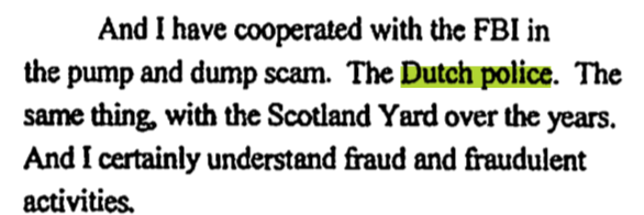
Wrong. The first mention on sec.gov was in 2004, 12 years earlier, in a declassified, encrypted mail:
You won’t see this in the search results from the search bar on sec.gov, even though this information does come straight from its website. Why the difference?
By default, you should distrust search engines from primary sources. They can give you a false impression of the actual content of the website and its associated databases. The proper way to search is to perform a “primary source check.”
Primary source check
Step 1: Look at the failing link
The search result from the SEC provided us with just one source:
Let’s work with that disappointment. First, get rid of “https://www,” the first part of the link. Watch out for the first backslash after that (/) — in this case it’s before the word “litigation/”
That’s the part we need: sec.gov
2. Second step: Use “site:”
Go to a generic search engine. Start with the query (“Dutch police”) and end with “site:” followed directly with the URL (no spaces). This is the formula for finding out if an original source shows you everything:

Including specific folders
You can now adapt the “primary source formula” to your needs. Let’s go to the press release section of the New Jersey Courts website. Say you want to find out when the Mercer County Bar Association sponsored a Law Day program, but you can’t find the primary source in the title of any press release. The “Mercer County Bar Association” is not visible in any title.
Now look at the URL of that page full of poorly indexed press releases:

The public relations material is filed away in the folder /public. That should be included in your Google search:

And there you are:

Predicting folders
China has a Ministry of Ecology and Environment. Do they have English documents about the German company Siemens? With the following formula, you get Chinese and English documents in the search results:
If you want to filter to see only the English ones, maybe they used the word English in the link? Try it out. It works:

2. Following the trail of documents
Sometimes the information we need isn’t contained on a webpage, but is actually in a document hosted on a website. Here’s how to follow the document trail using Google formulas.

Ross McKitrick is an associate professor in the Economics Department at the University of Guelph, Ontario. Back in 2014, he did a presentation for a climate skeptic group. Let’s try to find the invitation for that meeting. We know it was held on May 13, 2014, and was the 11th Annual Luncheon organized by the “Friends of Science (FOS).” If we search Google for these terms we come up empty:
Why? Because the word invitation is not in many invitations. It’s the same with the word interview. Many interviews don’t contain the word interview. Even most maps don’t have the word map explicitly written on it. My advice? Stop guessing and Go Zen.
Step 1: Establish the document type
Try to find the common denominator of any online invitation. It's often a PDF document. Search for just that with “filetype:pdf” and you might find it.
Step 2: Be (climate) neutral
You don’t know the exact wording of the invitation. But what you do know, is that the YouTube video was from a May 13, 2014, event. It’s feasible that the date is mentioned in the invitation. (Be sure to search for both the cardinal and ordinal forms, May 13 and May 13th.)
Step 3: Who is involved?
We know the organizer is “Friends of Science” and its website is friendsofscience.org.
When you combine all three steps, the query in Google will be:
There it is in the first hit: the invitation for the event.

The FOS, based in Calgary, is frequently labeled a climate denial group and is funded in part by the oil and gas sector So how would we craft a query to find out more information about it and its network of supporters and funders?
Step 1: Include target
“Friends of Science” results in too many hits, so include also “Calgary.”
Step 2: Include “filetype”
Go for the next best thing for any official document, “filetype:pdf.”
Step 3: Exclude your target’s website
Exclude the target’s website Friendsofscience.org by adding “-site:friendsofscience.org.” This helps you find information from outside parties.
The full query is:

Because you searched for the target in official documents, but not from its own website, you find some brothers in arms and those who are critical of the organization:
3. Filtering social media for primary sources
YouTube
YouTube’s search tool has a problem: it won’t let you filter for videos that are older than one year. If you want to find a video of a tour in Prague from Oct 11, 2014, this is the roadblock you will hit:
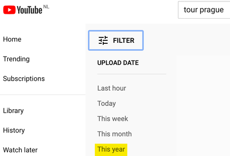
To solve this, manually enter the preferred date into a Google.com search by using the “Tools” menu on the far right. Then select “Any time” and “Custom Range.” Now we get the results we need:
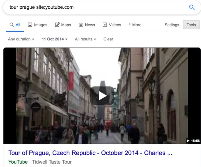
Despite the power of the “site:” search operator, you’ll be disappointed if you use it in Google to try searching Twitter. For example, we could try this query to find when I tweeted about the Verification Handbook for the first time:

But it returns you only one hit as of this writing. Generic search engines like Google often struggle to deliver quality results from the trillions of posts on Twitter, or on big platforms such as Facebook and Instagram. The answer for Twitter is to use its Advanced Search functionality and add keywords, username and time period, as shown here:
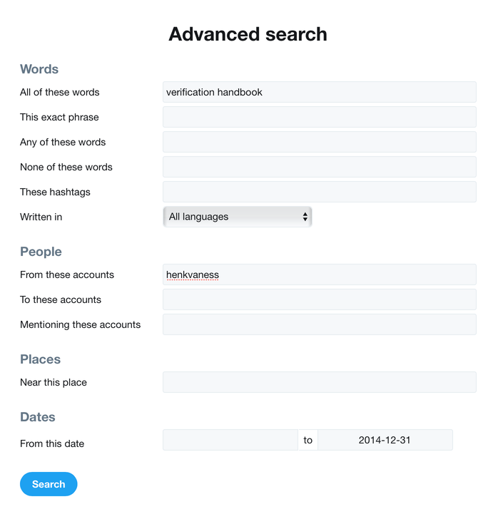
Don't forget to click on “Latest" on the menu at the top of the search results page so you can view the results in reverse chronological order. By default, Twitter sorts your results by what it considers to be the top tweets.
Using “site:” on Facebook is also not ideal, but we can make its native search tool fit our needs. Let’s say for example you want to see posts from March 2019 about strawberry cake from people in Brooklyn. Follow these steps:
Step 1: Type in query

Step 2: Click on posts

Step 3: Define location
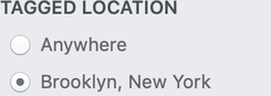
Step 4: Choose a date
And there you are:
Instagram
To search Instagram for posts from a specific date in a specific location, you can go to my site, whopostedwhat.com, and fill in your query:
Making a Database to Document Land Conflicts Across India
Written by: Kumar Sambhav Shrivastava Ankur Paliwal
Abstract
Documenting land conflicts to tell deeper, more nuanced and bigger stories of land and its relationship with India’s diverse society.
Keywords: land conflict, India, data journalism, databases, collaboration
Land is a scarce resource in India. The country only has 2.4% of the world’s land area but supports over 17% of the world’s population. As one of the world’s fastest-growing economies, it requires large swathes of lands to fuel its ambitious agenda of industrial and infrastructure growth. At least 11 million hectares of land are required for development projects in the next 15 years. But a huge section of India’s population—mostly marginalized communities—depend on land for their sustenance and livelihood. Over 200 million people depend on forests while 118.9 million depend on farming land in India.
These competing demands cause conflicts. In many cases land is forcefully acquired or fraudulently grabbed by the state or private interests, dissenters are booked by the state agencies under false charges, compensation is paid partially, communities are displaced, houses are torched, and people get killed. Social disparities around caste, class and gender also fuel land struggles. Climate change-induced calamities are making land-dependent communities further vulnerable to displacements. All this is reflected in the many battles taking place over land across India.
As journalists writing about development issues in India, we come across many such conflicts. However, we realized it was not easy to sell those stories happening in remote corners of India to the editors in New Delhi. The mainstream media did not report on land conflicts except the ones that turned fatally violent or that were fought in the national courts. Sporadic Reporting by a few journalists had little impact. Voices of the people affected by such conflicts remained unheard. Their concerns remained unaddressed.
The reason, we thought, was that the reporters and the editors looked at the conflicts as isolated incidents. We knew land conflicts were one of the most important stories about India’s political economy. But the question was how to sell it to editors and readers. We thought that if journalists could scale up their reporting on individual cases of conflict to examine broader trends, their stories could not only have wider reach but might also show the intensity of various kind of conflicts and their impact on people, the economy and the environment. The biggest challenge to achieving this was the lack of a database which journalists could explore to see what trends are emerging around specific kinds of conflicts, such as those over roads, townships, mining or wildlife-protected areas. There was no such database of ongoing land conflicts in India. So we decided to build one.
In November 2016, we started Land Conflict Watch, a research-based data journalism project which aims to map and document all ongoing land conflicts in India. We developed a documentation methodology in consultation with academics working on land governance. We put together a network of researchers and journalists, who live across the country, to document the conflicts in their regions following this methodology.

For the purpose of this project, we defined land conflict as any situation that has conflicting demands or claims over the use or ownership of land, and where communities are one of the contesting parties. Ongoing conflicts where such demands or claims have already been recorded in a written or audio-visual format at any place, from the village level to the national level, are included. These records could be news reports, village assembly resolu- tions, records of public consultation for development projects, complaints submitted by people to government authorities, police records or court documents. Conflicts such as property disputes between two private parties or between a private party and the government are excluded unless they directly affect broader publics.
The researchers and journalists track national and local media coverage about their regions and interact with local activists, community organizations and lawyers to find cases of conflict. They then collect and verify information from publicly available government documents and independent studies, and by talking to affected parties. Data such as location of conflict, reasons behind the conflict, number of affected people, affected area, land type—whether private, common or forest—names of the government and corporate agencies involved, and a narrative summary of the conflict are documented.
Researchers file all the data into reporting-and-review software built into the Land Conflict Watch website. Data is examined and verified by dedicated reviewers. The software allows to-and-fro workflow between the researchers and the reviewers before the data is published. The dashboard, on the portal, not only presents the macro picture of the ongoing conflicts at the national level but zooms in to give details of each conflict, along with the supporting documents, at the micro level. It also provides the approximate location of the conflict on an interactive map.
About 35 journalists and researchers are currently contributing. As of September 2018, the project had documented over 640 cases. These conflicts affect close to 7.3 million people and span over 2.4 million hectares of land. Investments worth USD186 billion are attached to projects and schemes affected by these conflicts.
As a conflict is documented, it is profiled on the portal as well as on social media to give a heads-up to national journalists and researchers. The project team then collaborates with journalists to create in-depth, investigative stories at the intersection of land rights, land conflicts, politics, economy, class, gender and the environment using this data. We also collaborate with national and international media to get these stories published. Many of these stories have been republished by other mainstream media outlets. We have also conducted training to support journalists in using the database to find and scale up stories around land governance.
Land Conflict Watch is an ongoing project. Apart from designing stories, we also work with academics, researchers and students to initiate public debates. Land Conflict Watch’s data has been cited by policy think tanks in their reports. Land-governance experts have written op-eds in national newspapers using the data. We regularly get requests from students at Indian and foreign universities to use our data in their research. Non-profit organizations use land conflict data, documents and cases to strengthen their campaigns to fight for the land rights of conflict affected communities. The stories inform people and help shape discourse around land rights and governance-related issues in India.
5. Verifying Video
Written by Malachy Browne
The convergence of affordable smartphone and camera technology, ubiquitous Internet access and social media is largely responsible for the explosion in citizen-powered news coverage. One byproduct of this is an enormous amount of video being uploaded and shared every minute, every hour.
The revolution in information technology is not over and the volume of newsworthy user- generated content will only grow. Journalists have a new responsibility - to quickly gather, verify and ascertain the usage rights of UGC. Traditional values of investigation apply, but a new skillset is required for media such as video.
Verifying video from an unknown source on social media may initially appear daunting. But it’s not rocket science.
Here’s what you need to get the job done: A determination to investigate the backstory of the content, coupled with a healthy level of skepticism and a familiarity with the multitude of free tools that can help establish facts about a video. This chapter will help to equip you with all three.
A first point to understand about verifying user-generated video is that it spreads across social media in a way that makes the version you first see unlikely to be the original. Videos may be spliced, diced and reposted with different context. Important traces from the original video may disappear. Your job is to root out the facts that support or deny what this video purports to show.
As with any story, start with the basic questions: who, what, when, where and why. In this context, the metadata associated with a video can help answer some of these questions by providing you with details about the original source, date and location.
One rule, however, is that one piece of evidence alone is insufficient to verify a video -usually a body of evidence needs to be collected to form a complete picture. Get ready for that adrenaline rush when the puzzle comes together.
Here’s a step-by-step-guide to verifying video from social media.
Provenance
Identifying a video’s provenance is the first step. Sometimes it is obvious that the video belongs to the Facebook or YouTube account where you discovered it. But as detailed in Chapter 3, you always start from the assumption that a video has been “scraped” or duplicated.
Most videos come with a description, tag, comment or some piece of identifying text. Extract useful keywords from this information to begin your search. Acronyms, place names and other pronouns make good keywords. If the description is in a foreign language, paste the text into Google Translate to highlight these keywords.
Search for the earliest videos matching these keywords using the date filter to order results. On YouTube, look directly below the search bar for the Filters menu and select Upload Date, as in the below image. Vimeo, YouKu and other video platforms have similar filters. Scroll through the results and compare video thumbnails to find the earliest version (the thumbnails of original and “scraped” videos usually match).

Another method to find the earliest version of a video is to perform an image search of the video thumbnail using Google Image Search or TinEye (as explained in the previous chapter). This can identify the first instance of video thumbnails and images. The helpfulness of these tools depends on the image quality; a strong contrast in the video and a distinctive color scheme help.
Once you’ve found the source behind the video, contact the source to begin the next step.
Verify the source
It’s time to examine the source the same way we would look at any more-traditional source of information. Indeed, often much more information is available about an online source than a traditional source telephoning a tip line, for example.
Online profiles leave a digital footprint that allows us to examine history and activity. Most platforms enable us to contact uploaders, which is an essential step. Ultimately we seek to engage with the uploader, ask questions and satisfy ourselves that the uploader filmed the footage.
These questions are useful when examining an uploader’s digital footprint:
- Are we familiar with this account? Has the account holder’s content and report age been reli- able in the past?
- Where is this account registered?
- Where is the uploader based, judging by the account history?
- Are video descriptions consistent and mostly from a specific location? Are videos dated?
- If videos on the account use a logo, is this logo consistent across the videos? Does it match the avatar on the YouTube or Vimeo account?
- Does the uploader “scrape” videos from news organizations and other YouTube accounts, or does he upload solely user-generated content?
- Does the uploader write in slang or dialect that is identifiable in the video’s narration?
- Are the videos on this account of a consistent quality? (On YouTube, go to Settings and then Quality to determine the best quality available.)
- Do video descriptions have file extensions such as .AVI or .MP4 in the video title? This can indicate the video was uploaded directly from a device.
- Does the description of a YouTube video read: “Uploaded via YouTube Capture”? This may indicate the video was filmed on a smartphone.
Gathering the answers to these questions helps paint a picture of the source, the source’s online history and the kind of content he shares. From there, it’s important to try to connect that account’s activity to any other online accounts the source maintains. Below are some practices/questions to guide this process.
- Search Twitter or Facebook for the unique video code - are there affiliated accounts? (Every piece of UGC is identified by a unique code that appears in the URL. On YouTube and Facebook, for instance, the code is placed between “v=” and the next “&” in the URL.)
- Are there other accounts - Google Plus, a blog or website - listed on the video profile or otherwise affiliated with this uploader?
- What information do affiliated accounts contain that indicate recent location, activity, reliability, bias or agenda of the account holder?
- How long have these accounts been active? How active are they?
- Who are the social media accounts connected with, and what does this tell us about the uploader?
- Can we find whois information for an affiliated website?
- Is the person listed in local phone directories, on Spokeo, Pipl.com or WebMii or on LinkedIn?
- Do the source’s online social circles indicate proximity to this story/location?
Asking these questions, and answering them, gives us an impression as to the reliability of a source of content. And, importantly, it provides a means to contact the uploader to seek further questions and guidance on the how the video may be used by news organizations.
When speaking to the source, be sure to ask about some of the information you came across. Do the answers match up? If the source isn’t honest with you about information, then you should be extra suspicious of the content.
Locate the video
With the source identified and examined, it’s time to try to verify the content of the video itself. This begins with confirming, or establishing, the location of the video.
Verifying where a video was filmed very much depends on the clues the video presents. A distinctive streetscape, a building, church, line of trees, mountain range, minaret or bridge are all good reference points to compare with satellite imagery and geolocated photographs. Should the camera pan across a business name, this might be listed in online classifieds or a local directory. A street sign might give clues to the precise location. Car registration plates or advertising billboards might indicate provincial details. Sunlight, shadows and the approximate time of day of the event can also be helpful. And if the video contains dialogue, do the accents or dialects fit the circumstances it purports to represent?
The starting point, again, is to examine any text accompanying the video and clues within the video. Home in on the location using Google Maps and try to map the video location. If possible, zoom into Street View to get the camera angle. If Street View is not available, turn on “Photos” in Google Maps’ options and check if geolocated photographs match the video location. Geolocated photos may also be searched using the advanced search features on Flickr, Picasa and Twitter.
If the video is in a foreign language, enter the text into Google Translate and identify the place name. Be aware that Google Translate often mistranslates: for instance, the Arabic for Lattakia in Syria mistranslates as “Protoplasm,” Daraa as “Shield.” Also be aware that various English transliterations of Arabic render names differently: Jidda or Jiddah, for example. By taking the Arabic text for these places and entering it into Google Maps, we’ll find our way to the city. The below image shows searches in Google Translate and Google Maps.

When translating, use the language skills available among your colleagues and contacts. Translating Japanese characters to Korean or Mandarin yields a more accurate translation than Japanese to English. So if you have a Korean or Mandarin speaker in your midst, or can find one quickly, ask her to investigate the translations for you.
Wikimapia is a crowdsourced version of Google Maps in which buildings, suburbs, military sites and other points of interest are outlined and described. This is useful to get context for an area and identify locations, though this information should be corroborated by other information, as it is possible to encounter errors, or deliberately misleading information.
One example of how Wikimapia can be useful came when a day of “civil disobedience” was held in Port Said, Egypt, in February 2013. Demonstrators were filmed marching by the Port Said University’s Faculty of Education, according to one YouTube uploader. The streetscape was difficult to identify on Google Maps amid the densely packed streets of Port Said. However, the Faculty of Education (ةيبرتلاةيلك) is tagged on Wikimapia; finding and examining this reference point confirmed the location of the demonstration, as shown on the next page.
Google Earth is another useful tool, in that it provides a history of satellite images. This is useful when examining older videos where the terrain may have changed.

Google Earth’s terrain view is also valuable when examining terrain and the relative dimensions of buildings. Recently when the team at Storyful was considering a video as evidence supporting a reported Israeli strike on Syria, Google Earth Terrain’s view of mountains north of Damascus verified the location of a YouTube uploader, as you can see in the below comparison.


Verify the date
Confirming the date of videos uploaded from a planned event like a demonstration or politi- cal rally is generally straightforward. Other videos of the same event are likely to exist via news reports, and corroborating pictures are usually shared on Twitter, Facebook, Instagram and other social media sites. Searching these platforms with relevant keywords and hashtags is usually sufficient to discover supporting evidence such as distinctive buildings or street furniture, placards or weather conditions.
However, for more obscure videos, date is generally the most difficult piece of metadata to verify. YouTube videos are time-stamped in Pacific Standard Time (PST) from the moment the upload begins. This led Russia’s Foreign Ministry to cast doubt on videos depicting a chemical weapons attack on Ghouta near Damascus: The videos were uploaded in the early hours of August 21, and therefore were dated on YouTube as August 20. The Foreign Ministry’s ignorance of this prompted it and others to claim the videos were staged and uploaded ahead of the reported time of the attack.
Weather reports alone are insufficient to verify dates, but they help. As previously detailed, Wolfram Alpha provides weather information about a place on a particular date. After Rita Krill uploaded what purported to be amazing video of a lightning strike in her Florida backyard on October 5, 2012, Wolfram Alpha showed that thunderstorms were active in the area.
And searching Twitter for Naples, Florida, on that date showed a local weatherman asking his followers for pictures of storm clouds in Naples. Below is an image of the Wolfram Alpha search and the tweet.

Final checks: What does the video show?
Now it’s time to bring all of your data together and ask the obvious questions: Does the video make sense given the context in which it was filmed? Does anything jar my journalistic instinct? Does anything look out of place? Do clues suggest it is not legitimate? Do any of the source’s details or answers to my questions not add up? Remember, your assumption is that the video is false. Does the evidence confirm or refute that assumption?
When it comes to video, bear in mind that elaborate hoaxes have been, and continue to be, played. Canadian students infamously faked a video of an eagle swooping down in a park in Montreal and picking up a baby. This was debunked by splitting the video into single frames and spotting that the eagle’s shadow was missing in some frames. (More technical people can use video editing software like the free VLC media player or the free Avidemux video editor, or the licensed Vegas Pro editor to split a video into its constituent frames if you have doubts over its construction.)
Reassembling Public Data in Cuba: Collaborations When Information Is Missing, Outdated or Scarce
Written by: Yudivián Almeida Cruz Saimi Reyes Carmona
Abstract
How a small data journalism team in Cuba fights against the lack of data.
Keywords: Cuba, scarce data, data learning, artificial intelligence, data journalism, researcher–journalist collaborations
Postdata.club is a small team. We started as four journalists and a specialist in mathematics and computer science, who, in 2014, decided to venture together into data journalism in Cuba. Until that moment, there was no media outlet that was explicitly dedicated to data journalism in Cuba and we were interested in understanding what the practice entailed.
Today we are two journalists and a data scientist working in our free time on data stories for Postdata.club.
Data journalism does not feature in our daily jobs. Saimi Reyes is editor of a cultural website, Yudivián Almeida is a professor of the School of Math and Computer Science at the University of Havana, and Ernesto Guerra is a journalist at a popular science and technology magazine. Our purpose is to be not just a media organization, but an experimental space where it is possible to explore and learn about the nation we live in with and through data.
Postdata.club lives on GitHub. This is because we want to share not just stories but also the way we do research and investigations. Depending on the requirements of the story we want to tell, we decide on the resources we will use, be they graphics, images, videos or audio. We focus on journalism with social impact, sometimes long-form, sometimes short-form. We are interested in all the subjects that we can approach with data, but, above all, those related to Cuba or its people.
The way we approach our investigations depends on the data that we have access to. Sometimes we have access to public and open databases. With these, we undertake data analyses to see if there may be a story to tell. Sometimes we have questions and go to the data to find answers that could constitute a story. In other cases, we explore the data and, in the process, find interesting leads or questions which may be answered by data we do not yet hold.
Other times—and on more than a few occasions—to support our analysis and investigations, we have to create databases ourselves based on information that is public but not properly structured. For example, to report on the Cuban elections, we had to build databases by combining information from different sources. We started with data published on the site of the Cuban Parliament. This data, however, was not complete, so we complemented it with press reports and information from Communist Party of Cuba websites.
To report on the recently designated Council of Ministers, it was also necessary to build a database. In that case, the information provided by the National Assembly was not complete and we used press reports, the Official Gazette and other websites to get a more comprehensive picture. In both cases, we created databases in JSON format which were analyzed and used for most of the articles we wrote about the elections and the executive and legislative powers in Cuba.

In most cases we share such databases on our website with an explanation of our methods. However, our work is sometimes complicated by the lack of data that should be public and accessible. Much of the information we use is provided by government entities, but in our country many institutions do not have an online presence or do not publicly report all the information that they should. In some cases we went directly to these institutions to request access to certain information, a procedure which is often cumbersome, but important.
For us, one of the biggest issues with the data that we can obtain in Cuba is its outdatedness. When we finally get access to the information we are looking for, it is often incomplete or very outdated. Thus, the data may be available for consultation and download on a website, but the most recent date covered is from five years ago. In these cases we identify other reliable websites which provide up-to-date information or resort to documents in print, scans or human sources.
Collaborations with students and researchers are one of the ways we approach situations where information is missing, outdated or scarce. Since 2017, we have taught a data journalism course to journalism students at the University of Havana School of Communication. Through our exchanges with these future journalists and communication professionals we have learned new ways of working and discovered new ways to access information.
One of the things we do in these classes is to involve students in the construction of a database. For example, there was no single source in Cuba to obtain the names of the people who have received national awards, based on their life’s work, in different areas. Together with students and teachers, we collected and structured a database of the recipients of more than 27 awards since they began to be granted until today. This information allowed us to reveal that there was a gender gap in awarding prizes. Women received these prizes only 25% of the time. With this discovery we were able, together, to write a story that encouraged reflection about gender issues in relation to the national recognition of different kinds of work.
In 2017 we had another revealing experience. This experience helped us to understand that, in many cases, we should not to settle for existing published databases and we should not make too many early assumptions about what is and is not possible. As part of their final coursework, we asked students to form small teams to carry out an investigation. These were composed, in each case, by one of the four members of the Postdata.club team, two journalism students and a student of computer science. One of the teams proposed tackling new initiatives of self-employment in Cuba. Here, these people are called cuentapropistas. What was a few years ago a very limited practice, is now rapidly growing due to the gradual acceptance of this form of employment in society.
We wanted to investigate the self-employment phenomenon in Cuba. Although the issue had been frequently addressed, there was almost nothing about the specificities of self-employment by province, the number of licenses granted per area of activity or trends over time. Together with the students, we discussed which questions to address and came to the conclu- sion that we lacked good data sources. In places where this information should have been posted publicly, there was no trace. Other than some interviews and isolated figures, not much information on this topic was available in the national press.
We thought that the data would be difficult to obtain. Nevertheless, journalism students from our programme approached the Ministry of Labour and Social Security and asked for information about self-employment in Cuba. In a few days the students had a database in their hands. Suddenly, we had information that would be of interest to many Cubans, and we could share it alongside our stories. We had wrongly assumed that the data was not intended for the public, whereas the ministry simply did not have an up-to-date Internet portal.
Coincidentally, the information came into our hands at a particularly convenient moment. At that time, the Ministry of Labour and Social Security decided to limit license issuing for 28 of the activities authorized for non-state employment. We were thus able to quickly use the data we had obtained to analyze how these new measures would affect the economy of the country and the lives of self-employed workers.
Most of our readers were surprised that we were able to obtain the data and that it was relatively easy to obtain. In the end it was possible to access this data because our students had asked the ministry and until today Postdata.club is the online place that makes this information publicly accessible.
Doing data journalism in Cuba continues to be a challenge. Amongst other things, the dynamics of creating and accessing data and the political and institutional cultures are different from other countries where data can be more readily available. Therefore, we must always be creative in looking for new ways of accessing information to tell stories that matter. It is only possible if we continue to try, and at Postdata.club we will always strive to be an example of how data journalism is possible even in regions where data can be harder to come by.
How to Hire a Hacker
Written by: Lucy Chambers
One of the things that I am regularly asked by journalists is how do I get a coder to help me with my project?. Don’t be deceived into thinking this is a one-way process; civic-minded hackers and data-wranglers are often just as keen to get in touch with journalists.
Journalists are power-users of data driven tools and services. From the perspective of developers: journalists think outside the box to use data tools in contexts developers haven’t always considered before (feedback is invaluable!) they also help to build context and buzz around projects and help to make them relevant. It is a symbiotic relationship.
Fortunately, this means that whether you are looking to hire a hacker or looking for possible collaborations on a shoestring budget, there will more than likely be someone out there who is interested in helping you.
So how do you find them? Says Aron Pilhofer from the New York Times:
You may find that your organzation already has people with all the skills you need, but they are not necessarily already in your newsroom. Wander around, visit the technology and IT departments and you are likely to strike gold. It is also important to appreciate coder culture, come across someone who has a computer that looks like the one here…
Here are a few more ideas:
- Post on job websites
-
Identify and post to websites aimed at developers who work in different programming languages. For example, the Python Job Board.
- Contact relevant mailing lists
-
For example, the NICAR-L and Data Driven Journalism mailing lists.
- Contact relevant organizations
-
For example, if you want to clean up or scrape data from the web, you could contact an organzation such as Scraperwiki, who have a great address book of trusted and willing coders.
- Join relevant groups/networks
-
Look out for initiatives such as Hacks/Hackers which bring journalists and techies together. Hacks/Hackers groups are now springing up all around the world. You could also try posting something to their jobs newsletter.
- Local interest communities
-
You could try doing a quick search for an area of expertise in your area (e.g. ‘javascript’ + ‘london’). Sites such as Meetup.com can also be a great place to start.
- Hackathons and competitions
-
Whether or not there is prize money available: app and visualization competitions and development days are often fruitful ground for collaboration and making connections.
- Ask a geek
-
Geeks hang around with other geeks. Word of mouth is always a good way to find good people to work with.
Once you’ve found a hacker, how do you know if they are any good? We asked Alastair Dant, the Guardian’s Lead Interactive Technologist, for his views on how to spot a good one:
- They code the full stack
-
When dealing with deadlines, it’s better to be a jack of all trades than a master of one. News apps require data wrangling, dynamic graphics and derring-do.
- They see the whole picture
-
Holistic thinking favours narrative value over technical detail. I’d rather hear one note played with feeling than unceasing virtuosity in obscure scales. Find out how happy someone is to work alongside a designer.
- They tell a good story
-
Narrative presentation requires arranging things in space and time. Find out what project they’re most proud of and ask them to walk you through how it was built — this will reveal as much about their ability to communicate as their technical understanding.
- They talk things through
-
Building things fast requires mixed teams working towards common goals. Each participant should respect their fellows and be willing to negotiate. Unforeseen obstacles often require rapid re-planning and collective compromise.
- They teach themselves
-
Technology moves fast. It’s a struggle to keep up with. Having met good developers from all sorts of backgrounds, the most common trait is a willingness to learn new stuff on demand.
How To Find Your Dream Developer
The productivity difference between a good and a great developer is not linear, it’s exponential. Hiring well is extremely important. Unfortunately, hiring well is also very difficult. It’s hard enough to vet candidates if you are not an experienced technical manager. Add to that the salaries that news organzations can afford to pay, and you’ve got quite a challenge.
At Tribune, we recruit with two angles: an emotional appeal and a technical appeal. The emotional appeal is this: Journalism is essential to a functioning democracy. Work here and you can change the world. Technically, we promote how much you’ll learn. Our projects are small, fast and iterative. Every project is a new set of tools, a new language, a new topic (fire safety, the pension system) that you must learn. The newsroom is a crucible. I’ve never managed a team that has learned so much, so fast, as our team.
As for where to look, we’ve had great luck finding great hackers in the open government community. The Sunlight Labs mailing list is where do-gooder nerds with shitty day jobs hang out at night. Another potential resource is Code for America. Every year, a group of fellows emerges from CfA, looking for their next big project. And as a bonus, CfA has a rigorous interview process — they’ve already done the vetting for you. Nowadays, programming-interested journalists are also emerging from journalism schools. They’re green, but they’ve got tons of potential.
Lastly, it’s not enough to just hire developers. You need technical management. A lone-gun developer (especially fresh from journalism school, with no industry experience) is going to make many bad decisions. Even the best programmer, when left to her own devices, will choose technically interesting work over doing what’s most important to your audience. Call this hire a news applications editor, a project manager, whatever. Just like writers, programmers need editors, mentorship and somebody to wrangle them towards making software on deadline.
5.1. Verifying a Key Boston Bombing Video
Written by Malachy Browne

One of the iconic videos of the tragic 2013 Boston bombings was filmed by an athlete running her final mile of the marathon. As she approached the finish line on Boylston Street, the second bomb detonated meters ahead. It was a compelling video, but we needed to verify it.
One photo showing the moment of the blast was posted by Boston journalist Dan Lampariello (below), a member of one of our pre-curated Twitter lists, and someone familiar to Storyful. Lampariello’s tweet was geolocated to Boylston Street; this information, which came from a reliable source, helped to confirm the location of the explosion. It also gave us a reference point to use with what was shown in the runner’s video.

Google Street View of Boylston street (below) confirmed both Dan Lampariello’s photo and the athlete’s point of view as she approached the finish line. Indeed, some of the athletes filmed in the video are seen in Lampariello’s photo, upon close inspection.

That process confirmed the content of the video. Finding the original source of this video was less straightforward.
The video itself was uploaded to a YouTube account with no giveaway details and an obscure username, NekoAngel3Wolf. Searching Twitter for the unique video code led us to someone sharing it under the handle NightNeko3, again with no personal details. The “Neko” reference in both profiles suggested they were affiliated.
Searching for similar social profiles, we found a Pinterest account also registered as NightNeko3, giving the real name Morgan Treacy. Our team at Storyful quickly located a Facebook account for Morgan Treacy, a teenager whose posts were geolocated to Ballston Spa in New York State.

Morgan described the video on Twitter as her mother’s perspective of the explosion. Knowing that a prestigious marathon like Boston’s would likely track athlete times, we checked the surname “Treacy” on Boston Athletic Association’s registrant page. A single result was returned - Jennifer Treacy, age 45-49, from New York State. Jennifer Treacy’s time split shows her passing the 40 kilometer mark at 2:38 p.m. but failing to cross the finish line 2 kilometers later. Jennifer was averaging 10 minutes per mile, placing her in the vicinity of the blast at 2:50 p.m., when the bombs exploded.
The social people search website Spokeo.com gave us an entry for Jennifer L. Treacy, 47, with an address at Ballston Spa, New York. LinkedIn also gave us a profile for Jennifer Treacy from Ballston Spa, who is employed by the New York State Department of Health.
One final piece of evidence confirmed our investigation. A man named Gerard Quinn is a Facebook friend of Morgan Treacy, who we were now almost 100 percent sure was Jennifer’s daughter. Quinn previously commented on family videos posted by Morgan. So there was a link between him and the family. We saw on Quinn’s Facebook profile (below) that he had expressed pride that his niece, Jennifer, was running the Boston marathon. He’d linked to her marathon map and time splits. He also later commented on Facebook that Jennifer was OK after the blast and on her way home.


A public telephone directory produced a phone number that allowed us to speak directly to Jennifer Treacy. She confirmed the video was hers and that news organizations were permitted to use it. She had also informed law enforcement agencies of the video, she said.
In summary, all of the information supporting the veracity of this video was available online via free tools - location information, corroborating accounts of the event, the uploader’s digital history and the owner’s contact details. Familiarity with these tools allowed us to verify the video in around 10 minutes.
3. Spotting bots, cyborgs and inauthentic activity
Written by: Johanna Wild , Charlotte Godart
Charlotte Godart is an investigator and trainer for Bellingcat. Before Bellingcat, she was at the Human Rights Center at UC Berkeley, working within its Investigations Lab, teaching students to conduct open-source research on global conflicts for international humanitarian entities.
Johanna Wild is an open-source investigator at Bellingcat, where she also focuses on tech and tool development for digital investigations. She has an online journalism background and previously worked with journalists in (post-)conflict regions. One of her roles was to support journalists in Eastern Africa to produce broadcasts for the Voice of America.
In late August 2019, Benjamin Strick, a Bellingcat contributor and BBC Africa EYE investigator, was analyzing tweets spreading the hashtags #WestPapua and #FreeWestPapua when he noticed accounts exhibiting abnormal behavior. These accounts were all spreading Indonesian pro-government messages at a moment when the conflict in West Papua was gaining international visibility: A local independence movement had taken to the streets to fight for freedom from Indonesian control, leading to violence between the Indonesian police and protesters.
The accounts Strick saw exhibited multiple odd similarities. Soon, he would realize that these were the early indicators of coordinated inauthentic behavior. But at first, he started by noticing the small stuff.
For one, many of the accounts had stolen profile pictures. Take this account for instance, which claimed to be of someone named Marco:

Using Yandex’s reverse image search tool, Strick found that the account’s profile picture had been previously used on other websites under different names. None of the accounts using the photo were for a real person named “Marco.” This proved that the accounts were, at the very least, misleading about their true identities.

Beyond faking their identities, Strick also found the accounts published similar or even identical content while often retweeting one another. Even more striking was that some of them showed precise synchronization in the timecode patterns of their tweets. For example, @bellanow1 and @kevinma40204275 mostly published their tweets at minute 7 or minute 32 of any particular hour.

It’s unlikely that a human would adopt this kind of tweet rhythm. This synchronization across multiple accounts, combined with their misleading photos, suggested the accounts were not linked to real identities, and could be automated. By analyzing suspicious account patterns such as these, Strick eventually concluded that the accounts were part of a pro-Indonesian Twitter bot network that was spreading one-sided and misleading information about the conflict in West Papua. (You can read more about the larger network these accounts were part of in the chapter 11b case study, “Investigating an Information Operation In West Papua.”)
What’s a bot? The answer is more complicated than you might think
The West Papua case is far from being the only information operation to use social bots. Other operations have been much more widely publicized and criticized, although at their core they contain similarities in how they operate.
A bot is a software application that can automatically perform tasks assigned to it by humans. Whether a bot does good or bad completely depends on the intentions of its “owner.”
The bots most often referred to in public debates are social bots, active on social networks including Facebook, Twitter and LinkedIn. On these platforms, they can be used to spread specific ideological messages, often with the aim to make it look as if there is a groundswell of support for a particular topic, person, piece of content or hashtag.
Social media bots tend to fall into three main categories: the scheduled bot, the watcher bot and the amplifier bot. It’s important to know which kind of bot you’re interested in because each type has a specific purpose. With each purpose comes a different language and communication pattern. In the context of disinformation, we’re most interested in looking into the amplifier bot.
The amplifier bot exists to do exactly what it sounds like: amplify and spread content, with the goal of shaping online public opinion. It can also be used to make individuals and organizations appear to have a larger following than they really do. Its power comes in numbers. A network of amplifier bots can attempt to influence hashtags, spread links or visual content, or gang up to mass spam or harass an individual online in an attempt to discredit them or to make them seem controversial or under siege.
By working together in large numbers, amplifier bots seem more legitimate and therefore help shape the online public opinion landscape. Amplifier bots that spread disinformation do it mainly through hashtag campaigns or by sharing news in the form of links, videos, memes, photos or other content types. Hashtag campaigns involve bots constantly tweeting the same hashtag, or set of hashtags, in coordination. The goal is often to trick Twitter’s trending algorithm into adding a specific hashtag to the trending topics list. An example is “#Hillarysick,” which was propagated widely by bots after Hillary Clinton stumbled in September 2016, shortly before the presidential election. (It’s also important to note that hashtag campaigns don’t require bots, and can be more effective without them. See this investigation of human “hashtag mills” in Pakistan from Dawn.)
Purchasing and creating bots is relatively easy. Countless sites will sell you your own bot army for just a couple of hundred dollars or even less. But a sophisticated, humanlike botnet is much harder to create and maintain.
How to recognize bots
Developers and researchers have created many tools to help assess whether an account might be automated. These tools can be useful in gathering information, but a score from one tool is by no means definitive and should never form the sole basis of any reporting or conclusion.
One of the most well-known tools is Botometer, created by researchers at Indiana University. Based on various criteria, it calculates a score for how likely it is that a Twitter account and its followers are bots.

For Reddit, Jason Skowronski has created a real-time dashboard. After you set it up for a chosen subreddit, it tries to assess whether the comments were made by bots, trolls or humans.

While there are exceptions, most publicly available bot detection tools have been created for Twitter. The reason is that many social networks — including Facebook — restrict their APIs (application programming interfaces) in a way that prevents the public from analyzing and using their data to create such public tools.
As noted earlier, bot detection tools are a great starting point but they should not be your sole evidence. One reason for their varying degree of accuracy is there is simply no universal list of criteria for recognizing bots with 100% certainty. There’s also little agreement about how to classify something as a bot. Researchers at the Oxford Internet Institute’s Computational Propaganda Project classify accounts that post more than 50 times a day as having “heavy automation.” The Atlantic Council’s Digital Forensics Research Lab considers “72 tweets per day (one every ten minutes for twelve hours at a stretch) as suspicious, and over 144 tweets per day as highly suspicious.”
It can often be challenging to determine whether a disinformation campaign is conducted by social bots or by humans who are motivated or paid to post large amounts of content about a specific topic. The BBC, for instance, found that accounts who posted similar Facebook messages amplifying favorable content about Boris Johnson in November 2019 were managed by people who pretended to be social bots.
You might also encounter cyborgs, social media accounts that are partly automated and partly managed by humans, which display a combination of natural and inauthentic behavior. Journalists must avoid falsely labeling suspicious accounts as bots without proper evidence and analysis, as a mistaken accusation can undermine your credibility.
One way to deal with these different types of bots, cyborgs and hyperactive human accounts is to focus your investigation on monitoring all inauthentic or bot-like behavior, instead of trying to identify only one type of suspicious account.
For example, Bot Sentinel provides a publicly available database containing (U.S.) Twitter accounts that exhibit suspicious behavior. Their creators decided to collect “accounts that were repeatedly violating Twitter rules” instead of specifically searching for social bots.

Steps to investigate inauthentic behavior
In general, we suggest the following approach for identifying inauthentic and potentially automated behavior on social networks:
1. Manually check the accounts for suspicious behavior.
2. Combine this with the use of tools or more technical network analyses.
3. Investigate their activity, content and network of other accounts they interact with. Combine this with traditional investigation techniques, such as trying to contact them or people they claim to know.
4. Consult with outside experts who specialize in bots and inauthentic activity.
To learn how to manually assess suspicious accounts, it’s important to understand the typical warning signs of automated accounts on Twitter, or other social networks.
Every social media bot needs an identity. Bot creators want to make their accounts appear as convincing as possible, but it takes time to set up and maintain credible-looking profiles, in particular if the goal is to run a large bot network. The more accounts someone has, the more time-consuming it is to create and manage them in a way that makes them seem authentic. This is where these accounts slip up. In many cases, their creators do the bare minimum to establish a profile, and a good investigator can detect this.
Here are a few things to look for:
No real profile picture
A stolen profile picture (as seen in Benjamin Strick’s West Papua investigation) or no profile picture at all can be an indicator of inauthenticity. Since bot creators want to create many accounts at once, they have to obtain a collection of photos and often copy them from other websites. However, doing so creates inconsistencies. For instance, an account with the profile photo of a male but a username implying that a female is the owner of the account could be a signal that something isn’t right. To get around this issue, many bot creators choose cartoons or animals as profile pictures, but again this tactic becomes another pattern to use to detect inauthentic or bot accounts.
Automatically created usernames
Next, look out for names and usernames. Every Twitter handle is unique, which means the username you want is often already taken. This is an inconvenience to the average person, but becomes a real challenge when you’re trying to create 50, 500 or 5,000 accounts in a short period of time.
Bot creators often deploy a strategy to help them easily find unused usernames. Scripts with criteria like the following are used to automatically create usernames:

When you notice several Twitter accounts with handles consisting of the same number of characters and digits, you can manually search for more accounts with that pattern in each of the accounts’ followers list to potentially identify a network.

In this example, the accounts have something else in common: They all were created in September 2019. When combined with other signals this can be an indicator that the accounts were all done at the same time by the same person.
Account activity does not fit age
You should become even more suspicious if a new account already has a relatively large number of followers or if it has published a large number of tweets within a short time. The same applies if an older account has very few followers despite being very active.

If you come across such an account, analyze the account’s tweet activity more deeply. Take the number of tweets located at the top of the page, and divide this by the number of days the account has been active. For example, take an account that has 3,489 tweets as of Nov. 11, 2019, and was created on Aug. 15, 2019. Divide 3,489 by 89 (the days it’s been active), and you get 39.2 tweets per day.
Looking at the tweets made over the lifetime of the account, does the number seem too high, unrealistic or not maintainable?
Suspicious tweet patterns
Another element to examine is tweet rhythm. Humans might show slight preferences for the days and times they usually tweet, but it is unlikely that a person posts consistently only on Monday, Tuesday and Wednesday and is completely silent on all other days of the week over a long period of time.
If you want to see these patterns visualized for one specific account, check out the account analysis tool built by Luca Hammer:


Visualization as part of your investigation
To get a better understanding of the activity of a whole bot network, you can use a visualization platform like Gephi. Bellingcat contributor Benjamin Strick used this tool to analyze the connections between Twitter accounts belonging to a pro-Indonesian bot network.
By looking at the visual representation of the connections between a large number of Twitter accounts, he noticed that the structure on the left side of the picture (in red) stood out.

By zooming in on this area, he could see which Twitter accounts were part of this specific structure.

Each red circle represents a Twitter account and the lines are the relationships between them. Usually, smaller accounts are arranged around a bigger circle in the middle, which means that they all interact with the influential account. The accounts in the structure above, however, did not interact in that way with one another. This led Strick to analyze those abnormal account’s behavior.
The future of social bots: Can we out-trick them?
The technology behind social bots has become much more advanced in the last few years, allowing these small software applications to become more adept at simulating human behavior. We are getting to the point where people are predicting that artificial users could engage in sophisticated online communications without their human counterparts realizing that they’re actually having a long conversation with a bot.
However, as of now there is no proof that high-level, machine-learning-empowered social bots exist or are being deployed. For now, it seems that many disinformation campaigns are currently still receiving support from less-complex amplifier bots.
“I don’t think that there are many sophisticated social bots out there that are able to have real conversations with people and to convince them of certain political positions,” said Dr. Ole Pütz, a researcher for the project “Unbiased Bots that Build Bridges” at Bielefeld University in Germany.
According to him, the best way to help the public recognize inauthentic behavior on social networks is to use a detection method that catalogs and weighs all the factors that make an account suspicious. As an example, he says, “This account uses a script to retweet news, it automatically follows others, and that one never uses speech patterns that humans would normally use.”
For now, a methodical analysis of account behavior, content, interactions and patterns remains the best approach for identifying inauthentic behavior.
In our case study chapter, we provide a more in-depth and technical explanation of how we analyzed the different factors in a suspicious Twitter network related to the Hong Kong protests.
Making Data with Readers at La Nación
Written by Flor Coelho
Abstract
Using civic marathons and the open-source platform Vozdata to collaborate with readers, universities and NGOs around large data-driven investigations.
Keywords: civic marathons, crowdsourcing, investigative journalism, open source, researcher–journalist collaborations, open data
At La Nación we have produced large data-driven investigations by teaming up with our readers. This chapter takes a look behind the scenes at how we have organized reader participation around some of these projects, including through setting goals, supporting investigative communities, and nurturing long-term collaborations with our readers and other external organizations and partners.
In such projects often our goal is to tackle the “impossible” by using technology to facilitate large-scale collaborations, enabling users to engage with investigative journalism and the process of making official data public.
For example, we spent around five years transcribing 10,000 PDFs of Senate expenses, two years listening to 40,000 intercepted phone calls and a couple of months digitizing more than 20,000 hand-written electoral forms.1
For these kinds of crowdsourcing initiatives, we relied on the online collaborative platform Vozdata. The platform was inspired by The Guardian’s MPs’ expenses and ProPublica’s “Free the Files'' crowdsourcing campaigns and was developed with the support of Knight-Mozilla OpenNews and CIVICUS, a global alliance of civil society organizations and activists. The software behind Vozdata was open-sourced as Crowdata.2
Organizing Participation
For these projects our collaborators were mainly journalism students, civic volunteers, transparency NGOs and retired citizens. They have different motivations to participate depending on the project. These may include contributing to public interest projects, working with our data team and getting to know other people at our meetups.
Vozdata has teams and live ranking features. We have been exploring how these can enhance participation through “gamification.” We had excellent results in fostering civic participation in this way around Argentina’s national holidays. Participation in the construction of collaborative databases is mostly undertaken remotely (online).
But we have also encouraged users to participate in “offline” civic events held at La Nación or during hackathons at various events. Sometimes we have built open (i.e., freely reusable) databases with journalism students at partner universities.
While hackathons are events that usually take one or two days, our online marathons can continue for months. The progress bar shows how many documents have been completed and the percentage that remain to be completed.
Setting Big Goals
The main role of collaborators in the Senate Expenses and Electoral Telegrams projects was to gather specific structured data from the documents provided. This involved over a thousand unique users. As well as extracting these details, readers also had the opportunity to flag data as suspicious or unacceptable and leave a comment with additional information.
The latter feature was rarely used. When you have a deadline to finish a crowdsourcing project, you may not reach your target. That happened to us in the Electoral Telegrams project. The election day was approaching and we needed to publish some conclusions. While some provinces reached 100%, many had only completed 10% to 15% of the files, which we acknowledged when we published.

Supporting Investigative Communities
For Prosecutor Nisman’s 40,000 files investigation, we worked with a trusted network of a hundred collaborators. Many audio files related to private conversations (e.g., family dialogues) held by the Iranian agent whose phone was tapped by a federal court. A group of six volunteers got really deep into the investigation. We created a WhatsApp group where anyone could suggest leads and curiosities.
One of our volunteers resolved a mystery that kept us busy for a couple of months. We had flagged several conversations where two people talked in code using nicknames and numbers (e.g., “Mr. Dragon, 2000”). Many volunteers had heard and transcribed such recordings. We thought about making a separate database to analyze the code behind them. One day, a volunteer discovered that the conversations were about betting on horse races! A quick Google search confirmed many names as racing horses.
You always have power users. But, depending on the scale of the project, many volunteers collaborating with a few documents each usually exceed the “superuser contribution.”
Nurturing Collaborations
Our advice for journalists and organizations who want to involve their readers in data investigations is to appoint a dedicated community manager to organize and deliver communications through collaborative spreadsheets (e.g., Google Sheets), mailing lists and social media.
Large collections of documents can be a good place to start: The learning curve is fast and participants feel part of something bigger. It’s also valuable to support collaborators with video tutorials or contextual introductions in-house at your organization or at dedicated events.
When we won an award related to these collaborative projects, we hosted a breakfast to share the prize with the volunteers. These are long-term relationships with your readers, so we made sure to dedicate time and energy to meeting up at events, visiting universities, giving interviews for student projects and so on.
Regarding partnerships with universities, professors usually act as nodes. Every year they have a new class of students who are usually eager to team with us in collaborative projects (plan for this in advance!).
Transparency NGOs can also demonstrate the benefits of these projects. In our platform, every task can be registered, so they can easily showcase projects and media recognition for their donors.
When publishing outputs and stories, we recommend acknowledging the collaboration process and participant organizations in every platform (print, online and social media) and in mailouts. Emphasizing the collective character of such projects can send a stronger message to those who we want to hold accountable.
Conclusion
To make data with readers it is vital to allocate time and resources to engage with your community, deal with requests, analyze outputs, enjoy interactions and participate in events.
Volunteers classify documents because they think a project matters. For governments and those being reported on it is a sign that the project is not only a press concern, but also affects civil society. Through such projects, participants can become passionate advocates and online distributors of the content.
Footnotes
1. blogs.lanacion.com.ar/projects/data/argentina, blogs.lanacion.com.ar/projects/data/prosecutor, blogs.lanacion.com.ar/projects/data/vozdata
2. blogs.lanacion.com.ar/projects/data/vozdata--ii-civic, theguardian.com/news/datablog/2009/jun/18/mps-expenses-houseofcommons, propublica.org/series/free-the-files, github.com/crowdata/cr...
Harnessing External Expertise Through Hackthons
Written by: Jerry Vermanen

In March 2010, Utrecht based digital culture organzation SETUP put on an event called ‘Hacking Journalism’. The event was organised to encourage greater collaboration between developers and journalists.
‘We organize hackathons to make cool applications, but we can’t recognise interesting stories in data. What we build has no social relevance’, said the programmers. ‘We recognize the importance of data journalism, but we don’t have all the technical skills to build the things we want’, said the journalists.
Working for a regional newspaper, there was no money or incentive to hire a programmer for the newsroom. Data journalism was still an unknown quantity for Dutch newspapers at that time.
The hackathon model was perfect. A relaxed environment for collaboration, with plenty of pizza and energy drinks. RegioHack was a hackathon organised by my employer, the regional newspaper De Stentor, our sister publication TC Tubantia and Saxion Hogescholen Enschede, who provided the location for the event.
The setup was as following: everyone could enlist for a 30-hour hackathon. We provided the food and drink. We aimed for 30 participants, which we divided into 6 groups. These groups would focus on different topics, such as crime, health, transport, safety, ageing and power. For us, the three main objectives for this event were as follows:
- Find stories
-
For us, data journalism is something new and unknown. The only way we can prove its use, is through well crafted stories. We planned to produce at least three data stories.
- Connect people
-
We, the journalists, don’t know how data journalism is done and we don’t pretend to. By putting journalists, students and programmers in one room for 30 hours, we want them to share knowledge and insights.
- Host a social event
-
Newspapers don’t organise a lot of social events, let alone hackathons. We wanted to experience how such an event can yield results. In fact, the event could have been tense: 30 hours with strangers, lots of jargon, bashing your head against basic questions, working out of your comfort zone. By making it a social event — remember the pizza and energy drink? — we wanted to create an environment in which journalists and programmers could feel comfortable and collaborate effectively.
Before the event, TC Tubantia had an interview with the widow of a policeman who had written a book on her husband’s working years. She also had a document with all registered murders in the eastern part of the Netherlands, maintained by her husband since 1945. Normally, we would publish this document on our website. This time, we made a dashboard using the Tableau software. We also blogged about how this came together on our RegioHack site.
During the hackathon, one project group came up with the subject of development of schools and the ageing of our region. By making a visualization of future projections, we understood which cities would get in trouble after a few years of decline in enrolments. With this insight, we made an article on how this would affect schools in our region.
We also started a very ambitious project, called De Tweehonderd van Twente (in English, The Two Hundred of Twente) to determine who had the most power in our region and build a database of the most influential people. Through a Google-ish calculation — who has the most ties with powerful organizations — a list of influential people will be composed. This could lead to a series of articles, but it’s also a powerful tool for journalists. Who has connections with who? You can ask questions to this database and use it in our daily routine. Also, this database has cultural value. Artists already asked if they could use this database when finished to make interactive art installations.

After RegioHack, we noticed that journalists considered data journalism as a viable addition to traditional journalism. My colleagues continued to use and build on the techniques learned on the day to create more ambitious and technical projects such as a database of the administrative costs of housing. With this data, I made an interactive map in Fusion Tables. We asked our readers to play around with the data and crowdsourced results (here, for example). After a lot of questions on how we made a map in Fusion Tables, I also recorded a video tutorial.
What did we learn? We learned a lot, but we also came along a lot of obstacles. We recognized these four:
- Where to begin: question or data?
-
Almost all projects stalled when searching for information. Most of the time, they began with a journalistic question. But then? What data is available? Where can you find it? And when you find this data, can you answer your question with it. Journalists usually know where they can find information when doing research for an article. With data journalism, most journalists don’t know what information is available.
- Little technical knowledge
-
Data journalism is quite a technical discipline. Sometimes you have to scrape, other times you’ll have to do some programming to visualize your results. For excellent data journalism, you’ll need two aspects: the journalistic insight of an experienced journalist and the technical know-how of a digital all-rounder. During RegioHack, this was not a common presence.
- Is it news?
-
Participants mostly used one dataset to discover news, instead of searching interconnections between different sources. The reason for this: you need some statistical knowledge to to verify news from data journalism.
- What’s the routine?
-
What above all comes down to, is that there’s no routine. The participants have some skills under their belt, but don’t know how and when to use them. One journalist compared it with baking a cake. ‘We have all the ingredients: flour, eggs, milk, etcetera. Now we throw it all in a bag, shake it and hope a cake comes out of it.' Indeed, we have all the ingredients, but don’t know what the recipe is.
What now? Our first experiences with data journalism could help other journalists or programmers aspiring the same field of work and we are working to produce a report.
Also, we are considering how to continue RegioHack in a hackathon form. We found it fun, educational and productive and a great introduction to data journalism.
But for data journalism to work, we have to integrate it in the newsroom. Journalists have to think in data, in addition to quotes, press releases, council meetings and so on. By doing RegioHack, we proved to our audience that data journalism isn’t just hype. We can write better informed and more distinctive articles, while presenting our readers different articles in print and online.
5.2. Investigating a Reported ‘Massacre’ in Ivory Coast
Written by Malachy Browne

In March 2011 a graphic video surfaced on YouTube that depicted what was claimed to be the killing of at least six women by Ivorian security forces (FDS) during a protest in Abobo. The demonstration occurred during a period of unrest when President Laurent Gbagbo clung to power after his defeat in presidential elections the previous November.
At the behest of a client, Storyful set about verifying the video two years after it happened. The video shows a large group of women chanting “ADO” (a reference to Alassane Dramane Ouattara, Gbagbo’s rival). Then, at the 3:32 mark, armored personnel carriers come into view and large-caliber rounds are fired. Several people appear to be fatally wounded. At the time, some Ivorians claimed the injuries were staged. The country’s then defense minister cast doubt over the video and Gbagbo supporters claimed the video was a “fake” in YouTube reconstructions (here and here).
Verifying video in a breaking news scenario is in some respects easier than this form of retrospective investigation. Information that corroborates or debunks a video is more accessible in the recent timeframe; information related to an older event is often hidden deep within social networks. Archival search is either challenging or not possible.
With those limitations in mind, here’s how I worked to try to verify the video.
Gather context on the event
Unfamiliar with the details of the reported massacre, I searched Google for “Women killed Gbagbo March 3 2011.” This returned several reports (here and here) describing the ap- proximate location and the sequence of events. This search also returned a statement about the event made by the country’s then defense minister, who claimed the scenes were staged.
Importantly, these reports also provided keywords I could use to run a more focused search. Using these terms for historical search on Twitter and YouTube, I unearthed eyewitness accounts and UGC. (Always try to put yourself in the shoes of the uploader and imagine how she would tag and describe video and other information.)

Location
According to reports, the demonstration and shooting happened at a roundabout in the vicinity of Abobo, a northern district of Abidjan. Specifically, one report located it at a major junction/roundabout on Autoroute d’Abobo, adjacent to the area known as Abobo Gare. A witness in the report described the security forces passing by a roundabout, doubling back and opening fire on the women “before heading back to Adjamé.” Adjamé lies south of Abobo, giving us a lead on the direction of traffic.
According to a contemporaneous report published in Le Patriot on March 8, demonstrators gathered “at the roundabout intersection of Banco” (mapped below). Searching a local forum shows that the roundabout was the site of previous such demonstrations.
Google Maps shows two major roundabouts. One of them, Carrefour Banco, lies at the southern end of Abobo, toward Adjamé. This fit with the previous report, so I used it as my starting point.


The position of street lights and traffic lights, the alignment of palm trees and deciduous trees filmed in the video from 4:00 onward line up with the satellite view of Banco Carrefour’s north-western corner, as shown in the above white circles. The large building with two prominent protrusions atop the roof (circled in red) also aligns with a building we see in the distance as the convoy of security vehicles disappears from view. This matches the direction of traffic evident in the satellite image above, and the account given by an eyewit- ness of the vehicles driving south toward Adjamé.

One piece of video evidence (above), however, did not match the satellite imagery. We counted three large deciduous trees as the convoy entered the roundabout; Google Maps shows just two such trees. The video was filmed in 2011 and the satellite images were dated 2013, so perhaps a tree was cut down. So we looked through historic satellite images on Google Earth. Images from 2009 show three large deciduous trees stood at this corner of the roundabout.
The third, missing tree from the 2013 satellite imagery is outlined in the above image. (It has been flipped 180 degrees from north to south). Judging by this view, we can see that the camera position was directly across the road. I later spoke with a reputable source known to Storyful who is familiar with the video, and who had visited Abobo to report on the “massacre.” The source confirmed this was the camera angle.
Date
The date of the shooting is corroborated by several independent reports and videos shared on social media. These are found retrospectively through a variety of searches: on Twitter, on Topsy or Topsy Pro (which allows a date range to be set), and on YouTube with results ordered by upload date.
Some of the steps I followed:
- I used historical Twitter search to generate leads by scrolling back to results from March 3, 2011, onwards.
- I examined Tweets and questions about the event and found this and this reply. These sources are potential witnesses, or people who could identify witnesses. The first source lists her location as Cocody, Abidjan, and the second one as Abidjan.
- I also located this person, who uploaded video from Abobo and previous RHDP rallies. Checking other Twitvids on his account leads to a video uploaded on the day of the protest.
- I looked further at his Twitter timeline and found other references to RHDP on that day. That led me to other links, such as this news report of the event. It included a photo credited to Reuters that showed victims matching those in our video.
- Running a Google Image Search on the photo confirmed it wasn’t used prior to March 3. However, the results also show that a Guardian article credited AFP/Getty Images and not Reuters. This meant a credible photographer was on the ground at the event.
I dug further into the photo, shown below.

The image is consistent with the picture of the victim at 5:30 in the lead video. The victim is covered by garments and green leaves used by many of the demonstrators. Note the tight, dark blue T-shirt worn by the victim and the distinctive garment with a square pattern of red, orange, white and dark lines, shown over the page in a close-up.
France 24 Observateurs was also provided with photos from the event by sources in Abid- jan. We at Storyful confirmed this with France 24.
Other searches uncovered a photo-diary published here by an Agence France-Presse journalist, Issouf Sanogo. Sanogo interviewed a woman named Sirah Drane, who says she helped organize the demonstration on March 3. Drane says she was holding a megaphone to address the large crowd that had gathered at a traffic circle in Abobo. A woman matching this description is seen in the video.

The video correlates with three other videos of the event. These videos were documented by Storyful at the time, and could be found by searching YouTube using search terms identified earlier.
The first video was uploaded on the day of the shooting to an Ivory Coast-registered YouTube account which was created specifically to upload the video. There is no further activity on the account to provide information regarding the source. The same wounded women are filmed in the video, as is the distinctive square building in the background.
A second video was uploaded to another Ivory Coast-registered YouTube account on the morning of March 4 at 09:06:37 GMT. The uploader describes it as “several women killed” at the “RHDP demonstration yesterday,” meaning March 3.
None of these videos or corroborating photos exist before March 3, suggesting to a high degree of certainty this was the date of the event.
Original uploader
The video itself was uploaded to YouTube on March 4, 2011. It‘s the earliest such video found on YouTube. However, it‘s highly likely the video originated from a Facebook account or elsewhere and was scraped onto this YouTube account.
The YouTube account is registered in the United States and is linked to a defunct website, onemendo.com. The account appeared to be operated by someone with connections to Jamaican emigrants living in New York or New Jersey because the account contained promotional material for a local club, DanceHallReggae.com.
Videos from around that time on an affiliated Vimeo account indicate they are based in Rochester, New York. An affiliated Facebook account also posts links to music by Jamaican DJs. It gives no further clues as to the origins of the video and did not post a link to it on March 3, 2011. Videos of a Senegalese soap opera were also posted to the YouTube account.
Is the video authentic?
The evidence above confirms the location and establishes the date of the video as highly likely to be March 3. However, to the central point: Does the video show women protesters being shot dead by the FDS on that day?
Claims have been made that the killing is staged and bodies were placed on the street after the security forces drive past. These serious questions warrant investigation.
In this statement, Gbagbo’s defense minister, Alain Dogou, referred to the emergence of this amateur video on March 4. He said a woman was instructed to “lay down, lay down,” (and we do hear this said in the video). Dogou said it is “difficult to say” that the video is from the location reported by journalists. (Of course, we have confirmed the location.) He also said international journalists were not covering the protest because they were attending a news conference by UNOCI, or another event related to the Council of Ministers. Finally, he acknowledged that a Women’s March did take place in Abobo on this date.
Serious questions that arise:
- Why did the camera point away from the wounded for so long as the convoy entered the roundabout?
- Would all the victims be shot within meters of one another?
- Would they all fall face down as they have in the video?
- Their faces are quickly obscured by garments - why is this?
- A bloodied woman is told to “lay down, lay down” in the video, as described by Defense Min- ister Dogou. Why is this? Is this out of concern for her poor condition, or to stage an injury?
- The “massacre” creates a frenzy of emotion in the video; is this real?
Or were other protesters duped by or complicit in a staged “massacre”?
Several witnesses give convincing accounts that injuries did result from the reported massacre. A doctor from South Abobo Hospital is quoted on page 63/64 in this Human Rights Watch report. The doctor reported seeing victims from the shooting:

(The video does appear to show a victim whose head was blown apart.)
A New York Times report quoted two named witnesses as follows:
“The forward tank started firing,” said one Abobo resident, Idrissa Diarrassouba. “Right away six women were killed. I was right there, beside them. They just fell.”
“There was a burst of machine-gun fire,” [the witness, Idrissa Sissoko] said. He also spoke of seeing six women being shot. “I saw six bodies lying there, suddenly,” he said.
According to this report, a military source told a Reuters journalist that the shooting was an accident resulting from the nervousness of the security forces following previous clashes.
Conclusion
We can say that the date and location are verified to a high degree. The original source is not, and we therefore did not get the opportunity to speak to the person who filmed the footage.
Ultimately, though, does the video show what it claims?
This we cannot determine to 100 percent satisfaction from a distance, and with the material that’s been gathered. Along with being able to contact and interview the uploader, it would be important to gather additional firsthand testimony from witnesses, doctors who treated victims, and the families of the reported victims. To identify those victims we could attempt a more detailed investigation of the first video, splitting it frame by frame at the key moments of the shooting to try and find ways to the identify victims, and then to track down their survivors.
Even with all of the corroborating facts and information I was able to marshal, the verdict is still out on this video.
Running Surveys for Investigations
Written by Crina-Gabriela Boroş
Abstract
Read this first before running a survey for accountability journalism: dos, don’ts and how to handle imperfect circumstances.
Keywords: statistics, data journalism, surveys, accountability
Is an issue anecdotal or systematic? You’re attempting to discover this when you realize there is not any tabular data—a fancy phrase that simply means information supplied in rows and columns. What should you do?
What is data, anyway? There are many nerdy definitions floating around, some of which are intimidating.1 Let’s trade them for the simple concept of “information.” And as you gather it, in any shape or form, you need to be able to find patterns and outliers. This means that you have to have a considerable amount of systematically gathered raw material that documents an issue according to a specific method (think fill-in forms). Whether you use a spreadsheet, a coding environment, an app, or pen and paper, it does not matter.
Sometimes, thoughts, feelings or past intimate experiences trapped in people’s hearts and minds can be articulated as data. One method of harvesting this precious information is to design a survey that would gather and order such feelings and experiences into a table, archive or a database that nobody else but you has access to.
For instance, the Thomson Reuters Foundation (TRF) undertook a project reporting on how women in the world’s largest capitals perceived sexual violence on public transport affects them.2 It was a survey-driven effort to raise awareness of the issue, but also to compare and contrast (the stuff stats do).
To deliver this spotlight, we went through several circles of Hell, as there are rigorous conventions that social scientific methods, like surveying, require, even when imported by journalists into their practice.
Here are a few main polling rules that journalists would benefit from knowing, but often don’t receive training for.
-Respondents cannot be handpicked. In order to be considered “representative” a pool of respondents would conventionally include people from all social categories, age groups, education levels and geographical areas that we have to report on. According to established methods, samples of the population under study need to be representative.
-The selection of respondents needs to be randomised—meaning everyone has the same chance of having their name drawn from a hat. If you’re conducting a poll and speaking to whomever is closest to hand without any criteria or method, there is considered to be a risk of producing misleading data, especially if you are aiming to make more general claims.
-The number of people taking a survey must also reach a certain threshold for it to be representative. There are helpful online calculators, like those provided by Raosoft, Survey Monkey or Survey Systems.3 As a rule of thumb: Keep the confidence level at 95% and the margin of error no bigger than 5%. Answer options must allow respondents to not know or not be certain. When reporters follow these basic rules, their findings are close to unattackable. At the time of the TRF public transport safety research, our polling methodology stuck to the conservative rules of social sciences. Our subject addressed such a common human experience that speaks volumes about how societies function, that a UN agency offered to join in our effort. An honour, but one which, as journalists, we had to decline.

If you like the sound of this, it’s time to take a stats course.
Sometimes rigorous polling is unrealistic. This doesn’t always mean you shouldn’t poll.
While there are established methods for surveying, these don’t exhaust what is possible, legitimate or interesting. There may be other ways of doing polls, depending on your concerns, constraints and resources.
For example, when openDemocracy wanted to interview reporters across 47 European Council member states about commercial pressure inside newsrooms, there was little chance for statistical significance.
“Why?” you might ask.
All respondents became whistle-blowers. Whistle-blowers need protection, including not disclosing important real demographic data, such as age or sex. We were expecting some contributions from countries where exercising freedom of speech may lead to severe personal consequences. We decided that providing personal data should not be compulsory; nor, if provided, should these data sit on a server with a company that co-owns our information.
The EU had wildly different and incomplete counts of journalists in the region, meaning establishing a country-level representative sample was tricky.
We couldn’t line up all press unions and associations and randomize respondents because membership lists are private. They also don’t include everyone, although it would have been an acceptable base as long as we were honest about our limitations. Plus, in some countries, transparency projects lead to suppression and we received expert advice in which countries we could not solicit the support of unions without attracting either surveillance or punitive consequences.
In cases like this, you needn’t throw the baby out with the bathwater.
We didn’t.
Instead, we identified what mattered for our reporting and how polling methods could be adjusted to deliver stories.
We decided that our main focus was examples of commercial pressure inside national newsrooms; whether there was a pattern of how they happened; and whether patterns matched across the region. We were also interested in the types of entities accused of image-laundering activities in the press. We went ahead and built a survey, based on background interviews with journalists, media freedom reports and focus group feedback. We included sections for open answers.
We pushed the survey through all vetted journalism organization channels. In essence, we were not randomizing, but we also had no control over who in the press took it. We also had partners—including Reporters sans frontières, the National Union of Journalists and the European Federation of Journalists—who helped spread the questionnaire.
The feedback coming through the survey was added to a unique database, assigning scores to answers and counting respondents per country, drawing comparisons between anecdotal evidence (issues reported sporadically) and systemic issues (problems reported across the board).
The open text fields proved particularly useful: Respondents used them to tip us. We researched their feedback, with an eye for economic censorship patterns and types of alleged wrongdoers. This informed our subsequent reporting on press freedom.4
Although we did publish an overview of the findings, we never released a data breakdown for the simple reason that the selection could not be randomized and country-level sample sizes were not always reached.5 But we built a pretty good understanding of how free the press is according to its own staff, how media corruption happens, how it evolves and sadly, how vulnerable reporters and the truth are.6
So, are there rules for breaking the rules?
Just a few. Always describe your efforts accurately. If you polled three top economic government advisers on a yes–no question, say so. If you interviewed ten bullying victims, describe how you chose them and why them in particular. Do not label interviews as surveys easily.
If you run a statistically significant study, have the courtesy to release its methodology.7 That affords the necessary scrutiny for your audience and experts to trust your reporting. No methodology, no trust.
Don’t be the next biggest “fake news” author. If an editor is pushing you to draw correlations based on inferences rather than precise data collection, use a language that does not suggest causality or scientific strength. Our job is to report the truth, not just facts. Do not use facts to cover up a lack of certainty over what the truth is.
Where does your story lie? In a pattern? In an outlier? Decide what data you need to collect based on this answer. Figure out where and how the data can be obtained before you decide on the most appropriate methods. The method is never the point, the story is.
If you run a survey, field-test your findings and protect your reporting against potentially problematic claims. For example, say a survey suggests that the part of the city you live in has the highest crime rate. Yet you feel safe and experienced almost weekly street violence in another neighbourhood you lived in for a year, so you may not yet trust the data. To check if you can trust your data, visit the places that you compare and contrast; talk to people on the streets, in shops, banks, pubs and schools; look at what data was collected; are residents in one area more likely to file complaints than residents in another area? What types of crime are we talking about?
Have the types of crime considered in the analysis been weighted, or does a theft equal a murder? Such “ground truthing” efforts will allow you to evaluate your data and decide to what extent you can trust the results of further analysis.
Footnotes
1. See 130 definitions of data, information and knowledge in Zins, C. (2007). Conceptual approaches for defining data, information, and knowledge. Journal of the American Society for Information Science and Technology, 58, 479–493.
2. news.trust.org/spotligh...
3. www.raosoft.com/samples..., www.surveymonkey.com/m..., www.surveysystem.com/s...
4. www.opendemocracy.net/...
5. www.opendemocracy.net/...
6. www.opendemocracy.net/...
7. news.trust.org/spotligh...
5.3. Confirming the Location and Content of a Video
Written by Christoph Koettl
During the violent clashes in Cairo in August 2013 there was one particular YouTube video that received a lot of media attention. (The original video was subsequently removed from YouTube, but can be also viewed here). The widely used description for this video, which for example appeared in the headline on a Washington Post blog post, was that protesters had pushed a police car off a bridge in Cairo.

Violent behavior displayed by protesters is, of course, relevant when investigating dispro- portionate use of force by the police, as we at Amnesty International do. We also work to verify video as part of determining whether human rights abuses have occurred. As a result, this video represented important footage that needed careful review.
What stood out from this video, in contrast to the description and resulting headline, was that at no time could the protesters be seen actually pushing the car off the bridge. It clearly required a closer look. Here’s what I did to assess the content of the video and determine the exact location of the incident:
One of the first steps when validating citizen video is to search for other content that shows the same incident.a I normally search YouTube as well as in the Storyful dashboard (a paid service) and Storyful’s Open News Room to find additional video content. (As noted in the chapter, I filter my YouTube searches by upload date to narrow down the number of results.) Using these tools, I found a second video that was shot from a different angle. It appears to be filmed from a nearby high-rise, and thus provides a great view of the whole scene. The additional footage shows that no one actually pushed the police car off the bridge. Rather, the car appears to have collided with another vehicle, causing it to roll back and fall off the bridge. This second video confirmed the incident was real, but also revealed that the description (and headline) were inaccurate.
With the new vantage point provided by the second video, it became easier to find the exact location of the incident. The Washington Post article provided the “6th of October Bridge” as the setting of the video. This is sufficient to get started, as the bridge is easy to find on online maps. However, the bridge is actually a very long elevated road that runs through large parts of the city. This made it more challenging to find the exact location.
When carefully reviewing the second video, one landmark stood out: a sports stadium. By tracing the 6th of October Bridge on Google Earth, I was able to identify two stadiums that are in close proximity to the bridge. After rotating the view on Google Earth to find the potential location and line of sight of the person filming, I found a location that matches up with the second stadium. Having confirmed the general location, it was then easy to pinpoint the high-rise buildings overlooking the incident. Using the mapping tool in Google Earth Pro, I produced a simple overview map, depicting the location of the two videos, the area of sights, and relevant landmarks:
Finally, two more features further confirmed the location: A broadcasting tower is visible in the background of the video, which is also visible in satellite images. Additionally, I turned on the Panoramio photo layer in Google Earth to check for user-generated photos. The Panoramio layer contains georeferenced, user-generated photos that provide an on-the-ground view, and thus a high level of detail. There are also several photos from underneath the bridge where the car landed, and the pillars of the bridge as seen in the video match up perfectly.
Thanks to a combination of video searches, Google Earth and Google Maps, I was quickly able to verify where the video was shot, and to also debunk an erroneous description that could have had serious implications for the protesters in Cairo.

Coordinates of lead video: 30.058807, 31.303089
In the end, after the real story of why the police car fell off the bridge was clear, The Washington Post followed up with a second post and a correction.
3a. Case study: Finding evidence of automated Twitter activity during the Hong Kong protests
Written by: Charlotte Godart , Johanna Wild
Charlotte Godart is an investigator and trainer for Bellingcat. Before Bellingcat, she was at the Human Rights Center at UC Berkeley, working within its Investigations Lab, teaching students to conduct open-source research on global conflicts for international humanitarian entities.
Johanna Wild is an open-source investigator at Bellingcat, where she also focuses on tech and tool development for digital investigations. She has an online journalism background and previously worked with journalists in (post-)conflict regions. One of her roles was to support journalists in Eastern Africa to produce broadcasts for the Voice of America.
In August 2019, Twitter announced the removal of thousands of Twitter accounts it said helped spread disinformation about the Hong Kong protests and were part of “a coordinated state-backed operation.” Soon, Facebook and YouTube released statements saying they also removed accounts engaging in coordinated inauthentic behavior about the protests.
Unlike Facebook and YouTube, Twitter released a list of the accounts it removed, offering an opportunity to further investigate the activity. With a participant of a Bellingcat workshop, our team decided to investigate the remaining Twitter content about the protests in Hong Kong to try to identify signs of coordinated inauthentic behavior.
Finding suspicious activity
We started by searching for relevant hashtags about the protests. A simple keyword search for “Hong Kong Riots” brought up many tweets, some containing multiple hashtags.
We wanted to focus on pro-China accounts and content, since these were the ones Twitter had already found engaging in inauthentic activity. We tried keyword formulations like:
“Shame on Hong Kong” -police -government
This search yields results that contain the phrase “Shame on Hong Kong” but not the words police or government. The goal was to filter out tweets such as “shame on hong kong police” and keep tweets such as “shame on hong kong protesters.” Other search terms were “Hong Kong roaches” and “Hong Kong mobs,” which were common descriptors of the protesters by pro-Chinese Twitter accounts.
After using those and other search terms, we examined recent tweets about Hong Kong that received many retweets and likes. You can filter by engagement simply by adding “min_retweets:500” or “min_faves:500” to your search query. This will get only tweets with at least 500 retweets or likes.
We then looked at the Twitter accounts that had interacted with those tweets. For example, there was this tweet from verified user Hu Xijin, editor-in-chief of the Chinese and English editions of the Global Times, a Chinese state-run media outlet:
We clicked on the “Retweets” and “Likes” hyperlinks next to each engagement number to display a list of accounts that performed the relevant action.

Our hypothesis was that inauthentic pro-China accounts would amplify tweets from prominent Chinese state media personnel. In this case, a lot of usernames stood out because they had an eight-digit number after the name, which indicated that the user had accepted the default username generated by Twitter when they signed up. That warranted further research into their behavior and characteristics.


As we examined these accounts, we saw they had a tiny number of followers, were following few accounts, offered no bio, were retweeting other people’s tweets and sending almost none of their own, and almost exclusively promoted content in opposition to the protests.
We also noticed that the creation dates for these accounts were very recent, around August 2019. Because Twitter released a list of the pro-China accounts it removed, we could check the creation dates on those accounts and see if they showed a similar trend.
With the help of Luigi Gubello, a coder who is engaged in the online open-source community, we used a simple Python script (you can find the code on his GitHub and more about him here) to identify patterns in the data. The below graph shows that the removed accounts were all created in recent months, which aligned with the characteristics of the set of active accounts we were investigating.

Automating the process
Now that we had identified a sample of tweets that exhibited suspicious characteristics and behavior, we wanted to conduct a much larger analysis. This required some automation. One Bellingcat workshop participant had a background in software development, so he wrote a small piece of JavaScript code — the regular expression (\w+\d{8}) — to perform two functions: extract the usernames of accounts that had retweeted or liked a specific tweet, and then quickly filter the username list so that it focused only on the usernames that matched a pattern. The pattern he filtered for was a name followed by an eight-digit number.
By loading this script in the Chrome developer tools console, which provides web developer tools directly in the browser, it would run in the background whenever he clicked on the “Retweets” or “Likes” hyperlink for a specific tweet. Then it would return results that highlighted usernames fitting the pattern. Go here to see what this looks like.
We could now use his script to examine the accounts interacting with other prominent pro-China tweets. In the midst of the Hong Kong protests, Chinese American actress Liu Yifei shared a Weibo post in support of the police, which led some people on social networks to call for a boycott of her new movie, “Mulan.” However, we also noticed that many Twitter accounts supported the actress and her movie using the hashtag #SupportMulan. (CNN also reported on this.) We decided to use the script to examine the users who retweeted or liked the pro-Mulan tweets.


We collected the account names that fit our pattern and then identified their creation dates. This revealed that most of the accounts were created on Aug. 16.

We gathered the exact creation date and time of the accounts by simply hovering over the profile’s “joined” information, as shown below:

With the set of accounts in front of us, we began the manual analysis of the content they were sharing. It quickly became clear that the accounts in our list had all tweeted in favor of Yifei and against the Hong Kong protesters.

Many of the accounts in our list became inactive after Aug. 17 or 18, which again showed an element of coordination. We don’t know exactly why they went dormant, but it’s possible that Twitter required additional verification steps for the creators to log in and they were unable to comply. Another option is that they simply stopped tweeting because the account creators did not want to raise further suspicion after Twitter started suspending pro-China accounts.
However, a few months later, we noticed that several of the accounts were active again. This time they spread positive messages about Yifei and her film, “Mulan.”

We also found pro-“Mulan” accounts with other username patterns or creation dates that were continuously spreading messages in favor of Yifei. We did this by searching for tweets that included hashtags like #SupportMulan or #liuyifei


It seems the accounts changed their strategy from criticizing the Hong Kong protesters to promoting the actress and her movie, perhaps to avoid being blocked from Twitter.
The case study shows how it’s possible to combine manual and automated techniques to quickly uncover a network of suspicious Twitter accounts. It also illustrates that it’s useful to look for additional accounts and activity even after a platform announces a takedown of accounts.
Here, we were able to use some simple search techniques and account details to identify a larger set of accounts that showed strong indicators of being engaged in coordinated inauthentic activity.
Following the Money: Cross-Border Collaboration

Investigative journalists and citizens interested in uncovering organised crime and corruption that affect the lives of billions worldwide gain, with each passing day, unprecedented access to information. Huge volumes of data are made available online by governments and other organzations and it seems that much needed information is more and more in everyone’s grasp. However, at the same time, corrupt officials in governments and organised crime groups are doing their best to conceal information in order to hide their misdeeds. They make efforts to keep people in the dark while conducting ugly deals that cause disruptions at all society levels and lead to conflict, famine or other types of crisis.
It is the duty of investigative journalists to expose such wrongdoings and by doing so to disable corrupt and criminal mechanisms.
There are three main guidelines that, if followed, can lead to good, thorough journalism when investigating major acts of corruption and crime even in the most austere of environments.
- Think Outside Your Country
-
In many instances it is much easier to get information from abroad than from within the country where the investigative journalist operates. Information gathered from abroad via foreign information databases or by using other countries' access to information laws might be just what is needed to put the investigative puzzle together. On top of that, criminals and corrupt officials don’t keep their money in the place they stolen it from. They would rather deposit it in foreign banks or they would rather invest in other countries. Crime is global. Databases that assist the investigative journalist in tracking the money worldwide can be found in many places on the Internet. For example, the Investigative Dashboard enables journalists to follow the money across borders.
- Make Use of the Existing Investigative Journalism Networks
-
Investigative journalists all over the world are grouped in organzations such as The Organized Crime and Corruption Reporting Project, The African Forum for Investigative Reporting, The Arab Reporters for Investigative Journalism, The Global investigative Journalism Network. Journalists can also make use of professional journalism platforms such as IJNet where global journalism related information is exchanged on daily basis. Many of the reporters grouped in networks work on similar issues and confront similar situations so it makes a lot of sense to exchange information and methods. Emailing lists or social network groups are attached to these networks so it is quite easy to get in touch with fellow journalists and to ask for information or advice. Investigative stories ideas can also be gathered from such forums and emailing lists.
- Make Use of Technology and Collaborate with Hackers
-
Software helps investigative journalists access and process information. Various types of software assist the investigator in cutting through the noise, in digging and making sense of large volumes of data and in finding the right documents needed to break the story. There are many ready-made software programs that can be used as tools for analyzing, gathering or interpreting information and, more important, investigative journalists need to be aware that there are scores of computer programmers ready to help if asked. These programmers or hackers know how to obtain and handle information and they can assist a big deal with the investigative effort. These programmers, some of them members of global open data movements, can become invaluable allies in the fight against crime and corruption. They can assist journalists in gathering and in analyzing information.
A good example of an interface between programmers and citizens is ScraperWiki, a site where journalists can ask programmers for help with extracting data from websites. Investigative Dashboard maintains a list of ready-made tools that could help to journalist gather, shape and analyze data can be found here.
The usefulness of the above-mentioned guidelines has been visible in many instances. One good example is the work of Khadija Ismayilova, a very experienced Azeri investigative reporter who works in a very austere environment when it comes to information access. Ms. Ismayilova has to overcome obstacles on daily basis in order to offer the Azeri public good and reliable information. In June of 2011, Khadija Ismayilova, an investigative reporter with Radio Free Europe/Radio Liberty’s (RFE/RL) Baku based office reported that the daughters of the Azeri president, Ilham Aliyev, secretly run a fast rising telecom company Azerfon through offshore companies based in Panama. The company boasts nearly 1.7 million subscribers, covers 80 percent of the country’s territory and was, at the time, Azerbaijan’s only provider of 3G services. Ismayilova spent three years trying to find out who were the owners of the telecom company but the government refused to disclose shareholder information and lied numerous times about the company’s ownership. They even claimed that the company was owned by the German based Siemens AG, a claim that has been flatly denied by the German corporation. The Azeri reporter managed to find out that Azerfon was owned by a few Panama based private companies and this seemed to be a dead end to her reporting until help from outside was employed. In early 2011, Ms. Ismayilova learned, through the Investigative Dashboard that Panama based companies can be tracked down through an application developed by programmer and activist Dan O’Huiginn. It was then when she finally managed to uncover the fact that the president’s two daughters were involved with the telecom company through the Panama based entities.
In fact, O’Huiginn created a tool that helped journalists from all over the world to report on corruption as Panama, a very well known offshore haven, has been widely used by corrupt officials from all over as a place to hide stolen money: from cronies of the former Egyptian president, Hosni Mubarak to dirty officials in the Balkans or in Latin America. What the programmer-activist has done is called web scraping; a method that allows the extraction and reshaping of information so that it can be used by investigators. O’Huiginn scraped the Panama registry of companies because this registry, although open, only allowed searches if the investigative reporter knew the name of the commercial company he or she was looking for. This limited the possibility to investigate as usually reporters look for names of persons in order to track down their assets. The programmer extracted the data and created a new web site where names-based searches are also possible. The new web site allowed investigative reporters in many countries to fish for information, to run names of officials in governments and Parliaments and to check if they secretly owned corporations in Panama just as the family of the Azerbaijan president.
There are other advantages to using the guidelines highlighted above, besides better access to information. One of them has to do with minimising harm and insuring better protection for investigative reporters who work in hostile environments. This is due to the fact that when working in a network the journalist is not alone, the investigative reporter works with colleagues in other countries so it is harder for criminals to pinpoint whom they think is guilty for their wrongdoings being exposed. As a result, retaliation by governments and corrupt officials is much harder to achieve.
Another thing to be kept in mind is that information that doesn’t seem very valuable in a geographical area might be crucially important in another. The exchange of information over investigative network can lead to breaking very important stories. For example, the information that a Romanian was caught in Colombia with 1 kilogram of cocaine is most probably not front-page news in Bogota but could be very important to the Romanian public if a local reporter manages to find out that the person who was caught with the narcotics is working for the government in Bucharest.
Efficient investigative reporting is the result of cooperation between investigative journalists, programmers and others who want to use data to contribute to create a cleaner, fairer and more just global society.
4. Monitoring for fakes and information operations during breaking news
Written by: Jane Lytvynenko
Jane Lytvynenko is a senior reporter at BuzzFeed News, where she focuses on disinformation, cyber security and online investigations. She has uncovered social media manipulation campaigns, cryptocurrency scammers and financially motivated bad actors spreading disinformation. Her work also brings accessible fact-checking to wide audiences during times of crisis. Jane is from Kyiv, Ukraine, and currently resides in Toronto, Canada.
When news breaks, it can be hours or even days until reporters and officials are fully able to make sense of a situation. As early evidence and details begin to flow over social networks and other online platforms, bad actors can emerge to sow division or distrust, or make a quick buck off a worried news consumer’s attention. Those same well-meaning consumers and other sources can also unintentionally spread false or misleading information. The mix of heightened emotions and slow trickle of news in the early minutes and hours of an event makes it necessary for journalists to be equipped to effectively monitor, verify and — when necessary — debunk breaking news. A fake tweet, image, social media account or article takes just a few minutes to create, while real information struggles to keep up.
The key to monitoring and debunking during breaking news is to lay a strong foundation before it happens. This means having a solid grounding in basic verification skills, such as those outlined in the first Verification Handbook, understanding how to monitor social networks and platforms, and knowing how to respond if you or your colleagues become targeted by bad actors. Reporters should never put online safety on the back burner.
When news breaks, the first step is to identify key impacted communities. During the 2018 shooting at the high school in Parkland, Florida, reporters scoured the Snapchat map for videos of what was happening to the students trapped inside classrooms. In contrast, during Hurricane Irma in 2017, it was key to focus on Facebook, where those affected tried to find information. Understanding how each social network functions and how it intersects with a given event is essential.
This chapter will focus on tools a reporter can use for monitoring and debunking breaking news. Not every tool will be right for every situation, and understanding who has been affected can help you know which places to focus on most.
Three things to look for
As platforms and reporters work hard to fight disinformation, bad actors have evolved their tactics to avoid detection. Still, some consistent patterns of content and behavior emerge repeatedly.
1. Doctored or out-of-context imagery. The infamous image of a shark swimming on a flooded highway has been making rounds and continuing to trick people for years. (It was also the subject of a case study in the first Handbook.) Photos and videos from that have previously debunked are what fact-checkers and debunkers call zombie hoaxes and are important to watch for. Imagery spreads much faster across digital platforms than text, so focusing on them is often fruitful.

2. False victims or perpetrators. During the YouTube headquarters shooting, social networks were littered with false claims of suspects. During the U.S. midterm elections in 2018, false rumors about ballots being cast by illegal immigrants were spread by the U.S. president. False perpetrators show up during most big breaking news events.

3. Harassment and brigading. While not strictly disinformation, bad actors commonly try to harass people involved in a news event as a way of silencing them. It’s also a sign that a group of people is paying attention to an event and may try different tactics down the road. “Brigading” is when a group of people work together to create the impression of a groundswell of engagement or reaction, by doing things such as up- or down voting content or flooding a user with comments.

Best practices for archiving and publishing
Before looking for hoaxes, set up a folder for your documents and start a spreadsheet for what you find. Immediately take a screenshot of each hoax and relevant piece of content you discover, and archive the page. (The Archive.org web browser extension is a free, quick and effective tool for archiving content.) Be sure to record the original and archived URLs of the content in your spreadsheet. This enables you to come back to what you found and look for patterns after the dust settles.
To avoid helping spread pages associated with dis- or misinformation, be sure to link to the archived URL in any articles or social media posts instead of the original. It’s also a best practice to watermark your images with a clear label such as “False” or “Misleading” to ensure they are spread and indexed with the proper context. If you do write an article, focus your headline and copy on what’s true, rather than primarily saying what’s false. Studies have shown that repeating falsehoods can cause people to retain the incorrect information
Your role is to minimize the repetition of falsehoods as much as possible, and to steer people toward accurate information.
Identifying keywords and locations
As the event unfolds, come up with a list of locations and relevant keywords.
For location, take into account the city, state and country, and any relevant local terms such as the nickname for a city or affected neighborhood. During elections, you should also use the county or relevant electoral district name. This information is used to monitor geotagged posts and to search for mentions of the location. Also be sure to identify and begin monitoring the social accounts of any relevant local authorities, such as police and fire departments, politicians and local news outlets.
Next, identify key terms. This can include words like victim, suspect, shooter, shooting, flood, fire, the confirmed names of anyone involved and more general wording like “looking for” — think of the language people would use in the situation aside from key terms. If you find a credible account posting about being in the midst of the event you’re monitoring, note their username and read their full feed. Looking through their friends or followers list is also a helpful way to find others in the area who might have been affected.
Note that during stressful situations, people may misspell locations or names. For example, during the 2019 Kincade fire in California, some tweeted #kinkaidfire because of autocorrect issues. Include common misspellings in your searches and try to identify possible autocorrect mistakes by typing key terms on your device and watching what suggestions pop up.

This is also a good time to reach out to any sources you know in the relevant location or who are part of communities that might be targeted with harassment or disinformation, and ask what they’ve seen online. You can tell your audience that you’re on the lookout for disinformation and other problematic content related to the event. Coordinate with your newsroom’s social media team to help spread the word about your monitoring and to see if they have seen anything of note.
Key Image Tools
1. Image search
Reverse image search is an indispensable tool. It’s easy to search Google for an image by right-clicking on an image and selecting “Search Google for Image” in the Chrome web browser. But it’s always a good idea to search an image using different tools. If you install the InVID browser extension, you can right-click on an image and search it across different tools. This reverse image search comparison chart created by Domain Tools shows the relevant strengths and weaknesses of different reverse image products:

InVID
InVID is a free browser extension and the best platform for helping you analyze and verify videos. It allows for users to paste a URL into its engine, which will then extract thumbnails from the video. You can run reverse image searches on these thumbnails to see where else this video has appeared on the web.

2. TweetDeck search
The best way to search Twitter is by using TweetDeck, which allows you to create unique columns for searches and lists.
Finding and duplicating relevant lists is key for staying abreast of a situation. You can use Google to search for Twitter lists using a simple formula. Type site:twitter.com/*/lists into the search engine and then add a key word in quotes, for example “Alabama reporters.” The final search string is therefore:
site:twitter.com/*/lists “Alabama reporters”
This will bring up any lists that other Twitter users have created that include the phrase “Alabama reporters” in the title.
Once you’ve found a list that’s relevant for your needs, you need to duplicate it so you can add it to TweetDeck. Use this app: http://projects.noahliebman.net/listcopy/connect.php to duplicate as many as you like. It’s ideal to duplicate a list rather than to follow it because you can add or remove users as you like.

Along with finding and adding lists to TweetDeck columns, you want to create columns with specific search filters that enable you to quickly monitor for keywords as well as images and videos. To look for multiple keywords, wrap them in quotes and put “OR” between them, such as “Kincade” OR “Kinkade.” You can also exclude certain words if they produce irrelevant results. Most people no longer tag their tweets by location, so you can leave that field blank to cast a wider net.


If you want to narrow your results, set the “From” field to a day or two before the event took place, as this will make sure you don’t miss tweets because of possible time zone issues. If you’re still getting too many results, try filtering them by engagement to surface only the posts that others have liked or retweeted. You can also try breaking key terms into separate columns. For example, put locations in one column and other keywords in another. I usually break out a third column for possible names of suspects or victims and their misspellings.
Finally, if you’re seeing a very high volume of tweets, it’s a good idea to create a new column with your best keywords and to set the “Showing” option under the “Tweet content” filter to show only photos and videos. This will give you a feed that can help you spot viral or emerging visuals.
3. CrowdTangle
CrowdTangle is a web app and browser extension that’s free for newsrooms to use. (Contact the company if your newsroom is not set up with access.)
It’s a powerful tool that allows you to set up dashboards to monitor across Facebook, Instagram and Reddit. You can also search by keyword and set many filters, including time posted, language and engagement. CrowdTangle is especially useful for monitoring Facebook and checking where a URL may have been posted on social media. Once you have access, go to app.crowdtangle.com to get started and then click “Create New Dashboard.” Even if you don’t have access, the browser extension is free for anyone to use.
CrowdTangle: Searching for Facebook posts
Click on “Saved Searches” on the left sidebar and then “New Search.” You have two options with Facebook: search pages and search groups. I’d recommend doing both. Enter as many keywords as you like by separating them with commas. Then you can set how you see the posts, for example by most recent, most popular and overperforming, which is a measurement of posts receiving more engagement than is normal for a given page. I toggle among the three based on the situation to make sure I see viral content and new content.
You’re also able to sort posts by a specific time frame and type. CrowdTangle recently added the ability to search posts by the location of the page they were posted by. By clicking on “English” and then picking “Country,” you can select only posts that are coming from pages that have declared their location to be within the U.S., for example. You can also do the opposite and search for posts coming from pages based in Iran, Russia, Saudi Arabia, the Philippines or India, for example. Keep a special eye on image and video-based posts, which tend to spread further and be more engaging.
Once you’ve set up a search with relevant results be sure to save it so you can keep coming back to it.

CrowdTangle: Lists
Like TweetDeck, CrowdTangle allows you to build lists of pages and public groups of interest. By clicking “Lists” on the left sidebar and then “Create List,” you can monitor pages or groups that match keywords you have chosen or pages whose URL you have. CrowdTangle also has a number of prebuilt lists you can view by clicking the “Explore” tab. As with Twitter, building lists of pages and groups talking about the event you’re covering is a good way to monitor the information environment.

CrowdTangle: Link search
Another relevant CrowdTangle feature is link search. Go to https://apps.crowdtangle.com/search/ and paste in the URL or key terms of the content you’re interested in. CrowdTangle will show you the top public sharers of the link across Facebook, Instagram, Reddit and Twitter. (Note that the Twitter results are restricted to the previous seven days.) This will help you understand how the content is spreading, whether there are any groups or individuals you should be investigating further, and whether the content has spread far enough to warrant a debunk. There are no simple rules on when to debunk a falsehood, but some good questions to ask are: Has it spread outside of its initial network of sharers? Has it been shared by figures of authority? Has it generated significant engagement? (The free browser extension delivers the same data as the link search tool, and both are free for anyone to use without a full CrowdTangle account.)

4. Instagram.com
Instagram is a useful place to monitor for hashtags and geotagged posts. Look up relevant locations where users may have tagged photos, and remember that location tags can also include neighborhoods and landmarks. Once you found someone who appears to have been involved in a news event, click through to their account and make sure you watch their stories — they’re by far more popular than regular Instagram posts. Also look through the comments for other potential witnesses, and note any new hashtags that may have been used alongside their posts. If you want to archive someone’s Instagram story for your files, you can use a site like storysaver.net to download it.
5. SnapMap
Disinformation on Snapchat is uncommon, but its public map feature is useful to help verify or debunk hoaxes. To get started, go to map.snapchat.com and enter a location of interest. This will show you a heat map of where content is being posted — the brighter the location, the more Snaps are coming from there. To save a useful Snap, click on three dots in the top right and select “Share.” You’ll be able to copy the URL of the Snap to look at later. (Be sure to screenshot it as well.)

Putting it all together
It’s essential to practice using each tool before news breaks to avoid scrambling in the moment. Disinformation is meant to play on emotions and capitalize on gaps in news coverage. Keep that in mind as you search the web. You will also often come across accurate information that could help your colleagues. Write down everything that you know is true so you can recognize false things faster, and don’t be afraid to ask any reporters your outlet has on the ground for help.
After the dust settles, it’s helpful to look back at your saved images and posts. While in the moment you want to highlight individual falsehoods by way of public service journalism, in the aftermath you should take stock of any themes or patterns that can be seen. Were people targeted for their race or gender? Did hoaxes that originated on small, anonymous accounts become mainstream? Did any social media companies perform especially well or especially poorly? A wrap-up story can help your readers fully grasp the purpose and methods of the disinformation’s spread. It will also serve as a research tool for you and your newsroom, showing you what might be useful to focus on the next time news breaks.
Data Journalism: What’s Feminism Got to Do With I.T.?
Written by Catherine D’Ignazio
Taking a feminist approach to data journalism means tuning in to the ways in which inequality enters databases and algorithms, as well as developing strategies to mitigate those biases.
Keywords: data journalism, feminism, gender, ethics, inequality, databases
Because of advances in technology over the last 70 years, people can store and process more information than ever before. The most successful technology companies in the world—Google, Facebook, Amazon, Microsoft, Apple—make their money by aggregating data.
In business and government, it is increasingly valued to make “data-driven” decisions. Data are powerful— because they are financially lucrative and valued by the powerful—but they are not distributed equally, nor are the skills to work with them, nor are the technological resources required to store and process them. The people that work with data are not representative of the general population—they are disproportionately male, white, from the Global North and highly educated.
Precisely because of these basic inequalities in the data ecosystem, taking a feminist approach to data journalism can be helpful to uncover hidden biases in the information pipeline.
Feminism can be simply defined as the belief in the social, political and economic equality of the sexes and organized activity on behalf of that belief. Feminist concepts and tools can be helpful for interrogating social power using gender as a central (but not the only) dimension of analysis.
One of the defining features of contemporary feminism is its insistence on intersectionality—the idea that we must consider not only sexism, but also racism, classism, ableism and other structural forces in thinking about how power imbalances can obscure the truth.1 For journalists who identify with the profession’s convention of “speaking truth to power,” a feminist approach may feel quite familiar.
This essay looks across several stages in the data-processing pipeline— data collection, data context and data communication—and points out pitfalls for bias as well as opportunities for employing a feminist lens. Note that a feminist approach is not only useful for data pertaining to women or gender issues, but suitable for any project about human beings or human institutions (read: pretty much every project), because where you have humans you have social inequality.2
Data Collection
Examining power—how it works and who benefits—has always been a central part of feminist projects. Sociologist Patricia Hill Collins’ concept of the matrix of domination helps us understand that power is complicated and that “there are few pure victims and oppressors” (Hill Collins, 2000,p. 332). While we tend to think of injustice in the interpersonal domain (e.g., a sexist comment), there are systemic forces that we need to understand and expose (e.g., sexism in institutions that collect data) in order to make change.
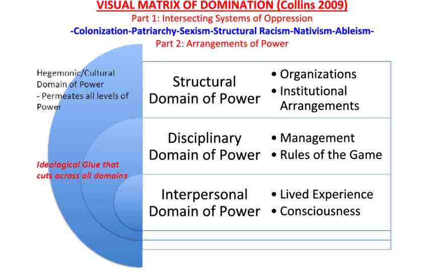
Structural inequality shows up in data collection in two ways. First, specific bodies are overcounted in a data collection process. Overcounting typically relates to the surveillance practiced by those in power on those with less power. For example, the Boston Police released data about their stop-and-frisk programme in 2015. The data show that police disproportionately patrol Black, immigrant and Latinx neighbourhoods and disproportionately stop young Black men. In cases like this of overcounting, it is important to be tuned into which groups hold power and which groups are likely to be targeted for surveillance. A data journalist’s role is to recognize and quantify the disparity, as well as name the structural forces at work—in this case, racism.
The second way that structural inequality shows up in data collection is undercounting or not counting at all. For example, why is the most compre- hensive database on feminicides (gender-based killings) in Mexico being collected by a woman who goes by the pseudonym of Princesa?3
Despite the fact that women’s deaths in Ciudad Juárez and around the country continue to rise, despite the establishment of a special commission on femicide in 2006, despite a 2009 ruling against the Mexican state by the Inter-American Human Rights Court, the state does not comprehensively track femicides. Undercounting is the case with many issues that relate to women and people of colour in which counting institutions systematically neglect to account for harms that they themselves are responsible for. Which is to say—the collection environment is compromised. In cases of undercounting, data journalists can do exactly what Princesa has done: Count it yourself, to the best of your abilities. Typically, this involves a combination of crowdsourcing, story collection and statistical inference. In the US context, other examples of undercounting include police killings and maternal mortality, both of which have been taken up as data collection projects by journalists.
Data Context
While the open data movement and the proliferation of APIs would seem to be a good thing for data journalists, data acquired “in the wild” comes with its own set of concerns, particularly when it comes to human and social phenomena. The feminist philosopher Donna Haraway says that all knowledge is “situated,” meaning that it is always situated in a social, cultural, historical and material context. Untangling and investigating how it is that data sets are products of those contexts can help us understand the ways in which power and privilege may be obscuring the truth.
For example, students in my data visualization class wanted to do their final project about sexual assault on college campuses.4 Colleges and universities in the United States are required to report sexual assault and other campus crimes annually per the Clery Act, so there appeared to be a comprehensive national database on the matter. But the Clery data troubled the students—Williams College, for example, had extremely high numbers in comparison to other urban colleges. What the students found by investigating context and interrogating how the collection environment was structured is that the numbers told a story that was likely the opposite of the truth. Sexual assault is a stigmatized issue and survivors often fear victim-blaming and retaliation and do not come forward. So the colleges that were reporting high numbers were places that had devoted more resources to creating an environment in which survivors would feel safe to report. Conversely, those with low numbers of sexual assault had a hostile climate that did not support survivors to break their silence.
Here, there is a pitfall and an opportunity. The pitfall is that journalists take numbers downloaded from the web at face value without understanding the nuances of the collection environment, including power differentials, social stigma and cultural norms around being made visible to institutions (e.g., groups like women, immigrants and people of colour generally feel less confidence in counting institutions, with extremely good reason). The opportunity is that there are many more data context stories to be told. Rather than always using numbers to look forward to new analyses, data journalists can use the numbers to interrogate the collection environment, point out flawed practices and power imbalances, and shift counting practices so that institutions are accounting for what truly matters.
Data Communication
Contemporary Western thinking about data has evolved from a “master stereotype” where what is perceived as rational and objective is valued more than that which is perceived as emotional and subjective. (Think about which sex is identified as “rational” and which as “emotional.”) The master stereotype would say that emotions cloud judgement and distance amplifies objectivity. But a feminist perspective challenges everything about that master stereotype. Emotions don’t cloud judgement—they produce curiosity, engagement and incentive to learn more. Patricia Hill Collins (2000, p. 266), for example, describes an ideal knowledge situation as one in which “neither ethics nor emotions are subordinated to reason.”
What does this mean for data communication? While prior practices in data visualization favoured minimalist charts and graphics as being more rational, both researchers and journalists are learning that leveraging visualization’s unique properties as a form of creative rhetoric yields more memorable, shareable graphics. Take, for example, the “Monstrous Costs” chart created by Nigel Holmes in 1984 to depict the rising costs of political campaigns. Previously derided as an instance of “junk charts,” researchers have now proven what most of us know intuitively: Some readers like monsters more than boring bar charts (Bateman et al., 2010).
As with every other communications medium, leveraging emotion in data comes with ethical responsibilities. Researchers have also recently demonstrated the importance of the title of a visualization in how people interpret the chart (Borkin et al., 2016). Typical titling practices tend towards the “rational,” which is to say that they depict the data as neutral and objective—something like “Reports of Sexual Assault on College Campuses 2012–2014.” But there are many cases—again, usually having to do with women and other marginalized groups—in which a neutral title actually does harm to the group depicted by the data.
In the case of sexual assault, for example, a neutral title implicitly communicates that the data that we have is true and complete, while we actually know that to be quite false. In other cases, a neutral title like “Mentally Ill Women Killed in Encounters with Police 2012–2014” opens the door to the perpetuation of harmful stereotypes, precisely because it is not naming the structural forces at work, including ableism and sexism, that make mentally ill women disproportionately victims of police violence in the United States.

Conclusion
Taking a feminist approach to data journalism means tuning in to the ways in which existing institutions and practices favour a status quo in which elite men are on top and others placed at various intersections in Collins’ matrix of domination. Patriarchy, white supremacy and settler colonialism are structural forces, thus they lend themselves particularly well to systemic data-driven investigation and visualization. We need to question enough of the received wisdom in data journalism to ensure that we are not inadvertently perpetuating that status quo and, at the same time, use our tools to expose and dismantle injustice. Those who wish to go further in this direction may look to my book Data Feminism (2020), co-authored with Lauren F. Klein, which introduces in more detail how feminist concepts may be applied to data science and data communication.
Footnotes
1. Indeed, feminism that does not consider how other factors of identity intersect with gender should be qualified as “white feminism.” Intersectionality was first named by legal scholar Kimberlé Crenshaw and comes out of an intellectual legacy of Black feminists who asserted that gender inequality cannot be considered in isolation from race- and class-based inequality.
2. For example, see Kukutai and Walter’s chapter on Indigenous data sovereignty.
3. feminicidiosmx.crowdma...
4. The final story by Patrick Torphy, Michaele Gagnon and Jillian Meehan is published here: cleryactfallsshort.ata...
Works Cited
Bateman, S., Mandryk, R. L., Gutwin, C., Genest, A., McDine, D., & Brooks, C. (2010). Useful junk? The effects of visual embellishment on comprehension and memorability of charts. In Proceedings of the 28th International Conference on Human Factors in Computing Systems—CHI ’10 (pp. 2573–2582). dl.acm.org/doi/10.1145...
Borkin, M. A., Bylinskii, Z., Kim, N. W., Bainbridge, C. M., Yeh, C. S., Borkin, D., Pfister, H., & Oliva, A. (2016). Beyond memorability: Visualization recognition and recall. IEEE Transactions on Visualization and Computer Graphics, 22(1), 519–528. ieeexplore.ieee.org/do...
D’Ignazio, C., & Klein, L. F. (2020). Data feminism. MIT Press.
Hill Collins, P. (2000). Black feminist thought: Knowledge, consciousness and the poli- tics of empowerment. Routledge. www.hartford-hwp.com/ar...
Our Stories Come As Code

OpenDataCity was founded towards the end of 2010. There was pretty much nothing that you could call data journalism happening in Germany at this time.
Why did we do this? Many times we heard people working for newspapers and broadcasters say: “No, we are not ready to start a dedicated data journalism unit in our newsroom. But we would be happy to outsource this to someone else.”
As far as we know, we are the only company specialising exclusively in data journalism in Germany. There are currently three of us: two of us with a journalism background and one with a deep understanding of code and visualization. We work with a handful of freelance hackers, designers and journalists.
In the last twelve month we have undertaken four data journalism projects with newspapers, and have offered training and consultancy to media workers, scientists and journalism schools. The first app we did was an interactive tool on airport noise around the the newly built airport in Berlin with TAZ. Our next notable project was an application about data retention of the mobile phone usage of a German politician with ZEIT Online. For this we won a Grimme Online Award and a Lead Award in Germany, and an Online Journalism Award by the Online Journalism Association in the US. At the time of writing, we are have several projects in the pipeline — ranging from simpler interactive infographics up to designing and developing a kind of data journalism middleware
Of course, winning prizes helps to built a reputation. But when we talk to the publishers, who have to approve the projects, our argument for investing into data journalism is not about winning prizes. Rather it is about getting attention over a longer period in a sustainable way. Building things for their long term impact, not for the scoop, which often is forgotten after a few days.
Here are three arguments which we have used to encourage publishers to undertake longer term projects:
- Data projects don’t date
-
Depending on their design, new material can be added to data journalism apps. And they are not just for the users, but can be used internally for reporting and analysis. If you’re worried that this means that your competitors will also benefit from your investment, you could keep some features or some data for internal use only.
- You can build on your past work
-
When undertaking a data project, you will often create bits of code which can be reused or updated. The next project might take half the time, because you know much better what to do (and what not to) and you have bits and pieces you can build on.
- Data journalism pays for itself
-
Data driven projects are cheaper than traditional marketing campaigns. Online news outlets will often invest in things like Search Engine Optimization (SEO) and Search Engine Marketing (SEM). A executed data project will normally generate a lot of clicks and buzz, and may go viral. Publishers will typically pay less for this then trying to generate the same attention by clicks and links through SEM.
Our work is not very different from other new media agencies: providing applications or services for news outlets. But maybe we differ in that we think of ourselves first and foremost as journalists. In our eyes the products we deliver are articles or stories, albeit ones which are provided not in words and pictures, audio or video, but in code. When we are talking about data journalism we have to talk about technology, software, devices and how to tell a story with them.
To give an example: we just finished working on an application, which pulls in realtime data via a scraper from the German railway website. Thus enabling us to develop an interactive Train Monitor for Süddeutsche Zeitung, showing the delays of long-distance trains in realtime. The application data is updated every minute or so and we are providing an API for it, too. We started doing this several months ago, and have so far collected a huge dataset which grows every hour. By now it amounts to hundreds of thousands of rows of data. The project enables the user to explore this realtime data, and to do research in the archive of previous months. In the end the story we are telling will be significantly defined by the individual action of the users.
In traditional journalism, due to the linear character of written or broadcasted media, we have to think about a beginning, the end, the story arc and the length and angle of our piece. With data journalism things are different. There is a beginning, yes. People come to the website and get a first impression of the interface. But then they are on their own. Maybe they stay for a minute — or half an hour.
Our job as data journalists is to provide the framework or environment for this. As well as the coding and data management bits, we have to thing of clever ways to design experiences. The User Experience (UX) derives mostly from the (Graphical) User Interface (GUI). In the end this is the part which will make or break a project. You could have the best code working in the background handling an exiting dataset. But if the front-end sucks, nobody will care about it.
There is still a lot to learn about and to experiment with. But luckily there is the games industry, which has been innovating with respect to digital narratives, ecosystems and interfaces for several decades now. So when developing data journalism applications we should watch closely how game design works and how stories are told in games. Why are casual games like Tetris such fun? And what makes the open worlds of sandbox games like Grand Theft Auto or Skyrim rock?
We think that data journalism is here to stay. In a few years data journalism workflows will be quite naturally be embedded in newsrooms, because news websites will have to change. The amount of data that is publicly available will keep on increasing. But luckily new technologies will continue to enable us to find new ways of telling stories. Some of the stories will be driven by data and many of applications and services will have a journalistic character. The interesting question is: which strategy are newsrooms going to develop to foster this process? Are they going to build up teams of data journalists integrated into their newsroom? Will there be R&D departments, a bit like in-house startups? Or will parts of the work be outsourced to specialized companies? We are still right at the beginning and only time will tell.
6. Putting the Human Crowd to Work
Written by Mathew Ingram
The idea of crowdsourcing verification of news events and emergencies isn’t really that all new - the crowd, broadly speaking, has always been a crucial part of how the news is formed and understood. It’s just that social technologies like Twitter, Facebook, YouTube and others allow us to engage in this kind of shared decision-making process on a much larger and broader scale, and they allow us to do it faster as well. That’s not to say there aren’t flaws in this process, because there are - but on balance, we are probably better off than we were before.
Just think about how facts and news events were established in the not-so-distant past: When a war broke out, a hurricane struck or a bomb exploded somewhere, there were often few journalists around, unless they just happened to be there. Sources on the ground would relay the information to a news outlet and then the painstaking process of verifying those events would begin, based on interviews with witnesses, phone calls and so on.
Now, we are just as likely to find out about news - particularly sudden, unpredictable events like earthquakes or mass shootings - on Twitter, within minutes or even seconds of their happening. And instead of just one or two observations from bystanders and witnesses, we can get hundreds or even thousands of them. Some of them are likely to be erroneous, as we saw with the bombings in Boston and other similar emergency situations, but overall a fairly accurate picture can be gradually assembled of what occurred and how - and it happens faster than ever.
Here’s a look at some of the best practices for the emerging practice of crowdsourced verification, as practiced by innovators like Andy Carvin, a former senior strategist at NPR, and others.
Identify, verify and connect with sources
In most cases, the starting point is to identify sources that are reliable and then curate, aggregate and verify the information that comes from them. Andy Carvin of NPR built what he called a “Twitter newsroom” of sources in the Middle East during the Arab Spring by starting with people he knew personally and using them as a means to discover other sources.
“What I find really important is paying attention to who these folks on Twitter, and occasionally on Facebook, are talking to,” Carvin told Craig Silverman in a 2011 interview. “For both Tunisia and Egypt I already had about half a dozen sources in each country that I had known.”
Carvin also asked people he knew to recommend or verify other sources he was finding through Twitter searches and by following specific hashtags. Over time, he generated lists of hundreds of valuable sources.
Those lists in turn became the engine that allowed Carvin to effectively live-tweet a series of wars - receiving information, republishing it, asking his followers and sources for help verifying it, then posting the results. In many ways it was a chaotic process, but ultimately successful.
To manage these many contacts, he built Twitter Lists to organize them into logical groups based on topics or geographical location. Today, this kind of thing could also be accomplished with Facebook Interest Lists, Google Plus circles and other tools, or by subscribing to YouTube accounts and building playlists, among other options.
Carvin also took another critical step, which was to contact many of his sources directly or meet them in person to develop a relationship. Many people saw only what he was doing with his Twitter account, but he also spent a lot of time communicating with people via Skype, email and other means to confirm their identities.
As detailed in previous chapters, these kinds of sources and the information they provide must be verified. After using Twitter advanced search, YouTube search and other means to find people and organizations on the ground or with access to relevant information, you need to work to contact them and verify where their information is coming from.
The more you interact with your sources, and learn about them, the more you’ll see their strengths, weaknesses, biases and other factors that need to be weighed when considering the information they share. As your list of sources grows, you also begin to see patterns in what they see and share and report, and this provides the raw material needed to triangulate and determine exactly what is and isn’t happening.
“Some of these folks are working to actively overthrow their local regimes,” Carvin said of the sources he connected with during the Arab Spring. “I just have to be aware of that at all times. Perhaps the answer is transparency, so a certain person might be giving me good information but I should never forget that they are part of the opposition.”
Engaging your sources

At one point during the violence in Libya in 2011, Carvin was contacted by someone on Twit- ter who asked him - and by extension his Twitter newsroom - to help verify if Israeli weapons were being used in Libya. He detailed how it played out in a Storify:

From that tip, Carvin enlisted his followers by asking them to help confirm whether the mortar in question was Israeli. They responded with a mix of useful tips and views, along with some dead ends. He eventually received specific information that helped answer the question:
In the end, the weapon wasn’t Israeli; it was Indian. And it wasn’t a mortar at all. Carvin said one way he knew he was onto the correct information was that he heard it from multiple sources whom he knew were unconnected to each other.
“In the case of what we did for the so-called Israeli weapons, I had a lot of people that were giving me essentially the same information and they didn’t really know each other so I captured some of that in my Storify,” he said.
It’s important to remember that one thing that helped Andy Carvin do what he did was his reaching out to others for help in a very human and approachable way. He also treated those he came into contact with as colleagues, rather than as just sources he could command to do his bidding. Journalists and others who simply hand out orders get very little in response, but treating people like human beings makes all the difference.
New York Times war reporter C.J. Chivers has taken advantage of a similar approach as Carvin’s to verify bombs used in various conflicts, and says the process arrives at the truth far quicker than would have been possible in the past.
With any given piece of information, there are likely to be knowledgeable people in your social circle (or in their broader web of connections) who know the truth about that incident or event. You just have to find them.
Said Chivers: “The proof in this case was made possible with the help of the standard tools of covering war from the field: the willingness to work in the field, a digital camera, a satellite Internet connection, a laptop, an e-mail account and a body of sources with specialized knowledge. But there was a twist that is a reflection of new ways that war can be examined in real time - by using social media tools to form brief crowds of experts on a social media site.”
Chivers has also celebrated the achievements of a British “citizen journalist”d by the name of Brown Moses. He’s a blogger whose real name is Eliot Higgins, and who has developed an expertise in chemical weapons by watching and verifying thousands of YouTube videos of the conflict in Syria.
Higgins had no training in either journalism or military hardware, but has become a key link in the chain of verification, to the point where professional journalists like Chivers and even aid agencies have come to rely on him. New, critical sources like Moses can emerge in certain situations, either because they work at an issue over time or because they are in the right (or wrong) place at the right time.
Responsible crowdsourcing
One thing that anyone, journalist or not, trying to collect and verify information during a crisis has to remember is that you are also a source of information for others, when using social media like Twitter or Facebook or Google Plus. That means any unsubstantiated information you post while you are doing your verification work could contribute to the confusion around the event.
Keep that in mind while tweeting or posting details and looking for corroboration. The best approach is to be as open as possible about what is happening, and to repeatedly remind your followers or social connections that you are looking for help, not just circulating unconfirmed information.
In order to prevent confusion, be as clear as possible about what you know and what you don’t know, and which pieces of information you need help confirming. With some kinds of sensitive or inflammatory details, you are better off trying to confirm through offline methods first before taking to social media or online methods. You may be careful to flag the information as “unconfirmed” or a rumor, but these flags can often disappear once they start to spread. We all have a responsibility to consider that reality, and to not add to confusion or misinformation in a crisis situation.
The power of the crowd
Algorithms and automated searches can generate a huge amount of content when it comes to breaking news events, as detailed in the next chapter. But arguably only human beings can sift through and make sense of that amount of content in an efficient way, in real time. As examples like Andy Carvin and Brown Moses have shown, by far the best tool for doing this is a network of trusted sources who are focused either on a specific topic area, or in a specific physical location - a network that you can use as your own crowdsourced newsroom.
Entering into this kind of relationship with sources shouldn’t be taken lightly, however. It’s not just a tool or a process that allows you to do your job or complete a task faster and more efficiently - it’s a collaborative effort, and you should be prepared to give as much as you receive
5. Verifying and questioning images
Written by: Hannah Guy , Farida Vis , Simon Faulkner
Farida Vis is director of the Visual Social Media Lab and a professor of digital media at Manchester Metropolitan University. Her academic and data journalism work focuses on the spread of misinformation online. She has served on the World Economic Forum’s Global Agenda Council on Social Media (2013-2016) and the Global Future Council for Information and Entertainment (2016-2019) and is a director at Open Data Manchester.
Simon Faulkner is a lecturer in art history and visual culture at Manchester Metropolitan University. His research is concerned with the political uses and meanings of images, with a particular focus on activism and protest movements. He is also the co-director of the Visual Social Media Lab and has a strong interest in the development of methods relevant to the analysis of images circulated on social media.
Hannah Guy is a Ph.D. student at Manchester Metropolitan University, examining the role of images in the spread of disinformation on social media. She is a member of the Visual Social Media Lab, where her current projects explore images shared on Twitter during the emergence of the Black Lives Matter movement, and Visual Media Literacy to combat misinformation in the context of Canadian schools.
Communication on social media is now overwhelmingly visual. Photos and video are persuasive, compelling and easier to create than ever, and can trigger powerful emotional responses. As a result, they have become powerful vehicles of mis- and disinformation.
To date, the discussion of images within the context of mis- and disinformation has either focused on verification techniques or, more recently, been disproportionately focused on deepfake videos. Before considering deepfakes, as we do in the next chapter, it’s essential to understand the more common low-tech use of misleading photos and videos, especially those shown out of context.
Given the widespread use of visuals in attempts to influence and manipulate public discourse, journalists must be equipped with fundamental image verification knowledge and with the ability to critically question and assess images to understand how and why they are being deployed. This chapter focuses on developing this second set of skills, and uses a framework we developed at the Visual Social Media Lab.
Building on verification
In the Visual Social Media Lab, we focus on understanding the roles online images play within society. While we mainly focus on still images, this also encompasses a range of different types of images: photos, composite images, memes, graphic images and screenshots, to name a few. Tackling visual mis- and disinformation requires its own set of strategies. To date, image verification by journalists has focused on establishing if the image is what they think it is. In the original “Verification Handbook,” Trushar Barot outlined four core basic principles for image verification, which remain invaluable. The First Draft Visual Verification Guide is another useful resource that uses these principles by focusing on five questions for photos and videos:
- Are you looking at the original version?
- Do you know who captured the photo?
- Do you know where the photo was captured?
- Do you know when the photo was captured?
- Do you know why the photo was captured?
Standard tools that can help with investigating photos and video include InVID, Yandex Image Search, TinEye, Google Image Search and Forensically. These verification methods focus on the origin of the image.
While that method remains crucial, the strategies and techniques frequently used in mis- and disinformation, and in a range of forms of media manipulation, mean it is also important to consider how images are used and shared and by whom, and also what role journalists play in potentially further amplifying problematic images.
To go beyond standard forms of image verification, we have combined methods from art history with questions designed specifically for mis- and disinformation content. Our framework, “20 Questions for Interrogating Social Media Images,” designed collaboratively with First Draft and journalists, is an additional tool journalists can use when investigating images.
Interrogating social media images

As the title suggests, the framework consists of 20 questions that can be asked of any social media image (still image, video, gif, etc.), with an additional 14 questions aimed at digging deeper into different aspects of mis- and disinformation. The questions do not appear in a set order, but these five questions are useful to address first:
- What is it?
- What does it show?
- Who made it?
- What did it mean?
- What does it mean?
Questions 1 to 3 are similar to established approaches to verification and are concerned with establishing what kind of image it is (a photograph, video, etc.), what it depicts and who made it. However, questions 4 and 5 take us somewhere else. They introduce considerations of meaning that encompass what the image shows, but also cover any meanings produced by the use of the image, including through its misidentification. When thought about together, questions 4 and 5 also allow us to focus on the changing nature of the meaning of images and on the ways that meanings ascribed to images through reuse can be significant in themselves. This doesn’t simply concern what images are made to mean in a new context and how this misidentifies what they show, but also what the effects of such misidentifications are. This approach is no longer about verification, but more akin to the analysis of the meanings of images performed in disciplines such as art history and photo theory.
In the development and early deployment of this framework with journalists, we often heard that they had never thought about images in this much detail. Many said the framework helped them recognize that images are complex forms of communication, and that a clear method is required to question them and their meaning.
Most of the time, you will not need to answer all 20 questions in the framework to get a comprehensive understanding of what’s going on with an image. The questions are there to fall back on. In our own work, we found them particularly useful when dealing with complex high-profile news images and videos that have received significant media attention and scrutiny. To show what this looks like in practice, here are three case studies with high-profile examples from the U.K. and U.S.
Case Study 1: Breaking Point, June 2016

What is it?
The “Breaking Point” image was a poster used by the UK Independence Party (UKIP) as part of its campaign during the EU referendum of 2016. It used a photograph taken by the photojournalist Jeff Mitchell in October 2015, focused on the refugee crisis.
What does it show?
A large queue of Syrian and Afghan refugees being escorted by Slovenian police from the border between Croatia and Slovenia to the Brezice refugee camp. The poster used a cropped version and added the text “BREAKING POINT: The EU has failed us all” and “We must break free of the EU and take back control of our borders.” Because the refugees appear to move toward the viewer en masse, it has a strong visual impact.
Who made it?
The Edinburgh-based advertising firm Family Advertising Ltd., which was employed by UKIP for its Brexit campaign.
What did it mean?
UKIP did not try to misrepresent the content, but layered further meaning through adding slogans. Exploiting existing anti-immigrant and racist sentiment, this manipulation focused on generating further fear of immigration and refugees, on the basis of unsubstantiated claims and insinuations about EU border policy.
What does it mean?
In November 2019, in the run-up to the U.K. general election, the campaign organization Leave.EU also used a tightly cropped version of the photograph in an anti-immigration image uploaded to Twitter, making a clear reference back to UKIP’s 2016 poster.
What other questions are useful to ask?
Is the actor official or unofficial? The key actor in creating and distributing the image, UKIP, is an official political party and not the type of actor usually associated with mis- and disinformation.
Is it similar to or related to other images? Some likened the poster to Nazi propaganda; it resonates both with previous anti-migrant imagery and a longer history of U.K. political posters involving queues, including one used by UKIP in May 2016 focused on immigration from the EU.
3 key takeaways:
- Official political parties and politicians can be actors in the spread of misinformation.
- Misinformation does not necessarily involve fake images or even the misidentification of what they show. Sometimes images can be used to support a message that misrepresents a wider situation.
- Some misinformation requires more than verification. There is a need to critically examine how real images are used to manipulate, and what such images do and mean.
Examples of media coverage of this case:
Nigel Farage's anti-migrant poster reported to police — The Guardian
Brexit: UKIP's 'unethical' anti-immigration poster — Al-Jazeera
Nigel Farage accused of deploying Nazi-style propaganda as Remain crash poster unveiling with rival vans — The Independent
Case Study 2: The Westminster Bridge Photograph, March 2017

What is it?
A tweet from a Twitter account that appears to be operated by a white Texan man, which received significant media attention. The account was later revealed to be operated by Russia’s Internet Research Agency, and was used to spread mis- and disinformation. The tweet shared a photograph from the aftermath of the Westminster Bridge terrorist attack in London (March 22, 2017).
What does it show?
A Muslim woman walking past a group of people and a person on the ground, who has been injured in the terrorist attack. The text has Islamophobic connotations, claiming that the woman is purposefully ignoring the injured person, as well as an overtly anti-Islamic hashtag.
Who made it?
The Internet Research Agency worker who operated the @SouthLoneStar Twitter account, though it was not known to be an IRA account at the time of the tweet. The picture itself was taken by press photographer Jamie Lorriman.
What did it mean?
In March 2017, this appeared to be a tweet from a right-wing Texan Twitter user, who interpreted the photograph as showing that the Muslim woman did not care about the injured person. It suggested this example spoke to a larger truth about Muslims.
What does it mean?
As of today, the tweet is evidence of the Internet Research Agency’s purposefully spreading Islamophobic disinformation in the aftermath of a terrorist attack.
What other questions are useful to ask?
What responses did it receive? This tweet received a significant response from the mainstream media. Dozens of U.K. newspapers reported on it, in some cases more than once. While most of these articles condemned @SouthLoneStar, it also moved the tweet from the confines of social media and opened it to a mainstream audience. After the image spread, the woman in the photo spoke out to say that she was distraught over the attacks at the time, and that “not only have I been devastated by witnessing the aftermath of a shocking and numbing terror attack, I’ve also had to deal with the shock of finding my picture plastered all over social media by those who could not look beyond my attire, who draw conclusions based on hate and xenophobia.”
Is it similar to or related to other images? The image that was circulated most of the time was one of seven images taken of the woman. Others showed clearly that she was distraught, something few publications picked up on.
How widely and for how long was it circulated? The added mainstream media attention means the tweet spread widely. However, within a few days, circulation slowed significantly. It was recirculated in November 2017, when it was discovered that @SouthLoneStar was operated by the Internet Research Agency. This later November circulation was notably smaller in the mainstream media compared to March.
3 key takeaways:
- Visual disinformation is not always wholly false and can involve elements that are based on truth. The photograph is real, but its context has been manipulated and falsified, and it relies on the reader/viewer not knowing what the woman was actually thinking in that moment.
- Journalists should think carefully about bringing further attention to such emotionally fueled, controversial and potentially harmful disinformation by reporting on it, even with positive intentions.
- More attention could be paid toward correcting disinformation-based news stories and ensuring that the true picture of events is most prominent. The limited coverage in November means that some readers may not have found out that the tweet was Russian disinformation.
Examples of media coverage of this case:
People are making alarming assumptions about this photo of ‘woman in headscarf walking by dying man’ — Mirror
British MP calls on Twitter to release Russian ‘troll factory’ tweets — The Guardian
Case Study 3: Lincoln Memorial confrontation, January 2019

What is it?
A video of a group of students from Covington Catholic High School who took part in the pro-life March for Life and an indigenous man, Nathan Phillips, who was accompanying other Native Americans in the Indigenous Peoples March.
What does it show?
A confrontation between one of the students from Covington Catholic High School and Phillips. The two demonstrations converged on the Plaza, with a large group of Covington students wearing MAGA hats supposedly facing off against Phillips. This paints a picture of a lone Native American facing off against a barrage of young alt-right bullies.
Who made it?
The video was first uploaded to Instagram by an Indigenous Peoples March participant. This received nearly 200,000 views. Hours later, the video was uploaded to Twitter, receiving 2.5 million views before being deleted by the original account. The video was then reposted across different social media sites, subsequently grabbing mainstream media attention. Within 24 hours, several articles about the video had been published.
What did it mean?
The initial narrative that spread online presented the video as a straightforward faceoff between Philips and the students in which the students were seen as intentionally taunting and ganging up on Phillips.
What does it mean?
A much longer video of the encounter, which emerged several days after the first video, painted a more complex picture. The memorial was also occupied by a group of Black Hebrew Israelites, who were taunting passersby, including the Covington students and Indigenous Peoples March participants. This led to a heated standoff between all three groups, with Phillips allegedly trying to pacify. This is where the first video begins.
What other questions are useful to ask?
What contextual information do you need to know?
Without the longer video, and the knowledge that the Black Hebrew Israelites were present and actively fueling conflict, all context is lost. While the students were recorded saying racist things, what led to this was more complicated than simply alt-right teens ganging up on an elderly indigenous man.
Where was it shared on social media?
While the video was originally shared on Instagram by someone who attended the Indigenous Peoples March, this received limited attention. It was subsequently reuploaded to Twitter and YouTube by other users, which greatly amplified awareness and secured mainstream media attention. Therefore, the attention came from these reuploads and not from the original video on Instagram.
3 key takeaways:
- When such emotion-ladened visuals spread so quickly online, it is easy to lose context and allow the superficial, reactionary online narrative to take control.
- In retrospect, some journalists argued that the initial articles served to fuel the controversy and further push the incorrect narrative. This suggests that, without proper investigation, mainstream media can unintentionally continue the spread of misinformation.
- The speed with which the video spread online meant a lot of mainstream media outlets “fell for” the narrative pushed on social media and did not investigate further. Many news sites were forced to retract or correct their articles once true events emerged, and some were sued.
Examples of media coverage of this case:
Native American Vietnam Vet Mocked And Surrounded By MAGA Hat-Wearing Teens — UNILAD
Outcry after Kentucky students in Maga hats mock Native American veteran — The Guardian
Fuller video casts new light on Covington Catholic students' encounter with Native American elder — USA Today
Conclusion
So much of what is shared on social media is visual. Journalists must be equipped with the ability to critically question and assess images to unearth important content and intent. The speed with which visual misinformation can spread further highlights the need for journalists to proceed with caution and make sure to investigate image-related stories fully before publishing. The “20 Questions for Interrogating Social Media Images” is an additional tool journalists can use when investigating images, especially when the story is primarily centered on something visual. Not every question in the framework is relevant to every image, but the five basic questions are a strong starting point and build on basic verification skills, with the aim of developing more accurate and more in-depth reporting.
APPENDIX
Below is the full list of questions from the 20 Questions framework, including 14 prompt questions specifically focused on mis- and disinformation. As we have noted in the chapter, there are five questions that are useful to address first (in bold). The prompt questions relate to either the agent, the message or the interpreter of the mis- and disinformation:
- AGENT (A) - Who created and distributed the image, and what was their motivation?
- MESSAGE (M) - What format did the image take, and what are its characteristics?
- INTERPRETER (I) - How was the message interpreted, and what actions were taken?

The framework takes inspiration from:
- The "Interrogating the work of Art" diagram (Figure 2.4, p.39), in (2014, 5th Edition), Pointon, M. History of Art: A Student’s Handbook, London and New York: Routledge.
- "Questions to ask about each element of an example of information disorder" (Figure 7, p. 28), in (2017), Wardle, C. and Derakshan, H., Information Disorder: Toward an interdisciplinary framework for research and policy making. Council of Europe report DGI(2017)09.
Infrastructuring Collaborations Around the Panama and Paradise Papers
Written by Emilia Díaz-Struck, Cécile Schilis-Gallego and Pierre Romera
Abstract
How the International Consortium of Investigative Journalists (ICIJ) makes digging through gigantic amounts of documents and data more efficient.
Keywords: data leaks, text extraction, radical sharing, cross-border investigation, data journalism, International Consortium of Investigative Journalists
The International Consortium of Investigative Journalists (ICIJ) is an international network of journalists launched in 1997. Journalists who are part of ICIJ’s large collaborations have diverse backgrounds and profiles. There is a wide range of reporters with different skills, some with strong data and coding skills, others with the best sources and shoe-leather reporting skills. All are united by an interest in journalism, collaboration and data.
When ICIJ’s director Gerard Ryle received a hard drive in Australia with corporate data related to tax havens and people around the world as a result of his three-year investigation of Australia’s Firepower scandal, he couldn’t at that time imagine how it would transform the story of collaborations in journalism. He arrived at ICIJ in 2011 with more than 260 gigabytes of data about offshore entities, about 2.5 million files, which ended up turning in a collaboration of more than 86 journalists from 46 countries known as Offshore Leaks (published in 2013).1
After Offshore Leaks came more investigative projects with large data sets and millions of files, more ad hoc developed technologies to explore them, and more networks of journalists to report on them. For instance, we recently shared with partners a new trove of 1.2 million leaked documents from the same law firm at the heart of the Panama Papers investigation, Mossack Fonseca.2 This was on top of the 11.5 million Panama Papers files brought to us in 2015 by the German newspaper Süddeutsche Zeitung and 13.6 million documents that were the basis of the subsequent Paradise Papers probe.3
If a single journalist were to spend one minute reading each file in the Paradise Papers, it would take 26 years to go through all of them. Obviously, that’s not realistic. So, we asked ourselves, how can we find a shortcut? How can we make research more efficient and less time consuming? How can technology help us find new leads in this gigantic trove of documents and support our collaborative model?
In this chapter we show how we deal with large collections of leaked documents not just through sophisticated “big data” technologies, but rather through an ad hoc analytical apparatus comprising of: (a) international collaborative networks, (b) secure communication practices and infrastructures, (c) processes and pipelines for creating structured data from unstructured documents, and (d) graph databases and exploratory visualizations to explore connections together.
Engaging With Partners
The ICIJ’s model is to investigate the global tax system with a worldwide network of journalists. We rally leading reporters on five continents to improve research efforts and connect the data dots from one country to another.4
Tax stories are like puzzles with missing pieces: A reporter in Estonia might understand one part of the story; a Brazilian reporter might come across another part. Bring them together, and you get a fuller picture. ICIJ’s job is both to connect those reporters and to ensure that they share everything they find in the data.
We call our philosophy “radical sharing”: ICIJ’s partners communicate their findings as they are working, not only with their immediate co-workers, but also with journalists halfway around the world.
In order to promote collaboration, ICIJ provides a communication platform called the Global I-Hub, building on open-source software components.5 It has been described by its users as a “private Facebook” and allows the same kind of direct sharing of information that occurs in a physical newsroom.
Reporters join groups that follow specific subjects—countries, sports, arts, litigation or any other topic of interest. Within those groups, they can post about even more specific topics, such as a politician they found in the data or a specific transaction they are looking into. This is where most of the discussion happens, where journalists cross-check information and share notes and interesting documents.
It took ICIJ several projects to get reporters comfortable with the I-Hub. To ease their way onto the platform and deal with technical issues, ICIJ’s regional coordinators offer support. This is key to ensuring reporters meet the required security standard.
Encrypting Everything
When you conduct an investigation involving 396 journalists, you have to be realistic about security: Every individual is a potential target for attackers, and the risk of breach is high. To mitigate this risk, ICIJ uses multiple defences.
It is mandatory when joining an ICIJ investigation to setup a PGP key pair to encrypt emails. The principle of PGP is simple.6 You own two keys: One is public and is communicated to any potential correspondent who can use it to send you encrypted emails. The second key is private and should never leave your computer. The private key serves only one purpose: To decrypt emails encrypted with your public key.
Think of PGP as a safe box where people can store messages for you. Only you have the key to open it and read the messages. Like every security measure, PGP has vulnerabilities. For instance, it could easily be compromised if spyware is running on your computer, recording words as you type or sniffing every file on your disk. This highlights the importance of accumulating several layers of security. If one of those layers breaks, we hope the other layers will narrow the impact of a breach.
To ensure the identity of its partners, ICIJ implements two-factor authentication on all of its platforms. This technique is very popular with major websites, including Google, Twitter and Facebook. It provides the user with a second, temporary code required to log in, which is usually generated on a different device (e.g., your phone) and disappears quickly. On some sensitive platforms, we even add third-factor authentication: The client certificate. Basically, it is a small file reporters store and configure on their laptops. Our network system will deny access to any device that doesn’t have this certificate. Another noteworthy mechanism ICIJ uses to improve its security is Ciphermail. This software runs between our platforms and users’ mailboxes, to ensure that any email reporters receive from ICIJ is encrypted.
Dealing With Unstructured Data
The Paradise Papers was a cache of 13.6 million documents. One of the main challenges in exploring them came from the fact that the leak came from a variety of sources: Appleby, Asiaciti Trust and 19 national corporate registries.7 When you have a closer look at the documents, you quickly notice their diverse content and character and the large presence of “non- machine readable” formats, such as emails, PDFs and Word documents, which cannot directly be parsed by software for analyzing structured data. These documents reflect the internal activities of the two offshore law firms ICIJ investigated.
ICIJ’s engineers put together a complex and powerful framework to allow reporters to search these documents. Using the expandable capacity of cloud computing, the documents were stored on an encrypted disk that was submitted to a “data extraction pipeline,” a series of software systems that takes text from documents and converts it into data that our search engine can use.
Most of the files were PDFs, images, emails, invoices and suchlike which were not easily searchable. Using technologies like Apache Tika (to extract metadata and text), Apache Solr (to build search engines) or Tesseract (to turn images into text), the team built an open-source software called Extract with the single mission of turning these documents into searchable, machine-readable content.8 This tool was particularly helpful in distributing this now-accessible data on up to 30 servers.
ICIJ also built a user interface to allow journalists to explore the refined information extracted from “unstructured data”: The hodgepodge of different types of documents from various sources. Once again the choice was to reuse an open-source tool named Blacklight which offers a user-friendly web portal where journalists can look into documents and use advanced search queries (like approximate string matching) to identify leads hidden in the leak.9

Using Graphs to Find Hidden Gems Together
ICIJ published its first edition of the Offshore Leaks database in 2013 using graph databases to allow readers to explore connections between officers and more than 100,000 offshore entities. This has grown to over 785,000 offshore entities at the time of writing, including from subsequent leaks such as the Panama and Paradise Papers.
ICIJ first attempted to use graph databases with Swiss Leaks, but it was with the Panama Papers that graph databases started playing a key role during the research and reporting phase. To explore 11.5 million complex financial and legal records amounting to 2.6 terabytes of data was not an easy task. By using network graph tools such as Neo4J and Linkurious, ICIJ was able to allow partners to quickly explore connections between people and offshore entities.
Our data and research teams extracted information from the files, structured it and made data searchable through Linkurious. Suddenly partners were able to query for the names of people of public interest and discover, for instance, that the then Icelandic prime minister, Sigmundur Gunnlaugsson, was a shareholder of a company named Wintris. The visualization with this finding could be saved and shared with other colleagues working on the investigation in other parts of the world.
One could then jump back into the document platform Blacklight to do more advanced searches and explore records related to Wintris. Blacklight later evolved to the Knowledge Center in the Paradise Papers. Key findings that came through exploring data and documents were shared through the Global I-Hub, as well as findings that came from the shoe-leather reporting.
Graph databases and technologies powered ICIJ’s radical sharing model. “Like magic!” several partners said. No coding skills were needed to explore the data. ICIJ did training on the use of our technologies for research and security, and suddenly more than 380 journalists were mining millions of documents, using graph databases, doing advanced searches (including batch searches), and sharing not only findings and results of the reporting, but also useful tips on query strategies.
For the Panama Papers project, graph databases and other ad hoc technologies like the Knowledge Center and the Global I-Hub connected journalists from nearly 80 countries working in 25 languages through a global virtual newsroom.
The fact that structured data connected to the large number of documents was shared with the audience through the Offshore Leaks database has allowed new journalists to explore new leads and work on new collaborations like the Alma Mater and West Africa Leaks projects. It has also allowed citizens and public institutions to use them independently for their own research and investigations. As of April 2019, governments around the world have recouped more than USD1.2 billion in fines and back taxes as a result of the Panama Papers investigation.
Since the first publication of the Panama Papers back in 2016, the groups of journalists using ICIJ technologies has grown and more than 500 have been able to explore financial leaked documents and continue to publish public interest stories linked to these millions of records.
Footnotes
1. www.icij.org/investiga...
2. www.icij.org/investiga...
3. www.icij.org/investiga...
4. www.icij.org/journalist...
5. See https://www.icij.org/blog/2014/07/icij-build-global-i-hub-new-secure-collaboration-tool/. For a different perspective on journalistic platforms such as the I-Hub, see Cândea’s chapter in this book.
6. www.gnupg.org/
7. www.icij.org/investigations/paradise-papers/...,
www.icij.org/investigations/%20paradise...,
www.icij.org/investigations/paradise-papers/roll-roll-asiacitis-u-s-marketing-tour/
8.https://github.com/ICIJ/extrac...
9. https://github.com/projectblac...,
https://en.wikipedia.org/wiki/...
6.1. Tripped Up by Arabic Grammar
Written by Tom Trewinnard and M.SH.
Shabab Souria (Syria Youth) is a network of Syrians inside and outside Syria who collaborate using online tools to verify and publish on-the-ground updates from across Syria. Working as a closely administered open Facebook group, members crowdsource verification of the hundreds of reports that emerge daily from official media and social networks. They then publish the verified content in Arabic and English using Checkdesk.
Checkdesk is an open source platform for newsrooms and media collectives to verify and publish digital media reports on breaking news events. Checkdesk was launched by Meedan in July 2013 with six leading Middle East media partners, all of whom have conducted a series of workshops within their communities to train citizens in media literacy, source awareness and digital verification techniques.
A good example of how Shabab Souria works to debunk and verify reports occurred on December 5, 2013. A person going by the name Sham al-Orouba posted a YouTube video to the Shabab Souria Facebook group. In the video, a bearded man was identified as a member of the Seyoof al Islam Jihadist group claimed the group had carried out attacks against the Christian community of Saydna and the Deir Cherubim monastery.
His narrative of the alleged attacks was interspersed with unclear clips apparently showing damage to a hilltop building and a statue of Jesus Christ. In submitting the video to the Shabab Souria network, Al-Orouba asked a simple question: “Confirmed or denied?”
Member Mohammad Fakhr Eddin (all members of the group use pseudonyms to protect themselves) responded quickly, noting that subtle grammatical inaccuracies in the presenter’s Arabic are atypical of a Jihadist. Based on their experience reviewing hundreds of videos and other con- tent from Jihadists, the group often finds these people to be eloquent in their use of language.
Another user, Abu Nabil, agreed that the presenter’s weak Arabic betrayed him, signaling he is not who he says he is. Nabil added that Islam prohibits attacks on churches, and another user agreed that Jihadist groups generally don’t target churches in Syria unless there is a strong military reason to do so.
Shamya Sy and Mohammad Fakhr Eddin added another important piece of information about the source: they said the person who uploaded the video to YouTube - Nizar Nayouf - is notoriously unreliable. Their evidence was that Nayouf has in the past been responsible for pro-Assad regime propaganda aimed at defaming anti-Assad groups.
“This couldn’t be confirmed from any other sources,” wrote Abu Karam al-Faraty in a post to the group.
No one could locate other reports, images or footage of Seyoof al Islam, or other Jihadist groups, attacking Deir Cherubim or the Christian community in Saydna.
Over time, members of a group such as Shabab Souria develop their own areas of expertise, as well as a reputation for their work. Sy and al-Faraty are known sleuths: Through their record of diligently checking media, they have established themselves as credible experts on matters of verification. The fact that they were the ones to identify the source of the video as being unreliable added extra weight to the information.
In the end, it took less than three hours for the group to determine the video was fake. By bringing together the expertise of various group members, they were able to check to see if other, corroborating footage or reports existed; examine and question the credibility of the source; and analyze the content of the video and identify aspects that questioned its authenticity.
Seven different users collaborated to debunk the video. If taken at face value, the fake Jihadist report could have contributed to a continuing propaganda war that influences not only civilians inside Syria, but also policymakers abroad.
As one user in the thread wrote, “The problem is we know that this is false, but the Western media will pick this up as real.”
This all took place at a time when an international military intervention seemed a real possibility. It was therefore essential that the video be debunked - and also publicly noted as such via the social media that have become so crucial in the flow of information in the Syria conflict.
Text as Data: Finding Stories in Text Collections
Written by Barbara Maseda
Abstract
How to find data stories in collections of documents and speeches.
Keywords: data journalism, unstructured data, text analysis, text mining, computational journalism
Looking at data journalism production over the past few years, you may notice that stories based on unstructured data (e.g., text) are much less common than their structured data counterparts.
For instance, an analysis of more than 200 nominations to the Data Journalism Awards from 2012 to 2016 revealed that the works competing relied predominantly on geographical and financial data, followed by other frequent types of sources, such as sensor, socio-demographic and personal data, metadata and polls (Loosen et al., 2020); in other words, mostly structured data.1
But as newsrooms have been having to deal with ever-increasing amounts of social media posts, speeches, emails and lengthy official reports, computational approaches to processing and analyzing these sources are becoming more relevant. You may have come across stories produced this way: Think of the statistical summaries of President Trump’s tweets; or visualizations of the main topics addressed in public communications or during debates by the presidential candidates in the US elections.
Treating text as data is no mean feat. Documents tend to have the most varied formats, layouts and contents, which complicates one-size-fits-all solutions or attempts to replicate one investigation with a different set of documents. Data cleaning, preparation and analysis may vary considerably from one document collection to another, and some steps will require further human review before we can make newsworthy assertions or present findings in a way that reveals something meaningful not just for researchers but also for broader publics.2
In this chapter I examine five ways in which journalists can use text analysis to tell stories, illustrated with reference to a variety of exemplary data journalism projects.
Length: How Much They Wrote or Spoke
Counting sentences or words is the simplest quantitative approach to documents. Computationally speaking, this is a task that has been around for a long time, and can be easily performed by most word processors. If you are a student or a reporter who ever had to submit an assignment with a word limit, you will not need any special data training to understand this.
The problem with word counts lies in interpreting the results against a meaningful baseline. Such measures are not as widely known as temperature or speed, and therefore deriving meaning from the fact that a speech is 2,000 words long may not be as straightforward. In practice, many times the only option is to create those baselines or references for comparison ourselves, which may translate into further work.
In some cases, it is possible to find context in the history of the event or speaker you are examining. For instance, for its coverage of the US president’s annual State of the Union address in 2016, Vox calculated the length of the whole collection of historic speeches to determine that “President Obama was among the wordiest State of the Union speakers ever” (Chang, 2016).
In events involving more than one speaker, it is possible to explore how much, and when, each person talks in relation to the total number of words spoken. For an example, see Figure 17.1.
Mentions: Who Said What, When and How Many Times
Counting the number of times a term or concept was used in speech or writing is another simple task that provides useful statistical overviews of our data. To do this, it is important to make sure that we choose to count the most appropriate elements.
Depending on the questions that you are looking to ask from the data, you may count the repetitions of each word, or of a series of words sharing a common root by using normalization operations such as “stemming” or “lemmatization.”3 Another approach is to focus on the most relevant terms in each document using a weighted measure called “term frequency/inverse document frequency” (TF-IDF).4 The following are a few examples.
Frequent terms and topics. For its coverage of the London mayoral elections in 2016, The Guardian analyzed the number of times the two candidates had addressed various campaign issues (e.g., crime, pollution, housing and transport) in the UK Parliament in the six years preceding the race (Barr, 2016). Topics to be analyzed can be decided beforehand, as in this case, and explored through a number of relevant keywords (or groups of keywords linked to a topic) in comparable or analogous text collections. Search terms can also be analogous and not necessarily the same. Take, for instance, FiveThirtyEight’s analysis of how the same media outlets covered three different hurricanes in 2017 (Harvey, Irma and Maria) (Mehta, 2017). Another approach is to simply look at the most common words in a text as a topic detection strategy.
Speech over time. Looking at speech over time can also be a way to point to topics that have never been mentioned before, or that have not been addressed in a long time. This was, for instance, the approach chosen by The Washington Post for its coverage of the State of the Union address in 2018, in a piece that highlighted which president had used which words first in the history of this event (Fischer-Baum et al., 2018). The fact that readers can very quickly learn that Trump was the first president ever to mention Walmart (in 2017) or freeloading (in 2019), without having to read hundreds of pages of speeches, shows how effective text-data summaries and visualizations can be.
Omissions. A low number or absence of mentions may be newsworthy as well. These omissions can be analyzed over time, but also based on the expectation that a person or organization mentions something in a given context. During the 2016 presidential campaign in the United States, FiveThirtyEight reported that candidate Donald Trump had stopped tweeting about polls when they found a comparatively low number of mentions of keywords related to polling in his posts (Mehta & Enten, 2016). Such omissions can be detected by monitoring the same speaker over time, like in this case, in which, months before, FiveThirtyEight had discovered that Trump was tweeting a lot about polls that were making him look like a winner (Bialik & Enten, 2015). This is also a good example of how news reports based on text analysis can later become the context for a follow-up piece, as a way to address the above-mentioned problem of contextualizing text statistics. The absence of a topic can be also measured based on the expectation that a person or organization mentions it in a given context.
People, places, nouns, verbs. Natural language processing (NLP) tools enable the extraction of proper names, names of places, companies and other elements (through a task called named entity recognition or NER), as well as the identification of nouns, adjectives and other types of words (through a task called part of speech tagging or POS). In The Washington Post piece mentioned earlier, the visualization includes filters to focus on companies, religious terms and verbs.
Comparisons
Determining how similar two or more documents are can be the starting point for different kinds of stories. We can use approximate sentence matching (also known as “fuzzy matching”) to expose plagiarism, reveal like-mindedness of public figures or describe how a piece of legislation has changed. In 2012, ProPublica did this to track changes in emails sent to voters by campaigns, showing successive versions of the same messages side by side and visualizing deletions, insertions and unchanged text (Larson & Shaw, 2012).
Classification
Text can be classified into categories according to certain predefined features, using machine learning algorithms. In general, the process consists of training a model to classify entries based on a given feature, and then using it to categorize new data.
For instance, in 2015, the Los Angeles Times analyzed more than 400,000 police reports obtained through a public records request, and revealed that an estimated 14,000 serious assaults had been misclassified by the Los Angeles Police Department as minor offenses (Poston et al., 2015). Instead of using MySQL to search for keywords (e.g., stab, knife) that would point to violent offenses—as they had done in a previous investigation covering a smaller amount of data—the reporters used machine learning classifiers (SVM and MaxEnt) to re-classify and review eight years’ worth of data in half the time needed for the first investigation, which covered one year only (Poston & Rubin, 2014). This example shows how machine learning approaches can also save time and multiply our investigative power.
Sentiment
Many journalists would recognize the value of classifying sentences or documents as positive, negative or neutral (other grading scales are possible), according to the attitude of the speaker towards the subject in question. Applications may include analyzing a topic, a hashtag or posts by a Twitter user to evaluate the sentiment around an issue, and doing similar computations on press releases or users’ comments on a website. Take, for example, The Economist’s comparison of the tone of party convention speeches by Hillary Clinton and Donald Trump (“How Clinton’s and Trump’s Convention Speeches,” 2016). Analyzing the polarity of the words used by these and previous candidates, they were able to show that Trump had “delivered the most negative speech in recent memory,” and Clinton “one of the most level-headed speeches of the past four decades.”

Becoming a “Text-Miner” Journalist
Using off-the-shelf text mining software is a good starting point to get familiar with basic text analysis operations and their outcomes (word counts, entity extraction, connections between documents, etc.). Platforms designed for journalists—such as DocumentCloud and Overview—include some of these features.5 The Google Cloud Natural Language API can handle various tasks, including sentiment analysis, entity analysis, content classification and syntax analysis.6
For those interested in learning more about text mining, there are free and open-source tools that allow for more personalized analyses, including resources in Python (NLTK, spaCy, gensim, textblob, scikit-learn) and R (tm, tidytext and much more), which may be more convenient for journalists already familiar with these languages. A good command of regular expres- sions and the tools and techniques needed to collect texts (web scraping, API querying, FOIA requests) and process them (optical character recognition or OCR, file format conversion, etc.) are must-haves as well.7 And, of course, it can be useful to obtain a grasp of the theory and principles behind text data work, including information retrieval, relevant models and algorithms, and text data visualization.8
Conclusions
The possibility of revealing new insights to audiences with and about documents, and of multiplying our capacities to analyze long texts that would take months or years to read, are good reasons to give serious consideration to the development of text analysis as a useful tool in journalism. There are still many challenges involved, from ambiguity issues—computers may have a harder time “understanding” the context of language than we humans do—to language-specific problems that can be easier to solve in English than in German, or that have simply been addressed more in some languages than in others. Our work as journalists can contribute to advancing this field. Many reporting projects could be thought of as ways of expanding the number of available annotated data sets and identifying challenges, and as new application ideas. Judging by the growing number of recent stories produced with this approach, text mining appears to be a promising and exciting area of growth in data journalism.
Footnotes
1. For more on the Data Journalism Awards, see Loosen’s chapter in this volume.
2. Data cleaning and preparation may include one or more of the following steps: Breaking down the text into units or tokens (a process known as “tokenization”); “grouping” words that share a common family or root (stemming and lemmatization); eliminating superfluous elements, such as stopwords and punctuation; changing the case of the text; choosing to focus on the words and ignore their order (a model called “bag of words”); and transforming the text into a vector representation.
3. Stemming and lemmatization are operations to reduce derived words to their root form, so that occurrences of “reporter,” “reporting” and “reported” can all be counted under the umbrella of “report.” They differ in the way that the algorithm determines the root of the word. Unlike lemattizers, stemmers strip words of their suffixes without taking into consideration what part of speech they are.
4. TF-IDF is a measure used by algorithms to understand the weight of a word in a collection. TF-IDF Weight (w, d) = TermFreq(w, d) · log (N / DocFreq(w)), where TermFreq(w, d) is the frequency of the word in the document (d), N is the number of all documents and DocFreq(w) is the number of documents containing the word w (Feldman and Sanger, 2007).
5. www.documentcloud.org, www.overviewdocs.com
6. cloud.google.com/natural-language
8. For further reading, see Speech and Language Processing by Daniel Jurafsky and James H. Martin; The Text Mining Handbook by Ronen Feldman and James Sanger. There are also numerous free online courses on these and associated topics.
Works cited
Barr, C. (2016, May 3). London mayor: Commons speeches reveal candidates’ differing issue focus. The Guardian. www.theguardian.com/politics/datablog/2016/may/03/london-mayor-data-indicates-candidates-differing-focus-on-issues
Bialik, C., & Enten, H. (2015, December 15). Shocker: Trump tweets the polls that make him look most like a winner. FiveThirtyEight. fivethirtyeight.com/features/shocker-trump-tweets-the-polls-that-make-him-look-most-like-a-winner/
Chang, A. (2016, January 11). President Obama is among the wordiest State of the Union speakers ever. Vox. www.vox.com/2016/1/11/10736570/obama-wordy-state-of-the-union
Feldman, R., & Sanger, J. (2007). The text mining handbook: Advanced approaches in analyzing unstructured data. Cambridge University Press.
Fischer-Baum, R., Mellnik, T., & Schaul, K. (2018, January 30). The words Trump used in his State of the Union that had never been used before. The Washington Post. www.washingtonpost.com/graphics/politics/presidential-lexicon-state-of-the-union/
How Clinton’s and Trump’s convention speeches compared to those of their predecessors. (2016, July 29). The Economist. www.economist.com/graphic-detail/2016/07/29/how-clintons-and-trumps-convention-speeches-compared-to-those-of-their-predecessors
Jurafsky, D., & Martin, J. H. (2008). Speech and Language Processing. Pearson.
Larson, J., & Shaw, A. (2012, July 17). Message machine: Reverse engineering the 2012 campaign. ProPublica. projects.propublica.org/emails/
Loosen, W., Reimer, J., & De Silva-Schmidt, F. (2020). Data-driven reporting: An on-going (r)evolution? An analysis of projects nominated for the Data Journalism Awards 2013–2016. Journalism, 21(9), 1246–1263. https://doi. org/10.1177/1464884917735691
Mehta, D. (2017, September 28). The media really has neglected Puerto Rico. FiveThirtyEight. fivethirtyeight.com/features/the-media-really-has-neglected-puerto-rico/
Mehta, D., & Enten, Ha. (2016, August 19). Trump isn’t tweeting about the polls anymore. FiveThirtyEight. fivethirtyeight.com/features/trump-isnt-tweeting-about-the-polls-anymore/
Poston, B., & Rubin, J. (2014, August 10). Times Investigation: LAPD misclassified nearly 1,200 violent crimes as minor offenses. Los Angeles Times. www.latimes.com/local/la-me-crimestats-lapd-20140810-story.html
Poston, B., Rubin, J., & Pesce, A. (2015, October 15). LAPD underreported serious assaults, skewing crime stats for 8 years. Los Angeles Times. www.latimes.com/local/cityhall/la-me-crime-stats-20151015-story.html
Business Models for Data Journalism
Written by: Mirko Lorenz
Amidst all the interest and hope regarding data-driven journalism there is one question that newsrooms are always curious about: what are the business models?
While we must be careful about making predictions, a look at the recent history and current state of the media industry can help to give us some insight. Today there are many news organizations who have gained by adopting new approaches.
Terms like “data journalism”, and the newest buzzword “data science” may sound like they describe something new, but this is not strictly true. Instead these new labels are just ways of characterizing a shift that has been gaining strength over decades.
Many journalists seem to be unaware of the size of the revenue that is already generated through data collection, data analytics and visualization. This is the business of information refinement. With data tools and technologies it is increasingly possible to shed a light on highly complex issues, be this international finance, debt, demography, education and so on. The term “business intelligence” describes a variety of IT concepts aiming to provide a clear view on what is happening in commercial corporations. The big and profitable companies of our time, including McDonalds, Zara or H&M rely on constant data tracking to turn out a profit. And it works pretty well for them.
What is changing right now is that the tools developed for this space are now becoming available for other domains, including the media. And there are journalists who get it. Take Tableau, a company providing a suite of visualization tools. Or the “Big Data” movement, where technology companies use (often open source) software packages to dig through piles of data, extracting insights in milliseconds.
These technologies can now be applied to journalism. Teams at The Guardian and The New York Times are constantly pushing the boundaries in this emerging field. And what we are currently seeing is just the tip of the iceberg.
But how does this generate money for journalism? The big, worldwide market that is currently opening up is all about transformation of publicly available data into something our that we can process: making data visible and making it human. We want to be able to relate to the big numbers we hear every day in the news — what the millions and billions mean for each of us.
There are a number of very profitable data-driven media companies, who have simply applied this principle earlier than others. They enjoy healthy growth rates and sometimes impressive profits. One example: Bloomberg. The company operates about 300,000 terminals and delivers financial data to it’s users. If you are in the money business this is a power tool. Each terminal comes with a color coded keyboard and up to 30,000 options to look up, compare, analyze and help you to decide what to do next. This core business generates an estimated US $6.3 billion per year, at least this what a piece by the New York Times estimated in 2008. As a result, Bloomberg has been hiring journalists left, right and centre, they bought the venerable but loss-making “Business Week” and so on.
Another example is the Canadian media conglomerate today known as Thomson Reuters. They started with one newspaper, bought up a number of well known titles in the UK, and then decided two decades ago to leave the newspaper business. Instead they have grown based on information services, aiming to provide a deeper perspective for clients in a number of industries. If you worry about how to make money with specialized information, the advice would be to just read about the company’s history in Wikipedia.
And look at the Economist. The magazine has built an excellent, influential brand on its media side. At the same time the “Economist Intelligence Unit” is now more like a consultancy, reporting about relevant trends and forecasts for almost any country in the world. They are employing hundreds of journalists and claim to serve about 1.5 million customers worldwide.
And there are many niche data-driven services that could serve as inspiration: eMarketer in the US, providing comparisons, charts and advice for anybody interested in internet marketing. Stiftung Warentest in Germany, an institution looking into the quality of products and services. Statista, again from Germany, a start-up helping to visualize publicly available information.
Around the world there is currently a wave of startups in this sector, naturally covering a wide range of areas — for example, Timetric, which aims to “reinvent business research”, OpenCorporates, Kasabi, Infochimps and Data Market. Many of these are arguably experiments, but together they can be taken as an important sign of change.
Then there is the public media, which in terms of data-driven journalism is a sleeping giant. In Germany €7.2 billion per year are flowing into this sector. Journalism is a special product: if done well it is not just about making money, but serves an important role in society. Once it is clear that data journalism can provide better, more reliable insights more easily, some of this money could be used for new jobs in newsrooms.
With data journalism, it is not just about being first but about being a trusted source of information. In this multi-channel world, attention can be generated in abundance, but trust is an increasingly scarce resource. Data journalists can help to collate, synthesize and present diverse and often difficult sources of information in a way which gives their audience real insights into complex issues. Rather than just recycling press releases and retelling stories they’ve heard elsewhere, data journalists can give readers a clear, comprehensible and preferably customizable perspective with interactive graphics and direct access to primary sources. Not trivial, but certainly valuable.
So what is the best approach for aspiring data journalists to explore this field and convince management to support innovative projects?
The first step should be to look for immediate opportunities close to home: low hanging fruit. For example, you might already have collections of structured texts and data that you could use. A prime example of this is the “Homicide database” of the Los Angeles Times. Here data and visualizations are the core, not an afterthought. The editors collect all the crimes they find and only then write articles based on this. Over time, such collections are becoming better, deeper and more valuable.
This might not work the first time. But it will over time. One very hopeful indicator here is that the Texas Tribune and ProPublica, which are both arguably post-print media companies, reported that funding for their non-profit journalism organizations exceeded their goals much earlier than planned.
Becoming proficient in all things data — whether as a generalist or as a specialist focused on one aspect of the data food chain — provides a valuable perspective for people who believe in journalism. One well-known publisher in Germany recently said in an interview: “There is this new group who call themselves data journalists. And they are not willing to work for peanuts anymore”.
6. How to think about deepfakes and emerging manipulation technologies
Written by: Sam Gregory
Sam Gregory is program director of WITNESS (www.witness.org), which helps people use video and technology to fight for human rights. An award-winning technologist and advocate, he is an expert on new forms of AI-driven mis/disinformation and leads work around emerging opportunities and threats to activism and journalism. He is also co-chair of the Partnership on AI’s expert group focused on AI and the media.
In the summer of 2018, Professor Siwei Lyi, a leading deepfakes researcher based at the University of Albany, released a paper showing that deepfake video personas did not blink at the same rate as real people. This claim was soon covered by Fast Company, New Scientist, Gizmodo, CBS News and others, causing many people to come away thinking they now had a robust way of spotting a deepfake.
Yet within weeks of publishing his paper, the researcher received videos showing a deepfake persona blinking like a human. As of today, this tip isn’t useful or accurate. It was the Achilles’ heel of a deepfakes creation algorithm at that moment, based on the training data being used. But within months it was no longer valid.
This illustrates a key truth about deepfake detection and verification: Technical approaches are useful until synthetic media techniques inevitably adapt to them. A perfect deepfake detection system will never exist.
So how should journalists verify deepfakes, and other forms of synthetic media?
The first step is to understand the cat-and-mouse nature of this work and be aware of how the technology is evolving. Second, journalists need to learn and apply fundamental verification techniques and tools to investigate whether a piece of content has been maliciously manipulated or synthetically generated. The approaches to image and video verification detailed in the first Verification Handbook, as well as in First Draft’s resources related to visual verification all apply. Finally, journalists need to understand we’re already in an environment where falsely claiming that something is a deepfake is increasingly common. That means the ability to verify a photo or video’s authenticity is just as important as being able to prove it has been manipulated.
This chapter expands on these core approaches to verifying deepfakes, but it’s first important to have a basic understanding of deepfakes and synthetic media.
What are deepfakes and synthetic media?
Deepfakes are new forms of audiovisual manipulation that allow people to create realistic simulations of someone’s face, voice or actions. They enable people to make it seem like someone said or did something they didn’t. They are getting easier to make, requiring fewer source images to build them, and they are increasingly being commercialized. Currently, deepfakes overwhelmingly impact women because they’re used to create nonconsensual sexual images and videos with a specific person’s face. But there are fears deepfakes will have a broader impact across society and in newsgathering and verification processes.
Deepfakes are just one development within a family of artificial intelligence (AI)-enabled techniques for synthetic media generation. This set of tools and techniques enable the creation of realistic representations of people doing or saying things they never did, realistic creation of people/objects that never existed, or of events that never happened.
Synthetic media technology currently enables these forms of manipulation:
- Add and remove objects within a video.
- Alter background conditions in a video. For example, changing the weather to make a video shot in summer appear as if it was shot in winter.
- Simulate and control a realistic video representation of the lips, facial expressions or body movement of a specific individual. Although the deepfakes discussion generally focuses on faces, similar techniques are being applied to full-body movement, or specific parts of the face.
- Generate a realistic simulation of a specific person’s voice.
- Modify an existing voice with a “voice skin” of a different gender, or of a specific person.
- Create a realistic but totally fake photo of a person who does not exist. The same technique can also be applied less problematically to create fake hamburgers, cats, etc.
- Transfer a realistic face from one person to another, aka a deepfake.
These techniques primarily but not exclusively rely on a form of artificial intelligence known as deep learning and what are called Generative Adversarial Networks, or GANs.
To generate an item of synthetic media content, you begin by collecting images or source video of the person or item you want to fake. A GAN develops the fake — be it video simulations of a real person or face-swaps — by using two networks. One network generates plausible re-creations of the source imagery, while the second network works to detect these forgeries. This detection data is fed back to the network engaged in the creation of forgeries, enabling it to improve.
As of late 2019, many of these techniques — particularly the creation of deepfakes — continue to require significant computational power, an understanding of how to tune your model, and often significant postproduction CGI to improve the final result. However, even with current limitations, humans are already being tricked by simulated media. As an example, research from the FaceForensics++ project showed that people could not reliably detect current forms of lip movement modification, which are used to match someone’s mouth to a new audio track. This means humans are not inherently equipped to detect synthetic media manipulation.
It should also be noted that audio synthesis is advancing faster than expected and becoming commercially available. For example, the Google Cloud Text-to-Speech API enables you to take a piece of text and convert it to audio with a realistic sounding human voice. Recent research has also focused on the possibility of doing text to combined video/audio edits in an interview video.
On top of that, all the technical and commercialization trends indicate that it will continue to become easier and less expensive to make convincing synthetic media. For example, the below image shows how quickly face generation technology has advanced.
Because of the cat-and-mouse nature of these networks, they improve over time as data on successful forgeries and successful detection is fed through them. This requires strong caution about the effectiveness of detection methods.
The current deepfake and synthetic media landscape
Deepfakes and synthetic media are — as yet — not widespread outside of nonconsensual sexual imagery. DeepTrace Lab’s report on their prevalence as of September 2019 indicates that over 95% of the deepfakes were of this type, either involving celebrities, porn actresses or ordinary people. Additionally, people have started to challenge real content, dismissing it as a deepfake.
In workshops led by WITNESS, we reviewed potential threat vectors with a range of civil society participants, including grassroots media, professional journalists and fact-checkers, as well as misinformation and disinformation researchers and OSINT specialists. They prioritized areas where new forms of manipulation might expand existing threats, introduce new threats, alter existing threats or reinforce other threats. They identified threats to journalists, fact-checkers and open-source investigators, and potential attacks on their processes. They also highlighted the challenges around “it’s a deepfake” as a rhetorical cousin to “it’s fake news.”
In all contexts, they noted the importance of viewing deepfakes in the context of existing approaches to fact-checking and verification. Deepfakes and synthetic media will be integrated into existing conspiracy and disinformation campaigns, drawing on evolving tactics (and responses) in that area, they said.
Here are some specific threats they highlighted:
- Journalists and civic activists will have their reputation and credibility attacked, building on existing forms of online harassment and violence that predominantly target women and minorities. A number of attacks using modified videos have already been made on women journalists, as in the case of the prominent Indian journalist Rana Ayyub.
- Public figures will face nonconsensual sexual imagery and gender-based violence as well as other uses of so-called credible doppelgangers. Local politicians may be particularly vulnerable, as they have plentiful images but less of the institutional structure around them as national-level politicians to help defend against a synthetic media attack. They also often are key sources in news coverage that bubbles up from local to national.
- Appropriation of known brands with falsified in-video editing or other ways in which a news, government, corporate or NGO brand might be falsely attached to a piece of content.
- Attempts to plant manipulated user generated content into the news cycle, combined with other techniques such as source-hacking or sharing manipulated content to journalists at key moments. Typically, the goal is to get journalists to propagate the content.
- Utilization of newsgathering/reporting process weaknesses such as single-camera remote broadcasts (as noted by the Reuters UGC team) and gathering material in hard-to-verify contexts such as war zones or other places.
- As deepfakes become more common and easier to make at volume, they will contribute to a fire hose of falsehood that floods media verification and fact-checking agencies with content they have to verify or debunk. This could overload and distract them.
- Pressure will be on newsgathering and verification organizations to prove that something is true, as well as to prove that something is not falsified. Those in power will have the opportunity to use plausible deniability on content by declaring it is deepfaked.
A starting point for verifying deepfakes
Given the nature of both media forensics and emerging deepfakes technologies, we have to accept that the absence of evidence that something was tampered with will not be conclusive proof that media has not been tampered with.
Journalists and investigators need to establish a mentality of measured skepticism around photos, videos and audio. They must assume that these forms of media will be challenged more frequently as knowledge and fear of deepfakes increases. It’s also essential to develop a strong familiarity with media forensics tools.
With that in mind, an approach to analyzing and verifying deepfakes and synthetic media manipulation should include:
- Reviewing the content for synthetic media-derived telltale glitches or distortions.
- Applying existing video verification and forensics approaches.
- Utilizing emerging new AI-based approaches and emerging forensics approaches when available.
Reviewing for telltale glitches or distortions
This is the least robust approach to identifying deepfakes and other synthetic media modifications, particularly given the evolving nature of the technology. That said, poorly made deepfakes or synthetic content may present some evidence of visible errors. Things to look in a deepfake for include:
- Potential distortions at the forehead/hairline or as a face moves beyond a fixed field of motion.
- Lack of detail on the teeth.
- Excessively smooth skin.
- Absence of blinking.
- A static speaker without any real movement of head or range of expression.
- Glitches when a person turns from facing forward to sideways.
Some of these glitches are currently more likely to be visible on a frame-by-frame analysis, so extracting a series of frames to review individually can help. This will not be the case for the frontal-lateral movement glitches — these are best seen in a sequence, so you should do both approaches.
Applying existing video verification approaches
As with other forms of media manipulation and shallowfakes, such as miscontextualized or edited videos, you should ground your approach in well-established verification practices. Existing OSINT verification practices are still relevant, and a good starting point is the chapters and case studies in the first Handbook dedicated to image and video verification. Since most deepfakes or modifications are currently not fully synthesized but instead rely on making changes in a source video, you can use frames from a video to look for other versions using a reverse image search. You can also check the video to see if the landscape and landmarks are consistent with images of the same location in Google Street View.
Similarly, approaches based on understanding how content is shared, by who, and how may reveal information about whether to trust an image or video. The fundamentals of determining source, date, time and motivation of a piece of content are essential to determining whether it documents a real event or person. (For a basic grounding in this approach, see this First Draft guide.) And as always, it’s essential to contact the person or people featured in the video to seek comment, and to see if they can provide concrete information to support or refute its authenticity.
New tools are also being developed by government, academics, platforms and journalistic innovation labs to assist with the detection of synthetic media, and to broaden the availability of media forensics tools. In most cases, these tools should be viewed as signals to complement your best-practices based verification approach.
Tools such as InVID and Forensically help with both provenance-based image verification and limited forensic analysis.
Free tools in this area of work include:
- FotoForensics: An image forensics tool that includes the capacity for Error Level Analysis to see where elements of an image might have been added.
- Forensically: A suite of tools for detecting cloning, error level analysis, image metadata and a number of other functions.
- InVID: A web browser extension that enables you to fragment videos into frames, perform reverse image search across multiple search engines, enhance and explore frames and images through a magnifying lens, and to apply forensic filters on still images.
- Reveal Image Verification Assistant: A tool with a range of image tampering detection algorithms, plus metadata analysis, GPS geolocation, EXIF thumbnail extraction and integration with reverse image search via Google.
- Ghiro: An open-source online digital forensics tool.
Note that almost all of these are designed for verification of images, not video. This is a weakness in the forensics space, so for videos it is still necessary to extract single images for analysis, which InVID can help with. These tools will be most effective with higher resolution, noncompressed videos that, for example, had video objects removed or added within them. Their utility will decrease the more a video has been compressed, resaved or shared across different social media and video-sharing platforms.
If you’re looking for emerging forensics tools to deal with existing visual forensics issues as well as eventually deepfakes, one option is to look at the tools being shared by academics. One of the leading research centers at the University of Napoli provides online access to their code for, among other areas, detecting camera fingerprints (Noiseprint), detecting image splices (Splicebuster) and detecting copy-move and removal detection in video.
As synthetic media advances, new forms of manual and automatic forensics will be refined and integrated into existing verification tools utilized by journalists and fact-finders as well as potentially into platform-based approaches. It’s important that journalists work to stay up to date on the available tools, while also not becoming overly reliant upon them.
Emerging AI-based and media forensics approaches
As of early 2020, there are no tested, commercially available GAN-based detection tools. But we should anticipate that some will enter the market for journalists either as plug-ins or as tools on platforms in 2020. For a current survey of the state-of-field in media forensics including these tools you should read Luisa Verdoliva’s ‘Media Forensics and Deepfakes: An overview’.
These tools will generally rely on having training data (examples) of GAN-based synthetic media, and then being able to use this to detect other examples that are produced using the same or similar techniques. As an example, forensics programs such as FaceForensics++ generate fakes using existing consumer deepfakes tools and then use these large volumes of fake images as training data for algorithms to perform fake detection. This means they might not be effective on the latest forgery methods and techniques.
These tools will be much more suited to detection of GAN-generated media than current forensic techniques. They will also supplement new forms of media forensics tools that deal better with advances in synthesis. However, they will not be foolproof, given the adversarial nature of how synthetic media evolves. A key takeaway is that any indication of synthesis should be double-checked and corroborated with other verification approaches.
Deepfakes and synthetic media are evolving fast and the technologies are becoming more broadly available, commercialized and easy to use. They need less source content to create a forgery than you might expect. While new technologies for detection emerge and are integrated into platforms and into journalist/OSINT-facing tools, the best way to approach verification is using existing approaches to image/video, and complement these with forensics tools that can detect image manipulation. Trusting the human eye is not a robust strategy!
Coding With Data in the Newsroom
Written by Basile Simon
Abstract
Newsrooms present unique challenges to coders and technically minded journalists.
Keywords: computational journalism, programming, data cleaning, databases, data visualization
Inevitably, there is a point where data and code become companions. Perhaps when Google Sheets slows down because of the size of a data set; when Excel formulas become too arcane; or when it becomes impossible to make sense of data spanning hundreds of rows.
Coding can make working with data simpler, more elegant, less repetitive and more repeatable. This does not mean that spreadsheets will be abandoned, but rather that they will become one of a number of different tools available. Data journalists often jump between techniques as they need: Scraping data with Python notebooks, throwing the result into a spreadsheet, copying it for cleaning in Refine before pasting it back again.
Different people learn different programming languages and techniques; different newsrooms produce their work in different languages, too. This partly comes from an organization’s choice of “stack,” the set of technologies used internally (for example, most of the data, visual and development work at The Times (of London) is done in R, JavaScript and React; across the pond ProPublica uses Ruby for many of their web apps).
While it is often individuals who choose their tools, the practices and cultures of news organizations can heavily influence these choices. For example, the BBC is progressively moving its data visualization workflow to R (BBC Data Journalism team, n.d.); The Economist shifted their world-famous Big Mac Index from Excel-based calculations to R and a React/d3.js dashboard (González et al., 2018). There are many options and no single right answer.
The good news for those getting started is that many core concepts apply to all programming languages. Once you understand how to store data points in a list (as you would in a spreadsheet row or column) and how to do various operations in Python, doing the same thing in JavaScript, R or Ruby is a matter of learning the syntax.
For the purpose of this chapter, we can think of data journalism’s coding as being subdivided into three core areas: Data work—including scraping, cleaning, statistics (work you could do in a spreadsheet); back-end work—the esoteric world of databases, servers and APIs; and front-end work—most of what happens in a web browser, including interactive data visualizations. This chapter explores how these different areas of work are shaped by several constraints that data journalists routinely face in working with code in newsrooms, including (a) time to learn, (b) working with deadlines and (c) reviewing code.
Time to Learn
One of the wonderful traits uniting the data journalism community is the appetite to learn. Whether you are a reporter keen on learning the ropes, a student looking to get a job in this field or an accomplished practitioner, there is plenty to learn. As technology evolves very quickly, and as some tools fall out of fashion while others are created by talented and generous people, there are always new things that can be done and learned. There are often successive iterations and versions of tools for a given task (e.g., libraries for obtaining data from Twitter’s API). Tools often build and expand on previous ones (e.g., extensions and add-ons for the D3 data visualization library). Coding in data journalism is thus an ongoing learning process which takes time and energy, on top of an initial investment of time to learn.
One issue that comes with learning programming is the initial reduction of speed and efficiency that comes with grappling with unfamiliar concepts. Programming boot camps can get you up to speed in a matter of weeks, although they can be expensive. Workshops at conferences are shorter and cheaper, and for beginners as well as advanced users. Having time to learn on the clock, as part of your job, is a necessity. There you will face real, practical problems, and if you are lucky you will have colleagues to help you. There’s a knack to finding solutions to your problems: Querying for issues over and over again and developing a certain “nose” for what is causing an issue.
This investment in time and resources can pay off: Coding opens many new possibilities and provides many rewards. One issue that remains at all stages of experience is that it is hard to estimate how long a task will take. This is challenging, because newsroom work is made of deadlines.
Working With Deadlines
Delivering on time is an essential part of the job in journalism. Coding, as reporting, can be unpredictable. Regardless of your level of experience, delays can—and invariably will—happen.
One challenge for beginners is slowdown caused by learning a new way to work. When setting off to do something new, particularly in the beginning of your learning, make sure you leave yourself enough time to be able to complete your task with a tool you know (e.g., spreadsheet). If you are just starting to learn and strapped for time, you may want to use a familiar tool and wait until you have more time to experiment.
When working on larger projects, tech companies use various methods to break projects down into tasks and sub-tasks (until the tasks are small and self-contained enough to estimate how long they will take) as well as to list and prioritize tasks by importance.
Data journalists can draw on such methods. For example, in one The Sunday Times project on the proportion of reported crimes that UK police forces are able to solve, we prioritized displaying numbers for the reader’s local area. Once this was done and there was a bit of extra time, we did the next item on the list: A visualization comparing the reader’s local area to other areas, and the national average. The project could have gone to publication at any point thanks to how we worked. This iterative workflow helps you focus and manage expectations at the same time.
Reviewing Code
Newsrooms often have systems in place to maintain standards for many of their products. A reporter doesn’t simply file their story and it gets printed: It is scrutinized by both editors and sub-editors.
Software developers have their own systems to ensure quality and to avoid introducing bugs to collaborative projects. This includes “code reviews,” where one programmer submits their work and others test and review it, as well as automated code tests.
According to the 2017 Global Data Journalism Survey, 40% of responding data teams were three to five members and 30% of them counted only one or two members (Heravi, 2017). These small numbers pose a challenge to internal code reviewing practices. Data journalists thus often work on their own, either because they don’t have colleagues, because there are no peer-review systems in place or because there is no one with the right skills to review their code.
Internal quality control mechanisms can therefore become a luxury that only a few data journalism teams can afford (there are no sub-editors for coding!). The cost of not having such control is potential bugs left unattended, sub-optimal performance or, worst of all, errors left unseen. These resource constraints are perhaps partly why it is important for many journalists to look for input on and collaboration around their work outside their organizations, for example from online coding communities.1
Footnotes
1. More on data journalism code transparency and reviewing practices can be found in chapters in this volume by Leon and Mazotte.
Works Cited
BBC Data Journalism team. (n.d.). What software do the BBC use [Interview].warwick.ac.uk/fac/cross_fac/cim/news/bbc-r-interview/
González, M., Hensleigh, E., McLean, M., Segger, M., & Selby-Boothroyd, A. (2018, August 6). How we made the new Big Mac Index interactive. Source. https:// source.opennews.org/articles/how-we-made-new-big-mac-index-interactive/ Heravi, B. (2017, August 1). State of data journalism globally: First insights into the global data journalism survey. Medium. medium.com/ucd-ischool/state-of-data-journalism-globally-cb2f4696ad3d
Accounting for Methods in Data Journalism: Spreadsheets, Scripts and Programming Notebooks
Written by: Sam Leon
Abstract
This chapter explores the ways in which literate programming environments such as Jupyter Notebooks can help make data journalism reproducible, less error prone and more collaborative.
Keywords: Jupyter Notebooks, reproducibility, programming, Python, literate programming environments, data journalism
With the rise of data journalism, ideas around what can be considered a journalistic source are changing. Sources come in many forms now: Public data sets, leaked troves of emails, scanned documents, satellite imagery and sensor data. In tandem with this, new methods for finding stories in these sources are emerging. Machine learning, text analysis and some of the other techniques explored elsewhere in this book are increasingly being deployed in the service of the scoop.
But data, despite its aura of hard objective truth, can be distorted and misrepresented. There are many ways in which data journalists can introduce error into their interpretation of a data set and publish a misleading story. There could be issues at the point of data collection which prevent general inferences being made to a broader population. This could, for instance, be a result of a self-selection bias in the way a sample was chosen, something that has become a common problem in the age of Internet polls and surveys. Errors can also be introduced at the data-processing stage. Data processing or cleaning can involve geocoding, correcting misspelled names, harmonizing categories or excluding certain data points altogether if, for instance, they are considered statistical outliers. A good example of this kind of error at work is the inaccurate geocoding of IP addresses in a widely reported study that purported to show a correlation between political persuasion and consumption of porn (Harris, 2014). Then, of course, we have the meat of the data journalist’s work, analysis. Any number of statistical fallacies may affect this portion of the work, such as mistaking correlation with causation or choosing an inappropriate statistic to summarize the data set in question.
Given the ways in which collection, treatment and analysis of data can change a narrative—how does the data journalist reassure the reader that the sources they have used are reliable and that the work done to derive their conclusions is sound?
In the case that the data journalist is simply reporting the data or research findings of a third party, they need not deviate from traditional editorial standards adopted by many major news outlets. A reference to the institution that collected and analyzed the data is generally sufficient. For example, a recent Financial Times chart on life expectancy in the United Kingdom is accompanied by a note which says: “Source: Club Vita calculations based on Eurostat data.” In principle, the reader can then make an assessment of the credibility of the institution quoted. While a responsible journalist will only report studies they believe to be reliable, the third-party institution is largely responsible for accounting for the methods through which it arrived at its conclusions. In an academic context, this will likely include processes of peer review and in the case of scientific publishing it will invariably include some level of methodological transparency.
In the increasingly common case where the journalistic organization produces the data-driven research, then they themselves are accountable to the reader for the reliability of the results they are reporting. Journalists have responded to the challenge of accounting for their methods in different ways. One common approach is to give a description of the general methodology used to arrive at the conclusions within a story. These descriptions should be framed as far as possible in plain, non-technical language so as to be comprehensible to the widest possible audience. A good example of this approach was taken by The Guardian and Global Witness in explaining how they counted deaths of environmental activists for their “Environmental Defenders” series (Leather, 2017; Leather & Kyte, 2017).

But—as with all ways of accounting for social life—written accounts have their limits. The most significant issue with them is that they generally do not specify the exact procedures used to produce the analysis or prepare the data. This makes it difficult, or in some cases impossible, to exactly reproduce steps taken by the reporters to reach their conclusions. In other words, a written account is generally not a reproducible one. In the example above, where the data acquisition, processing and analysis steps are relatively straightforward, there may be no additional value in going beyond a general written description. However, when more complicated techniques are employed there may be a strong case for employing reproducible approaches.
Reproducible Data Journalism
Reproducibility is widely regarded as a pillar of the modern scientific method. It aids in the process of corroborating results and identifying and addressing problematic findings or questionable theories. In principle, the same mechanisms can help to weed out erroneous or misleading uses of data in the journalistic context.
A look at one of the most well-publicized methodological errors in recent academic history can be instructive. In a 2010 paper, Harvard’s Carmen Reinhart and Kenneth Rogoff purposed to have shown that average real economic growth slows to -0.1% when a country’s public debt rises to more than 90% of gross domestic product (Reinhart & Rogoff, 2010). This figure was then used as ammunition by politicians endorsing austerity measures. As it turned out, the analysis was based on an Excel error. Rather than taking the mean of a whole row of countries, Reinhart and Rogoff had made an error in their formula which meant only 15 out of the 20 countries they looked at were incorporated. Once the all the countries were considered the 0.1% “decline” became a 2.2% average increase in economic growth.
The mistake was only picked up when PhD candidate Thomas Herndon and professors Michael Ash and Robert Pollin looked at the original spreadsheet that Reinhard and Rogoff had worked off. This demonstrates the importance of having not just the method written out in plain language—but also having the data and technology used for the analysis itself. But the Reinhart–Rogoff error perhaps points to something else as well—Microsoft Excel, and spreadsheet software in general, may not be the best technology for creating reproducible analysis.
Excel hides much of the process of working with data by design. Formulas—which do most of the analytical work in a spreadsheet—are only visible when clicking on a cell. This means that it is harder to review the actual steps taken to reaching a given conclusion. While we will never know for sure, one may imagine that had Reinhart and Rogoff’s analytical work been done in a language in which the steps had to be declared explicitly (e.g., a programming language) the error could have been spotted prior to publication.
Excel-based workflows generally encourage the removal of the steps taken to arrive at a conclusion. Values rather than formulas are often copied across to other sheets or columns, leaving the “undo” key as the only route back to how a given number was actually generated. “Undo” histories, of course, are generally erased when an application is closed, and are therefore not a good place for storing important methodological information.
The Rise of the Literate Programming Environment: Jupyter Notebooks in the Newsroom
An emerging approach to methodological transparency is to use so-called “literate programming” environments. Organizations like Buzzfeed, The New York Times and Correctiv are using them to provide human-readable documents that can also be executed by a machine in order to reproduce exactly the steps taken in a given analysis.1
First articulated by Donald Knuth in the 1980s, literate programming is an approach to writing computer code where the author intersperses code with ordinary human language explaining the steps taken (Knuth, 1992). The two main literate programming environments in use today are Jupyter Notebooks and R Markdown.2 Both produce human-readable documents that mix plain English, visualizations and code in a single document that can be rendered in HTML and published on the web. Original data can be linked to explicitly, and any other technical dependencies such as third-party libraries will be clearly identified.
Not only is there an emphasis on human-readable explanation, the code is ordered so as to reflect human logic. Documents written in this paradigm can therefore read like a set of steps in an argument or a series of answers to a set of research questions.
The practitioner of literate programming can be regarded as an essayist, whose main concern is with exposition and excellence of style. Such an author, with thesaurus in hand, chooses the names of variables carefully and explains what each variable means. He or she strives for a program that is comprehensible because its concepts have been introduced in an order that is best for human understanding, using a mixture of formal and informal methods that reinforce each other. (Knuth, 1984)
A good example of the form is found in Buzzfeed News’ Jupyter Notebook detailing how they analyzed trends in California’s wildfires.3 Whilst the notebook contains all the code and links to source data required to reproduce the analysis, the thrust of the document is a narrative or conversation with the source data. Explanations are set out under headings that follow a logical line of enquiry. Visualizations and charts are used to bring out key themes. One aspect of the “literate” approach to programming is that the docu- ments produced (as Jupyter Notebook or R Markdown files) may be capable of reassuring even those readers who cannot read the code itself that the steps taken to produce the conclusions are sound. The idea is similar to Steven Shapin and Simon Schaffer’s account of “virtual witnessing” as a means of establishing matters of fact in early modern science. Using Robert Boyle’s experimental program as an example, Shapin and Schaffer set out the role that “virtual witnessing” had:
The technology of virtual witnessing involves the production in a reader’s mind of such an image of an experimental scene as obviates the necessity for either direct witness or replication. Through virtual witnessing the multiplication of witnesses could be, in principle, unlimited. It was therefore the most powerful technology for constituting matters of fact. The validation of experiments, and the crediting of their outcomes as matters of fact, necessarily entailed their realization in the laboratory of the mind and the mind’s eye. What was required was a technology of trust and assurance that the things had been done and done in the way claimed. (Shapin & Schaffer, 1985)
Documents produced by literate programming environments such as Jupyter Notebooks—when published alongside articles—may have a similar effect in that they enable the non-programming reader to visualize the steps taken to produce the findings in a particular story. While the non-programming reader may not be able to understand or run the code itself, comments and explanations in the document may be capable of reassuring them that appropriate steps were taken to mitigate error.
Take, for instance, a recent Buzzfeed News story on children’s home inspections in the United Kingdom.4 The Jupyter Notebook has specific steps to check that data has been correctly filtered (Figure 19.1), providing a backstop against the types of simple but serious mistakes that caught Reinhart and Rogoff out.5 While the exact content of the code may not be comprehensible to the non-technical reader, the presence of these tests and backstops against error with appropriately plain English explanations may go some way to showing that the steps taken to produce the journalist’s findings were sound.

More Than Just Reproducibility
Using literate programming environments for data stories does not just help make them more reproducible.
Publishing code can aid collaboration between organizations. In 2016, Global Witness published a web scraper that extracted details on companies and their shareholders from the Papua New Guinea company register.6 The initial piece of research aimed to identify the key beneficiaries of the corruption-prone trade in tropical timber, which is having a devastating impact on local communities. While Global Witness had no immediate plans to reuse the scraper it developed, the underlying code was published on GitHub—the popular code-sharing website.
Not long after, a community advocacy organization, ACT NOW!, down- loaded the code from the scraper, improved it and incorporated it into their iPNG project that lets members of the public cross-check names of company shareholders and directors against other public interest sources.7 The scraper is now part of the core data infrastructure of the site, retrieving data from the Papua New Guinea company registry twice a year.
Writing code within a literate programming environment can also help to streamline certain internal processes where others within an organization need to understand and check an analysis prior to publication. At Global Witness, Jupyter Notebooks have been used to streamline the legal review process. As notebooks set out the steps taken to get a certain finding in a logical order, lawyers can then make a more accurate assessment of the legal risks associated with a particular allegation.
In the context of investigative journalism, one area where this can be particularly important is where assumptions are made around the identity of specific individuals referenced in a data set. As part of our recent work on the state of corporate transparency in the United Kingdom, we wanted to establish which individuals controlled a very large number of companies. This is indicative (although not proof) of them being a so-called “nominee” which in certain contexts—such as when the individual is listed as a Person of Significant Control (PSC)—is illegal. When publishing the list of names of those individuals who controlled the most companies, the legal team wanted to know how we knew a specific individual, let’s say John Barry Smith, was the same as another individual named John B. Smith.8 A Jupyter Notebook was able to clearly capture how we had performed this type of deduplication by presenting a table at the relevant step that set out the fields that were used to assert the identity of individuals.9 These same processes have been used at Global Witness for fact-checking purposes as well.
Jupyter Notebooks have also proven particularly useful at Global Witness when there is need to monitor a specific data set over time. For instance, in 2018 Global Witness wanted to establish how the corruption risk in the London property market had changed over a two-year period.10 We acquired a new snapshot from the land registry of properties owned by foreign companies and reused and published a notebook we had developed for the same purpose two years previously.11 This yielded comparable results with minimal overheads. The notebook has an additional advantage in this context, too: It allowed Global Witness to show its methodology in the absence of being able to republish the underlying source data which, at the time of analysis, had certain licensing restrictions. This is something very difficult to do in a spreadsheet-based workflow. Of course, the most effective way of accounting for your method will always be to publish the raw data used. However, journalists often use data that cannot be republished for reasons of copyright, privacy or source protection.
While literate programming environments can clearly enhance the accountability and reproducibility of a journalist’s data work, alongside other benefits, there are some important limitations.
One such limitation is that to reproduce (rather than just follow or “virtually witness”) an approach set out in a Jupyter Notebook or R Markdown document you need to know how to write, or at least run, code. The relatively nascent state of data journalism means that there is still a fairly small group of journalists, let alone general consumers of journalism, who can code. This means that it is unlikely that the GitHub repositories of newspapers will receive the same level of scrutiny as, say, peer-reviewed code referenced in an academic journal where larger portions of the community can actu- ally interrogate the code itself. Data journalism may, therefore, be more prone to hidden errors in code itself when compared to research with a more technically literate audience. As Jeff Harris (2013) points out, it might not be long before we see programming corrections published alongside traditional reporting corrections. It is worth noting in this context that tools like Workbench (which is also mentioned in Stray’s chapter in this book) are starting to be developed for journalists, which promise to deliver some of the functionality of literate programming environments without the need to write or understand any code.12
At this point it is also worth considering whether the new mechanisms for accountability in journalism may not just be new means through which a pre-existing “public” can scrutinize methods, but indeed play a role in the formation of new types of “publics.” This is a point made by Andrew Barry in his essay “Transparency as a Political Device”:
Transparency implies not just the publication of specific information; it also implies the formation of a society that is in a position to recognize and assess the value of—and if necessary to modify—the information that is made public. The operation of transparency is addressed to local witnesses, yet these witnesses are expected to be properly assembled, and their pres- ence validated. There is thus a circular relation between the constitution of political assemblies and accounts of the oil economy—one brings the other into being. Transparency is not just intended to make information public, but to form a public which is interested in being informed. (Barry, 2010)
The methods elaborated on above for accounting for data journalistic work in themselves may play a role in the emergence of new groups of more techni- cally aware publics that wish to scrutinize and hold reporters to account in ways not previously possible before the advent and use of technologies like literate programming environments.
This idea speaks to some of Global Witness’ work on data literacy in order to enhance the accountability of the extractives sector. Landmark legislation in the European Union that forces extractives companies to publish project-level payments to governments for oil, gas and mining projects, an area highly vulnerable to corruption, has opened the possibility for far greater scrutiny of where these revenues actually accumulate. However, Global Witness and other advocacy groups within the Publish What You Pay coalition have long observed that there is no pre-existing “public” which could immediately play this role. As a result, Global Witness and others have developed resources and training programmes to assemble journalists and civil society groups in resource-rich countries who can be supported in developing the skills to use this data to more readily hold companies to account. One component of this effort has been the development and publication of specific methodologies for red-flagging suspicious payment reports that could be corrupt.13
Literate programming environments are currently a promising means through which data journalists are making their methodologies more transparent and accountable. While data will always remain open to multiple interpretations, technologies that make a reporter’s assumptions explicit and their methods reproducible are valuable. They aid collaboration and open up an increasingly technical discipline to scrutiny from various publics. Given the current crisis of trust in journalism, a wider embrace of reproducible approaches may be one important way in which data teams can maintain their credibility.
Footnotes
2. jupyter.org, rmarkdown.rstudio.com
3. buzzfeednews.github.io/2018-07-wildfire-trends
4. buzzfeednews.github.io/2018-07-wildfire-trends/
5. github.com/BuzzFeedNews/2018-07-ofsted-inspections/blob/master/notebooks/00- analyze-ofsted-data.ipynb
6. github.com/Global-Witness/papua-new-guinea-ipa
8. www.globalwitness.org/en/campaigns/corruption-and-money-laundering/anonymous-company-owners/companies-we-keep/
9. github.com/Global-Witness/the-companies-we-keep-public
10. www.globalwitness.org/en/blog/two-years-still-dark-about-86000-anonymously-owned-uk-homes/
11. github.com/Global-Witness/overseas-companies-land-ownership-public/blob/master/overseas_companies_land_ownership_analysis.ipynb
13. www.globalwitness.org/en/campaigns/oil-gas-and-mining/finding-missing-millions
Works Cited
Barry, A. (2010). Transparency as a political device. In M. Akrich, Y. Barthe, F. Muniesa, & P. Mustar (Eds.), Débordements: Mélanges offerts à Michel Callon (pp. 21–39). Presses des Mines. http://books.openedition.org/pressesmines/721
Harris, J. (2013, September 19). The Times regrets the programmer error. Source.https://source.opennews.org/ar...
Harris, J. (2014, May 22). Distrust your data. Source. https://source.opennews.org/ articles/distrust-your-data/
Knuth, D. E. (1984). Literate programming. The Computer Journal, 27(2), pp. 97–111. https://doi.org/10.1093/comjnl...
Knuth, D. E. (1992). Literate programming. Center for the Study of Language and Information.
Leather, B. (2017, July 13). Environmental defenders: Who are they and how do we decide if they have died in defence of their environment? The Guardian. https:// www.theguardian.com/environment/2017/jul/13/environmental-defenders- who-are-they-and-how-do-we-decide-if-they-have-died-in-defence-of-their- environment
Leather, B., & Kyte, B. (2017, July 13). Defenders: Methodology. Global Witness. https://www.globalwitness.org/en/campaigns/environmental-activists/defendersmethodology/
Reinhart, C. M., & Rogoff, K. S. (2010). Growth in a time of debt (Working Paper No. 15639). National Bureau of Economic Research. https://doi.org/10.3386/w15639 Shapin, S., & Schaffer, S. (1985). Leviathan and the air-pump: Hobbes, Boyle, and the experimental life. Princeton University Press.
Kaas & Mulvad: Semi-finished Content for Stakeholder Groups

Stakeholder media is an emerging sector, largely overlooked by media theorists, which has the potential to have a tremendous impact either through online networks or by providing content to news media. It can be defined as (usually online) media that is controlled by organzational or institutional stakeholders, and which is used to advance certain interests and communities. NGOs typically create such media; so do consumer groups, professional associations, labour unions, etc. The key limit on its ability to influence public opinion or other stakeholders is often that it lacks capacity to undertake discovery of important information, even more so than the downsized news media. Kaas og Mulvad, a for-profit Danish corporation, is one of the first investigative media enterprises that provides expert capacity to these stakeholder outlets.
The firm originated in 2007 as a spinoff of the non-profit Danish Institute for Computer-Assisted Reporting (Dicar), which sold investigative reports to media and trained journalists in data analysis. Its founders, Tommy Kaas and Nils Mulvad, were previously reporters in the news industry. Their new firm offers what they call “data plus journalistic insight” (content which remains semi-finished, requiring further editing or rewriting) mainly to stakeholder media, which finalise the content into news releases or stories and distribute it through both news media and their own outlets (such as websites). Direct clients include government institutions, PR firms, labour unions and NGOs such as EU Transparency and the World Wildlife Fund. The NGO work includes monitoring farm and fishery subsidies, and regular updates on EU lobbyist activities generated through “scraping” of pertinent websites. Indirect clients include foundations that fund NGO projects. The firm also works with the news industry; a tabloid newspaper purchased their celebrity monitoring service, for example.
Data journalism projects in their portfolio include:
- Unemployment Map for 3F
-
A data visualization with key figures about unemployment in Denmark undertaken for 3F, which is the union for unskilled labour in Denmark.
- Living Conditions for 3F
-
Another project for 3F shows how different living conditions are in different parts of Denmark. The map shows 24 different indicators for living conditions.
- Debt for “Ugebrevet A4”
-
A project that calculates a “debt index” — and visualizes the differences in private economy.
- Dangerous Facilities in Denmark
-
A project which maps and analyzes the proximity of dangerous facilities to kindergartens and other day care institutions, undertaken for “Børn&Unge”, a magazine published by BUPL, the Danish Union of Early Childhood and Youth Educators.
- Corporate Responsibility Data for Vestas
-
Data visualization on five areas of CR-data for the Danish wind turbine company, Vestas, with auto-generated text. Automatically updated on a quarterly basis with 400 webpages from world scale data down to the single production unit.
- Name Map for Experian
-
Type in your last name and look at the distribution of this name around different geographical areas in Denmark.
- Smiley Map for Ekstra Bladet
-
Every day we extract all the bad food inspections and map all the latest on a map for the Danish tabloid Ekstra Bladet (see half way down the website for the map).
Kass og Mulvad are not the first journalists to work with stakeholder media. Greenpeace, for example, routinely engages journalists as collaborators for its reports. But we know of no other firm whose offerings to stakeholder media are data-driven; it is much more typical for journalists to work with NGOs as reporters, editors or writers. The current focus in computer-assisted news media is on search and discovery (think of Wikileaks); here again Kaas og Mulvad innovate, by focusing on data analysis. Their approach requires not only programming skills, but also understanding of what kind of information can make a story with impact. It can safely be said that anyone wishing to imitate their service would probably have to acquire those two skill sets through partnership, because individuals rarely possess both.
Processes: Innovative IT plus analysis
The firm undertakes about 100 projects per year, ranging in duration from a few hours to a few months. It also continuously invests in projects that expand its capacity and offerings. The celebrity monitoring service was one such experiment. Another involved scraping the Internet for news of home foreclosures and creating maps of the events. The partners say that their first criteria for projects is whether they enjoy the work and learn from it; markets are sought after a new service is defined. They make it clear that in the news industry, they found it difficult to develop new methods and new business.
Comments Mulvad:
We have no editors or bosses to decide which projects we can do, which software or hardware we can buy. We can buy the tools according to project needs — like the best solutions for text scraping and mining. Our goal is to be cutting edge in these areas. We try to get customers who are willing to pay, or if the project is fun we do it for a lower charge.
Value created: Personal and firm brands and revenue
Turnover in 2009 was approximately 2.5 million Danish kroner, or €336,000. The firm also sustains the partners' reputations as cutting edge journalists, which maintains demand for their teaching and speaking services. Their public appearances, in turn, support the firm’s brand.
Key insights of this example
-
The news industry’s crisis of declining capacity is also a crisis of under- utilisation of capacity. Kaas and Mulvad had to leave the news industry to do work they valued, and that pays. Nothing prevented a news organzation from capturing that value.
-
In at least some markets, there exists a profitable market for “semi-finished” content that can serve the interests of stakeholder groups.
-
However, this opportunity raises the issue of how much control journalists can exercise over the presentation and use of their work by third parties. We recall that this issue already exists within the news industry (where editors can impose changes on a journalist’s product), and it has existed within other media industries (such as the film industry, where conflicts between directors and studios over “final cuts” are hardly rare). It is not a particular moral hazard of stakeholder media, but it will not disappear, either. More attention is needed to the ethics of this growing reality and market.
-
From a revenue standpoint, a single product or service is not enough. Successful watchdog enterprises would do better to take a portfolio approach, in which consulting, teaching, speaking and other services bring in extra revenue, support the watchdog brand.
7. Adding the Computer Crowd to the Human Crowd
Written by Patrick Meier
Investigative journalists and human rights practitioners have for decades used a mix of strategies to verify information in emergency and breaking news situations. This expertise is even more in demand with the growth of user-generated content.
But many are increasingly looking to “advanced computing” to accelerate and possibly automate the process of verification. As with any other technique, using advanced computing to verify social media content in near real time has promises and pitfalls.
Advanced computing consists of two elements: machine computing and human computing. The former uses techniques from natural language processing (NLP) and machine learning (ML), while the latter draws on crowdsourcing and microtasking methods.
The application of advanced computing to verify user-generated content is limited right now because the field of research is still new; the verification platforms and techniques described below are still being developed and tested. As a result, exactly how much value they will add to the verification process remains to be seen, but advancements in technology are likely to continue to bring new ways to help automate elements of the verification process.
This is an important moment in the application of advanced computing to verify user-generated content: Three new projects in this field are being developed. This chapter provides an overview of them, along with background on how human and machine computing are being used (and combined) in the verification process. As we dive in, let me add a disclaimer: I spearheaded the digital humanitarian response efforts described below - for Haiti, the Phil- ippines and Pakistan. In addition, I’m also engaged in the Verily project and with the creation of the Twitter Credibility Plugin, both of which are also mentioned.
Human computing
In human computing, also referred to as crowd computing, a machine outsources certain tasks to a human or crowd. The machine then collects and analyzes the processed tasks.
An early use of human computing in an emergency was after the Haiti earthquake in 2010. Ushahidi Inc. set up a Web-based human computing platform to microtask the translation of urgent text messages from Haitian Creole into English. These messages came from disaster-affected communities in and around Port-au-Prince. The translated texts were subsequently triaged and mapped to the Ushahidi Haiti Crisis Map. While the translation of the texts was the first and only time that Ushahidi used a human computing platform to microtask crisis information, the success of this computer science technique highlighted the value it added in disaster response.
Human computing was next used in 2012 in response to Typhoon Pablo in the Philippines. At the request of the United Nations, the Digital Humanitarian Network (DHN) collected and analyzed all tweets posted during the first 48 hours of the typhoon’s making landfall. More specifically, DHN volunteers were asked to identify all the pictures and videos posted on Twitter that revealed damage caused by the strong winds and rain. To carry out this opera- tion, the DHN used the free and open-source microtasking platform CrowdCrafting to tag individual tweets and images. The processed data was then used to create a crisis map of disaster damage.
The successful human computing response to Typhoon Pablo prompted the launch of a new, streamlined microtasking platform called MicroMappers. Developed using CrowdCraft ing software, MicroMappers was first used in September 2013 to tag tweets and images posted online following the Baluchistan earthquake. This operation was carried out by the DHN in response to a request by the U.N. in Pakistan.
In sum, human computing is just starting to gain traction in the humanitarian community. But human computing has thus far not been used to verify social media content.
Verily platform
The Verily platform that I am helping to develop uses human computing to rapidly crowdsource evidence that corroborates or discredits information posted on social media. We expect Verily to be used to help sort out conflicting reports of disaster damage, which often emerge during and after a major disaster. Of course, the platform could be used to verify images and video footage as well.
Verily was inspired by the Red Balloon Challenge, which was launched in 2009 by the Defense Advanced Research Projects Agency (DARPA). The challenge required participants to correctly identify the location of 10 red weather balloons planted across the United States.
The winning team, from MIT, found all 10 balloons in less than nine hours without ever leaving their computers. Indeed, they turned to social media, and Twitter in particular, to mobilize the public. At the beginning of the competition, the team announced that rather than keeping the $40,000 cash prize if they won, they would share the winnings with members of the public who assisted in the search for the balloons. Notably, they incentivized people to invite members of their social network to join the hunt, writing: “We’re giving $2000 per balloon to the first person to send us the correct coordinates, but that’s not all - we’re also giving $1000 to the person who invited them. Then we’re giving $500 whoever invited the inviter, and $250 to whoever invited them, and so on.”
The Verily platform uses the same incentive mechanism in the form of points. Instead of looking for balloons across an entire country, however, the platform facilitates the verification of social media reports posted during disasters in order to cover a far smaller geo- graphical area - typically a city.
Think of Verily as a Pinterest board with pinned items that consist of yes or no questions. For example: “Is the Brooklyn Bridge shut down because of Hurricane Sandy?” Users of Verily can share this verification request on Twitter or Facebook and also email people they know who live nearby.
Those who have evidence to answer the question post to the Verily board, which has two sections: One is for evidence that answers the verification question affirmatively; the other is for evidence that provides a negative answer.
The type of evidence that can be posted includes text, pictures and videos. Each piece of evidence posted to the Verily board must be accompanied by an explanation from the person posting as to why that evidence is relevant and credible.
As such, a parallel goal of the Verily project is to crowdsource critical thinking. The Verily platform is expected to launch at www.Veri.ly in early 2014.
Machine computing
The 8.8 magnitude earthquake that struck Chile in 2010 was widely reported on Twitter. As is almost always the case, along with this surge of crisis tweets came a swell of rumors and false information.
One such rumor was of a tsunami warning in Valparaiso. Another was the reporting of looting in some districts of Santiago. Though these types of rumors do spread, recent empirical research has demonstrated that Twitter has a self-correcting mechanism. A study of tweets posted in the aftermath of the Chilean earthquake found that Twitter users typically push back against noncredible tweets by questioning their credibility.
By analyzing this pushback, researchers have shown that the credibility of tweets could be predicted. Related data-driven analysis has also revealed that tweets with certain features are often false. For example, the length of tweets, the sentiment of words used and the number of hashtags and emoticons used provide indicators of the likely credibility of the tweet’s messages. The same goes for tweets that include links to images and videos - the language contained in tweets that link to multimedia content can be used to determine whether that multimedia content is credible or not.
Taken together, these data provide machines with the parameters and intelligence they need to begin predicting the accuracy of tweets and other social media content. This opens the door to a bigger role for automation in the verification process during disasters and other breaking news and emergency situations.
In terms of practical applications, these findings are being used to develop a “Credibility Plugin” for Twitter. This involves my team at the Qatar Computing Research Institute working in partnership with the Indraprastha Institute of Information Technology in Delhi, India.
This plugin would rate individual tweets on a scale from 0 to 100 based on the probability that the content of a given tweet is considered credible. The plugin is expected to launch in early 2014. The main advantage of this machine computing solution is that it is fully automated, and thus more scalable than the human computing platform Verily.
Hybrid computing
The Artificial Intelligence for Disaster Response (AIDR) platform is a hybrid of the human and machine computing models.
The platform combines human computing (microtasking) with machine computing (machine learning). Microtasking is taking a large task and splitting it into a series of smaller tasks. Machine learning involves teaching a computer to perform a specified task.
AIDR enables users to teach an algorithm to find information of interest on Twitter. The teaching process is done using microtasking. For example, if the Red Cross were interested in monitoring Twitter for references to infrastructure damage following a disaster, then Red Cross staff would use AIDR’s microtasking interface to tag (select) individual tweets that refer to damage. The algorithm then would learn from this process and automatically find additional tweets that refer to damage.
This hybrid computing approach can be used to automatically identify rumors based on an initial set of tweets referring to those rumors. Rapidly identifying rumors and their source is an important component of verifying user-generated content. It enables journalists and humanitarian professionals to track information back to its source, and to know whom to contact to take the next essential step in verifying the information.
To be sure, the goal should not only be to identify false or misleading information on social media but to counter and correct this information in near real time. A first version of AIDR was released in November 2013.
Accelerating the verification process
As noted earlier, the nascent stages of verification platforms powered by advanced computing mean that their ultimate value to the verification of user-generated content remains to be seen. Even if these platforms bear fruit, their early iterations will face important constraints. But this early work is essential to moving toward meaningful applications of advanced computing in the verification process.
One current limitation is that AIDR and the upcoming Credibility Plugin described above are wholly dependent on just one source: Twitter. Cross-media verification platforms are needed to triangulate reports across sources, media and language. While Veri.ly comes close to fulfilling this need, it relies entirely on human input, which does not scale easily.
In any event, these solutions are far from being the silver bullet of verification that many seek. Like other information platforms, they too can be gamed and sabotaged with sufficient time and effort. Still, these tools hold the possibility of accelerating the verification process and are likely to only advance as more effort and investment are made in the field.
7. Monitoring and Reporting Inside Closed Groups and Messaging Apps
Written by: Claire Wardle
Claire Wardle leads the strategic direction and research for First Draft, a global non-profit that supports journalists, academics and technologists working to address challenges relating to trust and truth in the digital age. She has been a Fellow at the Shorenstein Center for Media, Politics and Public Policy at Harvard's Kennedy School, the Research Director at the Tow Center for Digital Journalism at Columbia University's Graduate School of Journalism and head of social media for UNHR, the United Nations Refugee Agency.
In March 2019, Mark Zuckerberg talked about Facebook’s “pivot to privacy,” which meant the company was going to emphasize Facebook groups, as a recognition that people were increasingly drawn to communicating with a smaller number of people in private spaces. Over the last few years, the importance of smaller groups for social communication has been clear to those of us working in this space.
In this chapter, I will explain the different platforms and applications, talk about the challenges of monitoring these spaces, and end with a discussion of the ethics of doing this type of work.
Different platforms and applications
Recent research by We Are Social shows the continuous dominance of Facebook and YouTube, but the next three most popular platforms are WhatsApp, FB Messenger and WeChat.

In many regions around the world, chat apps are now the dominant source of news for many consumers, particularly WhatsApp, for example, in Brazil, India and Spain.
Certainly, WhatsApp and FB Messenger are popular globally, but in certain countries, alternatives are dominant. For example, in Iran, it is Telegram. It’s Line in Japan, KakaoTalk in South Korea and WeChat in China.

All these sites have slightly different functionality, in terms of encryption, group or broadcast features, and additional options such as in-app commerce opportunities.
Closed Facebook groups
There are three types of Facebook Groups: Open, Closed and Hidden.
- Open groups can be found in search and anyone can join.
- Closed groups can be found in search but you have to apply to join.
- Hidden groups cannot be found in search and you have to be invited to join.
Increasingly, people are congregating on Facebook groups, partly because they’re being pushed by Facebook’s algorithm but also because people are choosing to spend time with people they already know, or people who share their perspective or interest.
Discord
According to Statista, in July 2019, Discord had 250 million monthly active users (for comparison, Snap had 294 million, Viber had 260 million and Telegram had 200 million). Discord is popular with the gaming community, but in recent years, it has also become known as a site where people congregate in “servers” (a form of group in Discord) to coordinate disinformation campaigns.
One aspect of Discord and some closed Facebook groups is that you will be asked questions before you are accepted into that group. These questions might be about your profession, your religion, your political beliefs or your attitudes toward certain social issues.
Encryption, groups and channels
One reason these platforms and applications have become so popular is that they offer different levels of encryption. WhatsApp and Viber are currently the most secure, offering end to end encryption. Others, like Telegram, FB Messenger and Line, offer encryption if you turn it on.
Certain apps have groups or channels where information is shared to large numbers of people. The largest WhatsApp group can hold 256 people. FB Messenger groups hold 250. In Telegram, a group can be private or publicly searchable, and can hold 200. Once it hits that number it can be converted into a supergroup and up to 75,000 people can join. Telegram also has channels, a broadcast capability inside an app. You can subscribe to a channel and see what’s being posted there, but you can’t post your own content in response.
Ongoing monitoring
There is no doubt that misinformation circulates on closed messaging apps. It is difficult to independently assess whether there is more misinformation on these platforms than on social media sites, because there is no way of seeing what is being shared. But we know it is a problem, as high-profile cases from India, France and Indonesia have shown us. And in the U.S., during the shootings in El Paso and Dayton in August 2019, there were examples of rumors and falsehoods circulating on Telegram and FB Messenger.
The question is whether journalists, researchers, fact-checkers, health workers and humanitarians should be in these closed groups to monitor for misinformation. If they should be in these groups, how should they go about their work in a way that is ethical and keeps them safe?
While there are significant challenges to doing this work, it is possible. However, keep in mind that many people who use these apps are doing so specifically so they will not be monitored. They use them because they are encrypted. They expect a certain level of privacy. This should be central to anyone working in these spaces. Even though you can join and monitor these spaces, it’s paramount to be aware of the responsibility you have to the participants in these groups, who often do not understand what is possible.
Techniques for searching
Searching for these groups can be difficult, as there are different protocols for each. For Facebook groups, you can search for topics within Facebook search and filter by groups. If you want to use more advanced Boolean search operators, search on Google using your keywords and then add site:facebook.com/groups.
For Telegram, you can search in the app if you have an Android phone, but not if you have an iPhone. There are desktop applications like https://www.telegram-group.com/. Similarly for Discord, there are sites such as https://disboard.org/search
Decisions around joining and participating
As mentioned, some of these groups will ask questions to secure entry. Before trying this, you should talk to your editor or manager about how to answer these questions. Will you be truthful about who you are and why you are in the group? Is there a way to join by staying deliberately vague? If not, how can you justify that decision to hide your identity (this might be necessary if you are joining a group that could jeopardize your safety if you identify yourself as a journalist). If you gain access will you contribute in any way, or just “lurk” to find information you can corroborate elsewhere?
Decisions about automatically collecting content from groups
It is possible to find “open” groups by searching for links that are posted to other sites. These then appear in search engines. It is then possible to use computational methods to automatically collect the content from these groups. Researchers monitoring elections in Brazil and India have done this, and I know anecdotally of other organizations doing similar work.
This technique allows organizations to monitor multiple groups simultaneously, which is often impossible otherwise. A key point is that only a small percentage of groups are findable this way, and they tend to be groups desperate for wide membership, so are not representative of all groups. It also raises ethical flags for me personally. However, there are guardrails that can be employed by securing the data, not sharing with others, and de-identifying messages. We need cross-industry protocols about doing this type of work.
Tiplines
The other technique is to set up a tipline, where you encourage the public to send you content. The key to a tipline is having a simple, clear call to action, and that you explain how you intend to use that content. Is it simply for monitoring trends, or are you going to reply to them with a debunk once you’ve investigated what they’re sent you?
Returning to the ethical questions, which impact so much around working with closed messaging apps, it’s important that you’re not just “taking” content, or in other words being extractive. And putting ethics aside for one minute, all the research shows that if audiences don’t know how their tips are being used, they are significantly less likely to keep sending them in. People are more willing to help if they feel like they’re being treated like partners.
The other aspect, however, is how easy it is to game tiplines by sending in hoax content, or by one individual or small group sending in lots of the same content to make it appear to be a bigger problem that it is.
Ethics of reporting from closed messaging groups
Once you’ve found content, the question is how to report on it. Should you be transparent about how you found it? As part of their community guidelines, many groups ask that what is discussed in a group does not get shared more widely. If the group is full of disinformation, what will be the impact of your reporting on it? Can you corroborate what you have found in other groups or online spaces? If you report, might you put your own safety, or that of your colleagues or family at risk? Remember that doxxing journalists and researchers (or worse) is part of the playbook for some of the darker groups online.
Conclusions
Reporting from and about closed messaging apps and groups is full of challenges, yet those sources will become increasingly important as spaces where information is shared. As a first step, think about the questions outlined in this chapter, talk to your colleagues and editors, and if you don’t have guidelines in your newsroom about this type of reporting, start working on some. There are no standard rules on how to do this. It depends on the story, the platform, the reporter and a newsroom’s editorial guidelines. But it is important that all the details are considered before you start this kind of reporting.
7.1. How OpenStreetMap Used Humans and Ma- chines to Map Affected Areas After Typhoon Haiyan
Written by Dan Stowell
OpenStreetMap is a map database, built on the crowd-edited and copyleft model that many will recognize from Wikipedia. It provides some of the most detailed maps publicly available - particularly for many developing countries.
When Typhoon Haiyan struck the Philippines in 2013, a group of volunteer mappers came together to map and validate the damage experienced in the area. This was coordinated by the Humanitarian OpenStreetMap Team (HOT), which responds to humanitarian incidents by “activating” volunteers to map affected areas with fast turnaround. The work combines human validation with automated analysis to get results that are relied on by the Red Cross, Médecins Sans Frontières and others to guide their teams on the ground.
The HOT maintains a network of volunteers coordinated via a mailing list and other routes. Twenty-four hours before the typhoon struck, members discussed the areas likely to be hit and assessed the quality of existing data, preparing for a rapid response.
Once the typhoon reached the Philippines and was confirmed as a humanitarian incident, the HOT team called for the network of volunteers to contribute to mapping the area, including specific mapping priorities requested by aid agencies. There were two main goals. The first was to provide a detailed general basemap of populated areas and roads. The second was to provide a picture of what things looked like on the ground, postdisaster. Where had buildings been damaged or destroyed? Which bridges were down?
Work was coordinated and prioritized through the HOT Tasking Manager website (pictured below), which is a microtasking platform for map-making. It allows HOT administrators to specify a number of “jobs” to be done - such as mapping the roads and buildings within a defined area - and divides each job into small square “tasks,” each manageable by one volunteer mapper by tracing from aerial imagery.

During the Haiyan response, more than 1,500 mappers contributed, with up to 100 using the Tasking Manager at the same time. Dividing each job was crucial in order to make the best use of this surge of effort.
After claiming a task, a user edits their area of OpenStreetMap and can then mark their task square as “Done” (the red squares in the picture). However, the Tasking Manager requires that a second, more experienced person survey the work done before the task can be marked as “Validated” (green). (If the task was not completed properly, the “Done” status is removed by the second person.) Mappers can leave comments on the task’s page, explaining reasons for unvalidating or highlighting any issues encountered in mapping.
Aerial imagery is crucial to enable “armchair mappers” to contribute remotely by tracing roads, buildings and other infrastructure. Microsoft provides global Bing imagery for the use of OpenStreetMap editors, and this was used during Haiyan.
Representatives of HOT also liased with the State Department Humanitarian Information Unit through the Imagery to the Crowd program and other agencies and companies, to obtain high-resolution aerial imagery. Once that became available, the HOT team created new jobs in the Tasking Manager, asking volunteers to further validate and improve the basemap of the Philippines.
The Tasking Manager is the most visible validation step, but the OpenStreetMap ecosystem also crucially features a lot of automatic (machine-driven) validation. Map editing software (“JOSM”) automatically validates a user’s edits before upload, warning about improbable data, such as buildings overlapping, or rivers crossing without meeting.
Other automated tools regularly scan the OpenStreetMap database and highlight potential problems. Experienced mappers often use these for post-moderation: They can fix or revert problematic edits, or contact the user directly.
This workflow (combined with ongoing coordination and communication via email lists, blogs and wikis) provides a validation structure on top of OpenStreetMap’s human-driven community model.
The model remains highly open, with no pre-moderation and a semiformal hierarchy of validators; yet it rapidly produces highly detailed maps that international response agencies find very valuable.
Since the data are open, agencies responding to needs in the aftermath of Typhoon Haiyan have been able to use it in many different ways: They printed it out as maps; downloaded it to response teams’ SatNav units; used it to locate population centers such as villages; and analyzed it to understand patterns of disease outbreak.
This rapidly updated map data can also be used by journalists with a bit of geodata know- how; for example, to provide geolocated contextual information for data coming in from other sources such as tweets, to help validate claims about the relative impacts on different areas, or to produce infographics of the impact and spread of a disaster.
7a. Case Study: Bolsonaro at the Hospital
Written by: Sérgio Lüdtke
Sérgio Lüdtke is a journalist and editor of Projeto Comprova, a coalition of 24 media organizations working collaboratively to investigate rumors about public policy in Brazil.
In 2018, Comprova reviewed suspicious content shared on social media and messaging apps about the presidential elections in Brazil.
On Sept. 6, 2018, a month before Brazil's presidential election, far-right candidate Jair Bolsonaro held a campaign event in downtown Juiz de Fora, a city of 560,000 people 200 kilometers from Rio de Janeiro.
It had been a week since Bolsonaro became the leader in the first-round polls for the Brazilian presidential election. He took the first position after the candidacy of former President Luiz Inácio Lula da Silva, the previously isolated leader in the polls, was barred by the Superior Electoral Court.
Bolsonaro, however, was losing in the runoff simulations to three of the four closest candidates in the polls.
Bolsonaro’s situation was worrisome, since he had only two 9-second daily blocks in the free electoral broadcasts on TV. Brazilian electoral rules require radio and TV stations to give free time to political parties to publicize their proposals. This time is distributed according to the number of seats won by each party in the last election of the House of Representatives. Bolsonaro’s lack of seats meant very little free airtime. As a result, he had to rely on his supporters on social networks and make direct contact with voters on the streets.
In Juiz de Fora, as in other cities he visited before, Bolsonaro participated in a march by being carried on the shoulders by his supporters. He was trailed by a crowd of admirers when the march was suddenly interrupted. In the middle of the crowd, a man reached out and stabbed the candidate. The knife left a deep wound in Bolsonaro’s abdomen — and opened a Pandora’s Box on social networks.
Rumors and conspiracy theories spread, with some accusing Adélio Bispo de Oliveira, the man who stabbed Bolsonaro, of being linked to the party of former President Dilma Rousseff, who was removed from office in 2016. Fake photos showed the attacker standing next to Lula. That Bispo had been affiliated with the left-wing Partido Socialismo e Liberdade (PSOL), and his lawyers’ refusal to say who was paying their fees only served to feed the conspiratorial claims.
At the same time, videos and messages that tried to undercut Bolsonaro gained traction on social media platforms. Some of the malicious content claimed the stabbing was staged, that Bolsonaro had actually been in hospital to treat cancer, and that the photos published showing the surgery had been forged.
The stabbing gave Bolsonaro a reason to withdraw from campaign activities, but earned him a better position in the polls. (Eventually, of course, Bolsonaro won the election.)
On Sept. 19, nearly two weeks after the attack, Eleições sem Fake, a WhatsApp group monitoring program created by the University of Minas Gerais, identified an audio recording that was making the rounds. The audio was shared by 16 of nearly 300 groups monitored by the project; some were Bolsonaro supporters.
That same day our organization, Comprova, began to receive, also by WhatsApp, requests from readers to verify the integrity of the recording.
In the audio, which was just over one minute long, an angry man with a voice that resembles that of Bolsonaro argued with someone appearing to be his son, Eduardo, and complains about being kept in the hospital. On the recording, the man said he can no longer stand “this theater,” suggesting that it was all an act.
That day, Bolsonaro was still a patient to the Semi-Intensive Care Unit at Albert Einstein Hospital in São Paulo. The medical report said he had no fever, was receiving intravenous nutrition, and had recovered bowel function.
Comprova could not find the original source of the recording. The audio primarily spread through WhatsApp at a time when files could still be shared in up to 20 conversations. This enabled it to spread rapidly, and soon make its way to other social networks. It became impossible to track it back to the original source. (WhatsApp has since restricted the number of groups you can forward a message to.)
Unable to identify the author(s) of the recording, Comprova focused on a more conventional investigation, and requested the help of an expert report from Instituto Brasileiro de Perícia (the Brazilian Institute of Forensics). Experts compared the viral recording with Bolsonaro’s voice in an April 2018 interview and concluded that the voice of the candidate was not the voice on the recording bring shared on social networks.
The experts made a qualitative analysis of the voice, speech and language markers of the man who spoke in the recording. Then they compared these parameters in each voice and speech sample. In this analysis, they investigated vowel and consonant patterns, speech rhythm and speed, intonation patterns, voice quality and habits presented by the speaker, as well as the use of specific words and grammatical rules.
For example, the below image shows a frequency analysis of “formants,” the name of the pitches produced by vibrations of the vocal tract, the cavity where the sound produced at the larynx is filtered. The air inside the vocal tract vibrates at different pitches, depending on its size and shape of the opening. The image shows a frequency analysis of the formants using the vowels “a,” “e” and “o.” The green vowels correspond to the audio sample we obtained on WhatsApp, and the blue vowels correspond to a sample taken from an interview given by Bolsonaro a few days before the attack on him.

Additional analysis found that the speaker in the WhatsApp audio was found to have a typical accent from the countryside of the state of São Paulo. But this did not appear in Bolsonaro’s speech patterns. Differences in resonance, articulation, speech rate and phonetic deviation were detected in the compared samples.
Comprova consulted a second expert. This professional also concluded that the voice in the recording differed from Bolsonaro’s for several reasons. He said the tone of the voice appeared to be a little more acute than Bolsonaro’s. He noted the pace of speech was also faster than another video recorded by the candidate at the hospital.
Another element that reinforced the conclusion that the audio was fake is the poor quality of the recording. According to experienced experts, this is a typical phony trick: Lowering the resolution of audios, videos and photos make analyzing them more difficult.
In terms of Bolsonaro’s response, his sons, Flavio and Carlos, posted on social media to say the audio was “fake news.”
If this audio went viral today, it would probably be harder to believe that the voice belonged to Bolsonaro. Before the election, with only 18 seconds a day on TV and his missing the campaign debates due to hospitalization and treatment, the current president’s voice was not so well known. That created an opportunity for a faked audio recording to fool many.
More than a year later, however, it is still difficult to understand why groups in favor of Bolsonaro or campaigning for his candidacy shared this audio, which, if proved authentic, could have destroyed his candidacy. We will never fully know why these groups so eagerly shared this content. Even so, it’s a powerful reinforcement of the fact that a piece of content that makes an explosive claim will spread rapidly across social media.
Working Openly in Data Journalism
Written by: Natalia Mazotte
Abstract
This chapter examines some examples and benefits of data journalists working more openly, as well as some ways to get started.
Keywords: data journalism, open source, free software, transparency, trust, programming
Many prominent software and web projects—such as Linux, Android, Wikipedia, WordPress and TensorFlow—have been developed collaboratively based on a free flow of knowledge.1
Stallman (2002), a noted hacker who founded the GNU Project and the Free Software Foundation, says that when he started working at MIT in 1971, sharing software source code was as common as exchanging recipes.
For years such an open approach was unthinkable in journalism. Early in my career as a journalist, I worked with open-source communities in Brazil and began to see openness as the only viable path for journalism. But transparency hasn’t been a priority or core value for journalists and media organizations. For much of its modern history, journalism has been undertaken in a paradigm of competition over scarce information.
When access to information is the privilege of a few and when an important finding is only available to eyewitnesses or insiders, ways of ensuring accountability are limited. Citing a document or mentioning an interview source may not require such elaborate transparency mechanisms. In some cases, preserving the secrecy means ensuring the security of the source, and is even desirable. But when information is abundant, not sharing the how-we-got-there may deprive the reader of the means to understand and make sense of a story.
As journalists both report on and rely on data and algorithms, might they adopt an ethos which is similar to that of open-source communities? What are the advantages of journalists who adopt emerging digital practices and values associated with these communities? This chapter examines some examples and benefits of data journalists working more openly, as well as some ways to get started.2
Examples and Benefits of Openness
The Washington Post provided an unprecedented look at the prescription opioid epidemic in the United States by digging into a database on the sales of millions of painkillers.3 They also made the data set and its methodology publicly accessible. This enabled local reporters from over 30 states to publish more than 90 articles about the impact of this crisis in their communities (Sánchez Díez, 2019).4
Two computational journalists analyzed Uber’s surge pricing algorithm and revealed that the company seems to offer better service in areas with more White people (Stark & Diakopoulos, 2016). The story was published by The Washington Post, and the data collection and analysis code used were made freely available on GitHub, an online platform that helps developers store and manage their code.5 This meant that a reader who was looking at the database and encountered an error was able to report this to the authors of the article, who were in turn able to fix the bug and correct the story.
Gênero e Número (Gender and number), a Brazilian digital magazine I co-founded, ran a project to classify more than 800,000 street names to understand the lack of female representation in Brazilian public spaces. We did this by running a Python script to cross-reference street names with a database of names from the Brazilian National Statistical office (Mazotte & Justen, 2017).
The same script was subsequently used by other initiatives to classify data sets that did not contain gender information—such as lists of electoral candidates and magistrates (Justen, 2019).
Working openly and making various data sets, tools, code, methods and processes transparent and available can potentially help data journalists in a number of ways. Firstly, it can help them to improve the quality of their work. Documenting processes can encourage journalists to be more organized, more accurate and less likely to miss errors. It can also lighten the burden of editing and reviewing complex stories, enabling readers to report issues. Secondly, it can broaden reach and impact. A story that can be built upon can gain different perspectives and serve different communities. Projects can take on a life of their own, no longer limited by the initial scope and constraints of their creators. And thirdly, it can foster data literacy amongst journalists and broader publics. Step-by-step accounts of your work mean that others can follow and learn—which can enrich and diversify data ecosystems, practices and communities.
In the so-called “post-truth” era there is also potential to increase public trust in the media, which has reached a new low according to the 2018 Edelman Trust Barometer.6

Working openly could help decelerate or even reverse this trend. This can include journalists talking more openly about how they reach their conclusions and providing more detailed “how tos,” in order to be honest about their biases and uncertainties, as well as to enable conversations with their audiences.7
As a caveat, practices and cultures of working openly and transparently in data journalism are an ongoing process of exploration and experimentation. Even as we advance our understanding of potential benefits, consideration is needed to understand when transparency is valuable, or might be less of a priority, or might even be harmful. For example, sometimes it’s important to keep data and techniques confidential in order to protect the integrity of the investigation itself, as happened in the case of the Panama Papers.
Ways of Working Openly
If there are no impediments (and this should be analyzed on a case-by- case basis) then one common approach to transparency is through the methodology section, also known as the “nerd box.” This can come in a variety of formats and lengths, depending on the complexity of the process and the intended audience.
If your intention is to reach a wider audience, a box inside the article or even a footnote with a succinct explanation of your methods may be sufficient. Some publications opt to publish stand-alone articles explaining how they reported the story. In either case, it is important to avoid jargon, explain how data was obtained and used, ensure readers don’t miss important caveats, and explain in the most clear and direct way how you reached your conclusion.
Many media outlets renowned for their work on data journalism—such as FiveThirtyEight, ProPublica, The New York Times and the Los Angeles Times—have repositories on code-sharing platforms such as GitHub.
The Buzzfeed News team even has an index of all its open-source data, analysis, libraries, tools and guides.8 They release not only the methodology behind their reporting, but also the scripts used to extract, clean, analyze and present data. This practice makes their work reproducible (as discussed further in Leon’s chapter in this volume) as well as enabling interested readers to explore the data for themselves. As scientists have done for centuries, these journalists are inviting their peers to check their work and see if they can arrive at the same conclusions by following the documented steps.
It is not simple for many newsrooms to incorporate these levels of documentation and collaboration into their work. In the face of dwindling resources and shrinking teams, journalists who are keen to document their investigations can be discouraged by their organizations.
This brings us to the constraints that journalists face: Many news organizations are fighting for their lives, as their role in the world and their business models are changing. In spite of these challenges, embracing some of the practices of free and open-source communities can be a way to stand out, as a marker of innovation and as a way of building trust and relationships with audiences in an increasingly complex and fast-changing world.
Footnotes
1. This chapter was written by Natalia Mazotte with contributions from Marco Túlio Pires.
2. For more on data journalism and open-source, see also chapters by Leon, Baack, and Pitts and Muscato in this book.
3.www.washingtonpost.com/national/2019/07/20/opioid-files/
4.www.washingtonpost.com/national/2019/08/12/post-released-deas-data-pain-pills-heres-what-local-journalists-are-using-it
5. github.com/comp-journalism/2016-03-wapo-uber
6. www.edelman.com/trust/2018-trust-barometer; www.edelman.com/sites/g/files/aatuss191/files/2018-10/2018_Edelman_Trust_Barometer_Global_Report_FEB.pdf
7. For more on issues around uncertainty in data journalism, see Anderson’s chapter in this volume.
8. github.com/BuzzFeedNews/everything#guides
Works Cited
Justen, A. (2019, May 31). Classif icando nomes por gênero usando da- dos públicos | Brasil.IO—Blog. Brasil.IO. blog.brasil.io/2019/05/31/classificando-nomes-por-genero-usando-dados-publicos/index.html
Mazotte, N., & Justen, A. (2017, April 5). Como classificamos mais de 800 mil lo- gradouros brasileiros por gênero. Gênero e Número. www.generonumero.media/como-classificamos-mais-de-800-mil-logradouros-brasileiros-por-genero/
Sánchez Díez, M. (2019, November 26). The Post released the DEA’s data on pain pills. Here’s what local journalists are using it for. The Washington Post. https:// www.washingtonpost.com/national/2019/08/12/post-released-deas-data-pain-pills-heres-what-local-journalists-are-using-it/
Stallman, R. M. (2002). Free software, free society: Selected essays of Richard M. Stallman (J. Gay, Ed.). GNU Press.
Stark, J., & Diakopoulos, N. (2016, March 10). Uber seems to offer better service in areas with more White people. That raises some tough questions. The Washington Post. www.washingtonpost.com/news/wonk/wp/2016/03/10/uber-seems-to-offer-better-service-in-areas-with-more-white-people-that-raises-some-tough-questions/
8. Investigating websites
Written by: Craig Silverman
Craig Silverman is the media editor of BuzzFeed News, where he leads a global beat covering platforms, online misinformation and media manipulation. He previously edited the “Verification Handbook” and the “Verification Handbook for Investigative Reporting,” and is the author of “Lies, Damn Lies, and Viral Content: How News Websites Spread (and Debunk) Online Rumors, Unverified Claims and Misinformation.”
Websites are used by those engaged in media manipulation to earn revenue, collect emails and other personal information, or otherwise establish an online beachhead. Journalists must understand how to investigate a web presence, and, when possible, connect it to a larger operation that may involve social media accounts, apps, companies or other entities.
Remember that text, images or the entire site itself may disappear over time — especially after you start contacting people and asking questions. A best practice is to use the Wayback Machine to save important pages on your target website as part of your workflow. If a page won’t save properly there, use a tool such as archive.today. This ensures you can link to archived pages as proof of what you found, and avoid directly linking to a site spreading mis/disinformation. (Hunchly is a great paid tool for creating your own personal archive of webpages automatically while you work.) These archiving tools are also essential for investigating what a website has looked like over time. I also recommend installing the Wayback Machine browser extension so it’s easy to archive pages and look at earlier versions.
Another useful browser extension is Ghostery, which will show you the trackers present on a webpage. This helps you quickly identify whether a site uses Google Analytics and/or Google AdSense IDs, which will help with one of the techniques outlined below.
This chapter will look at four categories to analyze when investigating a website: content, code, analytics, registration and connected elements.
Content
Most websites tell you at least a bit about what they are. Whether on a dedicated About page, a description in the footer or somewhere else, this is a good place to start. At the same time, a lack of clear information could be a hint the site was created in haste, or is trying to conceal details about its ownership and purpose.
Along with reading any basic “about” text, perform a thorough review of content on a website, with an eye toward determining who’s running it, what the purpose is, and whether it’s part of a larger network or initiative. Some things to look for:
- Does it identify the owner or any corporate entity on its about page? Also note if it doesn’t have an About page.
- Does it list a company or person in a copyright notice at the very bottom of the homepage or any other page?
- Does it list any names, addresses or corporate entities in the privacy policy or terms and conditions? Are those names or companies different from what’s listed on the footer, about page or other places on the site?
- If the site publishes articles, note the bylines and if they are clickable links. If so, see if they lead to an author page with more information, such as a bio or links to the writer’s social accounts.
- Does the site feature related social accounts? These could be in the form of small icons at the top, bottom or side of the homepage, or an embed inviting you to like its Facebook page, for example. If the page shows icons for platforms such as Facebook and Twitter, hover your mouse over them and look at the bottom left of your browser window to see the URL they lead to. Often, a hastily created website will not bother to fill in the specific social profile IDs in a website’s template. In that case, you’ll just see the link show up as facebook.com/ with no username.
- Does the site list any products, clients, testimonials or other people or companies that may have a connection and be worth looking into?
- Be sure to dig beyond the homepage. Click on all main menus and scroll down to the footer to find other pages worth visiting.
An important part of examining the content is to see if it’s original. Has text from the site’s About page or other general text been copied from elsewhere? Is the site spreading false or misleading information, or helping push a specific agenda?
In 2018 I investigated a large digital advertising fraud scheme that involved mobile apps and content websites, as well as shell companies, fake employees and fake companies. I ultimately found more than 35 websites connected to the scheme. One way I identified many of the sites was by copying the text on one site’s About page and pasting it into the Google search box. I instantly found roughly 20 sites with the exact same text:

The fraudsters running the scheme also created websites for their front companies to help them appear legitimate when potential partners at ad networks visited to perform due diligence. One example was a company called Atoses. Its homepage listed several employees with headshots. Yandex’s reverse image search (the best image search for faces) quickly revealed that several of them were stock images:

Atoses also had this text in the footer of its site: “We craft beautifully useful, connected ecosystems that grow businesses and build enduring relationships between online media and users.”
That same text appears on the sites of at least two marketing agencies:
If a company is using stock images for employees and plagiarized text on its site, you know it’s not what it claims to be.
It’s also a good idea to copy and paste text from articles on a site and enter them into Google or another search engine. Sometimes, a site that claims to be a source of news is just plagiarizing real outlets.
In 2019, I came across a site called forbesbusinessinsider.com that appeared to be a news site covering the tech industry. In reality it was mass plagiarizing articles from a wide variety of outlets, including, hilariously, an article I wrote about fake local websites.
Another basic step is to take the URL of a site and search it in Google. For example, “forbesbusinessinsider.com.” This will give you a sense of how many of the site’s pages have been indexed, and may also bring up examples of other people reporting on or otherwise talking about the site. You can also check if the site is listed in Google News by loading the main page of Google News and entering “forbesbusinessinsider.com” in the search box.
Another tip is to take the site URL and paste it into search bars at Twitter.com or Facebook.com. This will show you if people are linking to the site. During one investigation, I came across a site, dentondaily.com. Its homepage showed only a few articles from early 2020, but when I searched the domain on Twitter, I saw that it had previously pumped out plagiarized content, which had caused people to notice and complain. These older stories were deleted from the site, but the tweets provided evidence of its previous behavior.

Once you’ve dug into the content of a website, it’s time to understand how it spreads. We’ll look at two tools for this: BuzzSumo and CrowdTangle.
In 2016, I worked with researcher Lawrence Alexander to look at American political news sites being run from overseas. We soon zeroed in on sites run out of Veles, a town in North Macedonia. We used domain registration details (more on that below) to identify more than 100 U.S. political sites run from that town. I wanted to get a sense of how popular their content was, and what kind of stories they were publishing. I took the URLs of several sites that seemed to be the most active and created a search for them in BuzzSumo, a tool that can show a list of a website’s content ranked by how much engagement it received on Facebook, Twitter, Pinterest and Reddit. (It has a free version, though the paid product offers far more results.)
I immediately saw that the articles from these sites with the most engagement on Facebook were completely false. This provided us with key information and an angle that was different from previous reporting. The below image shows the basic BuzzSumo search results screen, which lists the Facebook, Twitter, Pinterest and Reddit engagements for a specific site, as well as some sample false stories from 2016:

Another way to identify how a website’s content is spreading on Facebook, Twitter, Instagram and Reddit is to install the free CrowdTangle browser extension, or use its web-based link search tool. Both offer the same functionality, but let’s work with the web version. (These tools are free, but you need a Facebook account for access.)
The key difference between BuzzSumo and CrowdTangle is that you can enter the URL of a site in BuzzSumo and it will automatically bring up the most-engaged content on that site. CrowdTangle is used to check a specific URL on a site. So if you enter buzzfeednews.com, in CrowdTangle, it’s going to show you engagement stats only for that homepage, whereas BuzzSumo will scan across the entire domain for its top content. Another difference is that CrowdTangle’s link search tool and extension will show Twitter engagements only from the past seven days. BuzzSumo provides a count of all-time shares on Twitter for articles on the site.
As an example, I entered the URL of an old, false story about a boil water advisory in Toronto into CrowdTangle Link Search. (The site later deleted the story but the URL is still active as of this writing.) CrowdTangle shows that this URL received more than 20,000 reactions, comments and shares on Facebook since being published. It also shows some of the pages and public groups that shared the link, and offers the option to view similar data for Instagram, Reddit and Twitter. Remember: The Twitter tab will show tweets only from the past seven days.

Note that the high number of total Facebook interactions is not really reflected in the small list of pages and groups we see. This is at least partly because some of the key pages that spread the link when it was first published were later removed by Facebook. This is a useful reminder that CrowdTangle shows data only from active accounts, and it won’t show you every public account that shared a given URL. It’s a selection, but is still incredibly useful because it often reveals a clear connection between specific social media accounts and a website. If the same Facebook page is consistently — or exclusively — sharing content from a site, that may signal they’re run by the same people. Now you can dig into the page to compare information with the site and potentially identify the people involved and their motivations. Some of the Facebook link share results listed in CrowdTangle may also be of people sharing the article in a Facebook group. Note the account that shared the link, and see if they’ve spread other content from the site. Again, there could be a connection.
Registration
Every domain name on the web is part of a central database that stores basic information about its creation and history. In some cases, we also get lucky and find information about the person or entity that paid to register a domain. We can pull up this information with a whois search, which is offered by many free tools. There are also a handful of great free and low-priced tools that can bring up additional information, such as who has owned a domain over time, the servers it’s been hosted on, and other useful details.
One caveat is that it’s relatively inexpensive to pay to have your personal information privacy protected when you register a domain. If you do a whois search on a domain and the result lists something such as “Registration Private,” “WhoisGuard Protected,” or “Perfect Privacy LLC” as the registrant, that means it’s privacy protected. Even in those cases, a whois search will still tell us the date the domain was most recently registered, when it will expire and the IP address on the internet where the site is hosted.
DomainBigData is one of the best free tools for investigating a domain name and its history. You can also enter in an email or person or company name to search by that data instead of a URL. Other affordable services you may want to bookmark are DNSlytics, Security Trails and Whoisology. A great but more expensive option is the Iris investigations product from DomainTools.
For example, if we enter dentondaily.com into DomainBigData, we can see it’s been privacy protected. It lists the registrant name as “Whoisguard Protected.” Fortunately, we can still see that it was most recently registered in August 2019.

For another example, let’s search newsweek.com in DomainBigData. We immediately see that the owner has not paid for privacy protection. There’s the name of a company, an email address, phone and fax numbers.

We also see that this entity has owned the domain since May 1994, and that the site is currently hosted at the IP address 52.201.10.13. The next thing to note is that the name of the company, the email and the IP address are each highlighted as links. That means they could lead us to other domains that belong to Newsweek LLC, [email protected] and other websites hosted at that same IP address. These connections are incredibly important in an investigation, so it’s always important to look at other domains owned by the same person or entity.
As for IP addresses, beware that completely unconnected websites can be hosted on the same server. This is usually because people are using the same hosting company for their websites. A general rule is that the fewer the websites hosted on the same server, the more likely they may be connected. But it’s not for sure.
If you see hundreds of sites hosted on a server, they may have no ownership connection. But if you see there are only nine, for example, and the one you’re interested in has private registration information, it’s worth running a whois search on the eight other domains to see if they might have a common owner, and if it’s possible that person also owns the site you’re investigating. People may pay for privacy protection on some web domains but neglect to do it for others.
Connecting sites using IP, content and/or registration information is a fundamental way to identify networks and the actors behind them.
Now let’s look at another way to link sites using the code of a webpage.
Code and analytics
This approach, first discovered by Lawrence Alexander, begins with viewing the source code of a webpage and then searching within it to see if you can locate a Google Analytics and/or Google AdSense code. These are hugely popular products from Google that, respectively, enable a site owner to track the stats of a website or earn money from ads. Once integrated into a site, every webpage will have a unique ID linked to the owner’s Analytics or AdSense account. If someone is running multiple sites, they often use the same Analytics or AdSense account to manage them. This provides an investigator with the opportunity to connect seemingly separate sites by finding the same ID in the source code. Fortunately, it’s easy to do.
First, go to your target website. Let’s use dentondaily.com. In Chrome for Mac, select the “View” menu then “Developer” and “View Source.” This opens a new tab with the page’s source code. (On Chrome for PC, press ctrl-U.)

All Google Analytics IDs begin with “ua-” and then have a string of numbers. AdSense IDs have “pub-” and a string of numbers. You can locate then in the source code by simply doing a “find” on the page. On a Mac, type command-F; on a PC it’s ctrl-F. This brings up a small search box. Enter “ua-” or “pub-” and then you’ll see any IDs within the page.

If you find an ID, copy it and paste it into the search box in services such as SpyOnWeb, DNSlytics, NerdyData or AnalyzeID. Note that you often receive different results from each service, so it’s important to test an ID and compare the results. In the below image, you can see SpyOnWeb found three domains with the same AdSense ID, but DNSlytics and AnalyzeID found several more.

Sometimes a site had an ID in the past but it’s no longer present. That’s why it’s essential to use the same view source approach on any other sites that allegedly have these IDs listed to confirm they’re present. Note that AdSense and Analytics IDs are still present in the archived version of a site in the Wayback Machine. So if you don’t find an ID on a live site, be sure to check the Wayback Machine.
All of these services deliver some results for free. But it’s often necessary to pay to receive the full results, particularly if your ID is present on a high number of other sites.
A final note on inspecting source code: It’s worth scanning the full page even if you don’t understand HTML, JavaScript, PHP or other common web programming languages. For example, people sometimes forget to change the title of a page or website if they reuse the same design template. This simple error can offer a point of connection.
While investigating the ad fraud scheme with front companies like Atoses, I was interested in a company called FLY Apps. I looked at the source code of its one-page website and near the top of the site’s code I saw the word “Loocrum” in plain text (emphasis added):

Googling that word brought up a company called Loocrum that used the exact same website design as FLY Apps, and had some of the same content. A whois search revealed that the email address used to register loocrum.com had also been used to register other shell companies I previously identified in the scheme. This connection between FLY Apps and Loocrum provided important additional evidence that the four men running FLY Apps were linked to this overall scheme. And it was revealed by simply scrolling through the source code looking for plain text words that seemed out of place.
Conclusion
Even with all of the above approaches and tools under your belt, you might sometimes feel as though you’ve hit a dead end. But there’s often another way to find connections or avenues for further investigation on a website. Click every link, study the content, read the source code, see who’s credited the site, see who’s sharing it, and examine anything else you can think of to reveal what’s really going on.
Making Algorithms Work for Reporting
Written by Jonathan Stray
Abstract
Sophisticated data analysis algorithms can greatly benefit investigative reporting, but most of the work is getting and cleaning data.
Keywords: algorithms, machine learning, computational journalism, data journalism, investigative journalism, data cleaning
The dirty secret of computational journalism is that the “algorithmic” part of a story is not the part that takes all of the time and effort.
Don’t misunderstand me: Sophisticated algorithms can be extraordinarily useful in reporting, especially investigative reporting. Machine learning (training computers to find patterns) has been used to find key documents in huge volumes of data. Natural language processing (training computers to understand language) can extract the names of people and companies from documents, giving reporters a shortcut to understanding who’s involved in a story. And journalists have used a variety of statistical analyses to detect wrongdoing or bias.
But actually running an algorithm is the easy part. Getting the data, cleaning it and following up algorithmic leads is the hard part.
To illustrate this, let’s take a success for machine learning in investigative journalism, The Atlanta Journal-Constitution’s remarkable story on sex abuse by doctors, “License to Betray” (Teegardin et al., 2016). Reporters analyzed over 100,000 doctor disciplinary records from every US state, and found 2,400 cases where doctors who had sexually abused patients were allowed to continue to practice. Rather than reading every report, they first drastically reduced this pile by applying machine learning to find reports that were likely to concern sexual abuse. They were able to cut down their pile more than 10 times, to just 6,000 documents, which they then read and reviewed manually.
This could not have been a national story without machine learning, according to reporter Jeff Ernsthausen. “Maybe there’s a chance we would have made it a regional story,” he said later (Diakopoulos, 2019).
This is as good a win for algorithms in journalism as we’ve yet seen, and this technique could be used far more widely. But the machine learning itself is not the hard part. The method that Ernsthausen used, “logistic regression,” is a standard statistical approach to classifying documents based on which words they contain. It can be implemented in scarcely a dozen lines of Python, and there are many good tutorials online.
For most stories, most of the work is in setting things up and then exploiting the results. Data must be scraped, cleaned, formatted, loaded, checked, and corrected—endlessly prepared. And the results of algorithmic analysis are often only leads or hints, which only become a story after large amounts of very manual reporting, often by teams of reporters who need collaboration tools rather than analysis tools. This is the unglamorous part of data work, so we don’t teach it very well or talk about it much. Yet it’s this preparation and follow-up that takes most of the time and effort on a data-driven story.
For “License to Betray,” just getting the data was a huge challenge. There is no national database of doctor disciplinary reports, just a series of state-level databases. Many of these databases do not contain a field indicating why a doctor was disciplined. Where there is a field, it often doesn’t reliably code for sexual abuse. At first, the team tried to get the reports through freedom of information requests. This proved to be prohibitively expensive, with some states asking for thousands of dollars to provide the data. So, the team turned to scraping documents from state medical board websites (Ernsthausen, 2017). These documents had to be OCR’d (turned into text) and loaded into a custom web-based application for collaborative tagging and review.
Then the reporters had to manually tag several hundred documents to produce training data. After machine learning ranked the remaining 100,000, it took several more months to manually read the 6,000 documents that were predicted to be about sex abuse, plus thousands of other documents containing manually picked key words. And then, of course, there was the rest of the reporting, such as the investigation of hundreds of specific cases to flesh out the story. This relied on other sources, such as previous news stories and, of course, personal interviews with the people involved.
The use of an algorithm—machine learning—was a key, critical part of the investigation. But it was only a tiny amount of the time and effort spent. Surveys of data scientists consistently show that most of their work is data “wrangling” and cleaning—often up to 80%—and journalism is no different (Lohr, 2014).
Algorithms are often seen as a sort of magic ingredient. They may seem complex or opaque, yet they are unarguably powerful. This magic is a lot more fun to talk about than the mundane work of preparing data or following up a long list of leads. Technologists like to hype their technology, not the equally essential work that happens around it, and this bias for new and sophisticated tools sometimes carries over into journalism. We should teach and exploit technological advances, certainly, but our primary responsibility is to get journalism done, and that means grappling with the rest of the data pipeline, too.
In general, we underappreciate the tools used for data preparation. OpenRefine is a long-standing hero for all sorts of cleaning tasks. Dedupe.io is machine learning applied to the problem of merging near-duplicate names in a database.
Classic text-wrangling methods like regular expressions should be a part of every data journalist’s education. In this vein, my current project, Workbench, is focused on the time-consuming but mostly invisible work of preparing data for reporting—everything that happens before the “algorithm.” It thus aims to make the whole process more collaborative, so reporters can work together on large data projects and learn from each other’s work, including with machines.
Algorithms are important to reporting, but to make them work, we have to talk about all of the other parts of data-driven journalism. We need to enable the whole workflow, not just the especially glamorous, high-tech parts.
Works cited
Diakopoulos, N. (2019). Automating the news: How algorithms are rewriting the media. Harvard University Press.
Ernsthausen, J. (2017). Doctors and sex abuse. NICAR 2017, Jacksonville. docs.google.com/presentation/d/1keGeDk_wpBPQgUOOhbRarPPFbyCculTObGLeAhOMmEM/edit#slide=id.p
Lohr, S. (2014, August 17). For big-data scientists, “janitor work” is key hurdle to insights. The New York Times. www.nytimes.com/2014/08/18/technology/for-big-data-scientists-hurdle-to-insights-is-janitor-work.html
Teegardin, C., Robbins, D., Ernsthausen, J., & Hart, A. (2016, July 5). License to betray. The Atlanta Journal-Constitution, Doctors & Sex Abuse. doctors.ajc.com/doctors_sex_abuse
9. Analyzing ads on social networks
Written by: Johanna Wild
Johanna Wild is an open-source investigator at Bellingcat, where she also focuses on tech and tool development for digital investigations. She has an online journalism background and previously worked with journalists in (post-) conflict regions. One of her roles was to support journalists in Eastern Africa to produce broadcasts for the Voice of America.
The ads you see on your social media timeline are not the same that the people sitting next to you on public transportation see on theirs. Based on factors like your location, gender, age and the things you liked or shared on the network, you might be shown ads for luxurious holiday suites in Málaga while your neighbor sees ads for Japanese mobile games.
Microtargeting, categorizing users into target groups to show them ads that fit their life circumstances and interests, has become a major concern during elections. The worry is that campaigns could target very small slices of the population with ads that stoke fear or hatred, or that spread false information. In general, ads from politicians placed on social networks are not subject to fact-checking. Facebook, for instance, reaffirmed in January 2020 that it will continue to allow any political ad as long as it abides by Facebook’s community standards. This means specific user groups could be targeted with ads that contain disinformation on crucial political or social topics.
Until recently, it was nearly impossible for journalists and researchers to gain insights into the ads targeted to different users. In response to public criticism about the lack of transparency, several social networks created ad libraries that allow anyone to review information about ads published on their platforms.
In particular, Facebook’s library has been accused of not reliably showing all available ads. So whenever you use these libraries, take some time to check whether all the ads that you see on your timeline can also be found there.
Ad libraries are nevertheless an important step toward more transparency and provide journalists and others with exciting new ways of investigating digital advertisements. The following techniques will help you get started on investigating ads placed on major platforms like Google, Twitter and Facebook.
Google’s ads center is well hidden within its Transparency Report. Use this link to access the political advertising section, which provides information on Google and YouTube ads from the European Union, India and the United States.
The page for each region shows a list of countries and the total ad spend since the launch of the report.

Click on a country and you will be led to a page containing its ads database:

You can filter the results by date, the amount of money spent and the number of times an ad is shown to users (impressions). You can filter by the format of the ad if you want to view results for video, image or text-based ads.
It’s also easy to find the biggest spenders. For example, if you want to view the biggest political ad campaigns placed in the U.K. since the launch of the report until January 2020, simply change the “sort” category to “spend – high to low,” as shown below.

Unsurprisingly, the biggest ad buys came just before and on the day of the General Election, Dec. 12, 2019. You can also see that the Conservative & Unionist Party invested more than £50,000 each on two YouTube ads that ran for just one day.
The Labour Party, in contrast, spent more than £50,000 for an ad on Google’s search results pages for a tool it said could help voters find their polling station.

You can also search by keyword. Type in NHS (for National Health Service) and you will see that in November and December 2019 the Labour Party and the Conservatives purchased Google search ads to criticize each other’s plans for the NHS.

By clicking on the name of the advertiser, you can also check the total amount of money they’ve spent on Google ads since the launch of the Transparency Report. Here’s what that looked like for the two leading U.K. political parties as of January 2020:


You can also view a timeline of their spend. The reports on the left shows the spending pattern for the Conservative & Unionist Party, and the one on the right is for the Labour Party:


If you want to further analyze the ads database, scroll down until you see a green section called “download data,” which allows you to download the data in CSV format.

This enables you to import the data into a spreadsheet program like Google Sheets or Excel so you can perform additional filtering and analysis.
The Facebook ad library is divided into two parts: “All Ads” and “Issue, Electoral or Political.” If you click on “All Ads,” you can search for specific advertisers by name only, instead of also using keywords.
For example, if I want to see ads from Deutschland Kurier, a publication that often publishes content in support of German far-right party AfD, I can type its name and Facebook will recommend pages with that text:

The results page shows that Deutschland Kurier placed ads worth 3,654 euros in Germany between March 2019 and January 2020.

Once on the results page, make sure to select the correct country for your search (or “all”), and to choose whether you want to see ads from Facebook, Instagram, Messenger or Facebook Audience Network. Audience Network is an ad network operated by Facebook that places ads on mobile apps and websites other than Facebook’s own properties. In most cases, the best choice will be to search across all platforms to get a full picture of an organization’s ads.
On an individual ad you can click the “See ad details” button to view additional information.

In this case, Deutschland Kurier spent less than €100 for this ad that calls climate change protesters “child soldiers of Soros & Co.,” and it had between 5,000 and 10,000 impressions, mostly displayed to men aged 45 and older.
The second option for searching the ads library is to choose “Issue, Electoral or Political” database, which is an archive of ads about “social issues, elections or politics.” The big advantage of this option is that you can search for any keyword you like, and these kinds of ads are archived by Facebook.
Let’s look at an example.
Sadhguru is the name of a well-known Indian spiritual figure who says he’s not associated with any political party. He has said he sees it as his duty to support any current government “to do their best.” If you type in his name in the “All Ads” section, Facebook suggests Sadhguru’s personal Facebook page.

This shows us a selection of apolitical ads published by Sadhguru in which he promotes his yoga and meditation courses.

Now let’s type in his name into the “Issue, Electoral or Political” search bar without accepting the Facebook page suggestions that come up:

The results change drastically. You can now see a collection of ads mentioning Sadhguru’s name published by other accounts.

One ad from the ruling Indian nationalist party BJP shows a video in which Sadhguru pronounces his support for the party’s controversial Citizenship Amendment bill. The bill allows unregistered immigrants from some of India’s neighboring countries to attain Indian citizenship more easily but does not grant the same opportunity to Muslims. The ad provides one hint to the possible relationship between Sadhguru and BJP, a topic that is widely discussed in India.
This example shows how to use Facebook’s ad library to add key information to your investigations. You may also want to have a look at the Facebook Ad library report, which extracts key insights from political ads in different countries.
In late 2019, Twitter decided to ban political advertising from its platform. However, it’s still possible to use the social network’s ads transparency center to gain information about nonpolitical ads from the past seven days.
Finding ads is cumbersome because there’s no keyword search functionality. To start a search, go to the box in the upper right corner and type in a specific username or handle.

If there were ads in the last seven days, you will now see them listed.

Searching for The Financial Times, we can see it paid to try to generate more interest in its story “How native speakers can stop confusing everyone else.” The tweet was sent on Dec. 3, 2019, but the ad information from Twitter doesn’t detail when this paid promotion exactly ran.
To speed up your searches, you can use a small trick. Once you have conducted a search, take a look at the URL in your browser:

The URL always uses the same structure, with a Twitter handle at the end. Simply delete the last part and replace it with another handle:

Refresh the page and you will now see the ads information for Bellingcat. If that account hasn’t run any ads in the past seven days, you’ll see the message “This account hasn’t promoted any ads in the last seven days.” Since you can only see ads from the previous seven days, the best thing you can do is to check back frequently to see if an account of note has run ads, and to take screenshots each time you see new ads.
Snapchat
The “Snap political ads library” offers insights into political, “issue related” or advocacy ads. The latter are defined as “ads concerning issues or organisations that are the subject of debate on a local, national or global level, or are of public importance.” For instance, topics such as immigration, education or guns.
If you go to the library, you will see a list of years.

Click on one of the years and you can download a spreadsheet with all available information about ads from that year. The content of the spreadsheet doesn’t look very exciting at first sight but it actually is! Each line represents an ad and it shows you who placed the ad, the amount of money spent on it, and even which characteristics were chosen to micro target users.


In the example above, the advertiser wanted to target “Adventure Seekers,Arts & Culture Mavens,Beachgoers & Surfers,Beauty Mavens,Bookworms & Avid Readers,Collegiates,Foodies,Hipsters & Trendsetters,Political News Watchers,Outdoor & Nature Enthusiasts,Pet & Animal Lovers,Philanthropists,Worldly Travelers,Women's Lifestyle.”
Other platforms do not offer this kind of targeting information in their ad libraries.
You also find a URL in the spreadsheet that allows you to see the actual ad. In this example, I found a message that encouraged people to order free rainbow flags in support of an upcoming vote in Switzerland related to the protection against discrimination of LGBT people.
LinkedIn does not allow political ads on its platform and it does not have an ads library. Luckily, there’s another way to get insights into a specific company’s advertising on the platform.
If you go to the company’s LinkedIn page, you will see a tab called “Ads” at the bottom of the left column.

Click on that tab and LinkedIn will show you a list of all ads published by that company in the previous six months. Using this feature, it was possible to see that the Epoch Times was still publishing ads on LinkedIn after it had been banned from doing the same on Facebook. The company’s two ads claimed that “America’s news outlets no longer provide the truth” and contrasted that claim by presenting The Epoch Times as “independent” and “non-partisan media.”


The exact publishing dates are not visible, but you can click on the ad (this will work even if it is not active on LinkedIn) and sometimes the destination site provides a more concrete date. The first Epoch Times ad led to a text dated as “September 23, 2019” and “Updated: December 18, 2019,” which helped estimate when it might have been online.

Once you get to know their hidden features, ad libraries are an easy and powerful addition to your digital investigation arsenal, and an important element to check when investigating a person or entity with a social media presence.
Journalism With Machines? From Computational Thinking to Distributed Cognition
Written by Eddy Borges-Rey
Imagine you are a journalist in the not so distant future. You are working on a story, and in order to get the insight you are looking for, you ask your conversational agent (who you affectionately call Twiki) to stitch together over 15 anonymized databases.
Given the magnitude and complexity of the fused data sets, visualization software is too rudimentary to isolate the anomalies you are searching for. So, using your brain implant, you plug into the system and easily navigate the abstraction of the data sets.
Although, individually, each redacted data set is effective in protecting the identity and the personal data of the people listed, when combined, you are able to infer the identity of some top-profile individuals and put into context their personal data.
Realizing the potential legal implications of revealing the names and the data attached to them, you ask Twiki to run a neural network to determine whether disclosing this information has ethical or legal implications.
The network runs a “n+” number of simulations of virtual journalists making decisions based on a number of codes of ethics and regulatory frameworks. Whilst this runs in the background, you manage to isolate a few outliers and identify a couple of interesting trends.
Since you want to make sure the anomalies have something to add to the story, and are not simply errors, you ask Twiki to check through archival historic records to see if the outliers coincide with any major historical event. In addition, you ask Twiki to run a predictive model to calculate the likelihood that the identified trends will persist for the foreseeable future, thus triggering worrying implications.
This brief, fictional introduction is based on a fascinating conversation I had with former Times data journalist Nicola Hughes a few years ago. Although the scene it describes could well have come out of Philip K. Dick’s “The Minority Report,” it actually refers to a range of tools and techniques that are either already available and widely used, or in rapid development.
More importantly, it also refers to a kind of journalistic workflow and professional mindset emerging in newsrooms, in a world where journalists are increasingly engaging with data and computation is becoming indispensable. These recent changes reflect how historically, every time a major technological innovation has been introduced into the news production workflow, news reporting itself has not only been disrupted and consequently transformed, but journalists’ thought processes and working professional ideals have invariably been modified.
Today, as we move beyond the era of big data to the era of artificial intelligence (AI) and automation, principles and working practices that hail from computing and data science become ever more pervasive in journalism. As Emily Bell, Founding Director of the Tow Center for Digital Journalism at Columbia University, puts it:
Every company in every field, and every organization, whether they are corporate or public sector, will have to think about how they reorient themselves around AI in exactly the same way that 20 years ago they had to think about the way they reoriented themselves around web technologies. (Bell, personal communication, September 7, 2017)
In this context, this chapter reflects on the ways journalists who work closely with data and automated processes internalize a range of computing principles, that on the one hand augment their journalistic abilities, and on the other have begun to modify the very cornerstone of their journalistic approaches and ideals.
The chapter, thus, explores a range of theoretical concepts that could serve as a framework to envision journalistic cognition in an environment of pervasive computation.
I adopt the notion of extended cognition to stimulate further discussion on the ways in which journalistic cognition is nowadays dependent on (and therefore distributed across) the machines used to report the news. Through this discussion I hope to encourage future work to investigate the role of computation in journalistic situations, including empirical work to test and further specify the concept of distributed journalistic cognition.
This line of inquiry could be particularly useful for professional journalists who want to be aware of, and engage with, the changes journalism is likely to experience if datafication and automation become ubiquitous in news production.
Computational Thinking
In an attempt to trace the historical meaning of the concept of computation, Denning and Martell (2015) suggest that “[c]omputation was taken to be the mechanical steps followed to evaluate mathematical functions [and] computers were people who did computations.”
In the 1980s, however, the concept was more frequently associated with a new way of doing science, thus shifting its emphasis from machines to information processes (Denning & Martell, 2015).
This shift in emphasis is critical for my argument, as it aligns the ultimate goals of news reporting and computation: Journalism is also about managing information processes—in very general terms, the journalist’s job consists of streamlining the flow of information, curating it and packaging it in a format that is palatable to an audience. Here, I would argue that the pervasiveness of a computational mindset in news reporting is partially due to the similarities that exist between both professional practices.
Both computing and journalism are formulaic, about solving problems and require syntactical mastery. Wing (2008) remarks that “[o]perationally, computing is concerned with answering ‘How would I get a computer to solve this problem?’” (p. 3719), and this requires a relatively high level of computational thinking.
As computation becomes a norm in newsrooms, computational thinking is employed by an increasing number of journalists to approach data stories. Bradshaw, for instance, argues that computational thinking “is at the heart of a data journalist’s work,” enabling them “to solve the problems that make up so much of modern journalism, and to be able to do so with the speed and accuracy that news processes demand” (Bradshaw, 2017).
Computational thinking is the reflexive process through which a set of programmatic steps are taken to solve a problem (Bradshaw, 2017; Wing, 2006, 2008).
Wing contends that “the essence of computational thinking is abstraction” and that “in computing, we abstract notions beyond the physical dimensions of time and space” (Wing, 2008, p. 3717) to solve problems, design systems and understand human behaviour (Wing, 2006). The author argues that in order to answer the question “How would I get a computer to solve this problem?” computing professionals have to identify appropriate abstractions (Wing, 2008, p. 3717) which are suitable for designing and implementing a programmatic plan to solve the problem at hand.
Since the introduction of automation technologies in newsrooms, journalists working with computing professionals have faced a similar question: “How would I get a computer to investigate or write a news story to human standards?” Gynnild proposes that the infusion of computational thinking into professional journalism challenges the “fundamental thought system in journalism from descriptive storytelling to abstract reasoning, autonomous research and visualization of quantitative facts” that equips journalists with “complementary, logical and algorithmic skills, attitudes, and values” (Gynnild, 2014).
Of course, this is not to say that the idea of “computational” abstraction is a new one to journalists. In fact, journalists working on beats like finance, business, real estate or education exert abstraction on a daily basis to understand complex dynamics such as market performance, stock returns, household net worth, etc.
And interestingly, as Myles (2019) remarks, contrary to expectations that automation would free up journalists from onerous tasks, it has introduced a range of new editorial activities not previously performed by journalists. For instance, he explains that the introduction of image recognition into the workflow of the Associated Press has seen journalists and photographers having to engage with tasks traditionally associated with machine learning, like labelling of training data, evaluation of test results, correcting metadata or generating definitions for concepts (Myles, 2019).
Cognitive Projection and Extended Creativity
So far, I have argued that journalists who, as part of their job, have to engage with the computational problems introduced by news automation, see their workflows and editorial responsibilities transformed. The Wall Street Journal, for instance, recently advertised for positions such as Machine Learning Journalist, Automation Editor and Emerging Processes Editor, all associated with the expansion of AI and automation.
As a result of these kinds of infrastructural expansions, and the subsequent diversification of editorial responsibilities prompted by them, journalists often find themselves asking questions that project them into the shoes of a machine that has to think and perform like a journalist. An interesting paradox, which brings equally interesting challenges.
This idea of projection, I believe, is becoming prevalent in news automation. Take, for instance, the quintessential journalistic endeavour: Writing a news story.
If we deconstruct the process, in general terms, journalists have to use their creativity to put together an account of events that engages and/ or informs the public. The question, then, is: How do I get a machine to write news that reads as if it were written by a human reporter?
Journalists and technologists have collaborated over the last five years to project themselves, in an attempt to solve this question. A good example, on this front, is the implementation of natural language generation (NLG) technologies to automate the production of news stories.
But counter to what we could expect, the process still involves human reporters writing templates of news stories, which contain blank spaces that are subsequently f illed in by automation software using a database. This process, which has been quite successful in news organizations such as the Associated Press, and in RADAR, a collaboration between the Press Association and Urbs Media, seeks to augment the speed and scale of the news production operation in areas such as sports, company earnings and local news.
Creativity within this realm takes a new form, in which coder-journos have had to rethink storytelling as a machine that decodes and recodes the news-writing process.
Instead of discerning which interview would better substantiate an argument or what words would make for a stronger headline, the goal has shifted to choosing which configuration of conditional statements would be more efficient in making the automated system decide which headline would appeal more effectively to the audience of the news organization where it functions.
Following the principles of human–computer interaction (HCI) and user experience (UX) design, coder-journos have to anticipate the ways users want to engage with automated informational experiences, the potential ways in which they will navigate the different layers of information and the confines of the news piece.
Wheeler (2018), conceptualizing the notion of extended creativity, explains that there are cases of intellectual creation in which “the material vehicles that realize the thinking and thoughts concerned are spatially distributed over brain, body and world.” The concept of extended creativity then works well as a framework to explicate the idea that the mind of a journalist working with data and automation now functions in close connection with a series of automations, spanning into a series of Python libraries, Jupyter Notebooks, data sets, data analytics tools and online platforms. This dynamic consequently brings a series of additional challenges worthy of attention.
For example, Mevan Babakar, head of automated fact-checking at Full Fact, explains that one of the challenges they face with their automated fact-checker is context. She uses as an example the claim of former UK prime minister Theresa May that her government allocated more resources to the National Health Service (NHS) than the opposition Labour Party promised in their manifesto.
And although the claim was fact-checked as accurate, for it to be meaningful and useful to the public, it needs to be understood within a wider context: The allocation was not enough for the NHS to perform efficiently (Babakar, personal communication, August 16, 2018). Therefore, as automated systems are not yet capable of making such contextual connections between sources of information, Babakar and her team have to resort to questions like “How do I get an automated fact-checker to understand the nuances of context?”
Journalistic Distributed Cognition
To conclude, I would like to further explore the idea of a journalistic distributed cognition and the questions it raises. Anderson, Wheeler and Sprevak (2018) argue that as computers become pervasive in human activity, cognition “spread[s] out over the brain, the non-neural body and . . . an environment consisting of objects, tools, other artefacts, texts, individuals, groups and/or social/institutional structures.”
In journalism, this means that, at present, as journalists use networked software and hardware to augment their capacity to produce news at scale and speed, their cognition becomes distributed across the range of platforms and tools they use. This of course, provides them with unlimited access to most of human knowledge online.
However, this idea of portable knowledge and distributed cognition begs the question of who owns and manages journalists’ access to that wealth of knowledge and “free” analytical power. Who enables journalistic distributed cognition?
This issue, worthy of deeper discussion, is a thorny one, as we experienced when Google shut down its online data visualization tool Google Fusion Tables. After the closure of the platform, dozens of data journalism projects that had been developed with the tool became unavailable as they were no longer supported by the company.
In this context, as journalists engage with computational dynamics on a daily basis, their computational thinking becomes normalized and facilitates the projection of their cognition into the machines they employ for their daily journalistic routines. As journalistic knowledge becomes distributed, does the same happen to journalistic authority and control?
Inexorably, distribution shifts the boundaries that provide journalists with control over their routines and professional cultures, thus impacting on their epistemological authority.
Looking ahead, as we did in this chapter’s fictional introduction, distribution could also create an array of associated risks, once journalists begin to delegate important ethical considerations and decisions to machines. It is important then, that the infrastructure they use to distribute their cognition is open, and available for public scrutiny, if the cornerstone ideals of journalism are to be preserved in the age of data and automation.
Works cited
Anderson, M., Wheeler, M., & Sprevak, M. (2018). Distributed cognition and the humanities. In M. Anderson, D. Cairns, & M. Sprevak (Eds.), Distributed cognition in classical antiquity (pp. 1–17). Edinburgh University Press.
Bradshaw, P. (2017). Computational thinking and the next wave of data journal- ism. Online Journalism Blog. onlinejournalismblog.com/2017/08/03/computational-thinking-data-journalism
Denning, P. J., & Martell, C. H. (2015). Great principles of computing. The MIT Press. Gynnild, A. (2014). Journalism innovation leads to innovation journalism: The impact of computational exploration on changing mindsets. Journalism, 15(6), 713–730. doi.org/10.1177/1464884913486393
Myles, S. (2019, February 1). Photomation or fauxtomation? Automation in the news- room and the impact on editorial labour: A case study. [Technology]. Computation + Journalism Symposium 2019, University of Miami.
Wheeler, M. (2018). Talking about more than heads: The embodied, embedded and extended creative mind. In B. Gaut & M. Kieran (Eds.), Creativity and philosophy (pp. 230–250). Routledge. dspace.stir.ac.uk/handle/1893/26296
Wing, J. M. (2006). Computational thinking. Communications of the ACM, 49, 33–35. doi.org/10.1145/1118178.1118215
Wing, J. M. (2008). Computational thinking and thinking about computing. Philosophical Transactions of the Royal Society A: Mathematical, Physical and Engineering Sciences, 366(1881), 3717–3725. doi.org/10.1098/rsta.2008.0118
The Opportunity Gap

The Opportunity Gap used never-before-released U.S. Department of Education civil rights data and showed that some states, like Florida, have levelled the field and offer rich and poor students roughly equal access to high-level courses, while other states, like Kansas, Maryland and Oklahoma offer less opportunity in districts with poorer families.
The data included every public school in a district with 3,000 students or more. More than three-quarters of all public-school children were represented. A reporter in our newsroom obtained the data and our Computer Assisted Reporting Director cleaned it very extensively.
It was roughly a three-month project. Altogether, six people worked on the story and news application: two editors, a reporter, a CAR person, and two developers. Most of us weren’t all working on it exclusively throughout that period.
The project really required our combined skills — deep domain knowledge, an understanding of data best practices, design and coding skills, and so on. More importantly it required an ability to find the story in the data. It also took editing, not only for the story that went with it, but for the news app itself.
For the data cleaning and analysis we used mostly Excel and cleaning scripts, as well as MS Access. The news app was written in Ruby on Rails and uses JavaScript pretty extensively.
In addition to an overview story, our coverage included an interactive news application, which let readers understand and find examples within this large national data set that related to them. Using our news app, a reader could find their local school — say, for example, Central High School in Newark, N.J. — and immediately see how well the school does in a wide variety of areas. Then they could hit a button that says ‘Compare to High and Low Poverty Schools’, and immediately see other high schools, their relative poverty, and the extent to which they offer higher math, Advanced Placement, and other important courses. In our example, Central High is bookended by Millburn Sr. High. The Opportunity Gap shows how only 1% of Milburn students get Free or Reduced Price lunch but 72% of them are taking at least one AP course. In the other extreme, International High has 85% of its students getting Free/Reduced Price lunch and only 1% taking AP courses.
Through this example a reader can use something they know — a local high school — to understand something they don’t know — the distribution of educational access, and the extent to which poverty is a predictor of that access.
We also integrated the app with Facebook, so readers could log in to Facebook and our app would automatically let them know about schools that might interest them.
Traffic to all of our news apps are excellent, and we’re particularly proud of the way this app tells a complex story — and more to the point, helps readers tell their own particular story for themselves.
As with many projects that start with government data, the data needed a lot of cleaning. For instance, while there are only around 30 possible Advanced Placement courses, some schools reported having hundreds of them. This took lots of manual checking and phone calls to schools for confirmation and corrections.
We also worked really hard at making sure the app told a “far” story and a “near” story. That is, the app needed to present the reader with a broad, abstract national picture — specifically, a way to compare how states did relative to each other on educational access. But given that abstraction sometimes leaves readers confused as to what the data means to them, we also wanted readers to be able to find their own local school and compare it to high and low-poverty schools in their area.
If I were to advise aspiring data journalists interested in taking on this kind of project, I’d say you have to know the material and be inquisitive! All of the rules that apply to other kinds of journalism apply here. You have to get the facts right, make sure you tell the story well, and crucially, make sure your news app doesn’t disagree with a story you’re writing — because if it does, one of the two might be wrong.
Also, if you want to learn to code, the most important thing is to start. You might like learning through classes or through books or videos — and all are available and quite good — but make sure you have a really good idea for a project and a deadline by which you’ve got to complete it. If there’s a story in your head that can only come out as a news app, then not knowing how to program won’t stop you!
8. Preparing for Disaster Coverage
Written by Sarah Knight
News organizations traditionally have had two information-driven roles during an emergency. The first is to provide people the information they need to respond to an event. This information must be clear, timely and unambiguous. Often this information comes directly from government agencies, the army, fire service, police or another official source.
The second role is the one newsrooms practice (or should practice) every day: to share critical information fairly and without favor or prejudice.
These days, there is also a third role. People today often first learn about an emergency threat through social media. Rather than being the first to inform people about an emergency event, newsrooms and other organizations often find themselves acting as a critical second source of verification, a filter that separates signal from noise, and rumor.
Preparedness is key to getting accurate information to the people who need it - and to ensuring you don’t accidentally spread false information.
What can you do to make sure that you get the information you need to keep people safe, and to be the trusted source during a time of chaos and confusion? In this chapter we’ll look at some simple ways to prepare yourself and your colleagues to deliver quality, timely information during an emergency.
Elements of preparedness
The first thing to decide is what informational role your organization is going to play. Are you reporting and/or are you assisting the community by issuing warnings and timely advice?
The Australian Broadcasting Corporation separates the two. Our newsroom reports and our programs on Local Radio and to an extent our 24-hour news channel News24 issue official warnings and advice, and report later.
The ABC policy says emergency broadcasting consists of transmitting formal and official warnings related to an emergency event, and transmitting information provided by other sources, including listener calls and social media and recovery broadcasting. Our policy does not apply to “Staff and contractors of the ABC News Division, whose reporting of emergency events is excluded.”
Local information
With your role(s) defined, the next thing is to arm your people with the local information they need to respond quickly, and to understand the implications of a potential threat. This means analyzing what kind of emergency situations are likely to occur in your area, and to prepare for them.
Some questions to consider:
- What are the most common and likely natural disasters that strike in our area?
- What kinds of crimes or emergencies tend to occur?
- What are the critical structures in the area (highways, bridges, etc.)?
- Are there sensitive government agencies or military installations that could be targets?
- What are the risky roadways or other infrastructure elements that often are the scene of emergency incidents?
- What neighborhoods/regions are home to gangs, rebel groups, etc.?
Now that you’ve identified some of the more likely situations, begin to build a list of the authoritative sources - both official and unofficial - that will have useful, critical information.
This includes first responders (are they on Twitter? Facebook? Can you build a list of them to have ready?), as well as local experts at universities, NGOs and government offices, and the communications leads for important agencies, companies and other organizations.
Gather phone numbers, Twitter accounts, Facebook pages and put everything into a central, accessible format, be it a shared database, spreadsheet or other means. Organize your contacts by the kind of situation where they might be most helpful.
Building relationships
Every journalist or humanitarian worker needs contacts. But it’s not just about the phone numbers and other details - it’s about the relationships. Trusted sources you know you can call for quality information. Sources that trust you.
That trust is not going to instantly develop during an emergency.
You need to be proactive. If possible, meet your sources face to face. Invite them to look around your newsroom, office or facilities. Show them what you do with the information they provide. Explain how you will be helping them get their message to the people who need it. Take time to visit them and see how they work during an emergency. Understand their processes and the pressures on them. Knowing you personally will help you get priority when they are busy dealing with multiple requests.
As well as relationships with key personnel in emergency management services and other organizations/agencies, consider the relationship with your audience.
Do they know that you will provide them with timely information? Do they know when they are likely to hear or see it? Do they know what services you provide - and don’t provide - during an emergency?
For newsrooms, preparedness stories are one way to communicate the message that you will be a source of information that can help them. For example, at the ABC we publish reports offering a view of what the upcoming fire season looks like, as well as guides to packing emergency kits. This sort of content can be offered by newsrooms, aid agencies and other organizations, and helps set the stage for how you can be of help to the public.
It’s also important to get the information flowing the other way, too. Your audience and community will be a valuable important source of information for you in an emergency. Encourage your audience to call, email or text you with information. This can start with traffic snarls, weather photos and other information.
Training staff
At the ABC we start with an Emergency Broadcast Plan. In it are clear instructions for how to treat official warnings on air, as well as information such as transmission coverage maps to make sure the warnings get to the people affected.
We also have in our plan information that anchors can use on air to help people. The information comes from the various emergency management agencies. For example: “Fill up your bath with water so you can use that water to put out spot fires if the water pressure falls,” or “Fasten all cyclone screens. Board up or heavily tape exposed windows.”
Part of your preparation should also include gathering advice that can be provided to the public when disaster strikes. This can be collected as you reach out to your sources ahead of time.
Be sure to create internal processes that require you to reconnect with your sources to ensure this information is current. This updating can be scheduled if your area is prone to weather-related emergencies.
In northern Australia, for example, cyclones are a big concern. They are also somewhat predictable in that there is a season when they’re most likely to occur. Prior to the season, our local plans are updated, and emergency agencies are called to check that the information and contacts are still correct. Staff are brought together to go through the procedures in small groups.
This not only ensures that the information in the plan is current but also helps to re-establish relationships that may have been neglected in the quiet period.
A tool we’ve found handy when training staff are hypotheticals based on previous experience. The hypothetical forces the staff to think through what they would do in that scenario and can sometimes lead to vigorous discussion about best practices. Technology and tools change quickly, so this can be a great way to ensure you’re up to date.
We pitch these hypotheticals at different levels, for example:
- What to do when a catastrophic weather event is forecast?
- What do you do when you’re asked to evacuate the studio?
- What if you’re doing your normal shift and a warning comes in?
Work health and safety is a key concern. Ensure your people have adequate training in being in hazardous zones. In Australia, for example, fire and emergency authorities hold training sessions for the media in reporting from fire zones; staff are not sent to the fire ground without having completing that training.
Emergency management agencies often run media training sessions to train journalists - in the hazards of visiting fire grounds, for example. This can be especially important to participate in if only journalists accredited with such training are able to pass through roadblocks to report the story. (The training in itself is another way for the journalist to make contacts within the emergency organization and to begin building trust.) At aid organizations, training people is especially important, as they can remain on the ground for long periods of time.
Finally, don’t neglect new hires and new members of your team. We have a policy of inducting staff in emergency broadcast procedures within two weeks of their starting. Emergencies unfortunately don’t wait for an annual training session!
Internal communication
It’s not enough to have fast communication pathways with external stakeholders. You need to devise the workflow and communication plan for you and your colleagues to work together.
Some key questions to consider and answer include:
- How you will communicate what you’re doing with the rest of your organization?
- Who is in charge of making the final call on what gets shared/published/broadcast?
- Is there a paywall that needs to come down in an emergency?
- Will you have a dedicated section on your website?
- What does your technical support team need to know/do?
What about your website producers? Those handling social media? - Are your transmitters and other critical infrastructure safe?
At the ABC we’ve developed a Situation Report that is distributed widely through our email system when there is a significant emergency. This ensures that everyone has an idea of the threat and the ABC’s response and who is managing the emergency internally.
The “Sitrep” is a useful tool not just to communicate internally but also as a checklist for managers when there is a danger of paralysis from information overload.
Email distribution groups of key personnel in each state have been set up and are regularly maintained for ease of distribution. You can also consider SMS distribution lists and other ways to pushing information to your people. (We use Whispir, an internal email/text tool that can deliver emergency alerts for breaking news.)
During a major emergency, such as the recent New South Wales bushfires, we ask the rest of the network to not call the team dealing with the emergency for interviews about the emergency. We also ask that teams outside of the affected area not call emergency authorities so that they are not overloaded. Sometimes we allocate someone to deal with outside requests specifically so that our team can get on with delivering emergency information to the people under threat.
When it comes to verification, the key piece to communicate is the workflow for how content and information will be gathered, checked and then approved or denied for publication. Who does the checking and who reviews that work? How do you ensure that each piece of content an benefit from many eyes, while still enabling you to move quickly and get important information out?
Recovery broadcasting
Organizations always want to cover and respond to an emergency during the height of the disaster, but the communities affected can take many months, or years, to recover. Newsrooms should plan to be there in the aftermath to support those communities with information they can use. (This is less of an issue with aid and humanitarian organizations, who put a priority on this aspect.)
Being there at this time can build trust with your organization. One of the common complaints post-emergency is a feeling of abandonment.
You need to aid your staff’s recovery as well. A debrief after the emergency is essential to allow people to vent and to make sure you understand what happened in order to improve your service next time. There will be a next time.
Staff members should also be checked on individually. Often these events can be traumatic, and not just for those who physically go to the disaster zone. Staff members may have been affected personally, with family members at risk.
After the 2009 Black Saturday bushfires in Victoria, Australia, many staffers reported feeling helpless after receiving phone call after phone call from desperate people caught in the fire zones.
Years after the Queensland floods of 2011, staff who “soldiered on” reported post-traumatic stress symptoms.
It’s important that staff and managers recognize the symptoms of stress in the workplace and have the tools or resources to help at hand.
You can cover an emergency without preparation, but your coverage will be more effective and less stressful on your staff if you create a plan, develop external relationships with stakeholders, set up communication pathways within your organization and ensure staff welfare through training, offering support during an event and conducting effective debriefs.
Tip for Aid Organizations
Aid organizations need to consider the target audience for information. Are you aiming to source information and provide it to your people on the ground to direct their efforts? Are you feeding information to the media or government? Are you communicating directly with the public using social media platforms?
Remember if you aren’t telling people what your organization is doing... who is? Someone will be and it may not be accurate. Make sure there isn’t an information vacuum.
10. Tracking actors across platforms
Written by Ben Collins
Ben Collins is an NBC News reporter covering disinformation, extremism and the internet. For the past five years, he’s reported on the rise of conspiracy theories, hate communities, foreign manipulation campaigns and platform failures. He previously worked at The Daily Beast, where his team discovered the accounts, groups and real-life events created by Russia’s Internet Research Agency troll farm during the 2016 U.S. election.
On August 3, 2019, Patrick Crusius walked into an El Paso Walmart and killed 22 people in a white nationalist-motivated shooting. But before he entered the store, he posted a manifesto to the /pol/ political discussion board on 8chan.net, an anonymous message board that has in recent years become a gathering place for white nationalists. The /pol/ boards on 4chan and 8chan are almost entirely unmoderated, and by the summer of 2019, 8chan had become a gathering place of violent white nationalist content and discussion.
Partly because of this, 8chan users would sometimes alert authorities and journalists when a new, violent manifesto was posted. This was done by adding comments beneath the manifesto itself and through online tip submissions to media or law enforcement. When the El Paso shooter first submitted his manifesto — which initially went up with the wrong attachment — one user replied “Hello FBI.” The correct manifesto was then posted directly underneath the comment flagging the FBI.
This sort of self-reporting can be critical information for journalists in the wake of these tragedies. In some cases, slightly benevolent users will take to more open and mainstream, civilian parts of the web like Reddit and Twitter to call out manifestos or suspicious posts made before shootings. This is essential because it’s easy to miss a relevant post or comment on 4chan and 8chan.
Anonymous platforms like 4chan and 8chan play an important role in the online mis- and disinformation and trolling ecosystem because they’re where people often work together to hatch and coordinate campaigns. Reddit, another popular place where users are largely anonymous, hosts a diverse array of online communities. Some are heavily moderated subreddits that can help users trade stories about hobbies or discus news and events; others are basically free-for-alls where hate can breed unabated. It’s essential for journalists to know how to monitor and report on all of these communities, and know the intricacies of how they operate.
With that in mind, here are five rules to abide when events require you to use 4chan or 8chan (or its newer iteration 8kun) to inform your reporting:
- Don’t trust anything on 4chan/8chan.
- Don’t trust anything on 4chan/8chan.
- Don’t trust anything on 4chan/8chan.
- Some useful information pertaining to (or even evidence of) a crime, trolling campaign or disinformation might be found on 4chan/8chan.
- Don’t trust anything on 4chan/8chan.
I can’t stress how important it is for reporters to follow rules 1, 2, 3 and 5, even if it prevents them from getting some of the important juice that could be garnered from number 4. These websites are literally built to troll, spread innuendo and falsehoods about perceived enemies, push lies about marginalized people, and, occasionally, post quasi-funny lies framed as true stories about what it’s like to be a teenager.
This is evidenced by the fact they have been used as dumping grounds for manifestos by white nationalist, incel and other aggrieved young male shooters.
Let’s say it one more time: If it’s on 4chan or 8chan (which we’ll continue to refer to as 8chan from here on out, despite its merely nominal name change to 8kun), there’s a very good chance it’s a lie meant to sow chaos and mess with reporters. Don’t go into a thread asking for more details. Don’t post anything, actually. You will be targeted by people with too much time on their hands.
Confirming the manifesto
This is why it’s so helpful when members of these communities make an effort to call out manifestos or other newsworthy content. The “Hello FBI” comment on 8chan is how I found out about the El Paso manifesto’s existence. Shortly after reports of the shooting, I searched Twitter with the keywords “El Paso 4chan” and “El Paso 8chan.” Searching for “[city name] + [8chan or 4chan or incels.co] or other extremist sites provides a useful template for any similar event.
My Twitter search revealed that a few users had shared screenshots of the shooter’s 8chan posts, though most had falsely attributed the post to someone on 4chan. So I needed to look for the post.
What’s the fastest way to search for an 8chan post? Google. In the aftermath of the shooting, I searched for “site:8ch.net” then added a part of a sentence from the alleged 8chan post from the shooter. (Note: 4chan automatically deletes posts from its servers after a certain period of time, but there are automatic 4chan archive sites. The most comprehensive one is called 4plebs.org. Archived 4chan posts can be found by simply replacing 4chan in the URL with 4plebs, and removing the “boards” prefix. For example: boards.4chan.org/pol/13561062.html could be found at 4plebs.org/pol/13561062.html.)
During some shootings, it might be beneficial to try searching for “site:4chan.net + ‘manifesto’ or ‘fbi’” and use Google’s search options to restrict your time frame to the past 24 hours. Chan users might have already attempted to rat out the shooter in replies to their post.
My initial search strategy didn’t turn up the relevant 8chan post, which led me to believe this was a quickly created hoax. But something didn’t sit right. The post shown in the screenshot on Twitter did, in fact, have a user ID and post number. These details led me to think it was real, and not a simple fake. On 8chan, each post comes from a unique user ID, which is algorithmically generated and displayed next to the post date. This system allows users to have a static ID so they can identify themselves within a thread.
This user ID system, by the way, is how people know “Q” from the QAnon conspiracy theory is actually him. Users can create de facto permanent usernames and passwords by entering a username in the ID field while making a post, followed by a #, followed by a password.
This user ID is how I knew the same person who mistakenly posted the PDF with the name of the shooter on it was the same user as the one who posted the actual manifesto two minutes later. Both posts shared the randomly created same user ID: 58820b.
Next to a user ID is a post number, which is a somewhat permanent artifact that creates a unique URL for each post. The screenshot of the El Paso manifesto shared on Twitter included a post ID of “No.13561062.” This creates the url 8ch.net/pol/res/13561062.html. You can use this URL convention across both 4chan and 8chan.
But in this case, the post didn’t exist. I thought maybe it had been deleted. (I later learned that 8chan owner Jim Watkins removed it once he was alerted to its content.)
With the post gone, my last best hope was that it had been archived by someone who recognized its importance. Thankfully, a quick-thinking 8chan user saved the post on the archive site archive.is. Pasting the URL into the “I want to search the archive for saved snapshots” box of archive.is revealed that the manifesto post was real, and now I could view it.
But there was a new problem: When was it first posted on 8chan? I needed an accurate timestamp to confirm that the manifesto was posted before the El Paso shooter began his rampage.
Both 4chan and 8chan localize their timestamps, making it a complicated task to derive the real time from archiving sites. Fortunately, there’s a foolproof way around this. Right-clicking the timestamp and clicking “inspect element” will bring up the site’s source code, and it will highlight a section that starts with ‘<time unixtime=‘[number].’”
Copy and paste that number into an Epoch/Unix timestamp converter, like unixtimestamp.com, and you’ll get a to-the-second post timestamp in UTC time. Converting from UTC time to El Paso time revealed that the manifesto was posted at 10:15 a.m. Central Time — minutes before the shooting began.
This work helped me confirm that the manifesto posted on 8chan manifesto was, in fact, a legitimate piece of evidence in a case of racist domestic terrorism.
Tracking actors across platforms
In 2017, Lane Davis, a former “Gamergate researcher” (read: professional internet stalker) for disgraced alt-right figure Milo Yiannopoulos, killed his father in his own home.
Davis had gotten into an argument with his parents, and a 911 call revealed he was spouting far-right internet extremist jargon shortly before the attack. He referred to his parents as “leftist pedophiles” before his father called the police to help him kick Davis out of their home, where his son still lived.
Davis was known as “Seattle4Truth” online, and in YouTube videos he frequently referred to fictitious secret pedophile rings he believed were the driving force behind liberalism. One video on YouTube under his name was titled, “Progressive ideology’s deep ties to pedophilia.”
A reporter’s dream scenario in online extremism investigations is a perpetrator using a static username across platforms, and that was the case with Davis. He identified himself as Seattle4Truth on YouTube and on Reddit, where his posts revealed an even more conspiracy-addled brain.
How was that discovered? By simply putting seattle4truth into the Reddit username URL convention: reddit.com/u/[username]. Once there, you can sort by newest posts, most popular posts, and most “controversial,” which ranks posts by how a combination of how many times they were upvoted and downvoted.
One way to quickly research a username is to use Namechk, which searches for a username across close to 100 internet services. As I detail below, that doesn’t mean the same person is running these accounts, but it’s an efficient way to see where the username is being used so you can dig in and research. You can also Google any username you’re interested in.
It’s also important to be aware of the kind of super-niche internet communities where your target could be active. A 2017 school shooter in New Mexico, William Edward Atchison, was identified by users on KiwiFarms, a site primarily devoted to anti-trans bullying, as @satanicdruggie. Users said he was active on Encyclopedia Dramatica, an anything-goes meme site that can sometimes host extremist rhetoric.
Not only was Atchison active on Encyclopedia Dramatica, he was a SysOp there, which means he was an administrator and power user. (We confirmed with users on the site who developed real-life, Skype-centric relationships with Atchison that the accounts were his. Atchison would voluntarily point users to other accounts of his own, in case of a ban.) A Google search of his username using the string “site:encyclopediadramatica.rs + [username]” revealed he went by Satanic Druggie, but also names like “Future School Shooter” and “Adam Lanza,” the name of the Sandy Hook shooter.
His posting history across the web revealed an obsession with school shootings that even the police didn’t discover in the wake of the shooting.
It’s again important to emphasize that the presence of a username across platforms does not guarantee the accounts were created by one person. In one famous example, notorious far-right disinformation agents Ian Miles Cheong, Mike Cernovich, InfoWars and GatewayPundit all claimed a man who killed two people and injured 10 others at a Jacksonville video game tournament was anti-Trump.
Their reason? The shooter, David Katz, used the username “Ravens2012Champs” in online video game tournaments, and an anti-Trump user on Reddit had a similar username: “RavenChamps.”
The coverage was as breathless as it was incorrect. The InfoWars headline read “Jacksonville Madden Shooter Criticized ‘Trumptards’ on Reddit,” and the story claimed he “hated Trump supporters.”
RavenChamps, it turns out, was an entirely different person, a Minnesota factory worker named Pavel.
“I’m alive you know?” he wrote on Reddit hours after the shooting. (The real shooter killed himself after committing the massacre.)
You need a lot more than just a username, but it can be a key starting point to further your reporting as you contact law enforcement, dig in public records and make phone calls.
Tracking campaigns in close to real time
Disinformation and media manipulation campaigns often spread across on Reddit and 4chan, and some are traceable in real time.
For example, 4chan has been in the business of rigging online polls to boost preferred candidates for years. In 2016, 4chan posters repeatedly posted links to both national and hyperlocal news sites running polls in the wake of debates featuring the userbase’s preferred candidate, Donald Trump.
Changing Google’s search parameters to filter by posts in the “last hour,” then searching “site:4chan.org ‘polls’” will give you a pretty good window into the polls 4chan users are trying to manipulate in real time.
This has continued well into the next election cycle. 4chan polls boosted Tulsi Gabbard, whom they referred to as “Mommy,” in polls on The Drudge Report and NJ.com. Using that simple Google search, anyone could see poll results shifted in real time after one channer told users to “GIVE HER YOUR POWER.”
It’s even easier to see active trolling operations on sites like Reddit’s r/The_Donald community because of Reddit’s useful “rising” feature.
Using the convention “reddit.com/r/[subreddit-name]/rising” shows results that are gaining steam at an unusual clip on a subreddit at any given hour.
You can also look at the posts that are overperforming posts across all of reddit.com/r/all/rising. This indexes every post across most Reddit communities. It does not search in quarantined subreddits, which are toxic communities with a habit for deeply offensive content and targeting other communities with trolling campaigns. Quarantined subreddits also don’t index on Google, but the “reddit.com/r/[subreddit-name]/rising” will work for them. Quarantining works great for limiting the reach of trolling campaigns outside of centralized audiences, but it makes it harder to track how bad actors are organizing in the moment.
Overall, it’s a good idea to keep tabs on the rising section of communities known for trolling campaigns, like r/the_donald, during big political news events, tragedies and elections.
The reality is that sometimes the things these platforms do to thwart bad actors can also make it more difficult for reporters to do important work. Tools can help, but so much of this is manual and requires approaches to verification that algorithms and computers can’t reproduce.
At the end of the day, a computer can’t replace this kind of work. It’s up to us.
A 9 Month Investigation into European Structural Funds

In 2010, the Financial Times and the Bureau of Investigative Journalism (BIJ) joined forces to investigate European Structural Funds. The intention was to review who the beneficiaries of European Structural Funds are and check whether the money was put to good use. At €347bn over seven years Structural Funds is the second largest subsidy programme in the EU. The programme has existed for decades, but apart from broad, generalised overviews, there was little transparency about who the beneficiaries are. As part of a rule change in the current funding round, authorities are obliged to make public a list of beneficiaries, including project description and amount of EU and national funding received.
The project team was made up of up to 12 journalists and one full-time coder collaborating for nine months. Data gathering alone took several months.
The project resulted in five days of coverage in the Financial Times and the BIJ, a BBC radio documentary, and several TV documentaries.
Before you tackle a project of this level of effort, you have to be certain that the findings are original, and that you will end up with good stories nobody else has.
The process was broken up into a number of distinct steps:
1. Identify who keeps the data and how it is kept
The European Commission’s Directorate General for the Regions have a portal to the websites of regional authorities that publish the data. We believed that the Commission would have an overarching database of project data that we could either access directly, or which we could obtain through a Freedom of Information request. No such database exists to the level of detail we required. We quickly realised that many of the links the Commission provided were faulty and that most of the authorities published the data in PDF format, rather than analysis-friendly formats such as CSV or XML.
A team of up to 12 people worked on identifying the latest data and collating the links into one large spreadsheet we used for collaboration. Since the data fields were not uniform (for example headers were in different languages, some data sets used different currencies, some included breakdowns of EU and National Funding) we needed to be as precise as possible in translating and describing the data fields available in each data set.
2. Download and prepare the data
The next step consisted of downloading all the spreadsheets, PDFs and, in some cases, web scraping the original data.
Each data set had to then be standardized. Our biggest task was extracting data out of PDFs, some hundreds of pages long. Much of this was done using UnPDF and ABBYY FineReader, which allow data to be extracted to formats such as CSV or Excel.
It also involved checking and double checking that the PDF extraction tools had captured the data correctly. This was done using filtering, sorting and summing up totals (to ensure it corresponded with what was printed on the PDFs).
3. Create a database
The team’s coder set up a SQL database. Each of the files prepared were then used as a building block for the overall SQL database. A once a day process would upload all the individual data files into one large SQL database, which could be queried on the fly through its front end by using queries.
4. Double-checking and analysis
The team analyzed the data in two main ways:
- Via the database front end
-
This entailed typing particular keywords of interest (e.g. "tobacco", "hotel", "company A" in to the search engine. With help of Google Translate, which was plugged into the search functionality of our database, those keywords would be translated into 21 languages and would return appropriate results. These could be downloaded and reporters could do further research on the individual projects of interest.
- By macro-analysis using the whole database
-
Occasionally, we would download a full data set, which could then be analyzed for example using keywords, or aggregating data by country, region, type of expenditure, number of projects by beneficiary etc.
Our story lines were informed by both these analyzes, but also through on the ground and desk research.
Double-checking the integrity of the data (by aggregating and checking against what authorities said had been allocated) took a substantial amount of time. One of the main problems was that authorities would for the most part only divulge the amount of "EU and national funding". Under EU rules, each program is allowed to fund a certain percentage of the total cost using EU funding. The level of EU funding is determined, at program level, by the so-called co-financing rate. Each program (e.g. regional competitiveness) is made up of numerous projects. At the project levels, technically one project could receive 100 per cent EU funding, and another none at all, as long as grouped together, the amount of EU funding at the program level is not more than the approved co-financing rate.
This meant that we needed to check each EU amount of funding we cited in our stories with the beneficiary company in question.
8.1. How NHK News Covered, and Learned From, the 2011 Japan Earthquake
Written by Takashi Ōtsuki
When a massive earthquake struck Japan the afternoon of March 11, 2011, NHK, Japan’s only public broadcaster, was broadcasting a live debate on its main channel.
The Japan Meteorological Agency (JMA) issued an alert 30 seconds after the quake was de- tected, and NHK reacted by immediately inserting a ticker with a map (seen below). It displayed the quake’s epicenter and indicated areas that could expect to experience tremors; the graphic was also accompanied by an audio warning. (The JMA issues alerts and warnings based on data from seismometers placed all over Japan.)
A minute after JMA’s alert, all of NHK’s TV and radio programs switched to live studio coverage about the earthquake, and the related tsunami warning.

NHK works closely with the JMA to ensure a high standard of disaster preparedness and the rapid communication of events. NHK set up a system that allows us to quickly create graphics and automatically produce news scripts for on-air personnel. NHK also carries out training every day after midnight when no programs are aired. (This is because we are constantly monitoring and reporting on earthquakes). These commitments to disaster preparedness meant we were able to quickly move to live coverage immediately after the quake was detected.
Disaster preparedness at NHK doesn’t solely rely on the JMA alerts. We also operate and monitor footage from 500 robot cameras set up in major cities, in coastal areas and around nuclear power plants. This provides us with an amazing amount of live footage when a disaster strikes. For example, during the earthquake, a camera captured a tsunami wave 30 minutes after the quake was detected (shown below).

Along with cameras, NHK used aerial images captured from helicopters to show the effects of the quake and tsunami. It meant we were able to broadcast live, unforgettable footage of a tsunami wiping out houses in Sendai - a mere hour after the quake (as shown in the following page).
By 2014, we will have 15 helicopters stationed in 12 locations around Japan. This will enable us to reach, and broadcast from, any location in the country within an hour.
NHK also made an effort to spread its earthquake coverage to different platforms. Live tel- evision and radio broadcasts were livestreamed on platforms such as Ustream and Niconico Live. We were swamped with requests from people seeking information about the safety of loved ones. To do this at scale, NHK placed whatever information we had on Google Person Finder, which “helps people reconnect with friends and loved ones in the aftermath of natu- ral and humanitarian disasters.”

Adapting and improving
Following the earthquake, NHK adapted our disaster coverage approach to improve areas of weakness and improve upon what we already do. Here are five new initiatives we launched:
1. We improved disaster reporting to ensure it can be understood both visually and auditorily. Our previous disaster broadcasting emphasized a detached, factual approach focused primarily on communicating the details of a quake (such as its epicenter, the expected height of any tsunami, etc.). Today, a newscaster will, in case of a major emergency, immediately call upon viewers to evacuate, when necessary. Newscasters also emphasize the need to evacuate calmly, so as not to cause panic. In addition, we use a visual ticker that can appear whenever there is a call for immediate evacuation (see below). This ensures that people with hearing disabilities receive the essential information.

2. In the wake of the 2011 earthquake, many media outlets relied on press releases from the government and power company to report the situation at nuclear power plants. This was in part a result of limited access to the plants, and it meant we were unable to independently verify the information. To better prepare and ensure that we can present official information in a more accurate context, we now train journalists in scientific and specialized topics. We also seek out and present the opinions of multiple experts, and deliver forecasts of the impact of a quake and any nuclear power plant accidents.
3. People in disaster-affected areas used social media to connect with local print and radio outlets, and with one another. In order to ensure that our reporters use social media effectively when covering a disaster, NHK developed new guidelines that provide protocols to deal with user-generated content, such as including caveats related to the level of verification we were able to apply to a given piece of information. The guidelines also include advice on how to identify fake information.
In addition, we established a “Social Listening” team that focuses on social media monitoring and verification. The team (seen below) makes heavy use of Twitter Lists to pre-establish a network of reliable sources for better monitoring and fact-checking when an event occurs.

4. NHK developed its own user-generated content platform, NHK ScoopBox. The platform gathers an uploader’s personal details and location, making it easier to directly contact and confirm their content. When a tornado struck Kanto region in September 2013, ScoopBox enabled us to source and verify 14 items of user-generated content that was used in national and local broadcasts.
5. In the aftermath of the quake, we lost the pictures from several of our robot cameras after power outages hit areas affected by the tsunami. Due to the scope of damage, as well as safety restrictions in Fukushima, NHK crews were unable to recharge the cameras. To avoid this in the future, NHK developed a system to generate power through wind and solar energy and store it more securely in robot cameras. (Below are images showing an NHK camera, and the solar panels that help keep it running.)


Ways of Doing Data Journalism
Written by Sarah Cohen
Abstract
This chapter explores the various ways that data journalism has evolved and the different forms it takes, from traditional investigative reporting to news apps and visualizations.
Keywords: investigative journalism, news applications, data visualization, explanatory journalism, precision journalism
data (dey-tah): a body of facts or information; individual facts, statistics or items of information (“Data,” n.d.)
journalism: the occupation of reporting, writing, editing, photographing, or broadcasting news or of conducting any news organization as a business (“Journalism,” n.d.)
If you’re reading this handbook, you’ve decided that you want to learn a little about the trade that’s become known as data journalism. But what, exactly, does that mean in an age of open data portals, dazzling visualizations and freedom of information battles around the world?
A dictionary definition of the two words doesn’t help much—put together, it suggests that data journalism is an occupation of producing news made up of facts or information. Data journalism has come to mean virtually any act of journalism that touches electronically held records and statistics—in other words, virtually all of journalism.
That’s why a lot of the people in the field don’t think of themselves as data journalists—they’re more likely to consider themselves explanatory writers, graphic or visual journalists, reporters, audience analysts, or news application developers—all more precise names for the many tribes of this growing field. That’s not enough, so add in anything in a newsroom that requires the use of numbers, or anything that requires computer programming. What was once a garage band has now grown big enough to make up an orchestra.
Data journalism is not very new. In fact, if you think of “data” as some sort of systematic collection, then some of the earliest data journalism in the United States dates back to the mid-1800s, when Frank Leslie, publisher of Frank Leslie’s Illustrated Newspaper, hired detectives to follow dairy carts around New York City to document mislabelled and contaminated milk.
Scott Klein (2016), a managing editor for the non-profit investigative site ProPublica, has documented a fascinating history of data journalism also dating to the 1800s, in which newspapers taught readers how to understand a bar chart. Chris Anderson also explores different genealogies of data journalism in the 1910s, 1960s and 2010s in his chapter in this volume.
With these histories, taxonomies of different branches of data journalism can help students and practitioners clarify their career preferences and the skills needed to make them successful. These different ways of doing data journalism are presented here in an approximate chronology of the development of the field.
Empirical Journalism, or Data in Service of Stories
Maurice Tamman of Reuters coined the term “empirical journalism” as a way to combine two data journalism traditions. Precision journalism, developed in the 1960s by Philip Meyer, sought to use social science methods in stories. His work ranged from conducting a survey of rioters in Detroit to directing the data collection and analysis of an investigation into racial bias in Philadelphia courts.
He laid the groundwork for investigations for a generation. Empirical journalism can also encompass what became known as computer-assisted reporting in the 1990s, a genre led by Eliot Jaspin in Providence, Rhode Island. In this branch, reporters seek out documentary evidence in electronic form—or create it when they must—to investigate a tip or a story idea.
More recently, these reporters have begun using artificial intelligence and machine learning to assist in finding or simplifying story development. They can be used to help answer simple questions, such as the sex of a patient harmed by medical devices when the government tried to hide that detail. Or they can be used to identify difficult patterns, such for Buzzfeed (Aldhous, 2017; Woodman, 2019).

These reporters are almost pure newsgatherers—their goal is not to produce a visualization nor to tell stories with data. Instead, they use records to explore a potential story. Their work is integral to the reporting project, often driving the development of an investigation. They are usually less involved in the presentation aspects of a story.
Arguably the newest entry into this world of “data journalism” could be the growing impact of visual and open-source investigations worldwide. This genre, which derives from intelligence and human rights research, expands our notion of “data” into videos, crowdsourced social media and other digital artefacts. While it’s less dependent on coding, it fits solidly in the tradition of data journalism by uncovering—through original research—what others would like to hold secret.
One of the most famous examples, Anatomy of a Killing from BBC’s Africa Eye documentary strand, uncovers where, precisely, the assassination of a family occurred in Cameroon, when it happened, and helps identify who was involved—after the Cameroonian government denied it as “fake news” (BBC News, 2018). The team used tools ranging from Google Earth to identify the outline of a mountain ridge to Facebook for documenting the clothing worn by the killers.
Data Visualization
Looking at the winners of the international Data Journalism Awards would lead a reader to think that visualization is the key to any data journalism.1 If statistics are currency, visualization is the price of admission to the club. Visualizations can be an important part of a data journalist’s toolbox. But they require a toolkit that comes from the design and art world as much as the data, statistics and reporting worlds. Alberto Cairo, one of the most famous visual journalists working in academia today, came from the infographics world of magazines and newspapers. His work focuses on telling stories through visualization—a storytelling role as much as a newsgathering one.
News Applications
At ProPublica, most major investigations start or end with a news application—a site or feature that provides access to local or individual data through an engaging and insightful interface. ProPublica has become known for its news apps, and engineers who began their careers in coding have evolved into journalists who use code, rather than words, to tell stories.
ProPublica’s Ken Schwenke, a developer by training who has worked in newsrooms including the Los Angeles Times and The New York Times, became one of the nation’s leading journalists covering hate crimes in the United States as part of the site’s Documenting Hate project, which revolved around stories crowdsourced through ProPublica’s news application.
Data Stories
The term “data journalism” came of age as reporters, statisticians and other experts began writing about data as a form of journalism in itself. Simon Rogers, the creator of The Guardian’s Datablog, popularized the genre. FiveThirtyEight, Vox and, later, The New York Times’ Upshot became this branch’s standard bearers. Each viewed their role a little differently, but they converged on the idea that statistics and analysis are newsworthy on their own.
Some became best known for their political forecasts, placing odds on US presidential races. Others became known for finding quirky data sets that provide a glimpse into the public’s psyche. One example of this is the 2014 map of baseball preferences derived from Facebook preferences in the US Table stakes. The entry point for this genre is a data set, and expertise in a subject matter is the way these practitioners distinguish themselves from the rest of the field. In fact, Nate Silver and others who defined this genre came not from a journalism background, but from the worlds of statistics and political science.
Amanda Cox, the editor of The New York Times’ Upshot, has said she sees the site’s role as occupying the space between known hard facts and the unknowable—journalism that provides insight from expert analysis of available data that rides the border between pure fact and pure opinion (Cox, personal communication, n.d.).
Investigating Algorithms
An emerging field of data journalism is really journalism about technology—the “algorithmic accountability” field, a term coined by Nicholas Diakopoulos at Northwestern University.2 Reporters Julia Angwin and Jeff Larson left ProPublica to pursue this specialty by founding The Markup, a site that Angwin says will hold technology companies accountable for the results that their machine learning and artificial intelligence algorithms create in our society, from decisions on jail sentences to the prices charged based on a consumer’s zip code.
This reporting has already prompted YouTube to review its recommendation engines to reduce its tendency to move viewers into increasingly violent videos. It has held Facebook to account for its potentially discriminatory housing ads, and has identified price discrimination in online stores based on a user’s location (Dwoskin, 2019).
Footnotes
1. See Loosen’s chapter in this volume.
2. For more on this field, see Diakopoulos’ and Elmer’s chapters in this book.
Works cited
Aldhous, P. (2017, August 8). We trained a computer to search for hidden spy planes. This is what it found. BuzzFeed News. www.buzzfeednews.com/article/peteraldhous/hidden-spy-planes
BBC News. (2018, September 23). Anatomy of a killing. BBC Africa Eye. https://www.youtube.com/watch?v=4G9S-eoLgX4
Data. (n.d.). In Dictionary.com. Retrieved May 20, 2020, from www.dictionary.com/browse/data
Dwoskin, E. (2019, January 25). YouTube is changing its algorithms to stop recom- mending conspiracies. The Washington Post. www.washingtonpost.com/technology/2019/01/25/youtube-is-changing-its-algorithms-stop-recommending-conspiracies/
Journalism. (n.d.). In Dictionary.com. Retrieved May 20, 2020, from www.dictionary.com/browse/journalism
Klein, S. (2016, March 16). Infographics in the time of cholera. ProPublica. www.propublica.org/nerds/infographics-in-the-time-of-cholera
Woodman, S. (2019, October 22). Using the power of machines to complete impossible reporting tasks. ICIJ. www.icij.org/blog/2019/10/using-the-power-of-machines-to-complete-impossible-reporting-tasks
The Eurozone Meltdown
Written by: Sarah Slobin
So we’re covering the Eurozone meltdown. Every bit of it. The drama as Governments clash and life-savings are lost; the reaction from world leaders, austerity measures and protests against austerity measures. Every day in the Wall Street Journal, there are charts on jobs loss, declining GDP, interest rates, plunging world markets. It is incremental. It is numbing.
The Page One editors call a meeting to discuss ideas for year-end coverage and as we leave the meeting I find myself wondering: what must it be like to be living through this?
Is this like 2008 when I was laid off and dark news was incessant? We talked about jobs and work and money every night at dinner nearly forgetting how it might upset my daughter. And weekends, they were the worst. I tried to deny the fear that seemed to have a permanent grip at the back of my neck and the anxiety tightening my rib cage. Is this what was it like right now to be a family in Greece? In Spain?
I turned back and followed Mike Allen, the Page One editor into his office and pitched the idea of telling the crisis through families in the Eurozone by looking first at the data, finding demographic profiles to understand what made up a family and then surfacing that along with pictures and interviews‚ audio of the generations. We’d use beautiful portraiture, the voices — and the data.
Back at my desk, I wrote a précis and drew a logo.

The next three weeks I chased numbers: metrics on marriage, mortality, family size and health spending. I read up on living arrangements and divorce rates, looked at surveys on well-being and savings rates. I browsed national statistics divisions, called the UN population bureau, the IMF, Eurostat and the OECD until I found an economist who had spent his career tracking families. He led me to a scholar on family composition. She pointed me to white papers on my topic.
With my editor, Sam Enriquez, we narrowed down the countries. We gathered a team to discuss the visual approach and which reporters could deliver words, audio and story. Matt Craig, the Page One photo editor set to work finding the shooters. Matt Murray, the Deputy Managing Editor for world coverage sent a memo to the bureau chiefs requesting help from the reporters. (This was crucial; sign-off from the top.)
But first the data. Mornings I’d export data into spreadsheets and make charts to see trends: savings shrinking, pensions disappearing, mothers returning to work, health spending up along with government debt and unemployment. Afternoons I’d look at those data in clusters, putting the countries against each other to find stories.
I did this for a week before I got lost in the weeds and started to doubt myself. Maybe this was the wrong approach. Maybe it wasn’t about countries, but it was about fathers and mothers, and children and grandparents. The data grew.
And shrank. Sometimes I spent hours gathering information only to find out that it told me, well, nothing. That I had dug up the entirely wrong set of numbers. Sometimes the data were just too old.

And then the data grew again as I realized I still had questions, and I didn’t understand the families.
I needed to see it, to shape it. So I made a quick series of graphics in Illustrator, and began to arrange and edit them.

As the charts emerged, so did a cohesive picture of the families.
We launched. I called each reporter. I sent them the charts, the broad pitch and an open invitation to find stories that they felt were meaningful, that would bring the crisis closer to our readers. We needed a small family in Amsterdam, and larger ones in Spain and Italy. We wanted to hear from multiple generations to see how personal history shaped responses.
From here on in I would be up early to check my email to be mindful of the time-zone gap. The reporters came back with lovely subjects, summaries and surprises that I hadn’t anticipated.
For photography we knew we wanted portraits of the generations. Matt’s vision of was to have his photographers follow each family member through a day in their lives. He chose visual journalists who had covered the world, covered news and even covered war. Matt wanted each shoot to end at the dinner table. Sam suggested we include the menus.
From here it was a question of waiting to see what story the photos told. Waiting to see what the families said. We designed the look of the interactive. I stole a palette from a Tintin novel, we worked through the interaction. And when it was all together and we had storyboards, we added back in some, not much but some of the original charts. Just enough to punctuate each story, just enough to harden the themes. The data became a pause in the story, a way to switch gears.

In the end, the data were the people, they were the photographs and the stories. They were what was framing each narrative and driving the tension between the countries.
By the time we published, right before the New Year as we were all contemplated what was on the horizon, I knew all the family members by name. I still wonder how they are now. And if this doesn’t seem like a data project, that’s fine by me. Because those moments which are documented in Life in the Eurozone‚ these stories of sitting down for a meal and talking about work and life with your family was something we were able to share with our readers. Understanding the data is what made it possible.

Data Visualisations: Newsroom Trends and Everyday Engagements
Written by: Helen Kennedy William Allen Rosemary Lucy Hill Martin Engebretsen Andy Kirk Wibke Weber
This chapter looks at both the production of data visualizations (henceforth “dataviz”) in newsrooms and audiences’ everyday engagements with dataviz, drawing on two separate research projects.
The first is Seeing Data, which explored how people make sense of data visualizations, and the second is INDVIL, which explored dataviz as a semiotic, aesthetic and discursive resource in society.1
The chapter starts by summarizing the main findings of an INDVIL sub-project focusing on dataviz in the news, in which we found that dataviz are perceived in diverse ways and deployed for diverse purposes.
It then summarizes our main findings from Seeing Data,2 where we also found great diversity, this time in how audiences make sense of dataviz. This diversity is important for the future work of both dataviz researchers and practitioners.
Data Visualization in Newsrooms: Trends and Challenges
How is data visualization being embedded into newsroom practice? What trends are emerging, and what challenges are arising?
To answer these questions, in 2016 and 2017 we undertook 60 interviews in 26 newsrooms across six European countries: Norway (NO), Sweden (SE), Denmark (DK), Germany (DE), Switzerland (CH) and the United Kingdom (UK). Interviewees in mainstream, online news media organizations included editorial leaders, leaders of specialist data visualization teams, data journalists, visual journalists, graphic/data visualization designers and developers (although some didn’t have job titles, a sign in itself that this is a rapidly emerging field). We present some highlights from our research here.
Changing Journalistic Storytelling
The growing use of data visualization within journalism means that there is a shift from writing as the main semiotic mode to data and visualization as central elements in journalistic storytelling. Many interviewees stated that data visualization is the driving force of a story, even when it is a simple graphic or diagram.
The reader stats tell us that when we insert a simple data visualization in a story, readers stay on the page a little longer. (SE)
Dataviz are used with a broad range of communicative intentions, including: “to offer insight” (UK), “to explain more easily” (SE), “to communicate clearly, more clearly than words can” (UK), “to tell several facets in detail, which in text is only possible in an aggregated form” (DE), to make stories “more accessible” (DK), “to reveal deplorable states of affairs” (CH), “to help people understand the world” (UK). Data visualization is used to emphasize a point, to add empirical evidence, to enable users to explore data sets, as aesthetic attraction to stimulate interest and to offer entry into unseen stories.
These changes are accompanied by the emergence of multiskilled specialist groups within newsrooms, with data and dataviz skills prioritized in new recruits. But there are no patterns in the organization of dataviz production within newsrooms—in some, it happens in data teams, in others, in visual teams (one of our dataviz designer interviewees was also working on a virtual reality project at the time of the interview) and elsewhere, in different teams still. And just as new structures are emerging to accommodate this newly proliferating visual form, so too newsroom staff need to adapt to learn new tools, in-house and commercial, develop new skills, and understand how to communicate across teams and areas of expertise in order to produce effective data stories.
The “Mobile First” Mantra and Its Consequences
Widespread recognition that audiences increasingly consume news on small, mobile screens has led to equally widespread adoption of a “mobile first” mantra when it comes to producing dataviz in newsrooms. This means a turn away from the elaborate and interactive visualizations that characterized the early days of dataviz in the news, to greater simplicity and linearity, or simple visual forms with low levels of interactivity. This has led to a predominance of certain chart types, such as bar charts and line charts, and to the advent of scrollytelling, or stories that unfold as users scroll down the page, with the visualizations that are embedded in the article appearing at the appropriate time. Scrolling also triggers changes in visualizations themselves, such as zooming out.
Often in our stories we use the scrolling technique. It is not necessary to click but to scroll, if you scroll down, something will happen in the story. (DE)
Tools to automate dataviz production and make it possible for journalists who are not dataviz experts to produce them also result in the spread of simplified chart forms. Nonetheless, some interviewees are keen to educate readers by presenting less common chart types (a scatterplot, for example) accompanied with information about how to make sense of them.
Some believe that pictures can also present data effectively—a Scandinavian national tabloid represented the size of a freight plane by filling it with 427,000 pizzas. Others recognize the value of animation, for example, to show change over time, or of experimenting with zoomability in visualizations.
The Social Role of Journalism
Linking a dataviz to a data source, providing access to the raw data and explaining methodologies are seen by some participants as ethical practices which create transparency and counterbalance the subjectivity of selection and interpretation which, for some, is an inevitable aspect of visualizing data. Yet for others, linking to data sources means giving audiences “all of the data” and conflicts with the journalistic norm of identifying and then telling a story.
For some, this conflict is addressed by complex processes of sharing different elements of data and process on different platforms (Twitter, Pinterest, GitHub). This leads data journalists and visualization designers to reflect on how much data to share, their roles as fact providers and their social role more generally. Data journalist Paul Bradshaw sums this up on his blog:
How much responsibility do we have for the stories that people tell with our information? And how much responsibility do we have for delivering as much information as someone needs? (Bradshaw, 2017)
Former Guardian editor Alan Rusbridger (2010) raised a similar question about the social role of journalism when he pointed to the range of actors who do what journalism has historically done—that is, act as a gatekeeper of data and official information (e.g., FixMyStreet and TheyWorkForYou in the United Kingdom). He concluded: “I don’t know if that is journalism or not. I don’t know if that matters” (Baack, 2018). Some of our interviewees work on large-scale projects similar to those discussed by Rusbridger—for example, one project collated all available data relating to schools in the United Kingdom and made this explorable by postcode to inform decision making about school preference. So the question of what counts as journalism in the context of widespread data and dataviz is not easy to answer.
What’s more, sharing data sets assumes that audiences will interact with them, yet studies indicate that online interactivity is as much a myth as a reality, with the idealized image of an active and motivated explorer of a visualized data set contrasting with the more common quick and scrolling reader of news (e.g., Burmester et al., 2010).
Similarly, a study of data journalism projects submitted to the Nordic Data Journalism Awards concludes that interactive elements often offer merely an illusion of interactivity, as most choices already are made or predefined by the journalists (Appelgren, 2017). This again calls into question the practice of sharing “all of the data” and raises questions about the changing social role of journalism.
Trust, Truth and Visualizations “in the Wild”
Other elements of the process of visualizing data raise issues of trust and truth and also relate to how journalists think about the social role of journalism. One aspect of dataviz work that points to these issues is how journalists working with data visualization think about data and their visual representation. Some see it as a form of truth-telling, others as a process of selection and interpretation, and others still believe that shaping data visualizations through choices is a way of revealing a story and so is precisely what journalists should do. These reflections highlight the relationship between (dis)trust and presentation, and between perspective and (un)truthfulness.
In our current, so-called “post-truth” context, in which audiences are said to have had enough of facts, data and experts and in which “fake news” circulates quickly and widely, our participants were alert to the potential ways in which audiences might respond to their data visualizations, which might include accepting naively, refuting sceptically, decontextualizing through social sharing, or even changing and falsifying. They felt that journalists increasingly need “soft knowledge of Internet culture” (UK), as one participant put it.
This includes an understanding of how online content might be more open to interrogation than its offline equivalent, and of how data visualizations may be more likely to circulate online than text, floating free of their original contexts as combinations of numbers and pictures “in the wild” (Espeland & Sauder, 2007). This in turn requires understanding of strategies that might address these dangers, such as embedding explanatory text into a visualization file so that the image cannot be circulated without the explanation. These issues, alongside concern about audiences’ data and visualization literacy, inform and reshape journalists’ thinking about their audiences.
How Do People Engage With Data Visualizations?
In this section, we look at dataviz in the news from the perspective of the audience. How do audiences engage with and make sense of the visualizations that they encounter in news media? Data journalists are often too busy to attend to this question. Data visualization researchers don’t have this excuse, but nevertheless rarely focus their attention on what end users think of the visualizations that they see.
Enter Seeing Data, a research project which explored how people engage with the data visualizations that they encounter in their everyday lives, often in the media. It explored the factors that affect engagement and what this means for how we think about what makes a visualization effective. On Seeing Data we used focus groups and interviews to explore these questions, to enable us to get at the attitudes, feelings and beliefs that underlie people’s engagements with dataviz. Forty-six people participated in the research, including a mix of participants who might be assumed to be interested in data, the visual or migration (which was the subject of a number of the visualizations that we showed them) and so “already engaged” in one of the issues at the heart of our project, and participants about whom we could not make these assumptions.
In the focus groups, we asked participants to evaluate eight visualizations, which we chose (after much discussion) because they represented a diversity of subject matters, chart types, original media sources and formats, and aimed either to explain or to invite exploration. Half of the visualizations were taken from journalism (BBC; The New York Times; The Metro, a freely distributed UK newspaper; and Scientific American magazine). Others came from organizations which visualize and share data as part of their work: The Migration Observatory at the University of Oxford; the UK Office for National Statistics (ONS); and the Organisation for Economic Co-operation and Development (OECD).
After the focus groups, seven participants kept diaries for a month, to provide us with further information about encounters with visualizations “in the wild” and not chosen by us.
Factors Which Affect Dataviz Engagement
Subject matter. Visualizations don’t exist in isolation from the subject matter that they represent. When subject matter spoke to participants’ interest, they were engaged—for example, civil society professionals who were interested in issues relating to migration and therefore in migration visualizations. In contrast, one participant (who was male, 38, White, British, an agricultural worker) was not interested in any of the visualizations we showed him in the focus group or confident to spend time looking. However, his lack of interest and confidence and his mistrust of the media (he said he felt they try “to confuse you”) did not stop him from looking at visualizations completely: He told us that when he came across visualizations in The Farmer’s Guide, a publication he read regularly because it speaks to his interests, he would take the time to look at them.
Source or media location. The source of visualizations is important: It has implications for whether users trust them. Concerns about the media setting out to confuse were shared by many participants and led some to view visualizations encountered within certain media as suspect. In contrast, some participants trusted migration visualizations which carried the logo of the University of Oxford, because they felt that the “brand” of this university invokes quality and authority. But during the diary-keeping period, a different picture emerged. Participants tended to see visualizations in their favoured media, which they trusted, so they were likely to trust the visualizations they saw there, too. One participant (male, 24, White, British, agricultural worker), who reads The Daily Mail, demonstrated this when he remarked in his interview that “you see more things wrong or printed wrong in The Sun, I think.” Given the ideological similarities between these two publications, this comment points to the importance of media location in dataviz engagement.
Beliefs and opinions. Participants trusted the newspapers they regularly read and therefore trusted the visualizations in these newspapers, because both the newspapers and the visualizations often fitted with their views of the world. This points to the importance of beliefs and opinions in influencing how and whether people take time to engage with particular visualizations. Some participants said they liked visualizations that confirmed their beliefs and opinions. But it is not just when visualizations confirm existing beliefs that beliefs matter. One participant (male, 34, White, British, IT worker) was surprised by the migration data in an ONS visualization in Figure 24.1. He said that he had not realized how many people in the United Kingdom were born in Ireland. This data questioned what he believed and he enjoyed that experience. Some people like, or are interested in, data in visualizations that call into question existing beliefs, because they provoke and challenge horizons. So beliefs and opinions matter in this way, too.
Time. Engaging with visualizations is seen as work by people for whom doing so does not come easily. Having time available is crucial in determining whether people are willing to do this “work.” Most participants who said they lacked time to look at visualizations were women, and they put their lack of time down to work, family and home commitments. One working mother talked about how her combined paid and domestic labour were so tiring that when she finished her day, she didn’t want to look at news, and that included looking at visualizations. Such activities felt like “work” to her, and she was too tired to undertake them at the end of her busy day. An agricultural worker told us in an email that his working hours were very long and this impacted on his ability to keep his month-long diary of engagement with visualizations after the focus group research.
Confidence and skills. Audiences need to feel that they have the necessary skills to decode visualizations, and many participants indicated a lack of confidence in this regard. A part-time careers advisor said of one visualization: “It was all these circles and colours and I thought, that looks like a bit of hard work; don’t know if I understand.” Many of our participants expressed concern about their lack of skills, or they demonstrated that they did not have the required skills, whether these were visual literacy skills, language skills, mathematical and statistical skills (like knowing how to read particular chart types), or critical thinking skills.
Emotions. Although last in our list, a major finding from our research was the important role that emotions play in people’s engagements with data visualizations.3 A broad range of emotions emerged in relation to engagements with dataviz, including pleasure, anger, sadness, guilt, shame, relief, worry, love, empathy, excitement, offence. Participants reported emotional responses to visualizations in general; represented data; visual style; the subject matter of data visualizations; the source or original location of visualizations; their own skill levels for making sense of visualizations.
For example, two civil society professionals used strong language to describe their feelings when they looked at the visualizations of migration in the United Kingdom shown in Figure 24.2. The data caused them to reflect on how it must feel to be a migrant who comes to the United Kingdom and encounters the anti-immigration headlines of the media. They described themselves as feeling “guilty” and “ashamed” to be British.
Other participants had strong emotional responses to the visual style of some visualizations. A visualization of film box office receipts by The New York Times divided participants, with some drawn to its aesthetic and some put off by it (Bloch et al., 2008):
It was a pleasure to look at this visual presentation because of the coor- dination between the image and the message it carries.
Frustrated. It was an ugly representation to start with, difficult to see clearly, no information, just a mess.


What This Means for Making Effective Visualizations
A broad range of understandings of what makes a visualization effective emerged from our research. Visualizations in the media that are targeted at non-specialists might aim to persuade, for example.
They all need to attract in order to draw people in, if they are to commit time to finding out about the data on which the visualization is based. Visualizations might stimulate particular emotions, which inspire people to look longer, deeper or further. They might provoke interest, or the opposite. An effective visualization could:
- Provoke questions/desire to engage in discussions with others
- Create empathy for other humans in the data
- Generate enough curiosity to draw the user in
- Reinforce or back up existing knowledge
- Provoke surprise
- Persuade or change minds
- Present something new
- Lead to new confidence in making sense of dataviz
- Present data useful for one’s own purposes
- Enable an informed or critical engagement with a topic
- Be a pleasurable experience
- Provoke a strong emotional response.
What makes a visualization effective is fluid—no single definition applies across all dataviz. For example, being entertained by a visualization is relevant in some contexts, but not others.
Visualizations have various objectives: to communicate new data; to inform a general audience; to influence decision making; to enable exploration and analysis of data; to surprise and affect behaviour.
The factors that affect engagement which we identified in our research should be seen as dimensions of effectiveness, which carry different weight in relation to different visualizations, contexts and purposes.
Many of these factors lie outside of the control of data visualizers, as they relate to consuming, not producing, visualizations. In other words, whether a visualization is effective depends in large part on how, by whom, when and where it is accessed. Sadly, our research doesn’t suggest a simple checklist which guarantees the production of universally effective visualizations. However, if we want accessible and effective data visualizations, it’s important that journalists working with data visualization engage with these findings.
Footnotes
2. The second half of the chapter summarizes a longer article available online: Kennedy, H., Hill, R. L., Allen, W., & Kirk, A. (2016). Engaging with (big) data visualizations: Factors that affect engagement and resulting new definitions of effectiveness. First Monday, 21(11). doi.org/10.5210/fm.v21i11.6389
3. For more on the role of emotions in engagements with data visualization, see Kennedy, H., & Hill, R. L. (2018). The feeling of numbers: Emotions in everyday engagements with data and their visualisation. Sociology, 52(4), 830–848. doi.org/10.1177/0038038516674675
Works cited
Appelgren, E. (2017). An illusion of interactivity: The paternalistic side of data journalism. Journalism Practice, 12(3). https://www.tandfonline.com/do...
Baack, S. (2018). Knowing what counts: How journalists and civic technologists use and imagine data [Doctoral dissertation], University of Groningen. www.rug.nl/research/portal/files/56718534/Complete_thesis.pdf
Bloch, M., Byron, L., Carter, S., & Cox, A. (2008, February 23). Ebb and flow of movies: Box office receipts 1986–2008. The New York Times. archive.nytimes.com/www.nytimes.com/interactive/2008/02/23/movies/20080223_REVENUE_GRAPHIC.html?_r=1
Bradshaw, P. (2017, September 14). No, I’m not abandoning the term “storytelling,” Alberto—Just the opposite (and here’s why). Online Journalism Blog. onlinejournalismblog.com/2017/09/14/narrative-storytelling-data-journalism-alberto-cairo/
Burmester, M., Mast, M., Tille, R., & Weber, W. (2010). How users perceive and use interactive information graphics: An exploratory study. In E. Banissi (Ed.), Proceedings of the 14th International Conference Information Visualisation (pp. 361–368). doi.org/10.1109/IV.2010.57
Espeland, W. N., & Sauder, M. (2007). Rankings and reactivity: How public measures recreate social worlds. American Journal of Sociology, 113(1), 1–40. doi.org/10.1086/517897
Rusbridger, A. (2010, July). Why journalism matters. Media Standards Trust Series, British Academy.
11. Network analysis and attribution
Written by: Ben Nimmo
Ben Nimmo is director of investigations at Graphika and a nonresident senior fellow at the Atlantic Council’s Digital Forensic Research Lab. He specializes in studying large-scale cross-platform information and influence operations. He spends his leisure time underwater, where he cannot be reached by phone.
When dealing with any suspected information operation, one key question for a researcher is how large the operation is and how far it spreads. This is separate from measuring an operation’s impact, which is also important: It’s all about finding the accounts and sites run by the operation itself.
For an investigator, the goal is to find as much of the operation as possible before reporting it, because once the operation is reported, the operators can be expected to hide — potentially by deleting or abandoning other assets.
The first link in the chain
In any investigation, the first clue is the hardest one to find. Often, an investigation will begin with a tipoff from a concerned user or (more rarely) a social media platform. The Digital Forensic Research Lab’s work to expose the suspected Russian intelligence operation “Secondary Infektion” began with a tipoff from Facebook, which had found 21 suspect accounts on its platform. The work culminated six months later when Graphika, Reuters and Reddit exposed the same operation’s attempt to interfere in the British election. An investigation into disinformation targeting U.S. veterans began with the discovery by a Vietnam Veterans of America employee that its group was being impersonated by a Facebook page with twice as many followers as their real presence on the platform.
There is no single rule for identifying the first link in the chain by your own resources. The most effective strategy is to look for the incongruous. It could be a Twitter account apparently based in Tennessee but registered to a Russian mobile phone number; it could be a Facebook page that claims to be based in Niger, but is managed from Senegal and Portugal. It could be a YouTube account with a million views that posts vast quantities of pro-Chinese content in 2019, but almost all its views came from episodes of British sitcoms that were uploaded in 2016.
It could be an anonymous website that focuses on American foreign policy, but is registered to the Finance Department of the Far Eastern Military District of the Russian Federation. It could be an alleged interview with an “MI6 agent” couched in stilted, almost Shakespearean English. It could even be a Twitter account that intersperses invitations to a pornography site with incomplete quotations from Jane Austen’s “Sense and Sensibility.”
The trick with all such signals is to take the time to think them through. Investigators and journalists are so often pressured for time that it is easy to dismiss signals by thinking “that’s just weird,” and moving on. Often, if something is weird, it is weird for a reason. Taking the time to say “That’s weird: Why is it like that?” can be the first step in exposing a new operation.
Assets, behavior, content
Once the initial asset — such as an account or website — is identified, the challenge is to work out where it leads. Three questions are crucial here, modeled on Camille François’ Disinformation ABC:
- What information about the initial asset is available?
- How did the asset behave?
- What content did it post?
The first step is to glean as much information as possible about the initial asset. If it is a website, when was it registered, and by whom? Does it have any identifiable features, such as a Google Analytics code or an AdSense number, a registration email address or phone number? These questions can be checked by reference to historical WhoIs records, provided by services such as lookup.icann.com, domaintools.com, domainbigdata. com or the unnervingly named spyonweb.com.

Web registration details for the website NBeneGroup.com, which claimed to be a “Youth Analysis Group,” showing its registration to the Finance Department of the Far Eastern Military District of the Russian Federation, from lookup.icann.org.
Website information can be used to search for more assets. Both domaintools.com and spyonweb.com allow users to search by indicators such as IP address and Google Analytics code, potentially leading to associated websites — although the savvier information operations now typically hide their registration behind commercial entities or privacy services, making this more difficult.
An early piece of analysis by British researcher Lawrence Alexander identified 19 websites run by the Russian Internet Research Agency by following their Google Analytics numbers. In August 2018, security firm FireEye exposed a large-scale Iranian influence operation by using registration information, including emails, to connect ostensibly unconnected websites.
Network of related websites connected by their Google Analytics codes (eight-digit numbers prefixed with the letters UA), identified by British researcher Lawrence Alexander
If the initial asset is a social media account, the guidance offered in the previous two chapters about bots and inauthentic activity, and investigating social accounts, applies. When was it created? Does its screen name match the name given in its handle? (If the handle is “@moniquegrieze” and the screen name is “Simmons Abigayle,” it’s possible the account was hijacked or part of a mass account creation effort.)

Three Twitter accounts involved in a major bot operation in August 2017. Compare the screen names with the handles, indicating that these were most probably accounts that had been hijacked, renamed and repurposed by the bot herder.
Does it provide any verifiable biographical detail, or links to other assets on the same or other platforms? If it’s a Facebook page or group, who manages it, and where are they located? Whom does it follow, and who follows it? Facebook’s “Page transparency” and “group members” settings can often provide valuable clues, as can Twitter profile features such as the date joined and the overall number of tweets and likes. (On Facebook and Instagram, it’s not possible to see the date the account was created, but the date of its first profile picture upload provides a reasonable proxy.)

Website and Facebook Page transparency for ostensible fact-checking site “C’est faux — Les fake news du Mali” (It’s false — fake news from Mali), showing that it claimed to be run by a student group in Mali, but was actually managed from Portugal and Senegal. Image from DFRLab.
Once the details of the asset have been recorded, the next step is to characterize its behavior. The test question here is, “What behavioral traits are most typical of this asset, and might be useful to identify other assets in the same operation?”
This is a wide-ranging question, and can have many answers, some of which may emerge only in the later stages of an investigation. It could include, for example, YouTube channels that have Western names and profile pictures, but post Chinese-language political videos interspersed with large quantities of short TikTok videos. It could include networks of Facebook or Twitter accounts that always share links to the same website, or the same collection of websites. It could include accounts that use the same wording, or close variations on the same wording, in their bios. It could include “journalist” personas that have no verifiable biographical details, or that give details which can be identified as false. It could include websites that plagiarize most of their content from other sites, and insert only the occasional partisan, polemic or deceptive article. It could include many such factors: The challenge for the researcher is to identify a combination of features that allows them to say, “This asset is part of this operation.”

Behavior patterns: An article originally posted to the website of Iran’s Ayatollah Khamenei, and then reproduced without attribution by IUVMpress.com and britishleft.com, two websites in an Iranian propaganda network. Image from DFRLab.
Sometimes, the lack of identifying features can itself be an identifying feature. This was the case with the “Secondary Infektion” campaign run from Russia. It used hundreds of accounts on different blogging platforms, all of which included minimal biographical detail, posted one article on the day they were created, and were then abandoned, never to be used again. This behavior pattern was so consistent across so many accounts that it became clear during the investigation that it was the operation’s signature. When anonymous accounts began circulating leaked US-UK trade documents just before the British general election of December 2019, Graphika and Reuters showed that they exactly matched that signature. Reddit confirmed the analysis.

Reddit profile for an account called “McDownes,” attributed by Reddit to Russian operation “Secondary Infektion.” The account was created on March 28, 2019, posted one article just over one minute after it was created, and then fell silent. Image from Graphika, data from redective.com.
Content clues can also help to identify assets that are part of the same network. If a known asset shares a photo or meme, it’s worth reverse-searching the image to see where else it has been used. The RevEye plug-in for web browsers is a particularly useful tool, as it allows investigators to reverse search via Google, Yandex, TinEye, Baidu and Bing. It’s always worth using multiple search engines, as they often provide different results.
If an asset shares a text, it’s worth searching where else that text appeared. Especially with longer texts, it’s advisable to select a sentence or two from the third or fourth paragraphs, or lower, as deceptive operations have been known to edit the headlines and ledes of articles they have copied, but are less likely to take the time to edit the body of the text. Inserting the chosen section in quotation marks in a Google search will return exact matches. The “tools” menu can also sort any results by date.

Results of a Google search for a phrase posted by a suspected Russian operation, showing the Google tools functionality to date-limit the search.
Assets that post text with mistakes have particular value, as errors are, by their nature, more unusual than correctly spelled words. For example, an article by a suspected Russian intelligence operation referred to Salisbury, the British city where former Russian agent Sergei Skripal was poisoned, as “Solsbury.” This made for a much more targeted Google search with far fewer results than a search for “Skripal” and “Salisbury.” It therefore produced a far higher proportion of significant finds.
With content clues, it’s especially important to look to other indicators, such as behavior patterns, to confirm whether an asset belongs to an operation. There are many legitimate reasons for unwitting users to share content from information operations. That means the sharing of content from an operation is a weak signal. For example, many users have shared memes from the Russian Internet Research Agency because those memes had genuine viral qualities. Simple content sharing is not enough on its own to mark out an operational asset.
Gathering the evidence
Information and influence operations are complex and fast moving. One of the more frustrating experiences for an open-source researcher is seeing a collection of assets taken offline halfway through an investigation. A key rule of analysis is therefore to record them when you find them, because you may not get a second chance.
Different researchers have different preferences for recording the assets they find, and the needs change from operation to operation. Spreadsheets are useful for recording basic information about large numbers of assets; shared cloud-based folders are useful for storing large numbers of screenshots. (If screenshots are required, it is vital to give the file an identifiable name immediately: few things are more annoying than trying to work out which of 100 files called “Screenshot” is the one you need.) Text documents are good for recording a mixture of information, but rapidly become cluttered and unwieldy if the operation is large.
Whatever the format, some pieces of information should always be recorded. These include how the asset was found (an essential point), its name and URL, the date it was created (if known), and the number of followers, follows, likes and/or views. They also include a basic description of the asset (for example, “Arabic-language pro-Saudi account with Emma Watson profile picture”), to remind you what it was after looking at 500 other assets. If working in a team, it is worth recording which team member looked at which asset.
Links can be preserved by using an archive service such as the Wayback Machine or archive.is, but take care that the archives do not expose genuine users who may have interacted unwittingly with suspect assets, and make sure that the archive link preserves visuals, or take a screenshot as backup. Make sure that all assets are stored in protected locations, such as password-protected files or encrypted vaults. Keep track of who has access, and review the access regularly.
Finally, it’s worth giving the asset a confidence score. Influence operations often find unwitting users to amplify their content: indeed, that is often the point. How sure are you that the latest asset is part of this operation, and why? The level of confidence (high, moderate or low) should be marked as a separate entry, and the reasons (discussed below) should be added to the notes.
Attribution and confidence
The greatest challenge in identifying an information operation lies in attributing it to a specific actor. In many cases, precise attribution will lie beyond the reach of open-source investigators. The best that can be achieved is a degree of confidence that an operation is probably run by a particular actor, or that various assets belong to a specific operation, but establishing who is behind the operation is seldom possible with open sources.
Information such as web registrations, IP addresses and phone numbers can provide a firm attribution, but they are often masked to all but the social media platforms. That’s why contacting the relevant platforms is a vital part of investigative work. As the platforms have scaled up their internal investigative teams, they've become more willing to offer public attribution for information operations. The firmest attribution in recent cases has come directly from the platforms, such as Twitter’s exposure of Chinese state-backed information operations targeting Hong Kong, and Facebook’s exposure of operations linked to the Saudi government.
Content clues can play a role. For example, an operation exposed on Instagram in October 2019 posted memes that were almost identical with memes posted by the Russian Internet Research Agency, but stripped out the IRA’s watermarks. The only way they could have made these memes was to source the original images that were the basis for the IRA’s posts and then rebuild the memes on top of them. Ironically, this attempt to mask the origins of the IRA posts suggested that the originators were, in fact, the IRA.
Similarly, a large network of apparently independent websites repeatedly posted articles that had been copied, without attribution, from Iranian government sources. This pattern was so repetitive that it turned out to be the websites’ main activity. As such, it was possible to attribute this operation to pro-Iranian actors, but it was not possible to further attribute it to the Iranian government itself.
Ultimately, attribution is a question of self-restraint. The researcher has to imagine the question, “How can you prove that this operation was run by the person you’re accusing?” If they cannot answer that question with confidence to themselves, they should steer clear of making the accusation. Identifying and exposing an information operation is difficult and important work, and reaching to make an unsupported or inaccurate attribution can undermine everything that came before it.
Covering the Public Purse with OpenSpending.org
Written by: Lucy Chambers

In 2007, Jonathan came to the Open Knowledge Foundation with a one page proposal for a project called Where Does My Money Go?, which aimed to make it easier for UK citizens to understand how public funds are spent. This was intended to be a proof-of-concept for a bigger project to visually represent public information, based on the pioneering work of Otto and Marie Neurath’s Isotype Institute in the 1940s.
The Where Does My Money Go? project enabled users to explore public data from a wide variety of sources using intuitive open source tools. We won an award to help to develop a prototype of the project, and later received from Channel 4’s 4IP to turn this into a fully fledged web application. Information design guru David McCandless (from Information is Beautiful) created several different views of the data which helped people relate to the big numbers — including the ‘Country and Regional Analysis’, which shows how money is disbursed in different parts of the country, and ‘Daily Bread’, which shows citizens a breakdown of their tax contributions per day in pounds and pence.

Around that time, the holy grail for the project was the cunningly acronymed Combined Online Information System (or COINS) data, which was the most comprehensive and detailed database of UK government finance available. Working with Lisa Evans (before she joined the Guardian Datablog team), Julian Todd and Francis Irving (now of Scraperwiki fame), Martin Rosenbaum (BBC) and others, we filed numerous requests for the data — many of them unsuccessful.
When the data was finally released in mid 2010, it was widely considered a coup for transparency advocates. We were given advance access to the data to load it into our web application, and we received a significant attention from the press when this fact was made public. On the day of the release we had dozens of journalists showing up on our IRC channel to discuss and ask about the release, as well as to enquire about how to open and explore it (the files were tens of gigabytes in size). While some pundits claimed the massive release was so complicated it was effectively obscurity through transparency, lots of brave journalists got stuck into the data to give their readers an unprecedented picture of how public funds are spent. The Guardian live-blogged about the release and numerous other media outlets covered it, and gave analyzes of findings from the data.
It wasn’t long before we started to get requests and enquiries about running similar projects in other countries around the world. Shortly after launching OffenerHaushalt — a version of the project for the German state budget created by Friedrich Lindenberg — we launched OpenSpending, an international version of the project, which aimed to help users map public spending from around the world a bit like OpenStreetMap helped them to map geographical features. We implemented new designs with help from the talented Gregor Aisch, partially based on David McCandless’s original designs.
With the OpenSpending project, we have worked extensively with journalists to acquire, represent, interpret and present spending data to the public. OpenSpending is first and foremost an enormous, searchable database of public spending — both high level budget information and transaction-level actual expenditure. On top of this are built a series of out of the box visualizations such as treemaps and bubbletrees. Anyone can load in their local council data and produce visualizations from it.
While initially we thought there would be a greater demand for some of our more sophisticated visualizations, after speaking to news organizations we realised that there were more basic needs that needed to be satisfied first, such as the the ability to embed dynamic tables of data in their blogposts. Keen to encourage news organizations to give the public access to the data alongside their stories — we built a widget for this too.
Our first big release was around the time of the first International Journalism Festival in Perugia. A group of developers, journalists and civil servants collaborated to load Italian data into the OpenSpending platform, which gave a rich view of how spending was broken down amongst central, regional and local administrations. It was covered in Il Fatto Quotidiano, Il Post, La Stampa, Repubblica, and Wired Italia, as well as in the Guardian.

In 2011 we worked with Publish What You Fund and the Overseas Development Institute to map aid funding to Uganda from 2003-2006. This was new because for the fist time you could see aid funding flows alongside the national budget — enabling you to see to what extent the priorities of donors aligned with the priorities of governments. There were some interesting conclusions, for example both counter HIV programmes and family planning emerged as almost entirely funded by external donors. This was covered in the Guardian.
We’ve also been working with NGOs and advocacy groups to cross-reference spending data with other sources of information. For example, Privacy International approached us with a big list of surveillance technology companies and a list of agencies attending a well known international surveillance trade show, known colloquially as the ‘wiretappers ball’. By systematically cross-referencing company names with spending datasets, it was possible to identify which companies had government contracts — which could then be followed up with FOI requests. This was covered by the Guardian and the Wall Street Journal.
We’re currently working to increase fiscal literacy among journalists and the public as part of a project called Spending Stories, which lets users link public spending data to public spending related stories to see the numbers behind the news, and the news around the numbers.
Through our work in this area, we’ve learned that:
-
Journalists are often not used to working with raw data, and many don’t consider it a necessary foundation for their reporting. Sourcing stories from raw information is still a relatively new idea.
-
analyzing and understanding data is a time-intensive process, even with the necessary skills. Fitting this into a short-lived news cycle is hard, so data journalism is often used in longer-term, investigative projects.
-
Data released by governments is often incomplete or outdated. Very often, public databases cannot be used for investigative purposes without the addition of more specific pieces of information requested through FOI.
-
Advocacy groups, scholars and researchers often have more time and resources to conduct more extensive data-driven research than journalists. It can be very fruitful to team up with them, and to work in teams.
Sketching With Data
Written by Mona Chalabi and Jonathan Gray
Abstract
An interview with celebrated data journalist Mona Chalabi exploring the development and reception of her practice of sketching as a way of making data relatable, including discussion of data as a means of providing context, visual practices of making things comparable, the role of humour and analogy in her work, data journalism as social commentary, and the importance of communicating the uncertainty of data and the provisionality of analysis.
Keywords: data sketching, data visualization, uncertainty, data publics, data journalism, visual practices
Jonathan Gray (JG): How did you start sketching with data?
Mona Chalabi (MC): When I was working at FiveThirtyEight I felt that they weren’t catering to readers like me. They were catering to a slightly different kind of reader with their complex interactives. During this time I began sketching with data, which I could do while sitting at my desk. As I started to do them I had this realization that they could be quite an effective way to communicate the uncertainty of data projects. They could remind people that a human was responsible for making all of these design decisions. They could be quite democratizing, communicating with data in a way that anyone can do. I used to write this DIY column at The Guardian which took people through every single step of my process. It was fun that as a journalist you could talk people through not only where you found your data, exactly how you processed it and what you did to it, but you could also enable them to replicate it, breaking down the wall between them and you, and hopefully creating new kinds of accessibility, participation and relationships with readers.
JG: In the book we explore how data journalists do not just have to mirror and reinforce established forms of expertise (e.g., data science and advanced statistical methods), but how they can also promote other kinds of data practices and data cultures. Do you consider your work to be partly about finding other ways of working with and relating to data?
MC: I don’t have really advanced statistical skills. The way that I often start analyzing data is through relatively simple calculations that other people can replicate. In a way this makes the data that I’m using much more reliable. At a certain point with other more advanced statistical approaches you present readers with an ultimatum: Either you trust the journalist’s analysis or you don’t. This is different to the proposition of trusting government statistics and basic multiplication or not trusting them. There is a certain benefit to doing things with simple calculations. This is a big part of what I do and my approach.
Data can be used as an opportunity to do two different things: To “zoom in” or “zoom out.” On the one hand, my responsibility as a data journalist is to zoom out from that one specific incident and give readers context using data. For example, say there is an incident or an attack, we might show them how these attacks happen, where they happen, whether their prevalence increases over time and whether there are people who are more targeted than others. That is an opportunity for readers to understand broader trends, which can be really informative for them. Maybe it helps them to not freak out, or to duly freak out in response to the news.
On the other hand, we can do the complete opposite and zoom in. Let’s say that the BLS [US Bureau of Labor Statistics] publishes unemployment data and that most other news outlets just publish the unemployment rate. We as data journalists are able to zoom in: We can say to readers, here is the national employment rate but also this is what it looks like for women, this is what it looks like for men, this is what it looks like for different age groups, here is what it looks like for different racial and ethnic groups. So it allows readers to explore the data more closely.
My work alternates between these two modes. I think one of my biggest critiques of outlets like FiveThirtyEight is that the work can sometimes be about intellectual bravado: “Here’s what we can do.” I’m not into that. My purpose is to serve readers and in particular the broadest community of readers, not just White men who identify as geeks. FiveThirtyEight readers call themselves geeks and FiveThirtyEight journalists call themselves that. But that is not why I got into journalism.

JG: To take one recent example of your work, could you tell us a bit more about the “Endangered Species on a Train” piece published in The Guardian (Figure 25.2)? How did you get into this topic, how did the project arise and how did you approach it?
MC: It was actually quite strange. It was not really inspired by the news; it was more about my personal practice of doing these illustrations and wanting to do something a bit more ambitious. Part of the reason why I started doing these illustrations is they are also really efficient: They can have such a fast turnaround, and can be made in a matter of hours if need be. I wanted to create something bigger that would take a bit more time. I started with a much bigger topic that people already feel familiar with—endangered species—but for which the existing visual language is perhaps a bit uninspiring. I took data from the International Union for Conservation of Nature (IUCN) “Red List.”1 For a lot of those numbers on endangered species they gave a range, and I chose a midpoint for each of them.
Stepping back, you could look at my illustrations as charts. The only thing that makes them charts is scale. Every illustration that I post has a sense of scale and that is what every single chart does. One of the problems with scale is that different countries and places use different scales, for example, millimetres in the United Kingdom and inches in the United States. Scales mean different things to different people. A lot of data journalists lose sight of this. What does “1 million” mean to someone? What does “1” mean to someone? All of this depends on context. When numbers are low it can be easier to get your head around this: You know what 27 means. But what does that mean?
Part of the beauty of data visualization is that it can make things feel more visceral. Another illustration that I was pretty proud of and that did really well was one where I compared the average parking space to the average solitary confinement cell (Figure 25.3). This is like a common practice for dealing with numbers in journalism: You don’t say “bankers in London earn this much,” you say “bankers in London earn 7,000 times what a social worker earns.” All of those analogies really help people.
JG: It seems that part of your practice is also to do with juxtaposition of different elements (e.g., the familiar and the disturbing). Is there also a curatorial element here?
MC: Humour also plays an important role in my work. Not that the pieces are funny, but there is often something wry in the style. The best comedy is basically saying “this is fucked up.” There is always some kind of social commentary. If you can inject data journalism with a little bit of that it can be really powerful.
JG: Returning to the “Endangered Species” example as a case of making numbers relatable through humour and the use of different visual spaces of comparison, did you start with the carriage (as opposed to the chart)?
MC: First I drew the carriage, and then I drew about seven or eight of each animal. I used Photoshop to separate out the layers, to colour them and to count them. To make sure I got it correct each animal is a different layer. My first idea was to draw endangered species in different things which are all universally relatable.
The New York Subway is not perfect (is it bigger or smaller than the London Tube?), but it is enough to give you a sense of scale. I started with a spreadsheet of different possibilities combining endangered species and relatable spaces. I was thinking of showing a shark in a swimming pool. But with all of the different spaces it felt a bit difficult to get your head around and once I started drawing them I realized it was going to be a really lengthy process. Rather than drawing them all in different places I would show them all in the same one, which also works better.
It is not really perfect: To fit all of the rhinos in the scale is a little bit questionable I would say (a lot of them would need to be babies rather than adults!). But it makes you feel something about the numbers. And it is also transparent about its shortcomings.
When you look at a chart that FiveThirtyEight created, how are you, especially as a non-expert, supposed to remotely understand to what extent it is accurate? Readers are just given an ultimatum: Trust us or don’t. When readers look at the illustrations of the endangered species they can look at the rhinos and think, “It is a little bit off but I get it.” They have access to that critique in a way that they don’t with computer generated graphics.
JG: Earlier you mentioned that you hoped your work could democratize how people engage with data. Could you say a bit more about this?
MC: Without this ability for readers to participate in making sense with data and forming their own judgements, how are journalists any better than politicians? You have right-wing papers and left-wing papers just saying: “You either trust us or you don’t.”
But we’re supposed to be empowering people to make informed decisions in their everyday lives. Empowering people is not just about saying, “These are the facts, now clearly you’re supposed to go and do this.” It is saying, “These are the facts; here is how we got here.” It is not just journalism: I think there is a lot of work to be done in medicine as well. I’d like to do more work around how to change medical packaging. Rather than boxes saying, “Here’s what you need to do,” if you’re going to be a really good doctor you should be able to say to the patient, “These are the risks for this medicine. These are the risks of not taking it. These are the risks of this other course of medicine. These are the risks of not taking it,” so people can make decisions for themselves as no two people are alike.
I think good data visualizations should communicate uncertainty.2 Uncertainty is part of that whole story of making an informed decision in your life. So few data journalists take the time to communicate uncertainty. So few data journalists take the time to reach out to communities that aren’t geeks. Just because you don’t have these particular vocabularies of statistical or computational skills does that mean that you are not smart, that you are not entitled to understand this information? Of course not. And yet some data journalists refer to so many of these terms in this off-hand way, like, “I’m not going to bother explaining this every time. You either get it or you don’t.” It is stupid. My approach to data journalism is based on the idea that you don’t necessarily need specific vocabularies or expertise to be smart.
JG: Is there also an element of people participating in deciding what matters?
MC: Part of the reason I started the “Dear Mona” advice column was so that people could send me questions. People are constantly sending DMs on Instagram about things which matter to them, and there are many things that I wouldn’t necessarily have thought of at all. There are some routes that I don’t want to go down, like looking at the relation between mental health and gun control, which can stigmatize people with mental health issues and open a whole can of worms. But if I get many DMs from people who want to know about this then you wonder whether you should not just sidestep the nuance because it is complicated but should instead try to tackle it head on. So I’m constantly looking to readers to tell me what matters to them. I don’t think that this is an abdication of journalistic responsibility. It is part of the democratic role of journalism and people seeing that they have a stake in the final product in every single way: In the process of creating it, in understanding it, and it is not this thing which is just given to them in a “take it or leave it” kind of way.
JG: Could you tell us a bit about the responses to your work? Have there been any unexpected or notable responses?
MC: I get all kinds of different responses to my work. Some people focus on the subject matter. So any time I do something on wage gaps, for example, I get lots of White men that are, like, “No, Black women only earn less because they work less,” and you have to engage with them about how the illustrations are based on “like for like” comparisons between full-time workers, and if there are differences in the levels they are at (e.g., senior management), that is also part of the problem. I’m always keen to focus on the critique first.
But overall I get much more support than criticism. Sometimes people respond to critiques in comments even before I get to them. People whose lives are represented in the illustrations sometimes intervene to say, “No, my personal experience bears this out.” People sometimes want to see extra data. Lots of students write to say that they really want to do this (interestingly I get more female students writing to me than men). A lot of NGOs and charities write to me as they want to feel something about their data rather than thinking something about their data, and sometimes my work manages to do that. One of my pieces was cited in a US bill.
My work has been viewed and shared by a lot of people on social media who are not necessarily into data journalism per se, which is getting it in front of a new audience. Bernie Sanders shared my gun violence illustration, Miley Cyrus shared one, as did Iman, the model, and Shaun King, the civil rights activist. These are not people I know and not necessarily people who follow my work, but they see other people sharing it and it somehow ends up on their radar. It is amazing to see people engaging with it. Once someone prominent shares it, it can take on a life of its own sometimes.
Examples of the works referred to in this chapter can be found on the web at monachalabi.com and on Instagram at @monachalabi.
Footnotes
1. www.iucnredlist.org
2. Editors: See also Anderson’s chapter in this book, as well as his Apostles of Certainty: Data Journalism and the Politics of Doubt (Oxford University Press, 2018).
9. Creating a Verification Process and Checklist(s)
Written by Craig Silverman and Rina Tsubaki
Verification Fundamentals
- Put a plan and procedures in place for verification before disasters and breaking news occur.
- Verification is a process. The path to verification can vary with each fact.
- Verify the source and the content they provide.
- Never parrot or trust sources whether they are witnesses, victims or authorities. Firsthand accounts can be inaccurate or manipulative, fueled by emotion or shaped by faulty memory or limited perspective.
- Challenge the sources by asking “How do you know that?” and “How else do you know that?”Triangulate what they provide with other credible sources including documentations such as photos and audio/video recordings.
- Ask yourself, “Do I know enough to verify?” Are you knowledgeable enough about the topics that require understanding of cultural, ethnical, religious complexities?
- Collaborate with team members and experts; don’t go it alone.
Verifying user-generated content
- Start from the assumption that the content is inaccurate or been scraped, sliced, diced, duplicated and/or reposted with different context.
- Follow these steps when verifying UGC:
- Identify and verify the original source and the content (including location, date and approximate time).
- Triangulate and challenge the source.
- Obtain permission from the author/originator to use the content (photos, videos, audio).
- Always gather information about the uploaders, and verify as much as possible before contacting and asking them directly whether they are indeed victims, witnesses or the creator of the content.
1. Identify and verify the original source and the content (including location, date and approximate time).
Provenance
The first step of UGC verification is to identify the original content, be it a tweet, image, video, text message, etc. Some questions to start with:
- Can you find the same or similar posts/content elsewhere online?
- When was the first version of it uploaded/filmed/shared?
- Can you identify the location? Was the UGC geotagged?
- Are any websites linked from the content?
- Can you identify the person who shared/uploaded the UGC, and contact them for more information? (See the “Source” section below.)
When dealing with images and videos, use Google Image Search or TinEye to perform a reverse image/video thumbnail search. If several links to the same image pop up, click on “view other sizes” to find the highest resolution/size, which usually is the original image.
For verifying provenance of images:
- Use Google Image Search or TinEye to perform a reverse image search. If several links to the same image pop up, click on “view other sizes” to find the highest resolution/size which usually is the original image.
- Check to see if the image has any EXIF data (metadata). Use software like Photoshop or free tools such as Fotoforensics.com or Findexif.com to see information about the model of the camera, the timestamp of the image (caution: the data could default to the manufacturer’s settings), and the dimensions of the original image.
- Social networks like Twitter, Facebook and Instagram strip out most metadata. Flickr is an exception. Instead, try Geofeedia and Ban.jo to identify the GPS data from the mobile device that uploaded the image.
For verifying provenance of video:
- Use acronyms, place names and other pronouns for good keyword search on video sharing platforms such as YouTube, Vimeo and Youku.
- Use Google Translate when dealing with contents in a foreign language.
- Use the date filter to find the earliest videos matching the keywords.
- Use Google Image Search or TinEye to perform a reverse video thumbnail search.
Source
With the original content identified, gather information about the author/originator of the content. The goal is to confirm whether the person behind the account is a reliable source. Examine an uploader’s digital footprint by asking these questions:
- Can you confirm the identity of, and contact, the person?
- Are you familiar with this account? Has their content and reportage been reliable in the past?
- Check the history of the uploader on the social network:
- How active are they on the account?
- What do they talk about/share?
- What biographical information is evident on the account? Does it link anywhere else? What kind of content have they previously uploaded?
- Where is the uploader based, judging by the account history?
- Check who they are connected on the social network:
- Who are their friends and followers?
- Who are they following?
- Who do they interact with?
- Are they on anyone else’s lists?
- Try to find other accounts associated with the same name/username on other social networks in order to find more information:
- If you find a real name, use people search tools (Spokeo, White Pages, Pipl.com, WebMii) to find the person’s address, email and telephone number.
- Check other social networks, such as LinkedIn, to find out about the person’s professional background.
- Check if a Twitter or Facebook Verified account is actually verified by hovering over the blue check. If the account is verified by Twitter or Facebook, a popup will say “Verified Account” or “Verified Page.”
When dealing with images and videos, adopt the shooter’s perspective. (These questions also work when trying to verify textual information.) Ask yourself these questions about the source to check their credibility:
- Who are they?
- Where are they?
- When did they get there?
- What could they see (and what does their photo/video show)?
- Where do they stand?
- Why are they there?
Connect their activity to any other online accounts they maintain by asking these questions:
- Search Twitter or Facebook for the unique video code - are there affiliated accounts?
- Are there other accounts - Google Plus, a blog or website - listed on the video profile or otherwise affiliated with this uploader?
- What information do affiliated accounts give that indicate recent location, activity, reliability, bias or agenda?
- How long have these accounts been active? How active are they? (The longer and more active, the more reliable they probably are.)
- Who are the social media accounts connected with, and what does this tell us about the up- loader?
- Can we find whois information for an affiliated website?
- Is the person listed in local phone directories, on Spokeo, Pipl.com or WebMii or on LinkedIn?
- Do their online social circles indicate they are close to this story/location?
Content
Date
Verify the date and approximate time, particularly when dealing with photos/videos:
- Check the weather information on the day and the location where the event happened. Is the weather condition the same from the (local) weather forecasts and other uploads from the same event? Use Wolfram Alpha to perform a search (e.g., “What was the weather in London, England, on January 20, 2014?”).
- Search news sources for reports about events on that day.
- Using video and image search (YouTube, Google, TinEye, etc.), see if any earlier pieces of content from the same event predate your example. (Be aware that YouTube date stamps using Pacific Standard Time from the moment the upload begins.)
- For images and video, look (and listen) for any identifying elements that indicate date/time, such as clocks, television screens, newspaper pages, etc.
Location
Another crucial aspect of verification is to identify the location of the content:
- Does the content include automated geolocation information? (Services such as Flickr, Picasa and Twitter offer the option of including location, though it is not foolproof.)
- Find reference points to compare with satellite imagery and geolocated photographs, such as:
- Signs/lettering on buildings, street signs, car registration plates, billboards, etc. Use Google Translate or free.orc.com for online translation.
- Distinctive streetscape/landscape such as mountain range, line of trees, cliffs, rivers, etc.
- Landmarks and buildings such as churches, minarets, stadiums, bridges, etc.
- Use Google Street View or Google Maps’ “Photos” function to check if geolocated photographs match the image/video location.
- Use Google Earth to examine older images/videos, as it provides a history of satellite images. Use Google Earth’s terrain view.
- Use Wikimapia, the crowdsourced version of Google Maps, to identify landmarks.
- Weather conditions such as sunlight or shadows to find approximate time of day. Use Wolfram Alpha to search weather reports at specific time and place.
- License/number plates on vehicles
- Clothing
For Videos:
- Examine the language(s) spoken in the video. Check if accents and dialects match up with the geographical location. Beware that Google Translate does not give correct translation for some languages. Ask those who speak the language for support.
- Are video descriptions consistent and mostly from a specific location?
- Are videos dated?
- If videos on the account use a logo, is this logo consistent across the videos? Does it match the avatar on the YouTube or Vimeo account?
- Does the uploader “scrape” videos from news organizations and other YouTube accounts, or do they upload solely user-generated content?
- Does the uploader write in slang or dialect that is identifiable in the video’s narration?
- Are the videos on this account of a consistent quality? (On YouTube go to Settings and then Quality to determine the best quality available.)
- Do video descriptions have file extensions such as .AVI or .MP4 in the video title? This can indicate the video was uploaded directly from a device.
- Does the description of a YouTube video read: “Uploaded via YouTube Capture”? This may indicate the video was filmed on a smartphone.
2. Triangulate and challenge the source
Once you go through the above steps ask yourself:
- Do the images/videos/content make sense given the context in which it was shot/filmed?
- Does anything look out of place?
- Do any of the source’s details or answers to my questions not add up?
- Did media outlets or organizations distribute similar images/videos?
- Is there anything on Snopes related to this?
- Does anything feel off, or too good to be true?
When getting in touch with the source, ask direct questions and cross-reference answers to information you get through your own research. Make sure that their answers match up with your findings.
For images:
- When questioning, reflect what you know from the EXIF data and/or geolocation information from tools like Google Street View and Google Maps.
- Ask them to send in other additional images that were shot before and after the image in question.
- If the image is from a dangerous location, always check if the person is safe to speak to you.
For videos:
• If you have doubts over construction of the video, use editing software such as VLC media player (free), Avidemux (free) or Vegas Pro (licensed) to split a video into its constituent frames.
3. Obtain permission from the author/originator to use the content
Copyright laws vary from country to country, and the terms of conditions differ from service to service. Obtaining permission to use images, video and other content is essential.
When seeking permission:
- Be clear about which image/video you wish to use.
- Explain how it will be used.
- Clarify how the person wishes to be credited. Do they want to be credited with a real name, a username or anonymously?
- Consider any consequences of using the content and/or name of the person. Is it necessary to blur the faces for privacy and security reasons? Will the creator/uploader be put in danger if you credit them by real name?
Preparing for verification success in disaster and breaking news situations
Here are a few tips for creating a better verification process:
- Build and maintain a network of trusted sources
- Build a list of reliable sources that include both official and unofficial such as first responders, academic experts, NGOs, government offices, etc. Gather not only social media accounts but also phone numbers and emails in a shared database/spreadsheet.
- Create Twitter Lists that are organized in logical groups based on topics or geographical location. Find the reliable sources through Twitter advanced searches and by following specific hashtags. You can also use Facebook Interest Lists and Google Plus circles, sub- scribe to YouTube channels and build playlists.
- Never treat those you come across on social networks as just sources. Treat them like human beings and engage. They are your colleagues.
- In the crowd, there are reliable sources who developed, either professionally or non-professionally, expertise in a specific topic area. There are also sources in a specific physical location.
- Build trust by engaging on social networks and meeting people in person. Ask them to recommend and/or help you verify sources. By interacting with them, you will learn their strengths, weaknesses, biases and other factors.
2. Identify the role you/your organization will play in the moment, and any possible disaster scenarios
- Identify your role in disaster communications.
- Determine how you should communicate effectively when an emergency occurs.
- Think about with whom you want to communicate, what are the useful information for these target group, what sort of language you should use to advise them.
- Structure your internal communication as fully as you structure your external one.
3. Train, debrief and support staff and colleagues
- Establish the toolset, workflow, approvals and communication procedures to use in dis- aster situations.
- Provide situational/scenario training, especially for those living in the area where certain types of disasters are expected to happen.
- Give staff the ability to participate in disaster training programs offered by emergency services.
- Prepare scripts/messages that will be used in specific disaster situations.
- Plan regular check-ins with key sources to ensure their contact information is up-to-date.
- Debrief staff after coverage, and adjust your emergency plans and training to adapt to new learnings.
- Do not underestimate “trauma” and “stress” that results from reporting crises. Provide support where needed.
Finnish Parliamentary Elections and Campaign Funding

In recent months there have been ongoing trials related to the election campaign funding of the Finnish general elections of 2007.
After the elections in 2007, the press found out that the laws on publicizing campaign funding had no effect on politicians. Basically, campaign funding has been used to buy favors from politicians, who have then failed to declare their funding as mandated by Finnish law.
After these incidents, the laws became stricter. After the general election in March 2011, Helsingin Sanomat decided to carefully explore all the available data on campaign funding. The new law stipulates, that election funding must be declared and only donations below 1500 euros may be anonymous.
1. Find Data and Developers.
Helsingin Sanomat has organized HS Open hackathons since March 2011. We invite Finnish coders, journalists and graphic designers to the basement of our building. Participants are divided into groups of three, and they are encouraged to develop applications and visualizations. We have had about 60 participants in each of our three events so far. We decided that campaign funding data should be the focus of HS Open #2, May 2011.
The National Audit Office of Finland is the authority that keeps records of campaign funding. That was the easy part. Chief information Officer, Jaakko Hamunen, built a website that provides real time access to their campaign funding database. The Audit Office made this in just two months after our request.
The Vaalirahoitus.fi website will provide the press and public information on campaign funding on every elections from now on.
2. Brainstorm for Ideas.
The participants of HS Open 2 came up with twenty different prototypes about what to do with the data. You can find all the prototypes on our website (text in Finnish).
A bioinformatics researcher called Janne Peltola noted that campaign funding data looked like gene data they research in terms of containing many interdependencies. In bioinformatics there is an open source tool called Cytoscape which is used to map these interdependencies. So we ran the data through Cytoscape, and had a very interesting prototype.
3. Implement the Idea on Paper and on the Web.
The law on campaign funding states that elected members of parliament must declare their funding two months after the elections. In practice this meant that we got the real data in mid-June. In HS Open, we had data only from MPs who had filed before the deadline.
There was also a problem with the data format. The National Audit Office provided the data as two CSV files. One contained the total budget of campaigns, the other listed all the donors. We had to combine these two, creating a file that contained three columns: donor, receiver and amount. If the politicians had used their own money, in our data format it looked like Politician A donated X euros to Politician A. Counter-intuitive perhaps, but it worked for Cytoscape.
When the data was cleaned and reformatted, we just ran it through Cytoscape. Then our graphics department made a full page page graphic out of it.
Finally we created a beautiful visualization on our website. This was not a network analysis graphic. We wanted to give people an easy way to explore how much campaign funding there is and who gives it. The first view shows the distribution of funding between MPs. When you click on one MP, you get the breakdown of his or her funding. You can also vote on whether this particular donor is good or not. The visualization was made by Juha Rouvinen and Jukka Kokko, from an ad agency called Satumaa.
The web version of campaign funding visualization uses the same data as the network analysis.
4. Publish the Data
Of course, the National Audit Office already publishes the data, so there was no need to republish. But, as we had cleaned up the data and given it a better structure, we decided to publish it. We give out our data with a Creative Commons Attribution licence. Subsequently several independent developers have made visualizations of the data, some of which we have published.
The tools we used for the project were: Excel and Google Refine for data cleaning and analysis, Cytoscape for network analysis, and Illustrator and Flash for the visualizations. The Flash should have been HTML5, but we ran out of time.
What did we learn? Perhaps the most important lesson was that data structures can be very hard. If the original data is not in suitable format, recalculating and converting it will take a lot of time.
9.1. Assessing and Minimizing Risks When Using UGC
Written by Madeleine Bair
Photos and videos that emanate from areas of the world rife with repression and political violence, or that document vulnerable populations, come with risks beyond the possibility that the content has been manufactured or manipulated. In these situations, individuals behind and in front of the camera may face the risk of arrest, harassment, torture or death. That danger can increase if international media picks up the footage.
We saw this during Iran’s Green Revolution of 2009, when the Islamic Revolutionary Guard used photos and video stills they found online to target protesters and crowdsource their identification, actions that sent a chill through the activist community.
Identity exposure puts individuals at risk of retribution by repressive authorities, and can lead to social stigma as well, with its own potentially severe consequences. Just as news organizations adhere to standards for protecting the privacy of rape victims, journalists should consider these same standards when using video that exposes vulnerable people, particularly if it appears to have been taken without their informed consent.
For example, in 2013 U.S. online media and advocacy organizations reported on an alarming pattern of abuse targeting LBGT youth in Russia. Many of their articles embedded photographs and videos shot by perpetrators abusing their victims — exposure which could perpetuate the harm and stigma to those victims.
Journalists and others should not censor video taken by activists who knowingly take risks to speak out or document their community. But journalists should take basic steps to identify and minimize harm to those who may be unaware of those risks, or who lack the capacity to give informed consent to the recording. In the case of the Russian abuse video, it’s clear that the victims did not consent to being a part of such footage.
Assess the potential for future harm
First, you must assess whether an image or video could cause harm to those involved. Are they in a dangerous part of the world? Do they risk reprisals for sharing this information, or for being shown? Can you safely assume that the people shown in the image/video consented to being filmed?
If there is a real risk of harm, you have two options:
- Don’t use the image/footage. Just because it exists does not mean it needs to be shared/broadcast/published. We can report on it in other ways, and use it to inform our work.
- Blur the identities. Television newsrooms often blur faces of vulnerable individuals when they broadcast their image. Photographs can easily be edited to blur faces. For online videos, you can re-upload the video to YouTube and use its face blurring function. Explained here, the tool was created to protect the identity of vulnerable subjects in videos, and can be found as an “Additional Feature” when you click on the Video Enhancements tool to edit a video.
One credo encompassed in the standard codes of ethics for journalists, crisis responders and human rights workers is to minimize harm. Taking the time to assess and minimize harm to individuals when using citizen media is one way to put that credo into practice in 21st century reporting.
The Web as Medium for Data Visualization
Written by Elliot Bentley
Abstract
Exploring the types of graphics made possible by the web, including interactive dataviz, games and virtual reality (VR).
Keywords: interactive graphics, data visualization, web development, JavaScript, infographics, newsgames
Not all media are created equal. A 20-episode television series is able to tell a story differently than a two-hour film, for example. In the same way, the humble web page can provide its own possibilities for data visualization.
The web was originally designed for simple, hyperlinked documents consisting of mostly text and static images. The addition of JavaScript and a slow drip of new features and tools has expanded the palette available to work with.1
Although traditional data visualization theory and techniques (e.g., Edward Tufte, Jacques Bertin) are still mostly applicable to graphics on the web, the unique features of the web provide vast potential for new forms of data journalism. These works are often referred to as “interactives,” an awkward word that obscures some of the web’s unique strengths.
Below is a list illustrating some of the ways in which graphics on the web can take advantage of their host medium.
Huge, Explorable Data Sets
A classic use of interactivity is to present the reader with a huge data set and allow them to “dive in” and explore in as much depth as they like. Sometimes this takes the shape of a giant table; other times, a big interactive map.
This format is often looked down upon nowadays, since it expects the reader to find the interesting bits themselves; but it can still be valuable if the data is juicy enough. I find that the most successful versions accept the fact they are simply tools (as opposed to being articles), such as the extremely popular Wall Street Journal College Rankings or ProPublica’s public-service news apps.2
Guide the Reader Through Complex Charts
A now-common format begins with a single chart and then proceeds to manipulate it—zooming in and out, travelling through time, switching out data—in order to fully explore the data set. This pairs exceptionally well with scrollytelling and is especially valuable on mobile, where there may not be enough space to show all elements of a chart at once.3
In the now-classic piece “A Visual Introduction to Machine Learning” (Figure 26.1), the same data points transition between multiple chart formats, helping readers keep track of how the machine learning algorithms are sorting them.4 Another good example is “100 years of tax brackets, in one chart,” a Vox piece that zooms in and out of a data set that might be overwhelming if presented otherwise.5
Up-to-the-Second Live Data
Why settle for a static data set when you can use the latest numbers of whatever you’re charting? Elections, sport coverage, weather events and financial data are obvious sources of live data interesting enough to display in real time. Even more cool is providing context for these live figures in interesting ways—for example, showing which countries benefit from the current price of oil (Figure 26.2).

Ampp3d, a short-lived experimental pop-data journalism outlet, used live counters to bring numbers to life in interesting ways, such as the number of immigrants entering the United Kingdom, and footballer Wayne Rooney’s earnings.6 Sadly, these have since been taken offline.
Placing the Reader Within a Data Set
Another twist on the “huge data sets” idea—and one that I’ve found to be incredibly compelling to readers—is to show the reader where they fall in a data set, usually by asking for a couple of personal details. The New York Times’ 2013 dialect quiz map (Figure 26.3) famously became the publication’s most popular article of the year—despite only being published on December 20th.
The BBC seem to do these pretty frequently, often as a public service tool, with things like “UK fat scale calculator.”7 I like this Quartz piece on how people in different cultures draw circles, which opens by asking the reader to draw a circle, a compelling introduction to an otherwise (potentially) dull feature.8

Collecting Original Data Sets
A step beyond the previous category are projects that not only use readers’ submitted data to give an immediate response, but also to compile a new data set for further analysis.
The Australian Broadcasting Corporation collaborated with political scientists on a “Vote Compass” to help readers understand their place in the political landscape—and then wrote a series of articles based on the data.9

More recently, The New York Times used the same idea on a softer subject, asking readers to rate Game of Thrones characters and plotting the results on live charts (Figure 26.4).
The Infinite Canvas
The web is infinite in its scope and capacity, but more specifically web pages can be as wide or tall as they like—an “infinite canvas” on which to work. I borrowed this term from artist Scott McCloud, who argues that there is “no reason that longform comics have to be split into pages when moving online.”10 And indeed, why should our graphics be constrained to the limits of paper either?
In The Washington Post’s “The Depth of the Problem,” a 16K-pixel-tall graphic is used to show the depth of the ocean area being searched for missing flight MH370 (Figure 26.5).11 Sure, this information could have been squeezed into a single screen, but it would have lacked the level of detail and emotional impact of this extremely tall graphic.
In The Guardian’s “How the List Tallies Europe’s Migrant Bodycount,” tens of thousands of migrant deaths are powerfully rendered as individual dots that appear one by one as the reader scrolls down the page.12


Data-Driven Games
“Newsgames,” interactive experiences that borrow mechanics from video games to explore news subjects, have existed for a while, with varying levels of success. The Upshot’s “You Draw It” series (Figure 26.6) challenges readers’ as- sumptions by asking them to fill in a blank chart, before revealing the answer and exploring the subject in greater depth.
Some games are more involved, perhaps asking the reader to solve a simplified version of a real-world problem—such as how to fund the BBC—to prove just how difficult it is.13

These could be considered toys that only present the reader with surface level information, but done right they can provide a fresh perspective on played-out subjects. FiveThirtyEight’s “How to Win a Trade War,” in which the reader chooses a trading strategy and competes against a previous visitor to the page, brings to life the otherwise potentially dry economic theory.14
Live, Randomized Experiments
A related format is to allow the reader to run a live simulation in their browser. More than just an animated explainer, this introduces a degree of randomness that leads to a unique result each time and is a great way to bring abstract statistical probabilities to life.
The Guardian piece in Figure 26.7 simulates a measles outbreak across ten populations with varying rates of vaccination. The web graphics make the results starkly clear in a way that percentages alone could not convey.
In Nathan Yau’s “Years You Have Left to Live, Probably,” a simple line chart (“probability of living to next year”) is made more poignant with “lives” that die at random and then pile up.15
These simulations don’t have to use imaginary data. “The Birthday Paradox” tests the probability of shared birthdays using data from previous visitors to the page.16

3D, VR and AR
3D graphics and virtual reality are difficult to harness in service of data journalism, outside of maps of terrain.
Two notable experiments, both from 2015 and on the subject of financial data (“Is the Nasdaq in Another Bubble?” and “A 3-D View of a Chart That Predicts the Economic Future: The Yield Curve”), are clever novelties but failed to spark an explosion of three-dimension charts.17 Perhaps for the best.
The potential of augmented reality, in which a camera feed of the real world is overlaid with graphics, has yet to be proven.
Conclusion: How New Formats Arise
Some of the web graphics listed above are new formats that have only emerged over the past few years; some have stuck around, such as the guide through a complex chart (typically using a scrollytelling interaction pattern). Others, like three-dimensional charts, were mere flashes in the pan.
Yet it’s not just taste that determines which types of graphics are in vogue on the web: Available technology and readers’ consumption habits shape trends, too.
Take, for example, the widely used interactive map. In addition to being a visually attractive and easily grasped form, the proliferation and familiarity of this format was doubtless helped by tools that make them easy to create and manipulate—Google Maps and Leaflet being two of the most common.
Without any hard data to hand, it at least feels as though fewer interactive maps are being published nowadays. While it would be easy to attribute this trend to a growing realization among journalists that such interactivity (or even the map itself) can often be superfluous, new technologies likely also contributed to this drop.
A high proportion of readers now access the web using mobile phones, and interactive maps are a particularly poor experience on small touchscreens. In addition, there is a new technological solution that in many ways is superior: ai2html, a script open-sourced by The New York Times that generates a responsive html snippet from Adobe Illustrator files.18 Maps built with ai2html can leverage a traditional cartographer’s skill set and still have sharp, machine-readable text. The lack of interactivity in such maps is often a blessing, even if it is in many ways limiting.
This is just one example of how data journalists should be thoughtful in their use of the web’s unique features. With so many possibilities to hand, it’s important to carefully evaluate those and use them only when truly necessary.
11a. Case study: Attributing Endless Mayfly
Written by: Gabrielle Lim
Gabrielle Lim is a researcher at the Technology and Social Change Research Project at Harvard Kennedy School’s Shorenstein Center and a fellow with Citizen Lab. She studies the implications of censorship and media manipulation on security and human rights.
In April 2017, an inauthentic article spoofing British news outlet The Independent was posted to Reddit. This article falsely quoted former U.K. Deputy Prime Minister Nick Clegg as saying that then-Prime Minister Theresa May was “kissing up to Arab regimes.” Savvy Redditors were quick to call out the post as dubious and false. Not only was it hosted on indepnedent.co as opposed to www.independent.co.uk, but the original poster was a shallow persona who had also posted several other inauthentic articles on Reddit.
From that initial inauthentic article, domain and persona, researchers at Citizen Lab spent the next 22 months tracking and investigating the network behind this multifaceted online information operation. Called Endless Mayfly, the goal of the operation was to target journalists and activists with inauthentic websites by spoofing established outlets's websites, and disseminating false and divisive information.
Broadly speaking, the network would spoof a reputable news outlet with an inauthentic article, amplify it through a network of websites and fake Twitter personas, and then either delete or redirect the inauthentic article once some online buzz was created. Below is an example of a spoofed article that masqueraded as Bloomberg.com by typosquatting on bloomberq.com:

This image shows two fake online personas affiliated with Endless Mayfly tweeting a link to a copycat version of the Daily Sabah, a Turkish news outlet. Note that the persona on the right, “jolie prevoit,” is using a photo of actor Elisha Cuthbert as its profile photo.

By the time we published our report in May 2019, our dataset included 135 inauthentic articles, 72 domains, 11 personas, one fake organization and a pro-Iran publishing network that amplified the falsehoods found in the inauthentic articles. In the end, we concluded with moderate confidence that Endless Mayfly was an Iran-aligned information operation.
Endless Mayfly illustrates how you can combine network and narrative analysis with external reporting to arrive at attribution. It also highlights the difficulty involved in attributing information operations to a specific actor, why multiple indicators are required, and how to use a confidence level to indicate your level of certitude for the attribution.
Ultimately, attribution is a difficult task often constrained by imperfect information, unless you’re able to elicit a confession or secure definitive proof. This is why attribution is often expressed as a probabilistic estimate in many media manipulation cases.
Triangulating multiple data points and analyses
Due to the clandestine nature of information operations, the ability for actors to engage in “false flag” campaigns, and the ephemeral nature of evidence, attribution should be the result of a combination of analysis and evidence. With Endless Mayfly, we concluded with moderate confidence that it was an Iran-aligned operation because of indicators derived from three types of analysis:
- Narrative analysis
- Network analysis
- External reporting and analysis
1. Narrative analysis
Using content and discourse analysis on the 135 inauthentic articles collected in our investigation, we determined that the narratives being propagated were aligned with Iran’s interests. Each article was coded into categories that were determined after an initial reading of all the articles. Two rounds of coding were conducted: The first round was executed independently by two researchers, and a second round was conducted together by the same researchers to resolve any discrepancies. This table represents the results of our coding process.

After all the articles were coded, we were able to determine the most common narratives propagated by Endless Mayfly. We compared these with our preliminary research on the region. This involved extensive research to understand the region’s rivalries and alliances, geopolitical interests and threats, and history of information controls. This was necessary for us to contextualize the evidence and situate the narratives in the broader political context. With the results of the coding in hand, we determined that these narratives were most likely serving the interests of Iran.
2. Network analysis
Network analysis was carried out to determine which domains or platforms were responsible for amplifying the content. For Endless Mayfly, two networks were involved in disseminating the inauthentic articles and their falsehoods: a network of pro-Iran websites, and a cluster of pro-Iran personas on Twitter. Both factored into Endless Mayfly’s attribution because they consistently pushed stories that were in line with official Iranian policies, public statements and positions with regards to Saudi Arabia, Israel and the United States.
The publishing network — The publishing network consisted of a number of seemingly pro-Iran websites portraying themselves as independent news outlets. In total, we found 353 webpages across 132 domains that referenced or linked back to Endless Mayfly’s inauthentic articles. This process involved a Google search of all the inauthentic articles’ URLs and their headlines. In addition, we scanned the links tweeted by the personas in our network, identifying webpages that contained references or links to the articles.
Following this process, we identified the top 10 domains that most frequently referenced the inauthentic articles. Of these 10 domains, eight shared the same IP address or registration details, indicating they may be controlled by the same actor. The content of these sites was also skewed toward promoting Iranian interests. For example, IUVM Press, which linked to or referenced Endless Mayfly’s inauthentic articles 57 times, hosted a PDF document titled “Statute” that explicitly stated they are against “the activities and projects of global arrogance states, the imperialism and Zionism,” and that “The headquarters of the Union is located in the Tehran — capital of Islamic Republic of Iran.”
The persona network — Similar to the inauthentic articles and the publishing network, the personas affiliated with Endless Mayfly on Twitter were decidedly critical of Saudi Arabia, Israel and Western nations in general. An analysis of their Twitter activity found these accounts pushed a combination of credible and inauthentic articles that were highly critical of Iran’s political rivals. Take, for example, the Twitter account for the “Peace, Security, Justice Community,” a fake organization identified by our investigation, shown below. Not only did it propagate content that was against Saudi Arabia, Israel and the U.S., the profile photo and header image also targeted Saudi Arabia. Note the cross hairs over Saudi Arabia in the profile photo, and the map used in the header image. The account’s bio also explicitly calls out Saudi Arabia and Wahhabi ideology as the cause of extremism.

Similarly, this tweet from another Endless Mayfly persona, “Mona A. Rahman,” mentions journalist and Saudi critic Ali al-Ahmed while criticizing Saudi Arabia’s crown prince, Mohammad bin Salman.

3. External reporting and analysis
We also compared our findings and data with external reporting. Following a tip from FireEye in August 2018, for example, Facebook deactivated some accounts and pages linked to the publishing network used by Endless Mayfly. In its analysis, FireEye identified several domains that were part of the publishing network we had identified, like institutomanquehue.org and RPFront.com. Like us, they also concluded with moderate confidence that the “suspected influence operation” appears to originate from Iran. Facebook, in its announcement, similarly noted the operations most likely originated from Iran.
In addition, Twitter released a dataset of Iran-linked accounts that had been suspended for “coordinated manipulation.” Although accounts with fewer than 5,000 followers at the time of suspension were anonymized, we were able to identify one Endless Mayfly persona (@Shammari_Tariq) in Twitter’s dataset.
The assessments by Twitter, Facebook and FireEye were useful in corroborating our hypothesis because they surfaced evidence that was not part of our data collection efforts, and overlapped with Endless Mayfly assets we identified. For example, FireEye’s analysis identified phone numbers and registration information connected to Twitter accounts and domains associated with Endless Mayfly — evidence that was not part of our dataset. Likewise, Facebook and Twitter presumably had account registration information, such as IP addresses, that we don’t have access to. The additional data points identified by these external reports therefore helped expand the body of evidence.
Arriving at moderate confidence
In Endless Mayfly’s case, the evidence we collected — the pro-Iran narratives, personas and publishing network — pointed to Iran as a plausible source of the information operation. This body of evidence was then compared to credible external reporting and research from FireEye, Facebook and Twitter, which corroborated our findings. Each individual piece of evidence, while insufficient on its own for attribution, helped confirm and strengthen our hypothesis when assessed holistically, and when compared to the totality of the evidence our investigation surfaced.
Despite the multiple indicators pointing to Iran, we still did not have definitive evidence. As such, we used a framework of cyber-attribution that’s common within the intelligence community. It makes use of multiple indicators and probabilistic confidence (low, moderate, high), allowing researchers to convey their findings while qualifying their level of uncertainty.
Ultimately, we concluded that Endless Mayfly is an Iran-aligned operation with moderate confidence, which the U.S. Office of the Director of National Intelligence defines as meaning “the information is credibly sourced and plausible but not of sufficient quality or corroborated sufficiently to warrant a higher level of confidence.” We did not opt for a higher level of confidence because we felt that there was insufficient evidence to completely rule out a false flag operation — meaning someone trying to make it look like Iran was behind this operation — or a third party sympathetic with Iranian interests.
Attributing information operations like Endless Mayfly will almost always rely on incomplete and imperfect information. Attaching confidence levels to findings is therefore an important component of attribution — as it operates with an abundance of caution. Incorrect attribution or an inflated confidence level can have dire consequences, especially if government policies and retaliatory measures result from the faulty assessment. To avoid hasty and poor attribution practices, it’s important to consider multiple indicators, types of evidence and analyses, and to make use of a confidence level that considers alternative hypotheses and missing data.
Electoral Hack in Realtime
Written by: Djordje Padejski

Electoral Hack is political analysis project that visualizes data from the provisional ballot results of the 23 October 2011 elections in Argentina. The system also features information from previous elections and socio-demographic statistics from across the country. The project was updated in real time with information from the provisional ballot count of the national elections of 2011 in Argentina and gave summaries of election results. It was an initiative of Hacks/Hackers Buenos Aires with the political analyst Andy Tow, and was a collaborative effort of journalists, developers, designers, analysts, political scientists, and others from the local chapter of Hacks/Hackers.
What data did we use?
All data came from official sources: the National Electoral Bureau provided access to data of the provisional count by Indra; the Department of the Interior provided information about elected posts and candidates from different political parties; a university project provided biographical information and the policy platforms of each presidential ticket; while socio-demographic information came from the 2001 National Census of Population and Housing (INDEC), the 2010 Census (INDEC), and from the Ministry of Health.
How was it developed?
The application was generated during the 2011 Election Hackathon by Hacks/Hackers Buenos Aires the day before the election on October 23, 2011. The hackathon saw the participation of 30 volunteers with a variety of different backgrounds. Electoral Hack was developed as an open platform that could be improved over time. For the technology, we used Google Fusion Tables, Google Maps, and vector graphics libraries.
We worked on the construction of polygons for displaying geographic mapping and electoral demographics. Combining polygons in GIS software and geometries from public tables in Google Fusion Tables we generated tables with keys corresponding to the electoral database of the Ministry of Interior, Indra and sociodemographic data from INDEC. From this, we created visualizations in Google Maps.
Using the Google Maps API we published several thematic maps representing the spatial distribution of voting with different tones of color, where the intensity of colour represented the percentage of votes for the various presidential tickets in different administrative departments and polling stations, with particular emphasis on major urban centers: the City of Buenos Aires, the 24 districts of Greater Buenos Aires, the City of Cordoba, and Rosario.
We used the same technique to generate thematic maps of previous elections, namely the presidential primaries of 2011 and the election of 2007, as well as of the distribution of sociodemographic data, such as for poverty, child mortality, and living conditions, allowing for analysis and comparison. The project also showed the spatial distribution of the differences in percentage of votes obtained by each ticket in the general election of October compared to the August primary election.
Later, using partial data from the provisional ballot counts, we created an animated map depicting the anatomy of the count, in which the progress of the vote count is shown from the closing of the local polls until the following morning.
Pros
-
We set out to find and represent data and we were able to do that. At hand we had the UNICEF’s database of child sociodemographics, as well as the database of candidates created by the yoquierosaber.org group of Torcuato Di Tella University. During the hackathon we gathered a large volume of additional data that we did not end up including.
-
It was clear that the journalistic and programming work was enriched by scholarship. Without the contribution of Andy Tow and Hilario Moreno Campos, the project would have been impossible to achieve.
Cons
-
The sociodemographic data we could use was not up to date (most was from the 2001 census), and it was not very granular. For example, it did not include detail about local average GDP, main economic activity, education level, number of schools, doctors per capita, lots of other things that it would have been great to have.
-
Originally the system was intended as a tool that could be used to combine and display any arbitrary data, so that journalists could easily display data that interested them on the web. But we had to leave this for another time.
-
As the project was built by volunteers in a short time frame, it was impossible to do everything that we wanted to do. Nevertheless we made a lot of progress in the right direction.
-
For the same reason, all the collaborative work of 30 people ended up condensed into a single programmer when the data offered by the government began to appear, and we ran into some problems importing data in real time. These were solved within hours.
Implications
The Electoral Hack platform had a big impact in the media, with television, radio, print and online coverage. Maps from the project were used by several media platforms during the elections and in subsequent days. As the days went by, the maps and visualizations were updated, increasing traffic even more. On Election Day, the site created that very day received about 20 thousand unique visitors and its maps were reproduced on the cover page of the newspaper Página/12 for two consecutive days, as well as in articles in La Nación. Some maps appeared in the print edition of the newspaper Clarín. It was the first time that an interactive display of real-time maps had been used in the history of Argentine journalism. In the central maps one could clearly see the overwhelming victory of Cristina Fernandez de Kirchner by 54 percent of the vote, broken up by color saturation. It also served to help users understand specific cases where local candidates had landslide victories in the provinces.
9.2. Tips for Coping With Traumatic Imagery
Written by Gavin Rees
Images from war zones, crimes scenes and natural disasters are often gruesome and distressing. When the imagery is traumatic, events that are happening far away can feel like they are seeping into one’s personal headspace. Negative reactions, such as disgust, anxiety and helplessness, are not unusual for journalists and forensic analysts working with such material.
We know from research that media workers are a highly resilient group: Exposure to limited amounts of traumatic imagery is unlikely to cause more than passing distress in most cases. Nevertheless, the dangers of what psychologists call secondary or vicarious traumatization become significant in situations where the exposure is repeated, the so-called slow drip effect. The same is true when there is a personal connection to the events - if, for example, it involves injury to someone you know.
Here are six practical things media and humanitarian workers can do to reduce the trauma load:
1. Understand what you’re dealing with. The first line of any defense is to know the enemy: Think of traumatic imagery as akin to radiation, a toxic substance that has a dose-dependent effect. Journalists and humanitarian workers, like nuclear workers, have a job to do; at the same time, they should take sensible steps to minimize unnecessary exposure.
2. Eliminate needless repeat exposure. Review your sorting and tagging procedures, and how you organize digital files and folders, among other procedures, to reduce unnecessary viewing. When verifying footage by cross-referencing images from different sources, taking written notes of distinctive features may help to mini- mize how often you need to recheck against an original image.
3. Try adjusting the viewing environment. Reducing the size of the window, and adjusting the screen’s brightness and resolution, can lessen the perceived impact. And try turning the sound off when you can — it is often the most affecting part.
4. Experiment with different ways of building distance into how you view images. Some people find concentrating on certain details, for instance clothes, and avoiding others, such as faces, helps. Consider applying a temporary matte/mask to distressing areas of the image. Film editors should avoid using the loop play function when trimming point of death imagery, or use it very sparingly.
5. Take frequent screen breaks. Look at something pleasing, walk around, stretch or seek out contact with nature (such as greenery and fresh air, etc.). All of these can help dampen the body’s distress responses. In particular, avoid working with distressing images just before going to sleep. It is more likely to populate your mental space.
6. Develop a deliberate self-care plan. It can be tempting to work twice, three times, four times as hard on an urgent story or project. But it’s important to preserve a breathing space for yourself outside of work. People who are highly resistant to trauma are more likely to exercise regularly, maintain outside interests in activities they love, and to invest time in their social connections, when challenged by trauma-related stress.
Some additional tips for editors and other managers:
1. Every member of a team should be briefed on normal responses to trauma. Team members should understand that different people cope differently, how the impact can accumulate over time, and how to recognize when they or their colleagues need to practice more active self-care.
2. Have clear guidelines on how graphic material is stored and distributed. Feeds, files and internal communications related to traumatic imagery should be clearly signposted and distributed only to those who need the material. Nobody should be forced to watch video images that will never be broadcast.
3. The environment matters. If possible, workplaces that deal with violent imagery should have windows with a view of the outside; bringing in plants and other natu- ral elements can also help.
Four Recent Developments in News Graphics
Written by Gregor Aisch and Lisa Charlotte Rost
Abstract
This chapter explores four developments we have recently seen in news graphics: “Mobile first” becomes more important, the importance of interactivity shifts, more (in-house) charting tools get developed, and data-centric online publications are on the rise.
Keywords: news graphics, mobile, charting tools, interactivity, data visualization, data journalism
The news graphics field is still young and tries to answer questions like: How do we show the bias and uncertainty in (polls) data? (Cairo & Schlossberg, 2019). How do we work together with reporters? How do we communicate complex data on fast-paced social media? (Segger, 2018). Here, we try to cover four key developments that we think are relevant for the coming years.
“Mobile First” Starts to Be Taken Seriously
“Mobile first” is a widely used buzzword, but in the fast-paced world of news graphics, mobile experiences have often remained an afterthought. Now we finally see them climb up the priority list. That has two consequences. First, there is more thought being put in making graphics work on mobile.
A note telling mobile users that “this experience works best on a desktop” becomes a faux pas. A chart needs to be responsive, to not make more than half of the users leave. But thinking inside the few pixels of a mobile box can be frustrating for graphics reporters, many of whom are used to the “luxury” of filling entire pages in print newspapers and designing full-screen desktop experiences. In the best case, the limits of the small screen motivate graphics reporters to think outside of the box and become creative. We already see this happening: For example, the Financial Times turned their parliament seat chart 90 degrees, essentially creating a new chart type.1
The second consequence of mobile-first data visualization is that news developers and reporters will see “mobile” not just as a tiny screen anymore, but also as a device that is packed with sensors. This can lead to new data experiences. The Guardian created an app with which you can take a virtual audio tour of Rio de Janeiro, covering the same length as the marathon that took place there in 2016.2 “Our challenge for you: Complete all 26.2 miles—or 42.2 km—of the route over the next three weeks,” they write. AR and VR make similar use of our smartphones, and we see them arriving in news as well.
Interactivity Is Dead, Except When It’s Not
We’ve seen interactivity being used less and less for simple charts in the past few years. It’s now reserved for the biggest projects a newsroom will publish each year. But interactivity is not necessary for success anymore. Newsrooms like the Financial Times, FiveThirtyEight and National Geographic have repeatedly published charts that went viral without letting users interact with them.
We see two main reasons for a decline in interactive graphics. First, fewer people interact with charts than previously assumed.3 Curious, Internet-savvy people—like graphics reporters—will always try to hover over a visualization. And reporters want their articles to feel more alive. But we’re creating for an audience that prefers passive consumption; especially on mobile. Most people will miss content if it’s hidden behind interactivity, which led many graphic reporters to decide not to hide anything in the first place.
Second, graphics arrived in the breaking news cycle. Graphics reporters have gotten faster and faster at creating visualizations, and a breaking news story will quickly have, for instance, a locator map of where an event happened. However, well-made interactivity still takes time. Often, it is left out for the sake of publishing the article faster.
We still see interactive news graphics, but their importance has shifted. Instead of adding to a story, interactivity becomes the story. We’ve seen great examples of explorable explanations where readers can enter their personal data, such as location, income, or opinion, to then see how they fit into the greater scheme. Examples are “You Draw It: How Family Income Predicts Children’s College Chances” and “Is It Better to Rent or Buy?” from The New York Times.4 Both pieces are of no value for readers if they don’t enter data: The value comes through the interaction.
Newsrooms Use More (in-House) Charting Tools
More than ever, reporters are pressured to make their articles stand out. Adding a chart is one solution, but graphics teams struggle to handle the increasingly large numbers of incoming requests. That’s why we see more and more newsrooms deciding to use charting tools that make it easy to create charts, maps and tables with a few clicks. A newsroom has two options when it comes to charting tools: Use an external charting tool such as Datawrapper or Infogram, or build an in-house charting tool adjusted to internal requirements and integrated into the content management system. Although the second option sounds like a great idea, many newsrooms will find that it uses more resources than expected. External charting tools are built by dedicated teams that will maintain the tool and offer training. Within a newsroom, all of this will often be done by the graphics or interactive team, leaving them less time for actual news projects. An in-house charting tool can become a success only if it is made a priority. The Neue Zürcher Zeitung, for example, has three developers that dedicate their time exclusively to developing and maintaining their charting tool Q.
Data-Centric Publications Drive Innovation and Visual Literacy
While a data-driven approach was only considered useful for individual stories a few years back, we now see entire (successful!) publications build on this idea. Often, these sites use data as a means to communicate about publication-specific topics, for example, FiveThirtyEight about politics and sport, The Pudding about pop culture and Our World in Data about the long-term development of humanity. Maybe the biggest difference between these publications and others about the same topics is the audience: It’s a curious and data-orientated one, one that is not afraid of seeing a chart. As a consequence, data-centric publications can show their readership harder-to-decipher chart types such as connected scatterplots. If used well, they give a more complex, less aggregated view of the world and make comparisons visible in a way that a bar chart wouldn’t be able to do.
A chapter reviewing recent developments can quickly become outdated. However, the four developments we covered have dominated debates for a few years now, and we expect them to remain relevant. This is because they are underpinned by questions with no single right answer in day-to-day news work: “Do we design a project mobile-first or go with a more complex solution that only works on desktop?”, “Do we invest effort into making this visualization interactive and possibly more interesting to readers (even if only an estimated 10–20% of them will use the interactive features)?”, “Do we build the visualization from scratch or use a charting tool?”, “Do we create a visualization for a broader audience or for a data-savvy audience?” The answers may differ across newsrooms, graphics teams and projects.
But, increasingly, we think, the answers will converge on mobile-first and non-interactive charts and visualizations built with charting tools and for an increasingly data-literate audience.
Footnotes
1. ig.ft.com/italy-poll-tracker/
2. www.theguardian.com/sport/2016/aug/06/rio-running-app-marathon-course-riorun
3. vimeo.com/182590214, medium.com/@dominikus/the-end-of-interactive-visualizations-52c585dcafcb
4.www.nytimes.com/interactive/2015/05/28/upshot/you-draw-it-how-family-income-affects-childrens-college-chances.html, www.nytimes.com/interactive/2014/upshot/buy-rent-calculator.html
Works Cited
Cairo, A., & Schlossberg, T. (2019, August 29). Those hurricane maps don’t mean what you think they mean. The New York Times. www.nytimes.com/interactive/2019/08/29/opinion/hurricane-dorian-forecast-map.html
Segger, M. (2018, June 28). Lessons for showcasing data journalism on social media. Medium. medium.com/severe-contest/lessons-for-showcasing-data-journalism-on-social-media-17e6ed03a868
11b. Case Study: Investigating an Information Operation in West Papua
Written by: Elise Thomas , Benjamin Strick
Benjamin Strick is an open-source investigator for the BBC, a Bellingcat contributor and an instructor in open-source techniques, geospatial intelligence and network analysis. He has a background in law and the military, and focuses on using OSINT/GEOINT, geolocation and intelligence methods for good, through human rights, conflict and privacy.
Elise Thomas is a freelance journalist and a researcher working with the International Cyber Policy Centre at the Australian Strategic Policy Institute. Her writing has appeared in Wired, Foreign Policy, The Daily Beast, The Guardian and others. She also previously worked as an editorial assistant for the U.N. Office for the Coordination of Humanitarian Affairs, and as a podcast writer and researcher.
In August 2019, separatist tensions flared up yet again in West Papua, a province that became part of Indonesia in a controversial decision in the 1960s. Since then, the region has suffered from widespread allegations of human rights abuses committed by Indonesian authorities to quash dissent.
Access to the region is heavily restricted, and foreign journalists have been banned from reporting in the province. All of this makes social media a crucial resource for monitoring and reporting on West Papua.
While trying to geolocate some of the footage that was coming out of the violence in FakFak, one of us identified two hashtags spreading on Twitter, #WestPapua and #FreeWestPapua.
Searches under those hashtags revealed a wave of fake accounts autoposting the same videos and same text using these same hashtags. The accounts also retweeted and liked one another’s content, helping further amplify it and increase engagement on the hashtags.
The process for analyzing these automated accounts was detailed in Chapter 3. Building on that work, we expanded our investigation by working to identify the people or groups behind the operations. In the process, we uncovered a similar, smaller and apparently unrelated campaign, and were also able to identify the individual responsible. Operators of both campaigns eventually admitted their involvement after being approached by the BBC.
The size of the first campaign and the fact that it was operating across multiple platforms gave us a range of opportunities to find clues we could use to pivot on to find more information about the campaign’s operators.
The first useful piece of information was the websites being shared by the network of Twitter and Facebook accounts. Whois searches revealed that four of the domains were registered using a fake name and a dummy email address, but with a real phone number. We entered the number into WhatsApp to see if it was connected to an account. It was, and that account also had a profile photo. Using Yandex reverse image search on that profile photo, we were able to connect the profile photo to Facebook, LinkedIn and Freelancer.com accounts. Through that associated LinkedIn account, we were able to find the person’s current workplace, and see their colleagues.

The individual was an employee of a Jakarta-based company called InsightID, whose website said it offered “integrated PR and digital marketing program[s].”
We also gathered additional data points that InsightID was responsible for the information operation. On its website, InsightID referred to its work on the “Papua Program Development Initiative,” which “examines Papua rapid socio-economic development and explores its challenges.” Former InsightID employees and interns described producing video content, writing copy and translating content as part of their work on the Papua Development Project.
One former employee stated on their LinkedIn profile that their work could be seen on “West Papuan (Instagram, Facebook, Website).” West Papuan was one of five news websites involved in the campaign. Another InsightID employee created a YouTube account in their own name to host a video as part of the campaign. This video was then embedded on westpapuan.org.
Further domain record searches revealed that InsightID’s co-founder used his company email address to register 14 domains on the same day, most of which clearly related directly to West Papua. These included westpapuafreedom.com, westpapuagenocide.com and westpapuafact.com. Each additional piece of information added to the evidence that InsightID was responsible for the operation.
At that point, BBC journalists attempted to contact InsightID for comment. Although the company didn’t respond, InsightID ultimately acknowledged its responsibility, saying in a social media post that “our content defends Indonesia against the hoax narrative of the Free Papua separatist groups.”
We were not able to identify the client who hired InsightID to conduct the information campaign.
While uncovering this larger operation, we also investigated a smaller network of three websites that masqueraded as independent news sources and had associated social media profiles. Although apparently not connected to the first campaign, these sites targeted international perceptions of the situation in West Papua, focusing on audiences in New Zealand and Australia.
The key to identifying the individual responsible was that the Facebook page for one brand, the Wawawa Journal, was originally called Tell the Truth NZ. We were able to see this by looking at the page’s naming history. This allowed us to link it back to the domain tellthetruthnz.com, which was registered to Muhamad Rosyid Jazuli.

When approached by BBC journalists, Jazuli admitted to being the operator of the campaign. He works with the Jenggala Center, an organization created by Indonesia’s vice president, Jusuf Kalla. It was created in 2014 to promote his reelection and support President Jokowi’s administration.
What this investigation demonstrates is that identifying information campaigns and attributing them to the individuals and groups responsible does not necessarily require complicated techniques or tools — but it does require both patience and a certain amount of luck. This investigation relied on open-source resources such as Whois records, reverse image search, social media profiles and analysis of website source codes. The fact that the campaign was in operation across multiple platforms, in combination with the social media and LinkedIn profiles of InsightID’s employees, was crucial in allowing us to piece together many small clues to build the bigger picture.
If there is a key lesson to take away from this example, it is to think about how you can use details or clues from one platform to pivot to another.
Data in the News: Wikileaks

It began with one of the investigative reporting team asking: “You’re good with spreadsheets, aren’t you?” And this was one hell of a spreadsheet: 92,201 rows of data, each one containing a detailed breakdown of a military event in Afghanistan. This was the WikiLeaks war logs. Part one, that is. There were to be two more episodes to follow: Iraq and the cables. The official term was SIGACTS: the US military significant actions database.
The Afghanistan war logs — shared with the New York Times and Der Spiegel — was data journalism in action. What we wanted to do was enable our team of specialist reporters to get great human stories from the information — and we wanted to analyze it to get the big picture, to show how the war really is going.
It was central to what we would do quite early on that we would not publish the full database. Wikileaks was already going to do that and we wanted to make sure that we didn’t reveal the names of informants or unnecessarily endanger Nato troops. At the same time, we needed to make the data easier to use for our team of investigative reporters led by David Leigh and Nick Davies (who had negotiated releasing the data with Julian Assange). We also wanted to make it simpler to access key information, out there in the real world — as clear and open as we could make it.
The data came to us as a huge excel file — over 92,201 rows of data, some with nothing in at all or poorly formatted. It didn’t help reporters trying to trawl through the data for stories and was too big to run meaningful reports on.
Our team built a simple internal database using SQL. Reporters could now search stories for key words or events. Suddenly the dataset became accessible and generating stories became easier.
The data was well structured: each event had the following key data: time, date, a description, casualty figures and — crucially — detailed latitude and longitude.
We also started filtering the data to help us tell one of the key stories of the war: the rise in IED (improvised explosive device) attacks — home-made roadside bombs which are unpredictable and difficult to fight. This dataset was still massive — but easier to manage. There were around 7,500 IED explosions or ambushes (an ambush is where the attack is combined with, for example, small arms fire or rocket grenades) between 2004 and 2009. There were another 8,000 IEDs which were found and cleared. We wanted to see how they changed over time — and how they compared. This data allowed us to see that the south, where British and Canadian troops were based then, was the worst-hit area — which backed-up what our reporters who had covered the war knew.
The Iraq war logs release in October 2010 dumped another 391,000 records of the Iraq war into the public arena.
This was in a different league to the Afghanistan leak — there’s a good case for saying this made the war the most documented in history. Every minor detail was now there for us to analyze and break down. But one factor stands out: the sheer volume of deaths, most of which are civilians.
As with Afghanistan, the Guardian decided not to republish the entire database, largely because we couldn’t be sure the summary field didn’t contain confidential details of informants and so on.
But we did allow our users to download a spreadsheet containing the records of every incident where somebody died, nearly 60,000 in all. We removed the summary field so it was just the basic data: the military heading, numbers of deaths and the geographic breakdown.
We also took all these incidents where someone had died and put it on a map using Google Fusion tables. It was not perfect, but a start in trying to map the patterns of destruction which had ravaged Iraq.
December 2010 saw the release of the cables. This was in another league altogether, a huge dataset of official documents: 251,287 dispatches, from more than 250 worldwide US embassies and consulates. It’s a unique picture of US diplomatic language — including over 50,000 documents covering the current Obama administration. But what did the data include?
The cables themselves came via the huge Secret Internet Protocol Router Network, or SIPRNet. SIPRNet is the worldwide US military internet system, kept separate from the ordinary civilian internet and run by the Department of Defense in Washington. Since the attacks of September 2001, there had been a move in the US to link up archives of government information, in the hope that key intelligence no longer gets trapped in information silos or “stovepipes”. An increasing number of US embassies have become linked to SIPRNet over the past decade, so that military and diplomatic information can be shared. By 2002, 125 embassies were on SIPRNet: by 2005, the number had risen to 180, and by now the vast majority of US missions worldwide are linked to the system — which is why the bulk of these cables are from 2008 and 2009. As David Leigh wrote:
An embassy dispatch marked SIPDIS is automatically downloaded on to its embassy classified website. From there, it can be accessed not only by anyone in the state department, but also by anyone in the US military who has a security clearance up to the ‘Secret’ level, a password, and a computer connected to SIPRNet
…which astonishingly covers over 3 million people. There are several layers of data in here; all the way up to SECRET NOFORN, which means that they are designed never be shown to non-US citizens. Instead, they are supposed to be read by officials in Washington up to the level of Secretary of State Hillary Clinton. The cables are normally drafted by the local ambassador or subordinates. The “Top Secret” and above foreign intelligence documents cannot be accessed from SIPRNet.
Unlike the previous releases, this was predominantly text, not quantified or with identical data. This is what was included:
- A source
-
The embassy or body which sent it
- A list of recipients
-
Normally cables were sent to a number of other embassies and bodies
- A subject field
-
Basically a summary of the cable
- Tags
-
Each cable was tagged with a number of keyword abbreviations.
- Body text
-
The cable itself. We opted not to publish these in full for obvious security reasons
One interesting nuance of this story is how the cables have almost created leaks on demand. They led the news for weeks on being published — but now, whenever a story comes up about some corrupt regime or international scandal, access to the cables gives us access to new stories.
Analysis of the cables is an enormous task which may never be entirely finished.
Searchable Databases as a Journalistic Product
Written by: Zara Rahman
Written by Zara Rahman and Stefan Wehrmeyer
Abstract
Exploring the responsible data challenges and transparency opportunities of using public-facing searchable databases within a data journalism investigation.
Keywords: databases, responsible data, crowdsourcing, engagement, data journalism, transparency
A still emerging journalistic format is the searchable online database—a web interface that gives access to a data set, by newsrooms. This format is not new, but its use in data journalism projects is still relatively scarce (Holovaty, 2006).
In this chapter, we review a range of types of databases, from ones which cover topics which directly affect a reader’s life, to interfaces which are created in service of further investigative work. Our work is informed by one of the co-author’s work on Correctiv’s Euros für Ärzte (Euros for Doctors) investigation, outlined below as an illustrative case study.1 It is worth noting, too, that although it has become good practice to make raw data available after a data-driven investigation, the step of building a searchable interface for that data is considerably less common.
We consider the particular affordances of creating databases in journalism, but also note that they open up a number of privacy-related and ethical issues on how data is used, accessed, modified and understood. We then examine what responsible data considerations arise as a consequence of using data in this way, considering the power dynamics inherent within, as well as the consequences of putting this kind of information online. We conclude by offering a set of best practices, which will likely evolve in the future.
Examples of Journalistic Databases
Databases can form part of the public-facing aspect of investigative journalism in a number of different ways.
One type of database which has a strong personalization element is ProPublica’s Dollars for Docs. It compiled data on payments to doctors and teaching hospitals that were made by pharmaceutical and medical device companies.2 This topic and approach was mirrored by Correctiv and Der Spiegel to create Euros für Ärzte, a searchable database of recipients of payments from pharmaceutical companies, as explained in further detail below. Both of these approaches involved compiling data from already-available sources. The goal was to increase the accessibility of said data so that readers would be able to search it for themselves to, for instance, see if their own doctor had been the recipient of payments. Both were accompanied by reporting and ongoing investigations.
Along similar lines, the Berliner Morgenpost built the Schul Finder to assist parents in f inding schools in their area. In this case, the database interface itself is the main product.3
In contrast to the type of database where the data is gathered and prepared by the newsroom, another style is where the readers can contribute to the data, sometimes known as “citizen-generated” data, or simply crowdsourcing. This is particularly effective when the data required is not gathered through official sources, such as The Guardian’s crowdsourced database The Counted, which gathered information on people killed by police in the United States, in 2015–2016.4 Their database used online reporting as well as reader input.
Another type of database involves taking an existing set of data and creating an interface that allows the reader to generate a report based on criteria they set. For example, the Nauru Files allows readers to view a summary of incident reports that were written by staff in Australia’s detention centre on Nauru between 2013 and 2015.5 The UK-based Bureau of Investigative Journalism compiles data from various sources gathered through their investigations, within a database called Drone Warfare.6 The database allows readers to select particular countries covered and the time frame, in order to create a report with visualizations summarizing the data.
Finally, databases can also be created in service of further journalism, as a tool to assist research. The International Consortium of Investigative Journalists created and maintain the Offshore Leaks Database, which pulls in data from the Panama Papers, the Paradise Papers, and other investigations.7 Similarly, Organized Crime and Corruption Reporting Project (OCCRP) maintains and updates OCCRP Data, which allows viewers to search over 19 million public records.8 In both cases, the primary user of the tools is not envisioned to be the average reader, but instead journalists and researchers envisioned to carry out further research on whatever information is found using these tools.
The list below summarizes the different considerations in making databases as a news product:
Audience: aimed at readers directly, or as a research database for other journalists
Timeliness: updated on an ongoing basis, or as a one-off publication
Context: forming part of an investigation or story, or the database itself as the main product
Interactivity: readers encouraged to give active input to improve the database, or readers considered primarily as viewers of the data
Sources: using already-public data, or making new information public via the database
Case Study: Euros für Ärzte (Euros for Doctors)
The European Federation of Pharmaceutical Industries and Associations (EFPIA) is a trade association which counts 33 national associations and 40 pharmaceutical companies among its members. In 2013, the federation decided that, starting in July 2016, member companies must publish payments to healthcare professionals and organizations in the countries they operate (EFPIA, 2013). Inspired by ProPublica’s Dollars for Docs project, the non-profit German investigative newsroom Correctiv decided to collect these publications from the websites of German pharmaceutical companies and create a central, searchable database of recipients of payments from pharmaceutical companies for public viewing. They named the investigation Euros für Ärzte (Euros for Doctors).
In collaboration with the German national news outlet Der Spiegel, documents and data were gathered from around 50 websites and converted from different formats to consistent tabular data. This data was further cleaned and recipients of payments from multiple companies were matched. The total time for data cleaning was around ten days and involved up to five people. A custom database search interface with individual URLs per recipient was designed and published by Correctiv.9 The database was updated in 2017 with a similar process. Correctiv also used the same methodology and web interface to publish data from Austria, in cooperation with derStandard.at and ORF, and data from Switzerland with Beobachter.ch.
The journalistic objective was to highlight the systemic influence of the pharmaceutical industry on healthcare professionals through events and organizations, and the associated conflicts of interest. The searchable database was intended to encourage readers to start a conversation with their doctor about the topic, and to draw attention to the very fact that this was happening. On a different level, the initiative also highlighted the inadequacy of voluntary disclosure rules. Because the publication requirement was an industry initiative rather than a legal requirement, the database was incomplete and it’s unlikely that this will change without legally mandated disclosure.
As described above, the database was incomplete, meaning that a number of people who had received payments from pharmaceutical companies were missing from the database. Consequently, when users search for their doctor, an empty result can either mean the doctor received no payment or that they denied publication two vastly different conclusions. Critics have noted that this puts the spotlight on the cooperative and transparent individuals, leaving possibly more egregious money flows in the dark. To counter that, Correctiv provided an opt-in feature for doctors who had not received payments to also appear in the database, which provides important context to the narrative, but still leaves uncertainty in the search result.
After publication, both Correctiv and Der Spiegel received dozens of complaints and legal threats from doctors who appeared in the database. As the data came from public, albeit difficult to find, sources, the legal team of Der Spiegel decided to defer most complaints to the pharma companies and only adjust the database in case of changes at the source.
Technical Considerations of Building Databases
For a newsroom considering how to make a data set available and accessible to readers, there are various criteria to consider, such as size and complexity of the data set, internal technical capacity of the newsroom, and how readers should be able to interact with the data.
When a newsroom decides that a database could be an appropriate product of an investigation, building one requires bespoke development and deployment a not insignificant amount of resources. Making that data accessible via a third-party service is usually simpler and requires fewer resources.
For example, in the case of Correctiv, the need to search and list around 20,000 recipients and their f inancial connections to pharma companies required a custom software solution. Correctiv developed the software for the database in a separate repository from its main website but in a way it could be hooked into the content management system. This decision was made to allow visual and conceptual integration into the main website and investigation section. To separate concerns, the data was stored in a relational database separate from the content database. In this case, having a process and interface for adjusting entries in the live database was crucial as dozens of upstream data corrections came in after publication.
However, smaller data sets with simple structures can be made accessible without expensive software development projects. Some third-party spreadsheet tools (e.g., Google Sheets) allow tables to be embedded. There are also numerous front-end JavaScript libraries to enhance HTML tables with searching, f iltering and sorting functionalities which can often be enough to make a few hundred rows accessible to readers.
An attractive middle ground for making larger data sets accessible are JavaScript-based web applications with access to the data set via API. This setup lends itself well to running iframe-embeddable search interfaces without committing to a full-fledged web application. The API can then be run via third party services while still having full control over the styling of the front end.
Affordances Offered by Databases
Databases within, or alongside, a story, provide a number of affordances for both readers and newsrooms.
On the reader side, providing an online database allows readers to search for their own city, politician or doctor and connects the story to their own life. It provides a different channel for engagement with a story on a more personal level. Provided there are analytics running on these search queries, this also gives the newsroom more data on what their readers are interested in potentially providing more leads for future work.
On the side of the newsroom, if the database is considered as a long-term investigative investment, it can be used to automatically cross-reference entities with other databases or sets of documents for lead generation. Similarly, if or when other newsrooms decide to make similar databases available, collaboration and increased coverage becomes much easier while reusing existing infrastructure and methodologies.
Databases also potentially offer increased optimization for search engines, thus driving more traffic to the news outlet website. When the database provides individual URLs for entities within, search engines will pick up these pages and rank them highly in their results for infrequent keyword searches related to these numerous entities the so-called “long tail” of web searches, thus driving more traffic to the publisher’s site.
Optimizing for search engines can be seen as an unsavoury practice within journalism; however, providing readers with journalistic information while they are searching for particular issues can also be viewed as a part of successful audience engagement. While the goal of the public database should not be to compete on search keywords, it will likely be a welcome benefit that drives organic traffic, and can in turn attract new readership.
Responsible Data Considerations
Drawing upon the approach of the responsible members of the data community, who work on developing best practices which take into account the ethical and privacy-related challenges faced by using data in new and different ways, we can consider the potential risks in a number of ways.10
First is the question of the way in which power is distributed in this situation, where a newsroom decides to publish a database containing data about people. Usually, those people have no agency or ability to veto or correct that data prior to publication. The power held by these people depends very much upon who they are for example, a politically exposed person (PEP) included in such a database would presumably have both the expectation of such a development and adequate resources to take action, whereas a healthcare professional would probably not be expecting to be involved in an investigation. Once a database is published, visibility of the people within that database might change rapidly for example, doctors in the Euros für Ärzte database gave feedback that one of the top web search results for their name was now their page in this database.
Power dynamics on the side of the reader or viewer are also worth con- sidering. For whom could the database be most useful? Do they have the tools and capacity required to be able to make use of the database, or will this information be used by the already-powerful to further their interests? This might mean widening the scope of user testing prior to publication to ensure that enough context is given to properly explain the database to the desired audience, or including certain features that would make the database interface more accessible to that group.
The assumption that more data leads to decisions that are better for society has been questioned on multiple levels in recent years. Education scholar Clare Fontaine (2017) expands upon this, noting that in the United States, schools are becoming more segregated despite (or perhaps because of) an increase in data available about “school performance.” She notes that “a causal relationship between school choice and rampant segregation hasn’t yet been established,” but she and others are working more to understand that relationship, interrogating the perhaps overly simplified relationship that more information leads to better decisions, and questioning what “better” might mean (Fontaine, 2017).
Second is the question of the database itself. A database on its own contains many human decisions; what was collected and what was left out, and how it was categorized, sorted or analyzed, for example. No piece of data is objective, although literacy and understanding of the limitations of data are relatively low, meaning that readers could well misunderstand the conclusions that are being drawn.
For example, the absence of an organization from a database of political organizations involved in organized crime may not mean that the organization does not take part in organized crime itself; it simply means that there was no data available about their actions. Michael Golebiewski and Danah Boyd (2018) refer to this absence of data as a “data void,” noting that in some cases a data void may “passively reflect bias or prejudice in society.” This type of absence of data in an otherwise data-saturated space also maps closely to what Brooklyn-based artist and researcher Mimi Onuoha (2016) refers to as a “missing data set,” and highlights the societal choices that go into collecting and gathering data.
Third is the direction of attention. Databases can change the focus of public interest from a broader systemic issue to the actions of individuals, and vice versa. Financial flows between pharmaceutical companies and healthcare professionals are, clearly, an issue of public interest—but, on an individual level, doctors might not think of themselves as a person of public interest. The fact remains, though, that in order to demonstrate an issue as broader and systemic (as a pattern, rather than a one-off), data from multiple individuals is necessary. Some databases, such as the Euros für Ärzte case study mentioned above, also change boundaries of what, or who, is in the public interest.
Even when individuals agree to the publication of their data, journalists have to decide how long this data is of public interest and if and when it should be taken down. The General Data Protection Regulation (GDPR) will likely affect the way in which journalists should manage this kind of personal data, and what kinds of mechanisms are available for individuals to rescind consent to their data being included.
With all of these challenges, our approach is to consider how people’s rights are affected by both the process and the end result of the investigation or product. At the heart is understanding that responsible data practices are ongoing approaches rather than checklists to be considered at specific points. We suggest that approaches which prioritize the rights of people reflected in the data throughout the entire investigation, from data gathering to publication, are a core part of optimizing (data) journalism for trust (Rosen, 2018).
Best Practices
For journalists thinking of building a database to share their investigation with the public, here are some best practices and recommendations. We envision these will evolve with time, and we welcome suggestions.
First, ahead of publication, develop a process for how to fix mistakes in the database. Good data provenance practices can help to find sources of errors. Second, build in a feedback channel. Particularly when individuals are unexpectedly mentioned in an investigation, there is likely to be feedback (or complaints). Providing a good user experience for them to make that complaint might help the experience. Third, either keep the database up to date, or clearly mark that it is no longer maintained. Within the journalistic context, publishing a database demands a higher level of maintenance than publishing an article. The level of interactivity that a database affords means that there is a different expectation of how up to date it is compared to an article. Fourth, allocate enough resources for maintenance over time. Keeping the data and database software up to date involves significant resources. For example, adding data from the following year to a database requires merging newer data with older data, and adding an extra time dimension to the user interface. Fifth, observe how readers are using the database. Trends in searches or use might provide leads for future stories and investigations. Finally, be transparent: It’s rare that a database will be 100% “complete,” and every database will have certain choices built into it. Rather than glossing over these choices, make them visible so that readers know what they’re looking at.
Footnotes
1. correctiv.org/recherchen/euros-fuer-aerzte/ (German language)
2. projects.propublica.org/docdollars
3. interaktiv.morgenpost.de/schul-finder-berlin/#/
4. www.theguardian.com/us-news/ng-interactive/2015/jun/01/the-counted-police-killings-us-database
5. www.theguardian.com/australia-news/ng-interactive/2016/aug/10/the-nauru-files-the-lives-of-asylum-seekers-in-detention-detailed-in-a-unique-database-interactive
6. www.thebureauinvestigates.com/projects/drone-war/
7.offshoreleaks.icij.org/
8. data.occrp.org
9. correctiv.org/thema/aktuelles/euros-fuer-aerzte/
10. .responsibledata.io/what-is-responsible-data/
Works Cited
EFPIA. (2013). About the EFPIA Disclosure Code. European Federation of Phar- maceutical Industries and Associations. efpia.eu/media/25046/efpia_ about_disclosure_code_march-2016.pdf
Fontaine, C. (2017, April 20). Driving school choice. Medium. points.data-society.net/driving-school-choice-16f014d8d4df
Golebiewski, M., & Boyd, D. (2018, May). Data voids: Where missing data can be easily exploited. Data & Society. datasociety.net/wp-content/uploads/2018/05/Data_Society_Data_Voids_Final_3.pdf
Holovaty, A. (2006, September 6). A fundamental way newspaper sites need to change.
Adrian Holovaty. http://www.holovaty.com/writing/fundamental-change/
Onuoha, M. (2016, February 3). On missing data sets. github.com/MimiOnuoha/missing-datasets
Rosen, J. (2018, May 14). Optimizing journalism for trust. Medium.
Mapa76 Hackathon
Written by:

We opened the Buenos Aires chapter of Hacks/Hackers in April 2011. We hosted two initial meetups to publicize the idea of greater collaboration between journalists and software developers, with between 120 and 150 people at each event. For a third meeting we had a 30-hour hackathon with eight people at a digital journalism conference in the city of Rosario, 300 kilometers from Buenos Aires.
A recurring theme in these meetings was the desire to scrape large volumes of data from the web, and then to represent it visually. To help with this a project called Mapa76.info was born, which helps users to extract data, and then to display it using maps and timelines. Not an easy task.
Why Mapa76? On March 24, 1976 there was a coup in Argentina, which lasted until 1983. In that period there were an estimated 30,000 disappeared people, thousands of deaths, and 500 children born in captivity appropriated for the military dictatorship. Over 30 years later, the number of people in Argentina convicted of crimes against humanity committed during the dictatorship amounts to 262 people (September 2011). Currently there are 14 ongoing trials and 7 with definite starting dates. There are 802 people in various open court cases.
These prosecutions generate large volumes of data that are difficult for researchers, journalists, human rights organizations, judges, prosecutors, and others to process. Data is produced in a distributed manner and investigators often don’t take advantage of software tools to assist them with interpreting in. Ultimately this means that facts are often overlooked and hypotheses are often limited. Mapa76 is an investigative tool providing open access to this information for journalistic, legal, juridical, and historical purposes.
To prepare for the hackathon we created a platform which developers and journalists could use to collaborate on the day of the event. Martin Sarsale developed some basic algorithms to extract structured data from simple text documents. Some libraries were also used from DocumentCloud.org project, but not many. The platform would automatically analyze and extract names, dates and places from the texts — and would enable users to explore key facts about different cases (e.g. date of birth, place of arrest, alleged place of disappearance and so on).
Our goal was to provide a platform for the automatic extraction of data on the judgments of the military dictatorship in Argentina. We wanted to a way of automatically (or at least semi-automatically) displaying key data related to cases from 1976-1983 based on written evidence, arguments and judgments. The extracted data (names, places and dates) are collected, stored and can be analyzed and refined by the researcher, as well as being explored using maps, timelines and network analysis tools.
The project will allow journalists and investigators, prosecutors and witnesses to follow the story of a person’s life, including the course of their captivity and subsequent disappearance or release. Where information is absent, users can comb through a vast number of documents for information which could be of possible relevance to the case.
For the hackathon, we made a public announcement through Hacks/Hackers Buenos Aires, which then had around 200 members (at the time of writing there are around 540). We also contacted many Human Rights associations. The meeting was attended by about forty people including journalists, advocacy organizations, developers and designers.
During the hackathon, we identified tasks that different types of participants could pursue independently to help things run smoothly. For example, we asked designers to work on an interface that combining maps and timelines, we asked developers to look into ways of extracting structured data and algorithms to disambiguate names, and we asked journalists to look into what happened with specific people, to compare different versions of stories, and to comb through documents to tell stories about particular cases.
Probably the main problem we had after the hackathon was that our project was very ambitious, our short-term objectives were demanding, and it is hard to coordinate a loose-knit network of volunteers. Nearly everyone involved with the project had a busy day job and many also participated in other events and projects. Hacks/Hackers Buenos Aires had 9 meetings in 2011.
The project is currently under active development. There is a core team of four people working with over a dozen collaborators. We have a public mailing list and code repository through which anyone can get involved with the project.
10. Verification Tools
Verifying Identity:
Use these online verification tools to find contact details and profiles of users who are active on social media
- AnyWho: a free white pages directory with a reverse look-up function.
- AllAreaCodes: allows users to look up any name and address listed against a phone number. The service is free if the number is listed in the White Pages, and they provide details about unlisted numbers for a small price.
- Facebook Graph Search: provides a streamlined method to locate individuals for the verification of information. Journalists do not need to know the name of the person they are searching for; instead, they can search based on other known criteria such as location, occupation and age.
- GeoSocial Footprint: a website where one can track the users’ location “footprint” created from GPS enabled tweets, social check ins, natural language location searching (geocoding) and profile harvesting.
- Hoverme: this plug-in for Google Chrome reveals social media users’ profiles on other net- works from their Facebook news feed.
- Linkedin: through work history and connections Linkedin can provide additional means to track an individual down and verify the person’s identity or story.
- Muck Rack: lists thousands of journalists on Twitter, Facebook, Tumblr, Quora, Google+, LinkedIn who are vetted by a team of Muck Rack editors.
- Numberway: a directory of international phone books.
- Person Finder: one of the most well-known open source databanks for individuals to post and search for the status of people affected by a disaster. Whenever a large scale disaster happens, the Google Crisis Team sets up a person finder.
- Pipl.com: searches for an individual’s Internet footprint and can help identify through multi- ple social media accounts, public records and contact details.
- Rapportive: this Gmail plugin gives users a profile on their contacts, including social media accounts, location, employment.
- Spokeo: a people search engine that can find individuals by name, email, phone or user- name. Results are merged into a profile showing gender and age, contact details, occupation, education, marital status, family background, economic profile and photos.
- WebMii: searches for weblinks that match an individual’s name, or can identify unspecified individuals by keyword. It gives a web visibility score which can be used to identify fake pro- files.
- WHOIS: finds the registered users of a domain name and details the date of registration, location and contact details of the registrant or assignee.
Verifying places:
Did something actually happen where the crowd said it happened?
- Flikr: search for geolocated photos.
- free-ocr.com: extracts text from images which can then be put into Google translate or searched on other mapping resources.
- Google Maps: an online map providing high-resolution aerial or satellite imagery covering much of the Earth, except for areas around the poles. Includes a number of viewing options such as terrain, weather information and a 360-degree street level view.
- Google Translate: can be used to uncover location clues (e.g. signs) written in other languages.
- Météo-France: France’s meteorological agency makes freely available Europe focused radar and satellite images, maps and climate modelling data.
- NASA Earth Observatory: the Earth Observatory was created to share satellite images and information with the public. It acts as a repository of global data imagery, with freely available maps, images and datasets.
- United States ZIP Codes: an online map of the United States categorized according to ZIP code. Users are able to search for a specific ZIP code, or can explore the map for information about different ZIP codes.
- Wolfram Alpha: a computational answer engine that responds to questions using structured and curated data from its knowledge base. Unlike search engines, which provide a list of relevant sites, Wolfram Alpha provides direct, factual answers and relevant visualizations.
Verifying images:
Is a particular image a real depiction of what’s happening?
- Foto Forensics: this website uses error level analysis (ELA) to indicate parts of an image that may have been altered. ELA looks for differences in quality levels in the image, highlighting where alterations may have been made.
- Google Search by Image: by uploading or entering an image’s URL, users can find content such as related or similar images, websites and other pages using the specific image.
- Jeffrey’s Exif Viewer: an online tool that reveals the Exchangeable Image File (EXIF) informa- tion of a digital photo, which includes date and time, camera settings and, in some cases GPS location.
- JPEGSnoop: a free Windows-only application that can detect whether an image has been edited. Despite its name it can open AVI, DNG, PDF, THM and embedded JPEG files. It also retrieves metadata including: date, camera type, lens settings, etc.
- TinEye: a reverse image search engine that connects images to their creators by allowing users to find out where an image originated, how it is used, whether modified versions exist and if there are higher resolution copies.
Other Useful Tools
- AIDR platform: uses human and computer monitoring to weed out rumors on Twitter.
- Ban.jo: aggregates all social media into one platform allowing images and events to be cross-checked against each other.
- HuriSearch: enables you to search content from over 5,000 human rights related Web pages and easily filter these to find verifiable sources.
- InformaCam: The app addresses the verification challenge by harnessing metadata to re- veal the time, date and location of photos or videos. Users can send their media files, and their metadata, to third parties by using digital signatures, encryption (PGP) and TOR secure servers.
- PeopleBrowsr: a platform and tool on which the crowd can monitor and synthesize social media and news into location and time sequence, which can then also be filtered down. The platform also features a credibility score measuring users’ influence and outreach on social networks.
- SearchSystems.net: an international directory of free public records.
- Snopes.com: a site dedicated to debunking Internet hoaxes, which can be used to crosscheck UGC.
- YouTube Face Blur: Developed out of concern for the anonymity of individuals who appear in videos in high-risk situations, this tool allows users to blur faces of people who appear in videos they upload. To use, when you upload a video on YouTube, go to Enhancements, and then Special Effects. There you can choose to blur all faces in the video.
The Guardian Datablog’s Coverage of the UK Riots

During the summer of 2011 the UK was hit by a wave of riots. At the time, politicians suggested that these actions were categorically not linked to poverty and those that who did the looting were simply criminals. Moreover, the Prime Minister along with leading conservative politicians blamed social media for causing the riots, suggesting that incitement had taken place on these platforms and that riots were organised using Facebook, Twitter and Blackberry Messenger (BBM). There were calls to temporarily shut social media down. Because the government did not launch an inquiry into why the riots happened, The Guardian Newspaper, in collaboration with the London School of Economics, set up the groundbreaking Reading the Riots project to address these issues.
The newspaper extensively used data journalism to enable the public to better understand who was doing the looting and why. What is more, they also worked with another team of academics, led by Professor Rob Procter at the University of Manchester, to better understand the role of social media, which The Guardian itself had extensively used in its reporting during the riots. The Reading the Riots team is led by Paul Lewis, The Guardian’s Special Projects Editor. During the riots Paul reported on the front-line in cities across England (most notably via his Twitter account, @paullewis). This second team worked on 2.6 million riot tweets donated by Twitter. The main aim of this social media work was to see how rumors circulate on Twitter, the function different users/actors have in propagating and spreading information flows, to see whether the platform was used to incite, and to examine other forms of organization.
In terms of the use of data journalism and data visualizations, it is useful to distinguish between two key periods: the period of the riots themselves and the ways in which data helped tell stories as the riots unfolded; and then a second period of much more intense research with two sets of academic teams working with The Guardian, to collect data, analyze it and write in depth reports on the findings. The results from the first phase of the Reading the Riots project were published during a week of extensive coverage in early December 2011. Below are some key examples of how data journalism was used during both periods.
Phase One: The Riots As They Happened
By using simple maps the Guardian data team showed the locations of confirmed riots spots and through mashing up deprivation data with where the riots took place started debunking the main political narrative that there was no link to poverty. Both of these examples used off the shelf mapping tools and in the second example combine location data with another data set to start making other connections and links.
In relation to the use of social media during the riots, in this case Twitter, the newspaper created a visualization of riot related hashtags used during this period, which highlighted that Twitter was mainly used to respond to the riots rather than to organize people to go looting, with #riotcleanup, the spontaneous campaign to clean up the streets after the rioting, showing the most significant spike during the riot period.
Phase Two: Reading the Riots
When the paper reported its findings from months of intensive research and working closely with two academic teams, two visualizations stand out and have been widely discussed. The first one, a short video, shows the results of combining the known places where people rioted with their home address and showing a so-called ‘riot commute’. Here the paper worked with transport mapping specialist, ITO World, to model the most likely route traveled by the rioters as they made their way to various locations to go looting, highlighting different patterns for different cities, with some traveling long distances.
The second one deals with the ways in which rumors spread on Twitter. In discussion with the academic team, seven rumors were agreed on for analysis. The academic team then collected all data related to each rumor and devised a coding schedule that coded the tweet according to four main codes: people simply repeating the rumor (making a claim), rejecting it (making a counter claim), questioning it (query) or simply commenting (comment). All tweets were coded in triplicate and the results were visualized by the Guardian Interactive Team. The Guardian team has written about how they built the visualization.
What is so striking about this visualization is that it powerfully shows what is very difficult to describe and that is the viral nature of rumors and the ways in which their life cycle plays out over time. The role of the mainstream media is evident in some of these rumors (for example outright debunking them, or indeed confirming them quickly as news), as is the corrective nature of Twitter itself in terms of dealing with such rumors. This visualization not only greatly aided the story telling, but also gave a real insight into how rumors work on Twitter, which provides useful information for dealing with future events.
What is clear from the last example is the powerful synergy between the newspaper and an academic team capable of an in depth analysis of 2.6 million riot tweets. Although the academic team built a set of bespoke tools to do their analysis, they are now working to make these widely available to anyone who wishes to use them in due course, providing a workbench for their analysis. Combined with the how-to description provided by the Guardian team, it will provide a useful case study of how such social media analysis and visualization can be used by others to tell such important stories.
Credits
Editor: Craig Silverman
Contributing Editor: Claire Wardle
Copy Editor: Merrill Perlman
Contributors: Ben Collins, Ben Nimmo, Benjamin Strick, Brandy Zadrozny, Charlotte Godart, Claire Wardle, Craig Silverman, Donie O’Sullivan, Elise Thomas, Farida Vis, Gabrielle Lim, Gemma Bagayaua-Mendoza, Hannah Guy, Henk van Ess, Jane Lytvynenko, Joan Donovan, Johanna Wild, Sam Gregory, Sérgio Lüdtke, Simon Faulkner, Vernise Tantuco
Production Manager: Arne Grauls
This book is published by the European Journalism Centre and was made possible thanks to funding from the Craig Newmark Philanthropies.
Illinois School Report Cards
Written by:

Each year, the Illinois State Board of Education releases school "report cards", data on the demographics and performance of all the public schools Illinois. It’s a massive dataset, this year’s drop was ~9,500 columns wide. The problem with that much data is choosing what to present. (As with any software project, the hard part is not building the software, but building the right software.)
We worked with the reporters and editor from the education team to choose the interesting data. (There’s a lot of data out there that seems interesting but which a reporter will tell you is actually flawed or misleading.)
We also surveyed and interviewed folks with school-age kids in our newsroom. We did this because of an empathy gap — nobody on the news apps team has school-age kids. Along the way, we learned much about our users and much about the usability (or lack thereof!) of the previous version of our schools site.
We aimed to design for a couple specific users and use cases: (1) parents with a child in school who want to know how their school measures up, and (2) parents who’re trying to sort out where to live, since school quality often has a major impact on that decision.
The first time around, the schools site was about a six week, two developer project. Our 2011 update was a four week, two developer project. (There were actually three people actively working on the recent project, but none were full-time, so it adds up to about two.)
A key piece of this project was information design. Although we present far less data than is available, it’s still a lot of data, and making it digestible was a challenge. Luckily, we got to borrow someone from our graphics desk — a designer who specialises in presenting complicated information. He taught us much about chart design and, in general, guided us to a presentation that is readable, but does not underestimate the reader’s ability or desire to understand the numbers.
The site was built in Python and Django. The data is housed in MongoDB — the schools data is heterogeneous and hierarchical, making it a poor fit for a relational database. (Otherwise we probably would have used PostgreSQL.)
We experimented for the first time with Twitter’s Bootstrap user interface framework on this project, and were happy with the results. The charts are drawn with Flot.
The app is also home to the many stories about school performance that we’ve written. It acts as sort of a portal in that way — when there’s a new school performance story, we put it at the top of the app, alongside lists of schools relevant to the story. (And when a new story hits, readers of chicagotribune.com are directed to the app, not the story.)
Early reports are that readers love the schools app. The feedback we’ve received has been largely positive (or at least constructive!), and page views are through the roof. As a bonus, this data will remain interesting for a full year, so although we expect the hits to tail off as the schools stories fade from the homepage, our past experience is that readers have sought out this application year-round.
A few key ideas we took away from this project are:
-
The graphics desk is your friend. They’re good at making complex information digestible.
-
Ask the newsroom for help. This is the second project for which we’ve conducted a newsroom-wide survey and interviews, and it’s a great way to get the opinion of thoughtful people who, like our audience, are diverse in background and generally uncomfortable with computers.
-
Show your work! Much of our feedback has been requests for the data that the application. We’ve made a lot of the data publicly available via an API, and we will shortly release the stuff that we didn’t think to include initially.
“VISUALIZE JUSTICE: A Field Guide to Enhanc- ing the Evidentiary Value of Video for Human Rights”
As we have seen from the case studies and stories in this invaluable handbook, user-generated content can be instrumental in drawing attention to human rights abuse, if it is verifiable. But many filmers and activists want their videos to do more. They have the underlying expectation that footage exposing abuse can help bring about justice. Unfortunately, the quality of citizen video and other content rarely passes the higher bar needed to function as evidence in a court of law.
With slight enhancements, the footage citizens and activists often risk their lives to capture can do more than expose injustice - it can also serve as evidence in the criminal and civil justice processes. The forthcoming free field guide, “Visualize Justice: A Field Guide to Enhancing the Evidentiary Value of Video for Human Rights,” is intended to serve as a reference manual for citizen witnesses and human rights activists seeking to use video not only to document abuses, but also for the ambitious end goal of bringing perpetrators to justice.
Why a field guide?
When image manipulation is simple and false context is easy to provide, it is no longer enough to simply film and share and thereby expose injustice. Activists producing footage they hope to be used not only by journalists but also by investigators and courtrooms must consider the fundamental questions raised in the “Verification Handbook”: Can this video be verified? Is it clear where and when the video was filmed? Has it been tampered with or edited? They must also consider other questions more pertinent to the justice system: Is the footage relevant to a human rights crime? Can provenance by proved? Would its helpfulness in securing justice outweigh its potential to undermine justice?
Who’s it for?
The guide’s primary audience is people working in the field who do or will potentially film human rights abuses. These may be citizen journalists, activists, community reporters or human rights investigators. Some may already be filming such abuses in their work and could use guidance to enhance the evidentiary value of the videos they create. Others may already be investigating human rights abuse by traditional means, but want to incorporate video into their human rights reporting in a way that can enhance their evidence collection.
The comprehensive guide “Visualize Justice,” produced by WITNESS together with human rights colleagues, will cover:
- Video’s role in the criminal justice process
- Techniques for capturing video with enhanced evidentiary value
- How to prioritize which content to capture
- Managing media to preserve the chain-of-custody
- Case studies illustrating how video has been used in judicial settings
Journalism and justice
While this “Verification Handbook” provides innovative ways for journalists and crisis responders to analyze citizen video, WITNESS’s “Field Guide to Enhancing the Evidentiary Value of Video for Human Rights” will address the same issue from the other side of the coin, by providing methods for filmers to use so that the videos they capture can be as valuable as possible in exposing abuse and bringing about justice. Collectively, these two resources help ensure that more cameras in more hands can lead to better journalism and greater justice.
For more information
To keep abreast of the handbook, bookmark WITNESS’s website, www.witness.org
Hospital Billing
Written by: Steve Doig

Investigative reporters at CaliforniaWatch received tips that a large chain of hospitals in California might be systematically gaming the federal Medicare program that pays for the costs of medical treatments of Americans aged 65 or older. The particular scam that was alleged is called upcoding, which means reporting patients having more complicated conditions — worth higher reimbursement — than actually existed. But a key source was a union that was fighting with the hospital chain’s management, and the CaliforniaWatch team knew that independent verification was necessary for the story to have credibility.
Luckily, California’s department of health has public records that give very detailed information about each case treated in all the state’s hospitals. The 128 variables include up to 25 diagnosis codes from the "International Statistical Classification of Diseases and Related Health Problems" manual (commonly known as ICD-9) published by the World Health Organization. While patients aren’t identified by name in the data, other variables tell the age of the patient, how the costs are paid and which hospital treated him or her. The reporters realized that with these records, they could see if the hospitals owned by the chain were reporting certain unusual conditions at significantly higher rates than were being seen at other hospitals.
The data sets were large; nearly 4 million records per year, and the reporters wanted to study six years worth of records in order to see how patterns changed over time. They ordered the data from the state agency; it arrived on CD-ROMs that were easily copied into a desktop computer. The reporter doing the actual data analysis used a system called SAS to work with the data. SAS is very powerful (allowing analysis of many millions of records) and is used by many government agencies, including the California health department, but it is expensive — the same kind of analysis could have been done using any of a variety of other database tools, such as Microsoft Access or the open-source MySQL.
With the data in hand and the programs written to study it, finding suspicious patterns was relatively simple. For example, one allegation was that the chain was reporting various degrees of malnutrition at much higher rates than were seen at other hospitals. Using SAS, the data analyst extracted frequency tables that showed the numbers of malnutrition cases being reported each year by each of California’s more than 300 acute care hospitals. The raw frequency tables then were imported into Microsoft Excel for closer inspection of the patterns for each hospital; Excel’s ability to sort, filter and calculate rates from the raw numbers made seeing the patterns easy.
Particularly striking were reports of a condition called Kwashiorkor, a protein deficiency syndrome that almost exclusively is seen in starving infants in famine-afflicted developing countries. Yet the chain was reporting its hospitals were diagnosing Kwashiorkor among elderly Californians at rates as much as 70 times higher than the state average of all hospitals.
For other stories, the analysis used similar techniques to examine the reported rates of conditions like septicemia, encephalopathy, malignant hypertension and autonomic nerve disorder. And another analysis looked at allegations that the chain was admitting from its emergency rooms into hospital care unusually high percentages of Medicare patients, whose source of payment for hospital care is more certain than is the case for many other emergency room patients.
To summarize, stories like these become possible when you use data to produce evidence to test independently allegations being made by sources who may have their own agendas. These stories also are a good example of the necessity for strong public records laws; the reason the government requires hospitals to report this data is so that these kinds of analyzes can be done, whether by government, academics, investigators or even citizen journalists. The subject of these stories is important because it examines whether millions of dollars of public money is being spent properly.
Care Home Crisis

A Financial Times investigation into the private care home industry exposed how some private equity investors turned elderly care into a profit machine and highlighted the deadly human costs of a business model that favored investment returns over good care.
The analysis was timely, because the financial problems of Southern Cross, then the country’s largest care home operator, were coming to a head. The government had for decades promoted a privatisation drive in the care sector and continued to tout the private sector for its astute business practices.
Our inquiry began with analyzing data we obtained from the UK regulator in charge of inspecting care homes. The information was public, but it required a lot of persistence to get the data in a form that was usable.
The data included ratings (now defunct) on individual homes' performance and a breakdown of whether they were private, government-owned or non-profit. The Care Quality Commission (CQC), up to June 2010, rated care homes on quality (0 stars = poor to 3 stars = excellent).
The first step required extensive data cleaning, as the data provided by the Care Quality Commission for example contained categorizations that were not uniform. This was primarily done using Excel. We also determined — through desk and phone research — whether particular homes were owned by private-equity groups. Before the financial crisis, the care home sector was a magnet for private equity and property investors, but several — such as Southern Cross — had begun to face serious financial difficulties. We wanted to establish what effect, if any, private equity ownership had on quality of care.
A relatively straight forward set of Excel calculations enabled us to establish that the non-profit and government-run homes on average performed significantly better than the private sector. Some private equity-owned care home groups performed well over average, and others well below average.
Paired with on-the-ground reporting, case studies of neglect, an in-depth look at the failures in regulatory policies as well as other data on levels of pay, turnover rates etc, our analysis was able to paint a picture of the true state of elderly care.
Some tips:
-
Make sure you keep notes on how you manipulate the original data.
-
Keep a copy of the original data and never change the original.
-
Check and double check the data. Do the analysis several times (if need be from scratch).
-
If you mention particular companies or individuals, give them a right to reply.
Verification and Fact Checking
Written by: Craig Silverman
Are verification and fact checking the same thing?
The two terms are often used interchangeably, sometimes causing confusion, but there are key differences.
“Verification is the editorial technique used by journalists — including fact-checkers — to verify the accuracy of a statement,” says Bill Adair, the founder of PolitiFact and currently the Knight Professor of the Practice of Journalism and Public Policy at Duke University.
- Verification is a discipline that lies at the heart of journalism, and that is increasingly being practiced and applied by other professions.
- Fact checking is a specific application of verification in the world of journalism. In this respect, as Adair notes, verification is a fundamental practice that enables fact checking.
They share DNA in the sense that each is about confirming or debunking information. As these two terms and practices enter more of the conversation around journalism, user- generated content, online investigations, and humanitarian work, it’s useful to know where they overlap, and where they diverge.
Fact Checking
Fact checking as a concept and job title took hold in journalism in New York in the 1920s. TIME magazine was at the time a young publication, and its two founders decided they needed a group of staffers to ensure everything gathered by the reporters was accurate.
TIME co-founder Edward Kennedy explained that the job of the fact checker was to identify and then confirm or refute every verifiable fact in a magazine article:
The most important point to remember in checking is that the writer is your natural enemy. He is trying to see how much he can get away with. Remember that when people write letters about mistakes, it is you who will be screeched at. So protect yourself.
Soon The New Yorker had fact checkers, as did Fortune and other magazines. Fact checkers have occasionally been hired by book publishers or authors to vet their material, but it remained largely a job at large American magazines.
The ranks of magazine checkers has thinned since layoffs began in the 1990s. Today, some digital operations including Upworthy and Medium employ staff or freelance fact checkers. But there are fewer working today than in decades past.
In fact, the work of fact-checking has largely moved away from traditional publishing and into the realm of political journalism.
Fact checking took on a new, but related, meaning with the launch of FactCheck.org in 1993. That site’s goal is to “monitor the factual accuracy of what is said by major U.S. political players in the form of TV ads, debates, speeches, interviews and news releases.”
In 2007, it was joined in that mission by PolitiFact. Today, according to a study by the Duke Reporters Lab, there are more than 40 active so-called “fact checking” organizations around the world. They primarily focus of checking the statements of politicians and other public figures.
This is increasingly what people mean today when they talk about fact checking.
Here’s how PolitiFact describes its process:
- PolitiFact writers and editors spend considerable time researching and deliberating on our rulings. We always try to get the original statement in its full context rather than an edited form that appeared in news stories. We then divide the statement into individual claims that we check separately.
- When possible, we go to original sources to verify the claims. We look for original government reports rather than news stories. We interview impartial experts.
The above notes that in order for PolitiFact staffers to do their fact checking, they must engage in the work of verification.
Once again, it is the application of verification that enables the act of fact checking.
Verification
In their book, “The Elements of Journalism” Tom Rosenstiel and Bill Kovach write that “The essence of journalism is a discipline of verification."
That discipline is described as “a scientific-like approach to getting the facts and also the right facts.”
This is a useful definition of verification. It also helps describe the process applied by fact checkers to do their work. You can't be a fact checker without practicing verification. But verification is practiced by many people who are not fact checkers — or journalists, for that matter.
Verification has come back to the fore of journalism, and taken on new urgency for people such as human rights workers and law enforcement, thanks to the rise of social media and user-generated content.
"Not too long ago, reporters were the guardians of scarce facts delivered at an appointed time to a passive audience," wrote Storyful CEO Mark Little in an essay for Nieman Reports. "Today we are the managers of an overabundance of information and content, discovered, verified and delivered in partnership with active communities."
That abundance of content, from disparate sources spread all over the world, makes the application of verification more essential than ever before. Social media content is also increasingly important in humanitarian, legal, public safety and human rights work.
Regardless of their goals and role, more and more people are working to verify a tweet, video, photograph, or online claim. Knowing whether something is true or false, or is what it claims to be, enables a range of work and actions.
The Tell-All Telephone
Written by: Sascha Venohr

Most people’s understanding of what can actually be done with the data provided by our mobile phones is theoretical; there were few real-world examples. That is why Malte Spitz from the German Green party decided to publish his own data. To access the information, he had to file a suit against telecommunications giant Deutsche Telekom. The data is the basis for ZEIT Online’s accompanying interactive map, were contained in a massive Excel document. Each of the 35,831 rows of the spreadsheet represent an instance when Spitz’s mobile phone transferred information over a half-year period.
Seen individually, the pieces of data are mostly harmless. But taken together they provide what investigators call a profile; a clear picture of a person’s habits and preferences, and indeed, of his or her life. This profile reveals when Spitz walked down the street, when he took a train, when he was in a plane. It shows that he mainly works in Berlin and which cities he visited. It shows when he was awake and when he slept.
To illustrate just how much detail from someone’s life can be mined from this stored data, ZEIT ONLINE has "augmented" Spitz’s information with records that anyone can access: the politician’s tweets and blog entries were added to the information on his movements. It is the kind of process that any good investigator would likely use to profile a person under observation. ZEIT ONLINE decided to keep one part of Spitz’s data record private, namely, whom he called and who called him. That kind of information would not only infringe on the privacy of many other people in his life, it would also, even if the numbers were encrypted, reveal much too much about Spitz (but government agents in the real world would have access to this information).
We were very happy to work with Lorenz Matzat and Michael Kreil from Open Data City to find a solution how to understand and extract the geolocation from the dataset. Every connection of Spitz’s mobile phone has to be triangulated to the positions of the antenna pole. Every pole has three antennas, each covering 120º. The two programmers found out, that the saved position indicated the direction from the mast Spitz’s mobile phone was connecting from.
Matching this with the positions of the poles-map of the state-controlled agency gave us the possibility to get his position for each of the 260,640 minutes during the 181 days and put it via API on a Google Map. Together with the in-house graphics and design team we created a great interface to navigate: By pushing the play button, you will set off on a trip through Malte Spitz’s life.
After a very successful launch of the Project in Germany, we noticed that we were having very high traffic from outside Germany and decided to create an English version of the app. After earning the German Grimme Online Award, the project was honored with an ONA Award in September 2011, the first time for a German news website.
Narrating Water Conflict With Data and Interactive Comics
Written by Nelly Luna Amancio
Abstract
How we developed an interactive comic to narrate the findings of a journalistic investigation into the water war in Peru against a big mining company.
Keywords: water conflicts, data journalism, environment, comic, interactivity, Peru
Everything in the comic La guerra por el agua (The war over water) is real (Figure 29.1). The main characters—Mauro Apaza and Melchora Tacure— exist, along with their fears and uncertainties. We found them on a hot September day of 2016. It was noon and there were no shadows, no wind. She was weeding the soil with her hands, he was making furrows on the rough ground. For over 70 years they’ve grown food on a small plot of land in the Tambo Valley, an agricultural area in southern Peru where there are proposals for a mining project. The history of this couple, like that of thousands of farmers and Indigenous communities, tells of disputes between farmers and the powerful industries working to extract one of the world’s most strategic resources: Water.
How to narrate this confrontation in a country like Peru where there are more than 200 environmental conflicts and the national budget depends heavily on income from this sector? How to approach a story about tensions between precarious farmers, the interests of multinational companies and those of a government that needs to increase its tax collection? What narrative can help us to understand this? How is it possible to mobilize people around this urgent issue? These questions prompted The War Over Water—the first interactive comic in Peru, developed by OjoPúblico.

The piece integrates data and visualizations into a narrative about this conflict.1
Why an Interactive Comic?
The project began in July 2016. We set out to narrate the conflict from an economic perspective, but to approach the reader from the perspective of two farmers, through a route that mimics an intimate trip to one of the most emblematic areas of the conflict. The interactivity of the format allows the audience to discover the sounds and dialogues of the conflict, across and beyond the strips.
We chose the story of the Tía María mining project of the Southern Copper Corporation—one of the biggest mining companies in the world, owned by one of the richest individuals in Mexico and in the world, Germán Larrea. Local opposition to this project led to violent police repression that killed six citizens.
The team that produced this comic was composed of a journalist (myself), cartoonist Jesús Cossio and web developer Jason Martínez. The three of us travelled to the Tambo Valley in Arequipa, the heart of the conflict, to interview leaders, farmers and authorities, and document the process. We took notes, photos and drawings that would later become the first sketches of the comic. Upon returning to Lima, we structured what would become the
first prototype. Based on the prototype, we wrote the final script, worked out the interactive features, and started developing the project.

Honesty With Comics
We chose the medium of the comic because we believe that journalists should not—as cartoonist Joe Sacco (2012) puts it—“neuter the truth in the name of equal time.” Sacco joined us for a presentation of the first chapter of the project and it was one of his works that inspired us: Srebrenica, a webcomic about the massacre in which more than 8,000 Bosnian Muslims died in 1995.
The War Over Water took eight months to develop. It is based on real events and has a narrative structure that allows the audience to experience the daily life of the characters and to surface one of the biggest dilemmas in the economy of Peru: Agriculture or mining? Is there enough water to do both? We told the story of this conflict through the eyes and memories of Mauro and Melchora. The story is accompanied by data visualizations showing the economic dependency of the region as well as the tax privileges that mining companies have. All the scenes and the dialogue in the comic are real, products of our reporting in the area, interviews with the authorities and local people, and investigations into the finances of Southern Copper. We aimed to compose scenes from dialogues, figures, interviews and settings with honesty and precision.

From Paper to the Web
For the cartoonist Jesús Cossio, the challenge was to rethink how to work with time in an interactive comic: “While in a printed cartoon or static digital strip the idea is to make the reader stop at the impact of the images, in an interactive comic the composition and images had to be adapted to the more agile and dynamic flow of reading.”
From a technological perspective, the project was a challenge for the OjoPúblico team as we had never developed an interactive comic before. We used the GreenSock Animation Platform (GSAP), a library that allowed us to make animations and transitions, as well as to standardize the scenes and timeline. This was complemented with JavaScript, CSS and HTML5.
The comic has 42 scenes and more than 120 drawings. Jesús Cossio drew each of the characters, scenes and landscapes in the script with pencil and ink. These images were then digitized and separated by layers: Backgrounds, environments, characters and elements of the drawing that had to interact with each other.
From the Web Back to Paper
The War Over Water is a transmedia experience. We have also published a print edition. With its two platforms, the comic seeks to approach different audiences. One of the greatest interests in the OjoPúblico team is the exploration of narratives and formats to tell (often complex) stories of public interest. We have previously won awards for our data investigations. In other projects we have also used the comic format to narrate the topic of violence. In Proyecto Memoria (Memory project), the images tell the horror of the domestic conflict that Peru faced between 1980 and 2000. Comics provide a powerful language for telling stories with data. This is our proposal: That investigative journalists should test all possible languages to tell stories for different audiences. But above all, we want to denounce imbalances of power—in this case the management of natural resources in Peru.
Footnotes
1. laguerraporelagua.ojo-publico.com/en
Works Cited
Sacco, J. (2012). Journalism. Henry Holt and Co.
Data Journalism Should Focus on People and Stories
Written by:
Written by Winny de Jong
Abstract
The story and the people the story is about should be the sun around which journalism, including data journalism, revolve.
Keywords: storytelling, data journalism, radio, television, data publics, data visualization
As is the case with people, data journalism and journalism share more commonalities than differences.1 Although data-driven reporting builds on different types of sources which require other skills to interrogate, the thought process is much the same. Actually, if you zoom out enough, you’ll find that the processes are almost indistinguishable.
Known Unknowns
At its core, journalism is the business of making known unknowns into known knowns. The concept of knowns and unknowns was popularized by the US Secretary of Defense Donald Rumsfeld in 2002. At the time there was a lack of evidence that the Iraqi government had supplied weapons of mass destruction to terrorist groups. During a press briefing over the matter, Rumsfeld said:
Reports that say that something hasn’t happened are always interesting to me, because as we know, there are known knowns; there are things we know we know. We also know there are known unknowns; that is to say we know there are some things we do not know. But there are also unknown unknowns—the ones we don’t know we don’t know. And if one looks throughout the history of our country and other free countries, it is the latter category that tend to be the difficult ones. (US Department of Defense, 2002)
Every journalistic process comes down to moving pawns over the matrix of knowns and unknowns. All journalism starts with a question or, to follow the said matrix, with a known unknown. (You know there is something you don’t know, hence the question.) When bootstrapping to move from question or hunch to publication-ready story, the ideal route is to “simply” move all pawns from known unknowns to known knowns. But as every journalist will tell you, reality tends to differ. While researching—either by interviewing people or examining documents or data sets -you are likely to find things you were not aware that you didn’t know (unknown unknowns), that require answers, too. If you’re lucky, you might stumble upon some things you didn’t know you were familiar with (unknown knowns). Working towards your deadline, you’re transforming three categories of knowledge into known knowns: Known unknowns (i.e., the questions that got you started), unknown unknowns (i.e., the questions you didn’t know you should have asked), and unknown knowns (answers you didn’t know you had). Unlike our governments, journalists can only proceed to action with, or publish, known knowns.
Solid Journalism
With data-driven reporting and classic bootstrapping being so indistinguish- able, surely the two should meet the same standards. Like journalism, data journalism should always be truthful, independent and free of bias. Like all other facts, data needs to be verified. So before trying to create known knowns, ask yourself: Is the data true? What does each number actually mean? What is the source? Why was the data collected? Who made the data set? How was the data table created? Are there outliers in the data? Do they make sense? And, often forgotten but, as with every interview, of significant importance: What does the source not say? While the requirements and therefore the questions are the same, the actions they result in slightly differ.

As Bill Kovach and Tom Rosenstiel (2007) describe in The Elements of Journalism, the first task of the news journalist is “to verify what information is reliable and then order it so people can grasp it efficiently.” For data journalists especially those working in television or radio—this means that the numbers they came to love do not necessarily have a place in the final production.

Limited Nerdery
Obviously you should be precise while doing data analysis. But in order to keep your story “efficiently graspable,” there needs to be a limit on precision for example, the number of decimals used in the final publication. Using “4 out of 10 people” is probably better than “41.8612%.” In my experience the right amount of precision is pretty close to the precision you would use when talking about your story to non-data-nerd friends on a Saturday afternoon.
Unless your audience needs to know about the methods and tools used to be able to grasp the story, you should probably save the nerd goodies for the methodology. Because when your audience is reading, listening or watching your data-driven production they should be thinking about the story, not the data, analysis or technology that keep the story afloat. This means that the best data journalism might hardly be recognizable as such—making data journalism an invisible craft. As long as this invisibility facilitates the story, making your journalism more “efficient to grasp,” it’s all for the better. After all, journalism creates different maps for citizens to navigate society with, so we should make sure our maps are readable for all and read by many.
Radio and Television
When publishing data journalism stories for radio or television, less is more. In the newsroom of NOS, the largest news organization in the Netherlands, reporters talk about the number of seconds they have to tell their stories. This means that there is no time to dwell on how a story was made or why we decided to use the one data source and not the other, if that does not contribute to the story or the public’s understanding of said story. In an online video on how thin you need to be to be able to become a high fashion model, we spent 20 seconds explaining our methods.2 When you have 90 seconds to tell a story on national television, 20 seconds is a lot. In this case, less is more means no time left to explain how we went about the investigation. When time and space are limited, the story prevails above everything else.
Modest Visuals
Of course, the “less is more” adage goes for data visualizations, too. Data journalism is much like teenage sex: Everybody talks about it, yet almost nobody actually does it. When newsrooms finally add data to their toolkit, some have a tendency to kiss and tell by making data visuals for everything. Sure, I love visuals, too, especially the innovative, high-end ones—but only if they add to the story. Visualizations can add value to journalism in multiple ways. Among others they can do so by deepening the public’s understanding of the story at hand and by widening the public’s understanding by giving extra insight at, for example, a regional level. So act like a gentleman and don’t kiss and tell. Limit yourself to value-adding data visualizations that help to get the story across. Nowadays most people combine listening to the radio and watching television with another activity. This limits their information intake: When driving, listening to news is secondary; the same goes for watching TV while cooking. So be careful not to ask too much from your audience. Again, this might make our craft an invisible one; but we’re here to break news and tell stories—not to flex our dataviz (data visualization) muscles.
About People
All of this is to say that everything that truly matters—in your story, in journalism and in life at large—does not fit in a data set. It never has, and it never will. In the end it’s always about people; so whatever you do, wherever you publish, talk people not data. And when you f ind yourself tempted to use more data, technology or news nerdery than necessary, remember that you’re one of too few craftspeople in this f ield. That in and of itself is awesome: There is no need to underline the obvious. So simply stick to the pecking order found in the best data journalism: Form facilitates data, facilitates story. Everything and everybody needs to revolve around the story it is our sun. Story is king.
Footnotes
1. Since ideas are new combinations of old elements, this essay draws on Winny’s 2019 Nieman Lab prediction, a talk at the Smart News Design Conference in Amsterdam and alshetongeveer- maarklopt.nl, a Dutch website that teaches math to journalist
Creating a Verification Workflow
Written by: Craig Silverman
The Associated Press puts a priority on being first and right. It’s part of the culture of the news service.
That dual priority was one of the things that Fergus Bell had to keep in mind when creating AP’s workflow for verifying user-generated video.
Bell is the AP’s Social Media & UGC Editor, International. He leads efforts to gather and verify UGC video from around the world. Part of that role involves ensuring that AP’s existing verification standards are applied to content that doesn’t come from its own journalists.
Bell had to create a verification workflow that supported rapid, reliable verification — while also upholding the standards and culture of the AP.
The goals and values of an organization are key to creating a workflow, according to Bell. As are existing processes and resources.
“The most essential thing to consider when working out workflows for verification is to come up with a process that is clear, easily understood in times of pressure and fits the editorial standards of your organization,” Bell said. “That way, when something breaks and there is a rush to source content you know that you can trust your process if something isn’t right without feeling the pressure from the competition. Part of that process is the communication line and knowing who, in a variety of scenarios, will be the person that gives the final sign off.”
Bell’s advice highlights four key elements of a verification workflow:
- Standards and values.
- Tools and people.
- Communication flows/platforms.
- Approval process.
At the core of the AP’s process is a “two track” approach, Bell said. “When content is discovered we take the two track approach, verifying and seeking permission from the original source AND separately verifying the content.”
This was visualized in an image shared at a recent Online News association conference:

“It’s a kind of two-line process where they are each done independently of the other,” Bell previously said. “… [W]hen I say we confirm a source, that means that we find the original source and we get permission to use it. By content it means that we understand what we’re seeing. So I may have verified the source, but I want to confirm myself that what they are telling me is true.”
As part of its process, AP makes use of the organization’s global resources. Bell and others collaborate to bring as much knowledge and expertise to bear when a piece of content needs to be verified.
“At the AP, the content verification is done by the AP staffer closest to the story in terms of location or expertise — whatever is most relevant,” he said. “Once that verification is completed we then submit it to a wider group to check that there are no other issues.”
Bell continued:
For example the reason we never ran the purported video of a helicopter going down in Ukraine was because I saw it as part of the screening process and flagged up that I had seen it before somewhere. It wasn’t too hard to work out the original was from Syria and the video we were looking at had been edited. Other reasons for this screening could be standards issues, or just generally checking it fits in with our other formats.
AP’s social media team possesses deep knowledge of verification tools and procedures. They are a central point of approval before any content is distributed by the organization.
Similarly, the BBC set up a User-Generated Content Hub, which is a team of specialists who are adept at sourcing and verifying UGC. They are the in-house experts. But in neither case does that absolve other journalists from caring about verification, or from taking part in the process.
Larger news organizations, such as the AP and BBC, have the resources to create dedicated, specialized teams. For most other organizations, that’s not an option. They must therefore put an emphasis on creating a workflow that is easy enough for everyone to follow, and that is supported by an approvals process that ensures appropriate sign off before publication.
Bell said that in the end what’s most important is creating a process that people have confidence in, and that they can easily follow. Otherwise, they will take shortcuts or ignore it. “Even if something is incredibly compelling and it doesn’t pass one of our steps, then it doesn’t go out,” Bell said. “That’s how we stop from being wrong, which is tough sometimes, especially when it’s something that’s really great. But we just don’t put it out, because the [verification] system has grown organically and it hasn’t failed us yet, and so we trust it.”
Which Car Model? MOT Failure Rates
Written by: Martin Rosenbaum

In January 2010 the BBC obtained data about the MOT pass and fail rates for different makes and models of cars. This is the test which assesses whether a car is safe and roadworthy — any car over three years old has to have an MOT test annually.
We obtained the data under freedom of information following an 18-month battle with VOSA, the Department for Transport agency which oversees the MOT system. VOSA turned down our FOI request for these figures on the grounds that it would breach commercial confidentiality. It argued that it could be commercially damaging to vehicle manufacturers with high failure rates. However, we then appealed to the Information Commissioner, who ruled that disclosure of the information would be in the public interest. VOSA then released the data, 18 months after we asked for it.
We analyzed the figures, focusing on the most popular models and comparing cars of the same age. This showed wide discrepancies. For example, among three year old cars, 28% of Renault Méganes failed their MOT in contrast to only 11% of Toyota Corollas. The figures were reported on television, radio and online.
The data was given to us in the form of a 1,200 page PDF document, which we then had to convert into a spreadsheet to do the analysis. As well as reporting our conclusions, we published this Excel spreadsheet (with over 14,000 lines of data) on the BBC News website along with our story. This gave everyone else access to the data in a usable form.
The result was that others then used this data for their own analyzes which we did not have time to do in the rush to get the story out quickly or which in some cases would have stretched our technical capabilities at the time. This included examining the failure rates for cars of other ages, comparing the records of manufacturers rather than individual models, and creating searchable databases for looking up the results of individuals models. We added links to these sites to our online news story, so our readers could get the benefit of this work.
This illustrated some advantages of releasing the raw data to accompany a data-driven story. There may be exceptions (for example, if you are planning to use the data for other follow-up stories later and want to keep it to yourself meanwhile), but on the whole publishing the data has several important benefits.
-
Your job is to find things out and tell people about them. If you’ve gone to the trouble of obtaining all the data, it’s part of your job to pass it on.
-
Other people may spot points of significant interest which you’ve missed, or simply details that matter to them even if they weren’t important enough to feature in your story.
-
Others can build on your work with further, more detailed analysis of the data, or different techniques for presenting or visualizing the figures, using their own ideas or technical skills which may probe the data productively in alternative ways.
-
It’s part of incorporating accountability and transparency into the journalistic process. Others can understand your methods and check your working if they want to.
Bus Subsidies in Argentina
Written by: Angelica Peralta Ramos
Since 2002 subsidies for the public bus transportation system in Argentina have been growing exponentially, breaking a new record every year. But in 2011, after winning the elections, Argentina´s new government announced cuts in subsidies for public services starting December of the same year. At the same time the national government decided to transfer to the City of Buenos Aires government the administration of the local bus lines and metro lines. As the transfer of subsidies to this local government hasn’t been clarified and due to lack of sufficient local funds to guarantee the safety of the transportation system, the government of the City of Buenos Aires rejected this decision.
As this was happening my colleagues at La Nación and I were meeting for the first time to discuss how to start our own data journalism operation. Our Financial Section Editor suggested that the subsidies data published by the Secretaría de Transporte (the Department of Transportation) would be a good challenge to start with as it was very difficult to make sense of due to the format and the terminology.
The poor conditions of the public transportation system impact the life of more than 5.800.000 passengers everyday. Delays, strikes, vehicle breakdowns or even accidents are often happening. We thus decided to look into where the subsidies for the public transportation system in Argentina go and make this data easily accessible to all Argentinian citizens by means of a “Transport Subsidies Explorer”, which is currently in the making.

We started with calculating how much bus companies receive every month from the government. To do this we look at the data published on the website of the Department of Transportation where more than 400 PDFs containing monthly cash payments towards more than 1300 companies since 2006 were published.

We teamed up with a senior programmer to develop a scraper in order to automate the regular download and conversion of these PDFs into Excel and Database files. We are using the resulting dataset with more than 285.000 records for our investigations and visualizations, in both print and online. Additionally, we are making this data available in machine readable format for every Argentinian to reuse and share.
The next step was to identify how much the monthly maintenance of a public transport vehicle costed the government on average. To find this out we went to another government website, that of the Comisión Nacional de Regulación del Transporte (The National Commission for the Regulation of Transport), CNRT, responsible for regulating transportation in Argentina. On this website we found a list of bus companies which altogether owned 9000 vehicles. We developed a normalizer to allow us to reconcile bus company names and cross-reference the two datasets.
To proceed we needed the registration number of each vehicle. We found on the CNRT website a list of vehicles per bus line per company with their license plates. Vehicle registration numbers in Argentina are composed of letters and numbers that corresponds to the vehicle’s “age”. For example my car has the IDF234 and the “I” corresponds to March-April 2011. We reverse engineered the license plates for buses belonging to all listed companies to find out the average age of buses per company and thus be able to show how much money goes to each company and compare the amounts based on the average age of their vehicles.

In the middle of this process the content of the government released PDFs containing the data we needed mysteriously changed although the URLs and names of the files remained the same. One of the things that has changed was that some PDFs were now missing the vertical "totals", making it impossible to cross-check totals across all the entire investigated time period, 2002-2011.
We took this case to a hackathon organised by Hacks/Hackers in Boston where developer Matt Perry generously created what we call the “PDF Spy.” This application won the "Most Intriguing” category in that event. The PDF Spy points at a Web page full of PDFs and checks if the content within the PDFs has changed. “Never be fooled by ‘government transparency' again,” writes Matt Perry.
Who worked on the project?
A team of seven journalists, programmers and an interactive designer have been working on this investigation for 13 months.
The skills we needed for this project were:
-
Journalists with knowledge of how the subsidies for the public transportation system work and what the risks were; knowledge of the bus companies market.
-
A programmer skilled in Web scraping, parsing and normalising data, extracting data from PDFs into Excel spreadsheets.
-
A statistician for conducting the data analysis and the different calculations
-
A designer for producing the interactive data visualizations.
What tools did we use?
We used VBasic for applications, Excel Macros, Tableau Public and Junar Open Data Platform as well as Ruby on Rails, the Google charts API and Mysql for the Subsidies Explorer.
The project had a great impact. We’ve had tens of thousands of views and the investigation was featured on the front page of La Nación’s print edition.
The success of this first data journalism project helped us internally to make the case for establishing a data operation that would cover investigative reporting and providing service to the public. This resulted in Data.lanacion.com.ar, a platform where we publish data on various topics of public interest in machine readable format.
Tracking Back a Text Message: Collaborative Verification with Checkdesk
Written by: Craig Silverman
During the days of heavy fighting and bombardment in Gaza and Israel in the summer of 2014, this image began to circulate on Twitter and Facebook:

It purported to show a text message that the Israeli Army sent to residents of an area in Gaza, warning them of an imminent attack. Tom Trewinnard, who works for the non-profit Meedan, which is active in the Middle East, saw the image being shared by his contacts.
“This was one image that I saw quite a lot of people sharing,” he says. “These were people who I would expect not to share things that they hadn't checked, or that looked kind of suspicious.”
It seemed suspicious to Trewinnard. A few things raised questions in his mind:
- The message was in English. Would the IDF send an English message to residents of Gaza?
- Language such as “We will destroy your house” seemed too stark, even though Trewinnard said he finds the IDF’s English Twitter account is often very blunt.
- He wondered if someone in Gaza would have “Israel Army” saved as a contact in their phone. That is apparently the case with this person, as evidenced by the contact name in the upper right hand corner.
- The image has a timestamp of 9:56 in the bottom left hand corner. What’s that from?
Trewinnard’s organization is developing Checkdesk, a platform that people and organizations can use to perform collaborative verification. He decided to open a Checkdesk thread to verify the image, and use it to track the verification process for the image in question.
He kicked off the process by sending a tweet from the Checkdesk Twitter account that invited people to help him verify whether this was a real text message:

“The Checkdesk account has less than 300 followers,” Trewinnard said. He didn't expect an onslaught of replies. But a few retweets from people with a lot of followers, including @BrownMoses, inspired others to take action.
The Checkdesk tweet included two specific questions for people to help answer, as well as an invitation for collaboration. Soon, Trewinnard was fielding replies from people who offered their opinion, and, in some cases, useful links.
He was also pointed to an Instagram account that had shared what appeared to be a real message sent by the IDF to someone in Gaza close to two years earlier:
Trewinnard was able to verify that the Instagram user in question was in Gaza at the time, and that Israel was carrying out an operation in Gaza in that timeframe. He also saw that the same image had been used by the credible 972mag blog.
The above image provided a valuable bit of evidence to compare to the image he was working to verify. It differed in that the above message came in Arabic, and showed that the sender was identified by “IDF,” not “Israel Army.” Trewinnard also said the tone of the message, which warned people to stay away from “Hamas elements,” was different than the language used in the message they were trying to verify.


This all suggested the image he was working on was not real. But there was still the question of where it came from, and why it had a time stamp in the bottom corner.
Trewinnard said he tried doing a reverse image search on the picture to see where else it had appeared online. But he didn't immediately click through to all of the links that showed where it had appeared on Facebook. Another Twitter user did, and he found a post that showed conclusively where the image had come from:
The Facebook post includes a video that clearly shows where the text message came from. It was shown in a short film clip that is critical of Israel. The numbers in the bottom left hand corner correspond to a countdown that takes place during the video:
“So there had been these flags ... but this guy found the actual source of the image,” Trewinnard said.
He said that the entire process took roughly an hour from his first tweet to the link to the video that confirmed the source of the image.
With an answer in hand, Trewinnard changed the verification status of the image to “False.”


The Algorithms Beat: Angles and Methods for Investigation
Written by Nicholas Diakopoulos
Abstract
A beat on algorithms is coalescing as journalistic skills come together with technical skills to provide the scrutiny that algorithms deserve.
Keywords: algorithms, algorithmic accountability, computational journalism, investigative journalism, algorithm studies, freedom of information (FOI)
The “Machine Bias” series from ProPublica began in May 2016 as an effort to investigate algorithms in society.1 Perhaps most striking in the series was an investigation and analysis exposing the racial bias of recidivism risk assessment algorithms used in criminal justice decisions (Angwin et al., 2016). These algorithms score individuals based on whether they are a low or high risk of reoffending. States and other municipalities variously use the scores for managing pretrial detention, probation, parole and sometimes even sentencing. Reporters at ProPublica filed a public records request for the scores from Broward County in Florida and then matched those scores to actual criminal histories to see whether an individual had actually recidivated (i.e., reoffended) within two years. Analysis of the data showed that Black defendants tended to be assigned higher risk scores than White defendants, and were more likely to be incorrectly labelled as high risk when in fact after two years they hadn’t actually been rearrested (Larson et al., 2016).
Scoring in the criminal justice system is, of course, just one domain where algorithms are being deployed in society. The “Machine Bias” series has since covered everything from Facebook’s ad-targeting system, to geographically discriminatory auto insurance rates, and unfair pricing practices on Amazon. com. Algorithmic decision making is increasingly pervasive throughout both the public and private sectors. We see it in domains like credit and insurance risk scoring, employment systems, welfare management, educational and teacher rankings, and online media curation, among many others (Eubanks, 2018; O’Neil, 2016; Pasquale, 2015). Operating at scale and often impacting large swaths of people, algorithms can make consequential and sometimes contestable calculation, ranking, classification, association and filtering decisions. Algorithms, animated by piles of data, are a potent new way of wielding power in society.
As ProPublica’s “Machine Bias” series attests, a new strand of computational and data journalism is emerging to investigate and hold accountable how power is exerted through algorithms. I call this algorithmic account- ability reporting, a re-orientation of the traditional watchdog function of journalism towards the power wielded through algorithms (Diakopoulos, 2015).2 Despite their ostensible objectivity, algorithms can and do make mistakes and embed biases that warrant closer scrutiny. Slowly, a beat on algorithms is coalescing as journalistic skills come together with technical skills to provide the scrutiny that algorithms deserve.
There are, of course, a variety of forms of algorithmic accountability that may take place in diverse forums beyond journalism, such as in po- litical, legal, academic, activist or artistic contexts (Brain & Mattu, n.d.; Bucher, 2018).3 But my focus is this chapter is squarely on algorithmic accountability reporting as an independent journalistic endeavour that contributes to accountability by mobilizing public pressure. This can be seen as complementary to other avenues that may ultimately also contribute to accountability, such as by developing regulations and legal standards, creating audit institutions in civil society, elaborating effective transparency policies, exhibiting reflexive art shows, and publishing academic critiques.
In deciding what constitutes the beat in journalism, it is first helpful to define what is newsworthy about algorithms. Technically speaking, an algorithm is a sequence of steps followed in order to solve a particular problem or to accomplish a defined outcome. In terms of information processes, the outcomes of algorithms are typically decisions. The crux of algorithmic power often boils down to computers’ ability to make such decisions very quickly and at scale, potentially affecting large numbers of people. In practice, algorithmic accountability is not just about the technical side of algorithms, however—algorithms should be understood as composites of technology woven together with people such as designers, operators, owners and maintainers in complex sociotechnical systems (Ananny, 2015; Seaver, 2017). Algorithmic accountability is about understanding how those people exercise power within and through the system, and are ultimately responsible for the system’s decisions. Oftentimes what makes an algorithm newsworthy is when it somehow makes a “bad” decision. This might involve an algorithm doing something it was not supposed to do, or perhaps not doing something it was supposed to do. For journalism, the public significance and consequences of a bad decision are key factors. What is the potential harm for an individual, or for society? Bad decisions might impact individu- als directly, or in aggregate may reinforce issues like structural bias. Bad decisions can also be costly. Let’s look at how various bad decisions can lead to news stories.
Angles on Algorithms
In observing the algorithms beat developed over the last several years in journalism, as well as through my own investigations of algorithms, I have identified at least four driving forces that appear to underlie many algorithmic accountability stories: (a) discrimination and unfairness, (b) errors or mistakes in predictions or classifications, (c) legal or social norm violations, and (d) misuse of algorithms by people either intentionally or inadvertently. I provide illustrative examples of each of these in the following subsections.
Discrimination and Unfairness. Uncovering discrimination and unfairness is a common theme in algorithmic accountability reporting. The story from ProPublica that opened this chapter is a striking example of how an algorithm can lead to systematic disparities in the treatment of different groups of people. Northpointe, the company that designed the risk assessment scores (since renamed Equivant), argued the scores were
equally accurate across races and were therefore fair. But their definition of fairness failed to take into account the disproportionate volume of mistakes that affected Black people. Stories of discrimination and unfairness hinge on the definition of fairness applied, which may reflect different political suppositions (Lepri et al., 2018).
I have also worked on stories that uncover unfairness due to algorithmic systems—in particular looking at how Uber pricing dynamics may differentially affect neighbourhoods in Washington, DC (Stark & Diakopoulos, 2016). Based on initial observations of different waiting times and how those waiting times shifted based on Uber’s surge pricing algorithm, we hypothesized that different neighbourhoods would have different levels of service quality (i.e., waiting time). By systematically sampling the waiting times in different census tracts over time, we showed that census tracts with more people of colour tend to have longer wait times for a car, even when controlling for other factors like income, poverty rate and population density in the neighbourhood. It is difficult to pin the unfair outcome directly to Uber’s technical algorithm because other human factors also drive the system, such as the behaviour and potential biases of Uber drivers. But the results do suggest that when considered as a whole, the system exhibits disparity associated with demographics.
Errors and Mistakes. Algorithms can also be newsworthy when they make specific errors or mistakes in their classification, prediction or filtering decisions. Consider the case of platforms like Facebook and Google which use algorithmic filters to reduce exposure to harmful content like hate speech, violence and pornography. This can be important for the protection of specific vulnerable populations, like children, especially in products (such as Google’s YouTube Kids) which are explicitly marketed as safe for children. Errors in the filtering algorithm for the app are newsworthy because they mean that sometimes children encounter inappropriate or violent content (Maheshwari, 2017). Classically, algorithms make two types of mistakes: False positives and false negatives. In the YouTube Kids scenario, a false positive would be a video mistakenly classified as inappropriate when actually it’s totally f ine for kids. A false negative is a video classified as appropriate when it is really not something you want kids watching.
Classification decisions impact individuals when they either increase or decrease the positive or negative treatment an individual receives. When an algorithm mistakenly selects an individual to receive free ice cream (increased positive treatment), you won’t hear that individual complain (although when others f ind out, they might say it’s unfair). Errors are generally newsworthy when they lead to increased negative treatment for a person, such as by exposing a child to an inappropriate video. Errors are also newsworthy when they lead to a decrease in positive treatment for an individual, such as when a person misses an opportunity. Just imagine a qualified buyer who never gets a special offer because an algorithm mistakenly excludes them. Finally, errors can be newsworthy when they cause a decrease in warranted negative attention. Consider a criminal risk assessment algorithm mistakenly labelling a high-risk individual as low-risk—a false negative. While that’s great for the individual, this creates a greater risk to public safety by setting free an individual who might go on to commit a crime again.
Legal and Social Norm Violations. Predictive algorithms can sometimes test the boundaries of established legal or social norms, leading to other opportunities and angles for coverage. Consider for a moment the possibility of algorithmic defamation (Diakopoulos, 2013; Lewis et al., 2019). Defamation is defined as “a false statement of fact that exposes a person to hatred, ridicule or contempt, lowers him in the esteem of his peers, causes him to be shunned, or injures him in his business or trade.”4 Over the last several years there have been numerous stories, and legal battles, over individuals who feel they have been defamed by Google’s autocomplete algorithm. An autocompletion can link an individual’s or a company’s name to everything from crime and fraud to bankruptcy or sexual conduct, which can then have consequences for reputation. Algorithms can also be newsworthy when they encroach on social norms like privacy. For instance, Gizmodo has extensively covered the “People You May Know” (PYMK) algorithm on Facebook, which suggests potential “friends” on the platform that are sometimes inappropriate or undesired (Hill, 2017b). In one story, reporters identified a case where PYMK outed the real identity of a sex worker to her clients (Hill, 2017a). This is problematic not only because of the potential stigma attached to sex work, but also out of fear of clients who could become stalkers.
Defamation and privacy violations are only two possible story angles here. Journalists should be on the lookout for a range of other legal or social norm violations that algorithms may create in various social contexts. Since algorithms necessarily rely on a quantified version of reality that only incorporates what is measurable as data they can miss a lot of the social and legal context that would otherwise be essential in rendering an accurate decision. By understanding what a particular algorithm actually quantifies about the world—how it “sees” things—journalists can inform critique by illuminating the missing bits that would support a decision in the richness of its full context.
Human Misuse. Algorithmic decisions are often embedded in larger decision-making processes that involve a constellation of people and algorithms woven together in a sociotechnical system. Despite the inaccessibility of some of their sensitive technical components, the sociotechnical nature of algorithms opens up new opportunities for investigating the relationships that users, designers, owners and other stakeholders may have to the overall system (Trielli & Diakopoulos, 2017). If algorithms are misused by the people in the sociotechnical ensemble, this may also be newsworthy. The designers of algorithms can sometimes anticipate and articulate guidelines for a reasonable set of use contexts for a system, and so if people ignore these in practice it can lead to a story of negligence or misuse. The risk assessment story from ProPublica provides a salient example. Northpointe had in fact created two versions and calibrations of the tool, one for men and one for women. Statistical models need to be trained on data reflective of the population where they will be used and gender is an important factor in recidivism prediction. But Broward County was misusing the risk score designed and calibrated for men by using it for women as well (Larson, 2016).
How to Investigate an Algorithm
There are various routes to the investigation of algorithmic power and no single approach will always be appropriate. But there is a growing stable of methods to choose from, including everything from highly technical reverse engineering and code-inspection techniques, to auditing using automated or crowdsourced data collection, or even low-tech approaches to prod and critique based on algorithmic reactions (Diakopoulos, 2017, 2019).5 Each story may require a different approach depending on the angle and the spe- cific context, including what degree of access to the algorithm, its data and its code is available. For instance, an exposé on systematic discrimination may lean heavily on an audit method using data collected online, whereas a code review may be necessary to verify the correct implementation of an intended policy (Lecher, 2018). Traditional journalistic sourcing to talk to company insiders such as designers, developers and data scientists, as well as to file public records requests and find impacted individuals, are as important as ever. I can’t go into depth on all of these methods in this short chapter, but here I want to at least elaborate a bit more on how journalists can investigate algorithms using auditing.
Auditing techniques have been used for decades to study social bias in systems like housing markets and have recently been adapted for studying algorithms (Gaddis, 2017; Sandvig et al., 2014). The basic idea is that if the inputs to algorithms are varied in enough different ways, and the outputs are monitored, then inputs and outputs can be correlated to build a theory for how the algorithm may be functioning (Diakopoulos, 2015). If we have some expected outcome that the algorithm violates for a given input this can help tabulate errors and see if errors are biased in systematic ways. When algorithms can be accessed via APIs or online web pages output data can be collected automatically (Valentino-DeVries et al., 2012). For personalized algorithms, auditing techniques have also been married to crowdsourcing in order to gather data from a range of people who may each have a unique “view” of the algorithm. AlgorithmWatch in Germany has used this technique effectively to study the personalization of Google Search results, collecting almost 6 million search results from more than 4,000 users who shared data via a browser plug-in (as discussed further by Christina Elmer in her chapter in this book).6 Gizmodo has used a variant of this technique to help investigate Facebook’s PYMK. Users download a piece of software to their computer that periodically tracks PYMK results locally to the user’s computer, maintaining their privacy. Reporters can then solicit tips from users who think their results are worrisome or surprising (Hill & Mattu, 2018).
Auditing algorithms is not for the faint of heart. Information deficits limit an auditor’s ability to sometimes even know where to start, what to ask for, how to interpret results and how to explain the patterns they are seeing in an algorithm’s behaviour. There is also the challenge of knowing and defining what is expected of an algorithm, and how those expectations may vary across contexts and according to different global moral, social, cultural and legal standards and norms. For instance, different expectations for fairness may come into play for a criminal risk assessment algorithm in comparison to an algorithm that charges people different prices for an airline seat. In order to identify a newsworthy mistake or bias you must first define what normal or unbiased should look like. Sometimes that definition comes from a data-driven baseline, such as in our audits of news sources in Google search results during the 2016 US elections (Diakopoulos et al., 2018). The issue of legal access to information about algorithms also crops up and is, of course, heavily contingent on the jurisdiction (Bhandari & Goodman, 2017). In the United States, freedom of information (FOI) laws govern the public’s access to government documents, but the response from different agencies for documents relating to algorithms is uneven at best (see Brauneis & Goodman, 2018; Diakopoulos, 2016; Fink, 2017). Legal reforms may be in order so that public access to information about algorithms is more easily facilitated. And if information deficits, difficult-to-articulate expectations and uncertain legal access are not challenging enough, just remember that algorithms can also be quite capricious. Today’s version of the algorithm may already be different than yesterday’s: As one example, Google typically changes its search algorithm 500–600 times a year. Depending on the stakes of the potential changes, algorithms may need to be monitored over time in order to understand how they are changing and evolving.
Recommendations Moving Forward
To get started and make the most of algorithmic accountability reporting, I would recommend three things. Firstly, we have developed a resource called Algorithm Tips, which curates relevant methods, examples and educational resources, and hosts a database of algorithms for potential investigation (first covering algorithms in the US federal government and then expanded to cover more jurisdictions globally).7 If you are looking for resources to learn more and help to get a project off the ground, that could be one starting point (Trielli et al., 2017). Secondly, focus on the outcomes and impacts of algorithms rather than trying to explain the exact mechanism of their decision making. Identifying algorithmic discrimination (i.e., an output) oftentimes has more value to society as an initial step than explaining exactly how that discrimination came about. By focusing on outcomes, journalists can provide a first-order diagnostic and signal an alarm which other stakeholders can then dig into in other accountability forums. Finally, much of the published algorithmic accountability reporting I have cited here is done in teams, and with good reason. Effective algorithmic accountability reporting demands all of the traditional skills journalists need in reporting and interviewing, domain knowledge of a beat, public records requests and analysis of the returned documents, and writing results clearly and compellingly, while often also relying on a host of new capabilities like scraping and cleaning data, designing audit studies, and using advanced statistical techniques. Expertise in these different areas can be distributed among a team, or with external collaborators, as long as there is clear communication, awareness and leadership. In this way, methods specialists can partner with different domain experts to understand algorithmic power across a larger variety of social domains.
Footnotes
1. www.propublica.org/series/machine-bias
2. The term algorithmic accountability was originally coined in: Diakopoulos, N. (2013, August 2). Sex, violence, and autocomplete algorithms. Slate Magazine. slate.com/technology/2013/08/words-banned-from-bing-and-googles-autocomplete-algorithms.html technology/2013/08/words-banned-from-bing-and-googles-autocomplete-algorithms.html; and elaborated in: Diakopoulos, N. (2013, October 3). Rage against the algorithms. The Atlantic. www.theatlantic.com/technology/archive/2013/10/rage-against-the-algorithms/280255/
3. For an activist/artistic frame, see: Brain, T., & Mattu, S. (n.d.). Algorithmic disobedience. samatt.github.io/algorithmic-disobedience/#/. For an academic treatment examining algorithmic power, see: Bucher, T. (2018). If . . . then: Algorithmic power and politics. Oxford University Press. A broader selection of the academic scholarship on critical algorithm studies can be found here: socialmediacollective.org/reading-lists/critical-algorithm-studies
4.www.dmlp.org/legal-guide/defamation
5. For more a more complete treatment of methodological options, see: Diakopoulos, N. (2019). Automating the news: How algorithms are rewriting the media. Harvard University Press; see also: Diakopoulos, N. (2017). Enabling accountability of algorithmic media: Transparency as a constructive and critical lens. In T. Cerquitelli, D. Quercia, & F. Pasquale (Eds.), Transparent data mining for big and small data (pp. 25–43). Springer International Publishing.doi.org/10.1007/978-3-319-54024-5_2
6. algorithmwatch.org/de/filterblase-geplatzt-kaum-raum-fuer-personalisierung-bei-google-suchen-zur-bundestagswahl-2017/ (German language)
Works Cited
Ananny, M. (2015). Toward an ethics of algorithms. Science, Technology & Human Values, 41(1), 93–117.
Angwin, J., Larson, J., Mattu, S., & Kirchner, L. (2016, May 23). Machine bias. ProPublica. www.propublica.org/article/machine-bias-risk-assessments-in-criminal-sentencing
Bhandari, E., & Goodman, R. (2017). Data journalism and the computer fraud and abuse act: Tips for moving forward in an uncertain landscape. Computation+Journalism Symposium. www.aclu.org/other/data-journalism-and-computer-fraud-and-abuse-act-tips-moving-forward-uncertain-landscape
Brain, T., & Mattu, S. (n.d.). Algorithmic disobedience. samatt.github.io/algorithmic-disobedience
Brauneis, R., & Goodman, E. P. (2018). Algorithmic transparency for the smart city.
Yale Journal of Law & Technology, 20, 103–176.
Bucher, T. (2018). If . . . then: Algorithmic power and politics. Oxford University Press. Diakopoulos, N. (2013, August 6). Algorithmic defamation: The case of the shameless autocomplete. Tow Center for Journalism. towcenter.org/algorithmic-defamation-the-case-of-the-shameless-autocomplete
Diakopoulos, N. (2015). Algorithmic accountability: Journalistic investigation ofcomputational power structures. Digital Journalism, 3(3), 398–415. doi.org/10.1080/21670811.2014.976411
Diakopoulos, N. (2016, May 24). We need to know the algorithms the govern- ment uses to make important decisions about us. The Conversation. theconversation.com/we-need-to-know-the-algorithms-the-government-uses-to-make-important-decisions-about-us-57869
Diakopoulos, N. (2017) Enabling Accountability of Algorithmic Media: Transparency as a Constructive and Critical Lens. In T. Cerquitelli, D. Quercia, & F. Pasquale (Eds.), Transparent data mining for Big and Small Data (pp. 25–44). Springer.
Diakopoulos, N. (2019). Automating the News: How Algorithms are Rewriting the Media. Harvard University Press.
Diakopoulos, N., Trielli, D., Stark, J., & Mussenden, S. (2018). I vote for—How search informs our choice of candidate. In M. Moore & D. Tambini (Eds.), Digital Domi- nance: The power of Google, Amazon, Facebook, and Apple (pp. 320–341). Oxford University Press. www.academia.edu/37432634/I_Vote_For_How_Search_ Informs_Our_Choice_of_Candidate
Eubanks, V. (2018). Automating inequality: How high-tech tools profile, police, and punish the poor. St. Martin’s Press.
Fink, K. (2017). Opening the government’s black boxes: Freedom of information and algorithmic accountability. Digital Journalism, 17(1).doi.org/10.1080/1369118X.2017.1330418
Gaddis, S. M. (2017). An introduction to audit studies in the social sciences. In M. Gaddis (Ed.), Audit studies: Behind the scenes with theory, method, and nuance (pp. 3–44). Springer International Publishing.
Gillespie, T., & Seaver, N. (2015, November 5). Critical algorithm studies: A reading list. Social Media Collective. socialmediacollective.org/reading-lists/
Hill, K. (2017a, October). How Facebook outs sex workers. Gizmodo. gizmodo.com/how-facebook-outs-sex-workers-1818861596
Hill, K. (2017b, November). How Facebook f igures out everyone you’ve ever met. Gizmodo. gizmodo.com/how-facebook-figures-out-everyone-youve-ever-met-1819822691
Hill, K., & Mattu, S. (2018, January 10). Keep track of who Facebook thinks you know with this nifty tool. Gizmodo. gizmodo.com/keep-track-of-who- facebook-thinks-you-know-with-this-ni-1819422352
Larson, J. (2016, October 20). Machine bias with Jeff Larson [Data Stories podcast]. datastori.es/85-machine-bias-with-jeff-larson/
Larson, J., Mattu, S., Kirchner, L., & Angwin, J. (2016, May 23). How we analyzed the COMPAS recidivism algorithm. ProPublica.www.propublica.org/article/how-we-analyzed-the-compas-recidivism-algorithm
Lecher, C. (2018, March 21). What happens when an algorithm cuts your health care. The Verge. www.theverge.com/2018/3/21/17144260/healthcare-medicaid-algorithm-arkansas-cerebral-palsy
Lepri, B., Oliver, N., Letouzé, E., Pentland, A., & Vinck, P. (2018). Fair, transparent, and accountable algorithmic decision-making processes. Philosophy & Technology, 31(4), 611–627. https://doi.org/10.1007/s13347...
Lewis, S. C., Sanders, A. K., & Carmody, C. (2019). Libel by algorithm? Automated journalism and the threat of legal liability. Journalism and Mass Communication Quarterly, 96(1), 60–81. https://doi.org/10.1177/107769...
Maheshwari, S. (2017, November 4). On Youtube Kids, startling videos slip past f ilters. The New York Times. www.nytimes.com/2017/11/04/business/media/youtube-kids-paw-patrol.html
O’Neil, C. (2016). Weapons of math destruction: How big data increases inequality and threatens democracy. Broadway Books.
Pasquale, F. (2015). The black box society: The secret algorithms that control money and information. Harvard University Press.
Sandvig, C., Hamilton, K., Karahalios, K., & Langbort, C. (2014, May 22). Audit- ing algorithms: Research methods for detecting discrimination on Internet platforms. International Communication Association preconference on Data and Discrimination Converting Critical Concerns into Productive Inquiry, Seattle, WA.
Seaver, N. (2017). Algorithms as culture: Some tactics for the ethnography of algo- rithmic systems. Big Data & Society, 4(2). https://doi.org/10.1177/205395...
Stark, J., & Diakopoulos, N. (2016, March 10). Uber seems to offer better service in areas with more White people. That raises some tough questions. The Washington Post. www.washingtonpost.com/news/wonk/wp/2016/03/10/uber-seems-to-offer-better-service-in-areas-with-more-white-people-that-raises-some-tough-questions/
Trielli, D., & Diakopoulos, N. (2017, May 30). How to report on algorithms even if you’re not a data whiz. Columbia Journalism Review. www.cjr.org/%20tow_center/algorithms-reporting-algorithmtips.php
Trielli, D., Stark, J., & Diakopoulos, N. (2017). Algorithm tips: A resource for algorithmic accountability in Government. Computation + Journalism Symposium.
Valentino-DeVries, J., Singer-Vine, J., & Soltani, A. (2012, December 24). Websites vary prices, deals based on users’ information. The Wall Street Journal. https:// www.wsj.com/articles/SB10001424127887323777204578189391813881534
Citizen Data Reporters

Large newsrooms are not the only ones that can work on data-powered stories. The same skills that are useful for data journalists can also help citizens reporters access data about their locality, and turn them into stories.
This was the primary motivation of the citizen media project Friends of Januária, in Brazil, which received a grant from Rising Voices, the outreach arm of Global Voices Online, and additional support from the organization Article 19. Between September and October 2011, a group of young residents of a small town located in north of the state of Minas Gerais, which is one of the poorest regions of Brazil, were trained in basic journalism techniques and budget monitoring. They also learned how to make Freedom of Information requests and access publicly available information from official databases on the Internet.
Januária, a town of approximately 65,000 residents, is also renowned for the failure of its local politicians. In three four-year terms, it had seven different mayors. Almost all of them were removed from office due to wrongdoing in their public administrations, including charges of corruption.
Small towns like Januária often fail to attract attention from the Brazilian media, which tends to focus on larger cities and state capitals. However, there is an opportunity for residents of small towns to become a potential ally in the monitoring of the public administration because they know the daily challenges facing their local communities better than anyone. With the Internet as another important ally, residents can now better access information such as budget and other local data.
After taking part in twelve workshops, some of the new citizen reporters from Januária began to demonstrate how this concept of accessing publicly available data in small towns can be put into practice. For example, Soraia Amorim, a 22 year-old citizen journalist, wrote a story about the number of doctors that are on the city payroll according to Federal Government data. However, she found that the official number did not correspond with the situation in the town. To write this piece, Soraia had access to health data, which is available online at the website of the SUS (Sistema Único de Saúde or Unique Health System), a federal program that provides free medical assistance to the Brazilian population. According to SUS data, Januária should have 71 doctors in various health specialities.
The number of doctors indicated by SUS data did not match what Soraia knew about doctors in the area: residents were always complaining about the lack of doctors and some patients had to travel to neighbouring towns to see one. Later, she interviewed a woman that had recently been in a motorcycle accident and could not find medical assistance at Januária’s hospital because no doctor was available. She also talked to the town’s Health Secretary, who admitted that there were less doctors in town than the number published by SUS.
These initial findings raise many questions about reasons for this difference between the official information published online and the town’s reality. One of them is that the federal data may be wrong, which would mean that there is an important lack of health information in Brazil. Another possibility may be that Januária is incorrectly reporting the information to SUS. Both of these possibilities should lead to a deeper investigation to find the definitive answer. However, Soraia’s story is an important part of this chain because it highlights an inconsistency and may also encourage others to look more closely about this issue.
“I used to live in the countryside, and finished high school with a lot of difficulty”, says Soraia. “When people asked me what I wanted to do with my life, I always told them that I wanted to be a journalist. But I imagined that it was almost impossible due to the world I lived in.” After taking part in the Friends of Januária training, Soraia believes that access to data is an important tool to change the reality of her town. “I feel able to help to change my town, my country, the world”, she adds.
Another citizen journalist from the project is 20 year old Alysson Montiériton, who also used data for an article. It was during the project’s first class, when the citizen reporters walked around the city to look for subjects that could become stories, that Alysson decided to write about a broken traffic light located in a very important intersection, which had remained broken since the beginning of the year. After learning how to look for data on the Internet, he searched for the number of vehicles that exists in town and the amount of taxes paid by those who own cars. He wrote:
The situation in Januária gets worse because of the high number of vehicles in town. According to IBGE (the most important statistics research institute in Brazil), Januária had 13,771 vehicles (among which 7,979 were motorcycles) in 2010. … The town’s residents believe that the delay in fixing the traffic light is not a result of lack of resources. According to the Treasury Secretary of Minas Gerais state, the town received 470 thousand reais in vehicle taxes in 2010.
By having access to data, Alysson was able to show that Januária has many vehicles (almost one for every five residents) and that a broken traffic light could put a lot of people in danger. Furthermore, he was able to tell his audience the amount of funds received by the town from taxes paid by vehicle owners and, based on that, to question whether this money would not be enough to repair the traffic light to provide safe conditions to drivers and pedestrians.
Although these two stories, written by Soraia and Alysson, are very simple, they show that data can be used by citizen reporters. You don’t need to be in a large newsroom with a lot of specialists to use data in your articles. After twelve workshops, Soraia and Alysson, neither of whom have a background in journalism, were able to work on data powered stories and write interesting pieces about their local situation. In addition, their articles show that data itself can be useful even on a small scale. In other words, that there is also valuable information in small datasets and tables — not only in huge databases.
The Fake Football Reporter
Written by: Craig Silverman
Samuel Rhodes was a blonde, square-jawed football insider who lit up Twitter with rumors of player transfers and other scoops.
Rhodes tweeted rumors and predictions about what players and managers were up to, and was right often enough to attract over 20,000 followers. His bio described him as a freelance writer for The Daily Telegraph and the Financial Times. His tweets kept the rumors and scoops coming:

One of Rhodes’ biggest coups came when he tweeted that Chelsea was going to fire its manager, Roberto Di Matteo, the next day.
He was right.
But things unraveled a few months later. A social media editor at The Daily Telegraph spoke out to say there was no one by the name of Samuel Rhodes writing for them, not now or ever. The FT disclaimed any knowledge or relationship with Rhodes.
Soon, the Twitter account was suspended. Then, in January 2014, the Financial Times revealed that Samuel Rhodes was Sam Gardiner, a teenaged British schoolboy.
“He devised a target of 50,000 Twitter followers and a strategy of propagating rumour,” reported the FT.
Gardiner said he created the account, and a previous fake, because he wanted people to listen to his views about football. No one had paid much attention to him when he tweeted as himself.
"My motive wasn't to deliberately mislead people, my motive was to air my opinions on the biggest possible platform, and to flood them around the world," he told BBC Trending radio.
Gardiner’s efforts reveal some of the tactics used by Twitter hoax accounts to draw in real people, and to push out rumors and fake information.
Rumor Strategy
One key to the success of the account was that Gardiner played on the insatiable desire for transfer rumors, and for exclusives about which players and managers were being signed or released.
“It was the only way to get big,” Gardiner told the FT. “Everyone has opinions, not everyone has access to the transfer market.”
Offering information that was exclusive and that fed into the desires of people is a common strategy for social media hoaxsters. It’s a fast way to gain attention.
He also followed real football journalists on Twitter, and copied them.
“He studied how journalists who are successful on Twitter tweet - a mix of wit, opinion, rumor and statistics, he says - and emulated this. He would tweet at peak times, send out teasers 30 minutes ahead of time and engage with his most high-profile followers,” the BBC reported. xw The FT also noted that “Gardiner interspersed his rumors with genuine tidbits from newspapers to lend his Twitter account more authority.”
This is a common deception tactic. In the world of espionage double agents would intersperse misinformation and deceptions with verifiable (and even mundane) information. Hoax propagators also try to give their falsehoods the trappings of veracity by combining real images and information with fakes.
If Gardiner had only tweeted rumors and scoops, he would have stood out from the other, credible football journalists due to his strange behavior, and the fact that he didn't have any real exclusive information to share. By not only tweeting rumors, he was able to build up credibility, and therefore make his rumors all the more believable.
The Big Board for Election Results

Election results provide a great visual storytelling opportunities for any news organization, but for many years this was an opportunity missed for us. In 2008, we and the graphics desk set out to change that.
We wanted to find a way to display results that told a story and didn’t feel like just a jumble of numbers in a table or on a map. In previous elections, that’s exactly what we did.
Not that there is anything wrong necessarily with a big bag of numbers, or what I call the “CNN model” of tables, tables and more tables. It works because it gives the reader pretty much exactly what she wants to know: who won?
And the danger in messing with something that isn’t fundamentally broken is significant. By doing something radically different and stepping away from what people expect, we could have made things more confusing, not less.
In the end, it was Shan Carter of the graphics desk who came up with the right answer, what we eventually ended up calling the “big board”. When I saw the mockups for the first time, it was quite literally a head-slap moment.
It was exactly right.
What makes this a great piece of visual journalism? To begin with, the reader’s eye is immediately drawn to the big bar showing the electoral college votes at the top, what we might in the journalism context call the lede. It tells the reader exactly what she wants to know, and it does so quickly, simply and without any visual noise.
Next, the reader is drawn to is the five-column grouping of states below, organized by how likely The Times felt a given state was to go for one candidate or the other. There in the middle column is what we might call in the journalism context our nut graph, where we explain why Obama won. The interactive makes that crystal clear: Obama took all the states he was expected to and four of the five toss-up states.
To me, this five-column construct is an example of how visual journalism differs from other forms of design. Ideally, a great piece of visual journalism will be both beautiful and informative. But when deciding between story or aesthetics, the journalist must err on the side of story. And while this layout may not be the way a pure designer might choose to present the data, it does tell the story very, very well.
And finally, like any good web interactive, this one invites the reader to go deeper still. There are details like state-by-state vote percentages, the number of electoral votes and percent reporting deliberately played down so as not to compete with the main points of the story.
All of this makes the “big board” a great piece of visual journalism that maps almost perfectly to the tried-and-true inverted pyramid.
The Story of Jasmine Tridevil: Getting around Roadblocks to Verification
Written by: Craig Silverman
She went by the name Jasmine Tridevil and claimed to have had a third breast added to her chest as a way to make herself unattractive to men.

That sentence alone includes enough questionable elements to cause journalists and others to treat her claims with great skepticism. But after Tridevil gave a radio interview about her alleged surgery, her story soon went viral, with some news websites reporting her augmentation as a matter of fact.
As the story spread rapidly on social media, the red flags became even more prominent:
- The only images of her and her new addition came from her own social media accounts and website. She wasn’t allowing other people to photograph her.
- She refused to provide the contact information of the doctor who performed the surgery, saying he required that she sign a non-disclosure agreement.
- Plastic surgeons in the United States are bound by an ethical code which holds that “'the principal objective of the medical profession is to render services to humanity with full respect for human dignity.” Any physician that agreed to add a third breast would likely be in violation of this code.
- The idea of a three-breasted woman was made famous in the film “Total Recall,” giving her claim a fictional aspect.
- She claimed to be filming a reality show, with the goal of having it picked up by MTV. If fame was her goal, could she be trusted?
- She was using a pseudonym.
Snopes, the website dedicated to investigating hoaxes and urban legends, pointed out the problems with her story, and the fact that many news sites were parroting it without performing basic checks:
In the initial frenzy of interest in Jasmine Tridevil and her purported third breast, lots of linking and re-posting of the same information and images occurred. However, few looked very deeply at the claims made by the woman shown in the images or her agents, or whether such a modification was even feasible. Instead, multiple media outlets took her claims at face value and ran it as a straight news story with no corroboration (other than self-provided images that could easily have been faked): they contacted no one who knew or had seen Ms. Tridevil, they sought no third-party photographs of her, they didn't verify the story with the doctor who supposedly performed her unusual enhancement surgery, nor did they probe her obvious pseudonym to determine her real name and background.
The lack of independent photos and access to her physician cut off obvious and important avenues for independent verification. When a source throws up so many roadblocks, that alone is reason to question their claims.
In the end, it was Snopes that did the necessary investigation into Tridevil. Along with noting her unwillingness to provide any corroborating evidence, they performed a Whois search on the domain jasminetridevil.com and discovered it had been registered by Alisha Hessler. Searching for online information about that woman turned up evidence that she looked very much like Tridevil and had worked as a massage therapist in the same city. They also discovered that she had achieved a level of notoriety years earlier:
In December 2013 Hessler made headlines for an incident in which she claimed she was beaten while on the way home from a club, then offered her attacker the choice of standing on a street corner wearing a dunce cap and holding a sign that read "I beat women" rather than being reported to police and charged with a crime. (Hessler also said "she wanted to have the man who beat her sign a waiver allowing her to beat him for 10 minutes.") According to local police, Hessler withdrew her complaint and "stopped returning [their] calls" after she was pressed for details of the alleged attack.
Based on the lack of supporting evidence, Tridevil/Hessler’s unwillingness to provide any avenues for verification, and her history as someone who made possible false claims for publicity, Snopes soon declared her claims to be fake. That caused some in the press to begin to question Tridevil’s story.
Tridevil, meanwhile, continued to offer ample reason to question her claims. She agreed to an interview with a Tampa TV station but refused to discuss her claim in detail, or to offer proof:
She agreed to the interview on the condition we only discuss her self-produced show she hopes will be picked up by a cable network, and when we asked to see her third breast, she obliged, but with only a quick flash. When asked her why we couldn't have a longer look Tridevil responded, "I'm not ready to do that right now because it's in episode six of my show."
But the smoking gun that proved her to be a fake came a day later. That same Tampa TV station obtained a document from the local airport that had been filled out when Hessler’s luggage was stolen weeks before. Among the items listed in the bag was a “3 breast prosthesis”:

Though the above document provided the final, irrefutable proof of this hoax, there were many clues and red flags from the very start.
Telling Stories with the Social Web
Written by: Lam Thuy Vo
We have become the largest producers of data in history1. Almost every click online, each swipe on our tablets and each tap on our smartphone produces a data point in a virtual repository. Facebook generates data on the lives of more than 2 billion people. Twitter records the activity of more than 330 million monthly users. One MIT study found that the average American office worker was producing 5GB of data each day2. That was in 2013 and we haven’t slowed down. As more and more people conduct their lives online, and as smartphones are penetrating previously unconnected regions around the world, this trove of stories is only becoming larger.
A lot of researchers tend to treat each social media user like they would treat an individual subject — as anecdotes and single points of contact. But to do so with a handful of users and their individual posts is to ignore the potential of hundreds of millions of others and their interactions with one another. There are many stories that could be told from the vast amounts of data produced by social media users and platforms because researchers and journalists are still only starting to acquire the large-scale data-wrangling expertise and analytical techniques needed to tap them.
Recent events have also shown that it is becoming crucial for reporters to gain a better grasp of the social web. The Russian interference with the 2016 U.S. presidential elections and Brexit; the dangerous spread of anti-Muslim hate speech on Facebook in countries in Europe and in Myanmar; and the heavy-handed use of Twitter by global leaders — all these developments show that there’s an ever-growing need to gain a competent level of literacy around the usefulness and pitfalls of social media data in aggregate.
How can journalists use social media data?
While there are many different ways in which social media can be helpful in reporting, it may be useful to examine the data we can harvest from social media platforms through two lenses.
First, social media can be used as a proxy to better understand individuals and their actions. Be it public proclamations or private exchanges between individuals — a lot of people’s actions, as mediated and disseminated through technology nowadays, leave traces online that can be mined for insights. This is particularly helpful when looking at politicians and other important figures, whose public opinions could be indicative of their policies or have real-life consequences like the plummeting of stock prices or the firing of important people.
Secondly, the web can be seen as an ecosystem in its own right in which stories take place on social platforms (albeit still driven by human and automated actions). Misinformation campaigns, algorithmically skewed information universes, and trolling attacks are all phenomena that are unique to the social web.
Case Studies
Instead of discussing these kinds of stories in the abstract, it may be more helpful to understand social media data in the context of how it can be used to tell particular stories. The following sections discuss a number of journalistic projects that made use of social media data.
Understanding public figures: social media data for accountability reporting
For public figures and everyday people alike, social media has become a way to address the public in a direct manner. Status updates, tweets and posts can serve as ways to bypass older projection mechanisms like interviews with the news media, press releases or press conferences.

For politicians, however, these public announcements — these projections of their selves — may become binding statements and in the case of powerful political figures may become harbingers for policies that need yet to be put in place.
Because a politician's job is partially to be public-facing, researching a politician’s social media accounts can help us better understand their ideological mindset. For one story, my colleague Charlie Warzel and I collected and analyzed more than 20,000 of Donald Trump’s tweets to answer the following question: what kind of information does he disseminate and how can this information serve as a proxy for the kind of information he may consume?
Social data points are not a full image of who we actually are, in part due to its performative nature and in part because these data sets are incomplete and so open to individual interpretation. But they can help as complements: President Trump's affiliation with Breitbart online, as shown above, was an early indicator for his strong ties to Steve Bannon in real life. His retweeting of smaller conservative blogs like The Conservative Tree House and News Ninja 2012 perhaps hinted at his distrust of “mainstream media.”.
Tracing back human actions
While public and semi-public communications like tweets and open Facebook posts can give insights into how people portray themselves to others, there’s also the kind of data that lives on social platforms behind closed walls like private messages, Google searches or geolocation data.
Christian Rudder (2014), co-founder of OKCupid and author of the book Dataclysm had a rather apt description of this kind of data: These are statistics that are recorded of our behavior when we “think that no one is watching.”
By virtue of using a social platform, a person ends up producing longitudinal data of their own behaviour. And while it’s hard to extrapolate much from these personal data troves beyond the scope of the person who produced them, this kind of data can be extremely powerful when trying to tell the story of one person. I often like to refer this kind of approach as a “quantified selfie,” a term Maureen O’Connor coined for me when she described some of my work.
Take the story of Jeffrey Ngo, for instance. When pro-democracy protests began in his hometown, Hong Kong, in early September 2014, Ngo, a New York University student originally from Hong Kong, felt compelled to act. Ngo started to talk to other expatriate Hong Kongers in New York and in Washington, DC. He ended up organizing protests in 86 cities across the globe and his story is emblematic of many movements that originate on global outrage about an issue.
For this Al Jazeera America story, Ngo allowed us to mine his personal Facebook history—an archive that each Facebook user can download from the platform (Vo, 2015). We scraped the messages he exchanged with another core organizer in Hong Kong and found 10 different chat rooms in which the two and other organizers exchanged thoughts about their political activities.
The chart below (Figure 32.2) documents the ebbs and flows of their communications. First there’s a spike of communications when a news event brought about public outrage—Hong Kong police throwing tear gas at peaceful demonstrators. Then there’s the emergence of one chat room, the one in beige, which became the chat room in which the core organizersplanned political activities well beyond the initial news events.
Since most of their planning took place inside these chat rooms, we were also able to recount the moment when Ngo first met his co-organizer, Angel Yau. Ngo himself wasn’t able to recall their first exchanges but thanks to the Facebook archive we were able to reconstruct the very first conversation Ngo had with Yau.

While it is clear that Ngo’s evolution as a political organizer is that of an individual and by no means representative of every person who participated in his movement, it is, however, emblematic of the kind of path a political organizer may take in the digital age.
Phenomena Specific to Online Ecosystems
Many of our interactions are moving exclusively to online platforms.
While much of our social behavior online and offline is often intermingled, our online environments are still quite particular because online human beings are assisted by powerful tools.
There’s bullying for one. Bullying has arguably existed as long as humankind. But now bullies are assisted by thousands of other bullies who can be called upon within the blink of an eye. Bullies have access to search engines and digital traces of a person’s life, sometimes going as far back as that person’s online personas go. And they have the means of amplification—one bully shouting from across the hallway is not nearly as deafening as thousands of them coming at you all at the same time. Such is the nature of trolling.

Washington Post editor Doris Truong, for instance, found herself at the heart of a political controversy online. Over the course of a few days, trolls (and a good amount of people defending her) directed 24,731 Twitter mentions at her. Being pummelled with vitriol on the Internet can only be ignored for so long before it takes some kind of emotional toll.
Trolling, not unlike many other online attacks, have become problems that can afflict any person now—famous or not. From Yelp reviews of businesses that go viral—like the cake shop that refused to prepare a wedding cake for a gay couple—to the ways in which virality brought about the f iring and public shaming of Justine Sacco—a PR person who made an unfortunate joke about HIV and South Africans right before she took off on an intercontinental flight—many stories that affect our day-to-day life take place online these days.
Information Wars
The emergence and the ubiquitous use of social media have brought about a new phenomenon in our lives: Virality.

Social sharing has made it possible for any kind of content to potentially be seen not just by a few hundred but by millions of people without expensive marketing campaigns or TV air time purchases.
But what that means is that many people have also found ways to game algorithms with fake or purchased followers as well as (semi-)automated accounts like bots and cyborgs (Vo, 2017a).
Bots are not evil from the get-go: There are plenty of bots that may delight us with their whimsical haikus or self-care tips. But as Atlantic Council fellow Ben Nimmo, who has researched bot armies for years, told me for a BuzzFeed story: “[Bots] have the potential to seriously distort any debate.
. . They can make a group of six people look like a group of 46,000 people.” The social media platforms themselves are at a pivotal point in their existence where they have to recognize their responsibility in defining and clamping down on what they may deem a “problematic bot.” In the meantime, journalists should recognize the ever-growing presence of non-humans and their power online.
For one explanatory piece about automated accounts we wanted to compare tweets from a human to those from a bot (Vo, 2017b). While there’s no sure-fire way to really determine whether an account is operated through a coding script and thus is not a human, there are ways to look at different traits of a user to see whether their behaviour may be suspicious. One of the characteristics we decided to look at is that of an account’s activity.
For this we compared the activity of a real person with that of a bot. During its busiest hour on its busiest day the bot we examined tweeted more than 200 times. Its human counterpart only tweeted 21 times.
How to harvest social data
There are broadly three different ways to harvest data from the social web: APIs, personal archives and scraping.
The kind of data that official channels like API data streams provide is very limited. Despite harbouring warehouses of data on consumers’ behaviour, social media companies only provide a sliver of it through their APIs. For Facebook, researchers were once able to get data for public pages and groups but are no longer able to mine that kind of data after the company implemented restrictions on the availability of this data in response to the Cambridge Analytica scandal. For Twitter, this access is often restricted to a set number of tweets from a user’s timeline or to a set time frame for search.
Then there are limitations on the kind of data users can request of their own online persona and behaviour. Some services like Facebook or Twitter will allow users to download a history of the data that constitutes their online selves—their posts, their messaging, or their profile photos—but that data archive won’t always include everything each social media company has on them either.
For instance, users can only see what ads they’ve clicked on going three months back, making it really hard for them to see whether they may or may not have clicked on a Russia-sponsored post.
Last but not least, extracting social media data from the platforms through scraping is often against the terms of service. Scraping a social media platform can get users booted from a service and potentially even result in a lawsuit (Facebook, Inc. v. Power Ventures, Inc., 2016).
For social media platforms, suing scrapers may make financial sense. A lot of the information that social media platforms gather about their users is for sale—not directly, but companies and advertisers can profit from it through ads and marketing. Competitors could scrape information from Facebook to build a comparable platform, for instance. But lawsuits may inadvertently deter not just economically motivated data scrapers but also academics and journalists who want to gather information from social media platforms for research purposes.
This means that journalists may need to be more creative in how they report and tell these stories. Journalists may want to buy bots to better understand how they act online, or reporters may want to purchase Facebook ads to get a better understanding of how Facebook works (Angwin et al., 2017).
Whatever the means, operating within and outside of the confines set by social media companies will be a major challenge for journalists as they are navigating this ever-changing cyber environment.
What Social Media Data Is Not Good For
It seems imperative to better understand the universe of social data also from a standpoint of its caveats.
Understanding Who Is and Who Is Not Using Social Media
One of the biggest issues with social media data is that we cannot assume that the people we hear on Twitter or Facebook are representative samples of broader populations offline.
While there are a large number of people who have a Facebook or Twitter account, journalists should be wary of thinking that the opinions expressed online are those of the general population. As a Pew study from 2018 il- lustrates, usage of social media varies from platform to platform (Smith & Anderson, 2018). While more than two thirds of US adults online use YouTube and Facebook, less than a quarter use Twitter. This kind of data can be much more powerful for a concrete and specific story, whether it is examining the hate speech spread by specific politicians in Myanmar or examining the type of coverage published by conspiracy publication Infowars over time.
Not Every User Represents One Real Human Being
In addition to that, not every user necessarily represents a person. There are automated accounts (bots) and accounts that are semi-automated and semi-human controlled (cyborgs). And there are also users who operate multiple accounts.
Again, understanding that there’s a multitude of actors out there manipu- lating the flow of information for economic or political gain is an important aspect to keep in mind when looking at social media data in bulk (although this subject in itself—media and information manipulation—has become a major story in its own right that journalists have been trying to tell in ever more sophisticated ways).
The Tyranny of the Loudest
Last but not least it’s important to recognize that not everything or everyone’s behaviour is measured. A vast amount of people often choose to remain silent. And as more moderate voices are recorded less, it is only the extreme reactions that are recorded and fed back into algorithms that disproportionately amplify the already existing prominence of the loudest.
What this means is that the content that Facebook, Twitter and other platforms algorithmically surface on our social feeds is often based on the likes, retweets and comments of those who chose to chime in. Those who did not speak up are disproportionately drowned out in this process. Therefore, we need to be as mindful of what is not measured as we are of what is measured and how information is ranked and surfaced as a result of these measured and unmeasured data points.
Footnotes
1. Earlier versions of this chapter have been published at: source.opennews.org/articles/what-buzzfeed-news-learned-after-year-mining-data-/
www.niemanlab.org/2016/12/the-primary-source-in-the-age-of-mechanical-multiplication/ doi 10.5117/9789462989511_ch32
Works Cited
Angwin, J., Varner, M., & Tobin, A. (2017, September 14). Facebook enabled adver- tisers to reach “Jew haters.” ProPublica.www.propublica.org/article/facebook-enabled-advertisers-to-reach-jew-haters
Facebook, Inc. v. Power Ventures, Inc., No. 13-17102 (United States Ninth Circuit July 12, 2016). https://caselaw.findlaw.com/su...caselaw.findlaw.com/summary/opinion/us-9th-circuit/2016/07/12/276979.html
Rudder, C. (2014). Dataclysm: Who we are (When we think no one’s looking). Fourth Estate.
Smith, A., & Anderson, M. (2018, March 1). Social media use 2018: Demograph- ics and statistics. Pew Research Center. www.pewresearch.org/internet/2018/03/01/social-media-use-in-2018/
www.technologyreview.com/2013/05/07/178542/%20has-big-data-made-anonymity-impossible/Tucker, P. (2013, May 7). Has big data made anonymity impossible? MIT Technology Review.
Vo, L. T. (2015, June 3). The umbrella network. Al Jazeera America. projects.aljazeera.com/2015/04/loving-long-distance/hong-kong-umbrella-protest.html
Vo, L. T. (2016). The primary source in the age of mechanical multiplication. Nieman Lab. www.niemanlab.org/2016/12/the-primary-source-in-the-age-of-mechanical-multiplication/
Vo, L. T. (2017a, October 11). Twitter bots are trying to influence you. These six charts show you how to spot one. BuzzFeed News. www.buzzfeednews.com/article/lamvo/twitter-bots-v-human
Vo, L. T. (2017b, October 20). Here’s what we learned from staring at social media data for a year. BuzzFeed. www.buzzfeed.com/lamvo/heres-what-we-learned-from-staring-at-social-media-data-for
Vo, L. T. (2017c, October 20). What we learned from staring at social media data for a year. Source. source.opennews.org/articles/what-buzzfeed-news-learned-after-year-mining-data-/
Crowdsourcing the Price of Water
Written by: Nicolas Kayser-Bril
Since March 2011 information about the price of tap water throughout France is gathered through a crowdsourcing experiment. In just 4 months, over 5,000 people fed up with corporate control of the water market took the time to look for their water utility bill, scan it and upload it on Prix de l’Eau (‘price of water’) project. The result is an unprecedented investigation that brought together geeks, NGO and traditional media to improve transparency around water projects.
The French water utility market consists in over 10,000 customers (cities buying water to distribute to their taxpayers) and just a handful of utility companies. The balance of power on this oligopoly is distorted in favor of the corporations, which sometimes charge different prices to neighboring towns!

The French NGO France Libertés has been dealing with water issues worldwide for the past 25 years. It now focuses on improving transparency on the French market and empowering citizens and mayors, who negotiate water utility deals. The French government decided to tackle the problem 2 years ago with a nationwide census of water price and quality. So far, only 3% of the data has been collected. To go faster, France Libertés wanted to get citizens directly involved.
Together with the OWNI team, I designed a crowdsourcing interface where users would scan their water utility bill and enter the price they paid for tap water on prixdeleau.fr (price of water). In the past 4 months, 8,500 signed up and over 5,000 bills have been uploaded and validated.
While this does not allow for a perfect assessment of the market situation, it showed stakeholders such as national water overseeing bodies that there was a genuine, grassroots concern about the price of tap water. They were skeptical at first about transparency, but changed their minds over the course of the operation, progressively joining France Libertés in its fight against opacity and corporate malpractice. What can media organizations learn from this?
- Partner with NGOs
-
NGOs need large amount of data to design policy papers. They will be more willing to pay for a data collection operation than a newspaper executive.
- Users can provide raw data
-
Crowdsourcing works best when users do a data collection or data refining task.
- Ask for the source
-
We pondered whether to ask users for a scan of the original bill, thinking it would deter some of them (especially as our target audience was older than average). While it might have put off some, it increased the credibility of the data.
- Set up a validation mechanism
-
We designed a point system and a peer-review mechanism to vet user contributions. This proved too convoluted for users, who had little incentive to make repeated visits to the website. It was used by the France Libertés team, however, whose 10 or so employees did feel motivated by the points system.
- Keep it simple
-
We built an automated mailing mechanism so that users could file a Freedom of Information request regarding water pricing in just a few clicks. Though innovative and well-designed, this feature did not provide substantial ROI (only 100 requests have been sent).
- Target your audience
-
France Libertés partnered with consumers' rights news magazine 60 Millions de Consommateurs, who got their community involved in a big way. It was the perfect match for such an operation.
- Choose your key performance indicators carefully
-
The project gathered only 45,000 visitors in 4 months, equivalent to 15 minutes worth of traffic on nytimes.com. What’s really important is that 1 in 5 signed up and 1 in 10 took the time to scan and upload his or her utility bill.
Stolen Batmobile: How to Evaluate the Veracity of a Rumor
On September 12, 2014 the website BleedingCool.com reported that the Batmobile had been stolen from a film set in Detroit.
At the time of the report, the new Batman v Superman movie was filming in Detroit. So the Batmobile was indeed in town. But had it been stolen? The site’s story largely consisted of two paragraphs:
The scuttlebutt from sources in Detroit is that one of the Batmobile models being used in the filming of Batman Vs. Superman has gone missing, believed stolen.
It would not be the first time a Batmobile has been nicked in Detroit. Though that was just a $200 replica of the TV Series version back in 2o10[sic].
The report was based on unnamed “sources,” and offered no other evidence to support the claim. The sources were also only identified as being in Detroit.
That didn’t stop the claim from spreading to other comics websites, including CosmicbookNews and theouthousers.com.
The story might have remained an unsourced rumor on a comics websites, but it was soon picked up by the website of the local CBS station:
A website is reporting that the Batmobile, from the upcoming Batman v. Superman flick, has gone missing in Detroit... and is presumed stolen. If this is true I could only imagine seeing it driving down 696 in rush hour. ...Does this person — if the rumor is true (we don’t know how credible the source is) — think that he or she can just go cruising around in this car no one will notice?
Two other local news organizations were aware of the report — but they took a very different approach.
Rather than repeat the unsourced report, The Detroit Free Press assigned reporters to contact people on-set for confirmation, and they also reached out to the police.
At the Detroit News, they also received word about a stolen Batmobile, and they too reached out to the police and the production.
“We wanted to do our own reporting,” said Dawn Needham, a digital news editor at The Detroit News. “We saw reports that it had been stolen, but also saw a Tweet that seemed to indicate it might not be true. We called police, tried to contact the production company, followed the string on social media.” Within a few hours of the initial report going live at BleedingCool.com, the Free Press published a story about the supposedly stolen Batmobile. Headlined, “Batmobile stolen in Detroit? Good one, joker!” it debunked the rumor.
“Holy Motor City gossip! The rumored theft of the Batmobile in Detroit appears to be a false alarm,” it reported.
The story quoted Detroit police spokesman Sgt. Michael Woody saying,“The Batmobile is safe in the Batcave where it belongs.”
At the same time other sites had chosen to re-report the claim from BleedingCool.com, the Free Press and News both elected to wait and make calls to sources that could offer a definitive answer. in this case, it was the local police and the film’s on-set publicity representatives.
In cases where information has already been published or is circulating on social media, journalists and others have to decide if they will repeat the rumor, or choose to hold back. In cases where the rumor could cause panic or harm, it’s essential to wait and work for confirmation. But what about when the information is of a light-hearted nature, as with a supposedly stolen Batmobile?
The decision making process at the Free Press and Detroit News both involved examining the original source of the rumor in order to judge whether the rumor itself was credible, and therefore worth sharing in the early stages.
It was easy to see why the BleedingCool.com article didn’t meet the standard for dissemination:
- The author of the post is based in London, England and did not have a track record for delivering scoops about this film shoot in Detroit.
- The report cited “scuttlebutt from sources in Detroit,” but gave no other details of the source of the information.
- There was no evidence to support the claim.
- The site bears this small disclaimer text at the bottom of every page: “Disclaimer: This site is full of news, gossip and rumour. You are invited to use your discretion and intelligence when discerning which is which. BleedingCool.com cannot be held responsible for falling educational standards. Bleeding Cool is neither fair nor balanced, but it is quite fun.”
Two newspapers decided to wait and reach out to credible sources. CBS Detroit and others, however, ran with the rumor right away. The CBS story did note that an effort had been made to secure information from the police:
Our brother station WWJ put a call into the Detroit Police Department to see if there is any truth to this. (Update! As of 4 p.m., police were saying they hadn’t heard about this, but were looking into it).
That was the last update made on the story. As of today, it still reports the rumor as being possibly true, even though the Free Press story debunking the rumor went online just a few hours later the same day.
“Holy crap, Batman -- look what happened to a a once-distinguished news organization,” noted a post from Detroit news site Deadline Detroit.
Digital Forensics: Repurposing Google Analytics IDs
Written by Richard Rogers
Abstract
This chapter describes a network discovery technique on the basis of websites sharing the same Google Analytics and/or AdSense IDs.
Keywords: digital methods, digital forensics, anonymous sources, network mapping, Google Analytics, data journalism
When an investigative journalist uncovered a covert network of Russian websites in July 2015 furnishing disinformation about Ukraine, not only did this revelation portend the state-sponsored influence campaigning prior to the 2016 US presidential elections,1 it also popularized a network discovery technique for data journalists and social researchers (Alexander, 2015).
Which websites share the same Google Analytics ID (see Figure 33.1)? If the websites share the same ID, it follows that they are operated by the same registrant, be it an individual, organization or media group.
The journalist, Lawrence Alexander, was prompted in his work by the lack of a source behind emaidan.com.ua, a website that appears to give information about the Euromaidan protests in 2013–2014 in Ukraine that ultimately upended the pro-Russian Ukrainian president in favour of a pro-Western one.
In search of the source, and “intrigued by its anonymity,” Alexander (2015) dug into the website code.

Viewing the source code of the web page, he found a Google Analytics ID, which he inserted into reverse lookup software that furnishes a list of other websites using the same ID.2
He found a (star-shaped) network of a Google Analytics ID linked to eight other (in Figure 33.1 at the top of the diagram), sharing a similar anti-Ukraine narrative.
One of those websites also used an additional Google Analytics ID, which led to another cluster of related websites (in Figure 33.1 at the bottom to the right), also of similar political persuasion.
Examining the WHOIS records of several of these domains, he found an associated email address, and subsequently a person’s profile and photo on VKontakte, the Russian social networking site. The name of this person he then found on a leaked list of employees from the Internet Research Agency in St Petersburg, known as the workplace of the Russian government-sponsored “troll army” (Chen, 2015; Toler, 2015).
Drawing links between data points, Alexander put a name and face on a so-called Russian troll. He also humanized the troll, somewhat, by pointing to his Pinterest hobby page, where there is posted a picture of Russian space achievements. The troll is a Cosmonaut space fan, too.
Employing so-called “open-source intelligence” (OSINT) tools as discovery techniques (and also digital methods in the sense of repurposing Google Analytics and reverse lookup software), Alexander and other journalists make and follow links in code, public records, databases and leaks, piecing it all together for an account of “who’s behind” particular operations (Bazzell, 2016).
“Discovery” is an investigative or even digital forensics approach for journalistic mining and exposure, where one would identify and subsequently strive to contact the individual, organization or media group to interview them, and grant them an opportunity to account for their work.3
The dual accountings—the journalist’s discovery and the discovered’s explanation—constitute the story to be told. The purpose is to make things public, to wring out of the hairy code of websites the covert political work being undertaken, and have this particular proof be acknowledged (Latour, 2005).

Google Analytics ID detective work has a lineage in the practice of unmasking anonymous online actors through exploits, or entry points to personally identificable data that have not been foreseen by its creators.
Mining Google Analytics IDs for network discovery and mapping is also a repurposing exercise, using the software in unintended fashion for social research.
The originator of the technique, Andy Baio, a journalist at Wired magazine, tells the story of an anonymous blogger posting highly offensive material, who had covered his tracks in the “usual ways”: “hiding personal info in the domain record, using a different IP address from his other sites, and scrubbing any shared resources from his WordPress install” (Baio, 2011).
Baio ID’d him because the blogger shared a Google Analytics ID with other websites he operated in full view. The cautionary tale about this discovery and unmasking technique concludes with Baio providing a safety guide for other anonymous bloggers with a just cause, such as those monitoring Mexican drug cartels, whose discovery could lead to danger or even loss of life. Here one also could test the robustness of the anonymity, and inform the journalists working undercover online of any vulnerabilities or potential exploits.
By way of conclusion, I offer a research protocol for network discovery using Google Analytics IDs, summarized in the list below:
- Curate a list of websites that do not provide their sources. Locate Google Analytics and AdSense IDs.
- Insert URL list into reverse lookup software such as dnslytics.com. Seek websites that share the same IDs.
- Thematically group and characterize the websites sharing IDs. Consider network visualization using Gephi.
Footnotes
1. A longer version of this chapter is available in Rogers, R. (2019). Doing digital methods. SAGE. The author would like to acknowledge the groundwork by Mischa Szpirt. For more on this approach, see Rogers, R. (2019). Doing digital methods. SAGE (Chapter 11), and Bounegru, L., Gray, J., Venturini, T., & Mauri, M. (Comp.) (2017). A fijield guide to “fake news”: A collection of recipes for those who love to cook with digital methods. Public Data Lab (Chapter 3).
2. The lookup may also yield each website’s IP address, Google AdSense ID, WHOIS domain record and other telling information.
3. Digital forensics has its roots in the investigation of corporate fraud through techniques such as “data carving,” which enable the retrieval of deleted fijiles.
Works Cited
Alexander, L. (2015, July 13). Open-source information reveals pro-Kremlin web campaign. Global Voices. https://globalvoices.org/2015/07/13/open-source-information-reveals-pro-kremlin-web-campaign/
Baio, A. (2011, November 15). Think you can hide, anonymous blogger? Two words: Google analytics. Wired. www.wired.com/2011/11/goog-analytics-anony-bloggers/
Bazzell, M. (2016). Open source intelligence techniques: Resources for searching and analyzing online information (5th ed.). CreateSpace Independent Publishing Platform.
Chen, A. (2015, June 2). The agency. The New York Times Magazine. www.nytimes.com/2015/06/07/magazine/the-agency.html
Latour, B. (2005). From realpolitik to dingpolitik—An introduction to making things public. In B. Latour & P. Weibel (Eds.), Making things public: Atmospheres of democracy (pp. 14–41). MIT Press. http://www.bruno-latour.fr/nod...
Toler, A. (2015, March 14). Inside the Kremlin troll army machine: Templates, guidelines, and paid posts. Global Voices. globalvoices.org/2015/03/14/russia-kremlin-troll-army-examples/
Russian Bear Attack: Tracking Back the Suspect Origin of a Viral Story
Written by: Craig Silverman
Igor Vorozhbitsyn was on a fishing trip in Northern Russia when he was attacked by a large bear.
Vorozhbitsyn was being mauled and feared for life until the bear was suddenly startled by a noise, causing it to run away. As was later reported by news organizations around the world, the bear ran off when Vorozhbitsyn’s phone began to play its ringtone: the song “Baby” by Justin Bieber.
In a line that was echoed by the many websites that ran with the story, MailOnline’s story led with the headline, “Finally, proof that Justin Bieber IS unbearable.”
After seeing the story tweeted out by someone on my Twitter timeline, I decided to see if it stood up to scrutiny.
Here’s how I eventually discovered that the Justin Bieber ringtone story wasn’t what it first appeared.
Step One: Close Reading
The first step was to gather all of the articles I could find in order to examine the facts they reported, and the sources they used. It soon became clear that all the stories about the bear-meets-Bieber tale included the same facts, and these facts were often stated without attribution. Most of the articles pointed to other articles that simply rewrote the story.
Some stories included the same quote from an unnamed “wildlife expert”: “Sometimes a sharp shock can stop an angry bear in its tracks and that ringtone would be a very unexpected sound for a bear.”
Many articles included the same pictures of the man in bandages. They were often attributed to CEN, the Central European News agency, or to EuroPics, another agency. It was clear that all of the stories were simply rewrites of the same facts, with them all pointing either to MailOnline or a site called the Austrian Times as the source. The photo agency, CEN, was also a potential source, as MailOnline credited it with the images.
Step Two: Identifying and Investigating the Original Source
The Austrian Times’ story was published prior to MailOnline’s. That meant it appeared to be the first English-language media outlet to carry the story.
The Austrian Times’s story repeated all of the same facts as the other stories, but the image it used was different in one important way:
Rather than credit the image to CEN or EuropPics, it cited a Russian publication, Komosomolskaya Pravda. This was the first indication that the story may have originated in a Russian news outlet.

By going to Pravda’s website and searching for the fisherman’s name, I discovered the original article about the bear attack, which predated the Austrian Times story by over a week:
It featured the photos that had spread everywhere, and a translation of the story also confirmed many of the key facts: the man’s name, the location where he was fishing, the bear attack... everything except one key detail. It made no mention of Justin Bieber. Instead, the story reported that the bear was scared off when the man’s phone began to recite the current time.

That meant at some point the Justin Bieber reference was inserted. Since it appeared to be the story that set off all the others, The Austrian Times was the place to focus more attention.
Step Three: Digging into The AustrianTimes/CEN/EuroPics
It was time to learn more about the Austrian Times and also about CEN/EuroPics, and where they got the story and the photos.
I called the phone number listed for the Times and asked to speak to the main person listed on their website, but was told he wasn’t available. The woman I spoke with said she didn’t know the specifics of the Bieber story, but that she would check with their people in Russia. As for their reporting process, she told me:
A lot of stories are found on the wire or in local media but also from local interviews on the ground, or we speak to the reporters who wrote them; we speak to police to get things confirmed.
That was the last real conversation I had with anyone at the Austrian Times, or at CEN/EuroPics. I soon found that the Times and the two agencies were all owned by the same man, Michael Leidig. The connection between the Times and CEN and its sister agency, EuroPics was found by performing Whois searches on all of the domains. They all came back to the same parent company and the same man, Leidig.
I called and asked to speak with him, but was told he was away on vacation and out of the country. He also didn’t respond to any of my emailed questions.
In the end, there remains no proof of the Justin Bieber connection, and the people who were responsible for spreading it refused to speak or answer questions.
With a bit of work to examine the content of the story, and track it back to the original source, news organizations around the world could have avoided giving exposure to a story that included fabricated material.
Apps and Their Affordances for Data Investigations
Written by Esther Weltevrede
Abstract
Exploring app–platform relations for data investigations.
Keywords: apps, social media platforms, digital methods, data infrastructures, data journalism, data investigations
Recently, Netvizz, a tool to extract data from Facebook, lost access to Facebook’s Page Public Content Access feature. This seems to have terminated the precarious relationship its developer, the digital methods researcher Bernhard Rieder, has maintained with the Facebook API over the past nine years.1
The end of Netvizz is symptomatic of a larger shift in digital research and investigations where platforms are further restricting data collection through their application programming interfaces (APIs) and developer policies.
Even though the actual effectiveness of the Cambridge Analytica methods are questioned (Lomas, 2018; Smout & Busvine, 2018), the scandal prompted a debate on privacy and data protection in social media and in turn Facebook responded by further restricting access to data from their platforms.
Since the initial announcement in March 2018,2 the staggered implementation of data access restrictions by Facebook within its larger family of apps has made visible the vast network of third-party stakeholders that have come to rely on the platform for a wide variety of purposes.
Apps stopped working, advertising targets have been restricted, but the party most severely hit seems to be digital researchers. This is because apps that have data collection as their primary purpose are no longer allowed.
Digital researchers resisted these changes (Bruns, 2018) by arguing that they would be to the cost of research in the interest of the public good. The list of references to the Netvizz article (Rieder, 2013) comprise over 450 publications, which in reality easily exceed that amount—just consider the many student research projects making use of the tool. Similarly, an ad hoc inventory by Bechmann of studies that “could not have existed without access to API data"3 comprises an impressive list of journalism, social science and other digital research publications.
Reflecting on the impact data access restrictions have on digital research, authors have contextualized these developments and periodized the past decade as “API-based research” (Venturini & Rogers, 2019) or “API-related research” (Perriam et al., 2020).
These are defined as approaches to digital research based on the extraction of data made available by online platforms through their APIs. Certainly, APIs—with their data ready-made for social research—have lowered the threshold for research with social media data, not to mention that they allowed a generation of students to experiment with digital research.
No technical skills are required, and for web data standards, the data is relatively clean. API-based research has also been critiqued from the onset, most notably because of APIs’ research affordances driven by convenience, affecting the researchers’ agency in developing relevant research questions (Marres, 2017).
This chapter picks up on recent calls for “post-API research” by Venturini and Rogers (2019) and the Digital Methods Initiative and focuses on the opportunities that arise in response to recent developments within social media ecosystems.4
Digital research, in the sense employed in this chapter, is defined by the methodological principle of “following the medium,” responding to and interfacing methods with developments in the digital environment.
In what follows I approach the recent API restrictions by arguing for the renewed need for, and potential of, creative and inventive explorations of different types of sociotechnical data that are key in shaping the current platform environments. I continue by picking up on the opportunities that have been identified by digital researchers, and adding to that by proposing a methodological perspective to study app–platform relations.
In doing so I hope to offer data journalists interested in the potential of social data for storytelling (see, e.g., the chapter by Lam Thuy Vo in this volume), some starting points for approaching investigations with and about platforms and their data in the current post-API moment.
Digital methods have in common that they utilize a series of data collection and analysis techniques that optimize the use of native digital data formats. These emerge with the introduction of digital media in social life.
Digital methods researchers develop tools inspired by digital media to be able to handle these data formats in methodologically innovative ways. The history of digital methods can therefore also be read as narrating a history of key data formats and data structures of the Internet; they are adaptive to changes of the media and include these in analysis.
In what follows, I would like to contribute to post-API research approaches by proposing a perspective to study platforms as data infrastructures from an app–platform perspective. The impact the data access restrictions have on the larger media ecosystems attest to the fact that advanced, nuanced knowledge of platform infrastructures and their interplay with third-party apps is direly needed. It demonstrates the need for a broadened data infrastructure literacy (Gray et al., 2018), in addition to knowledge about how third-party companies and apps operate in social media environments.
Apps and Platforms-as-Infrastructure
The platform data restrictions are part and parcel of developments of social media into platforms-as-infrastructure. These developments highlight the evolution of digital ecosystems’ focus on corporate partnerships (Helmond et al., 2019). After a year of negative coverage following the platform’s role in elections, Zuckerberg posted a note sketching out the platform’s changing perspective from “connecting people” to building a “social infrastructure” (Helmond et al., 2019; Hoffmann et al., 2018).5
The notion of social infrastructure both highlights social activities as the platform’s core product to connect and create value for the multiple sides of the market, as well as the company’s shift from a social network into a data infrastructure, extending the platform to include their websites and the larger family of 70 apps (Nieborg & Helmond, 2019).6
This infrastructural turn marks a next step in the platform’s ability to extend their data infrastructure into third-party apps, platforms and websites, as well as facilitating inwards integrations.
Even though platforms-as-infrastructure receive increasing attention (Plantin et al., 2018), as do individual apps, how apps operate on and between data infrastructures is understudied and often unaccounted for. Yet apps continually transform and valorize everyday practices within platform environments.
I use a relational definition of apps by focusing on third-party apps, defined as applications built on a platform by external developers, not owned or operated by the platform. When an app connects to a platform, access is granted to platform functions and data, depending on the permissions. Apps also enable their stakeholders—for example, app stores, advertisers or users—to integrate and valorize them in multiple, simultaneous ways.
In other words, apps have built-in tendencies to be related to, and relate themselves within different operative data infrastructures. This specific position of third-party apps makes them particularly appropriate for studies into our platform-as-infrastructure environments.
Social media platforms pose methodological challenges, because, as mentioned, access to user-generated data is increasingly limited, which challenges researchers to consider what “social data” is anew and open up alternative perspectives.
Contrary to how social media platforms offer access to user-generated data for digital research, structured via APIs, app data sources are increasingly characterized by their closed source or proprietary nature. Even though obfuscation is a widely used technique in software engineering (Matviyenko et al., 2015), efforts that render code and data illegible or inaccessible have a significant impact on digital research.
These increased challenges posed by platform and app environments to circumvent or sidetrack empirical research are what colleagues and I have termed “infrastructural resistance” (Dieter et al., 2019). Instead, the data formats available for digital research today are characterized by heterogeneous data formats ranging from device-based data (e.g., GPS), software libraries (e.g., software development kits, SDKs) and network-connections (e.g., ad networks). Apps can collect user-generated data, but mostly do not offfer access via open APIs, hence there is an absence of ready-made data for data investigations.
In what follows I present three different bottom-up data explorations through which digital researchers and journalists can actively invoke different “research affordances” (Weltevrede, 2016) and use these to advance or initiate an inquiry. Research affordances attune to the action possibilities within software from the perspective of, and aligned with, the interests of the researcher.
This approach allows the development of inventive digital methods (Lury & Wakeford, 2012; Rogers, 2013). These require the rethinking of the technical forms and formats of app–platform relationships by exploring their analytical opportunities.
The explorations draw on recent research colleagues and I undertook, taking inspiration from but also noting challenges and making suggestions towards the type of inquiries these data sources afford to increase our understanding of the platform-as-infrastructure environment.
Fake Social Infrastructures
The first exploration considers fake followers and their relation to Facebook’s social infrastructure. Increasing attention is being paid to the extent of fake followers in social media environments from both platforms and digital research. From the perspective of the platforms, the fake follower market is often excluded in discussions of platforms as multisided markets; the fake follower market is not considered a “side” and certainly not part of the “family.” Fake followers establish an unofficial infrastructure of relations, recognized by the platforms as undesirable misuses. They are unintended by the platforms, but work in tandem with and by virtue of platform mechanisms. Moreover, these practices decrease the value of the key product, namely social activity.
Colleagues and I investigated the run-up to the Brexit referendum on Twitter by focusing on the most frequently used apps in that data set (Gerlitz & Weltevrede, 2019) (see Figure 34.1).
A systematic analysis of these apps and their functionalities provides insight into the mechanisms of automated and fake engagements within the platform’s governance structure. In an ongoing project with Johan Lindquist, we are exploring a set of over 1,200 reselling platforms that enable the buying and selling of fake engagements on an extensive range of platforms. These initial explorations show how fake followers technically relate to platforms, both official third-party apps connecting through the API, as well as through an infrastructure of platforms unofficially connecting to social media platforms.
What these initial explorations have shown is that research will have to accommodate a variety of data of automated and fake origin. Automated and fake accounts cannot (only) be treated as type or actor but as practice, that is situated and emerging in relation to the affordances of the medium.
As shown in the case of Twitter, an account does not necessarily represent a human user, as it is accomplished in distributed and situated ways, just as a tweet is not a tweet, commonly understood as a uniquely typed post (Gerlitz & Weltevrede, 2019).

App–Platform Relations
The second exploration considers app stores as data infrastructures for apps. Today, the main entry point to apps—for developers and users—is via app stores, where users can search for individual apps or demarcate collections or genres of apps.
Building on methods from algorithm studies (Rogers, 2013; Sandvig et al., 2014), one can engage with the technicity of “ranking cultures” (Rieder et al., 2018), for example, in Google Play and the App Store. Such an undertaking concerns both algorithmic and economic power as well as their societal consequences. It can be used to gain knowledge about their ranking mechanisms and an understanding of why this matters for the circulation of cultural content.
The app stores can also be used to demarcate collections or genres of apps to study app–platform relations from the perspective of apps. In “Regramming the Platform” (Gerlitz et al., 2019), colleagues and I investigated over 18,500 apps and the different ways in which apps relate themselves to platform features and functionalities.
One of the key findings of this study is that app developers find creative solutions to navigate around the official platform APIs, thereby also navigating around the official governance systems of platforms (Table 34.1).
The app-centric approach to platforms-as- infrastructure provides insights into the third-party apps developed on the peripheries of social media platforms, the practices and features supported and extended by those apps, and the messy and contingent relations between apps and social media platforms (Gerlitz et al., 2019).
Third-Party Data Connections
The third exploration considers app software and how it relates to data infrastructures of external stakeholders. With this type of exploration it is possible to map out how the app as a software object embeds external data infrastructures as well as the dynamic data flows in and out of apps (Weltevrede & Jansen, 2019). Apps appear to us as discrete and bounded objects, whereas they are by definition data infrastructural objects, re- lating themselves to platforms to extend and integrate within the data infrastructure.
In order to activate and explore the inbound and outbound data flows, we used a variation on the “walkthrough method” (Light et al., 2016). Focusing on data connections, the resulting visualization shows which data is channelled into apps from social media platforms and the mobile platform (Figure 34.2).
In a second step, we mapped the advertising networks, cloud services, analytics and other third-party networks the apps connect to in order to monetize app data, improve functionality or distribute hosting to external parties, among others (Figure 34.3).
Mapping data flows in and out of apps provides critical insight into the political economy of the circulation and recombination of data: The data connections that are established, how they are triggered and which data types are being transferred to which parties.


Conclusion
Platforms and apps are so fundamentally woven into everyday life that they often go unnoticed without any moment of reflection. This tendency to move to the background is precisely the reason why digital researchers, data journalists and activists should explore how they work and the conditions which underpin their creation and use.
It is important to improve data infrastructure literacy in order to understand how they are related to different platforms and networks, how they operate between them, and how they involve a diversity of often unknown stakeholders.
In the aftermath of the Cambridge Analytica scandal, data ready-made for social investigations accessible through structured APIs is increasingly being restricted by platforms in response to public pressure.
In this chapter, I have suggested that, as a response, researchers, journalists and civil society groups should be creative and inventive in exploring novel types of data in terms of their affordances for data investigations.
I have explored three types of data for investigating apps. There are, moreover, multiple opportunities to further expand on this. It should be stressed that I have mainly addressed apps, yet this might offer inspiration for investigations into different data-rich environments, including smart cities and the Internet of things.
A more nuanced understanding of the data infrastructures that increasingly shape the practices of everyday life remains an ongoing project.
Footnotes
1. http://thepoliticsofsystems.net/?s=netvizz
2. https://about.fb.com/news/2018/03/cracking-down-on-platform-abuse/
3.https://docs.google.com/document/d/15YKeZFSUc1j03b4lW9YXxGmhYEnFx3TSy68qCrX9BEI/edit
4. https://wiki.digitalmethods.net/Dmi/WinterSchool2020
5. https://www.facebook.com/notes/3707971095882612/
6. https://www.appannie.com/en/
Works Cited
Bruns, A. (2018, April 25). Facebook shuts the gate after the horse has bolted, and hurts real research in the process. Internet Policy Review. policyreview.info/articles/news/facebook-shuts-gate-after-horse-has-bolted-and-hurts-real-research-process/786
Dieter, M., Gerlitz, C., Helmond, A., Tkacz, N., Van der Vlist, F. N., & Weltevrede, E. (2019). Multi-situated app studies: Methods and propositions: Social Media + Society. doi.org/10.1177/2056305119846486
Gerlitz, C., Helmond, A., Van der Vlist, F. N., & Weltevrede, E. (2019). Regramming the platform: Infrastructural relations between apps and social media. Compu- tational Culture, 7. computationalculture.net/regramming-the-platform/
Gerlitz, C., & Weltevrede, E. (2019). What happens to ANT, and its emphasis on the socio-material grounding of the social, in digital sociology? In A. Blok, I. Farias, & C. Roberts (Eds.), Companion to actor–network theory (pp. 345–356). Routledge. doi.org/10.4324/9781315111667-38
Gray, J., Gerlitz, C., & Bounegru, L. (2018). Data infrastructure literacy. Big Data & Society, 5(2), 1–13. doi.org/10.1177/2053951718786316
Helmond, A., Nieborg, D. B., & Van der Vlist, F. N. (2019). Facebook’s evolution: Development of a platform-as-infrastructure. Internet Histories, 3(2), 123–146. doi.org/10.1080/24701475.2019.1593667
Hoffmann, A. L., Proferes, N., & Zimmer, M. (2018). “Making the world more open and connected”: Mark Zuckerberg and the discursive construction of Facebook and its users. New Media & Society, 20(1), 199–218. doi.org/10.1177/1461444816660784
Light, B., Burgess, J., & Duguay, S. (2016). The walkthrough method: An ap- proach to the study of apps. New Media & Society, 20(3), 881–900. doi.org/10.1177%2F1461444816675438
Lomas, N. (2018, April 24). Kogan: “I don’t think Facebook has a developer policy that is valid.” TechCrunch. techcrunch.com/2018/04/24/kogan-i-dont-think-facebook-has-a-developer-policy-that-is-valid/
Lury, C., & Wakeford, N. (2012). Inventive methods: The happening of the social. Routledge.
Marres, N. (2017). Digital sociology: The reinvention of social research. Polity Press.
Matviyenko, S., Ticineto Clough, P., & Galloway, A. R. (2015). On governance, blackboxing, measure, body, afffect and apps: A conversation with Patricia Ticineto Clough and Alexander R. Galloway. The Fibreculture Journal, 25, 10–29. twentyfive.fibreculturejournal.org/fcj-179-on-governance-blackboxing-measure-body-affect-and-apps-a-conversation-with-patricia-ticineto-clough-and-alexander-r-galloway/
Nieborg, D. B., & Helmond, A. (2019). The political economy of Facebook’s platformization in the mobile ecosystem: Facebook Messenger as a platform instance.Media, Culture & Society, 41(2), 196–218. doi.org/10.1177/0163443718818384
Perriam, J., Birkbak, A., & Freeman, A. (2020). Digital methods in a post-API envi- ronment. International Journal of Social Research Methodology, 23(3), 277–290. doi.org/10.1080/13645579.2019.1682840
Plantin, J.-C., Lagoze, C., Edwards, P. N., & Sandvig, C. (2018). Infrastructure studies meet platform studies in the age of Google and Facebook. New Media & Society, 20(1), 293–310. doi.org/10.1177/1461444816661553
Rieder, B. (2013). Studying Facebook via data extraction: The Netvizz application. In Proceedings of the 5th Annual ACM Web Science Conference (pp. 346–355). doi.org/10.1177/1461444816661553
Rieder, B., Matamoros-Fernández, A., & Coromina, Ò. (2018). From ranking algo- rithms to “ranking cultures”: Investigating the modulation of visibility in YouTube search results. Convergence, 24(1), 50–68. doi.org/10.1177/1354856517736982
Rogers, R. (2013). Digital methods. MIT Press.
Sandvig, C., Hamilton, K., Karahalios, K., & Langbort, C. (2014, May 22). Auditing algorithms: Research methods for detecting discrimination on Internet platforms. International Communication Association preconference on Data and Discrimination Converting Critical Concerns into Productive Inquiry, Seattle, WA.
Smout, A., & Busvine, D. (2018, April 24). Researcher in Facebook scandal says: My work was worthless to Cambridge Analytica. Reuters. www.reuters.com/article/us-facebook-privacy-cambridge-analytica-idUSKBN1HV17M
Venturini, T., & Rogers, R. (2019). “API-based research” or how can digital sociology and journalism studies learn from the Cambridge Analytica data breach. Digital Journalism, 7(4), 532–540. doi.org/10.1080/216708...
Weltevrede, E. (2016). Repurposing digital methods: The research affordances of platforms and engines [Doctoral dissertation], University of Amsterdam.
Weltevrede, E., & Jansen, F. (2019). Infrastructures of intimate data: Mapping the inbound and outbound data flows of dating apps. Computational Culture, 7. computationalculture.net/infrastructures-of-intimate-data-mapping-the-inbound-and-outbound-data-flows-of-dating-apps/
A Five Minute Field Guide

Looking for data on a particular topic or issue? Not sure what exists or where to find it? Don’t know where to start? In this section we look at how to get started with finding public data sources on the web.
Streamlining Your Search
While they may not always be easy to find, many databases on the web are indexed by search engines, whether the publisher intended this or not. Here are a few tips:
-
When searching for data, make sure that you include both search terms relating to the content of the data you’re trying to find as well as some information on the format or source that you would expect it to be in. Google and other search engines allow you to search by file type. For example, you can look only for spreadsheets (by appending your search with ‘filetype:XLS filetype:CSV’), geodata (‘filetype:shp’), or database extracts (‘filetype:MDB, filetype:SQL, filetype:DB’). If you’re so inclined, you can even look for PDFs (‘filetype:pdf’).
-
You can also search by part of a URL. Googling for ‘inurl:downloads filetype:xls’ will try to find all Excel files that have “downloads” in their web address (if you find a single download, it’s often worth just checking what other results exist for the same folder on the web server). You can also limit your search to only those results on a single domain name, by searching for, e.g. ‘site:agency.gov’.
-
Another popular trick is not to search for content directly, but for places where bulk data may be available. For example, ‘site:agency.gov Directory Listing’ may give you some listings generated by the web server with easy access to raw files, while ‘site:agency.gov Database Download’ will look for intentionally created listings.
Browse data sites and services
Over the last few years a number of dedicated data portals, data hubs and other data sites have appeared on the web. These are a good place to get acquainted with the kinds of data that is out there. For starters you might like to take a look at:
-
Official data portals. The government’s willingness to release a given dataset will vary from country to country. A growing number of countries are launching data portals (inspired by the U.S.'s data.gov and the U.K.'s data.gov.uk) to promote the civic and commercial re-use of government information. An up-to-date, global index of such sites can be found at datacatalogs.org. Another handy site is the Guardian World Government Data, a meta search engine that includes many international government data catalogues.
-
The Data Hub. A community-driven resource run by the Open Knowledge Foundation that makes it easy to find, share and reuse openly available sources of data, especially in ways that are machine-automated.
-
ScraperWiki. an online tool to make the process of extracting "useful bits of data easier so they can be reused in other apps, or rummaged through by journalists and researchers." Most of the scrapers and their databases are public and can be re-used.
-
The World Bank and United Nations data portals provide high-level indicators for all countries, often for many years in the past.
-
A number of startups are emerging, that aim to build communities around data sharing and re-sale. This includes Buzzdata — a place to share and collaborate on private and public datasets — and data shops such as Infochimps and DataMarket.
-
DataCouch — A place to upload, refine, share & visualize your data.
-
An interesting Google subsidiary, Freebase, provides "an entity graph of people, places and things, built by a community that loves open data."
-
Research data. There are numerous national and disciplinary aggregators of research data, such as the UK Data Archive. While there will be lots of data that is free at the point of access, there will also be much data that requires a subscription, or which cannot be reused or redistributed without asking permission first.
Ask a Forum
Search for existing answers or ask a question at Get The Data or on Quora. GetTheData is Q&A site where you can ask your data related questions, including where to find data relating to a particular issue, how to query or retrieve a particular data source, what tools to use to explore a data set in a visual way, how to cleanse data or get it into a format you can work with.
Ask a Mailing List
Mailing lists combine the wisdom of a whole community on a particular topic. For data journalists, the Data Driven Journalism List and the NICAR-L lists are excellent starting points. Both of these lists are filled with data journalists and Computer Assisted Reporting (CAR) geeks, who work on all kinds of projects. Chances are that someone may have done a story like yours, and may have an idea of where to start, if not a link to the data itself. You could also try Project Wombat (“a discussion list for difficult reference questions”), the Open Knowledge Foundation’s many mailing lists, mailing lists at theInfo, or searching for mailing lists on the topic, or in the region that you are interested in.
Join Hacks/Hackers
Hacks/Hackers is a rapidly expanding international grassroots journalism organization with dozens of chapters and thousands of members across four continents. Its mission is to create a network of journalists ("hacks") and technologists ("hackers") who rethink the future of news and information. With such a broad network — you stand a strong chance of someone knowing where to look for the thing you seek.
Ask an Expert
Professors, public servants and industry folks often know where to look. Call them. Email them. Accost them at events. Show up at their office. Ask nicely. “I’m doing a story on X. Where would I find this? Do you know who has this?”
Learn About Government IT
Understanding the technical and administrative context in which governments maintain their information is often helpful when trying to access data. Whether it’s CORDIS, COINS or THOMAS — big-acronym databases often become most useful once you understand a bit about their intended purpose.
Find government organizational charts and look for departments/units with a cross-cutting function (e.g. reporting, IT services), then explore their web sites. A lot of data is kept in multiple departments and while for one, a particular database may be their crown jewels, another may give it to you freely.
Look out for dynamic infographics on government sites. These are often powered by structured data sources/APIs that can be used independently (e.g. flight tracking applets, weather forecast java apps).
Search again using phrases and improbable sets of words you’ve spotted since last time
When you know more about what you are looking for, you may have a bit more luck with search engines!
Write an FOI Request
If you believe that a government body has the data you need, a Freedom of Information request may be your best tool. See below for more information on how to file one.
Educator’s Guide: Types of Online Fakes
Written by Craig Silverman and Rina Tsubaki
The misinformation and hoaxes that flow over the Internet often fall into specific categories. Understanding what to expect can help you make the right call in a fast moving situation, and avoid giving a hoax new life.
The types of fakes fit into the following categories:
1. Real photos from unrelated events.
2. Art, ads, film and staged scenes.
3. Photoshopped images.
4. Fake accounts.
5. Altered manual retweets.
6. Fake tweets.
7. Fake websites.
1. Real photos from unrelated events
As seen during Hurricane Sandy and the Syrian conflict, images and video from past events are frequently reuploaded and reused on social networks.

During Hurricane Sandy, this photo went viral on Twitter. The original photo was published by the Wall Street Journal over a year earlier, on April 28, 2011. But this resharing of the image with a Sandy hashtag quickly attracted retweets and favorites.
Tip: Run a reverse image search to see whether there is an earlier version of the same image online.
Source: http://verificationhandbook.com/additionalmaterial/types-of-online-fakes.php

This photo was shared on social networks after the game between Brazil and Germany during the World Cup in 2014. The incident in the photo actually dates back to June 2013, when a number of protests took place ahead of the World Cup. This Reuters photo capturing the scene near the Mineirao Stadium in Belo Horizonte, Brazil that June was reused by @FootballCentre and was retweeted more than 10,000 times.
Tip: Professional photos may be misused in order to report new events. As with the earlier example, a fake can easily be spotted by running a reverse image search.
Source: http://www.bustle.com/articles/30930-fake-brazil-riot-photos-on-twitter-arent-from- tuesdays-world-cup-loss-to-germany
Another example is a photo that claimed to show Darren Wilson, the police officer who killed Michael Brown in Ferguson, Mo. in 2014. The photo went viral on Facebook and was shared tens of thousands times. The individual in the photo is not Wilson. It’s Jim McNeil, a motocross rider who died in 2011. The photo itself is from 2006, when McNeil was injured after a crash.

Tip: Identify who and what are captured in the photo and triangulate by comparing different sources, while of course performing a reverse image search.
Source: http://antiviral.gawker.com/supposed-photo-of-injured-darren-wilson-is-just-some- wh-1630576562

This photo appeared on Venezuelan state- owned broadcaster VTV’s programme “Con El Mazo Dando.” It claimed to be proof of weapons being used by General Angel Vivasthe during the Venezuelan uprising in early 2014.
Interestingly, the same photo was found on the website of a gun store.
Tip: Fakes may be used by the governments and state-owned media outlets to spread their political message and misinform the public.
Source : http://elpaisperfecto.blogspot.nl/2014/02/montaje-de-diosdado-cabello-24-02- 20114.html
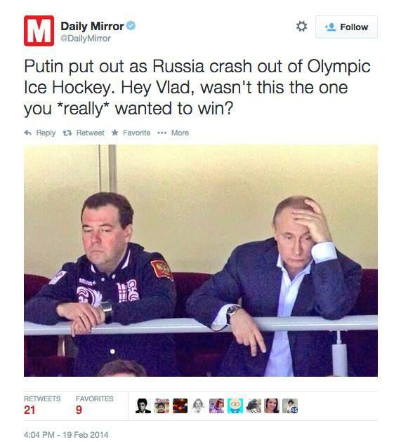
The Daily Mirror used this photo when the Russian Olympic hockey team was defeated by the Finnish team at the Sochi Winter Games in 2014. The photo was originally taken a few days earlier during the game between Russia and Slovakia — a game the Russians won.
Tip: It’s common practice for some media outlets to use a photo that best describes the story, rather than one from the actual event. It’s crucial to question whether images are from the actual event being described, especially on social media.
Source: https://www.politifact.com/factchecks/2014/feb/19/tweets/photo-showing-sad-/
When a ferry sank in South Korea, a FOX News report used old footage of the mother of a Mount Everest avalanche victim and portrayed it as being related to the ferry tragedy. The Korean Cultural Centre complained, as did other organizations.

Tip: Images being used to represent an event may reflect older footage, as well as poor sensitivity about races or ethnic groups. Don’t assume that the footage has been properly vetted.
This is another example where a photo from an unrelated event was used in a news story. On 27 May, 2012, the BBC reported about a massacre in Syria and used the above image. It included this description: “This image - which cannot be independently verified - is believed to show the bodies of children in Houla awaiting burial.” It was later identified as a photo from Iraq in 2003.
Tip: Pay close attention to photo descriptions that flag it as not having been fully verified.
2. Art, ads, movies and staged scenes
Users on social networks often circulate images taken from art, ads and films during real news events.

This tweet, sent during Hurricane Sandy, is actually a screen capture from an film art project entitled “Flooded McDonald’s,” which can be watched on Vimeo.
Tip: Be cautious of the images that are too good to be true, and seek out reliable sources to aid with confirmation. In this case, contacting local authorities to ask about the flooding situation in Virginia Beach could have provided some necessary context.
Source: http://www.snopes.com/photos/natural/sandy.asp

In January 2014, The Daily Bhaskar, a daily newspaper in India, used this photo in an article entitled “Heartbreaking pic: Syrian child sleeps between graves of his parents.” The photo, however, was part of art project by a Saudi Arabia-based photographer, and had been uploaded to Instagram weeks before this happened.
Tip: Media outlets do not necessary practice verification before sharing an image or other piece of content. It’sessential to perform your own verification before republishing.
Source: http://imediaethics.org/hoax-photo-of-syrian-boy-sleeping-between-parents-graves- was-staged/?new

This photo was posted across social networks with the hashtag #SaveDonbassPeople. However, it’s actually a still from the Russian war film, “The Brest Fortress.”
Tip: Check who’s spreading the photo. Are they politically active on one side or another, and have they shared other questionable images?
Source: http://www.stopfake.org/en/snapshot- of-movie-the-brest-fortress-is-being- presented-as-a-photo-of-donbass/
3. Photoshopped Images

This photo was released by North Korea’s state-owned Korean Central News Agency in March 2013. When The Atlantic examined the hovercrafts, they saw that they were identical to each other. The KCNA had cloned one hovercraft to make the image more threatening.
Tip: Handout images from governments, companies and other sources should be checked and verified.
Source: http://www.theatlantic.com/photo/2013/03/is-this-north-korean-hovercraft-landing-photo-faked/100480/

Prior to the Sochi Games in 2014, Quebec’s Minister of Higher Education, Research, Science and Technology came under attack after sharing a digitally manipulated photo of two athletes. The original photo did not include Quebec-branded gloves. After sending it, the minister deleted the tweet, adding “The perils of " photoshop " ... I am myself a victim. :)” His press attache also told the media that “He didn’t know before he tweeted it that the picture had been photoshopped.”
Tip: When influential people share images, they add a layer of credibility and virality to the content. But they too can be victims of fakes.
Source: http://globalnews.ca/news/1145676/quebec-minister-tweets-photoshopped- olympic-photo/
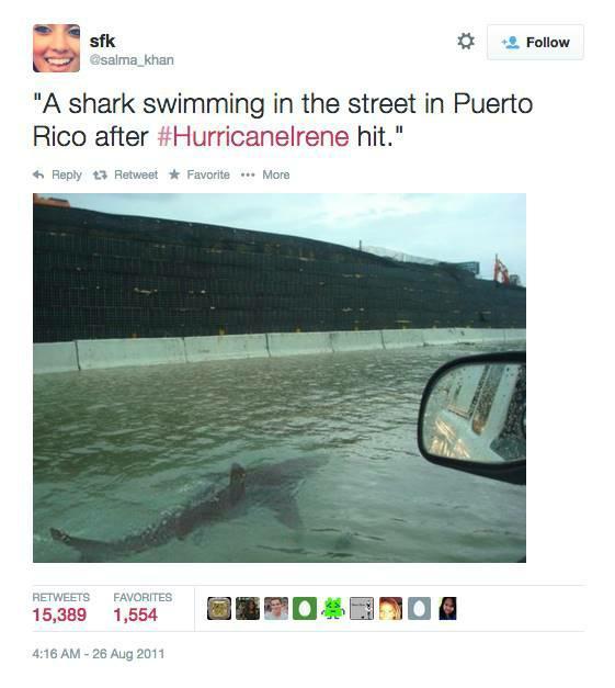
The Verification Handbook’s Case 4.2: Verifying Suspicious Sharks” During Hurricane Sandy explained how photoshopped shark images circulated during Hurricane Sandy. In fact, street sharks made an appearance even before Sandy. When Hurricane Irene struck in 2011, this tweet went viral, introducing many to the street shark phenomenon. The original photo of the shark is found in an issue of Africa Geographic in 2005.
Tip: Be very wary of shark images shared during hurricanes!
Source: https://www.imediaethics.org/7-fake-weather-photos-to-watch-out-for-in-the-2014-hurricane-season/

This example shows how traditional media outlets sometimes publish digitally manipulated photos. The Daily Mail published the image of Tottenham footballer Emmanuel Adebayor saluting the manager after his goal during the match between Tottenham and Sunderland. The print edition included a photo that erased Chris Ramsey, standing next to the manager
Tip: Professional photos published by media outlets are sometimes (though rarely) altered or manipulated. This is one of the recurring type of fakes that have existed throughout our history. Verification also needs to be applied to non-social media content.
4. Fake account

Fake accounts are a constant presence on social networks. They are usually set up using the names of celebrities, politicians or other famous people. This unverified account claimed to belong to the son of football player David Beckham and his popstar wife, Victoria Beckham. It was created in 2011 and gathered more than 27,000 followers, in spite of having many characteristics of fake accounts.
Tip: Twitter and Facebook verify accounts of famous/prominent people and organizations. You can spot these because they have a blue tick mark on the profile page. Second guess if there is no blue check mark, and ask them to share the evidence to authenticate the individual.
Source: https://alexirob.wordpress.com/2013/07/25/the-suspicious-account-of-brooklyn- beckham-brookbecks/

When Pope Francis I was appointed in 2013, a fake account, @JMBergoglio, tweeted "Immensely happy to be the new Pope, Francis I." Many people, including journalists, were fooled by this account, helping propel it to 100,000 followers within a few hours. However, a quick look at the account’s previous tweets reveals many questionable messages. This includes the above message which translates to, “If I'm the new pope, children will love me more than Santa Claus”.
Tip: Check previous tweets to see if they are consistent with the person.
Source: http://mashable.com/2013/03/13/new-pope-fake-twitter/

This Morrissey Twitter account is a unique example because it’s a case where Twitter itself wrongly verified a fake account.
Tip: While this is a rare case, this example shows that even a verified check cannot be treated as 100 percent reliable. Also remember that Twitter accounts can be hacked. In those cases, it’s not the real person tweeting.
Source: http://www.theverge.com/2014/5/19/5730542/morrissey-impersonated-on-twitter
5. Manual retweets

In 2009 Twitter introduced a retweet button that allows people to retweet the original tweet on their feed. However, many users still manually retweet by copy- pasting the original tweet with RT at the beginning. This opens up the possibility that people will alter the original message and attribute it to other users. It also means that previously deleted messages can live on as manual retweets, thereby spreading misinformation.
Tip: Check if you can find the original tweet.
6. Fake tweet, facebook wall posts and iPhone conversations
There are a number of tools and apps that allow people to easily create a fake tweets, Facebook wall posts and iPhone conversations. Here’s a look at some of the ones to watch out for.
- The Wall Machine (http://thewallmachine.com/):
This tool can be used to create fake Facebook wall posts. After signing in with your Facebook account, you can create a profile photo, account name and comments on your imaginary post. A similar tool is from Simulator.com, where you can create a fake Facebook post and download the JPG file from the site. See an example below.

- Lemme Tweet That For You (http://lemmetweetthatforyou.com):
This tool is used to fabricate an embeddable and sharable fake tweet with a customizable username, body text, and number of RTs and favorites. Simulator.com also has a tool to create a fake tweet and download it as a JPG image file.

- FakePhoneText (http://www.fakephonetext.com/):
This tool is used to create and download a image of fake iPhone message conversation. You can set the name and content of the messages, as well also the cell network, time, type of connection (i.e. 3G, WIFI) and battery status. There is also another text message generator called iOS7 Text.

7. Fake websites
It may look real, but this wasn’t the authentic New York Post website. It was created to raise awareness about climate change. It’s relatively easy to copy a website and set it up on a different web address — and to fool people in the process. That was what Wikileaks did when it set up a fake copy of The New York Times’ website in order to promote an equally fake op-ed by columnist Bill Keller:
The differences were subtle, and even some New York Times journalists were fooled.
Tip: Check the URL, and search on different search engines to see if the URL matches with the top hits for that property. If unsure about a URL, perform a Whois search to see who owns the domain, and when it was first registered.
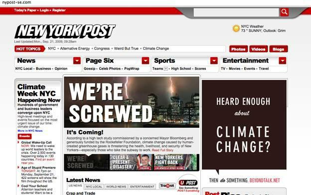

Algorithms in the Spotlight: Collaborative Investigations at Spiegel Online
Written by: Christina Elmer
The demand for transparency around algorithms is not new in Germany. In 2012, Der Spiegel columnist Sascha Lobo called for the mechanics of the Google search algorithm to be disclosed (Lobo, 2012), even if this would harm the company.
The reason was that Google can shape how we view the world, for example through the autocomplete function, as a prominent case in Germany illustrated. In this case, the wife of the former federal president had taken legal action against Google because problematic terms were suggested in the autocomplete function when her name was searched for. Two years later, the German minister of justice repeated this appeal, which was extended again by the federal chancellor in 2016: Algorithms should be more transparent, Angela Merkel demanded (Kartell, 2014; Reinbold, 2016).
In the past few years, the topic of algorithmic accountability has been under constant discussion at Der Spiegel—but initially only as an occasion for reporting, not in the form of our own research or analysis project.
There may be two primary reasons why the German media began experimenting in this area later than their colleagues in the United States.
First, journalists in Germany do not have such strong freedom of information rights and instruments at their disposal. Second, data journalism does not have such a long tradition as in the United States.
Der Spiegel has only had its own data journalism department since 2016 and is slowly but steadily expanding this area. It is, of course, also possible for newsrooms with smaller resources to be active in this field—for example, through cooperation with organizations or freelancers. In our case, too, all previous projects in the area of algorithmic accountability reporting have come about in this way. This chapter will therefore focus on collaborations and the lessons we have learned from them.
Google, Facebook and Schufa: Three Projects at a Glance
Our editorial team primarily relies on cooperation when it comes to the investigation of algorithms. In the run-up to the 2017 federal elections, we joined forces with the NGO AlgorithmWatch to gain insights into the personalization of Google search results.1
Users were asked to install a plug-in that regularly performed predefined searches on their computer. A total of around 4,400 participants donated almost six million search results and thus provided the data for an analysis that would challenge the filter bubble thesis—at least regarding Google and the investigated area.
For this project, our collaborators from AlgorithmWatch approached Der Spiegel, as they were looking for a media partner with a large reach for crowdsourcing the required data. While the content of the reporting was entirely the responsibility of our department covering Internet- and technology-related topics, the data journalism department supported the planning and methodological evaluation of the operation.
Furthermore, the backup of our legal department was essential in order to implement the project in a way which was legally bulletproof. For example, data protection issues had to be clarified within the reporting and had to be fully comprehensible for all participants involved in the project.
Almost at the same time, Der Spiegel collaborated with ProPublica to deploy their AdCollector in Germany in the months before the elections (Angwin & Larson, 2017). The project aimed to make transparent how German parties target Facebook users with ads.
Therefore, a plug-in collected the political ads that a user sees in her stream and revealed those ads that are not displayed to her. For this project, Der Spiegel joined forces with other German media outlets such as Süddeutsche Zeitung and Tagesschau—an unusual constellation of actors who usually are in competition with each other.
In this case it was necessary to reach as many people as possible to serve the public interest. The results could also be published as journalistic stories, but our primary focus was transparency. After two weeks, around 600 political advertisements had been collected and made available to the public.
ProPublica’s Julia Angwin and Jeff Larson introduced the idea of a collaboration at the annual conference of the German association of investigative journalists, Netzwerk Recherche in Hamburg, where they held a session on algorithmic accountability reporting.
The idea was developed from the very beginning in collaboration with technical and methodology experts from multiple departments in the newsroom of Der Spiegel.
The exchange with our previous partner, the non-profit AlgorithmWatch, was also very valuable for us in order to shed light on the legal background and to include it in our research. After the conference, we expanded the idea further through regular telephone conferences. Our partners from the other German media outlets became involved at later stages as well.
In 2018, Der Spiegel contributed to a major project to investigate an extremely powerful algorithm in Germany—the Schufa credit report. The report is used to assess the creditworthiness of private individuals. The report should indicate the probability that someone can pay their bills, pay the rent or service a loan. It can therefore have far-reaching implications for a person’s private life and a negative effect on society as a whole.
For example, it is conceivable that the score may increase social discrimination and unequal treatment of individuals, depending on the amount of data that is available about them. Incorrect data or mix-ups could be fatal for individuals. The algorithm’s underlying scoring is not transparent. Which data is taken into account in which weighting is not known. And those affected often have no knowledge of the process.
This makes Schufa a controversial institution in Germany—and projects like OpenSCHUFA absolutely vital for public debate on algorithmic accountability, in our opinion.2
The project was mainly driven by the NGOs Open Knowledge Foundation (OKFN) and AlgorithmWatch. Der Spiegel was one of two associated partners, together with Bayerischer Rundfunk (Bavarian Broadcasting). The idea for this project came up more or less simultaneously, with several parties involved. After some successful projects with the NGOs AlgorithmWatch and OKFN as well as with the data journalism team of Bayerischer Rundfunk, Der Spiegel was included in the initial discussions.
The constellation posed special challenges. For the two media teams, it was important to work separately from the NGOs in order to ensure their independence from the crowdfunding process in particular. Therefore, although there were, of course, discussions between the actors involved, neither an official partnership nor a joint data evaluation were possible. This example emphasizes how important it is for journalists to reflect on their autonomy, especially in such high-publicity topics.
Making OpenSCHUFA known was one of the central success factors of this project. The first step was to use crowdfunding to create the necessary infrastructure to collect the data, which was obtained via crowdsourcing. The results were jointly evaluated by the partners in the course of the year in anonymized form.
The central question behind it is: Does the Schufa algorithm discriminate against certain population groups, and does it increase inequality in society? According to the results, it does. We found that the score privileged older and female individuals, as well as those who change their residence less frequently. And we discovered that different versions of algorithms within the score generated different outcomes for people with the same attributes, a type of discrimination that was not previously known regarding this score.
These results would not have been possible without the participation of many volunteers and supporters. The crowdfunding campaign was largely successful, so that the financing of the software could be secured within the framework.3
And within the subsequent crowdsourcing process, about 2,800 people sent in their personal credit reports. This sample was, of course, not representative, but nevertheless sufficiently diverse to reveal the findings described.
Impact and Success Indicators
Both the Facebook and the Google investigations were rather unspectacular in terms of findings and confirmed our hypotheses. Political parties apparently hardly used Facebook’s targeting options and the much-cited Google filter bubble was not found in our crowdsourcing experiment in Germany. But for us the value of these projects lay in increasing our readers’ literacy around functionalities and risks of algorithms in society.
The reach of our articles was an indicator that we had succeeded in making the topic more widely known. The introductory article at the start of the Schufa project reached a large audience (around 335,000 readers).4 The reading time was also clearly above the typical one—with an average of almost three minutes. In addition, the topic was widely discussed in public arenas and covered by many media outlets and conferences.
The topic has also been debated in political circles. After the publication of the Schufa investigations, the German minister of consumer protection called for more transparency in the field of credit scoring. Every citizen must have the right to know which essential features have been included in the calculation of their creditworthiness and how these are weighted, she demanded.
What about impact on everyday reality? As a first step, it was important for us to contribute to establishing the topic in the public consciousness. So far, we have not seen any fundamentally different way political actors deal with algorithms that have broader societal consequences.
Nevertheless, the topic of algorithmic accountability reporting is very important to us. This is because in Europe we still have the opportunity to debate the issue of algorithms in society and to shape how we want to deal with it.
It is part of our function as journalists to provide the necessary knowledge so that citizens can understand and shape the future of algorithms in society. As far as possible, we also take on the role of a watchdog by trying to make algorithms and their effects transparent, to identify risks and to confront those responsible.
To achieve this, we have to establish what might otherwise be considered unusual collaborations with competitors and actors from other sectors. We hope that such alliances will ultimately increase the pressure on legislation and transparency standards in this area.
More effort and resources need to be dedicated to algorithmic accountability investigations and “The Markup” has published some very exciting research in this area. Further experimentation is very much needed, partly because there is still scope for action in the regulation of algorithms. The field of algorithmic accountability reporting has only begun to develop in recent years. And it will have to grow rapidly to meet the challenges of an increasingly digitized world.
Organizing Collaborative Investigations
Running collaborative investigations takes a whole set of new or less used skills in the newsroom. This includes the analysis of large data sets and the programming of specific procedures, but also the management of projects. The latter is too easily overlooked and will be described in more detail here, with concrete examples from our previous work.
Working together in diverse constellations not only makes it easier to share competencies and resources, it also allows a clear definition of roles. As a media partner, Der Spiegel positioned itself in these collaborations more as a neutral commentator, not too deeply involved in the project itself. This allowed the editors to remain independent and thus justify the trust of their readers. They continued to apply their quality criteria to reporting within the project—for example, by always giving any subject of their reporting the opportunity to comment on accusations. Compared to the NGOs involved, these mechanisms may slow media partners down more than they are comfortable with, but at the same time they ensure that readers are fully informed by their reports—and that these will enrich public debate in the long term.
Reaching agreement about these roles in advance has proven to be an important success criterion for collaborations in the field of algorithmic accountability. A common timeline should also be developed at an early stage and language rules for the presentation of the project on different channels should be defined. Because, after all, a clear division of roles can only work if it is communicated consistently. This includes, for example, a clear terminology on the roles of the different partners in the project and the coordination of disclaimers in the event of conflicts of interest.
Behind the scenes, project management methods should be used prudently, project goals should be set clearly and available resources have to be discussed. Coordinators should help with the overall communication and thus give the participating editors the space they need for their investigations. To keep everyone up to date, information channels should be kept as simple as possible, especially around the launch of major project stages.
Regarding editorial planning, the three subject areas were challenging. Although in general relevance and news value were never questioned, special stories were needed to reach a broad readership. Often, these stories focused on the personal effects of the algorithms examined. For example, incorrectly assigned Schufa data made it difficult for a colleague from the Der Spiegel editorial team to obtain a contract with an Internet provider. His experience report impressively showed what effects the Schufa algorithm can have on a personal level and thus connected with the reality of our audience’s lives (Seibt, 2018).
Thus, we tailored the scope of our reporting to the interests of our audience as far as possible. Of course, the data journalists involved were also very interested in the functioning of the algorithms under investigation—an interest that is extremely useful for research purposes. However, only if these details have a relevant influence on the results of the algorithms can they become the subject of reporting—and only if they are narrated in a way that is accessible for our readers.
Internally in the editorial office, support for all three projects was very high. Nevertheless, it was not easy to free up resources for day-to-day reporting in the daily routine of a news-driven editorial team—especially when the results of our investigations were not always spectacular.
Lessons Learned
By way of conclusion, I summarize what we have learned from these projects.
Collaborate where possible. Good algorithmic accountability investigations are only possible by joining forces with others and creating teams with diverse skill sets. This is also important given both the scarcity of resources and legal restrictions that most journalists have to cope with. But since these projects bring together actors from different fields, it is crucial to discuss beforehand the underlying relevance criteria, requirements and capabilities.
Define your goals systematically. Raising awareness of the operating principles of algorithms can be a first strong goal in such projects. Of course, projects should also try to achieve as much transparency as possible. At best we would check whether algorithms have a discriminatory effect—but project partners should bear in mind that this is a more challenging goal to attain, one that requires extensive data sets and resources.
Exercise caution in project implementation. Depending on the workload and the day-to-day pressure of the journalists involved, you might even need a project manager. Be aware that the project timeline may sometimes conflict with reporting requirements. Take this into account in communicating with other partners and, if possible, prepare alternatives for such cases.
Invest in research design. To set up a meaningful design that produces useful data, you might need specialized partners. Close alliances with scientists from computer science, mathematics and related disciplines are particularly helpful for investigating some of the more technical aspects of algorithms. Furthermore, it may also be useful to cooperate with social and cultural researchers to gain a deeper understanding of classifications and norms that are implemented in them.
Protect user data. Data donations from users may be useful to investigate algorithms. In such crowdsourcing projects legal support is indispensable in order to ensure data protection and to take into account the requirements of the national laws and regulations. If your company has a data protection officer, involve them in the project early on.
1. algorithmwatch.org/de/filterblase-geplatzt-kaum-raum-fuer-personalisierung-bei-google-suchen-zur-bundestagswahl-2017// (German language)
2. www.openschufa.de (German language)
3. www.startnext.com/open... (German language)
4. The majority of these, however, came to the article via internal channels like our homepage. This was different in the case of another article, the field report featuring the author’s personal story, which was read by around 220,000 people. A fifth of them reached the article via social media channels, which is well above the average. So it seems that we were able to reach new target groups with this topic.
Works Cited
Angwin, J., & Larson, J. (2017, September 7). Help us monitor political ads online. Pro- Publica. www.propublica.org/article/help-us-monitor-political-ads-online
Kartell, S. vor. (2014, September 16). Maas hätte gerne, dass Google geheime Such- formel offenlegt. Der Spiegel. www.spiegel.de/wirtschaft/unternehmen/
Lobo, S. (2012, September 11). Was Bettina Wulff mit Mettigeln verbindet. Der Spiegel. www.spiegel.de/netzwelt/netzpolitik/google-suchvorschlaege- was-bettina-wulff-mit-mettigeln-verbindet-a-855097.html
Reinbold, F. (2016, October 26). Warum Merkel an die Algorithmen will. Der Spiegel. www.spiegel.de/netzwelt/netzpolitik/angela-merkel-warum-die-kanzlerin-an-die-algorithmen-von-facebook-will-a-1118365.html
Seibt, P. (2018, March 9). Wie ich bei der Schufa zum “deutlich erhöhten Risiko” wurde. Der Spiegel. www.spiegel.de/wirtschaft/service/schufa-wie-ich- zum-deutlich-erhoehten-risiko-wurde-a-1193506.html
Your Right to Data
Written by: Djordje Padejski

Before you make a Freedom of Information (FOI) request you should check to see if the data you are looking for is already available — or has already been requested by others. The previous chapter has some suggestions for where you might look. If you’ve looked around and still can’t get hold of the data you need, then you may wish to file a formal request. Here are some tips that may help to make your request more effective.
- Plan Ahead to Save Time
-
Think about submitting a formal access request whenever you set out to look for information. It’s better not to wait until you have exhausted all other possibilities. You will save time by submitting a request at the beginning of your research and carrying out other investigations in parallel. Be prepared for delay: sometimes public bodies take a while to process requests, so it is better to expect this.
- Check the Rules About Fees
-
Before you start submitting a request, check the rules about fees for either submitting requests or receiving information. That way, if a public official suddenly asks you for money, you will know what your rights are. You can ask for electronic documents to avoid copying and posting costs, mention in your request that you would prefer the information in electronic format. That way you will avoid paying a fee, unless of course the information is not available electronically, although these days it’s usually possible to scan documents which are not already digitalised and then to send them as an attachment by e-mail.
- Know Your Rights
-
Find out what your rights are before you begin, so you know where you stand and what the public authorities are and are not obliged to do. For example, most freedom of information laws provide a time limit for authorities to reply to you. Globally, the range in most laws is from a few days to one month. You make sure that you know what this is before you set out, and make a note of when you submit your request.
Governments are not obliged to process data for you, but should give you all the data they have, and if it is data that they should have according to perform their legal competencies, they should certainly produce it for you.
- Say That You Know Your Rights
-
Usually the law does not require that you mention the access to information law or freedom of information act, but this is recommended because it shows you know your legal rights and is likely to encourage correct processing of the requests according to the law. We note that for requests to the EU it’s important to mention that it’s an access to documents request and it’s best to make a specific mention of Regulation 1049/2001.
- Keep it Simple
-
In all countries, it is better to start with a simple request for information and then to add more questions once you get the initial information. That way you don’t run the risk of the public institution applying an extension because it is a “complex request”.
- Keep it Focused
-
A request for information only held by one part of a public authority will probably be answered more quickly than one which requires a search across the entire authority. A request which involves the authority in consulting third parties (e.g., a private company which supplied the information, another government which is affected by it) can take particularly long. Be persistent.
- Think Inside the Filing Cabinet
-
Try to find out what data is collated. For example, if you get a blank copy of the form the police fill out after traffic accidents, you can then see what information they do or do not record about car crashes.
- Be Specific
-
Before you submit your request, think: is it in any way ambiguous? This is especially important if you are planning to compare data from different public authorities. For example, if you ask for figures for the past three years, some authorities will send you information for the past three calendar years and others for the past three financial years, which you won’t be able to directly compare. If you decide to hide the your real request in a more general one, then you should make your request broad enough so that it captures the information you want but not so broad as to be unclear or discourage a response. Specific and clear requests tend to get faster and better answers.
- Submit Multiple Requests
-
If you are unsure where to submit your request, there is nothing to stop you submitting the request with two, three or more bodies at the same time. In some cases, the various bodies will give you different answers, but this can actually be helpful in giving you a fuller picture of the information available on the subject you are investigating.
- Submit International Requests
-
Increasingly requests can be submitted electronically, so it doesn’t matter where you live. Alternatively, if you do not live in the country where you want to submit the request, you can sometimes send the request to the embassy and they should transfer it to the competent public body. You will need to check with the relevant embassy first if they are ready to do this — sometimes the embassy staff will not have been trained in the right to information and if this seems to be the case, it’s safer to submit the request directly to the relevant public body.
- Do a Test Run
-
If you are planning to send the same request to many public authorities start by sending an initial draft of the request to a few authorities as a pilot exercise. This will show you whether you are using the right terminology to obtain the material you want and whether answering your questions is feasible, so that you can then revise the request if necessary before sending it to everyone.
- Anticipate the Exceptions
-
If you think that exceptions might be applied to your request, then, when preparing your questions, separate the question about the potentially sensitive information from the other information that common sense would say should not fall under an exception. Then split your question in two and submit the two requests separately.
- Ask for Access to the Files
-
If you live near where the information is held (e.g. in the capital where the documents are kept), you can also ask to inspect original documents. This can be helpful when researching information that might be held in a large number of documents that you’d like to have a look through. Such inspection should be free of charge and should be arranged at a time that is reasonable and convenient for you.
- Keep a Record!
-
Make your request in writing and save a copy or a record of it so that in the future you are able to demonstrate that your request was sent, in case you need to make an appeal against failure to answer. This also gives you evidence of submitting the request if you are planning to do a story on it.
- Make it Public
-
Speed up answers by making it public that you submitted a request: If you write or broadcast a story that the request has been submitted, it can put pressure on the public institution to process and respond to the request. You can update the information as and when you get a response to the request — or if the deadline passes and there is no response you can make this into a news story as well. Doing this has the additional benefit of educating members of the public about the right of access to information and how it works in practice.
- Involve Colleagues
-
If your colleagues are sceptical about the value of access to information requests, one of the best ways to convince them is to write a story based on information you obtained using an access to information law. Mentioning in the final article or broadcast piece that you used the law is also recommended as a way of enforcing its value and raising public awareness of the right.
- Ask for Raw Data
-
If you want to analyze, explore or manipulate data using a computer then you should explicitly ask for data in an electronic, machine-readable format. You may wish to clarify this by specifying, for example, that you require budgetary information in a format “suitable for analysis with accounting software”. You may also wish to explicitly ask for information in ‘disaggregated’ or ‘granular’ form. You can read more about this point in this report.
- Asking About organizations Exempt From FOI Laws
-
You may wish to find out about NGOs, private companies, religious organizations and/or other organizations which are not required to release documents under FOI laws. However, it is possible to find information about them by asking public bodies which are covered by FOI laws. For example, you could ask a government department or ministry if they have funded or dealt with a specific private company or NGO and request supporting documents. If you need further help with making your FOI request, you can also consult the Legal Leaks toolkit for journalists
The #ddj Hashtag on Twitter
Written by Eunice Au and Marc Smith
Abstract
How we used the social network analysis and visualization package NodeXL to examine what the global data journalism community tweets about.
Keywords: #ddj, Twitter, social network analysis, data journalism, social media, data analysis
Picking a single term to track the data journalism field is not easy. Data journalists use a myriad of hashtags in connection with their work, such as #datajournalism, #ddj, #dataviz, #infographics, and #data. When the Global Investigative Journalism Network (GIJN)—an international association of investigative journalism organizations that supports the training and sharing of information among investigative and data journalists—first started to report on conversations around data journalism on Twitter six years ago, the most popular hashtag appeared to be #ddj (data-driven journalism).1
The term “data-driven journalism” itself is controversial as it can be argued that journalism is not driven by data; data merely informs, or is a tool used for journalism. Data consists of structured facts and statistics that require journalists to filter, analyze and discover patterns in order to produce stories. Just as one would not call a profile piece “interview-driven journalism” or an article based on public documents “document-driven journalism,” great data journalism stories use data as only one of their components.
The Role of #ddj
Aside from these considerations, the widespread use of the #ddj hashtag among data journalism communities has made it a prominent resource for sharing projects and activities around the world. Data journalists use the hashtag to promote their work and broadcast it to wider international audiences.
The hashtag also helps facilitate discussions on social media, where members of the data journalism community can search, discover and share content using the hashtag. Discussions embracing the #ddj hashtag range from election forecasting and misinterpretation of probability graphs, to data ethics and holding artificial intelligence to account.

The Birth of Top 10 #ddj
GIJN’s weekly Top 10 #ddj series started in January 2014 when one of us first tweeted a #ddj network graph (Smith, 2014). The graph, which mapped tweets mentioning the hashtag #ddj, including replies to those tweets, was created using NodeXL, a social network analysis and visualization package that builds on the Excel spreadsheet software.
These network graphs reveal the patterns of interconnection that emerge from activities such as replying, @mentioning and retweeting. These patterns highlight key people, groups and topics being discussed.
As an international investigative journalism organization, GIJN is always looking for ways to raise awareness about what is happening in the fields of investigative and data journalism. When GIJN’s executive director, David Kaplan, saw Smith’s network graph, he proposed to use the map to produce a weekly Top 10 #ddj to showcase popular and interesting examples of data journalism. (He and Smith also tried a weekly round-up of investigative journalism, but no single hashtag came close to doing the job that #ddj does for data journalism.) Although GIJN follows the network graph’s suggested findings closely, some human curation is necessary to eliminate duplicates and to highlight the most interesting items.
Since the birth of the series, we have assembled more than 250 snapshots of the data journalism community’s discussions featuring the #ddj hashtag over the past six years (GIJN, n.d.). The series now serves as a good quick summary for interested parties who cannot follow every #ddj tweet. Our use of the term “snapshot” is not simply a metaphor. This analysis gives us a picture of the data journalism Twitter community, in the same way that photojournalism depicts real crowds on the front pages of major news outlets.
The Evolution of #ddj Twitter Traffic
To get a sense of how Twitter traffic using #ddj has evolved, we did a very basic and rough analysis of the #ddj data we collected from 2014 to 2019.
We selected a small sample of eight weeks in February and March from each of the six years, or 48 weeks. There was a variety of content being shared and engaged with and the most popular items included analysis and think pieces, awards, grants, events, courses, jobs, tools, resources, and investigations. The types of content shared remained consistent over the years.
In 2014, we saw articles that discussed a burgeoning data journalism field. This included pieces arguing that data journalism is needed because it fuels accountability and insights (Howard, 2014), and predicting that analyzing data is the future for journalists (Arthur, 2010).
In later years, we observed new topics being discussed, such as artificial intelligence, massive data leaks and collaborative data investigations. There were also in-depth how-to pieces, where data journalists started offering insights into their data journalism processes (Grossenbacher, 2019) and sharing how to best utilize databases (Gallego, 2018), rather than debating whether the media industry should incorporate data journalism into its newsrooms.
We also noticed that among the investigations shared there were often analyses of elections, immigration, pollution, climate and football.
GIJN’s weekly #ddj round-up not only highlights the most popular tweets and URLs, but also lists the central participants of the #ddj discussion. Some of the usual suspects at the centre of #ddj discussions include data journalism experts Edward Tufte, Alberto Cairo, Martin Stabe, Nate Silver and Nathan Yau, along with data teams from Europe and North America, including those at Le Telegramme, Tages-Anzeiger, Berliner Morgenpost, FiveThirtyEight, the Financial Times, and The Upshot from The New York Times. Their work can at times be educational and inspiring and trigger further debate. The data journalism community can also take advantage of and network with these influencers.
A number of other hashtags often accompany #ddj, as Connected Action’s mapping reveals, allowing members of the community to seek out similar stories.

By far, the most common hashtags to appear alongside #ddj were #dataviz, #visualization, #datajournalism, #opendata, #data and #infographics. This signals to us that those who are in this fijield particularly care not just about the availability of public data, but also the way in which data is creatively presented and visualized for readers.
However, the NodeXL #ddj mapping is by no means representative of the entire field as it analyzes only people who tweet. Furthermore, those who generally have more followers on Twitter and garner more retweets tend to feature more prominently in our round-up.
We have also noticed that the majority of the top tweets usually come from Europe and the Americas, particularly Germany and the United States, with some smatterings of tweets from Asia and Africa. This could be due to the skew of the user base on Twitter, because other regions have relatively less robust data journalism communities, or because data journalism com- munities in other regions do not organize through the same Twitter hashtags or do not organize on Twitter at all.
Over the past year, we observed that some work by prominent data journalism organizations that was widely shared on Twitter did not appear in our network graph. This could possibly be due to people not using the hashtag #ddj when tweeting the story, or using other hashtags or none at all. We suspect that Twitter’s expansion of the tweet character count from 140 to 280 in November 2017 might also have helped people to choose lengthier hashtags such as #datajournalism.

Fun #ddj Discoveries
While what we find is often powerful journalism and beautiful visualizations, sometimes it is also just plain funny. By way of conclusion, we briefly discuss some of the more entertaining items we have discovered using the #ddj hashtag in the past year.
In an adorable and clever visual essay, Xaquín G. V. (2017) showed what people in different countries tend to search for the most when they want to fix something.
In many warmer countries, it is fridges, for North Americans and East Asians it is toilets, while people in northern and eastern Europe seem to need information on how to fix light bulbs. Next, a chart, found among the Smithsonian’s Sally L. Steinberg Collection of Doughnut Ephemera, argues that the size of the doughnut hole has gradually shrunk over the years (Edwards, 2018). In a different piece, graphic designer Nigel Holmes illustrated and explained oddly wonderful competitions around the world, from racing snails to carrying wives, in a book called Crazy Competitions (Yau, 2018).
In another piece in our collection, women worldwide already know that the pockets on women’s jeans are impractically tiny, and The Pudding has provided the unequivocal data and analysis to prove it (Diehm & Thomas, 2018).
Finally, is there such a thing as peak baby-making seasons? An analysis by Visme of United Nations’ data on live births seems to suggest so. They found a correlation between three different variables: The top birth months, seasons of the year and the latitude of the country (distance from the equator) that may have influence on mating rhythms in different countries (Chibana, n.d.).
Footnotes
1. gijn.org
Works Cited
Arthur, C. (2010, November 22). Analysing data is the future for journalists, says Tim Berners-Lee. The Guardian. www.theguardian.com/media/2010/nov/22/data-analysis-tim-berners-lee
Chibana, N. (n.d.). Do humans have mating seasons? This heat map reveals the surprising link between birthdays and seasons. Visual Learning Center by Visme. visme.co/blog/most-common-birthday/
Diehm, J., & Thomas, A. (2018, August). Pockets. The Pudding. pudding.cool/2018/08/pockets/
Edwards, P. (2018, June 1). Have donut holes gotten smaller? This compelling vintage chart says yes. Vox.www.vox.com/2015/9/20/9353957/donut-hole-size-chart
Gallego, C. S. (2018, January 23). How to investigate companies found in the offfshore leaks database. ICIJ. www.icij.org/inside-icij/2018/01/investigate-companies-found-offshore-leaks-database/
GIJN. (n.d.). Top 10 in data journalism archives. Global Investigative Journalism Network. gijn.org/series/top-10-data-journalism-links/
Grossenbacher, T. (2019, March 8). (Big) data journalism with Spark and R. timogrossenbacher.ch/2019/03/big-data-journalism-with-spark-and-r/
Howard, A. (2014, March 3). Data-driven journalism fuels accountability and insight in the 21st century. TechRepublic.www.techrepublic.com/article/data-driven-journalism-fuels-accountability-and-insight-in-the-21st-century/
Smith, M. (2014, January 22). First NodeXL #ddj network graph. Twitter. twitter.com/marc_smith/status/425801408873385984
Xaquín G. V. (2017, September 1). How to fix a toilet and other things we couldn’t do without search. how-to-fix-a-toilet.com
Yau, N. (2018, May 21). Nigel Holmes new illustrated book on Crazy Competitions. FlowingData. flowingdata.com/2018/05/21/nigel-holmes-new-illustrated-book-on-crazy-competitions/
Wobbing Works. Use it!
Written by: Brigitte Alfter
Using freedom of information legislation — or wobbing, as it is sometimes called — is an excellent tool. But it requires method and, often, persistence. Here are three examples illustrating the strengths and challenges of wobbing from my work as an investigative journalist.

Case Study 1: Farm Subsidy
Every year EU pays almost €60 billion to farmers and the farming industry. Every year. This has been going on since late 1950s and the political narrative was that the subsidies help our poorest farmers. However a first FOI breakthrough in Denmark in 2004 indicated that this was just a narrative. The small farmers were struggling as they so often complained about in private and in public, and in reality most of the money went to a few large land owners and to the agricultural industry. So obviously I wanted to know: is there a pattern across Europe?
In the summer of 2004 I asked the European Commission for the data. Every year in February the Commission receives data from the member states. The data shows who applies for EU funding, how much beneficiaries get, and whether they get it for farming their land, developing their region or for exporting milk powder. At that time, the Commission received the figures as CSV files on a CD. A lot of data, but in principle easy to work with. If you could get it out, that is.
In 2004 the Commission refused to release the data; the key argument was that the data was uploaded into a database and couldn’t be retrieved without a lot of work. An argument, that the European Ombudsmand called maladministration. You can find all documents in this case on the wobbing.eu website. Back in 2004 we did not have the time to be legal foodies. We wanted the data.
So we teamed up with partners throughout Europe to get the data country by country. English, Swedish and Dutch colleagues got the data in 2005. Finland, Poland, Portugal, regions of Spain, Slovenia and other countries opened up in the too. Even in wob-difficult Germany I got a breakthrough and received some data in the province of North Rhine-Westfalia in 2007. I had to go to court to get the data — but it resulted in some nice articles in the Stern and Stern online news magazine.
Was it a coincidence that Denmark and the UK were the first to open up their data? Not necessarily. Looking at the bigger political picture, the farm subsidies at the time had to be seen in the context of the WTO negotiations where subsidies were under pressure. Denmark and the UK are amongst the more liberal countries in Europe, so there may well have been political winds blowing into the direction of transparency in those countries.
The story did not stop there, for more episodes and for the data see farmsubsidy.org.
Lesson: Go wob-shopping. We have a fabulous diversity of freedom of information laws in Europe, and different countries have different political interests at different times. This can be used to your advantage.
Case Study 2: Side Effects
We are all guinea pigs when it comes to taking medicine. Drugs can have side-effects. We all know this, we balance potential benefits with potential risks, and we make a decision. Unfortunately often this decision is not an informed decision.
When teenagers take a pill against pimples they hope for smooth skin, not for a bad mood. Yet exactly this happened with one drug, where the youngsters turned depressive and even suicidal after taking it. The danger of this particular side effect — an obvious story for journalists — was not easily available.
There is data about side-effects. The producers regularly have to deliver information to the health authorities about observed side-effects. They are held by national or European authorities once a drug is allowed on the market.
The initial breakthrough again came at national level in Denmark. During a cross-border research by a Danish-Dutch-Belgian team, the Netherlands opened up too. Another example of wob-shopping: it greatly helped our case to point out to the Dutch authorities that the data was accessible in Denmark.
But the story was true: in Europe there were suicidal young people and sadly also suicides in several countries as a result of the drug. Journalists, researchers, and the family of a young victim were all pushing hard to get access to this information. The European Ombudsman helped to push for the transparency at the European Medicines Agency, and it looks, as if he succeeded. So now the task is upon journalists to get out data and analyze the material thoroughly. Are we all guinea pigs, as one researcher put it, or are the control mechanisms sound?
Lessons: Don’t take no for an answer when it’s about transparency. Be persistent and follow a story over time. Things may well change and allow better reporting based upon better access at a later point.
Case Study 3: Smuggling Death
Recent history can be utterly painful for entire populations, particularly after wars and in times of transition. So how can journalists obtain hard data to investigate, when — for example — last decade’s war profiteers are now in power? This was the task that a team of Slovenian, Croatian and Bosnian journalists set out to pursue.
The team set out to investigate arms trades in former Yugoslavia during the UN embargo in the early 1990s. The basis of the work were documents from parliamentary inquiries into this subject. In order to document the routes of the shipment and understand the structure of the trading, transports had to be traced by vessel number in ports and license plates of trucks.
Slovenian parliamentary commissions have held inquiries into the question of profiteering from the Balkan wars, but have never reached a conclusion. Yet there was an extremely valuable trail of declassified documents and data, including 6000 pages which the Slovene team obtained through a freedom of information request.
In this case the data had to be extracted from the documents and sorted in databases. By augmenting the data with further data, analysis and research, they were able to map numerous of the routes of the illegal weapon trade.
The team succeeded and the results are unique and have already won the team their first award. Most importantly the story matters for the entire region and may well be picked up by journalists in other countries through which the deadly cargo has passed.
Lessons: Get out good raw material even if you find it in unexpected places and combine it with existing publicly accessible data.
Archiving Data Journalism
Written by: Meredith Broussard
Abstract
This chapter discusses the challenges of archiving data journalism projects and the steps that data teams can take to ensure their projects are preserved for the future.
Keywords: data journalism, archival practices, archives, digital archives, broken links, web archiving
In the first edition of The Data Journalism Handbook, published in 2012, data journalism pioneer Steve Doig wrote that one of his favourite data stories was the “Murder Mysteries” project by Tom Hargrove.1
In the project, which was published by the Scripps Howard News Service, Hargrove looked at demographically detailed data about 185,000 unsolved murders and built an algorithm to suggest which murders might be linked. Linked murders could indicate a serial killer at work. “This project has it all,” Doig wrote. “Hard work, a database better than the government’s own, clever analysis using social science techniques, and interactive presentation of the data online so readers can explore it themselves.”
By the time of the second edition of The Data Journalism Handbook, six years later, the URL to the project was broken (projects.scrippsnews.com/magazine/murder-mysteries). The project was gone from the web because its publisher, Scripps Howard, was gone. The Scripps Howard News Service had gone through multiple mergers and restructurings, eventually merging with Gannett, publisher of the USA Today local news network.
We know that people change jobs and media companies come and go. However, this has had disastrous consequences for data journalism projects (for more on this issue see, e.g., Boss & Broussard, 2017; Broussard, 2014, 2015a, 2015b; Fisher & Klein, 2016).
Data projects are more fragile than “plain” text-and-images stories that are published in the print edition of a newspaper or magazine.
Ordinarily, link rot is not a big deal for archivists; it is easy to use LexisNexis or ProQuest or another database provider to find a copy of everything published by, say, The New York Times print edition on any day in the 21st century.
But for data stories, link rot indicates a deeper problem. Data journalism stories are not being preserved in traditional archives. As such, they are disappearing from the web.
Unless news organizations and libraries take action, future historians will not be able to read everything published by The Boston Globe on any given day in 2017.
This has serious implications for scholars and for the collective memory of the field. Journalism is often referred to as the “first draft of history.” If that first draft is incomplete, how will future scholars understand the present day? Or, if stories disappear from the web, how will individual journalists maintain personal portfolios of work?
This is a human problem, not just a computational problem. To understand why data journalism is not being archived for posterity, it helps to start with how “regular” news is archived.
All news organizations use software called a content management system (CMS), which allows the organization to schedule and manage the hundreds of pieces of content it creates every day and also imposes a consistent visual look and feel on each piece of content published.
Historically, legacy news organizations have used a different CMS for the print edition and for the web edition. The web CMS allows the news organization to embed ads on each page, which is one of the ways that the news organization makes money.
The print CMS allows print page designers to manage different versions of the print layout and then send the pages to the printer for printing and binding. Usually, video is in a different CMS. Social media posts may or may not be managed by a different application like SocialFlow or Hootsuite.
Archival feeds to Lexis-Nexis and the other big providers tend to be hooked up to the print CMS. Unless someone at the news organization remembers to hook up the web CMS, too, digital-first news is not included in the digital feeds that libraries and archives get. This is a reminder that archiving is not neutral, but depends on deliberate human choices about what matters (and what doesn’t) for the future.
Most people ask at this point, “What about the Internet Archive?” The Internet Archive is a treasure, and the group does an admirable job of capturing snapshots of news sites.
Their technology is among the most advanced digital archiving software. However, their approach does not capture everything. The Internet Archive only collects publicly available web pages.
News organizations that require logins, or which include paywalls as part of their financial strategy, cannot be automatically preserved in the Internet Archive. Web pages that are static content, or plain HTML, are the easiest to preserve.
These pages are easily captured in the Internet Archive. Dynamic content, such as JavaScript or a data visualization or anything that was once referred to as “Web 2.0,” is much harder to preserve, and is not often stored in the Internet Archive. “There are many different kinds of dynamic pages, some of which are easily stored in an archive and some of which fall apart completely,” reads an Internet Archive FAQ.
“When a dynamic page renders standard html, the archive works beautifully. When a dynamic page contains forms, JavaScript, or other elements that require interaction with the originating host, the archive will not contain the original site’s functionality.”
Dynamic data visualizations and news apps, currently the most cutting- edge kinds of data journalism stories, cannot be captured by existing web archiving technology. Also, for a variety of institutional reasons, these types of stories tend to be built outside of a CMS. So, even if it were possible to archive data visualizations and news apps (which it generally is not using this approach), any automated feed would not capture them because they are not inside the CMS.
It’s a complicated problem. There aren’t any easy answers. I work with a team of data journalists, librarians and computer scientists who are trying to develop tech to solve this thorny problem.
We are borrowing methods from reproducible scientific research to make sure people can read today’s news on tomorrow’s computers. We are adapting a tool called ReproZip that collects the code, data and server environment used in computational science experiments.
We think that ReproZip can be integrated with a tool such as Webrecorder.io in order to collect and preserve news apps, which are both stories and software.
Because web-and mobile-based data journalism projects depend on and exist in relation to a wide range of other media environments, libraries, browser features and web entities (which may also continually change), we expect that we will be able to use ReproZip to collect and preserve the remote libraries and code that allow complex data journalism objects to function on the web. It will take another year or two to prove our hypothesis.
In the meantime, there are a few concrete things that every data team can do to make sure their data journalism is preserved for the future.
Take a video. This strategy is borrowed from video game preservation. Even when a video game console is no more, a video play-through can show the game in its original environment. The same is true of data journalism stories. Store the video in a central location with plain text metadata that describes what the video shows. Whenever a new video format emerges (as when VHS gave way to DVD, or DVD was replaced by streaming video), upgrade all of the videos to this new format.
Make a scaled-down version for posterity. Libraries like Django-bakery allow dynamic pages to be rendered as static pages. This is sometimes called “baking out”. Even in a database with thousands of records, each dynamic record could be baked out as a static page that requires very little maintenance. Theoretically, all of these static pages could be imported into the organization’s content management system. Baking out doesn’t have to happen at launch. A data project can be launched as a dynamic site, then it can be transformed into a static site after traffic dies down a few months later. The general idea is to adapt your work for archiving systems by making the simplest possible version, then make sure that simple version is in the same digital location as all of the other stories published around the same time.
Think about the future. Journalists tend to plan to publish and move on to the next thing. Instead, try planning for the sunset of your data stories at the same time that you plan to launch them. Matt Waite’s story “Kill All Your Darlings” on Source, the OpenNews blog, is a great guide to how to think about the life cycle of a data journalism story. Eventually, you will be promoted or will move on to a new organization. You want your data journalism to survive your departure.
Work with libraries, memory institutions and commercial archives. As an individual journalist, you should absolutely keep copies of your work. However, nobody is going to look in a box in your closet or on your hard drive, or even on your personal website, when they look for journalism in the future. They are going to look in Lexis-Nexis, ProQuest or other large commercial repositories. To learn more about commercial preservation and digital archiving, Kathleen Hansen and Nora Paul’s book Future-Proofing the News: Preserving the First Draft of History (2017) is the canonical guide for understanding the news archiving landscape as well as the technological, legal and organizational challenges to preserving the news.
Footnotes
Works Cited
Boss, K., & Broussard, M. (2017). Challenges of archiving and preserving born-digital news applications. IFLA Journal, 43(2), 150–157. doi.org/10.1177/0340035216686355
Broussard, M. (2014, April 23). Future-proofijing news apps. MediaShift. mediashift.org/2014/04/future-proofing-news-apps/
Broussard, M. (2015a). Preserving news apps present huge challenges. Newspaper Research Journal, 36(3), 299–313. doi.org/10.1177/0739532915600742
Broussard, M. (2015b, November 20). The irony of writing about digital preserva- tion. The Atlantic.www.theatlantic.com/technology/archive/2015/11/the-irony-of-writing-about-digital-preservation/416184/
Fisher, T., & Klein, S. (2016). A conceptual model for interactive databases in news. GitHub. github.com/propublica/newsappmodel
From The Guardian to Google News Lab: A Decade of Working in Data Journalism
Written by Simon Rogers
Abstract
A personal narrative of the last decade of data journalism through the lens of the professional journey of one of its acclaimed figures.
Keywords: data journalism, The Guardian’s Datablog, WikiLeaks, open data, transparency, spreadsheets
When I decided I wanted to be a journalist, somewhere between the first and second years of primary school, it never occurred to me that would involve data.
Now, working with data every day, I realize how lucky I was. It certainly was not the result of carefully calibrated career plans. I was just in the right place at the right time. The way it happened says a lot about the state of data journalism in 2009. I believe it also tells us a lot about data journalism in 2019.
Adrian Holovaty, a developer from Chicago who had worked at The Washington Post and started EveryBlock, a neighbourhood-based news and discussion site, came to give a talk to the newsroom in the Education Centre of The Guardian on Farringdon Road in London.
At that time I was a news editor at the print paper (then the centre of gravity), having worked online and edited a science section. The more Holovaty spoke about using data to both tell stories and help people understand the world, the more something triggered in me. Not only could I be doing this, but it actually reflected what I was doing more and more. Maybe I could be a journalist who worked with data. A “data journalist.”
Working as a news editor with the graphics desk gave me the opportunity to work with designers who changed how I see the world, in Michael Robinson’s talented team. And as the portfolio of visuals grew, it turned out that I had accumulated a lot of numbers: Matt McAlister, who was launching The Guardian’s open API, described it as “the motherlode.” We had GDP data, carbon emissions, government spending data and much more cleaned up, all saved as Google spreadsheets and ready for use the next time we needed it.
What if we just published this data in an open data format? No PDFs, just interesting accessible data, ready to use, by anyone. And that’s what we did with The Guardian’s Datablog—at first with 200 distinct data sets: Crime rates, economic indicators, war zone details, and even fashion week and Doctor Who villains. We started to realize that data could be applied to everything.
It was still a weird thing to be doing. “Data editor” was hardly a widespread job—very few newsrooms had any kind of data team at all. In fact, just using the word “data” in a news meeting would elicit sniggers. This wasn’t “proper” journalism, right?
But 2009 was the start of the open data revolution: US government data hub data.gov had been launched in May of that year with just 47 data sets. Open data portals were being launched by countries and cities all over the world, and campaigners were demanding access to ever more.
Within a year, we had our readers helping to crowdsource the expenses of thousands of MPs. Within the same period, the UK government had released its ultimate spending data set: COINS (Combined Online Information System) and The Guardian team had built an interactive explorer to encourage readers to help explore it.1 Once stories were produced from that data, however, the ask became, “How can we get more of this?”
There wasn’t long to wait. The answer came from a then-new organization based in Sweden with what could charitably be described as a radical transparency agenda: WikiLeaks.
Whatever you feel about WikiLeaks today, the impact of the organization on the recent history of data journalism cannot be overstated. Here was a massive dump of thousands of detailed records from the war zones of Afghanistan first, followed by Iraq. It came in the form of a giant spreadsheet, one too big for the investigations team at The Guardian to handle initially.
It was larger than the Pentagon Papers, that release of files during the Vietnam War which shed light on how the conflict was really going. The records were detailed too—including a list of incidents with casualty counts, geo locations, details and categories. We could see the rise in IED attacks in Iraq, for instance, and how perilous the roads around the country had become. And when that data was combined with the traditional reporting skills of seasoned war reporters, the data changed how the world saw the wars.
It wasn’t hard to produce content that seemed to have an impact across the whole world. The geodata in the spreadsheets lent itself to mapping, for instance, and there was a new free tool which could help with that: Google Fusion Tables. So we produced a quick map of every incident in Iraq in which there had been at least one death. Within 24 hours, a piece of content which took an hour to make was being seen around the world as users could explore the war zone for themselves in a way which made it seem more real. And because the data was structured, graphics teams could produce sophisticated, rich visuals which provided more in-depth reporting.
And by the end of 2011—the year before this book was first published— the “Reading the Riots” project had applied the computer-assisted reporting techniques of Phil Meyer in the 1960s to an outbreak of violence across England (Robertson, 2011). Meyer had applied social science techniques to reporting on the Detroit riots of the late 1960s. A team led by The Guardian’s Paul Lewis did the same to the outbreak of unrest across England that year and incorporated data as a key part of that work. These were front-page, data-based stories.

But there was another change happening to the way we consume information, and it was developing fast. I can’t remember hearing the word “viral” outside health stories before 2010. The same is not true today and the rise of data journalism also coincided with the rise of social media.
We were using tweets to sell stories to users across the globe and the resultant traffic led to more users looking for these kinds of data-led stories. A visual or a number could be seen in seconds by thousands. Social media transformed journalism but the amplification of data journalism was the shift which propelled it from niche to mainstream.
For one thing, it changed the dynamic with consumers. In the past, the words of a reporter were considered sacrosanct; now you are just one voice among millions. Make a mistake with a data set and 500 people would be ready to let you know. I can recall having long (and deep) conversations on Twitter with designers around colour schemes for maps—and changing what I did because of it. Sharing made my work better.
In fact that spirit of collaboration is something that still persists in data journalism today. The first edition of this book was, after all, initially developed by a group of people meeting at the Mozilla Festival in London—and as events around data started to spring up, so did the opportunities for data journalists to work together and share skill sets.
If the Iraq and WikiLeaks releases were great initial examples of cross-Atlantic cooperation, then see how those exercises grew into pan-global reporting involving hundreds of reporters. The Snowden leaks and the Panama Papers were notable for how reporters coordinated around the world to share their stories and build off each other’s work.2
Just take an exercise like Electionland, which used collaborative reporting techniques to monitor voting issues in real time on election day. I was involved, too, providing real-time Google data and helping to visualize those concerns in real time. To this date, Electionland is the biggest single-day reporting exercise in history, with over a thousand journalists involved on the day itself. There’s a direct line from Electionland to what we were doing in those first few years.
My point is not to list projects but to highlight the broader context of those earlier years, not just at The Guardian, but in newsrooms around the world. The New York Times, the Los Angeles Times, La Nación in Argentina: Across the world journalists were discovering new ways to work by telling data-led stories in innovative ways. This was the background to the first edition of this book.
La Nación in Argentina is a good example of this. A small team of enthused reporters taught themselves how to visualize with Tableau (at that time a new tool) and combined this with freedom of information reports to kickstart a world of data journalism in Latin and South America.
Data journalism went from being the province of a few loners to an established part of many major newsrooms. But one trend became clear even then: Whenever a new technique is introduced in reporting, data would not only be a key part of it but data journalists would be right there in the middle of it. In a period of less than three years, crowdsourcing became an established newsroom tool, and journalists found data, used databases to manage huge document dumps, published data sets and applied data-driven analytical techniques to complex news stories.
This should not be seen as an isolated development within the field of journalism. These were just the effects of huge developments in international transparency beyond the setting up of open data portals. These included campaigns such as those run by Free Our Data, the Open Knowledge Foundation and civic tech groups to increase the pressure on the UK government to open up news data sets for public use and provide APIs for anyone to explore. They also included increased access to powerful free data visualization and cleaning tools, such as OpenRefine, Google Fusion Tables, Many Eyes, Datawrapper, Tableau Public and more. Those free tools combined with access to a lot of free public data facilitated the production of more and more public-facing visualizations and data projects. Newsrooms, such as The Texas Tribune and ProPublica, started to build operations around this data.
Can you see how this works? A virtuous circle of data, easy processing, data visualization, more data, and so on. The more data is out there, the more work is done with the data the greater pressure there is for more data to be released. When I wrote the piece “Data Journalism Is the New Punk” it was making that point: We were at a place where creativity could really run free (Rogers, 2012). But also where the work would eventually become mainstream.

Data can’t do everything. As Jonathan Gray (2012) wrote: “The current wave of excitement about data, data technologies and all things data-driven might lead one to suspect that this machine-readable, structured stuff is a special case.” It is just one piece of the puzzle of evidence that reporters have to assemble. But as there is more and more data available, that role changes and becomes even more important.
The ability to access and analyze huge data sets was the main attraction for my next career move.
In 2013, I got the chance to move to California and join Twitter as its first data editor—and it was clear that data had entered the vocabulary of mainstream publishing, certainly in the United States and Europe. A number of data journalism sites sprouted within weeks of each other, such as The New York Times’ Upshot and Nate Silver’s FiveThirtyEight.
Audiences out there in the world were becoming more and more visually literate and appreciative of sophisticated visualizations of complex topics. You will ask what evidence I have that the world is comfortable with data visualizations? I don’t have a lot beyond my experience that producing a visual which garners a big reaction online is harder than it used to be. Where we all used to react with “oohs and aahs” to visuals, now it’s harder to get beyond a shrug.
By the time I joined the Google News Lab to work on data journalism in 2015, it had become clear that the field has access to greater and larger data sets than ever before. Every day, there are billions of searches, a significant proportion of which have never been seen before. And increasingly reporters are taking that data and analyzing it, along with tweets and Facebook likes.3 This is the exhaust of modern life, turned around and given back to us as insights about the way we live today.
Data journalism is now also more widespread than it has ever been. In 2016, the Data Journalism Awards received a record 471 entries. But the 2018 awards received nearly 700, over half from small newsrooms, and many from across the world. And those entries are becoming more and more innovative. Artificial intelligence, or machine learning, has become a tool for data journalism, as evidenced by Peter Aldhous’ work at Buzzfeed (Aldhous, 2017).
Meanwhile access to new technologies like virtual and augmented reality open up possibilities for telling stories with data in new ways. As someone whose job is to imagine how data journalism could change—and what we can do to support it—I look at how emerging technologies can be made easier for more reporters to integrate into their work. For example, we recently worked with design studio Datavized to build TwoTone, a visual tool to translate data into sound.4
What does a data journalist at Google do? I get to tell stories with a large and rich collection of data sets, as well as getting to work with talented designers to imagine the future of news data visualization and the role of new technologies in journalism. Part of my role is to help explore how new technologies can be matched with the right use cases and circumstances in which they are appropriate and useful. This role also involves exploring how journalists are using data and digital technologies to tell stories in new ways. For example, one recent project, El Universal’s “Zones of Silence", demonstrated the use of AI in journalism, using language processing to analyze news coverage of drug cartel murders and compare them to the official data, the gap between the two being areas of silence in reporting. I helped them do it, through access to AI APIs and design resources.
The challenges are great, for all of us. We all consume information in increasingly mobile ways, which brings its own challenges. The days of full-screen complex visualizations have crashed against the fact that more than half of us now read the news on our phones or other mobile devices (a third of us read the news on the toilet, according to a Reuters news consumption study (Newman et al., 2017)). That means that increasingly newsroom designers have to design for tiny screens and dwindling attention spans.
We also have a new problem that can stop us learning from the past. Code dies, libraries rot and eventually much of the most ambitious work in journalism just dies. The Guardian’s MPs’ expenses, EveryBlock and other projects have all succumbed to a vanishing institutional memory. This problem of vanishing data journalism is already subject to some innovative approaches (as you can see from Broussard’s chapter in this book). In the long run, this requires proper investment and it remains to be seen if the community is sufficiently motivated to make it happen.
And we face a wider and increasingly alarming issue: Trust. Data analysis has always been subject to interpretation and disagreement, but good data journalism can overcome that. At a time when belief in the news and a shared set of facts are in doubt every day, data journalism can light the way for us, by bringing facts and evidence to light in an accessible way.
So, despite all the change, some things are constant in this field. Data journalism has a long history,5 but in 2009, data journalism seemed an important way to get at a common truth, something we could all get behind. Now that need is greater than ever before.
1. www.theguardian.com/politics/coins-combined-online-information-system
2. For more on large-scale collaborations around the Panama Papers, see Díaz-Struck, Gallego and Romera’s chapter in this volume.
3. For further perspectives on this, see the “Investigating Data, Platforms and Algorithms” section.
5. See, for example, the chapters by Anderson and Cohen in this volume.
Works cited
Aldhous, P. (2017, August 8). We trained a computer to search for hidden spy planes. This is what it found. BuzzFeed News. www.buzzfeednews.com/article/peteraldhous/hidden-spy-planes
Gray, J. (2012, May 31). What data can and cannot do. The Guardian. www.theguardian.com/news/datablog/2012/may/31/data-journalism-focused-critical
Newman, N., Fletcher, R., Kalogeropoulos, A., Levy, D. A. L., & Nielsen, R. K. (2017). Digital News Report 2017. Reuters Institute for the Study of Journalism. reutersinstitute.politics.ox.ac.uk/sites/default/files/Digital%20News%20Report%202017%20web_0.pdf
Robertson, C. (2011, December 9). Reading the riots: How the 1967 Detroit riots were investigated. The Guardian. www.theguardian.com/uk/series/reading-the-riots/2011/dec/09/all
Rogers, S. (2012, May 24). Anyone can do it. Data journalism is the new punk.The Guardian.www.theguardian.com/news/datablog/2012/may/24/data-journalism-punk
Getting Data from the Web
You’ve tried everything else, and you haven’t managed to get your hands on the data you want. You’ve found the data on the web, but, alas — no download options are available and copy-paste has failed you. Fear not, there may still be a way to get the data out. For example you can:
-
Get data from web-based APIs, such as interfaces provided by online databases and many modern web applications (including Twitter, Facebook and many others). This is a fantastic way to access government or commercial data, as well as data from social media sites.
-
Extract data from PDFs. This is very difficult, as PDF is a language for printers and does not retain much information on the structure of the data that is displayed within a document. Extracting information from PDFs is beyond the scope of this book, but there are some tools and tutorials that may help you do it.
-
Screen scrape web sites. During screen scraping, you’re extracting structured content from a normal web page with the help of a scraping utility or by writing a small piece of code. While this method is very powerful and can be used in many places, it requires a bit of understanding about how the web works.
With all those great technical options, don’t forget the simple options: often it is worth to spend some time searching for a file with machine-readable data or to call the institution which is holding the data you want.
In this chapter we walk through a very basic example of scraping data from an HTML web page.
What is machine-readable data?
The goal for most of these methods is to get access to machine-readable data. Machine readable data is created for processing by a computer, instead of the presentation to a human user. The structure of such data relates to contained information, and not the way it is displayed eventually. Examples of easily machine-readable formats include CSV, XML, JSON and Excel files, while formats like Word documents, HTML pages and PDF files are more concerned with the visual layout of the information. PDF for example is a language which talks directly to your printer, it’s concerned with position of lines and dots on a page, rather than distinguishable characters.
Scraping web sites: what for?
Everyone has done this: you go to a web site, see an interesting table and try to copy it over to Excel so you can add some numbers up or store it for later. Yet this often does not really work, or the information you want is spread across a large number of web sites. Copying by hand can quickly become very tedious, so it makes sense to use a bit of code to do it.
The advantage of scraping is that you can do it with virtually any web site — from weather forecasts to government spending, even if that site does not have an API for raw data access.
What you can and cannot scrape
There are, of course, limits to what can be scraped. Some factors that make it harder to scrape a site include:
-
Badly formatted HTML code with little or no structural information e.g. older government websites.
-
Authentication systems that are supposed to prevent automatic access e.g. CAPTCHA codes and paywalls.
-
Session-based systems that use browser cookies to keep track of what the user has been doing.
-
A lack of complete item listings and possibilities for wildcard search.
-
Blocking of bulk access by the server administrators.
Another set of limitations are legal barriers: some countries recognize database rights, which may limit your right to re-use information that has been published online. Sometimes, you can choose to ignore the license and do it anyway — depending on your jurisdiction, you may have special rights as a journalist. Scraping freely available Government data should be fine, but you may wish to double check before you publish. Commercial organizations — and certain NGOs — react with less tolerance and may try to claim that you’re “sabotaging” their systems. Other information may infringe the privacy of individuals and thereby violate data privacy laws or professional ethics.
Tools that help you scrape
There are many programs that can be used to extract bulk information from a web site, including browser extensions and some web services. Depending on your browser, tools like Readability (which helps extract text from a page) or DownThemAll (which allows you to download many files at once) will help you automate some tedious tasks, while Chrome’s Scraper extension was explicitly built to extract tables from web sites. Developer extensions like FireBug (for Firefox, the same thing is already included in Chrome, Safari and IE) let you track exactly how a web site is structured and what communications happen between your browser and the server.
ScraperWiki is a web site that allows you to code scrapers in a number of different programming languages, including Python, Ruby and PHP. If you want to get started with scraping without the hassle of setting up a programming environment on your computer, this is the way to go. Other web services, such as Google Spreadsheets and Yahoo! Pipes also allow you to perform some extraction from other web sites.
How does a web scraper work?
Web scrapers are usually small pieces of code written in a programming language such as Python, Ruby or PHP. Choosing the right language is largely a question of which community you have access to: if there is someone in your newsroom or city already working with one of these languages, then it makes sense to adopt the same language.
While some of the click-and-point scraping tools mentioned before may be helpful to get started, the real complexity involved in scraping a web site is in addressing the right pages and the right elements within these pages to extract the desired information. These tasks aren’t about programming, but understanding the structure of the web site and database.
When displaying a web site, your browser will almost always make use of two technologies: HTTP is a way for it to communicate with the server and to request specific resource, such as documents, images or videos. HTML is the language in which web sites are composed.
The anatomy of a web page
Any HTML page is structured as a hierarchy of boxes (which are defined by HTML “tags”). A large box will contain many smaller ones — for example a table that has many smaller divisions: rows and cells. There are many types of tags that perform different functions — some produce boxes, others tables, images or links. Tags can also have additional properties (e.g. they can be unique identifiers) and can belong to groups called ‘classes’, which makes it possible to target and capture individual elements within a document. Selecting the appropriate elements this way and extracting their content is the key to writing a scraper.
Viewing the elements in a web page: everything can be broken up into boxes within boxes.
To scrape web pages, you’ll need to learn a bit about the different types of elements that can be in an HTML document. For example, the <table> element wraps a whole table, which has <tr> (table row) elements for its rows, which in turn contain <td> (table data) for each cell. The most common element type you will encounter is <div>, which can basically mean any block of content. The easiest way to get a feel for these elements is by using the developer toolbar in your browser: they will allow you to hover over any part of a web page and see what the underlying code is.
Tags work like book ends, marking the start and the end of a unit. For example <em> signifies the start of an italicized or emphasized piece of text and </em> signifies the end of that section. Easy.
An example: scraping nuclear incidents with Python
NEWS is the International Atomic Energy Agency’s (IAEA) portal on world-wide radiation incidents (and a strong contender for membership in the Weird Title Club!). The web page lists incidents in a simple, blog-like site that can be easily scraped.
To start, create a new Python scraper on ScraperWiki and you will be presented with a text area that is mostly empty, except for some scaffolding code. In another browser window, open the IAEA site and open the developer toolbar in your browser. In the “Elements” view, try to find the HTML element for one of the news item titles. Your browser’s developer toolbar helps you connect elements on the web page with the underlying HTML code.
Investigating this page will reveal that the titles are <h4> elements within a <table>. Each event is a <tr> row, which also contains a description and a date. If we want to extract the titles of all events, we should find a way to select each row in the table sequentially, while fetching all the text within the title elements.
In order to turn this process into code, we need to make ourselves aware of all the steps involved. To get a feeling for the kind of steps required, let’s play a simple game: In your ScraperWiki window, try to write up individual instructions for yourself, for each thing you are going to do while writing this scraper, like steps in a recipe (prefix each line with a hash sign to tell Python that this not real computer code). For example:
Try to be as precise as you can and don’t assume that the program knows anything about the page you’re attempting to scrape.
Once you’ve written down some pseudo-code, let’s compare this to the essential code for our first scraper:
In this first section, we’re importing existing functionality from libraries — snippets of pre-written code. scraperwiki will give us the ability to download web sites, while lxml is a tool for the structured analysis of HTML documents. Good news: if you are writing a Python scraper with ScraperWiki, these two lines will always be the same.
Next, the code makes a name (variable): url, and assigns the URL of the IAEA page as its value. This tells the scraper that this thing exists and we want to pay attention to it. Note that the URL itself is in quotes as it is not part of the program code but a string, a sequence of characters.
We then use the url variable as input to a function, scraperwiki.scrape. A function will provide some defined job — in this case it’ll download a web page. When it’s finished, it’ll assign its output to another variable, doc_text. doc_text will now hold the actual text of the website — not the visual form you see in your browser, but the source code, including all the tags. Since this form is not very easy to parse, we’ll use another function, html.fromstring, to generate a special representation where we can easily address elements, the so-called document object model (DOM).
In this final step, we use the DOM to find each row in our table and extract the event’s title from its header. Two new concepts are used: the for loop and element selection (.cssselect). The for loop essentially does what its name implies; it will traverse a list of items, assigning each a temporary alias (row in this case) and then run any indented instructions for each item.
The other new concept, element selection, is making use of a special language to find elements in the document. CSS selectors are normally used to add layout information to HTML elements and can be used to precisely pick an element out of a page. In this case (Line. 6) we’re selecting #tblEvents tr which will match each <tr> within the table element with the ID tblEvents (the hash simply signifies ID). Note that this will return a list of <tr> elements.
As can be seen on the next line (Line. 7), where we’re applying another selector to find any <a> (which is a hyperlink) within a <h4> (a title). Here we only want to look at a single element (there’s just one title per row), so we have to pop it off the top of the list returned by our selector with the .pop() function.
Note that some elements in the DOM contain actual text, i.e. text that is not part of any markup language, which we can access using the [element].text syntax seen on line 8. Finally, in line 9, we’re printing that text to the ScraperWiki console. If you hit run in your scraper, the smaller window should now start listing the event’s names from the IAEA web site.
You can now see a basic scraper operating: it downloads the web page, transforms it into the DOM form and then allows you to pick and extract certain content. Given this skeleton, you can try and solve some of the remaining problems using the ScraperWiki and Python documentation:
-
Can you find the address for the link in each event’s title?
-
Can you select the small box that contains the date and place by using its CSS class name and extract the element’s text?
-
ScraperWiki offers a small database to each scraper so you can store the results; copy the relevant example from their docs and adapt it so it will save the event titles, links and dates.
-
The event list has many pages; can you scrape multiple pages to get historic events as well?
As you’re trying to solve these challenges, have a look around ScraperWiki: there are many useful examples in the existing scrapers — and quite often, the data is pretty exciting, too. This way, you don’t need to start off your scraper from scratch: just choose one that is similar, fork it and adapt to your problem.
Data Journalism’s Ties With Civic Tech
Written by: Stefan Baack
Abstract
How data journalism overlaps with other forms of data work and data culture.
Keywords: civic tech, gatekeeping, professional boundaries, data journalism, freedom of information (FOI), databases
While computer-assisted reporting was considered a practice exclusive to (investigative) journalists, data journalism is characterized by its entanglements with the technology sector and other forms of data work and data culture.
Compared to computer-assisted reporting, the emergence of data journalism in the United States and in Europe intersected with several developments both within and outside newsrooms.
These include: The growing availability of data online, not least due to open data initiatives and leaks; newsrooms hiring developers and integrating them within the editorial team to better cope with data and provide interactive web applications; and the emergence of various “tech for good” movements that are attracted to journalism as a way to use their technological skills for a “public good.”
This has contributed to an influx of technologists into newsrooms ever since data journalism emerged and became popular in the 2000s in the West and elsewhere.
However, the resulting entanglements between data journalists and other forms of data work are distinct in different regions. Moreover, data journalism is connected to new, entrepreneurial forms of journalism that have emerged in response to the continued struggle of media organizations to develop sustainable business models.
These new types of media organizations, for example, non-profit newsrooms like ProPublica or venture-backed news start-ups like BuzzFeed, tend to question traditional boundaries of journalism in their aspiration to “revive” or “improve” journalism, and technology and data often play a key role in these efforts (see Usher, 2017; Wagemans et al., 2019).
The entanglements between data journalism and other forms of data work and data cultures create new dependencies, but also new synergies that enable new forms of collaboration across sectors.
Here I want to use the close relationship between data journalism and civic tech as an example because in many places both phenomena emerged around the same time and mutually shaped each other from an early stage.
Civic tech is about the development of tools that aim to empower citizens by making it easier for them to engage with their governments or to hold them accountable.
Examples of civic tech projects are OpenParliament, a parliamentary monitoring website that, among other things, makes parliamentary speeches more accessible; WhatDoTheyKnow, a freedom of information website that helps users to submit and find freedom of information requests; and FixMyStreet, which simplifies the reporting of problems to local authorities.1

Civic technologists and data journalists share some important characteristics.
First, many practitioners in both groups are committed to the principles of open-source culture and promote sharing, the use of open-source tools and data standards.
Second, data journalists and civic technologists heavily rely on data, be it from official institutions, via crowdsourcing or via other sources.
Third, while differing in their means, both groups aspire to provide a public service that empowers citizens and holds authorities accountable.
Because of this overlapping set of data skills, complementary ambitions and joint commitment to sharing, civic technologists and data journalists easily perceive each other as complementary.
In addition, support from media organizations, foundations such as the Knight Foundation, and grassroots initiatives such as Hacks/Hackers, have created continuous exchanges and collaborations between data journalists and civic technologists.
The Tension Between Expanding and Reinforcing the Journalistic “Core”
Based on a case study in Germany and the United Kingdom that examined how data journalists and civic technologists complement each other, we can describe their entanglements as revolving around two core practices:
Facilitating and gatekeeping (Baack, 2018). Facilitating means enabling others to take actions themselves, while gatekeeping refers to the traditional journalistic role model of being a gatekeeper for publicly relevant information.
To illustrate the difference, parliamentary monitoring websites developed by civic technologists are intended to enable their users to inform themselves, for example, by searching through parliamentary speeches (facilitating), but not to pro-actively push information to them that is deemed relevant by professionals (gatekeeping).
Facilitating is about individual empowerment, while gatekeeping is about directing public debate and having impact.
What characterizes the entanglements between data journalists and civic technologists is that practices of facilitating and gatekeeping are complementary and can mutually reinforce each other. For example, civic tech applications not only facilitate ordinary citizens; data journalists can use them for their own investigations.
Investigations by journalists, on the other hand, can draw attention to particular issues and encourage people to make use of facilitating services. Moreover, information rights are essential for both facilitating and gatekeeping practices, which creates additional synergies. For example, data journalists can use their exclusive rights to get data that they then share with civic technologists, while journalists can profit from civic tech’s advocacy for stronger freedom of information rights and open data policies.
New entrepreneurial forms of journalism play a particular role in the relationship between data journalism and civic tech, as they are more open towards expanding traditional gatekeeping with civic tech’s notion of facilitating. For example, ProPublica has developed several large, searchable databases intended not only to facilitate the engagement of ordinary citizens with their governments, but also to aid journalistic investigations by reporters in local newsrooms who do not have the resources and expertise to collect, clean and analyze data themselves.
Another non-profit newsroom from Germany, Correctiv, has taken a similar approach and integrated the freedom of information website of the Open Knowledge Foundation Germany into some of its applications.
This integration enabled users to directly request further information that is automatically added back to Correctiv’s database once obtained.2
While these examples illustrate that there is a growing number of organizations that expand traditional notions of journalism by incorporating practices and values from other data cultures, there is also the opposite: Data journalists that react to the similarities in practices and aspirations with other fields of data work by embracing their professional identity as gatekeepers and storytellers.
Those journalists do not necessarily reject civic tech, but their response is a greater specialization of journalism, closer to notions of traditional, investigative journalism.
The Opportunities of Blurry Boundaries
In sum, data journalism’s entanglements with other fields of data work and data culture contribute to a greater diversification of how “journalism” is understood and practiced, be it towards an expansion or a reinforcement of traditional values and identities.
Both journalists themselves and researchers can consider data journalism as a phenomenon embedded in broader technological, cultural and economic transformations.
I have focused on the entanglements between data journalists and civic technologists in this chapter, but I would like to point out two key lessons for data journalists that are relevant beyond this particular case.
Benefitting from blurry boundaries. Journalists tend to describe a lack of professional boundaries towards other fields as problematic, but the synergies between civic technologists and data journalists demonstrate that blurry boundaries can also be an advantage. Rather than perceiving them primarily as problematic, data journalists also need to ask whether there are synergies with other fields of data work, and how to best benefit from them. Importantly, this does not mean that journalists necessarily have to adopt practices of facilitating themselves. While there are examples of that, journalists who reject this idea can still try to find ways to benefit without sacrificing their professional identity.
Embracing diversity in professional journalism. The findings of my study reflect how “journalism” is increasingly delivered by a variety of different, more specialized actors. This diversification is raising concerns for some of the journalists I interviewed.
For them, media organizations that adopt practices of facilitating might weaken their notion of “hard,” investigative journalism.
However, journalists need to acknowledge that it is unlikely that there will be a single definite form of journalism in the future.
In sum, a stronger awareness of both the historical and contemporary ties to other forms of data work and data culture can help journalists to reflect on their own role and to be better aware of not just new dependencies, but also potential synergies that can be used to support and potentially expand their mission.
1. Openparliament.ca, WhatDoTheyKnow.com, FixMyStreet.com
Works Cited
Baack, S. (2018). Practically engaged. The entanglements between data journalism and civic tech. Digital Journalism, 6(6), 673–692. doi.org/10.1080/21670811.2017.1375382
Usher, N. (2017). Venture-backed news start-ups and the fijield of journalism. Digital Journalism, 5(9), 1116–1133. doi.org/10.1080/21670811.2016.1272064
Wagemans, A., Witschge, T., & Harbers, F. (2019). Impact as driving force of journalistic and social change. Journalism, 20(4), 552–567. doi.org/10.1177/1464884918770538
The Web as a Data Source
How can you find out more about something that only exists on the internet? Whether you’re looking at an email address, website, image, or Wikipedia article, in this chapter I’ll take you through the tools that will tell you more about their backgrounds.
Web Tools
First, a few different services you can use to discover more about an entire site, rather than a particular page.
- Whois
-
If you go to whois.domaintools.com (or just type whois www.example.com in Terminal.app on a Mac) you can get the basic registration information for any website. In recent years, some owners have chosen ‘private’ registration which hides their details from view, but in many cases you’ll see a name, address, email and phone number for the person who registered the site. You can also enter numerical IP addresses here and get data on the organization or individual that owns that server. This is especially handy when you’re trying to track down more information on an abusive or malicious user of a service, since most websites record an IP address for everyone who accesses them.
- Blekko
-
The Blekko search engine offers an unusual amount of insight into the internal statistics it gathers on sites as it crawls the web. If you type in a domain name followed by ‘/seo’ you’ll receive a page of information on that URL. The first tab in Figure 59 shows you which other sites are linking to the domain in popularity order. This can be extremely useful when you’re trying to understand what coverage a site is receiving, and if you want to understand why it’s ranking highly in Google’s search results, since they’re based on those inbound links. Figure 61 tells you which other websites are running from the same machine. It’s common for scammers and spammers to astroturf their way towards legitimacy by building multiple sites that review and link to each other. They look like independent domains, and may even have different registration details but often they’ll actually live on the same server because that’s a lot cheaper. These statistics give you an insight into the hidden business structure of the site you’re researching.
- Compete.com
-
By surveying a cross-section of American consumers, Compete.com builds up detailed usage statistics for most websites, and they make some basic details freely available. Choose the ‘Site Profile’ tab and enter a domain (Figure 62). You’ll then see a graph of the site’s traffic over the last year, together with figures for how many people visited, and how often (as in Figure 63). Since they’re based on surveys, the numbers are only approximate, but I’ve found them reasonably accurate when I’ve been able to compare them against internal analytics. In particular, they seem to be a good source when comparing two sites, since while the absolute numbers may be off for both, it’s still a good representation of their relative difference in popularity. They only survey US consumers though, so the data will be poor for predominantly international sites.
- Google’s Site Search
-
One feature that can be extremely useful when you’re trying to explore all the content on a particular domain is the ‘site:’ keyword. If you add ‘site:example.com’ to your search phrase, Google will only return results from the site you’ve specified. You can even narrow it down further by including the prefix of the pages you’re interested in, for example ‘site:example.com/pages/’, and you’ll only see results that match that pattern. This can be extremely useful when you’re trying to find information that domain owners may have made publicly available but aren’t keen to publicise, so picking the right keywords can uncover some very revealing material.
Web Pages, Images, and Videos
Sometimes you’re interested in the activity that’s surrounding a particular story, rather than an entire website. The tools below give you different angles on how people are reading, responding to, copying, and sharing content on the web.
- Bit.ly
-
I always turn to bit.ly when I want to know how people are sharing a particular link with each other. To use it, enter the URL you’re interested in. Then click on the ‘Info Page+’ link. That takes you to the full statistics page (though you may need to choose ‘aggregrate bit.ly link’ first if you’re signed in to the service). This will give you an idea of how popular the page is, including activity on Facebook and Twitter, and below that you’ll see public conversations about the link provided by backtype.com. I find this combination of traffic data and conversations very helpful when I’m trying to understand why a site or page is popular, and who exactly its fans are. For example, it provided me with strong evidence that the prevailing narrative about grassroots sharing and Sara Palin was wrong.
-
As the micro-blogging service becomes more widely used, it becomes more useful as a gauge of how people are sharing and talking about individual pieces of content. It’s deceptively simple to discover public conversations about a link. You just paste the URL you’re interested in into the search box, and then possibly hit ‘more tweets’ to see the full set of results.
- Google’s Cache
-
When a page becomes controversial, the publishers may take it down or alter it without acknowledgement. If you suspect you’re running into the problem, the first place to turn is Google’s cache of the page as it was when it did its last crawl. The frequency of crawls is constantly increasing, so you’ll have the most luck if you try this within a few hours of the suspected changes. Enter the target URL in Google’s search box, and then click the triple arrow on the right of the result for that page. A graphical preview should appear, and if you’re lucky there will be a small ‘Cache’ link at the top of it. Click that to see Google’s snapshot of the page. If that has trouble loading, you can switch over to the more primitive text-only page by clicking another link at the top of the full cache page. You’ll want to take a screenshot or copy-paste any relevant content you do find, since it may be invalidated at any time by a subsequent crawl.
- The Internet Archive’s Wayback Machine
-
If you need to know how a particular page has changed over a longer time period, like months or years, the Internet Archive runs a service called The Wayback Machine that periodically takes snapshots of the most popular pages on the web. You go to the site, enter the link you want to research, and if it has any copies it will show you a calendar so you can pick the time you’d like to examine. It will then present a version of the page roughly as it was at that point. It will often be missing styling or images, but it’s usually enough to understand what the focus of that page’s content was then.
- View Source
-
It’s a bit of a long-shot, but developers often leave comments or other clues in the HTML code that underlies any page. It will be on different menus depending on your browser, but there’s always a ‘View source’ option that will let you browse the raw HTML. You don’t need to understand what the machine-readable parts mean, just keep an eye out for the pieces of text that are often scattered amongst them. Even if they’re just copyright notices or mentions of the author’s names, these can often give important clues about the creation and purpose of the page.
- TinEye
-
Sometimes you really want to know the source of an image, but without clear attribution text there’s no obvious way to do this with traditional search engines like Google. TinEye offers a specialised ‘reverse image search’ process, where you give it the image you have, and it finds other pictures on the web that look very similar. Because they use image recognition to do the matching, it even works when a copy has been cropped, distorted or compressed. This can be extremely effective when you suspect that an image that’s being passed off as original or new is being misrepresented, since it can lead back to the actual source.
- YouTube
-
If you click on the ‘Statistics’ icon to the lower right of any video, you can get a rich set of information about its audience over time. While it’s not complete, it is useful for understanding roughly who the viewers are, where they are coming from, and when.
- Emails
-
If you have some emails that you’re researching, you’ll often want to know more details about the sender’s identity and location. There isn’t a good off-the-shelf tool available to help with this, but it can be very helpful to know the basics about the hidden headers included in every email message. These work like postmarks, and can reveal a surprising amount about the sender. In particular, they often include the IP address of the machine that the email was sent from, a lot like caller ID on a phone call. You can then run whois on that IP number to find out which organization owns that machine. If it turns out to be someone like Comcast or AT&T who provide connections to consumers, then you can visit MaxMind to get its approximate location. To view these headers in Gmail, open the message and open the menu next to reply on the top right and choose ‘Show original’. You’ll then see a new page revealing the hidden content. There will be a couple of dozen lines at the start that are words followed by a colon. The IP address you’re after may be in one of these, but its name will depend on how the email was sent. If it was from Hotmail, it will be called ‘X-Originating-IP:’, but if it’s from Outlook or Yahoo it will be in the first line starting with ‘Received:’. Running the address through Whois tells me it’s assigned to Virgin Media, an ISP in the UK, so I put it through MaxMind’s geolocation service to discover it’s coming from my home town of Cambridge. That means I can be reasonably confident this is actually my parents emailing me, not impostors!
Trends
If you’re digging into a broad topic rather than a particular site or item, here’s a couple of tools that can give you some insight.
- Wikipedia Article Traffic
-
If you’re interested in knowing how public interest in a topic or person has varied over time, you can actually get day-by-day viewing figures for any page on Wikipedia at stats.grok.se/. This site is a bit rough and ready, but will let you uncover the information you need with a bit of digging. Enter the name you’re interested in to get a monthly view of the traffic on that page. That will bring up a graph showing how many times the page was viewed for each day in the month you specify. Unfortunately you can only see one month at a time, so you’ll have to select a new month and search again to see longer-term changes.
- Google Insights
-
You can get a clear view into the public’s search habits using Insights from Google. Enter a couple of common search phrases, like ‘Justin Bieber vs Lady Gaga’, and you’ll see a graph of their relative number of searches over time. There’s a lot of options for refining your view of the data, from narrower geographic areas, to more detail over time. The only disappointment is the lack of absolute values, you only get relative percentages which can be hard to interpret.
Open-Source Coding Practices in Data Journalism
Written by Ryan Pitts and Lindsay Muscato
Abstract
This chapter discusses the challenges of open-source coding for journalism and the features that successful projects share.
Keywords: open source, programming, coding, journalism, tool development, code libraries
Imagine this: a couple of journalists work together to scrape records from government websites, transform those scraped documents into data, analyze that data to look for patterns and then publish a visualization that tells a story for readers. Some version of this process unfolds in newsrooms around the world every single day. In many newsrooms, each step relies at least in part on open-source software, piecing together community-tested tools into a workflow that is faster than any way we could do it before.
But it is not just open-source software that has become part of today’s data journalism workflow, it is also the philosophy of open source. We share knowledge and skills with one another, at events and through community channels and social media. We publish methodologies and data, inviting colleagues to correct our assumptions and giving readers reason to trust our results. Such open, collaborative approaches can make our journalism better.1 Every time we seek feedback or outside contributions, we make our work more resilient. Someone else might spot a problem with how we used data in a story or contribute a new feature that makes our software better.
These practices can also have broader benefits beyond our own projects and organizations. Most of us will never dive into a big project using nothing but tools we have built ourselves and techniques we have pioneered alone. Instead, we build on the work of other people, learning from mentors, listening at conferences and learning how projects we like were made.
At OpenNews, we have worked with journalists on open-source projects, supported developer collaborations, and written The Field Guide to Open Source in the Newsroom. In this chapter we reflect on some of the things we have learned about the role of open-source practices in data journalism, including common challenges and features of successful projects.
Common Challenges
Working openly can be rewarding and fun, and you can learn more in the process—but it is not always simple! Planning for success means going in clear-eyed about the challenges that open-source projects often face.
Making the case. It can feel hard to persuade editors, legal teams and others that “giving away” your work is a good idea. There may be legal, business, reputational and sustainability concerns. In response, we have been working with journalists to document the benefits of open-sourcing tools and process, including stronger code, community goodwill and increased credibility.
People move on, and so does technology. When a key member of a team takes another job, the time they have available to maintain and advocate for an open-source project often goes with them. For example, a few years ago, The New York Times released Pourover, a JavaScript framework that powered fast, in-browser filtering of gigantic data sets. Pourover was widely shared and began to build a community. But one of the primary developers took a job elsewhere, and the team started looking at newer tools to solve similar problems. That is by no means a knock on Pourover’s code or planning—sometimes a project’s lifespan is just different than you had imagined.
Pressures of success. It sounds counterintuitive, but finding out that people are really excited about something you built can create work you are not ready for. Sudden, explosive popularity adds pressure to keep building, fix bugs and respond to community contributions. Elliot Bentley wrestled with all these things after releasing oTranscribe, a web app he wrote to solve a problem in his day job: Transcribing audio interviews. A few months later he had tens of thousands of active users and questions about the future of the project.
Features of Successful Projects
There are many great examples of open source in journalism—from projects released by one newsroom and adopted by many others, to those that are collaborations from the start. The most successful efforts we have seen share one or more qualities, which we describe below.
They solve a problem that you run into every day. Odds are, someone else is running into the same roadblock or the same set of repetitive tasks as you are. In covering criminal justice nationwide, the Marshall Project watches hundreds of websites for changes and announcements. Visiting a list of URLs over and over again is not a good use of a reporter’s time, but it is a great use of a cloud server. Klaxon keeps an eye on those websites and sends an alert whenever one changes—it’s so fast that the newsroom often has information even before it is officially announced. That kind of tracking is useful for all kinds of beats, and when the Marshall Project solved a problem for their reporters, they solved it for other organizations, too. By releasing Klaxon as an open-source project, its developers help reporting in dozens of newsrooms and receive code contributions in return that make their tool even better.
They solve a problem that is not fun to work on. NPR’s data/visuals team needed a way to make graphics change dimensions along with the responsive pages they were embedded on. It is a critical feature as readers increasingly use mobile devices to access news content, but not necessarily a fun problem to work on. When NPR released Pym.js, an open-source code library that solved the problem, it did not take long to find widespread adoption across the journalism community.
They have great documentation. There is a huge difference between dumping code onto the Internet and actually explaining what a project is for and how to use it. Deadlines have a tendency to make writing documentation a low priority, but a project can’t thrive without it. New users need a place to get started, and you, too, will thank yourself when you revisit your own work later on. Wherewolf is a small JavaScript service you can use to figure out where an address is located inside a set of boundaries (e.g., school districts or county borders). Although the code has not needed an update for a while, the user community is still growing, at least in part because its documentation is thorough and full of examples.
They welcome contributors. The California Civic Data Coalition has a suite of open-source tools that help reporters use state campaign-finance data. The project began as a collaboration between a few developers in two newsrooms, but it has grown thanks to contributions from students, interns, civic data folks, interested citizens and even journalists with no coding experience at all. This didn’t happen by accident: The initiative has a roadmap of features to build and bugs to fix, they create tickets with tasks for different levels of expertise, and they show up at conferences and plan sprints that welcome everyone.
There are many ways to measure success for an open-source newsroom project. Are you looking to build a community and invite contributions? Do you need a way to get extra eyes on your work? Or did you make something that solves a problem for you, and it just feels good to save other people the same heartache? You get to decide what success looks like for you. No matter what you choose, developing a plan that gets you there will have a few things in common: Being clear about your goal so you can create an honest roadmap for yourself and set the right expectations for others; writing friendly, example-driven documentation that brings new people onboard and explains decision making down the road; adopting a collaborative way of working that welcomes people in. You’ll learn so much by doing, so get out there and share!
1. See also the chapters by Leon and Mazotte for different perspectives on the role of open-source practices and philosophies in data journalism.
Crowdsourcing Data at the Guardian Datablog
Written by: Marianne Bouchart
Crowdsourcing, according to Wikipedia, is "a distributed problem-solving and production process that involves outsourcing tasks to a network of people, also known as the crowd". The following is from an interview with Simon Rogers on how the Datablog used crowdsourcing to cover the MPs expenses scandal, drug use, and the Sarah Palin papers:

Sometimes you will get a ton of files, statistics, or reports which it is impossible for one person to go through. Also you may get hold of material that is inaccessible or in a bad format and you aren’t able to do much with it. This is where crowdsourcing can help.
One thing the Guardian has got is lots of readers, lots of pairs of eyes. If there is an interesting project where we need input, then we can ask them to help us. That is what we did with the MPs Expenses. We had 450,000 documents and very little time to do anything. So what better way than open up the task to our readership?
The MPs Expenses project generated lots of tip-offs. We got more stories than data. The project was remarkably successful in terms of traffic. People really liked it.
We are currently doing something with MixMag on drug use, which has been phenomenal as well. It looks like it is going to be bigger than the British crime survey in terms of how many people come back to it, which is brilliant.
What both of these projects have in common is that they are about issues that people really care about, so they are willing to spend time on them. A lot of the crowdsourcing we have done relies on help from obsessives. With the MPs expenses we had a massive amount of traffic at the beginning and it really died down. But what we still have people that are obsessively going through every page looking for anomalies and stories. One person has done 30,000 pages. They know a lot of stuff.
We also used crowdsourcing with the Sarah Palin papers. Again this was a great help in scouring the raw information for stories.
In terms of generating stories crowdsourcing has worked really well for us. People really liked it and it made the Guardian ‘look good’. But in terms of generating data, we haven’t used crowdsourcing so much.
Some of the crowdsourcing projects that we’ve done that have worked really well have been more like old fashioned surveys. When you are asking people about their experience, about their lives, about what they’ve done, they work very well because people aren’t as likely to make that up. They will say what they feel. When we asked people to kind of do our job for us, you have to find a framework for people to produce the data in a way you can trust them.
Regarding the reliability of data, I think the approach that Old Weather have got is really good. They get ten people to do each entry, which is a good way to ensure accuracy. With the MPs expenses, we tried to minimise the risk of MPs going online and editing their own records to make themselves look better. But you can’t permanently guard against this. You can only really look out for certain URLs or if it’s coming from the SW1 area of London. So that’s a bit trickier. The data we were getting out was not always reliable. Even though stories were great, it wasn’t producing raw numbers that we could confidently use.
If I were to give advice to aspiring data journalists who want to use crowdsourcing to collecting data, I would encourage them do this on something that people really care about, and will continue to care about when it stops making front page headlines. Also if you make something more like a game this can really help to engage people. When we did the expenses story a second time it was much more like a game with individual tasks for people to do. It really helped to give people specific tasks. That made a big difference because I think if you just present people with the mountain of information to go through and say ‘go through this’ it can make for hard and rather unrewarding work. So I think making it fun is really important.
Data Feudalism: How Platforms Shape Cross-border Investigative Networks
Written by Ştefan Cândea
Abstract
Data feudalism: how platforms shape cross-border investigative journalism and pave the way for its colonization.
Keywords: cross-border investigation, political economy of networking, sociotechnological access control, radical sharing, data feudalism, platforms
The platformization of cross-border investigative journalism is a growing phenomenon, endorsed by the same techno-positivism as the current trend of the platformization of society (Dijck et al., 2018). Platforms to host data for cross-border investigations began to gain prominence around 2010, in the context of doing investigations with leaked data. Perhaps the most notable example of a platform-based large-scale journalistic collaboration is the Pulitzer Prize-winning Panama Papers.
In order to organize data querying and reporting for the 500 journalists involved in the Panama Papers investigation, the International Consortium of Investigative Journalists (ICIJ) developed a platform called Global I-Hub (Wilson-Chapman, 2017).1 Ryle (2017) describes the platform as “specially developed technology. . . . used to interrogate and distribute information, connect journalists together in an online newsroom and ensure that the journalists work as one global team.” It is called “the ICIJ virtual office . . . a Facebook for journalists” by both editorial and research staff of the ICIJ (Hare, 2016; Raab, 2016).
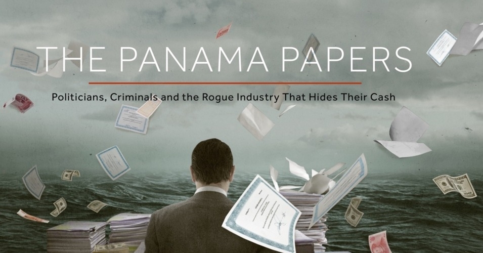
Data and cross-border investigations are supposed to be a perfect match and to empower independent journalistic collaborations (Coronel, 2016; Houston, 2016). Organizations such as the ICIJ, the Organised Crime and Corruption Reporting Project (OCCRP), and others, offer a hand-picked group of hundreds of journalists around the world, free (or, better said, subsidized) access to exclusive data sets available for querying on a private electronic platform, inaccessible to the outside world. They also offer a platform to publish and advertise the stories produced by these journalists.
For these organizations, using such platforms enables achieving scale and efficiency. For individual journalists, having exclusive and secure access in a single place to data troves of leaks, scraped company records, results of FOIA requests, archives, reporter notes, past stories, digitized prosecution files and court records—to name just a few—is a nirvana. This is especially true for those working in isolation and lacking the resources to travel and to store and process data.
While acknowledging these short-term benefits, critical research into how such investigative platforms are shaping the position and work of individual journalists who are using them and the networks they are part of, is yet to be developed.
There are consequences to having very few actors running such platforms and large numbers of journalists depending on them in the cross-border journalism realm. One of these could be understood as what in the landscape of “big tech” has been called a “hyper-modern form of feudalism” based on data ownership (Morozov, 2016). This concept draws attention to how total control of users’ data and interactions is placed in the hands of a few companies who face no competition.
This model raises a number of concerns. An important one is access control. Access to such platforms is for many good reasons behind many layers of security and not every journalist can gain access. The essential question is who decides about who is included and excluded, and what the rules governing these decisions, and any tensions and conflicts that might emerge from them, are. Participation in such platforms is typically governed by a basic non-disclosure agreement or a partnership agreement, where the duties of the journalist or the media outlet receiving access are listed in detail, usually with scarce reference to their rights. Such systems and their governing schemes are not designed with co-ownership principles in mind, but rather as centrally owned structures, with surveillance of user activities and policing of agreement breaches as built-in features.
Moreover, adopting this model in investigative journalism, just as in the rest of the “sharing economy,” runs the risk of generating a precariat within the realm of investigative journalism. Suggestive of this risk are the self-descriptions of some of the organizations running these platforms. For example, the OCCRP is describing itself as the “AirBnb or Uber of journalists” who want to do “great cross-border investigations” (OCCRP, 2017).
Indeed, often journalists are working without pay on data leaks owned by these organizations, having to pay for access to this data with their stories, and at any time running the risk of being removed from the platform. In spite of these unfavourable conditions, journalists increasingly have to be active on such platforms to stay in the game.
For these reasons, the business model for a major investigative network intermediary today may be seen as resembling that of a gig economy digital platform. Access to the platform can be revoked at any time, governance is not open for discussion, surveillance of user activity is built-in and “money is best kept out of the equation” (Buzenberg, 2015). The unpaid work and “radical sharing” interactions of hundreds of journalists are “sold” to donors, without profits being shared back. The ownership of the data leaks and the information exchange enriching such leaks is also not shared with users. Data produced by the information exchanged among users is only shared back under the form of features that would make the platform more efficient and thus would bring more interactions, more users and by extension more donors. The real cost of services is unknown to users.
What can be done to remedy this current trend in the investigative journalism world? A key first step is to acknowledge that platform-based data sharing in investigative journalism networks needs to be accompanied by discussions of governance rules and technology design, as well as co-ownership of data and digital tools. These networks need to develop and adopt public codes of conduct and to have accountability mechanisms in place to deal with abuses of any kind. The absence of these may amplify the precarious work conditions of individual journalists, instead of disrupting legacy media actors.
Secondly, the goal should not be to scale up a small number of cross-border investigative networks to thousands of people each. Rather, the goal should be to find a good model that can be applied to a multitude of independent networks that may collaborate with each other. So instead of a single network of 150 media partners, a more desirable approach would be to have ten networks of 15 partners each. The latter would be commensurate with the principles of a healthy media system, including fair competition and media pluralism. Without such approaches, the participatory potential of cross-border investigative networks will fail to materialize and, fuelled by a network effect, a few platforms will consolidate into a global investigative data-feudalism system.
Footnotes
1. For a different perspective on the I-Hub platform, see Díaz-Struck, Gallego and Romera’s chapter in this book.
Works Cited
Buzenberg, W. E. (2015, July 6). Anatomy of a global investigation: Collaborative, data-driven, without borders. Shorenstein Center. shorensteincenter.org/anatomy-of-a-global-investigation-william-buzenberg/
Coronel, S. (2016, June 20). Coronel: A golden age of global muckrak- ing at hand. Global Investigative Journalism Network. https://gijn.org/2016/06/20/a-golden-age-of-global-muckraking/
Dijck, J. van, Poell, T., & Waal, M. de. (2018). The platform society: Public values in a connective world. Oxford University Press.
Hare, K. (2016, April 4). How ICIJ got hundreds of journalists to collaborate on the Panama Papers. Poynter. www.poynter.org/reporting-editing/2016/how-icij-got-hundreds-of-journalists-to-collaborate-on-the-panama-papers/
Houston, B. (2016, April 14). Panama papers showcase power of a global move- ment. Global Investigative Journalism Network.gijn.org/2016/04/13/panama-papers-showcase-power-of-a-global-movement/
Morozov, E. (2016, April 24). Tech titans are busy privatising our data. The Guardian. www.theguardian.com/commentisfree/2016/apr/24/the-new-feudalism-silicon-valley-overlords-advertising-necessary-evil
OCCRP. (2017). 2016 Annual Report. OCCRP. www.occrp.org/documents/AnnualReport2017.pdf
Raab, B. (2016, April 8). Behind the Panama Papers: A Q&A with International Consortium of Investigative Journalists director Gerard Ryle. Ford Foundation. www.fordfoundation.org...
Ryle, G. (2017, November 5). Paradise Papers: More documents, more reporters, more revelations. ICIJ. www.icij.org/inside-ic...
Wilson-Chapman, A. (2017, August 29). Panama Papers a “notable security success.” ICIJ. www.icij.org/blog/2017...
How the Datablog Used Crowdsourcing to Cover Olympic Ticketing
Written by: Marianne Bouchart

I think the crowdsourcing project that got the biggest response was a piece on the Olympic ticket ballot. Thousands of people in the UK tried to get tickets for the 2012 Olympics and there was a lot of fury that people hadn’t got them. People had ordered hundreds of pounds worth and were told that they’d get nothing. But no one really knew if it was just some people complaining quite loudly while actually most people were happy. So we tried to work out a way to find out.
We decided the best thing we could really do, with the absence of any good data on the topic, was to ask people. And we thought we’d have to treat it as a light thing because it wasn’t a balanced sample.
We created a Google form and asked very specific questions. It was actually a long form, it asked how much in value people had ordered their tickets, how much their card had been debited for, which events they went for, this kind of thing.
We put it up as a small picture on the front of the site and it was shared around really rapidly. I think this is one of the key things, you can’t just think ‘what do I want to know for my story’, you have to think ‘what do people want to tell me right now’. And it’s only when you tap into what people want to talk about that crowdsourcing is going to be successful. The volume of responses for this project, which is one of our first attempts at crowdsourcing, was huge. We had a thousand responses in less than an hour and seven thousands by the end of that day.
So obviously we took presenting the results a bit more seriously at this point. Initially we had no idea how well it would do. So we added some caveats: Guardian readers may be more wealthy than other people, people who got less than they expected might be more willing to talk to us, and so on.
We didn’t know how much value the results would have. We ended up having a good seven thousand records to base our piece on, and we found about half the people who’d asked for tickets had got nothing. We ran all of this stuff and because so many people had taken part the day before, there was a lot of interest in the results.
A few weeks later, the official summary report came out, and our numbers were shockingly close. They were almost exactly spot on. I think partly through luck but also because we got just so many people.
If you start asking your readers about something like this on a comments thread, you will be limited in what you can do with the results. So you have to start by thinking: ‘What is the best tool for what I want to know?’ Is it a comment thread? Or is it building an app? And if it is building an app, you have to think ‘Is this worth the wait? And is it worth the resources that are required to do it?’
In this case we thought of Google Forms. If someone fills in the form you can see the result as a row on a spreadsheet. This meant that even if it was still updating, even if results were still coming in, I could open up the spreadsheet and see all of the results straight away.
I could have tried to do the work in Google but I downloaded it into Microsoft Excel and then did things like sort it from low to high and found the people who decided to write in instead of putting digits on how much they spent and fixed all of those. I decided not to exclude as little as I could. So rather than taking only valid responses, I tried to fix other ones. People had used foreign currencies so I converted them to sterling, all of which was a bit painstaking.
But the whole analysis was done in a few hours, and I knocked out the obviously silly entries. A lot of people decided to fill it out pointing out they spent nothing on tickets. That’s a bit facetious but fine. That was less than a hundred out of over seven thousands entries.
Then there were a few dozen who put in obviously fake high amounts to try to distort the results. Things like ten million pounds. So that left me with a set that I could use with the normal data principles we use every day. I did what’s called a ‘pivot table’. I did some averaging. That kind of thing.
We didn’t have any idea how much momentum the project would have, so it was just me working with the Sports blog editor. We put our heads together and thought this might be a fun project. We did it, start to finish, in 24 hours. We had the idea, we put something up at lunch time, we put it on the front of the site, we saw it was proving quite popular, we kept it on the front of the site for the rest of the day and we presented the results online the next morning.
We decided to use Google Docs because it gives complete control over the results. I didn’t have to use anyone else’s analytic tools. I can put it easily into a database software or into spreadsheets. When you start using specialist polling software, you are often restricted to using their tools. If the information we’d been asking for was particularly sensitive, we might have hesitated before using Google and thought about doing something ‘in house’. But generally, it is very easy to drop a Google Form into a Guardian page and it’s virtually invisible to the user that we are using one. So it is very convenient.
In terms of advice for data journalists who want to use crowdsourcing: you have to have very specific things you want to know. Ask things that get multiple choice responses as much as possible. Try to get some basic demographics of who you are talking to so you can see if your sample might be biased. If you are asking for amounts and things like this, try in the guidance to specify that it’s in digits, that they have to use a specific currency and things like that. A lot won’t, but the more you hold their hand through, the better. And always, always add a comment box because a lot of people will fill out the other things but what they really want is to give you their opinion on the story. Especially on a consumer story or an outrage.
Data-Driven Editorial? Considerations for Working With Audience Metrics
Written by Caitlin Petre
Abstract
Drawing on Caitlin Petre’s ethnographic study of Chartbeat, Gawker Media and The New York Times, this chapter explores the role of metrics in contemporary news production and offers recommendations to newsrooms incorporating metrics into editorial practice.
Keywords: metrics, analytics, newsrooms, journalism practice, ethnog- raphy, editorial practice
On August 23, 2013, the satirical news site The Onion published an op-ed purporting to be written by CNN digital editor Meredith Artley, titled “Let Me Explain Why Miley Cyrus’ VMA Performance Was Our Top Story This Morning.”1 The answer, the piece explained matter-of-factly, was “pretty simple”:
It was an attempt to get you to click on CNN.com so that we could drive up our web traffic, which in turn would allow us to increase our advertisingrevenue. There was nothing, and I mean nothing, about that story that related to the important news of the day, the chronicling of significant human events, or the idea that journalism itself can be a force for positive change in the world. . . . But boy oh boy did it get us some web traffic. (Artley, 2013)
The piece went on to mention specific metrics like page views and bounce rates as factors that motivated CNN to give the Cyrus story prominent home page placement.
Of course, Artley did not actually write the story, but it hit a nerve in media circles nonetheless—especially since a story on Cyrus’ infamous performance at the MTV Video Music Awards had occupied the top spot on CNN.com and, as the real Meredith Artley later confirmed, did bring in the highest traffic of any story on the site that day. The fake op-ed can be interpreted not only as a condemnation of CNN, but also as a commentary on the sorry state of news judgement in the era of web metrics.
Media companies have always made efforts to collect data on their audiences’ demographics and behaviour. But the tracking capabilities of the Internet, as well as the ability to store and parse massive amounts of data, mean that audience metrics have grown far more sophisticated in recent years. In addition to the aforementioned page views and bounce rates, analytics tools track variables like visitors’ return rates, referral sites, scroll depths and time spent on a page. Much of this data is delivered to news organizations in real time.
Metrics dashboards are now virtually ubiquitous in contemporary newsrooms, and heated debates about how and when they should be consulted are nearly as widespread as the metrics themselves. It is not surprising that metrics have become a hot-button issue in journalism. Their presence invites a number of ever-present tensions in commercial news media to come crashing into the foreground. Among them: What is the fundamental mission of journalism, and how can news organizations know when they achieve that mission? How can media companies reconcile their profit imperative with their civic one? To the extent that the distinction between journalist and audience is still meaningful, what kind of relationship should journalists have with their readers? Audience metrics have become ubiquitous in news organizations, but there has been little empirical research on how the data is produced or how it affects newsroom culture and journalists’ daily work.

With the support of Columbia University’s Tow Center for Digital Journalism, I undertook a long-term ethnographic research project to understand how the use of metrics changes reporters’ behaviour and what this means for journalism. My key research questions included the following:
First, how are metrics produced? That is, how do the programmers, data scientists, designers, product leads, marketers and salespeople who make and sell these tools decide which aspects of audience behaviour should be measured and how to measure them? What ideas—about both those whose behaviour they are measuring (news consumers) and those who will be using their tool (journalists)—are embedded in these decisions? How do analytics firms communicate the value of metrics to news organizations?
Second, how are metrics interpreted? Despite their opposing stances, arguments that metrics are good or bad for journalism have one thing in common: They tend to assume that the meaning of metrics is clear and straightforward. But a number on its own does not mean anything without a conceptual framework with which to interpret it. Who makes sense of metrics, and how do they do it?
Third, how are metrics actually used in news work? Does data inform theway newsrooms assign, write and promote stories? In which ways, if any, is data a factor in personnel decisions such as raises, promotions and layoffs? Does data play more of a role in daily work or long-term strategy? And how do the answers to these questions differ across organizational contexts?
To answer these questions, I conducted an ethnographic study of the role of metrics in contemporary news by examining three case studies: Chartbeat, Gawker Media, and The New York Times. Through a combination of observation and interviews with product managers, data scientists, reporters, bloggers, editors and others, my intention was to unearth the assumptions and values that underlie audience measures, the effect of metrics on journalists’ daily work, and the ways in which metrics interact with organizational culture. In what follows I will summarize some of my central discoveries.
First, analytics dashboards have important emotional dimensions that are too often overlooked. Metrics, and the larger “big data” phenomenon of which they are a part, are commonly described as a force of rationalization: That is, they allow people to make decisions based on dispassionate, objective information rather than unreliable intuition or judgement. While this portrayal is not incorrect, it is incomplete. The power and appeal of metrics are significantly grounded in the data’s ability to elicit particular feelings, such as excitement, disappointment, validation and reassurance. Chartbeat knew that this emotional valence was a powerful part of the dashboard’s appeal, and the company included features to engender emo- tions in users. For instance, the dashboard was designed to communicate deference to journalistic judgement, cushion the blow of low traffic and provide opportunities for celebration in newsrooms.
Second, the impact of an analytics tool depends on the organization using it. It is often assumed that the very presence of an analytics tool will change how a newsroom operates in particular ways. However, I found that organizational context was highly influential in shaping if and how metrics influence the production of news. For instance, Gawker Media and The New York Times are both Chartbeat clients, but the tool manifests in vastly different ways in each setting. At Gawker, metrics were highly visible and influential. At The Times, they were less so, and often used to corroborate decisions editors had already made. This suggests that it is impossible to know how analytics are affecting journalism without examining how they are used in particular newsrooms.
Finally, for writers, a metrics-driven culture can be simultaneously a source of stress and reassurance. It is also surprisingly compatible with a perception of editorial freedom. While writers at Gawker Media found traffic pressures stressful, many were far more psychologically affected by online vitriol in comments and on social media. In a climate of online hostility or even harassment, writers sometimes turned to metrics as a reassuring reminder of their professional competence. Interestingly, writers and editors generally did not perceive the company’s traffic-based evaluation systems as an impediment to their editorial autonomy. This suggests that journalists at online-only media companies like Gawker Media may have different notions of editorial freedom and constraint than their legacy media counterparts.
By way of conclusion, I make the following recommendations to news organizations. First, news organizations should prioritize strategic thinking on analytics-related issues (i.e., the appropriate role of metrics in the organization and the ways in which data interacts with the organization’s journalistic goals). Most journalists were too busy with their daily assignments to think extensively or abstractly about the role of metrics in their organization, or which metrics best complemented their journalistic goals. As a result, they tended to consult, interpret and use metrics in an ad hoc way. But this data is simply too powerful to implement on the fly. Newsrooms should create opportunities—whether internally or by partnering with outside researchers—for reflective, deliberate thinking removed from daily production pressures about how best to use analytics.
Second, when choosing an analytics service, newsroom managers should look beyond the tools and consider which vendor’s strategic objectives, business imperatives and values best complement those of their newsroom. We have a tendency to see numbers—and, by extension, analytics dash- boards—as authoritative and dispassionate reflections of the empirical world. When selecting an analytics service, however, it is important to remember that analytics companies have their own business imperatives.
Third, when devising internal policies for the use of metrics, newsroom managers should consider the potential effects of traffic data not only on editorial content, but also on editorial workers. Once rankings have a prominent place on a newsroom wall or website, it can be difficult to limit their influence. Traffic-based rankings can drown out other forms of evaluation, even when that was not the intention.
Finally, although efforts to develop better metrics are necessary and worthwhile, newsrooms and analytics companies should be attentive to the limitations of metrics. As organizational priorities and evaluation systems are increasingly built on metrics, there is danger in conflating what is quantitatively measurable with what is valuable. Not everything can—or should—be counted. Newsroom, analytics companies, funders and media researchers might consider how some of journalism’s most compelling and indispensable traits, such as its social mission, are not easily measured. At a time when data analytics are increasingly valorized, we must take care not to equate what is quantifiable with what is valuable.
Footnotes
1. This piece has been excerpted and adapted from “The Traffic Factories: Metrics at Chartbeat, Gawker Media, and The New York Times,” originally published by the Tow Center for Digital Journalism at the Columbia University Graduate School of Journalism in 2015. Republished with permission.
Works Cited
Artley, M. (2013, August 26). Let me explain why Miley Cyrus’ VMA performance was our top story this morning. The Onion. www.theonion.com/let-me-explain-why-miley-cyrus-vma-performance-was-our-1819584893
Using and Sharing Data: the Black Letter, Fine Print, and Reality
Written by: Mike Linksvayer
In this section we’ll have a quick look at the state of the law with respect to data and databases, and what you can do to open up your data using readily available public licenses and legal tools. Don’t let any of the following dampen your enthusiasm for data driven journalism. Legal restrictions on data usually won’t get in your way, and you can easily make sure they won’t get in the way of others using data you’ve published.
To state the obvious, obtaining data has never been easier. Before the widespread publishing of data on the web, even if you had identified a dataset you needed, you’d need to ask whoever had a copy to make it accessible to you, possibly involving paper and the post or a personal visit. Now, you have your computer ask their computer to send a copy to your computer. Conceptually similar, but you have a copy right now, and they (the creator or publisher) haven’t done anything, and probably have no idea that you have downloaded a copy.
What about downloading data with a program (sometimes called “scraping”) and terms of service (ToS)? Consider the previous paragraph: your browser is just such a program. Might ToS permit access by only certain kinds of programs? If you have inordinate amounts of time and money to spend reading such documents and perhaps asking a lawyer for advice, by all means, do. But usually, just don’t be a jerk: if your program hammers a site, your network may well get blocked from accessing the site in question and perhaps you will have deserved it. There is now a large body of practice around accessing and scraping data from the web. If you plan to do this, reading about examples at a site like ScraperWiki will give you a head start.
Once you have some data of interest, you can query, pore over, sort, visualize, correlate and perform any other kind of analysis you like using your copy of the data. You can publish your analysis, which can cite any datum. There’s a lot to the catchphrase “facts are free” (as in free speech), but maybe this is only a catchphrase among those who think too much about the legalities of databases, or even more broadly (and more wonkily), data governance.
What if, being a good or aspiring to be good data-driven journalist, you intend to publish not just your analysis, including some facts or data points, but also the datasets/databases you used — and perhaps added to — in conducting your analysis? Or maybe you’re just curating data and haven’t done any analysis — good, the world needs data curators. If you’re using data collected by some other entity, there could be a hitch. (If your database is wholly assembled by you, read the next paragraph anyway as motivation for the sharing practices in the next next paragraph.)
If you’re familiar with how copyright restricts creative works — if the copyright holder hasn’t given permission to use a work (or the work is in the public domain or your use might be covered by exceptions and limitations such as fair use) and you use — distribute, perform, etc. — the work anyway, the copyright holder could force you to stop. Although facts are free, collections of facts can be restricted very similarly, though there’s more variation in the relevant laws than there is for copyright as applied to creative works. Briefly, a database can be subject to copyright, as a creative work. In many jurisdictions, by the “sweat of the brow”, merely assembling a database, even in an uncreative fashion, makes the database subject to copyright. In the United States in particular, there tends to be a higher minimum of creativity for copyright to apply (Feist, a case about a phone book, is the U.S. classic if you want to look it up). But in some jurisdictions there are also “database rights” which restrict databases, separate from copyright (though there is lots of overlap in terms of what is covered, in particular where creativity thresholds for copyright are nearly nonexistent). The best known of such are the European Union’s “sui generis” database rights. Again, especially if you’re in Europe, you may want to make sure you have permission before publishing a database from some other entity.
Obviously such restrictions aren’t the best way to grow an ecosystem of data driven journalism (nor are they good for society at large – social scientists and others told the EU they wouldn’t be before sui generis came about, and studies since have shown them to be right). Fortunately, as a publisher of a database, you can remove such restrictions from the database (assuming it doesn’t have elements that you don’t have permission to grant further permissions around), essentially by granting permission in advance. You can do this by releasing your database under a public license or public domain dedication — just as many programmers release their code under a free and open source license, so that others can build on their code (as data driven journalism often involves code, not just data, of course you should release your code too, so that your data collection and analysis are reproducible). There are lots of reasons for opening up your data. For example, your audience might create new visualizations or applications with it that you can link to — as the Guardian do with their data visualization Flickr pool. Your datasets can be combined with other datasets to give you and your readers greater insight into a topic. Things that others do with your data might give you leads for new stories, or ideas for stories, or ideas for other data driven projects. And they will certainly bring you kudos.

When one realises that releasing works under public licenses is a necessity, the question becomes: which license? That tricky question will frequently be answered by the project or community whose work you’re building on, or that you hope to contribute your work to – use the license they use. If you need to dig deeper, start from the set of licenses that are free and open – meaning that anyone has permission, for any use (attribution and sharing alike might be required). What the Free Software Definition and Open Source Definition do for software, the Open Knowledge Definition does for all other knowledge, including databases: define what makes a work open, and what open licenses allow users to do.
You can visit the Open Knowledge Definition website to see the current set of licenses which qualify. In summary, there are basically three classes of open licenses:
-
Public domain dedications, which also serve as maximally permissive licenses; there are no conditions put upon using the work;
-
Permissive or attribution-only licenses; giving credit is the only substantial condition;
-
Copyleft, reciprocal, or share-alike licenses; these also require that modified works, if published, be shared under the same license.
Note if you’re using a dataset published by someone else under an open license, consider the above paragraph a very brief guide as to how to fulfil the conditions of that open license. The licenses you’re most likely to encounter, from Creative Commons, Open Data Commons, and various governments, usually feature a summary that will easily allow you to see what the substantial conditions are. Typically the license will be noted on a web page from which a dataset may be downloaded (or “scraped”, as of course web pages can contain datasets) or in a conspicuous place within the dataset itself, depending on format. This marking is what you should do as well, when you open up your datasets.
Going back to the beginning, what if the dataset you need to obtain is still not available online, or behind a some kind of access control? Consider, in addition to asking for access yourself, asking for the data to be opened up for the world to reuse. You could give some pointers to some of the great things that can happen with their data if they do this.
Sharing with the world might bring to mind that privacy and other considerations and regulations might come into play for some datasets. Indeed, just because open data lowers many technical and copyright and copyright-like barriers, doesn’t mean you don’t have to follow other applicable laws. But that’s as it always was, and there are tremendous resources and sometimes protections for journalists should your common sense indicate a need to investigate those.
Good luck! But in all probability you’ll need more of it for other areas of your project than you’ll need for managing the (low) legal risks.
Data Journalism, Digital Universalism and Innovation in the Periphery
Written by Anita Say Chan
Abstract
The “myth of digital universalism” manifests not only in the means by which it keeps public narratives and imaginations fixed exclusively around so-called “centres” of innovation, but in the means by which it simultaneously discourages attention to digital dynamics beyond such centres—a dynamic conjuring colonial relations to data and the periphery that reporters and scholars of global digital cultures alike must be wary of reproducing.
Keywords: digital universalism, centre, periphery, colonial relations, decolonial computing, local innovation
“Digital universalism” is the pervasive but mistaken framework shaping global imaginaries around the digital that presumes that a single, universal narrative propelled by “centres” of innovation can accurately represent the forms of digital development underway across the globe today. It presumes, that is, that the given centres of contemporary “innovation” and technological design will inevitably determine the digital future that comes to spread across the world for the majority of the “digital rest.” And it resonates through the casual presumption that the best, most “legitimate” sites from which to study and observe technological transformation, digital productivity and practice, or information-based innovation and inquiry, are from such centres. Foremost among them: the labs, offices and research sites nestled in Silicon Valley and their dispersed equivalents in other innovation capitals worldwide that concentrate elite forms of digital expertise.
It is from such centres that digital culture presumably originates and has its purest form and manifestation—only to be replicated elsewhere; there that visions for digital futuricity in its most accurate or ideal approximations emerge; and there that technological advancements—and thus digital cultural advancements—are dominantly understood to be at their most dynamic, lively and inspired. It assumes, in other words, that digital culture—despite its uniquely global dimensions—does indeed have more “authentic” and productive sites from which to undertake its study and observe its dynamics.
As a young researcher studying and writing about digital cultural activism and policy in Peru and Latin America from the early 2000s onward, it shaped my experience in fundamental ways, most regularly in the routine and seemingly innocent question I heard: “Why go to Peru or Latin America to study digital culture?” Weren’t there “better” sites from which to study digital cultures, and wouldn’t my time be better invested attending to and documenting activity in a site like Silicon Valley?
For such questioners, Peru inevitably evoked the idea of a mountainous South American nation that once served as the heart of the Inca civilization: Home to Machu Picchu, high stretches of the Andes mountain range, and large populations of Quechua- and Aymara-speaking communities. This Peru might be known as an ideal space from which to peer into past tradition, native culture or the plethora of nature’s bounty—but it had little to tell us, the thinking went, about the dynamics of contemporary digital culture, high technological flows or their associated future-oriented developments. Places such as Peru might unlock a path strewn with the relics and treasures of a technological past we’d have to literally struggle not to forget, while sites like Silicon Valley are where the secrets to a technological future whose path we had yet to fully tread would inevitably come to be unlocked.
Quietly asserted in such a question then, is a casual certainty around the idea that the digital futures imagined by select populations of technologists in elite design centres can speak for the global rest, and the present currently unfolding in innovation centres must surely be the future of the periphery.
The power of the “myth of digital universalism” thus manifests not only in the means by which it keeps public narratives and imaginations fixed exclusively around established centres of innovation, but in the means by which it simultaneously discourages attention to digital dynamics beyond such centres. It therein narrows the diversity and global circulation of narratives around actual digital dynamics occurring across a range of locales, invisibilizes diverse forms of digital generativity, and artificially amplifies and reinforces a representation of “innovation” capitals as exclusive sites of digital productivity.
There is a particular colonial notion of the periphery conjured here that reporters and scholars of global digital cultures alike must be wary of reproducing: That is, of the “periphery” as mere agents of global counterfeit or zones of diffusion for a future invented prior and elsewhere. Indeed, the periphery is hardly so passive or uninventive. Lively and dynamic outdoor markets or Internet cafes filled with used, recycled and reassembled computers and parts are innovations of the Global South that extended low-cost Internet access and scaled out global and local media content circulation to diverse populations in rural and urban zones alike. These technological hacks and local improvisations are an everyday part of the periphery’s technology landscape whose vibrancy is only partly captured by comparing it to formalized commercial chains of digital goods or computer and Internet suppliers. As the social scientists Daniel Miller and Don Slater (2001) observed in their study of Trinidad, “the Internet is not a monolithic cyberspace,” but exists instead as a globally expansive technology with various local realities, adoptive practices and cultural politics that surround its varying localizations. There have been, indeed, more ways than one to imagine what digital practice and connection could look like.
In Peru, evidence of lively digital cultures that brought a range of distinct actors and interests into unexpected and often contradictory proximity was readily visible. Apparent collectives of free software advocates, who had helped to bring the first UN-sponsored conference on free software use in Latin America—a landmark event—to the ancient Incan capital of Cuzco in 2003, sought to reframe the adoption of open technologies. They sought to reframe it as not just an issue of individual liberty and free choice, as it had been for free/libre and open-source software (FLOSS) advocacy in the United States, but of cultural diversity, state transparency and political sovereignty from the monopolistic power of transnational corporations in the Global South.
“Digital innovation” classrooms installed in rural schools by the state would later be converted into the largest network of deployment sites for MIT’s high-profile One Laptop per Child (OLPC) initiative just several years later, all in the name of enabling universal digital inclusion. And intellectual property (IP) titles newly and aggressively applied by state programmes to “traditional” goods promised to convert rural producers and artisans into new classes of export-ready “information workers” as part of the nation’s growing information society-based initiatives.

FLOSS advocates and high-tech activists in Cuzco, state -promoted “innovation classrooms” in rural schools, and traditional artisans as new global “information workers” were not the conventional interests or protagonists that emerged from most tales spun in centres of digital culture. To watch their stories unfold was to watch the details of each spill over the edges of the existing frameworks and dominant narratives of digital culture. Global imaginaries around IT in the new millennium, after all, have made Silicon Valley hackers, the obsessions and aspirations of high-tech engineers, and the strategic enterprise of competitive technology entrepreneurs, the stuff of popular Hollywood films and obsessively followed Twitter accounts. These are a cast of increasingly recognizable actors, heroes and villains. But to capture the dynamic engagements and fraught experiments in digital culture in Peru requires attention to a host of other stakes, agents and developments—ones that in working around the digital tried to build new links and exchanges between spaces of the rural and the urban, the high-tech and the traditional, and distinct orientations around the global with intensive commitments to the local.
Data journalists today have a growing host of digital tools and technological resources to witness, capture and recall digital cultures and activities across a range of local sites around the world. Even before the wave of social protests in the Middle East starting in early 2011, networked digital media extended new global broadcast capabilities for movements that adopted strategic uses of social media in contexts as diverse as Mexico (Schulz, 2007), Iran (Burns & Eltham, 2009; Grossman, 2009), the Philippines (Uy-Tioco, 2003; Vicente, 2003) and Ukraine (Morozov, 2010).
In the wake of the 2011 Arab Spring—movements from Spain’s 15-M Indignados, to the North American Occupy, made strategic uses of hashtag organizing and activism on social media platforms. More recently, movements from the US-launched #MeToo and #BlackLivesMatter run alongside global mobilizations from Latin America’s #NiUnaMenos, to the Nigerian- launched #BringBackOurGirls, Australia’s #Sosblakaustralia, Canadian First Nations’ #IdleNoMore mobilizations and Hong Kong’s #UmbrellaRevolution.

Such movements’ expanding user-generated media streams multiply civic data practices and decentre the dominant applications of “big data” on social media platforms that bias towards forms of market-oriented profiling. They instead leverage data practices for new forms of narrative capacity that break from established centres of media and news production while lending their data archives—and online evidence of the global extensions of their publics—to geographically dispersed documentarians, reporters and organizers alike.
But the growth of digital resources and data repositories—from online “data” archives by social movements on social media platforms, to parallel forms of creative data activism—creates new risks for data journalists as well. Foremost among these is a risk from the seductive capacity of big data and social media platforms to leverage the abundance of data and informa- tion they collect as a means to convince audiences that their extensive data trackings compile and create the best possible form of documenting present human activity and social experience—as well as assessing and predicting the future of their political or economic ramifications.
The temporal presumptiveness of digital universalists’ projection that the forms of digital “present” cultivated in innovation centres today can and will accurately represent the digital futures of global peripheries finds a new complement in data industries’ self-assured claims for the predictive capacities of algorithmic data processing. Such pronouncements remain, even despite the evident contemporary failures of mainstream political data analysts, social media companies and news pundits in the West to accurately predict the major global political disruptions of recent years—from the 2016 US presidential election, to Brexit, to the Cambridge Analytica scandal, to the “surprise” rise of the alt-right movements across the West.
Today’s data journalists should be vigilantly wary of enabling data tracings and archives—regardless of how extensive and impressively large they may be—to serve as the sole or dominant form of documenting, speaking for and assessing the diverse forms of social realities that the public relies on them to channel. Parallel with growing calls from Latin American and postcolonial scholars for broadening research and documentation methods to expand what and who represents information, technology and new media cultures under a “decolonial computing” framework (Chan, 2018), data journalists critical of digital universalist frameworks should aim too to consciously diversify data sources and decentre methods that would privilege “big data” as the exclusive or most legitimate key to mapping empirical events and social realities. Moves towards a “decolonization of knowledge” underscore the significance of the diverse ways through which citizens and researchers in the Global South are engaging in bottom-up data practices.1 These practices leverage an emphasis on community practices and human-centred means of assessing and interpreting data—for social change, as well as speaking for the resistances to uses of big data that increase oppression, inequality and social harm.
Data journalists critical of digital universalism’s new extensions in data universalism should take heart to find allies and resonant concerns for developing accountable and responsible data practices with scholars in critical data studies, algorithm studies, software and platform studies, and postcolonial computing. This includes a reinforced rejection of data fundamentalism (Boyd & Crawford, 2012) and technological determinism that still surrounds mainstream accounts of algorithms in application. It also entails a fundamental recentring of the human within datafied worlds and data industries—that resists the urge to read big data and “algorithms as fetishized objects . . . and firmly resist[s] putting the technology in the explanatory driver’s seat” (Crawford, 2016). It also involves treating data infrastructures and the underlying algorithms that give political life to them intentionally as both ambiguous and approachable—to develop methodologies that not only explore new empirical and everyday settings for data politics—whether airport security, credit scoring, hospital and patient tracking, or social media across a diversity of global sites—but also find creative ways to make data productive for analysis (Gillespie, 2013; Ziewitz, 2016).
Finally, it is perhaps worth a reminder that conserving the given centres of digital innovation as the exclusive sites of digital invention or the making of data futures, of course, also neglects another crucial detail—that the centres of the present were once on the periphery, too. To focus on centres as inventing models that simply come to be adopted and copied elsewhere presumes the perfect, continual extension of replicative functions and forces. It fails to account for the possibility of change within the larger system—the destabilizations and realignments of prior centres—and so, too, the realignments of prior peripheries.
The “surprise” of the 2011 Arab Spring and its influence across a range of global sites in the West and non-West like, much like the recent rise of non-Western digital markets and economic competitors in nations labelled “developing” less than two decades ago, and the destabilization of powerful Western democracies today, are reminders that the stability of established powers and the permanence of centre–periphery relations can questioned. Far from merely lagging behind or mimicking centres, dynamic activities from the periphery suggest how agents once holding minor status can emerge instead as fresh sources of distinct productivity. Their diverse threads unsettle the unspoken presumption that a single, universal narrative could adequately represent the distinct digital futures and imaginaries emerging across a range of local sites today.
Footnotes
1. For more on this see Kukutai and Walter’s chapter in this book.
Works Cited
Boyd, D., & Crawford, K. (2012). Critical questions for big data. Information, Communication & Society, 15(5), 662–679. doi.org/10.1080/1369118X.2012.678878
Burns, A., & Eltham, B. (2009). Twitter free Iran: An evaluation of Twitter’s role in public diplomacy and information operations in Iran’s 2009 election crisis. In P. Franco & M. Armstrong (Eds.), Record of the Communications Policy & Research Forum 2009 (pp. 322–334). Network Insight Institute.
Chan, A. (2018). Decolonial computing and networking beyond digital universalism. Catalyst, 4(2). doi.org/10.28968/cftt.v4i2.29844
Crawford, K. (2016). Can an algorithm be agonistic? Ten scenes from life in cal- culated publics. Science, Technology, & Human Values, 41(1), 77–92. doi.org/10.1177/0162243915589635
Gillespie, T. (2013). The relevance of algorithms. In T. Gillespie, P. J. Boczkowski, & K. A. Foot (Eds.), Media technologies: Essays on communication, materiality, and society (pp. 167–193). MIT Press.
Grossman, L. (2009, June 17). Iran’s protests: Why Twitter is the medium of the movement. Time. content.time.com/time/world/article/0,8599,1905125,00.html
Miller, D., & Slater, D. (2001). The Internet: An ethnographic approach. Berg Publishers.
Morozov, E. (2010). The net delusion: The dark side of Internet freedom. Public Affairs.
Schulz, M. (2007). The role of the Internet in transnational mobilization: A case studyof the Zapatista movement, 1994–2005. In M. Herkenrath (Ed.), Civil society: Local and regional responses to global challenges (pp. 129–156). Transaction Publishers.
Uy-Tioco, C. (2003, October 11). The cell phone and EDSA 2: The role of a com- munication technology in ousting a president. Critical Themes in Media Studies Conference.
Vicente, R. (2003). The cell phone and the crowd: Messianic politics in the contemporary Philippines. Public Culture, 24(47), 3–36. doi.org/10.1080/01154451.2003.9754246
Ziewitz, M. (2016). Governing algorithms: Myth, mess, and methods. Science,Technology, & Human Values, 41(1), 3–16. doi.org/10.1177/0162243915608948
Become Data Literate in 3 Simple Steps
Written by: Nicolas Kayser-Bril

Just as literacy refers to “the ability to read for knowledge, write coherently and think critically about printed material” data-literacy is the ability to consume for knowledge, produce coherently and think critically about data. Data literacy includes statistical literacy but also understanding how to work with large data sets, how they were produced, how to connect various data sets and how to interpret them.
Poynter’s News University offers classes of Math for journalists, in which reporters get help with concepts such as percentage changes and averages. Interestingly enough, these concepts are being taught simultaneously near Poynter’s offices, in Floridian schools, to fifth grade pupils (age 10-11), as the curriculum attests.
That journalists need help in math topics normally covered before high school shows how far newsrooms are from being data literate. This does not go without problems. How can a data-journalist make use of a bunch of numbers on climate change if she doesn’t know what a confidence interval means? How can a data-reporter write a story on income distribution if he cannot tell the mean from the median?
A reporter certainly does not need a degree in statistics to become more efficient when dealing with data. When faced with numbers, a few simple tricks can help her get a much better story. As Max Planck Institute professor Gerd Gigerenzer says says, better tools will not lead to better journalism if they are not used with insight.
Even if you lack any knowledge of math or stats, you can easily become a seasoned data-journalist by asking 3 very simple questions.
1. How was the data collected?
Amazing GDP growth
The easiest way to show off with spectacular data is to fabricate it. It sounds obvious, but data as commonly commented upon as GDP figures can very well be phony. Former British ambassador Craig Murray reports in his book, Murder in Samarkand, that growth rates in Uzbekistan are subject to intense negotiations between the local government and international bodies. In other words, it has nothing to do with the local economy.
GDP is used as the number one indicator because governments need it to watch over their main source of income - VAT. When a government is not funded by VAT, or when it does not make its budget public, it has no reason to collect GDP data and will be better-off fabricating them.
Crime is always on the rise
“Crime in Spain grew by 3%”, writes El Pais. Brussels is prey to increased crime from illegal aliens and drug addicts, says RTL. This type of reporting based on police-collected statistics is common, but it doesn’t tell us much about violence.
We can trust that within the European Union, the data isn’t tampered with. But police personnel respond to incentives. When performance is linked to clearance rate, for instance, policemen have an incentive to reports as much as possible on incidents that don’t require an investigation. One such crime is smoking pot. This explains why drug-related crimes in France increased fourfold in the last 15 years while consumption remained constant.
What you can do
When in doubt about a number’s credibility, always double check, just as you’d have if it had been a quote from a politician. In the Uzbek case, a phone call to someone who’s lived there for a while suffices (‘Does it feel like the country is 3 times as rich as it was in 1995, as official figures show?’).
For police data, sociologists often carry out victimisation studies, in which they ask people if they are subject to crime. These studies are much less volatile than police data. Maybe that’s the reason why they don’t make headlines.
Other tests let you assess precisely the credibility of the data, such as Benford’s law, but none will replace your own critical thinking.
2. What’s in there to learn?
Risk of Multiple Sclerosis doubles when working at night
Surely any German in her right mind would stop working night shifts after reading this headline. But the article doesn’t tell us what the risk really is in the end.
Take 1,000 Germans. A single one will develop MS over his lifetime. Now, if every one of these 1,000 Germans worked night shifts, the number of MS sufferers would jump to 2. The additional risk of developing MS when working in shifts is 1 in 1,000, not 100%. Surely this information is more useful when pondering whether to take the job.
On average, 1 in every 15 Europeans totally illiterate
The above headline looks frightening. It is also absolutely true. Among the 500 million Europeans, 36 million probably don’t know how to read. As an aside, 36 million are also under 7 (data from Eurostat).
When writing about an average, always think “an average of what?” Is the reference population homogeneous? Uneven distribution patterns explain why most people drive better than average, for instance. Many people have zero or just one accident over their lifetime. A few reckless drivers have a great many, pushing the average number of accidents way higher than what most people experience. The same is true of the income distribution: most people earn less than average.
What you can do
Always take the distribution and base rate into account. Checking for the mean and median, as well as mode (the most frequent value in the distribution) helps you gain insights in the data. Knowing the order of magnitude makes contextualization easier, as in the MS example. Finally, reporting in natural frequencies (1 in 100) is way easier for readers to understand that using percentage (1%).
3. How reliable is the information?
The sample size problem
“80% dissatisfied with the judicial system”, says a survey reported in Zaragoza-based Diaro de Navarra. How can one extrapolate from 800 respondents to 46 million Spaniards? Surely this is full of hot air.
When researching a large population (over a few thousands), you rarely need more than a thousand respondents to achieve a margin of error under 3%. It means that if you were to retake the survey with a totally different sample, 9 times out of 10, the answers you’ll get will be within a 3% interval of the results you had the first time around. Statistics are a powerful thing, and sample sizes are rarely to blame in dodgy surveys.
Drinking tea lowers the risk of stroke
Articles about the benefits of tea-drinking are commonplace. This short item in Die Welt saying that tea lowers the risk of myocardial infarction is no exception. Although the effects of tea are seriously studied by some, many pieces of research fail to take into account lifestyle factors, such as diet, occupation or sports.
In most countries, tea is a beverage for the health-conscious upper classes. If researchers don’t control for lifestyle factors in tea studies, they tell us nothing more than ‘rich people are healthier - and they probably drink tea’.
What you can do
The math behind correlations and error margins in the tea studies are certainly correct, at least most of the time. But if researchers don’t look for co-correlations (e.g. drinking tea correlates with doing sports), their results are of little value.
As a journalist, it makes little sense to challenge the numerical results of a study, such as the sample size, unless there are serious doubts about it. However, it is easy to see if researchers failed to take into account relevant pieces of information.
The Datafication of Journalism: Strategies for Data-Driven Storytelling and Industry–Academy Collaboration
Written by Damian Radcliffe and Seth C. Lewis
Abstract
How are journalism and academia responding to the datafication of their professions, and how can they collaborate more effectively on data-driven work?
Keywords: journalism, academia, collaboration, datafication, data work, researcher–journalist collaborations
We live in a world driven and informed by data. Data increasingly influences how policy and political decisions are made (Höchtl et al., 2016; Kreiss, 2016), informs the design and functionality of the cities we live in (Glaeser et al., 2018), as well as shapes the types of news, products and information that we have access to—and consume—in the digital age (Diakopoulos, 2019; Lewis, 2017; Lewis & Westlund, 2015; Thurman et al., 2019; Usher, 2016; Zamith, 2018). The full power and potential of data, for good or ill, is only just beginning to be realized (Couldry & Mejias, 2019; O’Neil, 2016; Schroeder, 2018).
Governments, universities and news media have long made use of data and statistics to find patterns and explain the world. But with the growth in digital devices and the massive trace data they produce—about our clicks, likes, shares, locations, contacts and more—the sheer volume of data generated, as well as the increase in computing power to harness and analyze such data at scale, is staggering. Making sense of all that data, in many cases, is arguably the biggest challenge, and is deeply fraught with ethical determinations along the way (Crawford et al., 2014). It is a riddle that policy makers, businesses, researchers, activists, journalists and others are contending with—and one that will not be so easily resolved by “big-data solutions” or, in vogue today, the glittering promise of artificial intelligence (Broussard, 2018; Broussard et al., 2019).
In this chapter, building on our respective observations of practice (Radcliffe) and research (Lewis) regarding data and journalism, we outline how the worlds of journalism and academia are responding to the datafication of their professions as well as the broader datafication of public life. Ultimately, our aim is to offer recommendations for how these two fields, which historically have shared a rather uneasy relationship (Carlson & Lewis, 2019; Reese, 1999), might more productively work together on data-centric challenges.
The poet John Donne wrote that “no man is an island.” In a data-driven world, no profession should be either.
Journalism and Data-Driven Storytelling: Five Strategic Considerations
The use of data to tell stories, and make sense of the world around us, is not wholly new.1
In Victorian England, physician John Snow produced a map that plotted cholera cases in central London. It enabled him to identify a pump on Broad Street as the cause of a particularly fatal, and geographically focused, outbreak of the disease in 1855 (see Figures 44.1 and 44.2). Snow’s influential analysis does not look too dissimilar from disease maps produced with modern tools of data analysis and visualization.
In another example, Florence Nightingale’s visualizations “of the causes of mortality in the army in the East” (“Worth a Thousand Words,” 2013) helped to demonstrate the role that sanitation (or lack thereof) played in causing the death of British soldiers fighting in the Crimean War (see Figure 44.3). Her designs still feel remarkably contemporary.
Alongside these efforts, around the same time, Horace Greeley’s work for The New York Tribune in the mid-19th century exposed how a number of elected officials (including a young Abraham Lincoln) were claiming expenses greater than they were eligible for (Klein, 2015). Although the world has moved on (Greeley’s work focused on distances typically travelled by horseback), this type of important investigative work continues to be a journalistic staple (Larcinese & Sircar, 2017; see also Barrett, 2009; “A Chronology of the Senate Expenses Scandal,” 2016; “Expenses Scandal an Embarrassing Start,” 2017; “MPs’ Expenses: Full List,” 2009; “Q&A: MP Expenses,” 2009; Rayner, 2009; “Senate Expenses Scandal,” n.d.).

These historic examples, coupled with more contemporary case studies (such as those identified by the annual Data Journalism Awards), can act as powerful sources of inspiration for journalists.2 They demonstrate how data-driven approaches may be used to hold authority to account (ICIJ, n.d.), highlight important social injustices (Lowenstein, 2015), as well as visualize and showcase the extraordinary (“2016 Year in Review,” 2016).
While data has long been a part of journalism, as reflected in the emergence of “computer-assisted reporting” during the late 20th century, recent developments in the availability and accessibility of data-driven techniques have amplified opportunities for distinctly data-driven journalism (for a history, see Anderson, 2018; for an overview of data journalism, see Gray et al., 2012). It is against this backdrop that news organizations around the world—particularly the best-resourced ones, but increasingly smaller newsrooms as well—are using data to inform their journalistic work, both in telling stories with data (Hermida & Young, 2019) as well as in using data (in the form of digital audience metrics) to influence story selection as well as to measure and improve the impact of their work (Zamith, 2018).


Here are five key messages for newsrooms and journalists looking to do more with data:
Data alone does not tell stories. We still need journalists. For all of the data we have access to, we still need journalists to make sense of it, by providing context and interrogating the data in the same way as any other source.
As Steve Johnson (2013) of Montclair State University has noted: “Readers don’t care about the raw data. They want the story within the data.” Commenting on data about lower Manhattan provided by an early open-data portal, EveryBlock, he observed:
There were reports on what graffiti the city said it had erased each month, by neighborhoods. But what was missing was context, and photos. If I’m a reporter doing a story on graffiti, I want to show before and after photos, AND, more importantly, I want to know whether the city is successfully fighting the graffiti artists, i.e., who is winning. The raw data didn’t provide that. (Johnson, 2013)
More recent “data dumps” such as the Paradise Papers and Panama Papers also emphasize this point. In this instance, sources had to be cross-referenced and contextualized—a time-consuming process that took many journalists months to do. However, without this interrogation of the sources by journalists (as opposed to concerned citizens), the full impact of the data could not be realized. These principles are as applicable at the local level as they are in stories of national and international import (Radcliffe, 2013).
Data, in itself, is seldom the story. It needs to be unpacked and its implications explained, if the full meaning behind it is to be understood.
You don’t have to go it alone. Collaboration is often key. Collaboration has been a watchword of the networked age, and a key element in the ongoing blending of journalism and technology sensibilities—including the integration of “hacks” (journalists) and “hackers” (coders) (Lewis & Usher, 2014, 2016) as well as the broader interplay of news organizations and their communities around shared concerns. The essence of such “networked journalism” (Beckett, 2010; Van der Haak et al., 2012) or “relational journalism” (Boczkowski & Lewis, 2018; Lewis, 2019) is the underlying belief that more might be accomplished through cooperative activity.
This approach is applicable to many beats and stories, including those involving large volumes of data. As The Guardian showed in their 2009 analysis of British MPs’ expenses, concerned citizens and members of the public can work in tandem with journalists to analyze data sets and provide tips (“MPs’ Expenses: The Guardian,” 2009; Rogers, 2009a, 2009b). More recently, research by Stanford’s James T. Hamilton (2016) and others (Sambrook, 2018) has identified the importance of collaboration—both across organizations and in the deployment of different disciplines—for many newsrooms, when it comes to producing high-quality, high-impact investigative journalism.
The amount of data that many new organizations are contending with, coupled with ongoing challenging economic circumstances, means that partnerships, the use of specialists, volunteers and wide-ranging skill sets, are often a necessity for many newsrooms. And, a collaborative approach is increasingly essential from both a financial and journalistic standpoint.
How you present your data matters. Journalists have access to a wide range of tools, techniques and platforms through which to present data and tell stories accordingly.3 As a result, it is important to determine which tools are most appropriate for the story you are trying to tell.
Data visualizations, graphs, infographics, charts, tables and interactives—all can help to convey and drive home a story. But which one (or ones) you use can make all the difference.4
As our colleague Nicole Dahmen has noted, one way to do this is through data visualization. “Visuals catch audience attention . . . [and] . . . are processed 60 times faster than text” (as cited in Frank et al., 2015). When used well, they can help to bring a story alive in a manner that text alone cannot.
The Washington Post’s online feature “The Depth of the Problem,” which shows how deep in the ocean the black box from the missing Malaysia Airlines flight 370 could be, is a good example of this (“The Depth of the Problem,” n.d.; see Figure 26.5). The reader scrolls down the page to 1,250 feet, the height of the Empire State Building; past 2,600 feet, the depth of giant squids; and below 12,500 feet, where the Titanic sits; to 15,000 feet, where the black box was believed to be.
“You’re not just reading how deep that plane is,” Dahmen has said. “You can see and engage and really experience and understand how deep they suspect that plane to be.”
Determining your approach may be influenced by both the story you want to tell and the data literacy and preferences of your audience. Either way, your data-driven stories should be well designed so that audiences do not struggle to understand what is being shown or how to interact with the data (Radcliffe, 2017b, 2017c).
Place your work in a wider context. Alongside these considerations, journalists working with data also need to be cognizant of wider developments, in terms of the consumption of content and attitudes towards journalism.
Think mobile: In 2012, the Pew Research Center found that over half of those who owned a smartphone or a tablet accessed news content on those devices (Mitchell et al., 2012; “News Consumption on Digital Devices,” 2017); just four years later, more than seven in ten Americans (72%) reported getting news via mobile (Mitchell et al., 2016). As mobile news consumption continues to grow, so too it is imperative that news organizations provide a positive mobile experience for all of their content, including data-rich material.
Make it personal: In an era of personalization and algorithmically generated media experiences, this can include creating opportunities for audiences to interrogate data and understand what it means for them. ProPublica’s Dollars for Docs investigation (Tigas et al., 2019), which enables patients to see the payments made by pharmaceutical and medical device companies to their doctors, is one example of this technique in action.
Protecting your sources: Journalists need to know how to protect data as well as how to analyze it. Protecting yourself, and your sources, may well require a new approach—including new skill sets—to handling sensitive data and whistleblowers (Keeble-Gagnere, 2015). Encryption coupled with anonymity (as witnessed in the Panama Papers) is one way to do this.
Harnessing new technologies: Blockchain is just one tool that may protect and support data and investigative work (IJNET, 2016). As Walid Al-Saqaf of Södertörn University (Sweden) (as cited in Bouchart, 2018) has explained: “Blockchain preserves data permanently and prevents any manipulation or fraud. That means that if governmental data is there it can’t be removed or changed once it is published.” Machine learning is another technology already being used in this space, and one which will only grow (Bradshaw, 2017). See also our Long Read article on blockchain and journalism, written by Walid Al-Saqaf.
Rebuilding public trust: With trust in journalism at near-record lows, it is incumbent on all journalists to work towards remedying this (Knight Foundation, 2018; Nicolau & Giles, 2017). For those working with data, this means being transparent about the data you are working with, providing links to the original sources, and ensuring that original data files are available for download. Showing your work—what Jay Rosen (2017) calls “the new terms for trust in journalism”—allows readers to see the raw materials you worked with (and interpreted), and thereby opens a door to transparency-based trust in news.
The influence of data on your work is/will be wider than you might think. Finally, it is impossible to overlook the role that data also plays in shaping acts of journalism. We need to remember that the datafication of journalism is not just influencing data storytelling but also the wider journalistic profession (Anderson, 2018; Usher, 2016).
Analytics tools such as Google Analytics, Chartbeat and Omniture are omnipresent in newsrooms, giving journalists more information about the reading habits of their audiences than ever before. These quantitative insights, coupled with qualitative insights (see, e.g., programs like Metrics for News, developed by the American Press Institute), are informing the work of newsrooms large and small.
As highlighted in white papers published by Parse.ly 5 and in recent academic research (Belair-Gagnon & Holton, 2018; Cherubini & Nielsen, 2016; Ponsford, 2016; Radcliffe et al., 2017; Zamith, 2018), it’s clear that data is playing a pivotal role both in the positioning of stories (including literally how they are placed on homepages and promoted on social media) and in the decision making around what stories get covered.
Levi Pulkkinen, a Seattle-based reporter and editor and former senior editor of the Seattle Post-Intelligencer, argues that much of this data suggests that newsrooms need to do some things differently. “I think there’s a hesitancy in the newspaper industry among reporters to not recognize that what the metrics are telling us is that we need to change the content,” Pulkkinen (as cited in Radcliffe, 2017a) says, indicating that public affairs reporting (among other beats) may be ripe for change. “They like when we can tell them a whole story, or tell them an important story . . . but they don’t need us to just act as a kind of stenographer of government” (as cited in Radcliffe, 2017a).
Moving Forward: Five Ideas for Industry–Academy Collaboration
Data is shaping and informing acts of journalism across virtually all newsrooms and reporting beats. It can be a tool for telling specific stories—as exemplified among established players such as The Guardian and newer entities such as FiveThirtyEight and Quartz (Ellis, 2015; Seward, 2016)—as well as an important source for editorial and resource-driven decision making.
But beyond discrete stories and strategies, data portends a larger sea change in journalism. For better or worse, an embrace of quantification may well have major implications for what have been described as the Four Es of big data and journalism: Epistemology (what journalism knows), expertise (how journalism expresses that knowledge), economics (journalism’s market value) and ethics (journalism’s social values) (Lewis & Westlund, 2015). The data-related implications are therefore far-reaching—for how we teach, practice and research journalism. We believe that, too often, the worlds of academia and news industry fail to recognize the generative potential that could come through greater collaboration between them (much like our point about collaborative jour- nalism, above). As both parties grapple with the possibilities afforded by datafication, we contend that closer relationships between journalists and academics could be mutually beneficial. Below we outline five starting points to explore.
More partnerships between classrooms and newsrooms. The work undertaken by Paul Bradshaw offers a clear indication of how to do this. As part of the new MA in Data Journalism offered at Birmingham City University in the UK, Paul and his students have partnered with a number of news organizations, such as The Daily Telegraph (Bradshaw, 2018), the BBC, ITN, the Manchester Evening News, The Guardian and the Centre for Investigative Journalism.6 To extend this teaching-based partnership to improve research, these news organizations could open up their data journalism processes to (participant) observation by ethnographers, with the expectation that such scholarship would lead not only to peer-reviewed academic publication but also to public-facing reports that are intended for industry—like the kind produced by the Tow Center for Digital Journalism and the Reuters Institute for the Study of Journalism.
Undertake classroom projects with potential news value. Jan Goodey, a journalism lecturer at Kingston University in west London, has also demonstrated the ability to turn class projects into tangible reporting, having identified some potential conflicts of interest in UK local government. Their research—which included submitting, tracking and analyzing 99 separate FOI requests—revealed that these bodies were investing pension funds in fracking companies, while at the same time also acting as arbiters for planning proposals submitted by this nascent industry (Goodey & Milmo, 2014). In some cases, students and their professors may have a longer time horizon to explore data projects, thus allowing them to do forms of data journalism that are elusive for journalists overwhelmed by ceaseless daily deadlines.
Reverse-engineer these relationships. Given the resource challenges that most newsrooms face, journalists could more frequently approach students and academics with stories that could benefit from their help. Arizona State University’s Steve Doig, who won a 1993 Pulitzer Prize for Public Service at The Miami Herald,7 for a series which showed how weakened building codes and poor construction practices exacerbated damage caused by Hurricane Andrew a year before, actively consults on computer-assisted reporting problems.8 He won the George Polk Award (2012) for Decoding Prime, an analysis of suspect hospital billing practices for the California Watch investigative organization.9 His is an advising and consultancy model—with faculty and potential student involvement—that others could emulate.
Open the door to researchers and independent critique. Journalists are known to rely on academics as frequent sources for news stories, but they are often less comfortable opening themselves up to academic scrutiny. Compounding this problem are increasingly strident organizational direc- tives against taking surveys or speaking to researchers without permission from upper management. But, just as journalists need good source material to do their work, for academics to do good research about journalism requires their having better access than they presently do. This is especially pertinent as researchers seek to understand what datafication means for journalism (Baack, 2015)—for how journalists use metrics (Belair-Gagnon & Holton, 2018; Christin, 2018; Ferrer-Conill & Tandoc, 2018), for how they tell stories in new ways (Hermida & Young, 2019; Toff, 2019; Usher, 2016) and so on. A little less defensiveness on the part of news organizations could go a long way towards developing a mutually beneficial relationship: Researchers get better access to understanding how data fits in journalism, and in turn news organizations can gain independent evaluations of their work and thus better appraise, from a critical distance, how they are doing.
Ensure your research is accessible. On the flip side, academics could do much more to ensure the openness and accessibility of their work. By now, dozens of academic studies have been produced regarding the “datafication of journalism,” with a particular emphasis on the evolution of tools for data storytelling and its impact on journalistic ethics and approaches (for an overview, see Ausserhofer et al., 2020). These studies could have tremendous relevance for news organizations. But too often they are locked behind academic journal paywalls, obscured by the overuse of jargon and altogether situated in such a way that makes it hard for journalists to ac- cess, let alone understand, the transferable lessons in this research. Where possible, industry outreach and engagement could be an integral part of the publication process, so that the benefits of these insights resonate beyond the journals—such as through rewritten briefs or short explainers for trade-press venues, such as Nieman Journalism Lab, or websites designed to disseminate academic work to lay audiences, such as The Conversation.
Conclusion
Data journalism, in the words of famed data journalist Simon Rogers (2012), now data editor at Google, is “a great leveler.” Because of its emergent character, virtually anyone can try it and become proficient in it. “Data journalism is the new punk,” he says (Rogers, 2012). This means that “many media groups are starting with as much prior knowledge and expertise as someone hacking away from their bedroom” (Rogers, 2012).10
Data journalism, of course, has a long history, with antecedents in forms of science and storytelling that have been around for more than a century (Anderson, 2018).11 But as a nascent “social world” (Lewis & Zamith, 2017) within journalism—a space for sharing tools, techniques and best practices across news organizations and around the globe—data journalism is at a particular inflection point, amid the broader datafication of society in the 21st century.
There is a corresponding opportunity, we argue, for critical self-reflection: For examining what we know about data journalism so far, for outlining what remains to be explored, and particularly for pursuing a path that recognizes the mutual dependence of journalism as practice and pedagogy, industry and academy. For journalism to make sense of a world awash in data requires better recognizing, self-critically, the limitations and generative possibilities of data-driven approaches—what they reveal, what they don’t and how they can be improved.
Footnotes
1. See Anderson’s chapter in this book for a look at different genealogies of data journalism.
2. dev.datajournalismawards.org. See also Loosen’s discussion of the awards in her chapter in this book.
3. www.journaliststoolbox.org/2018/03/11/online_journalism/
4. See www.import.io/post/8-f... for eight stories which use different techniques and consider swapping them.
7. www.pulitzer.org/winner...
8. www.flickr.com/photos/...
10. See also Simon Rogers’ chapter in this book.
11. See also Anderson’s chapter in this book.
Works Cited
2016 year in review: Highlights and heartbreaks. (2016, December 29). Los Angeles Times. www.latimes.com/local/california/la-me-updates-best-year-review-2016-htmlstory.html
Anderson, C. W. (2018). Apostles of certainty: Data journalism and the politics of doubt. Oxford University Press.
Ausserhofer, J., Gutounig, R., Oppermann, M., Matiasek, S., & Goldgruber, E. (2020). The datafication of data journalism scholarship: Focal points, methods, and research propositions for the investigation of data-intensive newswork. Journal- ism, 21,(7) 950–973. doi.org/10.1177/1464884917700667
Baack, S. (2015). Datafication and empowerment: How the open data movement re-articulates notions of democracy, participation, and journalism. Big Data & Society, 2(2), 2053951715594634. doi.org/10.1177/2053951715594634
Barrett, D. (2009, May 17). MPs’ expenses: How they milk the system. The Telegraph. www.telegraph.co.uk/news/newstopics/mps-expenses/5294350/Expenses-How-MPs-expenses-became-a-hot-topic.html
Beckett, C. (2010). The value of networked journalism. POLIS, London School of Economics and Political Science.
Belair-Gagnon, V., & Holton, A. E. (2018). Boundary work, interloper media, and analytics in newsrooms. Digital Journalism, 6(4), 492–508. doi.org/10.1080/21670811.2018.1445001
Boczkowski, P. J., & Lewis, S. C. (2018). The center of the universe no more: From the self-centered stance of the past to the relational mindset of the future. In P. J. Boczkowski & Z. Papacharissi (Eds.), Trump and the media (pp. 177–185). MIT Press. doi.org/10.7551/mitpress/11464.003.0028
Bouchart, M. (2018, February 1). A data journalist’s new year’s resolutions. Medium. medium.com/data-journalism-awards/a-data-journalists-new-year-s- resolutions-474ef92f7e8f
Bradshaw, P. (2017, December 14). Data journalism’s AI opportunity: The 3 dif- ferent types of machine learning & how they have already been used. Online Journalism Blog. onlinejournalismblog.com/2017/12/14/data-journalisms-ai-opportunity-the-3-different-types-of-machine-learning-how-they-have-already-been-used/
Bradshaw, P. (2018, February 15). Wanted: MA Data Journalism applicants to partner with The Telegraph. Medium. paulbradshaw.medium.com/wanted-ma-data-journalism-applicants-to-partner-with-the-telegraph-8abd154260f3
Broussard, M. (2018). Artificial unintelligence: How computers misunderstand the world. MIT Press.
Broussard, M., Diakopoulos, N., Guzman, A. L., Abebe, R., Dupagne, M., & Chuan, C.-H. (2019). Artificial intelligence and journalism. Journalism & Mass Communication Quarterly, 96(3), 673–695. doi.org/10.1177/1077699019859901
Carlson, M., & Lewis, S. C. (2019). Temporal reflexivity in journalism studies: Making sense of change in a more timely fashion. Journalism, 20(5), 642–650. doi.org/10.1177/1464884918760675
Cherubini, F., & Nielsen, R. K. (2016). Editorial analytics: How news media are developing and using audience data and metrics (SSRN Scholarly Paper ID 2739328). Social Science Research Network. doi.org/10.2139/ssrn.2739328
Christin, A. (2018). Counting clicks: Quantif ication and variation in web journalism in the United States and France. American Journal of Sociology, 123(5), 1382–1415. doi.org/10.1086/696137
A chronology of the Senate expenses scandal. (2016, July 13). CBC News.www.cbc.ca/news/politics/senate-expense-scandal-timeline-1.3677457
Couldry, N., & Mejias, U. A. (2019). Data colonialism: Rethinking big data’s relation to the contemporary subject. Television & New Media, 20(4), 336–349. doi.org/10.1177/1527476418796632
Crawford, K., Gray, M. L., & Miltner, K. (2014). Critiquing big data: Politics, ethics, epistemology. International Journal of Communication, 8, 1663–1672. ijoc.org/index.php/ijoc/article/view/2167
The depth of the problem. (n.d.). The Washington Post. www.washingtonpost.com/apps/g/page/world/the-depth-of-the-problem/931/
Diakopoulos, N. (2019). Automating the news: How algorithms are rewriting the media. Harvard University Press.
Ellis, J. (2015, June 23). Quartz maps a future for its interactive charts with Atlas. Nieman Lab. www.niemanlab.org/2015/06/quartz-maps-a-future-for-its-interactive-charts-with-atlas/
Expenses scandal an embarrassing start to 2017 for Australia’s embattled Prime Minister. (2017, January 13). The Indian Express. indianexpress.com/article/world/expenses-scandal-an-embarrassing-start-to-2017-for-australias-embattled-pm-4466029/
Ferrer-Conill, R., & Tandoc, E. C. (2018). The audience-oriented editor. Digital Journalism, 6(4), 436–453. doi.org/10.1080/21670811.2018.1440972
Frank, A., Yang, Y., & Radcliffe, D. (2015, December 18). The mainstreaming of data reporting and what it means for journalism schools. Journalism.co.uk. https://www.journalism.co.uk/n...
Glaeser, E. L., Kominers, S. D., Luca, M., & Naik, N. (2018). Big data and big cities: The promises and limitations of improved measures of urban life. Economic Enquiry, 56(1), 114–137. www.hbs.edu/faculty/Pages/item.aspx?num=51012
Goodey, J., & Milmo, C. (2014, April 27). Exclusive: Local authorities have “conflict of interest” on fracking investments. The Independent. www.independent.co.uk/news/uk/politics/exclusive-local-authorities-have-conflict-of-interest-on-fracking-investments-9294590.html
Gray, J., Chambers, L., & Bounegru, L. (Eds.). (2012). The data journalism handbook: How journalists can use data to improve the news. O’Reilly Media.
Hamilton, J. T. (2016). Democracy’s detectives: The economics of investigative journalism. Harvard University Press.
Hermida, A., & Young, M. L. (2019). Data journalism and the regeneration of news. Routledge.
Höchtl, J., Parycek, P., & Schöllhammer, R. (2016). Big data in the policy cycle: Policy decision making in the digital era. Journal of Organizational Computing and Electronic Commerce, 26(1–2), 147–169. doi.org/10.1080/10919392.2015.1125187
ICIJ. (n.d.). The Panama Papers: Exposing the rogue offshore finance industry. www.icij.org/investigations/panama-papers/
IJNET. (2016, August 5). How blockchain technology can boost freedom of the press. International Journalists’ Network. ijnet.org/en/story/how-blockchain-technology-can-boost-freedom-press
Johnson, S. (2013, February 8). Sorry EveryBlock, you never learned how to write a headline. The Hudson Eclectic. https://hudsoneclectic.com/201...
Keeble-Gagnere, G. (2015, November 5). Encryption for the working journalist: Communicating securely. Journalism.co.uk. https://www.journalism.co.uk/n...
Klein, S. (2015, March 17). Antebellum data journalism: Or, how big data busted Abe Lincoln. ProPublica. https://www.propublica.org/ner...
Knight Foundation. (2018, June 26). 10 reasons why Americans don’t trust the media. Medium. https://medium.com/trust-media...
Kreiss, D. (2016). Prototype politics: Technology-intensive campaigning and the data of democracy. Oxford University Press.
Larcinese, V., & Sircar, I. (2017). Crime and punishment the British way: Account- ability channels following the MPs’ expenses scandal. European Journal of Political Economy, 47, 75–99. doi.org/10.1016/j.ejpoleco.2016.12.006
Lewis, S. C. (2017). Digital journalism and big data. In B. Franklin & S. Eldridge (Eds.), The Routledge companion to digital journalism studies (pp. 126–135). Routledge. Lewis, S. C. (2019). Lack of trust in the news media, institutional weakness, and relational journalism as a potential way forward. Journalism, 20(1), 44–47. doi.org/10.1177/1464884918808134
Lewis, S. C., & Usher, N. (2014). Code, collaboration, and the future of journalism: A case study of the hacks/hackers global network. Digital Journalism, 2(3), 383–393. doi.org/10.1080/21670811.2014.895504
Lewis, S. C., & Usher, N. (2016). Trading zones, boundary objects, and the pursuit of news innovation: A case study of journalists and programmers. Convergence, 22(5), 543–560. doi.org/10.1177/1354856515623865
Lewis, S. C., & Westlund, O. (2015). Big data and journalism: Epistemology, expertise, economics, and ethics. Digital Journalism, 3(3), 447–466. doi.org/10.1080/21670811.2014.976418
Lewis, S. C., & Zamith, R. (2017). On the worlds of journalism. In P. J. Boczkowski & C. W. Anderson (Eds.), Remaking the news: Essays on the future of journalism scholarship in the digital age (pp. 111–128). MIT Press.
Lowenstein, J. K. (2015, February 13). How I used data-driven journalism to reveal racial disparities in U.S. nursing homes. Storybench. www.storybench.org/how..https://www.storybench.org/how-i-used-data-driven-journalism-to-reveal-racial-disparities-in-u-s-nursing-homes/
Mitchell, A., Gottfried, J., Barthel, M., & Shearer, E. (2016, July 7). The modern news consumer: News attitudes and practices in the digital era. Pew Research Center. https://www.journalism.org/201...
Mitchell, A., Rosenstiel, T., & Christian, L. (2012). Mobile devices and news consump- tion: Some good signs for journalism. In Pew Research Center (Ed.), The state of the news media: An annual report on American journalism. www.pewresearch.org/wp-content/uploads/sites/8/2017/05/State-of-the-News-Media-Report-2012-FINAL.pdf
MPs’ expenses: Full list of MPs investigated by The Telegraph. (2009, May 8). The Telegraph. www.telegraph.co.uk/politics/0/mps-expenses-full-list-mps-investigated-telegraph/
MPs’ expenses: The Guardian launches major crowdsourcing experiment. (2009, June 23). The Guardian. www.theguardian.com/gnm-press-office/crowdsourcing-mps-expenses
News consumption on digital devices. (2017, August 21). Pew Research Center. www.journalism.org/2012/03/18/mobile-devices-and-news-consumption-some-good-signs-for-journalism/
Nicolau, A., & Giles, C. (2017, January 16). Public trust in media at all time low, research shows. Financial Times. www.ft.com/content/fa332f58-d9bf-11e6-944b-e7eb37a6aa8e
O’Neil, C. (2016). Weapons of math destruction: How big data increases inequality and threatens democracy. Crown.
Ponsford, D. (2016, July 31). “Heartbroken” reporter Gareth Davies says Croydon Advertiser print edition now “thrown together collection of clickbait.” Press Gazette. www.pressgazette.co.uk/heartbroken-reporter-gareth-davies-says-croydon-advertser-print-edition-now-thrown-together-collection-of-clickbait/
Q&A: MP expenses row explained. (2009, June 18). BBC News. news.bbc.co.uk/2/hi/uk_...
Radcliffe, D. (2013). Hyperlocal media and data journalism. In J. Mair & R. L. Keeble(Eds.), Data journalism: Mapping the future (pp. 120–132). Abramis Academic Publishing.
Radcliffe, D. (2017a). Local journalism in the Pacific Northwest: Why it matters, how it’s evolving, and who pays for it (SSRN Scholarly Paper ID 3045516). Social Science Research Network. papers.ssrn.com/abstract=3045516
Radcliffe, D. (2017b). Data journalism in the US: Three case studies and ten general principles for journalists. In J. Mair, R. L. Keeble, & M. Lucero (Eds.), Data journalism: Past, present and future (pp. 197–210). Abramis Academic Publishing.
Radcliffe, D. (2017c, November 28). 10 key principles for data-driven storytelling. Journalism.co.uk. www.journalism.co.uk/news/10-key-principles-for-data-driven-storytelling/s2/a713879/
Radcliffe, D., Ali, C., & Donald, R. (2017). Life at small-market newspapers: Results from a survey of small-market newsrooms. Tow Center for Digital Journalism. doi.org/10.7916/D8XP7BGC
Rayner, G. (2009, May 8). MPs’ expenses: Ten ways MPs play the system to cash in on expenses and allowances. The Telegraph.www.telegraph.co.uk/news/newstopics/mps-expenses/5293498/MPs-expenses-Ten-ways-MPs-play-the-system-to-cash-in-on-expenses-and-allowances.html
Reese, S. D. (1999). The progressive potential of journalism education: Recasting the academic versus professional debate. Harvard International Journal of Press/ Politics, 4(4), 70–94. doi.org/10.1177/1081180X9900400405...
Rogers, S. (2009a, June 18). How to crowdsource MPs’ expenses. The Guardian. www.theguardian.com/news/datablog/2009/jun/18/mps-expenses-houseofcommons
Rogers, S. (2009b, June 19). MPs’ expenses: What you’ve told us. So far. The Guardian. www.theguardian.com/news/datablog/2009/sep/18/mps-expenses-westminster-data-house-of-commons
Rogers, S. (2012, May 24). Anyone can do it. Data journalism is the new punk. The Guardian. www.theguardian.com/news/datablog/2012/may/24/data-journalism-punk
Rosen, J. (2017, December 31). Show your work: The new terms for trust in journal- ism. PressThink. pressthink.org/2017/12/show-work-new-terms-trust-journalism/
Sambrook, R. (Ed.). (2018). Global teamwork: The rise of collaboration in investigative journalism. Reuters Institute for the Study of Journalism.
Schroeder, R. (2018). Social theory after the Internet: Media, technology, and globalization. UCL Press.
Senate expenses scandal. (n.d.). HuffPost Canada. www.huffingtonpost. ca/news/senate-expenses-scandal/
Seward, Z. M. (2016, May 10). Atlas is now an open platform for everyone’s charts and data. Quartz. qz.com/679853/atlas-is-now-an-open-platform-for-everyones-charts-and-data/
Thurman, N., Lewis, S. C., & Kunert, J. (2019). Algorithms, automation, and news. Digital Journalism, 7(8), 980–992. doi.org/10.1080/21670811.2019.1685395 Tigas, M., Jones, R. G., Ornstein, C., & Groeger, L. (2019, October 17). Dollars for docs. ProPublica. projects.propublica.org/docdollars/
Toff, B. (2019). The “Nate Silver effect” on political journalism: Gatecrashers, gate- keepers, and changing newsroom practices around coverage of public opinion polls. Journalism, 20(7), 873–889. doi.org/10.1177/1464884917731655
Usher, N. (2016). Interactive journalism: Hackers, data, and code. University of Illinois Press.
Van der Haak, B., Parks, M., & Castells, M. (2012). The future of journalism: Net-worked journalism. International journal of communication, 6, 2923–2938. Worth a thousand words. (2013, October 7). The Economist. www.economist.com/christmas-specials/2013/10/07/worth-a-thousand-words
Zamith, R. (2018). Quantified audiences in news production: A synthesis and research agenda. Digital Journalism, 6(4), 418–435. doi.org/10.1080/21670811.2018.1444999
Data Journalism by, about and for Marginalized Communities
Written by: Eva Constantaras
Abstract
Data journalism has a role to play in empowering marginalized communities to combat injustice, inequality and discrimination.
Keywords: data journalism, marginalized communities, injustice, inequality, discrimination, empowerment
I do data journalism in countries where things are widely considered to be going badly—as in not just a rough patch, not just a political hiccup, but entire political and economic systems failing. In such places, one reads that corruption has paralyzed the government, citizens are despondent and civil society is under siege. Things are going terribly. Producing data journalism in some of the most impoverished, uneducated and unsafe parts of the world has brought me to an important conclusion. Injustice, inequality and discrimination are ubiquitous, insidious and overlooked in most countries. Journalists I work with have unflinchingly embraced new tools to, for the first time, measure just how bad things are, who is suffering as a result, whose fault it is and how to make things better. In these contexts, journalists have embraced data as a means to influence policy, mobilize citizens and combat propaganda. Despite the constraints on free press, data journalism is seen as a means to empowerment.
This chapter explores data journalism by, about and for marginalized communities. By attending to different aspects of injustice, inequality and discrimination, and their broader consequences on the lives of marginalized communities, we render them visible, measurable and maybe even solvable. These stories engage journalists deeply rooted in marginalized communities. They tap into issues that groups which face institutional discrimination care about to foster citizen engagement. They are disseminated through local mass media to reach large numbers of people and pressure governments into making better decisions for the whole country. In what follows I will discuss five kinds of data journalism stories that attend to the interests and concerns of marginalized communities in Afghanistan, Pakistan, Kenya, Kyrgyzstan and the Balkans.

Why Are People Going Hungry if Our Country Has Enough Resources to Feed Everyone?
In Kenya, donors were funding exactly the wrong food programmes. A 12-minute television story by NTV’s Mercy Juma about Turkana, an isolated, impoverished region of Northern Kenya, revealed that malnutrition in children is a growing problem as drought and famine become more frequent and intense. Money goes to emergency food aid, not long-term drought mitigation. The same money spent on one year of emergency food aid could fund a food sustainability programme for the entire county and its nearly one million residents, according to draft policies in parliament. Juma threatened to pull her story when editors wanted to edit out the data: Her story depended on engaging donors, enraging citizens and embarrassing the government mostly through television, but also in print and a summary online (Juma, 2014).

She convinced donors with the strength of her data. She sourced climate, agricultural and health data from government ministries, public health surveys, donor agencies and the Kenyan Red Cross. The USAID Kenya mission saw the data visualization demonstrating that one year of USAID emergency food aid could fund the entire Kenya Red Cross food sustainability strategy for Turkana. She demonstrated the health impact of delays on children, and the stark contrast with countries growing food in deserts. She was invited to present her findings at the USAID office in Nairobi and, in 2015, USAID’s agriculture and food security strategy shifted from humanitarian aid to sustainable agriculture.1
She won over public opinion with the intimate documentation of families starving in Turkana. She spent three days with the families featured in the piece along with a Turkana translator and videographer. The station phone was ringing off the hook before the story finished airing, with Kenyans seeking to donate money to the families featured in the story. Due to the massive reaction to the story from individuals and organizations alike, within hours the station established a relief fund for Turkana County. This and follow-up stories on the desperate famine situation in Northern Kenya prompted daily attention in the Kenyan media, which has historically shown a lack of interest in the plight of the isolated and impoverished regions of Northern Kenya. Her main audience connected to a strong, human story and not the data that would suggest donations could be more wisely invested in development.
The government succumbed to public and donor pressure. The Drought Monitoring Committee asked Juma to share data from her story because they claimed they were not aware that the situation had become so desperate, although the same department had tried to charge her for access to the data when she began her investigation. Based on Juma’s water shortage data, the Ministry of Water plans to travel to Turkana to dig more boreholes. The government, through the Ministry of Planning and Devolution, released Sh2.3 billion ($27 million) to go towards relief distribution in Turkana County, a development that Juma followed closely. Due to the massive reaction to the story from individuals and organizations, food sustainability legislation that redirected aid was f inally introduced into the Senate in May that year.2 Juma has continued to produce data-driven features on the disconnect between public perception, donor programmes and policy, including in “Teen Mums of Kwale,” an investigation on the impact of contraceptive use on teen pregnancy rates in a conservative part of the country (“#TeenMumsOfKwale,” 2016).
How Do We Ensure Our Justice System Is Protecting the Marginalized?
In Afghanistan, the Pajhwok Afghan News data team used data to probe the impact of two policies lauded as key for progress towards justice in the country: Afghanistan’s Law on the Elimination of Violence Against Women (2009), and the Afghanistan National Drug Control Strategy (2012–2016). It found two unexpected casualties of these policies: Abused women and rural labourers. Although Afghanistan does not have an access to information law, many agencies that receive donor funding, including the women’s affairs and counter- narcotics ministries, are contractually obliged to make that data available.
Five years after the domestic violence law took effect, Pajhwok Afghan News wanted to track the fate of abusers and the abused. The team obtained the data on the 21,000 abuse cases from the Ministry of Women’s Affairs and several UN agencies tasked with tracking cases, from registration, to final verdicts and mediation. They found that in the worst country in the world to be a woman, the widely lauded law has channelled women through a local mediation process entrenched in traditional chauvinism, that usually lands her right back with her abuser (Munsef & Salehai, 2016). Two years later, Human Rights Watch published a study confirming PAN’s findings, namely that law and mediation have failed Afghan women (United Nations Assistance Mission in Afghanistan, 2018). Even if more women had access to the court system, which boasts a high rate of conviction for abusers, there remains the thorny issue of what to do with divorced women in a society where women do not work.
Similar practical challenges arise in the enforcement of Afghanistan’s drug strategy. The United Nations Office of Drugs and Crime was granted rare access to prisoners convicted of drug charges and handed over the raw survey data to the Pajhwok team. Analysis of survey findings revealed that the policy has seen mostly poor and illiterate drivers and farmers being imprisoned, while most drug kingpins walk free (Barakzai & Wardak, 2016). Most also reported that they planned to go right back to labouring in the drug trade once they are released as it is the only way to support their families in isolated rural areas.
These stories served a threefold purpose for the Pajhwok data team: To reality check policies developed from a Western legal lens, to highlight the consequences of economic marginalization by both gender and location, and to provide data-driven public interest content in Dari, Pashtu and English for a diverse audience.
How Do We Ensure Quality Education for Everyone?
Access to education, often regarded as a great equalizer, has allowed marginalized communities to quantify the government’s failure to provide basic public services and push local leaders towards reform. In a series of stories, developer-cum-journalist Abdul Salam Afridi built a beat around education access among the disadvantaged, which landed him on the shortlist for the Data Journalism Awards for his portfolio. In his first story, he used official government education statistics and nationwide education survey data to show that parents in the remote tribal region of the Khyber Pass, who out of desperation were sending growing numbers of children to private schools, were making a bad investment. His story showed that most graduating students in both public and private schools fail basic standardized tests (Afridi, 2017a). Further stories on public education in the Khyber Pass and the Federally Administered Tribal Areas, where Salam himself is from, probe the reasons behind the failing schools (Afridi, 2017b, 2018).
Another story based on student rosters for the national vocational training programme and national job listings revealed a huge gap between skills and market demand. The investigation revealed that the country is training IT specialists and beauticians when it needs drivers and steel workers. Thus over half of their alumni are left unemployed, largely because of who is behind the project. Funded by the German government development fund, GiZ, the Pakistan government did its own analysis, came to the same conclusion, and quickly overhauled the programme, adding new course offerings aligned with more needed jobs skills (Afridi, 2017c).
An inherent advantage to data-driven beat reporting among marginalized communities is that the journalist can stay on the story after the initial scandal is forgotten. What these stories also have in common is that they use data not just to report the problem, but also what can be done about it. These journalists gathered data to measure the problem, the impact, the causes and the solution. Globally, there is a push for accessible data journalism by, about and for marginalized communities to win their trust and engage them in civic life.
Data journalism under constraints
Much of the division in academia about the long-term viability of data journalism stems from a split over whether its aim is to produce high prof ile interactive products or fact-based public interest reporting. Journalists in developing countries use data to answer basic questions about institutionalized gender discrimination, prejudicial justice systems and wilful neglect of the hungry, and to deliver that information to as many people as they can. They do this knowing that these problems are complicated and policies are still very unlikely to change as a result. Data journalists in the West, with access to better resources, data and free media, and a more responsive government, are often not seizing the opportunity to ensure that in such tumultuous times, we are addressing the information needs of marginalized citizens and holding government accountable.
Most of these problems were invisible in the past and will become invisible again if journalists stop counting. Data journalism at its best is by, about and for those who society has decided do not count. Luckily civil society, activists, academics, governments and others are working together to do a better job of counting those who have been left out. Journalists have a vital role in ensuring that these are problems people are talking about and working to fix. Everything was terrible, is terrible and will be terrible unless we keep counting and talking. Year after year, we need to count the hungry, the abused, the imprisoned, the uneducated, the unheard, because everywhere on earth, things are terrible for someone.
Footnotes
1. www.usaid.gov/kenya/agriculture-and-food-security
2.kenyalaw.org/kl/fileadmin/pdfdownloads/bills/2014/TheFoodSecurityBill2014.pdf
Works Cited
Afridi, A. S. (2017a, February 18). In KP, parents still prefer private over public schools. News Lens Pakistan. www.newslens.pk/in-kp-parents-still-prefer-private-over-public-schools/
Afridi, A. S. (2017b, June 16). Half of FATA schools functioning in dire straits. News Lens Pakistan. www.newslens.pk/half-fata-schools-functioning-dire-straits/
Afridi, A. S. (2017c, September 16). TVET Reform programmes targeting wrong skills. News Lens Pakistan. www.newslens.pk/tvet-reform-programmes-targeting-wrong-skills/
Afridi, A. S. (2018, March 2). Despite huge investment the outlook of Educationin KP remains questionable. News Lens Pakistan.www.newslens.pk/despite-huge-investment-outlook-education-in-kp
Barakzai, N. A., & Wardak, A. (2016, September 28). Most jailed drug offenders are poor, illiterate. Pajhwok Afghan News. pajhwok.com/2016/09/28/most-jailed-drug-offenders-are-poor-illiterate/
Juma, M. (2014, January 28). When will Kenya have enough to feed all its citizens? Daily Nation. www.nation.co.ke/lifestyle/dn2/
Munsef, A. Q., & Salehai, Z. (2016, May 11). Cases of violence against women: Is mediation the best option? Pajhwok Afghan News. pajhwok.com/2016/05/11/cases-violence-against-women-mediation-best-option/
#TeenMumsOfKwale: Primary school girls in Kwale using contraceptives to prevent unwanted pregnancies. (2016, October 2). NTV Kenya. www.youtube.com/watch?v=xMx5lRHbw3g&lc=z12vjhuoysrivtgtl22guhgrgrjzsfezd04
United Nations Assistance Mission in Afghanistan. (2018). Injustice and impunity: Mediation of criminal offences of violence against women. United Nations Office of the High Commissioner for Human Rights. unama.unmissions.org/sites/default/files/unama_ohchr_evaw_report_2018_injustice_and_impunity_29_may_2018.pdf
Tips for Working with Numbers in the News
Written by: Michael Blastland
-
The best tip for handling data is to enjoy yourself. Data can appear forbidding. But allow it to intimidate you and you’ll get nowhere. Treat it as something to play with and explore and it will often yield secrets and stories with surprising ease. So handle it simply as you’d handle other evidence, without fear or favour. In particular, think of this as an exercise in imagination. Be creative by thinking of the alternative stories that might be consistent with the data and explain it better, then test them against more evidence. ‘What other story could explain this?’ is a handy prompt to think about how this number, this obviously big or bad number, this clear proof of this or that, might be nothing of the sort.
-
Don’t confuse skepticism about data with cynicism. Skepticism is good; cynicism has simply thrown up its hands and quit. If you believe in data journalism, and you probably do or you wouldn’t be reading this book, then you must believe that data has something far better to offer than the lies and damned lies of caricature or the killer facts of swivel-eyed headlines. Data often give us profound knowledge, if used carefully. We need to be neither cynical nor naive, but alert.
-
If I tell you that drinking has gone up during the recession, you might tell me it’s because everyone is depressed. If I tell you that drinking is down, you might tell me it’s because everyone is broke. In other words, what the data says makes no difference to the interpretation that you are determined to put on it, namely that things are terrible one way or the other. If it goes up, it’s bad, if it goes down, it’s bad. The point here is that if you believe in data, try to let it speak before you slap on your own mood, beliefs or expectations. There’s so much data about that you will often be able to find confirmation of your prior beliefs if you simply look around a bit. In other words, data journalism, to me at least, adds little value if you are not open-minded. It is only as objective as you strive to make it, and not by virtue of being based on numbers.
-
Uncertainty is ok. We associate numbers with authority and certainty. Often as not, the answer is that there is no answer, or the answer may be the best we have but still wouldn’t hit a barn door for accuracy. I think we should say these things. If that sounds like a good way of killing stories, I’d argue that it’s a great way of raising new questions. Equally, there can often be more than one legitimate way of cutting the data. Numbers don’t have to be either true or false.
-
The investigation is a story. The story of how you tried to find out can make great journalism, as you go from one piece of evidence to another — and this applies in spades to the evidence from data, where one number will seldom do. Different sources provide new angles, new ideas, richer understanding. I wonder if we’re too hung up on wanting to be authoritative and tell people the answer — and so we miss a trick by not showing the sleuthing.
-
The best questions are the old ones: is that really a big number? Where did it come from? Are you sure it counts what you think it counts? These are generally just prompts to think around the data, the stuff at the edges that got squeezed by looking at a single number, the real-life complications, the wide range of other potential comparisons over time, group or geography; in short, context.
Teaching Data Journalism
Written by Cheryl Phillips
Abstract
Teaching data journalism begins with teaching critical thinking.
Keywords: critical thinking, data journalism education, programming, collaboration, data practice, researcher–journalist collaborations
At Texas State University, Professor Cindy Royal teaches web development.1 A few thousand miles east, at the University of Florida, Mindy McAdams, the Knight Chair of Journalism Technologies and the Democratic Process, and Associate Professor Norman Lewis, teach a variety of classes from coding to traditional data journalism and app development. Alberto Cairo, the Knight Chair of Visual Journalism at the School of Communication at the University of Miami, teaches an entire programme focused on data visualization visualization.
Go north and students at Columbia University and CUNY take classes taught by practicing data journalists from NBC and The New York Times, learning the basics of investigative reporting along with data analysis. At the University of Maryland, media law classes regularly go through the process of submitting public records requests for journalism projects. In Nebraska, Matt Waite teaches students to visualize data using Legos. At Stanford University, we teach basic data analysis, coding in Python and R and basic data visualization, more for understanding than presentation.
Data journalism professors—many of whom got their start as practitioners—teach in a variety of ways across the world (and the examples above are just from programmes in the United States). Which programme is true data journalism? Trick question: all of them are. So how to teach?
The same way we teach any type of journalism class. Any specialization— from sports journalism to business reporting or science reporting—has domain-specific skills and knowledge that must be learned. Yet each rests on the fundamentals of journalism.
In the same way, data journalism education should begin with the fundamentals. By that, I don’t mean learning spreadsheets, although I do think it can be ideal for understanding many basic tenets of data journalism. There’s nothing like understanding the inherent messiness of entered data by having students embark on a class exercise that involves entering information into little boxes on a computer screen. I also don’t mean learning a particular way of coding, from Python to R, although I do think both languages have many benefits. There’s nothing like seeing a student run a line of code and get a result that would take four or more steps in a spreadsheet.
Learning about data journalism begins with understanding how to think critically about information and how it can be collected, normalized and analyzed for journalistic purposes. It begins with figuring out the story, and asking the questions that get you there.
And journalism educators likely already know the form those questions can take:
- Who created the data?
- What is the data supposed to include
- When was the data last updated?
- Where in the world does the data represent?
- Why do we need this data to tell our story?
- How do we find the answers to the questions we want to ask of this data?
So, build the curricula using spreadsheets, or SQL, or Python, or R. It doesn’t matter. Just as it doesn’t matter that I once knew something called Paradox for DOS. What matters is knowing the steps to take with collecting and analyzing data. Visualization is key both in analyzing and presenting, but if visual analysis for understanding comes first—then presentation follows more easily.
This chapter contains a variety of approaches and starting points regard- ing how to teach data journalism, based on who you are, what level of programme you have and how you can build collaborative efforts. After introducing the “suitcase” approach to teaching data journalism, it explores one-course models, flipped classroom models, integrated models and experiments in co-teaching across different disciplines.
One Course Is All You Can Do: Packing the Suitcase
When we go car camping, we always make the joke that we pack everything, including the kitchen sink. The trick is knowing what you can pack and what would overload you to the point of unproductiveness. That kitchen sink is actually a small, foldable, cloth-based bowl.
If you are teaching just one class, and you are the solo data journalism educator—don’t try to pack in too much, including data analysis with spreadsheets and Structured Query Language (SQL), data processing using Python, analysis using R and data visualization design using D3, all in one quarter or semester.
Pick the tools that are vital. Consider making the class at least partly project-based. Either way, walk through the steps. Do it again and keep it simple. Keep the focus on the journalism that comes out of using the tools you do select.
In 2014 and 2015, Charles Berret of Columbia University and I conducted a survey and extensive interviews with data journalists and journalism educators. Most of those who teach data journalism reported that beginning with a spreadsheet introduces the concept of structured data to students in a way that is easy to grasp.
Another step is to ramp up the complexity to include other valuable techniques in data journalism: moving beyond sorts and filters and into “group by” queries, or joining disparate data sets to find patterns otherwise undiscovered.
But that doesn’t mean adding a myriad number of new tools, or even picking the newest tool. You can introduce students to that next level using whatever technology works for you and your institution’s journalism programme. If it’s a university programme where every student has MS Access, then use that, but go behind the point-and-click interface to make sure that students understand the Structured Query Language behind each query. Or use MySQL. Or use Python in a Jupyter Notebook. Or use R and R Studio, which has some great packages for SQL-like queries.
The goal is to teach the students journalism while helping them to understand what needs to happen and that there are many ways of achieving similar operations with data in the service of telling a story.
Again, keep it simple. Don’t make students jump through hoops for tech tools. Use the tools to make journalism more powerful and easier to do. To go back to that car camping analogy, pack just what you need into your class. Don’t bring the chainsaw if all you need is a hatchet, or a pocketknife.
But also, once you have the one class established, think beyond that one-class model. Think about ways to build in data journalism components throughout the department or school. Find shared motivation with other classes. Can you work with colleagues who are teaching a basic news reporting class to see where they might be interested in having their students learn a bit more about integrating data?
Some journalism professors have experimented with “flipped classroom” models to balance skills instruction, critical thinking and theoretical reflection. Students can take tutorials at their own pace and focus on problem- solving with instructors during class as well as learning other methods for tackling a variety of data journalism challenges. Professor McAdams from the University of Florida follows a flipped classroom model for her designing web apps class, for example.
One benefit for this type of classroom is that it accounts for journalists of many different skill levels. In some instances, a journalism class may draw interest from a student who is adept at computer science, and, at the same time, a student who has never used a spreadsheet.
But teaching data journalism goes beyond flipped classrooms. It means thinking about other ways to teach data journalism concepts. At SRCCON, a regular unconference, Sarah Cohen, the Knight Chair in Data Journalism at Arizona State University, and a Pulitzer Prize-winning journalist most recently at The New York Times, advocated using other analogue activities to engage students. Cohen and Waite, a professor of practice at the University of Nebraska, were introducing the idea of a common curriculum with modules that can be used by educators everywhere. The goal is to create a system where professors don’t have to build everything from scratch. At the conference in summer 2018, they led a group of participants in contributing possible modules for the effort. “We are trying not to have religion on that stuff [tools],” Cohen told the group, instead arguing that the focus should be on the “fundamental values of journalism and the fundamental values of data analysis.”
Now, a GitHub repo is up and going with contributors adding to and tweaking modules for use in data journalism education.2 The repo also offers links to other resources in teaching data journalism, including this handbook.
A few possibilities for modules include interpreting polls or studies. Basic numeracy is an important component of journalism courses. Finding data online is another quick hit that can boost any class.
It also doesn’t mean you have to give up all your free time for the cause. Build a module or tutorial once and it can be used over and again by others.
Or tap into the many free tutorials already out there. The annual conferences held by Investigative Reporters and Editors (IRE) and the National Institute for Computer-Assisted Reporting (NICAR) yield even more tutorials for their members on everything from pivot tables to scraping and mapping.
I guest-teach once a quarter for a colleague on finding data online. The benefits include creating a pipeline of students interested in exploring data journalism and being part of a collegial atmosphere with fellow faculty.
If possible, consider building modules that those colleagues could adopt. Environmental journalists could do a module on mean temperatures over time using a spreadsheet, for example. Doing so has one other potential benefit: You are showing your colleagues the value of data journalism, which may also help to build the case for a curriculum that systematically integrates these practices and approaches.
More on an Integrated Model, or Teaching Across Borders
A fully integrated model means more than one person is invested in teaching the concepts of data journalism. It also has potential to reach beyond the bounds of a journalism programme. At Stanford, we launched the Stanford Open Policing Project and partnered with Poynter to train journalists in analyzing policing data. Professors in engineering and journalism have worked together to teach classes that cross boundaries and educate journal- ism students, law students and computer science students. This is important because the best collaborative teams in newsrooms include folks from multiple disciplines. More recently, academic institutions are not only adopting such integrated models, but producing work that reaches into newsrooms and teaching students at the same time.
Just this month, the Scripps Howard Foundation announced it is providing two $3 million grants to Arizona State University and the University of Maryland, which will launch investigative reporting centres.3 Those centres will train students and produce investigative work, taking on the role of publisher as well as trainer.
Classes that have a mission and that move beyond the classroom are more compelling to students and can provide a more engaging learning experience. One of the most successful classes I have been a part of is the Law, Order & Algorithms class taught in spring 2018 by myself and Assistant Engineering Professor Sharad Goel. The class title is Goel’s, but we added a twist. My watchdog class by the same name met in concert with Goel’s class. Between the two classes, we taught computer science and engineering students, law students and journalism students. The student teams produced advanced statistical analysis, white papers and journalism out of their projects. Goel and I each lectured in our own area of expertise. I like to think that I learned something about the law and how algorithms can be used for good and for ill, and that Prof. Goel learned a little something about what it takes to do investigative and data journalism.
As for the students, the project-based nature of the class meant they were learning what they needed to accomplish the goals of their team’s project. What we avoided was asking the students to learn so much in the way of tools or techniques that they would only see incremental progress. We tried to pack in just what was necessary for success, kind of like those car camping trips.
1. Credit for this chapter is due to Charles Berret, co-author of Teaching Data and Computational Journalism, published with support from Columbia University and John S. and James L. Knight Foundation.
2. github.com/datajtext/DataJournalismTextbook
3. To learn more about the grants for launching investigative journalism centres, see Boehm, J. (2018, August 6). Arizona State University, University of Maryland get grants to launch investigative journalism centers, AZCentral. amp.azcentral.com/amp/902340002
Basic Steps in Working with Data
Written by: Steve Doig
There are at least three key concepts you need to understand when starting a data project:
-
Data requests should begin with a list of questions you want to answer.
-
Data often is messy and needs to be cleaned.
-
Data may have undocumented features

Know the Questions You Want to Answer
In many ways, working with data is like interviewing a live source. You ask questions of the data and get it to reveal the answers. But just as a source can only give answers about which he or she has information, a data set can only answer questions for which it has the right records and the proper variables. This means that you should consider carefully what questions you need to answer even before you acquire your data. Basically, you work backwards. First, list the data-evidenced statements you want to make in your story. Then decide which variables and records you would have to acquire and analyze in order to make those statements.
Consider an example involving local crime reports. Let’s say you want to do a story looking at crime patterns in your city, and the statements you want to make involve the times of day and the days of a week in which different kinds of crimes are most likely to happen, as well as what parts of town are hot spots for various crime categories.
You would realize that your data request has to include the date and the time each crime was reported, the kind of crime (murder, theft, burglary, etc.) as well as the address of where the crime occurred. So Date, Time, Crime Category and Address are the minimum variables you need to answer those questions.
But be aware that there are a number of potentially interesting questions that this four-variable data set CAN’T answer, like the race and gender of victims, or the total value of stolen property, or which officers are most productive in making arrests. Also, you may only be able to get records for a certain time period, like the past three years, which would mean you couldn’t say anything about whether crime patterns have changed over a longer period of time. Those questions may be outside of the planned purview of your story, and that’s fine. But you don’t want to get into your data analysis and suddenly decide you need to know what percentage of crimes in different parts of town are solved by arrest.
One lesson here is that it’s often a good idea to request ALL the variables and records in the database, rather than the subset that could answer the questions for the immediate story. (In fact, getting all the data can be cheaper than getting a subset, if you have to pay the agency for the programming necessary to write out the subset.) You can always subset the data on your own, and having access to the full data set will let you answer new questions that may come up in your reporting and even produce new ideas for follow-up stories. It may be that confidentiality laws or other policies mean that some variables, such as the identities of victims or the names of confidential informants, can’t be released. But even a partial database is much better than none, as long as you understand which questions the redacted database can and can’t answer.
Cleaning Messy Data
One of the biggest problems in database work is that often you will be using for analysis reasons data that has been gathered for bureaucratic reasons. The problem is that the standard of accuracy for those two is quite different.
For example, a key function of a criminal justice system database is to make sure that defendant Jones is brought from the jail to be in front of Judge Smith at the time of his hearing. For that purpose, it really doesn’t matter a lot if Jones' birth date is incorrect, or that his street address is misspelled, or even if his middle initial is wrong. Generally, the system still can use this imperfect record to get Jones to Smith’s courtroom at the appointed time.
But such errors can skew a data journalist’s attempts to discover the patterns in the database. For that reason, the first big piece of work to undertake when you acquire a new data set is to examine how messy it is and then clean it up. A good quick way to look for messiness is to create frequency tables of the categorical variables, the ones that would be expected to have a relatively small number of different values. (When using Excel, for instance, you can do this by using Filter or Pivot Tables on each categorical variable.)
Take “Gender”, an easy example. You may discover that your Gender field includes any of a mix of values like these: Male, Female, M, F, 1, 0, MALE, FEMALE, etc., including misspellings like ‘Femal’. To do a proper gender analysis, you must standardise — decide on M and F, perhaps — and then change all the variations to match the standards. Another common database with these kinds of problems are American campaign finance records, where the Occupation field might list “Lawyer”, “Attorney”, “Atty”, “Counsel”, “Trial Lawyer” and any of a wealth of variations and misspellings; again, the trick is to standardise the occupation titles into a shorter list of possibilities.
Data cleanup gets even more problematic when working with names. Are “Joseph T. Smith”, “Joseph Smith”, “J.T. Smith”, “Jos. Smith” and “Joe Smith” all the same person? It may take looking at other variables like address or date of birth, or even deeper research in other records, to decide. But tools like Google Refine can make the cleanup and standardisation task faster and less tedious.
Data May Have Undocumented Features
The Rosetta Stone of any database is the so-called data dictionary. Typically, this file (it may be text or PDF or even a spreadsheet) will tell you how the data file is formatted (delimited text, fixed width text, Excel, dBase, et al.), the order of the variables, the names of each variable and the datatype of each variable (text string, integer, decimal, et al.) You will use this information to help you properly import the data file into the analysis software you intend to use (Excel, Access, SPSS, Fusion Tables, any of various flavors of SQL, et al.)
The other key element of a data dictionary is an explanation of any codes being used by particular variables. For instance, Gender may be coded so that ‘1=Male’ and ‘0=Female’. Crimes may be coded by your jurisdiction’s statute numbers for each kind of crime. Hospital treatment records may use any of hundreds of 5-digit codes for the diagnoses of the conditions for which a patient is being treated. Without the data dictionary, these data sets could be difficult or even impossible to analyze properly.
But even with a data dictionary in hand, there can be problems. An example happened to reporters at the Miami Herald in Florida some years ago when they were doing an analysis of the varying rates of punishment that different judges were giving to people arrested for driving while intoxicated. The reporters acquired the conviction records from the court system and analyzed the numbers in the three different punishment variables in the data dictionary: amount of prison time given, amount of jail time given, and amount of fine given. These numbers varied quite a bit amongst the judges, giving the reporters' evidence for a story about how some judges were harsh and some were lenient.
But for every judge, about 1-2 percent of the cases showed no prison time, no jail time and no fine. So the chart showing the sentencing patterns for each judge included a tiny amount of cases as “No punishment,” almost as an afterthought. When the story and chart was printed, the judges howled in complaint, saying the Herald was accusing them of breaking a state law that required that anyone convicted of drunk driving be punished.
So the reporters went back to Clerk of the Court’s office that had produced the data file and asked what had caused this error. They were told that the cases in question involved indigent defendants with first-time arrests. Normally they would be given a fine, but they had no money. So the judges were sentencing them to community service, such as cleaning litter along the roads. As it turned out, the law requiring punishment had been passed after the database structure had been created. So all the court clerks knew that in the data, zeros in each of the prison-jail-fine variables meant community service. However, this WASN’T noted in the data dictionary, and therefore caused a Herald correction to be written.
The lesson in this case is to always ask the agency giving you data if there are any undocumented elements in the data, whether it is newly-created codes that haven’t been included in the data dictionary, changes in the file layout, or anything else. Also, always examine the results of your analysis and ask “Does this make sense?” The Herald reporters were building the chart on deadline and were so focused on the average punishment levels of each judge that they failed to pay attention to the scant few cases that seemed to show no punishment. They should have asked themselves if it made sense that all the judges seemed to be violating state law, even if only to a tiny degree.
Organizing Data Projects With Women and Minorities in Latin America
Written by Eliana A. Vaca Muñoz
Abstract
This chapter discusses organizing data projects with women and minorities in Latin America.
Keywords: analogue dataviz, minorities, women, Latin America, data journalism education, data visualization
Chicas Poderosas (Powerful Girls) is a transnational network of journalists, designers and developers working to develop digital media projects by and for women and marginalized communities throughout Latin America. As a designer with Chicas Poderosas, my work explores the role that design can play as an agent of culture and diversity, including through interdisciplinary and participatory research to explore cultural heritage, identity, the appropriation of territories, and the recognition of women and vulnerable populations.
This chapter examines the organization of several Chicas Poderosas initiatives in Colombia and Central America. As social and cultural inequalities in Colombia widen, it is important for minorities to be heard, to share their knowledge and to be treated as equals. To this end, the Chicas Colombia team has conducted a series of collaborative workshops focusing on data journalism and associated digital media practices. In the following sections I examine two methods that we used to facilitate participation in these workshops: analogue data collection and analogue data visualization. These approaches may be relevant to the practices and cultures of data journalism in communities and regions where connectivity, devices and technological literacies cannot be taken for granted.
Analogue Data Collection
In May 2016, Chicas Colombia went to Villa España in Quibdó, Chocó, to work with women and teenagers belonging to the AJODENIU (Association of Displaced Youth) collective. Since 2002 this group has worked to defend the interests and rights of children displaced from Chocó, Río Sucio, Bojayá and Urabá. These regions are all difficult to access, with no Internet and few support services available. Therefore, the workshops began with analogue techniques to collect qualitative data. With this data, we worked to construct stories on issues such as forced displacement and teenage pregnancy, by recording spoken and written narratives.1
Building on these approaches, we worked with the United Nations Development Programme in Honduras in September 2018 to create a work- shop with the Observatorios de Municipales de Convivencia y Seguridad Ciudadana (Municipal Observatories for Coexistence and Citizen Security). They worked with data on violent deaths of men and women and were interested in presenting data disaggregated by gender. Two of the goals were to create emotional pathways to initiate conversations with the community around these difficult topics through participatory activities, and to use limited resources to share sensitive and important data.
At these workshops the initial steps are ice-breaking activities with simple and funny questions (Figure 47.1). At the Honduras workshop there were difficulties in discussing violence with participants due to different societal norms as well as language barriers. Thus, we focused the workshop on different exploratory data-gathering activities to surface different conceptions and experiences of violence. We used drawings, pictures and photographs to create posters together. Participants could add stickers to these as a way to gather data—including on the way they envisaged themselves, on their understanding of rights and on how they had experienced different kinds of domestic violence (e.g., physical, psychological, economic) in their own lives.
Analogue Data Visualisation
In an effort to better understand the issues plaguing Indigenous communities, in 2017 we planned interactive workshops with the Embera Tribe of the Vigía del Fuerte region. The workshops sought to provide a window into their lives in spite of language barriers. Historically, interactions between the tribe and outsiders have been largely male-dominated, so we prioritized accessing the female populations in order to gauge their levels of education and facilitate discussions regarding empowerment.

In the absence of modern technologies, we explored traditional expressions of culture as a means to more meaningfully access the lives of our participants. These expressions included traditional practices such as weaving, beading and craftwork (Figure 47.2).
In September 2018 in Honduras, we ran a workshop around the question of how to “humanize” data, conducting resiliency projects with victims and populations at risk. We designed low-cost analogue data visualization workshops with empathetic design techniques using scissors, papers, stickers, post-its and balloons. These served to facilitate the sharing of sensitive information with relevant organizations to better support these communities, as well as teaching different methods that vulnerable and low-literacy populations could use to share data about their lives, experiences and issues. For example, we worked with participants to create analogue visualizations about murders and femicides by region, type and age.
In another workshop in Belize we explored different collaborative approaches to visualizing data about crime and violence. We originally set out to see how data from the Belize Violence Observatory could be used to coordinate different kinds of collective responses. While participants had high levels of literacy, the technological resources and connectivity were much more precarious, making it difficult to use basic online visualization tools. This raised many questions and challenges about online data visualization practices, which are often taken for granted, but which would not work in the settings we were in—again suggesting the relevance of analogue approaches to data visualization using more readily available materials.

Footnotes
1. chicaspoderosas.org/2016/11/22/the-pacific-counts-chicas-poderosas-quibdo-colombia
The £32 Loaf of Bread
Written by: Claire Miller

A story for Wales on Sunday about how much the Welsh Government is spending on prescriptions for gluten-free products, contained the headline figure that it was paying £32 for a loaf of bread. However, this was actually 11 loaves that cost £2.82 each.
The figures, from a Welsh Assembly written answer and a Welsh NHS statistics release, listed the figure as cost per prescription item. However, they gave no additional definition in the data dictionary of what a prescription item might refer or how a separate quantity column might define it.
The assumption was that it referred to an individual item, e.g. a loaf of bread, rather than what it actually was, a pack of several loafs.
No one, not the people who answered the written answer or the press office, when it was put to them, raised the issue about quantity until the Monday after the story was published.
So do not assume that the background notes for Government data will help explain what information is being presented or that the people responsible for the data will realize the data is not clear even when you tell them your mistaken assumption.
Generally newspapers want things that make good headlines, so unless something obviously contradicts an interpretation, it is usually easier to go with what makes a good headline and not check too closely and risk the story collapsing, especially on deadline.
But journalists have a responsibility to check the ridiculous claims even if it means that this drops the story down the news list.
Start With the Data, Finish With a Story
To draw your readers in you have to be able to hit them with a headline figure that makes them sit up and take notice. You should almost be able to read the story without having to know that it comes from a dataset. Make it exciting and remember who your audience are as you go.
One example of this can be found in a project carried out by the Bureau of Investigative Journalism using the EU Commission’s Financial Transparency System. The story was constructed by approaching the data set with specific queries in mind.
We looked through the data for key terms like ‘cocktail’, ‘golf’ and ‘away days’. This allowed us to determine what the Commission had spent on these items and raised plenty of questions and story lines to follow up.
But key terms don’t always give you what you want, sometimes you have to sit back and think about what you’re really asking for. During this project we also wanted to find out how much Commissioners spent on private jet travel but the as the data set didn’t contain the phrase ‘private jet’ we had to get the name of their travel providers by other means. Once we knew the name of the service provider to the Commission, ‘Abelag’, we were able to query the data to find out how much was being spent on services provided by Abelag.
With this approach we had a clearly defined objective in querying the data; to find a figure that would provide a headline, the color followed.
Another approach is to start with a blacklist and Look for exclusions. An easy way to pull storylines from data is to know what you shouldn’t find in there! A good example of how this can work is illustrated by the collaborative EU Structural Funds project between the Financial Times and the Bureau of Investigative Journalism.
We queried the data, based on the Commission’s own rules about what kinds of companies and associations should be prohibited from receiving structural funds. One example was expenditure on tobacco and tobacco producers.
By querying the data with the names of tobacco companies, producers and growers we found data that revealed British American Tobacco were receiving €1.5m for a factory in Germany.
As the funding was outside the rules of Commission expenditure, it was a quick way to find a story in the data.
You never know what you might find in a dataset, so just have a look. You have to be quite bold and this approach generally works best when trying to identify obvious characteristics that will show up through filtering (the biggest, extremes, most common etc.).
Genealogies of Data Journalism
Written by: C.W. Anderson
Introduction
Why should anyone care about the history of data journalism? Not only is “history” a rather academic and abstract topic for most people, it might seem particularly remote for working data journalists with a job to do. Journalists, working under tight deadlines and with a goal of conveying complicated information quickly and understandably to as many readers as possible, can be understandably averse to wasting too much time on self-reflection. More often than not, this reluctance to “navel-gaze” is an admirable quality; when it comes to the practices and concepts of data journalism and computational reporting, however, a hostility towards historical thinking can be a detriment that hampers the production of quality journalism itself.
Data journalism may be the most powerful form of collective journalistic sense making in the world today. At the very least, it may be the most positive and positivistic form of journalism. This power (the capacity of data journalism to create high-quality journalism, along with the rhetorical force of the data journalism model), positivity (most data journalists have high hopes for the future of their particular subfield, convinced it is on the rise) and positivism (data reporters are strong believers in the ability of method-guided research to capture real and provable facts about the world) create what I would call an empirically self-assured profession. One consequence of this self-assurance, I would argue, is that it can also create a Whiggish assumption that data journalism is always improving and improving the world. Such an attitude can lead to arrogance and a lack of critical self-reflexivity, and make journalism more like the institutions it spends its time calling to account.
In this chapter I want to argue that a better attention to history can actually improve the day-to-day workings of data journalism. By understanding that their processes and practices have a history, data journalists can open their minds to the fact that things in the present could be done differently because they might have once been otherwise. In particular, data journalists might think harder about how to creatively represent uncertainty in their empirical work. They might consider techniques through which to draw in readers of different political sensibilities and persuasions that go beyond simply stating factual evidence. They might, in short, open themselves up to what science and technology studies scholars and historians Catherine D’Ignazio and Lauren Klein have called a form of “feminist data visualization,” one that rethinks binaries, embraces pluralism, examines power and considers context (D’Ignazio & Klein, 2020; see also D’Ignazio’s chapter in this book). To accomplish these changes, data journalism, more than most forms of journalistic practice, should indeed inculcate this strong historical sensibility due to the very nature of its own power and self-assurance. No form of history is better equipped to lead to self-reflexivity, I would argue, than the genealogical approach to conceptual development pioneered by Michel Foucault and embraced by some historians of science and scholars in science and technology studies.
“Genealogy,” as defined by Foucault, who himself draws on the earlier work of Nietzsche, is a unique approach to studying the evolution of institutions and concepts over time and one that might be distinguished from history as such. Genealogical analysis does not look for a single, unbroken origin of practices or ideas in the past, nor does it try to understand how concepts developed in an unbroken and evolutionary line from yesterday to today. Rather, it focuses more on discontinuity and unexpected changes than it does on the presence of the past in the present. As Nietzsche noted, in a passage from the Genealogy of Morals quoted by Foucault:
The “development” of a thing, a practice, or an organ has nothing to do with its progress towards a single goal, even less is it the logical and shortest progress reached with the least expenditure of power and resources. Rather, it is the sequence of more or less profound, more or less mutually independent processes of overpowering that take place on that thing, together with the resistance that arises against that overpowering each time, the changes of form which have been attempted for the purpose of defense and reaction, as well as the results of successful counter-measures. Form is fluid; the “meaning,” however, is even more so. (Foucault, 1980)
A “genealogy of data journalism,” then, would uncover the ways that data journalism evolved in ways that its creators and practitioners never anticipated, or in ways that may have even been contrary to their desires. It would look at the ways that history surprises us and sometimes leads us in unexpected directions. This approach, as I argued earlier, would be particularly useful for working data journalists of today. It would help them understand, I think, that they are not working in a predefined tradition with a venerable past; rather, they are mostly making it up as they go along in ways that are radically contingent. And it would prompt a useful form of critical self-reflexivity, one that might help mitigate the (understandable and often well-deserved) self-confidence of working data journalists and reporters.
I have attempted to write such a genealogical account in my book, Apostles of Certainty: Data Journalism and the Politics of Doubt (Anderson, 2018). In the pages that follow, I want to summarize some of the main findings of the book and discuss ways that its lessons might be helpful for the present day. I want to conclude by arguing that journalism, particularly of the datafied kind, could and should do a better job demonstrating what it does not know, and that these gestures towards uncertainty would honour data journalism’s origins in the critique of illegitimate power rather than the reification if it.

Data Journalism Through Time: 1910s, 1960s and 2010s
Can journalists use data—along with other forms of quantified information such as paper documents of figures, data visualizations, and charts and graphs—in order to produce better journalism? And how might that journalism assist the public in making better political choices? These were the main questions guiding Apostles of Certainty: Data Journalism and the Politics of Doubt, which tried to take a longer view of the history of news. With stops in the 1910s, the 1960s, and the present, the book traces the genealogy of data journalism and its material and technological underpinnings, and argues that the use of data in news reporting is inevitably intertwined with national politics, the evolution of computable databases and the history of professional scientific fields. It is impossible to understand journalistic uses of data, I argue in the book, without understanding the oft-contentious relationships between social science and journalism. It is also impossible to disentangle empirical forms of public truth telling without first understanding the remarkably persistent progressive belief that the publication of empirically verifiable information will lead to a more just and prosperous world. Apostles of Certainty concluded that this intersection of technology and professionalism has led to a better journalism but not necessarily to a better politics. To fully meet the demands of the digital age, journalism must be more comfortable expressing empirical doubt as well as certitude. Ironically, this “embrace of doubt” could lead journalism to become more like science, not less.
The Challenge of Social Science
The narrative of Apostles of Certainty grounds itself in three distinct US time periods which provide three different perspectives on the development of data journalism. The first is the so-called “Progressive Era,” which was a period of liberal political ascendancy accompanied by the belief that both the state and ordinary citizens, informed by the best statistics available, could make the world a more just and humane place. The second moment is the 1950s and 1960s, when a few journalism reformers began to look to quantitative social science, particularly political science and sociology, as a possible source of new ideas and methods for making journalism more empirical and objective. They would be aided in this quest by a new set of increasingly accessible databases and powerful computers. The third moment is the early 2010s, when the cutting edge of data journalism has been supplemented by “computational” or “structured” journalism. In the current moment of big data and “deep machine learning,” these journalists claim that journalistic objectivity depends less on external referents but rather emerges from within the structure of the database itself.
In each of these periods, data-oriented journalism both responded to but also defined itself in partial opposition to larger currents operating within social science more generally, and this relationship to larger political and social currents helped inform the choice of cases I focused on in this chapter. In other words, I looked for inflection points in journalism history that could help shed light on larger social and political structures, in addition to journalism. In the Progressive Era,1 traditional news reporting largely rejected sociology’s emerging focus on social structures and depersonalized contextual information, preferring to retain their individualistic focus on powerful personalities and important events. As journalism and sociology professionalized, both became increasingly comfortable with making structural claims, but it was not until the 1960s that Philip Meyer and the reformers clustered around the philosophy of Precision Journalism began to hold up quantitative sociology and political science as models for the level of exactitude and context to which journalism ought to aspire. By the turn of the 21st century, a largely normalized model of data journalism began to grapple with doubts about replicability and causality that were increasingly plaguing social science; like social science, it began to experiment to see if “big data” and non-causal forms of correlational behaviouralism could provide insights into social activity.
Apostles of Certainty thus argues implicitly that forms of journalistic expertise and authority are never constructed in isolation or entirely internally to the journalistic field itself. Data journalism did not become data journalism for entirely professional journalistic reasons, nor can this process be analyzed solely through an analysis of journalistic discourse or “self-talk.” Rather, the type of expertise that in the 1960s began to be called data journalism can only be understood relationally, by examining the manner in which data journalists responded to and interacted with their (more authoritative and powerful) social scientific brethren. What’s more, this process cannot be understood solely in terms of the actions and struggles of humans, either in isolation or in groups. Expertise, according to the model I put forward in Apostles of Certainty, is a networked phenomenon in which professional groupings struggle to establish jurisdiction over a wide variety of discursive and material artefacts. Data journalism, to put it simply, would have been impossible without the existence of the database, but the database as mediated through a particular professional understanding of what a database was and how it could be deployed in ways that were properly journalistic (for a more general attempt at this argument about the networked nature of expertise, see Anderson, 2013). It is impossible to understand journalistic authority without also understanding the authority of social science (and the same thing might be said about computer science, anthropology or long-form narrative non-fiction). Journalistic professionalism and knowledge can never be understood solely by looking at the field of journalism itself.
The Persistence of Politics
Data journalism must be understood genealogically and in relation to adjacent expert fields like sociology and political science. All of these fields, in turn, must be analyzed through their larger conceptions of politics and how they come to terms with the fact that the “facts” they uncover are “political” whether they like it or not. Indeed, even the desire for factual knowledge is itself a political act. Throughout the history of data journalism, I argue in Apostles of Certainty, we have witnessed a distinct attempt to lean on the neutrality of social science in order to enact what can only be described as progressive political goals. The larger context in which this connection is forged, however, has shifted dramatically over time. These larger shifts should temper any enthusiasm that what we are witnessing in journalism is a teleological unfolding of journalistic certainty as enabled by increasingly sophisticated digital devices.
In the Progressive Era, proto-data journalists saw the gathering and piling up of quantitative facts as a process of social and political enlightenment, a process that was nonetheless free of any larger political commitments. By collecting granular facts about city sanitation levels, the distribution of poverty across urban spaces, statistics about church attendance and religious practice, labour conditions, and a variety of other bits of factual knowledge—and by transmitting these facts to the public through the medium of the press—social surveyors believed that the social organism would gain a more robust understanding of its own conditions of being. By gaining a better understanding of itself, society would improve, both of its own accord and by spurring politicians towards enacting reformist measures. In this case, factual knowledge about the world spoke for itself; it simply needed to be gathered, visualized and publicized, and enlightenment would follow. We might call this a “naïve and transparent” notion of what facts are—they require no interpretation in and of themselves, and their accumulation will lead to positive social change. Data journalism, at this moment, could be political without explicitly stating its politics.
By the time of Philip Meyer and the 1960s, this easy congruence between transparent facts and politics had been shattered. Journalism was flawed, Meyer and his partisans argued throughout the 1950s and 1960s, because it mistook objectivity for simply collecting a record of what all sides of a political issue might think the truth might be and allowing the reader to make their own decisions about what was true. In an age of social upheaval and political turmoil, journalistic objectivity needed to find a more robust grounding, and it could find its footing on the terrain of objective social science. The starting point for journalistic reporting on an issue should not be the discursive claims of self-interested politicians but rather the cold, hard truth gleaned from an analysis of relevant data with the application of an appropriate method. Such an analysis would be professional but not political; by acting as a highly professionalized cadre of truth-tellers, journalists could cut through the political spin and help plant the public on the terrain of objective truth. The directions this truth might lead, on the other hand, were of no concern. Unlike the earlier generation of blissfully and naively progressive data journalists, the enlightened consequences of data were not a foregone conclusion.
Today I would argue that a new generation of computational journalists has unwittingly reabsorbed some of the political and epistemological beliefs of their Progressive Era forbearers. Epistemologically, there is an increasing belief amongst computational journalists that digital facts in some way “speak for themselves,” or at least these facts will do so when they have been properly collected, sorted and cleaned. At scale, and when linked to larger and internally consistent semantic databases, facts generate a kind of correlational excess in which troubles with meaning or causality are washed away through a flood of computational data. Professionally, data journalists increasingly understand objectivity as emerging from within the structure of the database itself rather than as part of any larger occupational interpretive process. Politically, finally, I would argue that there has been the return of a kind of “crypto-progressivism” amongst many of the most studiously neutral data journalists, with a deep-seated political hope that more and more data, beautifully visualized and conveyed through a powerful press, can act as a break on the more irrational or pathological political tendencies increasingly manifest within Western democracies. Such, at least, was the hope before 2016 and the twin shocks of Brexit and Donald Trump.
Certainty and Doubt
The development of data journalism in the United States across the large arc of the 20th century should be seen as one in which increasingly exact claims to journalistic professional certitude coexisted uneasily with a dawning awareness that all facts, no matter what their origins, were tainted with the grime of politics. These often-contradictory beliefs are evident across a variety of data-oriented fields, of course, not simply just in journalism. In a 2017 article for The Atlantic, for instance, science columnist Ed Yong grappled with how the movement towards “open science” and the growing replicability crisis could be used by an anti-scientific Congress to demean and defund scientific research. Yong quoted Christie Aschwanden, a science reporter at FiveThirtyEight: “It feels like there are two opposite things that the public thinks about science,” she tells Yong.
[Either] it’s a magic wand that turns everything it touches to truth, or that it’s all bullshit because what we used to think has changed. . . . The truth is in between. Science is a process of uncertainty reduction. If you don’t show that uncertainty is part of the process, you allow doubt-makers to take genuine uncertainty and use it to undermine things. (Yong, 2017)
These thoughts align with the work of STS scholar Helga Nowotny (2016), who argues in The Cunning of Uncertainty that “the interplay between overcoming uncertainty and striving for certainty underpins the wish to know.” The essence of modern science—at least in its ideal form—is not the achievement of certainty but rather the fact that it so openly states the provisionality of its knowledge. Nothing in science is set in stone. It admits to often know little. It is through this, the most modern of paradoxes, that its claims to knowledge become worthy of public trust.
One of the insights provided by this genealogical overview of the development and deployment of data journalism, I would argue, is that data-oriented journalists have become obsessed with increasing exactitude and certainty at the expense of a humbler understanding of provisionality and doubt. As I have tried to demonstrate, since the middle of the 20th century journalists have engaged in an increasingly successful effort to render their knowledge claims more certain, contextual and explanatory. In large part, they have done this by utilizing different forms of evidence, particularly evidence of the quantitative sort. Nevertheless, it should be clear that this heightened professionalism—and the increasing confidence of journalists that they are capable of making contextualized truth claims—has not always had the democratic outcomes that journalists expect. Modern American political discourse has tried to come to grips with the uncertainty of modernity by engaging a series of increasingly strident claims to certitude. Professional journalism has not solved this dilemma; rather it has exacerbated it. To better grapple with the complexity of the modern world, I would conclude, journalism ought to rethink the means and mechanisms by which it conveys its own provisionality and uncertainty. If done correctly, this could make journalism more like modern science, rather than less.
Footnotes
1. In the United States the time period known as the “Progressive Era” lasted from the 1880s until the 1920s, and is commonly seen as a great era of liberal reform and an attempt to align public policy with the industrial era.
Works Cited
Anderson, C. W. (2013). Towards a sociology of computational and algorithmic journalism. New Media & Society, 15(7), 1005–1021. doi.org/10.1177/1461444812465137
Anderson, C. W. (2018). Apostles of certainty: Data journalism and the politics of doubt. Oxford University Press.
D’Ignazio, C., & Klein, L. F. (2020). Data feminism. MIT Press.
Foucault, M. (1980). Power/knowledge: Selected interviews and other writings,1972–1977. Vintage.
Nowotny, H. (2016). The cunning of uncertainty. Polity Press.
Yong, E. (2017, April 5). How the GOP could use science’s reform movement against it. The Atlantic. www.theatlantic.com/science/archive/2018/08/scientists-can-collectively-sense-which-psychology-studies-are-weak/568630/
Data Stories
Written by: Martin Rosenbaum
Data journalism can sometimes give the impression that it is mainly about presentation of data — such as visualizations which quickly and powerfully convey an understanding of an aspect of the figures, or interactive searchable databases which allow individuals to look up say their own local street or hospital. All this can be very valuable, but like other forms of journalism, data journalism should also be about stories. So what are the kinds of stories you can find in data? Based on my experience at the BBC, I have drawn up a list or ‘typology’ of different kinds of data stories.
I think it helps to bear this list below in mind, not only when you are analyzing data, but also at the stage before that, when you are collecting it (whether looking for publicly available datasets or compiling freedom of information requests).
Measurement The simplest story — counting or totaling something.
‘Local councils across the country spent a total of £x billion on paper clips last year’
But it’s often difficult to know if that’s a lot or a little. For that, you need context — which can be provided by:
2. Proportion
‘Last year local councils spent two-thirds of their stationery budget on paper clips’
Or
3. Internal comparison
‘Local councils spend more on paper clips than on providing meals-on-wheels for the elderly’
Or
4. External comparison
‘Council spending on paper clips last year was twice the nation’s overseas aid budget’
Or there are other ways of exploring the data in a contextual or comparative way:
5. Change over time
‘Council spending on paper clips has trebled in the past four years’
Or
6. ‘League tables’
These are often geographical or by institution, and you must make sure the basis for comparison is fair, e.g. taking into account the size of the local population.
‘Borsetshire Council spends more on paper clips for each member of staff than any other local authority, at a rate four times the national average’
Or you can divide the data subjects into groups:
7. Analysis by categories
‘Councils run by the Purple Party spend 50% more on paper clips than those controlled by the Yellow Party’
Or you can relate factors numerically
8. Association
‘Councils run by politicians who have received donations from stationery companies spend more on paper clips, with spending increasing on average by £100 for each pound donated’
But, of course, always remember that correlation and causation are not the same thing.
So if you’re investigating paper clip spending, are you also getting the following figures:
-
Total spending to provide context?
-
Geographical/historical/other breakdowns to provide comparative data?
-
The additional data you need to ensure comparisons are fair, such as population size?
-
Other data which might provide interesting analysis to compare or relate the spending to?
Data-Driven Gold-Standards: What the Field Values as Award-Worthy Data Journalism and How Journalism Co-Evolves with the Datafication of Society
Written by: Wiebke Loosen
Abstract
This chapter explores the relationship between the datafication of society and a datafied journalism and introduces awards as a means to study the evolution of data journalism.
Keywords: Data Journalism Awards, datafication, datafied journalism, data society, journalism research, co-creation
Introduction: Journalism’s Response to the Datafication of Society
Perhaps better than in the early days of data journalism, we can understand the emergence of this new reporting style today as one journalistic response to the datafication of society (Loosen, 2018). Datafication refers to the ever-growing availability of data that has its roots in the digitalization of our (media) environment and the digital traces and big data that accrue with living in such an environment (Dijck, 2014). This process turns many aspects of our social life into computerized data—data that is to various ends aggregated and processed algorithmically. Datafication leads to a variety of consequences and manifests itself in different ways in politics, for instance, than it does in the financial world or in the realm of education. However, what all social domains have in common is that we can assume that they will increasingly rely on an ever more diverse range and greater amount of data in their (self-)sense-making processes.
Situating the datafication of journalism in relation to the datafication of wider society helps us to look beyond data journalism, to recognize it as “only” one occurrence of datafication in journalism, and to better understand journalism’s transformation towards a more and more data-based, algorithmicized, metrics-driven or even automated practice (Loosen, 2018). In particular, this includes the objects and topics that journalism is supposed to cover, or, put differently, journalism’s function as an observer of society. The more the fields and social domains that journalism is supposed to cover are themselves “datafied,” the more journalism itself needs to be able to make sense of and produce data to fulfil its societal role. It is this relationship that is reflected in contemporary data journalism which relies on precisely this increased availability of data to expand the repertoire of sources for journalistic research and for identifying and telling stories.
Awards: A Means to Study What Is Defined and Valued as Data Journalism
One way of tracing the evolution of data journalism as a reporting style is to look at its output. While the first studies in journalism research tended to focus more on the actors involved in its production and were mainly based on interviews, more and more studies have recently been using content analysis to better understand data journalism on the basis of its products (Ausserhofer et al., 2020). Journalism awards are a good empirical access point for this purpose for several reasons. Firstly, award submissions have already proved to be useful objects for the analysis of genres and aspects of storytelling (e.g., Wahl-Jorgensen, 2013). Secondly, data journalism is a diffuse object of study that makes it not only difficult, but, rather, preconditional, to identify respective pieces for a content analysis. The sampling of award nominees, in turn, avoids starting with either a too narrow or too broad definition—this strategy is essentially a means of observing self-observation in journalism, as such pieces represent what the field itself regards as data journalism and believes are significant examples of this reporting style. Thirdly, nominations for internationally oriented awards are likely to influence the development of the field as a whole as they are highly recognized, are considered to be a kind of gold standard and, as such, also have a cross-border impact. In addition, looking at international awards allows us to investigate a sample that covers a broad geographical and temporal range.
However, it is also important to keep in mind that studying (journalism) awards brings with it different biases. The study we are drawing from here is based on an analysis of 225 nominated pieces (including 39 award-winning pieces) for the Data JournalismAwards (DJA)—a prize annually awarded by the Global Editors Network 1—in the years 2013 to 2016 (Loosen et al., 2020). This means that our sample is subject to a double selection bias: At first it is self-selective, since journalists have to submit their contributions themselves in order to be nominated at all. In the second step, a more or less annually changing jury of experts will decide which entries will actually be nominated. In addition, prizes and awards represent a particular form of “cultural capital,” which is why award-winning projects can have a certain signal effect for the field as a whole and serve as a model for subsequent projects (English, 2002). This also means that awards not only represent the field (according to certain standards), but also constitute it. That is, in our case, by labelling content as data journalism, the awards play a role in gathering together different practices, actors, conventions and values. They may be considered, then, to have not just an award-making function but also a field-making function. This means that award-worthy pieces are always the result of a kind of “co-construction” by applicants and jurors and their mutually shaped expectations. Such effects are likely to be particularly influential in the case of data journalism as it is still a relatively new reporting style with which all actors in the field are more or less experimenting.
Evolving but Not Revolutionizing: Some Trends in (Award- Worthy) Data Journalism
Studies that analyze data-driven pieces generally demonstrate that the evolution of data journalism is by no means a revolution in news work. As a result, they challenge the widespread belief that data-driven journalism is revolutionizing journalism by replacing traditional methods of news discovery and reporting. Our own study broadly concurs with what other empirical analyses of “daily” data journalism samples have found (Loosen et al., 2020). These only represent fairly limited data collections, but they do at least allow us to trace some developments and perhaps, above all, some degree of consistency in data journalism output.
In terms of who is producing data-driven journalism on an award-worthy level, results show that the “gold standard” for data journalism, that is, worthy of peer recognition, is dominated by newspapers and their online departments. Over the four years we analyzed, they represent by far the largest group among all nominees as well as among award-winners (total: 43.1%; DJA awarded: 37.8%). The only other prominent grouping comprises organizations involved in investigative journalism such as ProPublica and the International Consortium of Investigative Journalists (ICIJ), which were awarded significantly more often than not. This might reflect the awards’ inherent bias towards established, high-profile actors, echoing findings from other research that data journalism above a certain level appears to be an undertaking for larger organizations that have the resources and editorial commitment to invest in cross-disciplinary teams made up of writers, programmers and graphic designers (Borges-Rey, 2020; Young et al., 2018). This is also reflected in the team sizes. Of the 192 projects in our sample that had a byline, they named on average just over five individuals as authors or contributors, and about a third of projects were completed in collaboration with external partners who either contributed to the analysis or designed visualizations. This seems particularly true for award-winning projects that our analysis found were produced by larger teams than those only nominated (M = 6.31, SD = 4.7 vs M = 4.75, SD = 3.8).
With regards to the geographies of data journalism that receives recognition in this competition, we can see that the United States dominates: Nearly half of the nominees come from the United States (47.6%), followed at a distance by Great Britain (12.9%) and Germany (6.2%). However, data journalism appears to be an increasingly global phenomenon, as the number of countries represented by the nominees grew with each year, amounting to 33 countries from all five continents in 2016.
Data journalism’s reliance on certain sources influences the topics it may or may not cover. As a result, data journalism can neglect those social domains for which data is not regularly produced or accessible. In terms of topics covered, DJA nominees are characterized by an invariable focus on political, societal and economic issues, with almost half the analyzed pieces (48.2%) covering a political topic. The small share of stories on education, culture and sports—in line with other studies—might be unrepresentative of data journalism in general and instead result from a bias towards “serious” topics inherent in industry awards. However, this may also reflect the availability or unavailability of data sources for different domains and topics or, in the case of our sample, the applicants’ self-selection biases informed by what they consider worthy of submission and what they expect jurors to appreciate. In order to gain more reliable knowledge on this point of crucial importance, an international comparative study that relates data availability and accessibility to topics covered by data reporting in different countries would be required. Such a study is still absent from the literature but could shed light on which social domains and topics are covered by which analytical methods and based on which data sources. Such an approach would also provide valuable insight to the other side of this coin: The blind spots in data-driven coverage due to a lack of (available) data sources.
One recurring finding in content-related research on data journalism is that it exhibits a “dependency on pre-processed public data” from statistical offices and other governmental institutions (Borges-Rey, 2020; Tabary et al., 2016; Young et al., 2018). This is also true of data-driven pieces at an award- worthy level: We observed a dependence on data from official institutions (almost 70% of data sources) and other non-commercial organizations such as research institutes and NGOs, as well as data that are publicly available, at least on request (almost 45%). This illustrates, on the one hand, that data journalism is making sense of the increased availability of data sources, but, on the other, that it also relies heavily on this availability: The share of self-collected, scraped, leaked and requested data is substantially smaller. Nonetheless, data journalism has been continually linked to investigative reporting, which has “led to something of a perception that data journalism is all about massive data sets, acquired through acts of journalistic bravery and derring-do” (Knight, 2015; Parasie, 2015; Royal & Blasingame, 2015). Recent cases such as the Panama Papers have contributed to that perception.2 However, what this case also shows is that some complex issues of global importance are embedded in data that require transnational cooperation between different media organizations. Furthermore, it is likely that we will see more of these cases as soon as routines can be further developed to continuously monitor international data flows, for example, in finance, not merely as a service, but also as deeper and investigative background stories. That could stimulate a new kind of investigative data-based real-time journalism, which constantly monitors certain finance data streams, for example, and searches for anomalies.
Interactivity counts as a quality criterion in data journalism, but interactivity is usually implemented with a relatively clear set of features—here our results are also in harmony with other studies and what is often described as a “lack of sophistication” in data-related interactivity (Young et al., 2018). Zoomable maps and filter functions are most common, perhaps because of a tendency to apply easy-to-use and/or freely available software solutions, which results in less sophisticated visualizations and interactive features. However, award-winning projects are more likely to provide at least one interactive feature and integrate a higher number of different visualizations. The trend towards rather limited interactive options might also reflect journalists’ experiences with low audience interest in sophisticated interactivity (such as gamified interactivity opportunities or personalization tools that make it possible to tailor a piece with customized data). At the same time, however, interactive functions as well as visualizations should at best support the storytelling and the explanatory function of an article—and this requires solutions adapted to each data-driven piece.
A summary of the developmental trends over the years shows a somewhat mixed pattern, as the shares and average numbers of the categories under study were mostly stable over time or, if they did change, they did not increase or decrease in a linear fashion. Rather, we found erratic peaks and lows in individual years, suggesting the trial-and-error evolution one would expect in a still emerging field such as data journalism. As such, we found few consistent developments over the years: A significantly growing share of business pieces, a consistently and significantly increasing average number of different kinds of visualizations, and a (not statistically significant, but) constantly growing portion of pieces that included criticism (e.g., on the police’s wrongful confiscation methods) or even calls for public intervention (e.g., with respect to carbon emissions). This share grew consistently over the four years (2013: 46.4% vs 2016: 63.0%) and was considerably higher among award winners (62.2% vs 50.0%). We can interpret this as an indication of the high appreciation of the investigative and watchdog potential of (data) journalism and, perhaps, as a way of legitimizing this emerging field.
From Data Journalism to Datafied Journalism—and Its Role in the Data Society
Data journalism represents the emergence of a new journalistic sub-field that is co-evolving in parallel with the datafication of society—a logical step in journalism’s adaptation to the increasing availability of data. However, data journalism is no longer a burgeoning phenomenon; it has, in fact, firmly positioned itself within mainstream practice. A noteworthy indicator of this can again be found when looking at the Data Journalism Awards. The 2018 competition introduced a new category called “innovation in data journalism,” which suggests that data journalism is no longer regarded as an innovative field in and of itself, but is looking for novel approaches in contemporary practice.3
We can expect data journalism’s relevance and proliferation to co-evolve alongside the increasing datafication of society as a whole—a society in which sense making, decisions and all kinds of social actions increasingly rely on data. Against this background, it is not too difficult to see that the term “data journalism” will become superfluous in the not too distant future because journalism as a whole, as well as the environment of which it is part, is becoming increasingly datafied. Whether this prognosis is confirmed or not: The term “data journalism,” just as the term “data society,” still sensitizes us to fundamental transformation processes in journalism and beyond. This includes how and by what means journalism observes and covers (the datafied) society, how it self-monitors its performance, how it controls its reach and audience participation, and how it (automatically) produces and distributes content. In other words, contemporary journalism is characterized by its transformation towards a more data-based, algorithmicized, metric-driven or even automated practice.
However, data is not a “raw material”; it does not allow direct, objective or otherwise privileged access to the social world (Borgman, 2015). This way of understanding data is all the more important for a responsible data journalism as the process of society’s datafication advances. Advancing datafication and data-driven journalism’s growing relevance may also set incentives for other social domains to produce or make more data available (to journalists), and we are likely to see the co-evolution of a “data PR,” that is, data-driven public relations produced and released to influence public communications for its own purposes. This means that routines for check- ing the quality, origin and significance of data are becoming increasingly important for (data) journalism, and raise the question of why there may be no data available on certain facts or developments.
In summary, I can organize our findings according to seven “Cs”—seven challenges and underutilized capacities of data journalism that may also be useful for suggesting modified or alternative practices in the field.
Collection. Investigative and critical data journalism must overcome its dependency on publicly accessible data. More effort needs to be made in gaining access to data and collecting them independently.
Collaboration. Even if the “everyday” data-driven piece is becoming increasingly easier to produce, more demanding projects are resource- and personnel-intensive, and it is to be expected that the number of globally relevant topics will increase. These will require data-based investigations across borders and media organizations, and, in some cases, collaboration with other fields such as science or data activism.
Crowdsourcing. The real interactive potential of data journalism lies not in increasingly sophisticated interactive features but in crowdsourcing approaches that sincerely involve users or citizens as collectors, categorizers and co-investigators of data (Gray, 2018).
Co-Creation. Co-creation approaches, common in the field of software development, can serve as a model for long-term data-driven projects. In such cases, users are involved in the entire process, from finding a topic to developing one and maintaining it over a longer period.
Competencies. Quality data journalism requires teams with broad skill sets. The role of the journalist remains important, but journalists increas- ingly need a more sophisticated understanding of data, data structures and analytical methods. Media organizations, in turn, need resources to recruit data analysts who are increasingly desirable in many other industries.
Combination. Increasingly complex data requires increasingly sophisticated analysis. Methods that combine data sources and look at these data from a variety of perspectives could help paint more substantial pictures of social phenomena and strengthen data journalism’s analytical capacity.
Complexity. Complexity includes not only the data itself, but its increasing importance for various social areas and political decision making. In the course of these developments, data journalism will increasingly be confronted with data PR and “fake data.”
What does this mean? Taking into account what we already know about (award-winning) data journalism in terms of what kinds of data journalism are valued, receiving wide public attention and contributing to a general appreciation of journalism, what kinds of data journalism do we really want? In this regard, I would argue that responsible data journalism in the data society is one that: Investigates socially relevant issues and makes the data society understandable and criticizable by its own means; is aware of its own blind spots while asking why there are data deficiencies in certain areas and whether this is a good or a bad sign; actively tries to uncover data manipulation and data abuse; and, finally, keeps in mind, explains and emphasizes the character of data as “human artefacts” that are by no means self-evident collections of facts, but are often collected in relation to very particular conditions and objectives (Krippendorff, 2016).
At the same time, however, this means that data journalism’s peculiarity, its dependency on data, is also its weakness. This limitation concerns the availability of data, its reliability, its quality and its manipulability. A responsible data journalism should be reflexive about its dependency on data—and it should be a core subject in the discussion on ethics in data journalism. These conditions indicate that data journalism is not only a new style of reporting, but also a means of intervention that challenges and questions the data society, a society loaded with core epistemological questions that confront journalism’s assumptions about what we (can) know and how we know (through data).
These questions become more urgent as more and increasingly diverse data is incorporated at various points in the “circuit of news”: As a means of journalistic observation and investigation, as part of production and distribution routines, and as a means of monitoring the consumption activities of audiences. It is in these ways that datafied journalism is affecting: (a) journalism’s way of observing the world and constructing the news from data, (b) the very core of journalism’s performance in facilitating the automation of content production, (c) the distribution and circulation of journalism’s output within an environment that is shaped by algorithms and their underlying logic to process data, and (d) what is understood as newsworthy to increasingly granularly measured audience segments.
These developments present (data) journalism with three essential responsibilities: To critically observe our development towards a datafied society, to make it understandable through its own means, and to make visible the limits of what can and should be recounted and seen through the lens of data.
Footnotes
1. www.globaleditorsnetwork.org/about-us, www.datajournalismawards.org
3. www.datajournalismawards.org/categories/
Works Cited
Ausserhofer, J., Gutounig, R., Oppermann, M., Matiasek, S., & Goldgruber, E. (2020). The datafication of data journalism scholarship: Focal points, methods, and research propositions for the investigation of data-intensive newswork. Journal- ism, 21(7), 950–973. doi.org/10.1177/1464884917700667
Borges-Rey, E. (2020). Towards an epistemology of data journalism in the de- volved nations of the United Kingdom: Changes and continuities in materi- ality, performativity and reflexivity: Journalism, 21(7), 915–932. doi.org/10.1177/1464884917693864
Borgman, C. L. (2015). Big data, little data, no data: Scholarship in the networked world. The MIT Press.
Dijck, J. van. (2014). Datafication, dataism and dataveillance: Big data between scientific paradigm and ideology. Surveillance & Society, 12(2), 197–208. doi.org/10.24908/ss.v12i2.4776
English, J. F. (2002). Winning the culture game: Prizes, awards, and the rules of art. New Literary History, 33(1), 109–135. www.jstor.org/stable/20057712
Gray, J. (2018, August 8). New project: What can citizen-generated data do? Research collaboration around UN Sustainable Development Goals. Jonathan Gray. jonathangray.org/2018/08/08/what-can-citizen-generated-data-do/
Knight, M. (2015). Data journalism in the UK: A preliminary analysis of form and content. Journal of Media Practice, 16, 55–72. doi.org/10.1080/14682753
Krippendorff, K. (2016). Data. In K. B. Jensen & R. T. Craig (Eds.), The international encyclopedia of communication theory and philosophy, vol. 1: A–D (pp. 484–489). Wiley Blackwell. doi.org/10.1002/9781118766804.wbiect104
Loosen, W. (2018). Four forms of datafied journalism. Journalism’s response to the datafication of society. (Communicative Figurations Working Paper No. 18). www.kofi.uni-bremen.de/fileadmin/user_upload/Arbeitspapiere/CoFi_EWP_No-18_Loosen.pdf
Loosen, W., Reimer, J., & De Silva-Schmidt, F. (2020). Data-driven reporting: An on-going (r)evolution? An analysis of projects nominated for the Data Journalism Awards 2013–2016. Journalism, 21(9), 1246–1263. doi.org/10.1177/1464884917735691
Parasie, S. (2015). Data-driven revelation? Digital Journalism, 3(3), 364–380. doi.org/10.1080/21670811.2014.976408
Royal, C., & Blasingame, D. (2015). Data journalism: An explication. #ISOJ, 5(1), 24–46. isojjournal.wordpress.com/2015/04/15/data-journalism-an-explication/
Tabary, C., Provost, A.-M., & Trottier, A. (2016). Data journalism’s actors, practices and skills: A case study from Quebec. Journalism: Theory, Practice & Criticism,17(1), 66–84. doi.org/10.1177/1464884915593245
Wahl-Jorgensen, K. (2013). The strategic ritual of emotionality: A case study of Pulitzer Prize–winning articles. Journalism: Theory, Practice & Criticism, 14(1),129–145. doi.org/10.1177/1464884912448918
Young, M. L., Hermida, A., & Fulda, J. (2018). What makes for great data journalism? A content analysis of Data Journalism Awards finalists 2012–2015. Journalism Practice, 12(1), 115–135. doi.org/10.1080/17512786.2016.1270171
Data Journalists Discuss Their Tools of Choice
Psssss. That is the sound of your data decompressing from its airtight wrapper. Now what? What do you look for? And what tools do you use to get stuck in? We asked data journalists to tell us a bit about how they work with data. Here is what they said.
Lisa Evans, The Guardian
At the Guardian Datablog we really like to interact with our readers and allowing them to replicate our data journalism quickly means they can build on the work we do and sometimes spot things we haven’t. So the more intuitive the data tools the better. We try to pick tools that anyone could get the hang of without learning a programming language or having special training and without a hefty fee attached.
Cynthia O’Murchu, Financial Times
Am I ever going to be a coder? Very unlikely! I certainly don’t think that all reporters need to know how to code. But I do think it is very valuable for them to have a more general awareness of what is possible and know how to talk to coders.
Scott Klein, ProPublica
The ability to write and deploy complex software as quickly as a reporter can write a story is a pretty new thing. It used to take a lot longer. Things changed thanks to the development of two free/open source rapid development frameworks: Django and Ruby on Rails, both of which were first released in the mid-2000s.
Cheryl Phillips, Seattle Times
Sometimes the best tool can be the simplest tool — the power of a spreadsheet is easy to underestimate. But using a spreadsheet back when everything was in DOS enabled me to understand a complex formula for the partnership agreement for the owners of The Texas Rangers — back when George W. Bush was one of the key owners. A spreadsheet can help me flag outliers or mistakes in calculations. I can write clean-up scripts and more. It is a basic in the toolbox for a data journalist. That said, my favourite tools have even more power — SPSS for statistical analysis and mapping programs that enable me to see patterns geographically.
Gregor Aisch, Open Knowledge Foundation
I’m a big fan of Python. Python is a wonderful open source programming language which is easy to read and write (e.g. you don’t have to type a semi-colon after each line). More importantly, Python has a tremendous user base and therefore has plugins (called packages) for literally everything you need.
Steve Doig, Walter Cronkite School of Journalism of Arizona State University
My go-to tool is Excel, which can handle the majority of CAR problems and has the advantages of being easy to learn and available to most reporters. When I need to merge tables, I typically use Access, but then export the merged table back into Excel for further work. I use ESRI’s ArcMap for geographic analyzes; it’s powerful and is used by the agencies that gather geocoded data. TextWrangler is great for examining text data with quirky layouts and delimiters, and can do sophisticated search-and-replace with regular expressions. When statistical techniques like linear regression are needed, I use SPSS; it has a friendly point-and-click menu. For really heavy lifting, like working with datasets that have millions of records that may need serious filtering and programmed variable transformations, I use SAS software.
Brian Boyer, Chicago Tribune
Our tools of choice include Python and Django. For hacking, scraping and playing with data, and PostGIS, QGIS and the MapBox toolkit for building crazy web maps. R and NumPy + MatPlotLib are currently battling for supremacy as our kit of choice for exploratory data analysis, though our favorite data tool of late is homegrown: CSVKit. More or less everything we do is deployed in the cloud.
Angélica Peralta Ramos, La Nacion (Argentina)
At La Nacion we use:
- Excel for cleaning, organizing and analyzing data;
- Google Spreadsheets for publishing and connecting with services such as Google Fusion Tables and the Junar Open Data Platform;
- Junar for sharing our data and embedding it in our articles and blog posts;
- Tableau Public for our interactive data visualizations;
- Qlikview, a very fast business intelligence tool to analyze and filter large datasets;
- NitroPDF for converting PDFs to text and Excel files; and
- Google Fusion Tables for map visualizations.
Pedro Markun, Transparência Hacker
As a grassroots community without any technical bias we at Transparency Hackers use a lot of different tools and programming languages. Every member has it’s own set of preferences and this great variety is both our strength and our weakness. Some of us are actually building a ‘Transparency Hacker Linux Distribution’ which we could live-boot anywhere and start hacking data. This toolkit has some interesting tools and libraries for handling data like Refine, RStudio and OpenOffice Calc (usually an overlooked tool by savvy people, but really useful for quick/small stuff). Also we’ve been using Scraperwiki quite a lot to quickly prototype and save data results online.
Using Data Visualization to Find Insights in Data
Written by: Gregor Aisch
visualization is critical to data analysis. It provides a front line of attack, revealing intricate structure in data that cannot be absorbed in any other way. We discover unimagined effects, and we challenge imagined ones.
Data by itself, consisting of bits and bytes stored in a file on a computer hard drive, is invisible. In order to be able to see and make any sense of data, we need to visualize it. In this chapter I’m going to use a broader understanding of the term visualizing, that includes even pure textual representations of data. For instance, just loading a dataset into a spreadsheet software can be considered as data visualization. The invisible data suddenly turns into a visible ‘picture’ on our screen. Thus, the questions should not be whether journalists need to visualize data or not, but which kind of visualization may be the most useful in which situation.
In other words: when does it makes sense to go beyond the table visualization? The short answer is: almost always. Tables alone are definitely not sufficient to give us an overview of a dataset. And tables alone don’t allow us to immediately identify patterns within the data. The most common example here are geographical patterns which can only be observed after visualizing data on a map. But there are also other kinds of patterns which we will see later in this chapter.
Using visualization to Discover Insights
It is unrealistic to expect that data visualization tools and techniques will unleash a barrage of ready-made stories from datasets. There are no rules, no ‘protocol’ that will guarantee us a story. Instead, I think it makes more sense to look for ‘insights’, which can be artfully woven into stories in the hands of a good journalist.
Every new visualization is likely to give us some insights into our data. Some of those insights might be already known (but perhaps not yet proven) while other insights might be completely new or even surprising to us. Some new insights might mean the beginning of a story, while others could just be the result of errors in the data, which are most likely to be found by visualizing the data.
In order to make the finding of insights in data more effective, I find the following process very helpful:

Each of these steps will be discussed further in this section.
How To Visualize Data
Visualization provides a unique perspective on the dataset. You can visualize data in lots of different ways.
Tables are very powerful when you are dealing with a relatively small number of data points. They show labels and amounts in the most structured and organized fashion and reveal their full potential when combined with the ability to sort and filter the data. Additionally, Edward Tufte suggested including small chart pieces within table columns, for instance one bar per row or a small line chart (since then also known as a sparkline). But still, as mentioned in the introduction, tables clearly have their limitations. They are great to show you one-dimensional outliers like the top 10, but they are poor when it comes to comparing multiple dimensions at the same time (for instance population per country over time).

Charts, in general, allow you to map dimensions in your data to visual properties of geometric shapes. There’s much written about the effectiveness of individual visual properties, and the short version is: color is difficult, position is everything. In a scatterplot, for instance, two dimensions are mapped to the to the x- and y-position. You can even display a third dimension to the color or size of the displayed symbols. Line charts are especially suited for showing temporal evolutions while bar charts are perfect for comparing categorical data. You can stack chart elements on top of each other. If you want to compare a small number of groups in your data, displaying multiple instances of the same chart is a very powerful way (also referred to as small multiples). In all charts you can use different kinds of scales to explore different aspects in your data (e.g., linear or log scale).
In fact, most of the data we’re dealing with is somehow related to actual people. The power of maps is to re-connect the data to our very physical world. Imagine a dataset of geo-located crime incidents. Crucially, you want to see where the crimes happen. Also maps can reveal geographic relations within the data, e.g. a trend from North to South or from urban to rural areas.

Speaking of relations, the fourth most important type of visualization is a graph. Graphs are all about showing the inter-connections (edges) in your data points (nodes). The position of the nodes is then calculated by more or less complex graph layout algorithms which allow us to immediately see the structure within the network. The trick about graph visualization in general is to find a proper way to model the network itself. Not all datasets already include relations and even if they do, it might not be the most interesting aspect to look at. Sometimes it’s up to the journalist to define edges between nodes. A perfect example of this is the U.S. Senate Social Graph, whose edges connect senators that voted the same in more than 65% of the votes.

Analyze and Interpret What You See
Once you have visualized your data, the next step is to learn something from the picture you created. You could ask yourself:
-
What can I see in this image? Is it what I expected?
-
Are there any interesting patterns?
-
What does this mean in the context of the data?
Sometimes you might end up with visualization that, in spite of its beauty, might seem to tell you nothing of interest about your data. But there is almost always something that you can learn from any visualization, however trivial.
Document Your Insights and Steps
If you think of this process as a journey through the dataset, the documentation is your travel diary. It will tell you where you have traveled to, what you have seen there and how you made your decisions for your next steps. You can even start your documentation before taking your first look at the data.
In most cases when we start to work with a previously unseen dataset we are already full of expectations and assumptions about the data. Usually there is a reason why we are interested that dataset that we are looking at. It’s a good idea to start the documentation by writing down these initial thoughts. This helps us to identify our bias and reduces the risk of mis-interpretation of the data by just finding what we originally wanted to find.
I really think that the documentation is the most important step of the process; and it is also the one we’re most likely to tend to skip. As you will see in the example below, the described process involves a lot of plotting and data wrangling. Looking at a set of 15 charts you created might be very confusing, especially after some time has passed. In fact, those charts are only valuable (to you or any other person you want to communicate your findings) if presented in the context in which they have been created. Hence you should take the time to make some notes on things like:
-
Why have I created this chart?
-
What have I done to the data to create it?
-
What does this chart tell me?
Transform Data
Naturally, with the insights that you have gathered from the last visualization you might have an idea of what you want to see next. You might have found some interesting pattern in the dataset which you now want to inspect in more detail.
Possible transformations are:
- Zooming
-
To have look at a certain detail in the visualization Aggregation To combine many data points into a single group
- Filtering
-
To (temporarily) remove data points that are not in our major focus
- Outlier removal
-
To get rid of single points that are not representative for 99% of the dataset.
Let’s consider that you have visualized a graph and what came out of this was nothing but a mess of nodes connected through hundreds of edges (a very common result when visualizing so-called densely connected networks), one common transformation step would be to filter some of the edges. If, for instance, the edges represent money flows from donor countries to recipient countries we could remove all flows below a certain amount.
Which Tools to Use
The question of tools is not any easy one. Every data visualization tool available is good at something. Visualization and data wrangling should be easy and cheap. If changing parameters of the visualizations takes you hours, you won’t experiment that much. That doesn’t necessarily mean that you don’t need to learn how to use the tool. But once you learned it, it should be really efficient.
It often makes a lot of sense to choose a tool that covers both the data wrangling and the data visualization issues. Separating the tasks in different tools means that you have to import and export your data very often. Here’s a short list of some data visualization and wrangling tools:
-
Spreadsheets like LibreOffice, Excel or Google Docs.
-
Statistical programming frameworks like R (r-project.org) or Pandas (pandas.pydata.org)
-
Geographic Information Systems (GIS) like Quantum GIS, ArcGIS, GRASS
-
visualization Libraries like d3.js (mbostock.github.com/d3), Prefuse (prefuse.org), Flare (flare.prefuse.org)
-
Data Wrangling Tools: Google Refine, Datawrangler
-
Non-Programming Visualization Software: like ManyEyes, Tableau Public (tableausoftware.com/products/public)
The sample visualizations in the next section were created using R, which is kind of a swiss army knife of (scientific) data visualization.
An Example: Making Sense of US Election Contribution Data
Let us have look at the US Presidential Campaign Finance database which contains about 450,000 contributions to US Presidential candidates. The CSV file is 60 megabytes and way too big to handle easily in a programme like Excel.
In the first step I will explicitly write down my initial assumptions on the FEC contributions dataset:
-
Obama gets the most contributions (since he is the president and has the greatest popularity)
-
The number of donations increases as the time moves closer to election date.
-
Obama gets more small donations than Republican candidates.
To answer the first question we need to transform the data. Instead of each single contributions we need to sum the total amounts contributed to each candidate. After visualizing the results in a sorted table we can confirm our assumption that Obama would raise the most money:
Even though this table shows the minimum and maximum amounts and the order, it does not tell very much about the underlying patterns in candidate ranking. Figure 75 is another view on the data, a chart type that is called ‘dot chart’ in which we can see everything that is shown in the table plus the patterns within the field. For instance, the dot chart allows us to immediately compare the distance between Obama and Romney and Romney and Perry without needing to subtract values. (Note: The dot chart was created using R. You can find links to the source codes at the end of this chapter).

Now, let us proceed with a bigger picture of the dataset. As a first step I visualized all contributed amounts over time in a simple plot. We can see that almost all donations are very very small compared to three really big outliers. Further investigation returns that these huge contribution are coming from the “Obama Victory Fund 2012” (also known as Super PAC) and were made on June 29th ($450k), September 29th ($1.5mio) and December 30th ($1.9mio).

While the contributions by Super PACs alone is undoubtedly the biggest story in the data, it might be also interesting to look beyond it. The point now is that these big contributions disturb our view on the smaller contributions coming from individuals, so we’re going to remove them from the data. This transform is commonly known as outlier removal. After visualizing again, we can see that most of the donations are within the range of $10k and -$5k.

According to the contribution limits placed by the FECA individuals are not allowed to donate more than $2500 to each candidate. As we see in the plot, there are numerous donations made above that limit. In particular two big contributions in May attract our attention. It seems that they are mirrored in negative amounts (refunds) June and July. Further investigation in the data reveals the following transactions:
-
On May 10 Stephen James Davis, San Francisco, employed at Banneker Partners (attorney), has donated $25,800 to Obama.
-
On May 25 Cynthia Murphy, Little Rock, employed at the Murphy Group (public relations), has donated $33,300 to Obama.
-
On June 15 the amount of $30,800 was refunded to Cynthia Murphy, which reduced the donated amount to $2500.
-
On July 8 the amount $25,800 was refunded to Stephen James Davis, which reduced the donated amount to $0.
What’s interesting about these numbers? The $30,800 refunded to Cynthia Murphy equals the maximum amount individuals may give to national party committees per year. Maybe she just wanted to combine both donations in one transaction which was rejected. The $25,800 refunded to Stephen James Davis possibly equals the $30,800 minus $5000 (the contribution limit to any other political committee).
Another interesting finding in the last plot is a horizontal line pattern for contributions to Republican candidates at $5000 and -$2500. To see them in more detail, I visualized just the Republican donations. The resulting graphic is kind of the perfect example for patterns in data that would be invisible without data visualization.

What we can see is that there are many $5000 donations to Republican candidates. In fact, a look up in the data returns that these are 1243 donations, which is only 0.3% of the total number of donations, but since those donations are evenly spread across time, the line appears. The interesting thing about the line is that donations by individuals were limited to $2500. Consequently, every dollar above that limited was refunded to the donors, which results in the second line pattern at -$2500. In contrast, the contributions to Barack Obama don’t show a similar pattern.

So, it might be interesting to find out why thousands of Republican donors did not notice the donation limit for individuals. To further analyze this topic, we can have a look at the total number of $5k donations per candidate.

Of course, this is a rather distorted view since it does not consider the total amounts of donations received by each candidate. The next plot shows the percentage of $5k donations per candidate.

What To Learn From This
Often, such a visual analysis of a new dataset feels like an exciting journey to an unknown country. You start as a foreigner with just the data and your assumptions, but with every step you make, with every chart you render, you get new insights about the topic. Based on those insights you make decisions for your next steps and what issues are worth further investigation. As you might have seen in this chapter, this process of visualizing, analyzing and transformation of data could be repeated nearly infinitely.
Get the Source Code
All of the charts shown in this chapter were created using the wonderful and powerful software R. Created mainly as a scientific visualization tool, it is hard to find any visualization or data wrangling technique that is not already built into R. For those who are interested in how to visualize and wrangle data using R, here’s the source code of the charts generated in this chapter. Also, there is a wide range of books and tutorials available.
Data Journalism: In Whose Interests?
Written by Mary Lynn Young and Candis Callison
Abstract
This chapter asks whose interests are served by data journalism projects and questions the imagined audiences, particularly in regard to recent crime-related data journalism that purports to serve the public good. It draws on the work of Indigenous scholars who suggest that refusal, misrepresentation, colonialism and data collection are persistent challenges for journalism and require better ethical diagnostics.
Keywords: colonialism, Indigenous, data journalism, crime content, ethics, science and technology studies
One of the early significant contributions to data journalism in the United States was chicagocrime.org, an online map of Chicago layered with crime statistics (Anderson, 2018; Holovaty, 2005, 2008). According to its founder, Adrian Holovaty, chicagocrime.org, which launched in 2005, was one of the original map mashups, combining crime data from the Chicago Police Department with Google Maps. It offered a page and RSS feed for every city block in Chicago and a multitude of ways to browse crime data—by type, by location type (e.g., sidewalk or apartment), by ZIP code, by street/ address, by date, and even by an arbitrary route. (Holovaty, 2008)1
A few years later, the Los Angeles Times launched the journalism blog Homicide Report, which drew from police data to generate homicide blog posts about each of the more than 900 homicides in the county. Both projects utilized crime data and geography in major metropolitan US centres. And both provide insight into persistent critiques and challenges related to the aims and impacts of data-driven journalism, and journalism in general.
Holovaty’s motives for launching chicagocrime.org were in keeping with journalism’s goals of generating local “news you can use” along with its increasingly technical identity and focus on “cool technical things” (Holovaty, 2005). The goals of Homicide Report’s founder, Los Angeles Times journalist Jill Leovy, were more critical. Leovy wanted to account for all homicides in Los Angeles County in order to deconstruct traditional journalism norms and practices that saw only certain homicides covered (Leovy, 2008; Young & Hermida, 2015).2 In a 2015 interview with National Public Radio’s Fresh Air, Leovy articulated her motives for launching the Homicide Report as a response to structural bias in the news, and her frustration that newspaper reporting on crime “paled to the reality so much”:
The newspaper’s job is to cover unusual events, and when it comes to homicide, that always ends up meaning that you’re covering the very low edges of the bell curve. And you’re never the bulge in the middle because that’s implicitly the routine homicides, even though, of course, a homicide is never routine. Those homicides have gone on in the same form, in the same ways, for so long in America, particularly American cities, that they are the wallpaper of urban life. They are taken for granted, and it’s very difficult to make them into a narrative and a story that works for a newspaper (Leovy, 2015).
By combining her experience as a crime journalist with the endless, less hierarchical space of digital journalism (compared to a newspaper front page) and access to public data, Leovy (2008) envisioned a news report that represented information about all the killings in the county, “mostly of young Latinos and, most disproportionately, of young Black men,” with as much equivalence as possible (Leovy, 2015). According to Leovy (2008), the response was powerful: “Readers responded strongly. ‘Oh my God,’ began one of the first posts by a reader. ‘The sheer volume is shocking,’ wrote another. ‘Almost like they’re disposable people,’ wrote a third.”

As novel articulations of a growing subspecialty, these examples of data journalism received commendation and acclaim for innovation. The site, chicagocrime.org, according to Holovaty (2008), was even part of an exhibit at the Museum of Modern Art in New York. But questions about whose interests and who was the imagined audience of these signature projects and others that purport to share data in the interests of the public good have remained largely silent.
Science and technology studies (STS) scholars have repeatedly demonstrated how harmful relationships between vulnerable populations and certain kinds of data can and do persist even while technology is heralded as new and transformative (Nelson, 2016; Reardon, 2009; TallBear, 2013).
Data journalism’s positivist orientation (Coddington, 2019) is implicated as well despite extensive critique about the social construction of race and the role of technology in replicating White supremacy (Benjamin, 2019; Noble, 2018). In addition, studies of journalism representations, norms, practices, economics and crime news indicate a long history of racialization, social control, harm and ongoing colonialism(s) (Anderson & Robertson, 2011; Callison & Young, 2020; Ericson et al., 1991; Hamilton, 2000; Schudson, 2005; Stabile, 2006).
This chapter briefly explores what structures are being supported and whose data is more likely to be gathered—or not—while raising questions about journalists’ need to be able to incorporate an “ethics of refusal” as they decide whether and how to employ data journalism (Simpson, 2014; TallBear, 2013). As Butler argues, “there are ways of distributing vulnerability, differential forms of allocation that make some populations more subject to arbitrary violence than others” (Butler, 2004).
We draw from Coddington (2014, 2019) for our definition of data journalism as quantitative journalism consisting of three forms: data journalism, computational journalism and computer-assisted reporting. Persistent critiques of scientific practices and societal institutions that bring together research and data collection rationales, new technologies, and social issues, are relevant to all three fors of data journalism, as are questions about vulnerability and whose interests are being supported.
STS and Indigenous studies scholar TallBear studied genomic research among Indigenous populations in the US and found that many of the stereotypes and colonial narratives associated with the notion of “vanishing Indians” were part of the rationale for research in addition to statements about potential identity (i.e., knowing about migration and connectedness of ancestors) and health benefits. She points out that, while the notion of genetic connectedness may have replaced that of racial hierarchy in the lexicon of mainstream science, relations of power, difference, and hierarchy remain integral to our broader culture, to our institutions and structures, and to the culture in which science gets done and which science helps produce (TallBear, 2007, p. 413).
What TallBear argues is that undergirding scientific notions of machinic or lab-based objectivity are institutional prerogatives, historical and ongoing relations with communities, and cultural frameworks that drive both rationales for research and articulations of intended benefits. The questions of “in whose interest and why” must always be asked—and in some cases, research and/or data mining analyses are worth refusing because meaning making processes are predicated on entrenched notions of race, gender and class. What TallBear calls “the colonial assumptions and practices that continue to inform science,” we would argue, similarly inform journalism and, by extension, data journalism (TallBear, 2007, p. 423).
Indigenous peoples have also been subject to contending with extensive anthropological and government archives and consistent media misrepresentations and stereotypes (Anderson & Robertson, 2011) in the service of varied forms and histories of settler colonialism (Tuck & Yang, 2012; Wolfe, 2006). Hence, the stakes for data journalism specifically as an extension of notions of machine-based objectivity are profound. In Simpson’s (2014) critique of anthropology, she suggests that Mohawk communities regularly engage in forms of refusal when it comes to both contending with such archives and participating in research centred on settler colonial institutions and frameworks. Refusal in Simpson’s framework is multidirectional: A refusal to be eliminated, a refusal to internalize the misrepresentations of your identity, culture and lands, and a refusal to conform to expectations of difference such that state or other (we add in this case, media) recognition is conveyed on you or your group.
Such arguments by Indigenous scholars pose direct challenges to intentions, rationales and practices of data journalism, as they centre questions of history and power. These questions pertain not just to the state, but also to the role of journalism in maintaining social orders that support state aims and goals and structures and ideologies such as patriarchy, settler colonialism and White supremacy (Callison & Young, 2020).
A further complication for Indigenous communities is that both data and accurate media representations are almost always difficult to locate—as well as the fact that data is a reflection of the institutional contexts in which the data is gathered, archived and accessed.3 Ericson’s critique of police statistics as not reflecting the social reality of crime but rather the “cultural, legal, and social constructs produced . . . for organizational purposes” (Ericson, 1998, p. 93) is relevant for journalists focused solely on data wrangling. For example, Laguna Pueblo journalist Jenni Monet (2020) characterizes Indigenous communities in the United States as “Asterisk nations,” which are those for whom no data exists. Especially in Alaska, many social data charts will have an asterisk saying there is no data for Alaska natives. Digital media, like Facebook, offer hopeful alternative platforms that might be seen as a tool for journalism to engage Indigenous audiences and their concerns and to create meaningful and accurate representations that address structural inequities and data gaps (Monet, 2018). Again then, the question of whether and how to participate revolves around who benefits, what processes are utilized in data collection and whose meaning-making processes prevail.
For journalism, broadly speaking, meaning-making processes are often linked to issues of dissent, deviance, conflict, or “the behaviour of a thing or person straying from the norm” (Ericson, 1998, p. 84) within a positivist orientation. Journalism’s role in social ordering has had and continues to have material impacts and harmful effects on populations constructed as deviant (Callison & Young, 2020; Rhodes, 1993; Stabile, 2006). Stabile’s historical study of crime news in the United States, which includes newspapers, television coverage of crime and radio programmes, and the relationship of crime news to race, articulates the impact of norms of deviance on structurally vulnerable populations within an ideological context of White supremacy and for-profit journalism. She focuses on race and gender as they “are among the most important sites for struggles over the historical meaning assigned to deviance” (Stabile, 2006, p. 5), arguing that media supports the “processes of criminalization” of Black men by the state and its agents such as the police (Stabile, 2006, p. 3). An example is how media amplify and reinforce police data-gathering practices by focusing on specific crimes, such as carjackings, offenders and victims. She finds an “acquisitive and violent white society that flourished in the USA, in which fictions of white terror have consistently displaced the materialities of white terrorism” (Stabile, 2006, p. 2). Here Carey’s (1974) analysis of journalism as about generating enemies and allies might be understood as also relevant to the profession’s institutional relationships to capitalism and the state in North America, which include state genocide and ongoing colonialisms. Combined with journalism’s allergy to the notion that facts and knowledge are socially constructed, journalism—and news in particular—becomes the fascia by which discourses of social ordering have been and are co-generated, replicated and also potentially transformed (Dumit & O’Connor, 2016).
On these critical points, the literatures from journalism, criminology, STS and other disciplines raise a set of urgent concerns that have been underaddressed with regards to data journalism. Scholars have spent more time on typologies (Coddington, 2019), the state of data journalism (Heravi, 2017), and effects of data journalism on broader journalistic epistemologies, cultures, practices and identities (Anderson, 2018; Borges-Rey, 2020; Gynnild, 2014; Lewis & Usher, 2014; Young & Hermida, 2015) than on its wider effects and consequences. Few scholars have raised questions related to power, with the exception of research by Borges-Rey (2016, 2020), who integrates a political economy analysis of the growth of data journalism in the United Kingdom.
However, data journalism can point to some impacts, such as in this statement from Holovaty:
A lot of good has come out of chicagocrime.org. At the local level, countless Chicago residents have contacted me to express their thanks for the public service. Community groups have brought print-outs of the site to their police-beat meetings, and passionate citizens have taken the site’s reports to their aldermen to point out troublesome intersections where the city might consider installing brighter street lights. (Holovaty, 2008)
In this case, community groups have taken the data and created their own meaning and rationale for action. But how this works on a larger scale, in rural areas far from the centres of power and media, in communities already disproportionately surveilled, and in cases where communities are not well represented in newsrooms that remain predominantly White in both Canada and the United States, requires a broader set of ethical diagnostics (Callison & Young, 2020). Given these examples and evidence from critical literatures outside of journalism studies, potential harm could and should take priority over norms such as “news you can use” and technologically fuelled experimentations. The way journalists cover crime news from a data perspective requires deep understanding of the consequences as well as problems of considering intentions that are only internal to journalism, evidence of success and rationales of innovation.4 Ethical diagnostics need to better account for the notion of refusal, the long histories of misrepresentation and service to colonialism by journalism, and the uneven processes by which meaning-making and data collection occur. In whose interests and why become essential questions for journalists in considering how, where, and for whom data journalism is making a contribution.
1. It was an early iteration of the eulogized community data journalism site, EveryBlock, which was launched by Holovaty in 2008, and acquired by MSNBC.com in 2009 (Holovaty, A. (2013, 7 February). RIP EveryBlock. Adrian Holovaty. www.holovaty.com/writing/rip-everyblock
2. It was later re-envisioned as an algorithmic journalism blog.
3. For more on these issues, see Kukutai and Walter’s chapter in this volume.
4. See Loosen’s chapter in this volume.
Works Cited
Anderson, C. W. (2018). Apostles of certainty: Data journalism and the politics of doubt. Oxford University Press.
Anderson, M. C., & Robertson, C. L. (2011). Seeing red: A history of natives in Canadian newspapers. University of Manitoba Press.
Benjamin, R. (2019). Race after technology: Abolitionist tools for the New Jim Code. Polity Press.
Borges-Rey, E. (2016). Unravelling data journalism: A study of data journalism practice in British newsrooms. Journalism Practice, 10(7), 833–843. doi.org/10.1080/17512786.2016.1159921
Borges-Rey, E. (2020). Towards an epistemology of data journalism in the devolved nations of the United Kingdom: Changes and continuities in materiality, performativity and reflexivity: Journalism, 21(7), 915–932. doi.org/10.1177/1464884917693864
Butler, J. (2004). Precarious life: The powers of mourning and violence. Verso.
Callison, C., & Young, M. L. (2020). Reckoning: Journalism’s limits and possibilities. Oxford University Press.
Carey, J. W. (1974). The problem of journalism history. Journalism History, 1(1), 3–27. doi.org/10.1080/00947679.1974.12066714
Coddington, M. (2014). Clarifying journalism’s quantitative turn. Digital Journalism,3, 331–348. doi.org/10.1080/21670811.2014.976400
Coddington, M. (2019). Defining and mapping data journalism and computationaljournalism: A review of typologies and themes. In S. Eldridge & B. Franklin (Eds.), The Routledge handbook of developments in digital journalism studies (pp. 225–236). Routledge. doi.org/10.4324/9781315270449-18
Dumit, J., & O’Connor, K. (2016). The senses and sciences of fascia: A practice as research investigation. In L. Hunter, E. Krimmer, & P. Lichtenfels (Eds.), Sentient performativities of embodiment: Thinking alongside the human (pp. 35–54). Rowman & Littlef ield.
Ericson, R. (1998). How journalists visualize fact. The Annals of the American Academy of Political and Social Science, 560, 83–95. doi.org/10.1177/0002716298560001007
Ericson, R., Baranek, P. M., & Chan, J. B. L. (1991). Representing order: Crime, law, and justice in the news media. University of Toronto Press.
Gynnild, A. (2014). Journalism innovation leads to innovation journalism: The impact of computational exploration on changing mindsets. Journalism, 15(6), 713–730. doi.org/10.1177/1464884913486393
Hamilton, J. T. (2000). Channeling violence: The economic market for violent television programming. Princeton University Press.
Heravi, B. (2017, August 1). State of data journalism globally: First insights into the global data journalism survey. Medium. medium.com/ucd-ischool/state-of-data-journalism-globally-cb2f4696ad3d
Holovaty, A. (2005, May 18). Announcing chicagocrime.org. Adrian Holovaty. www.holovaty.com/writing/chicagocrime.org-launch/
Holovaty, A. (2008, January 31). In memory of chicagocrime.org. Adrian Holovaty. www.holovaty.com/writing/chicagocrime.org-tribute/
Leovy, J. (2008, February 4). Unlimited space for untold sorrow. Los Angeles Times. www.latimes.com/archives/la-xpm-2008-feb-04-me-homicide4-story.html
Leovy, J. (2015, January 25). “Ghettoside” explores why murders are invis- ible in Los Angeles [interview with Dave Davies]. Fresh Air. www.npr.org/2015/01/26/381589023/ghettoside-explores-why-murders-are-invisible-in-los-angeles?t=1617534739128
Lewis, S. C., & Usher, N. (2014). Code, collaboration, and the future of journalism: A case study of the hacks/hackers global network. Digital Journalism, 2(3),383–393. doi.org/10.1080/21670811.2014.895504
Monet, J. (2020, October 30). Native American voters could decide key Senate races while battling intense voter suppression. Democracy Now! www.democracynow.org/2020/10/30/jenni_monet_indigenous_sovereignty_2020
Monet, J. (2018b, March 23). #DeleteFacebook? Not in Indian Country. Yes! Magazine. www.yesmagazine.org/social-justice/2018/03/23/deletefacebook-not-in-indian-country
Nelson, A. (2016). The social life of DNA: Race, reparations, and reconciliation after the genome. Beacon Press
Noble, S. (2018). Algorithms of oppression. NYU Press.
Reardon, J. (2009). Race to the finish: Identity and governance in an age of genomics. Princeton University Press.
Rhodes, J. (1993). The visibility of race and media history. Critical Studies in MassCommunication, 10(2), 184–190. doi.org/10.1080/15295039309366859
Schudson, M. (2005). Autonomy from what? In R. Benson & E. Neveu (Eds.), Bourdieu and the journalistic field (pp. 214–223). Polity Press.
Simpson, A. (2014). Mohawk interruptus: Political life across the borders of settler states. Duke University Press.
Simpson, A. (2016). The state is a man: Theresa Spence, Loretta Saunders and the gender of settler sovereignty. Theory & Event, 19(4). muse.jhu.edu/article/633280
Stabile, C. (2006). White victims, Black villains: Gender, race and crime news in USculture. Routledge.
TallBear, K. (2007). Narratives of race and indigeneity in the genographic project. The Journal of Law, Medicine & Ethics, 35(3), 412–424. doi.org/10.1111/j.1748-720X.2007.00164.x
TallBear, K. (2013). Native American DNA: Tribal belonging and the false promise of genetic science. University of Minnesota Press.
Tuck, E., & Yang, K. (2012). Decolonization is not a metaphor. Decolonization: Indigeneity, Education & Society, 1(1), 1–40.
Wolfe, P. (2006). Settler colonialism and the elimination of the native. Journal of Genocide Research, 8(4), 387–409. doi.org/10.1080/14623520601056240
Young, M. L., & Hermida, A. (2015). From Mr. and Mrs. Outlier to central tendencies. Digital Journalism, 3(3), 381–397. doi.org/10.1080/21670811.2014.976409
Data Journalism With Impact
Written by: Paul Bradshaw
Abstract
Data journalism with impact: How and why impact is measured, how that has changed, and the factors shaping impact.
Keywords: impact, engagement, data journalism, analytics, investigative journalism, data quality
If you have not seen Spotlight (2015), the film about The Boston Globe’s investigation into institutional silence over child abuse, then you should watch it right now. More to the point—you should watch right through to the title cards at the end.1
A list scrolls down the screen. It details the dozens and dozens of places where abuse scandals have been uncovered since the events of the film, from Akute, Nigeria, to Wollongong, Australia. But the title cards also cause us to pause in our celebrations: One of the key figures involved in the scandal, it says, was reassigned to “one of the highest ranking Roman Catholic churches in the world.”
This is the challenge of impact in data journalism: Is raising awareness of a problem “impact”? Does the story have to result in penalty or reward? Visible policy change? How important is impact? And to whom?
These last two questions are worth tackling first. Traditionally, impact has been important for two main reasons: Commercial and cultural.
Commercially, measures of impact such as brand awareness and high audience figures can contribute directly to a publication’s profit margin through advertising (increasing both price and volume) and subscription/copy sales (Rusbridger, 2018).
Culturally, however, stories with impact have also given news organizations and individual journalists “bragging rights” among their peers. Both, as we shall see, have become more complicated.
Measurements of impact in journalism have, historically, been limited: Aggregate sales and audience figures, a limited pool of industry prizes, and the occasional audience survey were all that publishers could draw on.
Now, of course, the challenge lies not only in a proliferation of metrics, but in a proliferation of business models, too, with the expansion of non-profit news provision in particular leading to an increasing emphasis on impact and discussion about how that might be measured (Schlemmer, 2016).
Furthermore, the ability to measure impact on a story-by-story basis has meant it is no longer editors who are held responsible for audience impact, but journalists, too.
Measuring Impact by the Numbers
Perhaps the easiest measure of impact is sheer reach: Data-driven interactives like the BBC’s “7 Billion People and You: What’s Your Number?”2 engaged millions of readers in a topical story; while at one point in 2012 Nate Silver’s data journalism was reaching one in five visitors to The New York Times (Byers, 2012).
Some will sneer at such crude measures—but they are important. If journalists were once criticized for trying to impress their peers at the expense of their audience, modern journalism is at least expected to prove that it can connect with that audience. In most cases this proof is needed for advertisers, but even publicly funded universal news providers like the BBC need it, too, to demonstrate that they are meeting requirements for funding.
Engagement is reach’s more sophisticated relation, and here data journalism does well, too: At one editors’ conference for newspaper publisher Reach, for example, it was revealed that simply adding a piece of data visualization to a page can increase dwell time (the amount of time a person spends on a page) by a third.
Data-driven interactivity can transform the dullest of subjects: In 2015 the same company’s David Higgerson noted that more than 200,000 people put their postcodes into an interactive widget by their data team based on deprivation statistics—a far higher number, he pointed out, “than I would imagine [for] a straight-forward ‘data tells us x’ story” (Higgerson, 2015).
Engagement is particularly important to organizations who rely on advertising (rates can be increased where engagement is high), but also to those for whom subscriptions, donations and events are important: These tend to be connected with engagement, too.
The expansion of non-profit funding and grants often comes with an explicit requirement to monitor or demonstrate impact which is about more than just reach. Change and action, in particular—political or legal—are often referenced.
The International Consortium of Investigative Journalists (ICIJ), for example, highlight the impact of their Panama Papers investigation in the fact that it resulted in “at least 150 inquiries, audits or investigations . . . in 79 countries,” alongside the more traditional metric of almost 20 awards, including the Pulitzer Prize (Fitzgibbon & Díaz-Struck, 2016; “ICIJ’s Awards,” n.d.).
In the United Kingdom, a special place is reserved in data journalism history for the MPs’ expenses scandal. This not only saw The Telegraph newspaper leading the news agenda for weeks, but also led to the formation of a new body: The Independent Parliamentary Standards Authority (IPSA). The body now publishes open data on politicians’ expense claims, allowing them to be better held to account and leading to further data journalism.
But policy can be much broader than politics. The lending policies of banks affect millions of people, and were famously held to account in the late 1980s in the US by Bill Dedman in his Pulitzer Prize-winning “Colour of Money” series of articles. In identifying racially divided loan practices (“redlining”), the data-driven investigation also led to political, financial and legal change, with probes, new financing, lawsuits and the passing of new laws among the follow-ups.3
Fast-forward 30 years and you can see a very modern version of this approach: ProPublica’s “Machine Bias” series shines a light on algorithmic accountability, while the Bureau Local tapped into its network to crowdsource information on algorithmically targeted “dark ads” on social media (McClenaghan, 2017).
Both have helped contribute to change in a number of Facebook’s policies, while ProPublica’s methods were adopted by a fair housing group in establishing the basis for a lawsuit against the social network (Angwin & Tobin, 2018; “Improving Enforcement and Promoting Diversity,” 2017; Jalonick, 2017). As the policies of algorithms become increas- ingly powerful in our lives—from influencing the allocation of police, to Uber pricing in non-White areas—holding these to account is becoming as important as holding more traditional political forms of power to account, too (Chammah, 2016; Stark, 2016).
What is notable about some of these examples is that their impact relies upon—and is partly demonstrated by—collaboration with others. When the Bureau Local talk about impact, for example, they refer to the numbers of stories produced by members of its grassroots network, inspiring others to action, while the ICIJ lists the growing scale of its networks: “LuxLeaks (2014) involved more than 80 reporters in 26 countries. Swiss Leaks (2015) more than 140 reporters in 45 countries” (Cabra, 2017). The figure rises to more than 370 reporters in nearly 80 countries for the Panama Papers investigation: A hundred media organizations publishing 4,700 articles (Blau, 2016).
What is more, the data gathered and published as a result of investigations can become a source of impact itself: The Offshore Leaks database, the ICIJ points out, “is used regularly by academics, NGOs and tax agencies” (Cabra, 2017).
There is something notable about this shift from the pride of publishing to winning plaudits for acting as facilitators and organizers and database managers. As a result, collaboration has become a skill in itself: Many non-profit organizations have community or project management roles dedicated to building and maintaining relationships with contributors and partners, and journalism training increasingly reflects this shift, too.
Some of this can be traced back to the influence of early data journalism culture: Writing about the practice in Canada in 2016, Alfred Hermida and Mary Lynn Young (2017) noted “an evolving division of labor that prioritizes inter-organizational networked journalism relationships.” And the influence was recognized further in 2018 when the Reuters Institute published a book on the rise of collaborative journalism, noting that “collaboration can become a story in itself, further increasing the impact of the journalism” (Sambrook, 2018).
Changing What We Count, How We Count It and Whether We Get It Right
Advanced technical skills are not necessarily required to create a story with impact. One of the longest-running data journalism projects, the Bureau of Investigative Journalism’s “Drone Warfare” project, has been tracking US drone strikes for over five years.4 Its core methodology boils down to one word: Persistence.5
On a weekly basis Bureau reporters have turned “free text” reports into a structured data set that can be analyzed, searched and queried. That data—complemented by interviews with sources—has been used by NGOs and the Bureau has submitted written evidence to the UK Parliament’s Defence Committee.6
Counting the uncounted is a particularly important way that data journalism can make an impact—indeed, it is probably fair to say that it is data journalism’s equivalent of “giving a voice to the voiceless.” “The Migrants’ Files,” a project involving journalists from over 15 countries, was started after data journalists noted that there was “no usable database of people who died in their attempt to reach or stay in Europe” (The Migrants’ Files, n.d.). Its impact has been to force other agencies into action: The International Organization for Migration and others now collect their own data.
Even when a government appears to be counting something, it can be worth investigating. While working with the BBC England Data Unit on an investigation into the scale of library cuts, for example, I experienced a moment of panic when I saw that a question was being asked in Parliament for data about the issue (“Libraries Lose a Quarter of Staff as Hundreds Close,” 2016). Would the response scoop the months of work we had been doing? In fact, it didn’t—instead, it established that the government itself knew less than we did about the true scale of those cuts, because they hadn’t undertaken the depth of investigation that we had.
And sometimes the impact lies not in the mere existence of data, but in its representation: One project by the Mexican newspaper El Universal, “Ausencias Ignoradas” (Ignored absences), puts a face to over 4,500 women who have gone missing in the country in a decade (Crosas Batista, 2016). The data was there, but it hadn’t been broken down to a “human” level. Libération’s “Meurtres conjugaux, des vies derrière les chiffres” does the same thing for domestic murders of women, and Ceyda Ulukaya’s “Kadin Cinayetleri” project has mapped femicides in Turkey.7
When Data Is Bad: Impacting Data Quality
Some of my favourite projects as a data journalist have been those which highlighted, or led to the identification of, flawed or missing data. In 2016 the BBC England Data Unit looked at how many academy schools were following rules on transparency: We picked a random sample of a hundred academies and checked to see if they published a register of all their governors’ interests, as required by official rules. One in five academies failed to do so—and as a result the regulator Ofcom took action against those we’d identified (“Academy Schools Breach Transparency Rules,” 2016). But were they serious about ensuring this would continue? Returning to the story in later years would be important in establishing whether the impact was merely short-term, or more systemic.
Sometimes the impact of a data journalism project is a by-product—only identified when the story is ready and responses are being sought. When the Bureau Local appeared to find that 18 councils in England had nothing held over in their reserves to protect against financial uncertainty, and sought a response, it turned out the data was wrong. No one noticed the incorrect data, they reported. “Not the councils that compiled the figures, nor the Ministry of Housing, Communities and Local Government, which vetted and then released [them]” (Davies, 2018). Their investigation has added to a growing campaign for local bodies to publish data more consistently, more openly and more accurately.
Impact Beyond Innovation
As data journalism has become more routine, and more integrated into ever-complex business models, its impact has shifted from the sphere of innovation to that of delivery. As data editor David Ottewell wrote of the distinction in 2018:
Innovation is getting data journalism on a front page. Delivery is getting it on the front page day after day. Innovation is building a snazzy interactive that allows readers to explore and understand an important issue. Delivery is doing that, and getting large numbers of people to actually use it; then building another one the next day, and another the day after that. (Ottewell, 2018)
Delivery is also, of course, about impact beyond our peers, beyond the “wow” factor of a striking dataviz or interactive map—on the real world. It may be immediate, obvious and measurable, or it may be slow-burning, under the radar and diffuse. Sometimes we can feel like we did not make a difference—as in the case of The Boston Globe’s Catholic priest—but change can take time: Reporting can sow the seeds of change, with results coming years or decades later. The Bureau Local and BBC do not know if council or schools data will be more reliable in future—but they do know that the spotlight is on both to improve.
Sometimes shining a spotlight and accepting that it is the responsibility of others to take action is all that journalism can do; sometimes it takes action itself, and campaigns for greater openness. To this data journalism adds the ability to force greater openness, or create the tools that make it possible for others to take action.
Ultimately, data journalism with impact can set the agenda. It reaches audiences that other journalism does not reach and engages them in ways that other journalism does not. It gives a voice to the voiceless and shines a light on information which would otherwise remain obscure. It holds data to account and speaks truth to its power.
Some of this impact is quantifiable, and some has been harder to measure—and any attempt to monitor impact should bear this in mind. But that does not mean that we should not try.
Footnotes
1. www.imdb.com/title/tt1895587...
2. www.bbc.com/news/world-15391515
3. http://powerreporting.com/colo...
4. www.thebureauinvestigates.com/projects/drone-war
5. www.thebureauinvestigates.com/explainers/our-methodology
6.publications.parliament.uk/pa/cm201314/cmselect/cmdfence/772/772vw08.htm
7. www.liberation.fr/apps/2018/02/meurtres-conjugaux-derriere-les-chiffres/ (French language), http://kadincinayetleri.org/ (Turkish language)
Works Cited
Academy schools breach transparency rules. (2016, November 18). BBC News.www.bbc.com/news/uk-england-37620007
Angwin, J., & Tobin, A. (2018, March 27). Fair housing groups sue Facebook for allowing discrimination in housing ads. ProPublica. www.propublica.org/article/facebook-fair-housing-lawsuit-ad-discrimination
Blau, U. (2016, April 6). How some 370 journalists in 80 countries made the Panama Papers happen. Nieman Reports. niemanreports.org/articles/how-some-370-journalists-in-80-countries-made-the-panama-papers-happen/
Byers, D. (2012, November 6). 20% of NYT visitors read 538. Politico. www.politico.com/com/blogs/media/2012/11/nate-silver-draws-of-nyt-traffic-148670.html.
Cabra, M. (2017, November 29). How ICIJ went from having no data team to being a tech-driven media organization. ICIJ. www.icij.org/inside-icij/2017/11/icij-went-no-data-team-tech-driven-media-organization/
Chammah, M. (2016, February 3). Policing the future. The Marshall Project. www.themarshallproject.org/2016/02/03/policing-the-future
Crosas Batista, M. (2016, June 22). How one Mexican data team uncovered the story of 4,000 missing women. Online Journalism Blog. onlinejournalismblog.com/2016/06/22/mexico-data-journalism-ausencias-ignoradas/
Davies, G. (2018, May 2). Inaccurate and unchecked: Problems with local coun- cil spending data. The Bureau of Investigative Journalism. www.thebureauinvestigates.com/blog/2018-05-02/inaccurate-and-unchecked-problems-with-local-council-spending-data
Fitzgibbon, W., & Díaz-Struck, E. (2016, December 1). Panama Papers have had historic global effects—And the impacts keep coming. ICIJ. /www.icij.org/investigations/panama-papers/20161201-global-impact/
Hermida, A., & Young, M. L. (2017). Finding the data unicorn. Digital Journalism,5(2), 159–176. doi.org/10.1080/21670811.2016.1162663
Higgerson, D. (2015, October 14). How audience metrics dispel the myth that read- ers don’t want to get involved with serious stories. David Higgerson. davidhiggerson.wordpress.com/2015/10/14/how-audience-metrics-dispel-the-myth-that-readers-dont-want-to-get-involved-with-serious-stories/
ICIJ’s awards. (n.d.). ICIJ.www.icij.org/about/awards/
Improving enforcement and promoting diversity: Updates to ads policies and tools. (2017, February 8). About Facebook. about.fb.com/news/2017/02/improving-enforcement-and-promoting-diversity-updates-to-ads-policies-and-tools/
Jalonick, M. C. (2017, October 27). Facebook vows more transparency over political ads. The Seattle Times. www.seattletimes.com/business/facebook-vows-more-transparency-over-political-ads/
Libraries lose a quarter of staff as hundreds close. (2016, March 29). BBC News. www.bbc.com/news/uk-england-35707956
McClenaghan, M. (2017, May 18). Campaigners target voters with Brexit “dark ads.” The Bureau of Investigative Journalism. www.thebureauinvestigates.com/stories/2017-05-18/campaigners-target-voters-brexit-dark-ads
The Migrants’ Files. (n.d.). www.themigrantsfiles.com/
Ottewell, D. (2018, March 28). The evolution of data journalism. Medium. towardsdatascience.com/the-evolution-of-data-journalism-1e4c2802bc3d
Rusbridger, A. (2018, August 31). Alan Rusbridger: Who broke the news? The Guardian. www.theguardian.com/news/2018/aug/31/alan-rusbridger-who-broke-the-news
Sambrook, R. (Ed.). (2018). Global teamwork: The rise of collaboration in investigativejournalism. Reuters Institute for the Study of Journalism.
Schlemmer, C. (2016). Speed is not everything: How news agencies use audience metrics.Reuters Institute for the Study of Journalism. reutersinstitute.politics.ox.ac.uk/our-research/speed-not-everything-how-news-agencies-use-audience-metrics
Stark, J. (2016, May 2). Investigating Uber surge pricing: A data journalism case study. Global Investigative Journalism Network. gijn.org/2016/05/02/investigating-uber-surge-pricing-a-data-journalism-case-study/
Presenting Data to the Public
Written by: Simon Rogers Steve Doig Angelica Peralta Ramos Nicolas Kayser-Bril Lulu Pinney
There are lots of different ways to present your data to the public — from publishing raw datasets with stories, to creating beautiful visualizations and interactive web applications. We asked leading data journalists for tips on how to present data to the public.
To Visualize or Not to Visualize?
There are times when data can tell a story better than words or photos, and this is why terms like “news application” and “data visualization” have attained buzzword status in so many newsrooms of late. Also fuelling interest is the bumper crop of (often free) new tools and technologies designed to help even the most technically challenged journalist turn data into a piece of visual storytelling.
Tools like Google Fusion Tables, Many Eyes, Tableau, Dipity and others make it easier than ever to create maps, charts, graphs or even full-blown data applications that heretofore were the domain of specialists. But with the barrier to entry now barely a speed bump, the question facing journalists now less about whether you can turn your dataset into a visualization, but whether you should. Bad data visualization is worse in many respects than none at all.
Using Motion Graphics
With a tight script, well timed animations and clear explanations motion graphics can serve to bring complex numbers or ideas to life, guiding your audience through the story. Hans Rosling’s video lectures are a good example of how data can come to life to tell a story on the screen. Whether or not you agree with their methodology I also think the Economist’s Shoe-throwers' index is a good example of using video to tell a numbers-based story. You wouldn’t, or shouldn’t, present this graphic as a static image. There’s far too much going on. But having built up to it step by step you’re left with an understanding of how and why they got to this index. With motion graphics and animated shorts, you can reinforce what your audience is hearing from a voice-over with explanatory visuals provides a very powerful and memorable way of telling a story.
Telling the World
Our workflow usually starts in Excel. It is such an easy way to quickly work out if there’s something interesting in the data. If we have a sense that there is something in it then we go to the news desk. We’re really lucky as we sit right next to main news desk at the Guardian. Then we look at how we should visualize it or show it on the page. Then we write the post that goes with it. When I’m writing I usually have a cut down version of the spreadsheet next to the text editor. Often I’ll do bits of analysis while I’m writing to pick out interesting things. Then I’ll publish the post and spend a bit of time Tweeting about it, writing to different people and making sure that it is linked to from all the right places.
Half of the traffic from some of our posts will come from Twitter and Facebook. We’re pretty proud that the average amount of time spent on a Datablog article is 6 minutes, compared to an average of 1 minute for the rest of the Guardian website. 6 minutes is a pretty good number and time spent on the page is one of the key metrics when analyzing our traffic.
This also helps to convince our colleagues about the value of what we’re doing. That and the big data-driven stories that we’ve worked on that everyone else in the newsroom knows: COINS, Wikileaks and the UK riots. For the COINS spending data, we had 5-6 specialist reporters at the Guardian working to give their views about the data when it was released by the UK Government. We also had another team of 5-6 when the UK government spending over £25k data was released — including well known reporters like Polly Curtis. Wikileaks was also obviously very big, with lots of stories about Iraq and Afghanistan. The riots was also pretty big, with over 550k hits in two days.
But it is not just about the short term hits: it is also about being a reliable source of useful information. We try to be the place where you can get good, meaningful information on topics that we cover.
Publishing the Data
We often will embed our data onto our site in a visualization and in a form that allows for easy download of the dataset. Our readers can explore the data behind the stories through interacting in the visualization or using the data themselves in other ways. Why is this important? It increases the transparency of The Seattle Times. We are showing the readers the same data that we used to draw powerful conclusions. And who uses it? Our critics for sure, as well as those just interested in the story and all of its ramifications. By making the data available we also can enlist tips from these same critics and general readers on what we may have missed and what more we could explore — all valuable in the pursuit of journalism that matters.
Opening up your Data
Giving news consumers easy access to the data we use for our work is the right thing to do for several reasons. Readers can assure themselves that we aren’t torturing the data to reach unfair conclusions. Opening up our data is in the social science tradition of allowing researchers to replicate our work. Encouraging readers to study the data can generate tips that may lead to follow-up stories. Finally, engaged readers interested in your data are likely to return again and again.
Starting an Open Data Platform
At La Nación, publishing open data is an integral part of our data journalistic activities. In Argentina there is no Freedom of Information Act and no national data portal, so we feel strongly about providing our readers with access to the data that we use in our stories.
Hence we publish raw structured data through our integrated Junar platform as well as in Google Spreadsheets. We explicitly enable and encourage others to reuse our data, and we explain a bit about how to do this with documentation and video tutorials.
Furthermore we’re presenting some of these datasets and visualizations in our NACION Data blog. We’re doing this in order to evangelise about data and data publishing tools in Argentina, and show others how we gathered our data, how we use it and how they can reuse it.
Since we opened the platform in February 2012 , we’ve received suggestions and ideas for datasets, mostly from academic and research people, as well as students from universities that are very thankful every time we reply with a solution or specific dataset. People are also engaging with and commenting on our data on Tableau and several times we have been the most commented and top viewed item on the service. In 2011 we had 7 out of the top 100 most viewed visualizations.
Making Data Human
As the discussion around big data bounds into the broader conscious, one important part has been conspicuously missing — the human element. While many of us think about data as disassociated, free-floating numbers, they are in fact measurements of tangible (and very often human) things. Data are tethered to real lives of real people, and when we engage with the numbers, we must consider the real-world systems from which they came.
Take, for example, location data, which is being collected right now on hundreds of millions of phones and mobile devices. It’s easy to think of these data (numbers that represent latitude, longitude, and time) as ‘digital exhaust’, but they are in fact distilled moments from our personal narratives. While they may seem dry and clinical when read in a spreadsheet, when we allow people to put their own on a map and replay them, they experience a kind of memory replay that is powerful and human.
At the moment, location data is used by a lot of ‘third parties’ — application developers, big brands, and advertisers. While the ‘second parties’ (telecoms & device managers) own and hold the data, the ‘first party’ in this equation — you — has neither access or control over this information. At the NYTimes R&D group, we have launched a prototype project called OpenPaths (openpaths.cc) to both allow the public to explore their own location data, and to experience the concept of data ownership. After all, people should have control of these numbers that are so closely connected to their own lives and experiences.
Journalists have a very important role in bringing this inherent humanity of data to light. By doing so, they have the power to change public understanding — both of data and of the systems from which the numbers emerged.
Open Data, Open Source, Open News
2012 may well be the year of open news. It’s at the heart of our editorial ideology and a key message in our current branding. Amidst all this, it’s clear that we need an open process for data-driven journalism. This process must not only be fuelled by open data, but also be enabled by open tools. By the end of the year, we hope to be able to accompany every visualization we publish with access to both the data behind it and the code that powers it.
Many of the tools used in visualization today are closed source. Others come with restrictive licences that prohibit the use of derivative data. The open source libraries that do exist often solve a single problem well but fail to offer a wider methodology. All together, this makes it difficult for people to build on each others work. It closes conversations rather than them opening up. To this end, we are developing a stack of open tools for interactive storytelling — the Miso Project (@themisoproject).
We are discussing this work with a number of other media organizations. It takes community engagement to realise the full potential of open source software. If we’re successful, it will introduce a fundamentally different dynamic with our readers. Contributions can move beyond commenting to forking our work, fixing bugs or reusing data in unexpected ways.
Add A Download Link
In the past few years, I’ve worked with a few gigabytes of data for projects or articles, from scans of typewritten tables from the 1960’s to the 1.5 gigabytes of cables released by Wikileaks. It’s always been hard to convince editors to systematically publish source data in an open and accessible format. Bypassing the problem, I added “Download the Data” links within articles, pointing to the archives containing the files or the relevant Google docs. The interest from potential re-users was in line with what we see in government-sponsored programs (i.e. very, very low). However, the few instances of reuse provided new insights or spurred conversations that are well worth the few extra minutes per project!
Know Your Scope
Know your scope. There’s a big difference between hacking for fun and engineering for scale and performance. Make sure you’ve partnered with people who have the appropriate skill set for your project. Don’t forget design. Usability, user experience and presentation design can greatly affect the success of your project.
What is Data Journalism For? Cash, Clicks, and Cut and Trys
Written by Nikki Usher
Abstract
The financial incentives and the unintended consequences of commercial data journalism are addressed.
Keywords: journalism, datafication, misinformation, political economy, elections, experimentation
The daily refreshing of FiveThirtyEight’s interactive 2016 election map forecasts was all but ritual among my fellow Washingtonians, from politicians to journalists to students to government workers and beyond. Some of this ilk favoured The New York Times’ Upshot poll aggregator; the more odds-minded of them, Real Clear Politics, and those with more exotic tastes turned to The Guardian’s US election coverage. For these serial refreshers, all was and would be right with the world so long as the odds were ever in Hillary Clinton’s favour in the US presidential election’s version of the Hunger Games, the bigger the spread, the better.
We know how this story ends. Nate Silver’s map, even going into election day, had Hillary Clinton likely to win by 71.4%. Perhaps it’s due time to get over the 2016 US election, and after all, obsession with election maps is perhaps a particularly American pastime, due to the regular cycle of national elections—although that is not to say that a worldwide audience is not also paying attention (N. P. Lewis & Waters, 2018). But until link rot destroys the map, it is there, still haunting journalists and Clinton supporters alike, providing fodder for Republicans to remind their foes that the “lamestream media” is “fake news.” Politics aside, the 2016 US presidential election should not be forgotten by data journalists: Even if the quantification was correct to anyone’s best knowledge, the failures in mapping and visualization have become one more tool through which to dismantle journalists’ claim to epistemic authority (or more simply, their claim to be “authorized knowers”).
Yes, it is unfair to conflate data journalism with electoral prediction—it certainly is far more than that, particularly from a global vantage point, but it sometimes seems that this is what data journalism’s ultimate contribution looks like: Endless maps, clickable charts, calculators prone to user error, oversimplification, and marginalization regardless of the rigor of the computation and statistical prowess that produced them. With the second edition of this handbook now in your hands, we can declare that data journalism has reached a point of maturation and self-reflection, and, as such, it is important to ask, “What is data journalism for?”
Data journalism, as it stands today, still only hints at the potential it has offered to reshape and reignite journalism. The first edition of this handbook began as a collaborative project, in a large group setting in 2011 at a Mozilla Festival, an effort I observed but quickly doubted would ever actually materialize into a tangible result (I was wrong); this second edition is now being published by the University of Amsterdam Press and distributed in the United States by the University of Chicago Press with solicited contributors, suggesting the freewheeling nature of data journalism has been exchanged somewhat in return for professionalism, order and legitimacy. And indeed, this is the case: Data journalism is mainstream, taught in journalism schools, and normalized into the newsroom (Usher, 2016). Data journalism has also standardized and, as such, has changed little over the past five to seven years; reviews of cross-national data journalism contests reveal limited innovation in form and topic (most often: politics), with maps and charts still the go-to (Loosen et al., 2020). Interactivity is limited to what is considered “entry-level techniques” by those in information visualization (Young et al., 2018); moreover, data journalism has not gone far enough to visualize “dynamic, directed, and weighted graphs” (Stoiber et al., 2015). Data journalists are still dealing with preprocessed data rather than original “big data”—and this data is “biggish,” at best—government data rather than multilevel data in depth and size of the sort an Internet service provider might collect.
This critique I offer flows largely from a Western-centred perspective (if not a US-centred perch), but that does not undermine the essential call to action I put forward: Data journalists are still sitting on a potentially revolutionary toolbox for journalism that has yet to be unleashed. The revolution, however, if executed poorly, only stands to further undermine both the user experience and the knowledge-seeking efforts of news consumers, and, at worst, further seed distrust in news. If data journalism just continues to look like it has looked for the past five to ten years, then data journalism does little to advance the cause of journalism in the digital and platform era. Thus, to start asking this existential question (“What is data journalism for?”), I propose that data journalists, along with less-data-focused-but- web-immersed journalists who work in video, audio and code, as well as the scholars who poke and prod them, need to rethink data journalism’s origin story, its present rationale and its future.
Data Journalism in the United States: The Origin Story
The origin story is the story we tell ourselves about how and why we came to be, and is more often than not viewed through rose-tinted glasses and filled with more braggadocio than it is reality. The origin story of data journalism in the United States goes something like this: In the primordial pre-data journalism world, data journalism existed in an earlier form, as computer-assisted reporting, or was called that in the United States, which offered an opportunity to bring social science rigor to journalism.
In the mythos of data journalism’s introduction to the web, data journalists would become souped-up investigative journalists empowered with the superior computational prowess of the 21st century who set the data (or documents) free in order to help tell stories that would otherwise not be told. But beyond just investigating stories, data journalists were also somehow to save journalism with their new web skills, bringing a level of transparency, personalization and interactivity to news that news consumers would appreciate, learn from and, of course, click on. Stories of yesteryear’s web, as it were, would never be the same. Data journalism would right wrongs and provide the much-needed objective foundation that journalism’s qualitative assessments lacked, doing it at a scale and with a prowess unimaginable prior to our present real-time interactive digital environment replete with powerful cloud-based servers that offload the computational pressure from any one news organization. Early signs of success would chart the way forward, and even turn ordinary readers into investigative collaborators or citizen scientists, such as with The Guardian’s coverage of the MPs’ expenses scandal or the “Cicada Tracker” project of the New York City public radio station WNYC, which got a small army of area residents to build soil thermometers to help chart the arrival of the dreaded summer instincts. And this inspired orchestration of journalism, computation, crowds, data and technology would continue, pushing truth to justice.
The Present: The “Hacker Journalist” as Just Another (Boring) Newsroom Employee
The present has not moved far past the origin story that today’s data journalists have told themselves, neither in vision nor in reality. What has emerged has become two distinct types of data journalism: The “investigative” data journalism that carries the noble mantle of journalism’s efforts forward, and daily data journalism, which can be optimized for the latest viral click interest, which might mean anything from an effort at ASAP journalistic cartography to turning public opinion polling or a research study into an easily shareable meme with the veneer of journalism attached. Data journalism, at best, has gotten boring and overly professional, and, at worst, has become another strategy to generate digital revenue.
It is not hyperbole to say that data journalism could have transformed journalism as we know it—but hitherto it has not. At the 2011 MozFest, a headliner hack of the festival was a plug-in of sorts that would allow anyone’s face to become the lead image of a mock-up of The Boston Globe home page. That was fun and games, but The Boston Globe was certainly not going to just allow user-generated content, without any kind of pre-filtering, to actually be used on its home page. Similarly, during the birth of the first Data Journalism Handbook, the data journalist was the “hacker journalist,” imagined as coming from technology into journalism or at least using the spirit of open source and hacking to inspire projects that bucked at the conventional processes of institutional journalism and provided room for experimentation, imperfection and play—tinkering for the sake of leading to something that might not be great in form or content, but might well hack journalism nonetheless (S. C. Lewis & Usher, 2013). In 2011, the story was of outsiders moving into journalism, but in 2018, the story is of insiders professionalizing programming in journalism, so in five years the spirit of innovation and invention has become decidedly corporate, decidedly white-collar and decidedly less fun (S. C. Lewis & Usher, 2016).
Boring is OK, and it serves a role. Some of the professionalization of data journalism has been justified with the “data journalist as hero” self-perception—data journalists as those who, thanks to a different set of values (e.g., collaboration, transparency) and skills (visualization, assorted computational skills) could bring truth to power in new ways. The Panama and Paradise Papers are perhaps one of the best expressions of this vision. But investigative data journalism requires time, effort and expertise that goes far beyond just data crunching, and includes many other sources of more traditional data, primarily interviews, on-location reporting and documents.
Regularly occurring, groundbreaking investigative journalism is an oxymoron, although not for lack of effort: The European Data Journalism Network, the United States’ Institute for NonProfit News and the Global Investigative Journalism Network all showcase the vast network of would-be investigative efforts. The truth is that a game-changer investigation is not easy to come by, which is why we can generally name these high-level successes on about ten fingers and the crowdsourced investigative success of The Guardian’s MPs’ expenses example from 2010 has yet to be replaced by anything newer.
What’s past is prologue when it comes to data journalism. “Snow Fall,” The New York Times’ revolutionary immersive storytelling project that won a Pulitzer Prize in 2012, emerged in December 2017 as “Deliverance from 27,000 Feet” or “Everest.” Five years later, The New York Times featured yet another long-form story about a disaster on a snowy mountain, just a different one (but by same author, John Branch). In those five years, “Snowfall” or “Snowfalled” became shorthand within The New York Times and outside it for adding interactive pizzazz to a story; after 2012, a debate raged not just at The Times but in other US and UK newsrooms as to whether data journalists should be spending their time building templating tools that could auto-Snowfall any story, or work on innovative one-off projects (Usher, 2016). Meanwhile, “Snow Fall,” minimally interactive at best in 2012, remained minimally interactive at best in its year-end 2017 form.
“But wait,” the erstwhile data journalist might proclaim. “‘Snow Fall’ isn’t data journalism—maybe a fancy trick of some news app developers, but there’s no data in ‘Snow Fall’!” Herein lies the issue: Maybe data journal- ists don’t think “Snow Fall” is data journalism, but why not? What is data journalism for if it is not to tell stories in new ways with new skills that take advantage of the best of the web?

Data journalism also cannot just be for maps or charts, either, nor does mapping or charting data give data journalism intellectual superiority over immersive digital journalism efforts. What can be mapped is mapped. Election mapping in the United States aside, the ethical consequences of quantifying and visualizing the latest available data into clickable coherence needs critique. At its most routine, data journalism becomes the vegetables of visualization. This is particularly true given the move towards daily and regular demand for data journalism projects. Perhaps it’s a new labour statistic, city cycling data, recycling rates, the results of an academic study, visualization because it can be visualized (and maybe, will get clicked on more). At worst, data journalism can oversimplify to the point of dehumanizing the subject of the data that their work is supposed to illuminate. Maps of migrants and their flows across Europe take on the form of interactive arrows or genderless person icons. As human geographer Paul Adams argues, digital news cartography has rendered the refugee crisis into a disembodied series of clickable actions, the very opposite of what it could as journalism do to make unknown “refugees” empathetic and more than a number (Adams, 2017). Before mapping yet another social problem or academic study, data journalists need to ask: To what end are we mapping and charting (or charticle-ing for that matter)?
And somewhere between “Snow Fall” and migration maps lies the problem: What is data journalism for? The present provides mainly evidence of professionalization and isomorphism, with an edge of corporate incentive that data journalism is not just to aid news consumers with their understanding of the world but also to pad the bottom lines of news organizations. Surely that is not all data journalism can be.
The Future: How Data Journalism Can Reclaim Its Worth (and Be Fun, Too)
What is data journalism for? Data journalism needs to go back to its roots of change and revolution, of inspired hacking and experimentation, of a self-determined vision of renegades running through a tired and uninspired industry to force journalists to confront their presumed authority over knowledge, narrative and distribution. Data journalists need to own up to their hacker inspiration and hack the newsroom as they once promised to do; they need to move past a focus on profit and professionalism within their newsrooms. Reclaiming outsider status will bring us closer to the essential offering that data journalism promised: A way to think about journalism differently, a way to present journalism differently, and a way to bring new kinds of thinkers and doers into the newsroom, and beyond that, a way to reinvigorate journalism.
In the future, I imagine data journalism as unshackled from the term “data” and instead focused on the word “journalism.” Data journalists presumably have skills that the rest of the newsroom or other journalists do not: The ability to understand complicated data or guide a computer to do this for them, the ability to visualize this data in a presumably meaningful way, and the ability to code. Data journalism, however, must become what I have called interactive journalism—data journalism needs to shed its vegetable impulse of map and chart cranking as well as its scorn of technologies and skills that are not data-intensive, such as 360 video, augmented reality and animation. In my vision of the future, there will be a lot more of the BBC’s “Secret Life of the Cat” interactives and The New York Times’ “Dialect Quizzes”; there will be more projects that combine 360 video or VR with data, like Dataverse’s effort funded by the Journalism 360 immersive news initiative. There will be a lot less election mapping and cartography that illustrates the news of the day, reducing far-away casualties to clickable lines and flows. Hopefully, we will see the end of the new trend towards interactives showing live-time polling results, a new fetish of top news outlets in the United States. Rather, there will be a lot more originality, fun, and inspired breaking of what journalism is supposed to look like and what it is supposed to do. Data journalism is for accountability, but it is also for fun and for the imagination; it gains its power not just because an MP might resign or a trend line becomes clearer, but also because ordinary people see the value of returning to news organizations and to journalists because journalists fill a variety of human information needs—for orientation, for entertainment, for community, and beyond.
And to really claim superior knowledge about data, data journalists intent on rendering data knowable and understandable need to collect this data on their own—data journalism is not just for churning out new visualizations of data gathered by someone else. At best, churning out someone else’s data makes the data providers’ assumptions visible; at worst, data journalism becomes as stenographic as a press release for the data provider. Yet many data journalists do not have much interest in collecting their own data and find it outside the boundaries of their roles; as The Washington Post data editor Steven Rich explained, in a tweet, the Post “and others should not have to collect and maintain databases that are no-brainers for the government to collect. This should not be our fucking job” (Rich, 2018). At the same time, however, the gun violence statistics Rich was frustrated by having to maintain are more empowering than he realized: Embedded in government data are assumptions and decisions about what to collect that need sufficient inquiry and consideration. The data is not inert, but filled with presumptions about what facts matter. Journalists seeking to take control over the domain of facticity need to be able to explain why the facts are what they are, and, in fact, the systematic production of fact is how journalists have claimed their epistemic authority for most of modern journalism.
What data journalism is for, then, is for so much more than it is now—it can be for fun, play and experimentation. It can be for changing how stories get told and can invite new ways of thinking about them. But it also stands to play a vital role in re-establishing the case for journalism as truth-teller and fact-provider; in creating and knowing data, and being able to explain the process of observation and data collection that led to a fact. Data journalism might well become a key line of defence about how professional journalists can and do gather facts better than any other occupation, institution or ordinary person ever could.
Works Cited
Adams, P. (2017). Migration maps with the news: Guidelines for ethical visualization of mobile populations. Journalism Studies, 19(1), 1–21.doi.org/10.1080/1461670X.2017.1375387
Lewis, N. P., & Waters, S. (2018). Data journalism and the challenge of shoe-leather epistemologies. Digital Journalism, 6(6), 719–736. doi.org/10.1080/21670811.2017.1377093
Lewis, S. C., & Usher, N. (2013). Open source and journalism: Toward new frameworks for imagining news innovation. Media, Culture & Society, 35(5), 602–619. doi.org/10.1177/0163443713485494
Lewis, S. C., & Usher, N. (2016). Trading zones, boundary objects, and the pursuit of news innovation: A case study of journalists and programmers. Convergence, 22(5), 543–560. https://doi.org/10.1177/135485...
Loosen, W., Reimer, J., & De Silva-Schmidt, F. (2020). Data-driven reporting: An on-going (r)evolution? An analysis of projects nominated for the Data Journalism Awards 2013–2016. Journalism, 21(9), 1246–1263. doi.org/10.1177/1464884917735691
Rich, S. (2018, February 15). The @washingtonpost and others should not have to collect and maintain databases that are no-brainers for the government to collect. This should not be our fucking job. Twitter. twitter.com/dataeditor/status/964160884754059264
Stoiber, C., Aigner, W., & Rind, A. (2015). Survey on visualizing dynamic, weighted, and directed graphs in the context of data-driven journalism. In Proceedings of the International Summer School on Visual Computing (pp. 49–58).
Usher, N. (2016). Interactive journalism: Hackers, data, and code. University of Illinois Press.
Young, M. L., Hermida, A., & Fulda, J. (2018). What makes for great data journalism? A content analysis of Data Journalism Awards finalists 2012–2015. Journalism Practice, 12(1), 115–135. doi.org/10.1080/17512786.2016.1270171
How to Build a News App

News applications are windows into the data behind a story. They might be searchable databases, sleek visualizations or something else altogether. But no matter what form they take, news apps encourage readers to interact with data in a context that is meaningful to them: looking up crime trends in their area, checking the safety records of their local doctor, or searching political contributions to their candidate of choice.
More than just high-tech infographics, the best news apps are durable products. They live outside the news cycle, often by helping readers solve real-world problems, or answering questions in such a useful or novel way that they become enduring resources. When journalists at ProPublica wanted to explore the safety of American kidney dialysis clinics, they built an application that helped users check whether their hometown facility was safe. Providing such an important and relevant service creates a relationship with users that reaches far beyond what a narrative story can do alone.
Therein lies both the challenge and the promise of building cutting-edge news apps: creating something of lasting value. Whether you are a developer or a manager, any discussion about how to build a great news app should start with a product development mentality: Keep a laser focus on the user, and work to get the most bang for your buck. So before you start building, it helps to ask yourself three questions:
Who is my audience and what are their needs?
News apps don’t serve the story for its own sake – they serve the user. Depending on the project, that user might be a dialysis patient who wants to know about the safety record of her clinic, or even a homeowner unaware of earthquake hazards near his home. No matter who it is, any discussion about building a news app, like any good product, should start with the people who are going to use it.
A single app might serve many users. For instance, a project called Curbwise, built by the Omaha (Nebraska) World-Herald serves homeowners who believe they are being overtaxed; curious residents who are interested in nearby property values; and real estate workers trying to keep track of recent sales. In each of those cases, the app meets a specific need that keeps users coming back.
Homeowners, for instance, might need help gathering information on nearby properties so they can argue that their taxes are unfairly high. Pulling together that information is time-consuming and complicated – a problem Curbwise solves for its users by compiling a user-friendly report of all the information they need to challenge their property taxes to local authorities. Curbwise sells that report for $20, and people pay for it because it solves a real problem in their lives.
Whether your app solves a real-world problem like Curbwise or supplements the narrative of a story with an interesting visualization, always be aware of the people who will be using it. And then concentrate on designing and building features based on their needs.
How much time should I spend on this?
Developers in the newsroom are like water in the desert: highly sought after and in short supply. Building news apps means balancing the daily needs of a newsroom against the long-term commitments it takes to build truly great products.
Say your editor comes to you with an idea: The City Council is set to have a vote next week about whether to demolish several historic properties in your town. He suggests building a simple application that allows users to see the buildings on a map.
As a developer, you have a few options. You can flex your engineering muscle by building a gorgeous map using custom software. Or you can use existing tools like Google Fusion Tables or open source mapping libraries and finish the job in a couple hours. The first option will give you a better app; but the second might give you more time to build something else with a better chance of having a lasting impact.
Just because a story lends itself to a complex, beautiful news app doesn’t mean you need to build one. Balancing priorities is critical. The trick is to remember that every app you build comes at a cost: namely, another potentially more impactful app you could have been working on instead.
How can I take things to the next level?
Building high-end news apps can be time-consuming and expensive. That’s why it always pays to ask about the payoff. How do you elevate a one-hit wonder into something special?
Creating an enduring project that transcends the news cycle is one way. But so is building a tool that saves you time down the road (and open sourcing it!), or applying advanced analytics to your app to learn more about your audience.
Lots of organizations build Census maps to show demographic shifts in their cities. But when the Chicago Tribune news apps team built theirs, they took things to the next level by developing tools and techniques to build those maps quickly, which they then made available for other organizations to use.
At my employer, the Center for Investigative Reporting, we coupled a simple searchable database with a fine-grained event tracking framework that allowed us to learn, among other things, how much users value serendipity and exploration in our news apps.
At the risk of sounding like a bean-counter, always think about return on investment. Solve a generic problem; create a new way to engage users; open source parts of your work; use analytics to learn more about your users; or even find cases like Curbwise where part of your app might generate revenue.
Wrapping up
News application development has come a long way in a very short time. News Apps 1.0 were a lot like Infographics 2.0 – interactive data visualizations, mixed with searchable databases, designed primarily to advance the narrative of the story. Now, many of those apps can be designed by reporters on deadline using open source tools, freeing up developers to think bigger thoughts.
News Apps 2.0, where the industry is headed, is about combining the storytelling and public service strengths of journalism with the product development discipline and expertise of the technology world. The result, no doubt, will be an explosion of innovation around ways to make data relevant, interesting and especially useful to our audience – and at the same time hopefully helping journalism do the same.
Data Journalism and Digital Liberalism
Written by Dominic Boyer
Abstract
How the rise of data journalism intersects with political liberalism.
Keywords: liberalism, sedentary journalism, screenwork, lateral messaging, autological individuality, data journalism
The past 30 years have witnessed a massive transformation of the journalistic profession and the organizational culture of news-making. The causes and effects of that transformation are too complex to detail here. Suffice it to say that the model of print and terrestrial broadcasting that still seemed quite robust as late as the 1990s has been almost fully replaced by a digital-first model of news media created by the rise of the Internet, search engines and social media as dominant communication and information systems, and by the widespread financialization and privatization of news media driven by the economic philosophy of “neoliberalism.” As this volume argues, proliferating digital data streams and tokens are now the default condition of journalistic practice. All journalism is now, to some extent, “data journalism.” In my 2013 book The Life Informatic I described this process as “the lateral revolution,” suggesting that we have witnessed an ecological shift from the dominance of radial (e.g., largely monodirectional, hub-to-spoke) infrastructures of news media to lateral (e.g., largely pluridirectional, point-to-point) infrastructures (Boyer, 2013). As Raymond Williams (1974) observed in his brilliant historical study of the rise of television, electronic media have exhibited both radial and lateral potentialities since the 18th century. Where these potentialities have been unlocked and institutionalized has always been guided by social and political circumstances beyond the technologies themselves. There was a prototype fax machine over a century before there was an obvious social need for such a technology and so its formal “invention” was delayed accordingly. Broadcasting systems ranging from radio to television first became socially necessary, Williams (1974) argues, once what he terms the “mobile privatization” of Western society had advanced to the point that it was difficult for government and industry to locate and communicate with citizen-consumers other than by “blanket” radial messaging over a whole terrain. The lesson for our contemporary situation is simply that we should not assume that the recent data revolution in news journalism is solely or even primarily driven by new technologies and infrastructures like the Internet. We should rather be attentive to how news media have evolved (and continue to evolve) within a more complex ecology of social forces.
Williams’ approach informed the concept of “digital liberalism” that I developed in The Life Informatic to capture a hunch that I developed during my fieldwork with news journalists in the late 2000s that there was a symbiotic relationship between the digital information practices of news journalists and the broader neoliberalization of society and the economy since the 1980s. I was, for example, interested in the increasing importance of screenwork among news journalists. One might consider screenwork as an infrastructural precondition for the rise of data journalism. Screenwork first emerged as an aspect of news-making in the 1970s and 1980s, driven by organizational initiatives in news media and elsewhere in Western corporate culture to harness personal computers and office-based digital information systems to generate new production efficiencies. In the news industry, computerization was originally viewed as a means of improving word-processing speed and reducing labour costs through the automation of composition and some copyediting work. But in the process of institutionalization, computers rapidly became involved in every aspect of news production from marketing to layout to archiving, creating new opportunities for automating tasks previously accomplished directly by humans and for concentrating remaining production tasks in the hands of fewer news workers. Veteran journalists who recalled work life before computerization frequently told me how much larger the support staff had been, how much more time they now spent at their desks, and how their individual workloads had increased.
It is true that news journalism has always had its sedentary side. Typewriting, for example, also involved seated production; as did telephone use before cellular systems. The crucial difference between previous forms of sedentary journalism and its contemporary variant is how screenwork currently channels an unprecedented number of key journalistic tasks (e.g.,word processing, text editing, archival research, breaking news monitoring, surveillance of the competition, and intra-office communication and coordination) through a single interface with a normally fixed location. The combined importance of smartphone use and fast-time social media like Twitter for news journalism has made mobile screenwork at least as important as desktop screenwork, but it has done little to change the phenomenon of journalists being “glued to their screens.” Few would dispute now that the screen interface has become a central aspect of journalistic practice. Almost everything journalists do, almost every source of information, almost every professional output involves their engagement with one or more screens.
This co-location of critical tasks creates convenience but also distraction. Many journalists report feeling overwhelmed by the sheer number and speed of the data streams they have to manage. It is important to recognize that the experience of data journalism is frequently an anxious one. In my field research, journalistic screen workers frequently reported having to rely on other trusted news sources for judgements (for example, as to news value) because their own abilities were so overtaxed. It is easy to see how screenwork contributes to the much-maligned “herd mentality” of contemporary news, with distracted, overwhelmed journalists often relying on each other for real-time guidance while data streams move on at breakneck pace.
Knowing that the dominance of screenwork did not emerge in a vacuum, this is where a parallel investigation of neoliberalism proves fruitful. Classical liberalism came into being in the 17th and 18th centuries as European intellectual culture adapted to the realities of the formation of colonial empires across the world. The cultural dominance of medieval Christian conservatism and even Renaissance humanism were increasingly displaced by social philosophies that emphasized labour, liberty, private property and productivity. A critical problem for early liberalism was how to make the pursuit and possession of private property a virtuous path, since it would seem to threaten to deprive the poor of their share of God’s gifts to humanity. The solution was to emphasize that human science and industry’s ability to improve the productive use of resources combined with the sheer abundance of the new colonial frontier meant that the acquisition of private property need not be antithetical to Christian values.
A perhaps unintended consequence of this new ethical formation was concentrated attention on the individual as a subject of reason, action, freedom and virtue. As liberalism developed in conjunction with the rise of capitalism and its modern ways of life, the individual became an increasingly important figure in Western culture. At first, the individual sought to harmoniously counterbalance the restrictive forces of “society,” but increasingly individuality was positioned as an end in itself where all social and economic relations ultimately served to develop and enable robust, productive, self-sustaining individuals. These individuals were imagined as being ideally free of social determination and instead free to think and act as they wished. I describe this model of individuality, following anthropologist Elizabeth Povinelli, as “autological” in its working ideological assumption that individuals to a great extent are capable of “making themselves,” a proposition that remains cherished across the liberal political spectrum today.
What does all this have to do with computer screens you might ask? It is true that the first great ventures in analogue and digital computation took place in the 1930s as the Keynesian social democracies of the mid-20th century readied themselves for war. But the development of personal computation that was the more direct forerunner of contemporary screenwork developed during the 1970s and 1980s at the same time that neoliberalism rose to political and philosophical dominance as Keynesian social democracy seemed to collapse under the weight of the multiple geopolitical crises of the late 1960s and 1970s (the Vietnam War, the Arab–Israeli conflicts, the formation of OPEC, among others). Where liberalism had long believed that the best way to pursue public interests was by empowering private interest, one might describe neoliberalism as ruthlessly autological in its empowerment of private interests at the expense of public investments and institutions.
The neoliberal turn in politics and policy had a profoundly negative impact on the kind of public interest news journalism that accompanied Keynesian mid-20th-century norms even as it propelled massive new investments in communication and information infrastructures like the Internet, satellite broadcasting and cellular telephony around the world. The imagination and creation of these infrastructures originally had very little to do with news media. The Internet, as is widely known, came into being through the shared interests of military defence and research science. Less well known, but equally important, was the usefulness of fast-time transnational communications for financial practices like arbitrage. Nevertheless, the new information and communication infrastructures impacted all areas of social communication including, of course, news-making. Their net effect was the radical strengthening of point-to-point lateral messaging capacities as well as the pluralization and retemporalization of hub-to- spoke broadcasting such that even though radial messaging still exists, it is increasingly transnational and asynchronous. The model of the nation sitting down to listen to the evening news together simply does not exist in any practical sense in most parts of the world, even in Europe and Asia where stronger public broadcasting traditions have endured.
Our contemporary news ecology does not actually guarantee robust individualism even though it has made finding community and trusted information a more precarious venture. But where the rubber hits the road for digital liberalism, so to speak, is in the individualizing experience of screenwork (and screenplay for that matter). The evolution of personal computation, the Internet and social media were deeply shaped by the social importance of neo/liberal principles of maximizing individual capacities for action, communication and ideation.
Over the past decade, an increasing percentage of the population (over 70% of the United States, for example) carries with them an all-purpose portable media device operating like a fifth limb of the body. That limb allows access to multiple information flows, the possibility of curating those flows to reflect personal interests and desires, and myriad ways to message personal views and thoughts and to constitute self-centred micropublics. It is both the inheritor of centuries of liberal epistemology as well as the crucial device for enabling the reproduction and intensification of that epistemology in what we have come to call “the digital era.” You have seen the images of strangers in a bar or on a train, everyone glued to their screens. The smartphone did not invent social estrangement of course. What it invents is a communicational interface that allows us to experience active, productive individuality, while minimizing social connectedness and accountability, even when we are crowded among strangers in any given place in the world. In other eras those strangers might have found greater occasion and opportunity in their co-presence to become unneighbourly with one another.
In short, I remain convinced that autological individuality is being reinforced by the proliferation and intensification of screen interfaces even as the fact those interfaces exist in the first place has much to do with technologies developed to materialize liberal worldviews and priorities over the course of the past few centuries. To paraphrase Marshall McLuhan, we assume we work our screens but we should recognize that our screens also work us. This juncture of mobile portable screen-based media and liberal perceptions of autological individuality is what I term “digital liberalism,” and it will be interesting to see how that liberalism further evolves in the future. What if all the strangers on that train car were wearing VR headsets that allowed them immersive access to virtual worlds? How might such new media interfaces elicit new modes of individuality and sociality? Although data journalism is often suspected to share kinship with surveillance technologies and algorithmic authoritarianism, I would submit that the evolution of digital liberalism is actually data journalism’s deeper history.
Works Cited
Boyer, D. (2013). The life informatic: Newsmaking in the digital era. Cornell University Press.
Williams, R. (1974). Television. Wesleyan University Press.
News Apps at ProPublica
A news application is a big interactive database that tells a news story. Think of it like you would any other piece of journalism. It just uses software instead of words and pictures.
By showing each reader data that is specific to them, a news app can help each reader understand a story in a way that’s personally meaningful to them. It can help a reader understand their personal connection to a broad national phenomenon, and help them attach what they know to what they don’t know, and thereby encourage a deep understanding of abstract concepts.
We tend to build news apps when we have a dataset (or think we can acquire a dataset) that is national in scope yet granular enough to expose meaningful details.
A news app should tell a story, and just like any good news story, it needs a headline, a byline, a lead, and a nut graph. Some of these concepts can be hard to distinguish in a piece of interactive software, but they’re there if you look closely.
Also, a news app should be generative — meaning it should generate more stories and more reporting. ProPublica’s best apps have been used as the basis for local stories.
For instance, take our Dollars for Docs news app. It tracked, for the first time, millions of dollars of payments by drug companies to doctors, for consulting, speaking, and so on. The news app we built lets readers look up their own doctor and see the payments they’ve received. Reporters at other news organizations also used the data. More than 125 local news organizations, including the Boston Globe, Chicago Tribune and the St. Louis Post-Dispatch did investigative stories on local doctors based on Dollars for Docs data.
A few of these local stories were the result of formal partnerships, but the majority were done quite independently – in some cases, we didn’t have much if any knowledge that the story was being worked on until it came out. As a small but national news organization, this kind of thing is crucial for us. We can’t have local knowledge in 125 cities, but if our data can help reporters who have local knowledge tell stories with impact, we’re fulfilling our mission.

One of my favorite news apps is the Los Angeles Times’s Mapping L.A., which started out as a crowdsourced map of Los Angeles’s many neighbourhoods, which up until Mapping L.A. launched had no independent, widely-accepted set of boundaries. After the initial crowdsourcing project, the Times has been able to use neighborhoods as a framing device for great data reporting — things like crime rate by neighborhood, school quality by neighborhood, etc., which they wouldn’t have been able to do before. So not only is Mapping L.A. both broad and specific, it’s generative, and it tells people’s own stories.
The resources necessary to build a news app range pretty widely. The New York Times has dozens of people working on news apps and on interactive graphics. But Talking Points Memo made a cutting edge political poll tracker app with two staffers, neither of whom had computer science degrees.
Like most newsroom-based coders, we follow a modified Agile methodology to build our apps. We iterate quickly and show drafts to the other folks in the newsroom we’re working with. Most importantly we work really closely with reporters and read their drafts — even early ones. We work much more like reporters than like traditional programmers. In addition to writing code, we call sources, gather information and build expertise. It would be pretty difficult to make a good news app using material we don’t understand.
Why should newsrooms be interested in producing data-driven news apps? Three reasons: It’s great journalism, it’s hugely popular — ProPublica’s most popular features are news apps — and if we don’t do it somebody else will. Think of all the scoops we’d miss! Most importantly, newsrooms should know that they can all do this too. It’s easier than it looks.
Visualization as the Workhorse of Data Journalism
Before you launch into trying to chart or map your data, take a minute to think about the many roles that static and interactive graphic elements play in your journalism.
In the reporting phase, visualizations can:
-
Help you identify themes and questions for the rest of your reporting
-
Identify outliers: good stories, or perhaps errors, in your data
-
Help you find typical examples
-
Show you holes in your reporting
visualizations also play multiple roles in publishing:
-
Illustrate a point made in a story in a more compelling way
-
Remove unnecessarily technical information from prose
-
Particularly when they are interactive and allow exploration, provide transparency about your reporting process to your readers
These roles suggest you should start early and often with visualizations in your reporting, whether or not you start electronic data or records. Don’t consider it a separate step, something to be considered after the story is largely written. Let this work help guide your reporting.
Getting started sometimes means just putting in a visual form the notes you’ve already taken. Consider the graphic in Figure 84, which ran in the Washington Post in 2006.

It shows the portion of farm income associated with subsidies and key events over the past 45 years, and was built over a series of months. Finding data that could be used over time with similar definitions and similar meanings was a challenge. Investigating all of the peaks and troughs helped us keep context in mind as we did the rest of our reporting. It also meant that one chore was pretty much finished before the stories were written.
Here are some tips for using visualization to start exploring your datasets.
Tip 1: Use small multiples to quickly orient yourself in a large dataset
I used this technique at the Washington Post when we were looking into a tip that the George W. Bush administration was awarding grants on political, not substantive, grounds. Most of these aid programs are done by formula, and others have been funded for years, so we were curious whether we might see the pattern by looking at nearly 1,500 different discretionary streams.

I created a graph for each program, with the red dots indicating a presidential election year and the green dots indicating a congressional year. The problem: Yes, there was a spike in the six months before the presidential election in several of these programs — the red dots with the peak numbers next to them – but it’s the wrong election year. Instead of George W. Bush’s re-election bid, the peak as consistently for the 2000 presidential election, when Bill Clinton was in the White House and his vice president, Al Gore, was running for the office.
This was really easy to see in a series of graphs rather than a table of numbers, and an interactive form let us check various types of grants, regions and agencies. Maps in small multiples can be a way to show time and place on a static image that’s easy to compare — sometimes even easier than an interactive.
This example was created with a short program written in PHP, but it’s now much easier to do with Excel 2007 and 2010’s sparklines. Edward Tufte, the visualization expert, invented these “intense, simple, word-like graphics” to convey information in a glance across a large dataset. You now see them everywhere, from the little graphs under stock market quotations to win-loss records in sports.
Tip 2: Look at your data upside down and sideways
When you’re trying to understand a story or a dataset, there’s no wrong way to look at it; try it every way you can think of, and you’ll get a different perspective. If you’re reporting on crime, you might look at one set of charts with change in violent crimes in a year; another might be the percent change; the other might be a comparison to other cities; and another might be a change over time. Use raw numbers, percentages and indexes.
Look at them on different scales. Try following the rule that the x-axis must be zero. Then break that rule and see if you learn more. Try out logarithms and square roots for data with odd distributions.
Keep in mind the research done on visual perception. William Cleveland’s experiments showed that the eye sees change in an image when the average slope is about 45 degrees. This suggests you ignore the admonitions to always start at zero and instead work toward the most insightful graphic. Other research in epidemiology has suggested you find a target level as a boundary for your chart. Each of these ways helps you see the data in different ways. When they’ve stopped telling you anything new, you know you’re done.
Tip 3: Don’t assume
Now that you’ve looked at your data a variety of ways, you’ve probably found records that don’t seem right — you may not understand what they meant in the first place, or there are some outliers that seem like they are typos, or there are trends that seem backwards.
If you want to publish anything based on your early exploration or in a published visualization, you have to resolve these questions and you can’t make assumptions. They’re either interesting stories or mistakes; interesting challenges to common wisdom or misunderstanding.
It’s not unusual for local governments to provide spreadsheets filled with errors, and it’s also easy to misunderstand government jargon in a dataset.
First, walk back your own work. Have you read the documentation, its caveats and does the problem exist in the original version of the data? If everything on your end seems right, then it’s time to pick up the phone. You’re going to have to get it resolved if you plan to use it, so you might as well get started now.
That said, not every mistake is important. In campaign finance records, it’s common to have several hundred postal codes that don’t exist in a database of 100,000 records. As long as they’re not all in the same city or within a candidate, the occasional bad data record just doesn’t matter.
The question to ask yourself is: if I were to use this, would readers have a fundamentally accurate view of what the data says?
Tip 4: Avoid obsessing over precision
The flip side of not asking enough questions is obsessing over precision before it matters. Your exploratory graphics should be generally correct, but don’t worry if you have various levels of rounding, if they don’t add up to exactly 100 percent or if you are missing one or two years' data out of 20. This is part of the exploration process. You’ll still see the big trends and know what you have to collect before it’s time for publication.
In fact, you might consider taking away labeling and scale markers, much like the charts above, to even better get an overall sense of the data.
Tip 5: Create chronologies of cases and events
At the start of any complex story, begin building chronologies of key events and cases. You can use Excel, a Word document or a special tool like TimeFlow for the task, but at some point you will find a dataset you can layer behind it. Reading through it periodically will show you what holes are in your reporting that have to be filled out.
Tip 6: Meet with your graphics department early and often
Brainstorm about possible graphics with the artists and designers in your newsroom. They will have good ways to look at your data, suggestions of how it might work interactively, and know how to connect data and stories. It will make your reporting much easier if you know what you have to collect early on, or if you can alert your team that a graphic isn’t possible when you can’t collect it.
TIPS FOR PUBLICATION
You might have spent only a few days or few hours on your exploration, or your story might have taken months to report. But as it becomes time to move to publication, two aspects become more important.
Remember that missing year you had in your early exploration? All of a sudden, you can’t go any further without it. All of that bad data you ignored in your reporting? It’s going to come back to haunt you.
The reason is that you can’t write around bad data. For a graphic, you either have everything you need or you don’t, and there’s no middle ground.
1. Match the effort of the data collection with the interactive graphic
There’s no hiding in an interactive graphic. If you are really going to have your readers explore the data any way they want, then every data element has to be what it claims to be. Users can find any error at any time, and it could haunt you for months or years.
If you’re building your own database, it means you should expect to proof read, fact check and copy edit the entire database. If you’re using government records, you should decide how much spot-checking you’ll do, and what you plan to do when you find the inevitable error.
2. Design for two types of readers
The graphic — whether it’s a standalone interactive feature or a static visualization that goes with your story — should satisfy two different kinds of readers. It should be easy to understand at a glance, but complex enough to offer something interesting to people who want to go further. If you make it interactive, make sure your readers get something more than a single number or name.
3. Convey one idea – then simplify
Make sure there is one single thing you want people to see? Decide on the overwhelming impression you want a reader to get, and make everything else disappear. In many cases, this means removing information even when the Internet allows you to provide everything. Unless your main purpose is in transparency of reporting, most of the details you collected in your timeline and chronology just aren’t very important. In a static graphic, it will be intimidating. In an interactive graphic, it will be boring.
Using visualizations to Tell Stories
Written by: Sarah Cohen
Data visualization merits consideration for several reasons. Not only can it be strikingly beautiful and attention getting — valuable social currency for sharing and attracting readers – it also leverages a powerful cognitive advantage: fully half of the human brain is devoted to processing visual information. When you present a user with an information graphic, you are reaching them through the mind’s highest-bandwidth pathway. A well-designed data visualization can give viewers an immediate and profound impression, and cut through the clutter of a complex story to get right to the point.
But unlike other visual media – such as still photography and video – data visualization is also deeply rooted in measurable facts. While aesthetically engaging, it is less emotionally charged, more concerned with shedding light than heat. In an era of narrowly-focused media that is often tailored towards audiences with a particular point of view, data vis – and data journalism in general – offers the tantalising opportunity for storytelling that is above all driven by facts, not fanaticism.
Moreover, like other forms of narrative journalism, data visualization can be effective for both breaking news – quickly imparting new information like the location of an accident and the number of casualties – and for feature stories, where it can go deeper into a topic and offer a new perspective, to help you see something familiar in a completely new way.
Seeing the Familiar in a New Way

In fact, data visualization’s ability to test conventional wisdom is exemplified by an interactive graphic published by The New York Times in late 2009, a year after the global economic crisis began. With the United States' national unemployment rate hovering near 9 percent, users could filter the US population by various demographic and educational filters to see how dramatically rates varied. As it turned out, the rate ranged from less than 4% for middle aged women with advanced degrees to nearly half of all young black men who had not finished high school, and moreover that this disparity was nothing new — a fact underscored by fever lines showing the historic values for each of these groups.
Even after you’ve stopped looking it, a good data vis gets into your head and leaves a lasting mental model of a fact, trend or process. How many people saw the by animation distributed by tsunami researchers in December 2004, which showed cascading waves radiating outward from an Indonesian earthquake across the Indian Ocean, threatening millions of coastal residents in South Asia and East Africa?
Data visualizations — and the aesthetic associations they engender — can even become cultural touchstones, such as the representation of deep political divisions in the United States after the 2000 and 2004 elections, when “red” Republican-held states filled the heartland and “blue” Democratic states clustered in the Northeast and far West. Never mind that in the US media before 2000, the main broadcast networks had freely switched between red and blue to represent each party, some even choosing to alternate every four years. Thus some Americans' memories of Ronald Reagan’s epic 49-state “blue” landslide victory for the Republicans in 1984.
But for every graphic that engenders a visual cliché, another comes along to provide powerful factual testimony, such as The New York Times' 2006 map using differently sized circles to show where hundreds of thousands of evacuees from New Orleans were now living, strewn across the continent by a mixture of personal connections and relocation programs. Would these "stranded" evacuees ever make it back home?
So now that we’ve discussed the power of data visualization, it’s fair to ask: when should we use it, and when should we not use it?
When to Use Data visualization?
First of all we’ll look at some examples of where data visualization might be useful to tell help to tell a story to your readers.
To Show Change Over Time

Perhaps the most common use of data vis – as personified by the humble fever chart – is to show how values have changed over time. The growth of China’s population since 1960, or the spike in unemployment since the economic crash of 2008, are good examples. But data vis also can very powerfully show change over time through other graphic forms. The Portuguese researcher Pedro M. Cruz used animated circle charts to dramatically show the decline of western European empires since the early 19th century. Sized by total population, Britain, France, Spain and Portugal pop like bubbles as overseas territories achieve independence. There go Mexico, Brazil, Australia, India, wait for it… there go many African colonies in the early sixties, nearly obliterating France.
A graph by the Wall Street Journal shows the number of months it took a hundred entrepreneurs to reach the magic number of $50 million in revenues. Created using the free charting and data analysis tool Tableau Public, the comparison resembles the trails of multiple airplanes taking off, some fast, some slow, some heavy, plotted over each other.
Speaking of airplanes, another interesting graph showing change over time plots the market share of major US airlines during several decades of industry consolidation. After the Carter administration deregulated passenger aviation, a slew of debt-financed acquisitions created national carriers out of smaller regional airlines, as the graphic in [FIG] by The New York Times illustrates.

Given that almost all casual readers view the horizontal “x” axis of a chart as representing time, sometimes it’s easy to think that all visualizations should show change over time.
To Compare Values

However, data vis also shines in the area of helping readers compare two or more discrete values, whether to put in context the tragic loss of servicemen and women in the Iraq and Afghan conflicts (by comparing them to the scores of thousands killed in Vietnam and the millions who died in World War Two, as the BBC did in an animated slide show accompanying their casualties database); or when National Geographic, using a very minimalist chart, showed how much more likely you were to die of heart disease (1 in 5 chance) or stroke (1 in 24) than, say airplane crashes (1 in 5,051) or a bee sting (1 in 56,789) by showing the relative odds of dying (all overshadowed by a huge arc representing the odds of dying overall: 1 in 1!). BBC, in collaboration with the agency Berg Design, also developed the website “Dimensions”, which let you overlay the outlines of major world events — the Deepwater Horizon oil spill, the Pakistan floods, for example — over a Google map of your own community. (howbigreally.com)
To Show Connections

France’s introduction of high-speed rail in 1981 didn’t literally make the country smaller, but a clever visual representation shows how much less time it now takes to reach different destinations than by conventional rail. A grid laid over the country appears square in the “before” image, but is squashed centrally towards Paris in the “after” one, showing not just that outbound destinations are "closer," but that the greatest time gains occur in the first part of the journey, before the trains reach unimproved tracks and have to slow down.
For comparisons between two separate variables, look at Ben Fry’s chart evaluating the performance of Major League Baseball teams relative to their payrolls. In the left column, the teams are ranked by their record to date, while on the right is the total of their player salaries. A line drawn in red (under performing) or blue (over performing) connects the two values, providing a handy sense of which team owners are regretting their expensive players gone bust. Moreover, scrubbing across a timeline provides a lively animation of that season’s “pennant race” to the finish.
To Trace Flows

Designing With Data
Written by: Brian Suda
Similar in a way to graphing connections, flow diagrams also encode information into the connecting lines, usually by thickness and/or colour. For example, with the Eurozone in crisis and several members incapable of meeting their debts, The New York Times sought to untangle the web of borrowing that tied EU members together with their trading partners across the Atlantic and in Asia. In one “state” of the visualization, the width of the line reflects the amount of credit passing from one country to another, where a yellow to orange colour ramp indicates how “worrisome” it is – i.e., unlikely to be paid back!
On a happier topic, National Geographic magazine produced a deceptively simple chart showing the connections of three US cities – New York, Chicago and Los Angeles – to major wine producing regions, and how the transportation methods bringing product from each of the sources could result in drastically different carbon footprints, making Bordeaux a greener buy for New Yorkers than California wine, for example.
“SourceMap”, a project started at MIT’s business school, uses flow diagrams to take a rigorous look at global procurement for manufactured products, their components and raw materials. Thanks to a lot of heavy research, a user can now search for products ranging from Ecco brand shoes to orange juice and find out from what corners of the globe it was sourced from, and what would be its corresponding carbon footprint.
To Show Hierarchy

In 1991, the researcher Ben Shneiderman invented a new visualization form called the “treemap” consisting of multiple boxes concentrically nested inside of each other. The area of a given box represents the quantity it represents, both in itself and as an aggregate of its contents. Whether visualizing a national budget by agency and sub agency, visualizing the stock market by sector and company, or a programming language by classes and sub-classes, the treemap is a compact and intuitive interface for mapping an entity and its constituent parts. Another effective format is the dendrogram, which looks like a more typical organization chart, where sub-categories continue to branch off a single originating trunk.
To Browse Large Databases

While sometimes data vis is very effective at taking familiar information and showing it in a whole new light, what happens when you have brand-new information that people want to navigate? The age of data brings with it startling new discoveries almost every day, from Eric Fischer’s brilliant geographic analyzes of Flickr snapshots to New York City’s release of thousands of previously confidential teacher evaluations.
These data sets are at their most powerful when users can dig in and drill down to the information that is most relevant to them.
In early 2010, The New York Times was given access to Netflix’s normally private records of what areas rent which movies the most often. While Netflix declined to disclose raw numbers, The Times created an engaging interactive database that let users browse the top 100-ranked rentals in 12 US metro areas, broken down to the postal code level. A colour-graded “heatmap” overlaid on each community enabled users to quickly scan and see where a particular title was most popular.
Toward the end of that same year, the Times published the results of the United States decennial census — just hours after it was released. The interface, built in Adobe Flash, offered a number of visualization options and allowed users to browse down to every single census block in the nation (out of 8.2 million) to see the distribution of residents by race, income and education. Such was the resolution of the data, when looking through the data set in the first hours after publication, you wondered if you might be the first person in the world to explore that corner of the database.
Similar laudable uses of visualization as a database front-end include the BBC’s investigation of traffic deaths, and many of the attempts to quickly index large scale data dumps as Wikileaks' release of the Iraq and Afghanistan war logs.
To Envision Alternate Outcomes

In the New York Times, Amanda Cox’s “porcupine chart” of tragically optimistic US deficit projections over the years shows how sometimes what happened is less interesting than what didn’t happen. Cox’s fever line showing the surging budget deficit after a decade of war and tax breaks shows how unrealistic expectations of the future can turn out to be.
Bret Victor, a longtime Apple interface designer (and originator of the "kill math" theory of visualization to communicate quantitative information), has prototyped a kind of reactive document. In his example, energy conservation ideas include editable premises, whereby a simple step like shutting off lights in empty rooms could save Americans the output of from two to 40 coal plants. Changing the percentage referenced in the middle of a paragraph of text causes the text in the rest of the page to update accordingly!
For more examples and suggestions, here is a list of different uses for visualizations, maps and interactive graphics compiled by Matthew Ericson of The New York Times.
When Not To Use Data visualization
In the end, effective data visualization depends on good, clean, accurate and meaningful information. Just as much as good quotes, facts and descriptions power good narrative journalism, data vis is only as good as the data that fuels it.
When Your Story Can Be Better Told Through Text or Multimedia
Sometimes the data alone does not tell the story in the most compelling way. While a simple chart illustrating a trend line or summary statistic can be useful, a narrative relating the real-world consequences of an issue can be more immediate and impactful to a reader.
When You Have Very Few Data Points
It has been said, “a number in isolation doesn’t mean anything”. A common refrain from news editors in response to a cited statistic is, “compared to what?” Is the trend going up or down? What is normal?
When You Have Very Little Variability in Your Data, No Clear Trend or Conclusion
Sometimes you plot your data in Excel or a similar charting app and discover that the information is noisy – a lot of fluctuation, or a relatively flat trend. Do you raise the baseline from zero to just below the lowest value, in order to give the line some more shape? No! Sounds like you have ambiguous data and need to do more digging and analysis.
When a Map is Not a Map
When the spatial element is not meaningful or compelling, or distracts attention from more pertinent numeric trends, like change over time or showing similarities between non-adjacent areas.
Don’t Forget About Tables
If you have relatively few data points but have information that might be of use to some of your readers, consider just laying out the data in tabular form. It’s clean, easy to read and doesn’t create unrealistic expectations of "story." In fact, tables can be a very efficient and elegant layout for basic information.
Different Charts Tell Different Tales
Written by: Brian Suda
In this digital world, with the promise of immersive 3D experiences, we tend to forget that for such a long time we only had ink on paper. We now think of this static, flat medium as a second class citizen, but in fact over the hundreds of years we’ve been writing and printing, we’ve managed to achieve an incredible wealth of knowledge and practices to represent data on the page. While interactive charts, data visualizations and infographics are all the rage, they forego many of the best-practices we’ve learned. Only when you look back through the history of accomplished charts and graphs can we understand that bank of knowledge and bring it forward into new mediums.
Some of the most famous charts and graphs came out of the need to better explain dense tables of data. William Playfair was a Scottish polyglot who lived in the late 1700s to early 1800s. He single handedly introduced the world to many of the same charts and graphs we still use today. In his 1786 book, Commercial and Political Atlas, Playfair introduced the bar chart to clearly show the import and export quantities of Scotland in a new and visual way.

He then went on to popularise the dreaded pie chart in his 1801 book Statistical Breviary. The need for these new forms of charts and graphs came out of commerce, but as time passed others appeared which were used to save lives. In 1854 John Snow created his now famous ‘Cholera Map of London’, by adding a small black bar over each address where an incident was reported. Over time, an obvious density of the outbreak could be seen and action taken to curb the problem.

As time passed, practitioners of these new chart and graphs got more and more bold and experimented further, pushing the medium toward what we know today. André-Michel Guerry was the first to publish the idea of a map where individual regions where colours different based on some variable. In 1829 he created the first Choropleth by taking regions in France and shading them to represent crime levels. Today we see such maps used to show political polling regions, who voted for whom, wealth distribution and may other geographically linked variables. It seems like such a simple idea, but even today, it is difficult to master and understand if not used wisely.

There are many tools a good journalist needs to understand and have in their toolbox for constructing visualizations. Rather than jump right in at the deep end, an excellent grounding in charts and graphs is important. Everything you create needs to originate from a series of atomic charts and graphs. If you can master the basics, then you can move onto constructing more complex visualizations which are made-up from these basic units.
Two of the most basic chart types are bar charts and line charts. While they are very similar in their use cases, they can also differ greatly in their meaning. Let’s take for instance company sales for each month of the year. We’d get 12 bars representing the amount of money brought in each month.
Let’s look into why this should be bars rather than a line graph. Line graphs are idea for continuous data. With our sales figures it is the sum of the month, not continuous. As a bar, we know that in January the company made $100 and in February it made $120. If we made this a line graph, it would still represent $100 and $120 on the first of each month, but with the line graph we estimate that on the 15th it looks as it the company made $110. Which isn’t true. Bars are used for discrete units of measurement, whereas lines are used when it is a continuous value, such as temperature.

We can see that at 8:00 the temperature was 20C and at 9:00 it was 22C. If we look at the line to guess the temperature at 8:30 we’d say 21C, which is a correct estimate since temperature is continuous and every point isn’t a sum of other values, it represents the exact value at that moment or an estimate between two exact measurements.
Both the bar and line have a stacked variation. This is an excellent story telling tool that can work in different ways. Let’s take for example a company that has 3 locations.

For each month we have 3 bars, one for each of the shops, for 36 total for the year. When we place them next to each other, we can quickly see which month which store was earning the most. This is one interesting and valid story, but there is another hidden within the same data. If we stack the bars, so we only have one for each month, we now lose the ability to easily see which store is the biggest earner, but now we can see which months the company as a whole does the best business.

Both of these are valid displays of the same information, but they are two different stories using the same starting data. As a journalist, the most important aspect of working with the data is that you first choose the story you are interested in telling. Is if which month is the best for business or is it which store is the flagship? This is just a simple example, but it is really the whole focus of data journalism, asking the right question before getting too far. The story will guide the choose of visualization.
The bar chart and line graph are really the bread and butter of any data journalist. From there you can expand into histograms, horizon graphs, sparklines, stream graphs, and others which all share similar properties and are suited for slightly different situations, including the amount of data or data sources and location of the graphic in terms of the text.
In journalism, one of the very commonly used charting features is a map. Time, amount and geography are common to maps. We always want to know how much is on one area versus another or how the data flows from one area to another. Flow diagrams and choropleths are very useful tools to have in your skill set when dealing with visualization for journalism. Knowing how to colour-code a map properly without misrepresenting or misleading readers is key. Political maps are usually colour-coded as all or nothing for certain regions, even if on part of the country only won by 1%. Colouring does not have to be a binary choice, gradients of colour based on groups can be used with care. Understanding maps is a large part of journalism. Maps easily answer the WHERE part of the 5 w’s.
Once you have mastered the basic type of charts and graphs can you then begin to build-up more fancy data visualizations. If you don’t understand the basics, then you are building on a shaky foundation. In much the way you learn how to be a good writer, keeping sentences short, keep the audience in mind, and not over complicating things to make yourself sound smart, but rather convey meaning to the reader. You shouldn’t go overboard with the data either. Starting small is the most effective way to tell the story, slowly building only when needed.
Vigorous writing is concise. A sentence should contain no unnecessary words, a paragraph no unnecessary sentences, for the same reason that a drawing should have no unnecessary lines and a machine no unnecessary parts. This requires not that the writer make all his sentences short, or that he avoid all detail and treat his subjects only in outline, but that every word tell.
It is ok to not use every piece of data in your story. You shouldn’t have to ask permission to be concise, it should be the rule.
Data visualization DIY: Our Top Tools
Written by: Simon Rogers
What data visualization tools are out there on the web that are easy to use — and free? Here on the Datablog and Datastore we try to do as much as possible using the internet’s powerful free options.
That may sound a little disingenuous, in that we obviously have access to the Guardian’s amazing graphics and interactive teams for those pieces where we have a little more time — such as this map of public spending(created using Adobe Illustrator) or this Twitter riots interactive.
But for our day-to-day work, we often use tools that anyone can — and create graphics that anyone else can too.
So, what do we use?
This online database and mapping tool has become our default for producing quick and detailed maps, especially those where you need to zoom in. You get all the high resolution of google maps but it can open a lot of data — 100mb of CSV, for instance. The first time you try it, Fusion tables may seem a little tricky — but stick with it. We used it to produce maps like the Iraq one above and also border maps like this one of homelessness too.
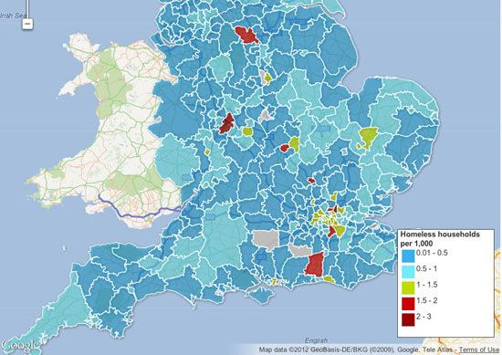
The main advantage is the flexibility — you can can upload a kml file of regional borders, say — and then merge that with a data table. It’s also getting a new user interface, which should make it easier to use.
You don’t have to be a coder to make one — and this Fusion layers tool allows you to bring different maps together or to create search and filter options, which you can then embed on a blog or a site.
This excellent tutorial by Google’s Kathryn Hurley is a great place to start.
Top tip: use shpescape to convert official shp files into Fusion tables for you to use. Also, watch out for over-complicated maps — Fusion can’t cope with more than a million points in one cell
If you don’t need the unlimited space of the professional edition, this is free — and means you can make pretty complex visualizations simply and easily with up to 100,000 rows. We use it when we need to bring different types of charts together — as in this map of top tax rates around the world, which also has a bar chart too.
Or you can even use it as a data explorer — which is what we did below with the US federal elections spending data (although we ran out of space in the free public version — something to watch out for). Tableau also needs the data formatted in quite specific ways for you to get the most out of it. But get through that and you have something intuitive which works well. La Nación in Argentina has built its entire data journalism operation around Tableau, for instance.
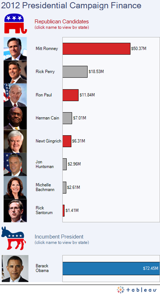
Tableau has some good online tutorials here for you to start with.
Top tip: Tableau is designed for PCs, although a Mac version is in the works. Use a mirror such as parallels to make it work
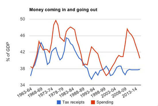
After something simple — like a bar or line chart, or a pie chart? You’ll find that Google spreadsheets (which you create from the documents bit of your Google account) can create some pretty nice charts — including the animated bubbles used by Hans Rosling’s Gapminder. Unlike the charts API you don’t need to worry about code — it’s pretty similar to making a chart in Excel, in that you highlight the data and click the chart widget. The customisation options are worth exploring too — you can change colours, headings and scales. They are pretty design-neutral, which is useful in small charts. The line charts have some nice options too, including annotation options.
Top tip: spend some time with the chart customisation options — you can create your own colour palette
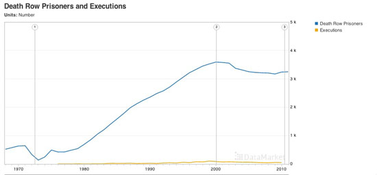
Explore this data US executions
Better-known as a data supplier, Datamarket is actually a pretty nifty tool for visualizing numbers too. You can upload your own or use some of the many datasets they have to offer — but the options do get better if you get the Pro account.
Top tip: works best with time series data, but check out their extensive data range
If ever a site needed a bit of TLC, it’s IBM’s Many Eyes. When it launched, created by Fernanda B. Viégas and Martin Wattenberg it was a unique exercise in allowing people to simply upload datasets and visualise them. Now, with its creators working for Google, the site feels a little unloved with its muted colour palettes — and hasn’t seen much new in the way of visualizations for some time.
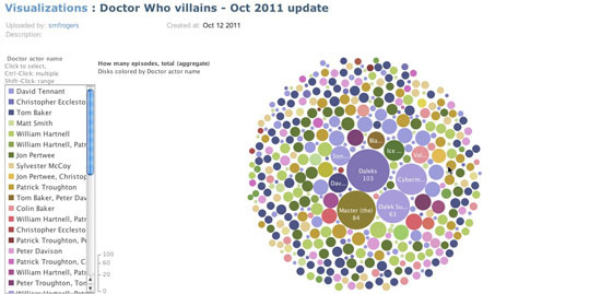
If ever a site needed a bit of TLC, it’s IBM’s Many Eyes. When it launched, created by Fernanda B. Viégas and Martin Wattenberg it was a unique exercise in allowing people to simply upload datasets and visualise them. Now, with its creators working for Google, the site feels a little unloved with its muted colour palettes — and hasn’t seen much new in the way of visualizations for some time.
Top tip: you can’t edit the data once you’ve uploaded it, so make sure you get it right before you create it.
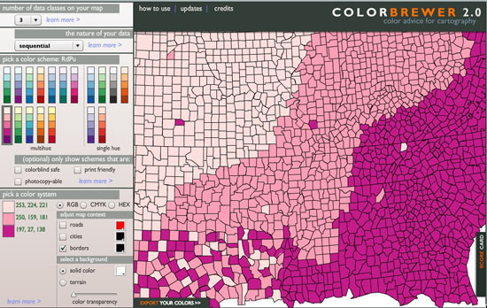
Not, strictly speaking, a visualization tool, Color Brewer — originally designed with federal funding and developed at Penn State — is really for choosing map colors, and is worth spending some time with if plan to make many more. You can choose your base colour and get the codes for the entire palette.
And some more
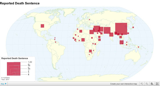
If none of these are for you, it’s also worth checking out this piece by EduGuide which has even more options. The ones above aren’t the only tools, just those we use most frequently. There are lots of others out there too, including:
-
Chartsbin A tool for creating clickable world maps
-
iCharts Specialises in small chart widgets
-
Geocommons Shares data and boundary data to create global and local maps
Oh and there’s also piktochart.com, which provides templates for those text/numbers visualizations there are a lot of around at the moment.
How We Serve Data at Verdens Gang
Written by: John Bones
News journalism is about bringing new information to the reader as quickly as possible. The fastest way may be a video, a photo, a text, a graph, a table or a combination of these. Concerning visualizations, the purpose should be the same: quick information. New data tools enable journalists to find stories they couldn’t otherwise find, and present stories in new ways. Here are a few examples showing how we serve data at the most read newspaper in Norway, Verdens Gang (VG).
Numbers

This story is based on data from the Norwegian Bureau of Statistics, taxpayers data and data from the national Lotto monopolist. In this interactive graph, the reader could find different kinds of information from each Norwegian county and municipality. The actual table is showing the percent of the income used on games. It was built using Access, Excel, MySql, and Flash.
Networks

We used social network analysis to analyze the relations between 157 sons and daughters of the richest people in Norway. Our analysis showed that heirs of the richest persons in Norway also inherited their parents' network. Altogether there was more than 26000 connections, the graphics were all finished manually using Photoshop. We used: Access, Excel, Notepad, and the social network analysis tool Ucinet.
Maps

In this animated heatmap combined with a simple bar chart you can watch see crime incidents occur on a map of downtown Oslo, hour by hour, over the weekend for several months. In the same animated heatmap, you can see the number of police officers working at the same time. When crime really is happening, the number of police officers is at the bottom. It was built using ArcView with Spatial Analyst.
Text Mining

For this visualization we text mined speeches held by the seven Norwegian party leaders during their conventions. All speeches were analyzed, and the analyzes supplied angles for some stories. Every story was linked to the graph, and the readers could explore and study the language of politicians. This was built using Excel, Access, Flash and Illustrator. If this had been built in 2012 we would have made the interactive graph in Javascript.
Concluding Notes
When do we need to visualize a story? Most of the times we do not need to do it, but sometimes we want to do so to help our readers. Stories containing a huge amount of data quite often need visualization. However, we have to be quite critical when choosing what kind of data we are going to present. We know all kinds of stuff when we report about something, but does the reader really need to know for the story? Perhaps a table is enough, or a simple graph showing a development from year A to year C. When working with data journalism, the point is not necessarily to present huge amounts of data. It’s about journalism!
There has been a clear trend in last 2-3 years to create interactive graphs and tables which enable the reader to drill down into different themes. A good visualization is like a good picture. You understand what it is about just by looking at it for a moment or two. The more you look at the visual the more you see. The visualization is bad when the reader does not know where to start or where to stop, and when the visualization is overloaded by details. In this scenario, perhaps a piece of text would be better?
John Bones, Verdens Gang
Public Data Goes Social
Written by: Oluseun Onigbinde
Data is invaluable. Access to data has the potential to illuminate issues in a way which triggers results. Nevertheless, poor handling of data can put facts in an opaque structure which communicates nothing. If it doesn’t promote discussion or provide contextual understanding, data may be of limited value to the public.
Nigeria returned to democracy in 1999 after lengthy years of military rule. Probing the facts behind data was taken as an affront to authority and was seen to be trying question the stained reputation of the junta. The Official Secrets Act compelled civil servants not to share government information. Even after thirteen years of return to democracy, accessing public data can be a difficult task. Data about public expenditure communicates little to the majority of the public who are not well versed in financial accounting and complex arithmetic.
With the rise of mobile devices and an increasing number of Nigerians online, with BudgIT we saw a huge opportunity to use use data visualization technologies to explain and engage people around public expenditure. To do this we have had to engage users across all platforms and to reach out to citizens via NGOs. This project is about making public data a social object and building an extensive network that demands change.

To successfully engage with users, we have to understand what they want. What does the Nigerian citizen care about? Where do they feel an information gap? How can we make the data relevant to their lives? BudgIT’s immediate target is the average literate Nigerian connected to online forums and social media. In order to compete for the limited attention of users immersed in a wide variety of interests (gaming, reading, socialising) we need to present the data in a brief and concise manner. After broadcasting a snapshot of the data as a Tweet or an infographic, there’s an opportunity for a more sustained engagement with a more interactive experience to give users a bigger picture.
When visualizing data it is important to understand the level of data literacy of our users. As beautiful and sophisticated as they may be, complex diagrams and interactive applications might not meaningfully communicate to our users based on their previous experiences with interpreting data. A good visualization will speak to the user in a language they can understand, and bring forth a story that they can easily connect with.
We have engaged over 10,000 Nigerians over the budget and we profile them into three categories to ensure that optimum value is delivered. The categories are briefly explained below:
-
Occasional Users. These are users who want information simply and quickly. They are interested in getting a picture of the data, not detailed analytics. We can engage them via Tweets or interactive graphics.
-
Active Users. Users who stimulate discussion, and use the data to increase their knowledge of a given area or challenge the assumptions of the data. For these users we want to provide feedback mechanisms and the possibility to share insights with their peers via social networks.
-
Data Hogs: These users want raw data for visualization or analysis. We simply give them the data for their purposes.

With BudgIT, our user engagement is based on the following:
-
Stimulating Discussion Around Current Trends. BudgIT keeps track of online and offline discussions and seeks to provide data around these topics. For example, with the fuel strikes in January 2012 there was constant agitation among the protesters on the need to reinstate fuel subsidies and reduce extravagant and unnecessary public expenditure. BudgIT tracked the discussion via social media and in 36 busy hours built an app that allows citizens to reorganise the Nigerian budget.
-
Good Feedback Mechanisms. We engage with users through discussion channels and social media. Many users want to know about stories behind the data and many ask for our opinion. We make sure that our responses only explain the facts behind the data and our not biased by our personal or political views. We need to keep feedback channels open, to actively respond to comments and to engage the users creatively to ensure the community built around the data is sustained.
-
Make it Local. For a dataset targeted at a particular group, BudgIT aims to localise its content and to promote a channel of discussion that connects to the needs and interests of particular groups of users. In particular we’re interested in engaging users around issues they care about via SMS.
After making expenditure data available on yourbudgit.com, we reach out to citizens through various NGOs. We also plan to develop a participatory framework where citizens and government institutions can meet in town halls to define key items in the budget that needs to be prioritised.
The project has received coverage in local and foreign media, from CP-Africa to the BBC. We have undertaken a review of 2002-2011 budget for the security sector for an AP journalist, Yinka Ibukun. Most media organizations are ‘data hogs’ and have requested data from us to use for their reportage. We are planning further collaborations with journalists and news organizations in the coming months.
Oluseun Onigbinde, BudgIT Nigeria
Engaging People Around Your Data
Written by: Duncan Geere
Almost as important as publishing the data in the first place is getting a reaction from your audience. You’re human — you’re going to make mistakes, miss things and get the wrong idea from time to time. Your audience is one of the most useful assets that you’ve got — they can fact-check and point out things that you may not have considered.
Engaging that audience is tricky, though. You’re dealing with a group of people who’ve been conditioned over years of internet use to hop from site to site, leaving nothing but a sarcastic comment in their wake. Building a level of trust between you and your users is crucial — they need to know what they’re going to get, know how they can react to it and offer feedback, and know that that feedback is going to be listened to.
But first you need to think about what audience you’ve got, or want to get. That will both inform and be informed by the kind of data that you’re working with. If it’s specific to a particular sector, then you’re going to want to explore particular communications with that sector. Are there trade bodies that you can get in touch with that might be willing to publicize the resources that you’ve got and the work that you’ve done to a wider audience? Is there a community website or a forum that you can get in touch with? Are there specialist trade publications that may want to report on some of the stories that you’re finding in the data?
Social media is an important tool, too, though it again depends on the type of data that you’re working with. If you’re looking at global shipping statistics, for example, you’re unlikely to find a group on Facebook or Twitter that’ll be especially interested in your work. On the other hand if you’re sifting through corruption indices across the world, or local crime statistics, that’s likely to be something that’s going to be of interest to a rather wider audience.
When it comes to Twitter, the best approach tends to be to contact high-profile figures, briefly explaining why your work is important, and including a link. With any luck, they’ll retweet you to their readers, too. That’s a great way to maximize exposure to your work with minimum effort, though don’t badger people!
Once you’ve got people on the page, you need to think about how your audience going to interact with your work. Sure, they might read the story that you’ve written and look at the infographics or maps, but giving your users an outlet to respond is immensely valuable. More than anything it’s likely to give you greater insight into the subject you’re writing about, informing future work on the topic.
Firstly, it goes without saying that you need to publish the raw data alongside your articles. Either host the data in comma-separated plain text, or host it in a third-party service like Google Docs. That way, there’s only one version of the data around, and you can update it as necessary if you find errors in the data that need correcting later. Better still, do both. Make it as easy as possible for people to get a hold of your raw materials.
Then start to think about if there’s other ways that you can get the audience to interact. Keep an eye on metrics on which parts of your datasets are getting attention — it’s likely that the most trafficked areas could have something to say that you might have missed. For example, you might not think to look at the poverty statistics in Iceland, but if those cells are getting plenty of attention, then there might be something there worth looking at.
Think beyond the comment box, too. Can you attach comments to particular cells in a spreadsheet? Or a particular region of an infographic? While most embeddable publishing systems don’t necessarily allow for this, it’s worth taking a look at if you’re creating something a little more bespoke. The benefits that it can bring to your data can’t be underestimated.
Make sure that other users can see those comments too — they have almost as much value as the original data, in a lot of cases, and if you keep that information to yourself, then you’re depriving your audience of that value.
Finally, other people might want to publish their own infographics and stories based on the same sources of data — think about how best to link these together and profile their work. You could use a hashtag specific to the dataset, for example, or if it’s highly pictorial then you could share it in a Flickr group.
Having a route to share information more confidentially could be useful too — in some cases it might not be safe for people to publicly share their contributions to a dataset, or they might simply not be comfortable doing so. Those people may prefer to submit information through an email address, or even an anonymous comments box.
The most important thing you can do with your data is share it as widely and openly as possible. Enabling your readers to check your work, find your mistakes, and pick out things that you might have missed will make both your journalism, and the experience for your reader, infinitely better.
Duncan Geere, Wired.co.uk