Data Journalism: What’s Feminism Got to Do With I.T.?
Written by Catherine D’Ignazio
Taking a feminist approach to data journalism means tuning in to the ways in which inequality enters databases and algorithms, as well as developing strategies to mitigate those biases.
Keywords: data journalism, feminism, gender, ethics, inequality, databases
Because of advances in technology over the last 70 years, people can store and process more information than ever before. The most successful technology companies in the world—Google, Facebook, Amazon, Microsoft, Apple—make their money by aggregating data.
In business and government, it is increasingly valued to make “data-driven” decisions. Data are powerful— because they are financially lucrative and valued by the powerful—but they are not distributed equally, nor are the skills to work with them, nor are the technological resources required to store and process them. The people that work with data are not representative of the general population—they are disproportionately male, white, from the Global North and highly educated.
Precisely because of these basic inequalities in the data ecosystem, taking a feminist approach to data journalism can be helpful to uncover hidden biases in the information pipeline.
Feminism can be simply defined as the belief in the social, political and economic equality of the sexes and organized activity on behalf of that belief. Feminist concepts and tools can be helpful for interrogating social power using gender as a central (but not the only) dimension of analysis.
One of the defining features of contemporary feminism is its insistence on intersectionality—the idea that we must consider not only sexism, but also racism, classism, ableism and other structural forces in thinking about how power imbalances can obscure the truth.1 For journalists who identify with the profession’s convention of “speaking truth to power,” a feminist approach may feel quite familiar.
This essay looks across several stages in the data-processing pipeline— data collection, data context and data communication—and points out pitfalls for bias as well as opportunities for employing a feminist lens. Note that a feminist approach is not only useful for data pertaining to women or gender issues, but suitable for any project about human beings or human institutions (read: pretty much every project), because where you have humans you have social inequality.2
Data Collection
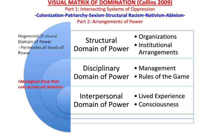
Examining power—how it works and who benefits—has always been a central part of feminist projects. Sociologist Patricia Hill Collins’ concept of the matrix of domination helps us understand that power is complicated and that “there are few pure victims and oppressors” (Hill Collins, 2000,p. 332). While we tend to think of injustice in the interpersonal domain (e.g., a sexist comment), there are systemic forces that we need to understand and expose (e.g., sexism in institutions that collect data) in order to make change.
Structural inequality shows up in data collection in two ways. First, specific bodies are overcounted in a data collection process. Overcounting typically relates to the surveillance practiced by those in power on those with less power. For example, the Boston Police released data about their stop-and-frisk programme in 2015. The data show that police disproportionately patrol Black, immigrant and Latinx neighbourhoods and disproportionately stop young Black men. In cases like this of overcounting, it is important to be tuned into which groups hold power and which groups are likely to be targeted for surveillance. A data journalist’s role is to recognize and quantify the disparity, as well as name the structural forces at work—in this case, racism.
The second way that structural inequality shows up in data collection is undercounting or not counting at all. For example, why is the most compre- hensive database on feminicides (gender-based killings) in Mexico being collected by a woman who goes by the pseudonym of Princesa?3
Despite the fact that women’s deaths in Ciudad Juárez and around the country continue to rise, despite the establishment of a special commission on femicide in 2006, despite a 2009 ruling against the Mexican state by the Inter-American Human Rights Court, the state does not comprehensively track femicides. Undercounting is the case with many issues that relate to women and people of colour in which counting institutions systematically neglect to account for harms that they themselves are responsible for. Which is to say—the collection environment is compromised. In cases of undercounting, data journalists can do exactly what Princesa has done: Count it yourself, to the best of your abilities. Typically, this involves a combination of crowdsourcing, story collection and statistical inference. In the US context, other examples of undercounting include police killings and maternal mortality, both of which have been taken up as data collection projects by journalists.
Data Context
While the open data movement and the proliferation of APIs would seem to be a good thing for data journalists, data acquired “in the wild” comes with its own set of concerns, particularly when it comes to human and social phenomena. The feminist philosopher Donna Haraway says that all knowledge is “situated,” meaning that it is always situated in a social, cultural, historical and material context. Untangling and investigating how it is that data sets are products of those contexts can help us understand the ways in which power and privilege may be obscuring the truth.
For example, students in my data visualization class wanted to do their final project about sexual assault on college campuses.4 Colleges and universities in the United States are required to report sexual assault and other campus crimes annually per the Clery Act, so there appeared to be a comprehensive national database on the matter. But the Clery data troubled the students—Williams College, for example, had extremely high numbers in comparison to other urban colleges. What the students found by investigating context and interrogating how the collection environment was structured is that the numbers told a story that was likely the opposite of the truth. Sexual assault is a stigmatized issue and survivors often fear victim-blaming and retaliation and do not come forward. So the colleges that were reporting high numbers were places that had devoted more resources to creating an environment in which survivors would feel safe to report. Conversely, those with low numbers of sexual assault had a hostile climate that did not support survivors to break their silence.
Here, there is a pitfall and an opportunity. The pitfall is that journalists take numbers downloaded from the web at face value without understanding the nuances of the collection environment, including power differentials, social stigma and cultural norms around being made visible to institutions (e.g., groups like women, immigrants and people of colour generally feel less confidence in counting institutions, with extremely good reason). The opportunity is that there are many more data context stories to be told. Rather than always using numbers to look forward to new analyses, data journalists can use the numbers to interrogate the collection environment, point out flawed practices and power imbalances, and shift counting practices so that institutions are accounting for what truly matters.
Data Communication
Contemporary Western thinking about data has evolved from a “master stereotype” where what is perceived as rational and objective is valued more than that which is perceived as emotional and subjective. (Think about which sex is identified as “rational” and which as “emotional.”) The master stereotype would say that emotions cloud judgement and distance amplifies objectivity. But a feminist perspective challenges everything about that master stereotype. Emotions don’t cloud judgement—they produce curiosity, engagement and incentive to learn more. Patricia Hill Collins (2000, p. 266), for example, describes an ideal knowledge situation as one in which “neither ethics nor emotions are subordinated to reason.”
What does this mean for data communication? While prior practices in data visualization favoured minimalist charts and graphics as being more rational, both researchers and journalists are learning that leveraging visualization’s unique properties as a form of creative rhetoric yields more memorable, shareable graphics. Take, for example, the “Monstrous Costs” chart created by Nigel Holmes in 1984 to depict the rising costs of political campaigns. Previously derided as an instance of “junk charts,” researchers have now proven what most of us know intuitively: Some readers like monsters more than boring bar charts (Bateman et al., 2010).
As with every other communications medium, leveraging emotion in data comes with ethical responsibilities. Researchers have also recently demonstrated the importance of the title of a visualization in how people interpret the chart (Borkin et al., 2016). Typical titling practices tend towards the “rational,” which is to say that they depict the data as neutral and objective—something like “Reports of Sexual Assault on College Campuses 2012–2014.” But there are many cases—again, usually having to do with women and other marginalized groups—in which a neutral title actually does harm to the group depicted by the data.
In the case of sexual assault, for example, a neutral title implicitly communicates that the data that we have is true and complete, while we actually know that to be quite false. In other cases, a neutral title like “Mentally Ill Women Killed in Encounters with Police 2012–2014” opens the door to the perpetuation of harmful stereotypes, precisely because it is not naming the structural forces at work, including ableism and sexism, that make mentally ill women disproportionately victims of police violence in the United States.

Conclusion
Taking a feminist approach to data journalism means tuning in to the ways in which existing institutions and practices favour a status quo in which elite men are on top and others placed at various intersections in Collins’ matrix of domination. Patriarchy, white supremacy and settler colonialism are structural forces, thus they lend themselves particularly well to systemic data-driven investigation and visualization. We need to question enough of the received wisdom in data journalism to ensure that we are not inadvertently perpetuating that status quo and, at the same time, use our tools to expose and dismantle injustice. Those who wish to go further in this direction may look to my book Data Feminism (2020), co-authored with Lauren F. Klein, which introduces in more detail how feminist concepts may be applied to data science and data communication.
Footnotes
1. Indeed, feminism that does not consider how other factors of identity intersect with gender should be qualified as “white feminism.” Intersectionality was first named by legal scholar Kimberlé Crenshaw and comes out of an intellectual legacy of Black feminists who asserted that gender inequality cannot be considered in isolation from race- and class-based inequality.
2. For example, see Kukutai and Walter’s chapter on Indigenous data sovereignty.
3. feminicidiosmx.crowdma...
4. The final story by Patrick Torphy, Michaele Gagnon and Jillian Meehan is published here: cleryactfallsshort.ata...
Works Cited
Bateman, S., Mandryk, R. L., Gutwin, C., Genest, A., McDine, D., & Brooks, C. (2010). Useful junk? The effects of visual embellishment on comprehension and memorability of charts. In Proceedings of the 28th International Conference on Human Factors in Computing Systems—CHI ’10 (pp. 2573–2582). dl.acm.org/doi/10.1145...
Borkin, M. A., Bylinskii, Z., Kim, N. W., Bainbridge, C. M., Yeh, C. S., Borkin, D., Pfister, H., & Oliva, A. (2016). Beyond memorability: Visualization recognition and recall. IEEE Transactions on Visualization and Computer Graphics, 22(1), 519–528. ieeexplore.ieee.org/do...
D’Ignazio, C., & Klein, L. F. (2020). Data feminism. MIT Press.
Hill Collins, P. (2000). Black feminist thought: Knowledge, consciousness and the poli- tics of empowerment. Routledge. www.hartford-hwp.com/ar...
