Better data visualisations
Conversations with Data: #71
Do you want to receive Conversations with Data? Subscribe

Welcome to our latest Conversations with Data newsletter.
Before we jump into this week's conversation, we have some exciting news! We're setting up the first community for data journalists on Discord and are looking for beta testers! Want to take part? Fill out this form!
Now, on to the podcast.
In our latest Conversations with Data episode, we caught up with economist and data visualisation expert Jonathan Schwabish. As the founder of the data visualisation and presentation skills firm, PolicyViz, and a senior fellow at the Urban Institute, he speaks to us about his latest book, "Better Data Visualizations: A Guide for Scholars, Researchers and Wonks".
You can listen to the entire podcast on Spotify, SoundCloud, Apple Podcasts or Google Podcasts.
What we asked
Tell us about your career and how you first became interested in data visualisation?
Like everyone in the data visualisation field, I didn't actually start in the data visualisation field. I began my career as an economist and earned my PhD in Economics. I worked for a non-profit in New York City but then hit my stride personally and professionally in Washington, D.C. at the Congressional Budget Office (CBO). I spent about a decade there where I worked primarily on what we call the CBO long term model focusing on retirement policy and Social Security.
In 2010, I was looking to spark things up. I realised that a lot of the work we were putting out at the CBO was not getting picked up by members of Congress, our main audience. I started thinking about why is that. I then stumbled into this world of graphic design and data visualisation to improve our charts and graphs at the CBO. Next I started teaching data visualisation and later founded PolicyViz.
Seven years ago, I moved over to the Urban Institute, which is a non-profit research institution in Washington, D.C. I spend half my time on research and the other in the communications department where I work on data visualisation. My whole journey into the field of data visualisation was spurred by this observation that we as analysts, as researchers, as economists don't really do a good job of communicating our analysis. We bury it in text and in tables that nobody reads and only other economists can understand. And I believe there has to be a better way.
Tell us about your consultancy firm PolicyViz.
PolicyViz is my one-man consulting shop. It began as a blog back in 2013. I wanted to be more a part of the conversation in the data visualisation field as I was coming at it from the perspective of statistics, mathematics and economics, rather than from a design or computer science background.
Since then, PolicyViz has expanded into multiple things. The site has my books, an online shop and the PolicyViz Podcast. I also offer workshops and consulting in data visualisation and presentations. A few years ago I launched HelpMeViz where people can submit their visualisations to help improve them.

Talk to us about your new book, "Better Data Visualisations: A Guide for Scholars, Researchers and Wonks".
The book comes from my experience in teaching and holding workshops over the past few years. There's really two learning goals that I try to get across in the book. The first is about best practices. The beginning of the book talks through a number of guidelines covering the basic principles such as using active titles and good annotation. I also explore some things that you should do in all of your visualisations. But the meat of the book walks through more than 80 different graph types. I came to the field of data visualisation relying on line charts, pie charts, bar charts -- the economist's bread and butter -- but there's a lot of other graph types out there. And sometimes those other graph types are useful to help engage readers, which could be a goal in and of itself. And sometimes those graphs are better at visualising the data when the line chart isn't.
There is also a section on qualitative data visualisation. This is important because I think a lot of people who are working with qualitative data rely on the word cloud. But there are lots of other ways that you can visualise qualitatively. There's a chapter on tables and another on building a data visualisation style guide.
And then I wrap the whole book in a chapter on redesigns. This is where I do about a dozen graphs and redesign them. This involves pulling all the information in the book together to say, here's the best practice to make this graph clear. For example, I'm going to remake this graph as a dot plot or slope chart or whatever it is to demonstrate how I could try some of these alternative graph types. This is done in order to make the graph a little more effective and better at communicating the message that the author wants to get across.
You talk about the do's and don'ts of data visualisation in your book. Are there any things you see that make your blood boil?
For me, the only rule of data is that your bar charts need to start at zero. Otherwise, you're overemphasising the difference. My most hated things that people do are adding that third dimension, the 3D graphs when you just don't need it. At this point, it looks kind of like ClipArt. Another thing that really bugs me is the bar chart where people break the bar. Any time where you can make arbitrary decisions to make your data look the way you want it to look or make your graph seem more convenient, I think that's a dangerous game. More generally, journalists need to be mindful of people and organisations misrepresenting data or lying about data in their work. It's particularly important for journalists to be honest with the data, to be objective with the data, and put responsible use of the data first.
In your book, you discuss the data visualisation style guide. Tell us about that.
One of the earliest style guides that I ever saw was from the Dallas Morning News. They published their style guide in 2005. I have a collection on my website of style guides that I have seen. A lot of them I draw from media organisations. Each chapter of my book uses a different style guide. This is done to demonstrate how you implement these styles. One is kind of loosely based on The Washington Post. Another is based on the Texas Tribune. The Minneapolis Star Tribune has a really nice style guide. The Urban Institute also has a very detailed style guide.
For journalists, it helps with the branding of the news organisation. For instance, you could show me any graph from The Economist without the magazine and I would know it comes from The Economist. Same thing with the Financial Times. It has that the background colours, the font, the look. You can easily identify it.
For the people that I work with, researchers and analysts who don't really care about the font or colour. That is why it is important to give them a style guide and the tools associated with that. Perhaps an Excel template or an art theme. This allows them to focus more on the analysis and the story and the graph type, and then they can just click a button or run a little script that applies those styles. One thing I would say is that it is important for the style guide to be a living evolving document that can change as people develop their aesthetic style.
What are some of your favourite books in the field you'd recommend for data journalists getting started?
I have a few that I can recommend. I like all the books by Alberto Cairo including his most recent book, "How Charts Lie". I'd also recommend "Storytelling With Data" by Cole Nussbaumer Knaflic. That's another great book for introductory data visualisation techniques. "Info We Trust" by RJ Andrews is more of a historical look at data. "R for Data Science" by Garrett Grolemund and Hadley Wickham H is a must-have if you're coding in R programming language.
Finally, what is next for you at PolicyViz and the Urban Institute?
I'm just about to finish up a daily video series that I've been posting since early January. It's called One Chart At A Time. It'll be 56 videos when it's all done. Each video covers a different graph. It's from different people in the data visualisation and data journalism fields. I asked people to do a five-minute video about a specific graph type. So every day I've been posting those over the last couple of months. And that project is about to wrap up this May. It is a really exciting project with so many different people and personalities from a variety of fields talk about specific graphs.
I will publish a new report on racial equity in data and data visualisation, it's building off of a paper that I published back in August with a colleague of mine, Alice Feng, at the Urban Institute. But we have a much longer in-depth report. In summary, it's a combination of the conceptual reasons and rules about why we should be having these discussions and thoughts, but also some practical considerations, not rules.
Latest from DataJournalism.com
By popular demand, DataJournalism.com is launching a data Discord community server. We are looking for data journalism and data visualisation enthusiasts to test out the beta version. Sign up here for early access!

Dr. Amelia McNamara guides us on a journey through the history of handmade data visualisation. She provides an in-depth tutorial for journalists and cites a variety of resources to help you experiment with hand-drawing visuals for your next story. Read the long read article here.

Sonification is all around us! So how can you use music and sound to enhance your storytelling? Data journalists Duncan Geere and Miriam Quick explain how by walking us through some compelling examples from journalism, science and civil society. Read the entire long read article here.

Our next conversation
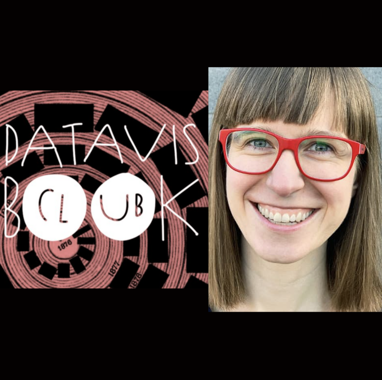
Our next Conversations with Data podcast will feature Lisa Charlotte Rost from Datawrapper. As a data visualisation designer and blogger, she will speak to us about the rules of data visualisation and the DataVis Book Club she runs on behalf of Datawrapper.
As always, don’t forget to let us know what you’d like us to feature in our future editions. You can also read all of our past editions here. You can also subscribe to this newsletter here.
Onwards!
Tara from the EJC Data team,
bringing you DataJournalism.com, supported by Google News Initiative.
P.S. Are you interested in supporting this newsletter as well? Get in touch to discuss sponsorship opportunities.
Time to have your say

Sign up for our Conversations with Data newsletter
Join 10.000 data journalism enthusiasts and receive a bi-weekly newsletter or access our newsletter archive here.