Why we love journalistic databases
Conversations with Data: #22
Do you want to receive Conversations with Data? Subscribe

Databases can be so much more than just a place to find stories. Why not make a database the story?
Welcome to our 22nd edition of Conversations with Data, where we’ll be looking at the many ways journalistic databases can be used as an interactive end-product.
From localising stories for individual readers to summarising complex data in a more user-friendly format, searchable databases are a must in any data journalist’s toolbox.
We don’t need any more convincing, but in case you do, here are 7 of the community’s favourite journalistic databases.
What you liked
1. Dying Homeless, the Bureau of Investigative Journalism (TBIJ)
“I really appreciate the Dying Homeless database from TBIJ. It combines data from many sources -- local reporters, charities, grassroots groups, and readers -- and really makes the most of the audience engagement aspect of creating such a database. The database itself combines quantitative and qualitative data in a powerful way -- the headline figure of 800 people have died homeless since the database began in October 2017, combined with the stories of who the people were.
-- Zara Rahman, co-author of Searchable Databases as a Journalistic Product in the the Data Journalism Handbook 2

2. Europe One Degree Warmer, European Data Journalism Network
“In Europe One Degree Warmer we collected local temperature data from 117 years, in 558 cities across Europe. This allowed us to do local reporting on global climate trends. Because our focus was on the local stories, we published our findings as separate, robot-generated texts in nine languages for each city, producing in total 5,022 articles, with over 60,000 maps and charts to accompany them. The reports, and the underlying data, are now being updated to include 2018 temperature data. Dive into the numbers behind the reports here, or read our notebook explaining the method used for the analysis.”
-- Leonard Wallentin, journalist and CEO at J++ Stockholm
3. Better Government Association projects
“We produce a number of different databases and tools with our investigations. For example, in Elevators in Chicago Public Housing, we used a database to show that residents of Chicago Housing Authority apartment buildings, mostly seniors, have faced elevator problems for years. The database allowed users to check the status of their elevators, including failed inspections and violations issued by city inspectors. Hover over the squares to get additional information, such as dates and notes from city inspectors.
Another example is the Suburban Police Shooting project. Since 2005, there have been at least 113 police shootings in suburban Cook County. Not a single officer involved in those shootings was disciplined, fired or charged criminally, a year-long investigation by the Better Government Association and WBEZ found. What’s more, almost none of those shootings were even reviewed for misconduct.

The searchable database, shedding light on police shootings in Chicago.
In the database, a summary of each shooting is listed, along with a map that details the location of each incident. To track each case, we compiled tens of thousands of pages of public records and conducted more than 100 interviews with police, law enforcement supervisors, elected officials, witnesses to the incidents, and many of the individuals who were shot. The documents behind the data, as well as the data itself, are available to download.”
-- Jared Rutecki, investigative reporter for the Better Government Association
4. The Press and Journal Scotland Sex Offender map
“We used Freedom of Information to request the number of Registered Sex Offenders in our area. After finding out the number had increased we decided to show this on an interactive map and searchable database. We felt this would show the data in a more interesting manner than just listing it and would let readers engage with the story by searching for their postcode.
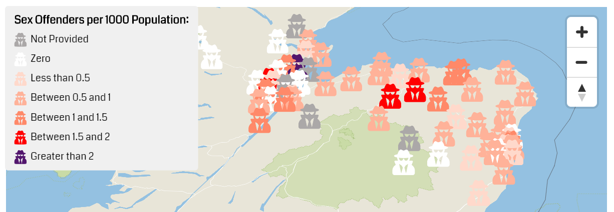
A screenshot of the project’s explorable map.
Both the map and database were created using Flourish who very kindly provide free pro accounts to newsrooms via the Google News Initiative. It was the most clicked on story on our website that month and generated a lot of reader engagement.”
-- Lesley-Anne Kelly, data analyst, newspapers
5. Paul Biya’s Cameroon
“Paul Biya, president of Cameroon since 1982, spends much of his time abroad on private trips, in particular at the luxurious Intercontinental hotel in Switzerland. This was a well-known fact, but nobody had documented exactly how much time he was away from his office. Luckily for us, each time Biya comes and goes from Cameroon, the event makes the cover of the government-owned newspaper, the Cameroon Tribune. So, we collected as many of these covers as we could and found out that President Biya had spent over 4.5 on ‘private trips’ abroad, costing over $100 million to Cameroon's citizens. We wanted to make the detailed information public so people can find out when the president was away, so we uploaded all of the covers and the data on a website.
-- Emmanuel Freudenthal, freelance journalist

Newspaper covers from the database.
6. USASpending.gov
“USASpending.gov is an endlessly fascinating site: it documents pretty much every cent that the US government spends, in the USA, and around the world. I have spent many hours using the ‘place of performance’ filter to see what is being spent in individual countries outside the USA.
Whether you want to look at big patterns or small details, there are thousands of potential story ideas here: from the Israeli genomics firm receiving Pentagon money; to President Chavez’ brother’s firm, which was high on the league table of recipients of federal funding even as the White House was spurning dealings with Venezuela."
-- Jonathan Stoneman, data journalism trainer
7. Ranking das Escolas, Renascença
“We usually transform the Portuguese national exams classifications database into a searchable database. This allows the user to learn more about every school in the country and discover things like the average grade per school. Clicking over the school on the table allows the user to acquire further data, such as the average grade per subject, as well as to understand more about the social context of that school, for example the percentage of students with financial aid from the state, the number of teachers, and the average number of years that the students’ parents were in school.
-- Rui Barros, data journalist at Renascença
Our next conversation
What’s better than Conversations with Data in your inbox? A live version of course! Next week, on 4 April 2019, we’ll be bringing the format to the International Journalism Festival in Perugia, featuring our Data Journalism Handbook 2 authors Christina Elmer, Paul Bradshaw, Jacopo Ottaviani and Lindsay Green-Barber.
For those of you who aren’t Perugia-bound, you don’t need to miss out on the fun! In our next edition, we’ll have the authors of our data visualisation chapter with us to answer your questions on newsroom trends and challenges.
As always, don’t forget to let us know what you’d like us to feature in our future editions.
Until next time,
Madolyn from the EJC Data team
Time to have your say

Sign up for our Conversations with Data newsletter
Join 10.000 data journalism enthusiasts and receive a bi-weekly newsletter or access our newsletter archive here.