World Cup data journalism
Conversations with Data: #6
Do you want to receive Conversations with Data? Subscribe
...And the winner is France! Congrats les bleus!
Still running high on football fever, we’re bringing you a special edition of Conversations with data, to look back at a tournament full of inspiring data journalism.
What you made
Throughout the Cup, journalists have used data to answer questions about odds during penalty shoot-outs, how well teams have been playing, and, of course, who will win. At The Economist, they even looked at why these predictions will probably be wrong.
And your projects were no different. As you’ll soon see, there is no shortage of questions about the World Cup that data journalists can’t answer.
1. Which country has the most expensive squad? (link)
"To source the data, we used OutWit Hub to scrape Transfermarkt. We then crunched these figures to rank the teams, writing a couple of paragraphs one each and then producing one small visualisation for each of them. These were beeswarm plots (made in RStudio with the ggplot library) that plotted each player on the same axis. This meant that even for a reader scrolling through the page quickly, they could not only see which team is the most valuable but they could also see how each players' individual valued contributed to this." - Ashley Kirk, The Telegraph
2. How many club teammates opposed each other? (link)
"One part of the World Cup that always interests me is that players transition from teammates on professional clubs to opponents on national squads. I pitched this idea to Reuters and they were interested in supporting it. There may be simpler ways to show these overlaps, but using a Voronoi treemap creates a beautiful display and one that evokes the shapes on a football. It is produced using D3.js and the data came from a number of sources (It's trickier than might you think to find the league of every professional club in the world)." - Andrew Garcia Phillips for Reuters
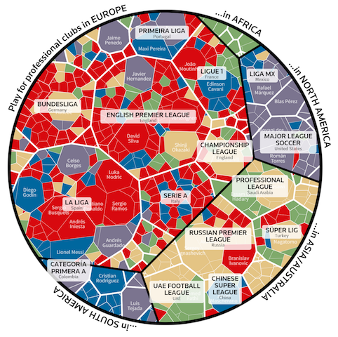
Credit: Reuters
3. What’s the ideal team lineup? (link)
"As someone who loves data science and has grown up playing FIFA, it came to my realisation that I can use the data from EA Sport’s extremely popular FIFA18 video game released last year to do my analysis.
Here is the step-by-step approach I used:
- Get the FIFA 18 dataset from Kaggle.
- Do some exploratory data analysis and data visualisation of important player attributes.
- Write functions to get the best squad according to the players' overall rating.
- Apply the functions to derive results for the 10 national teams.
- Compare the results and make predictions on the potential winner." - James Le for Towards Data Science
4. Which teams have the most foreign-born players? (link)
"There is a rather shallow notion the surfaces in the United States (my home country) that the World Cup features teams made just of national stereotypes. People joke about 11 stern Germans taking on 11 flashy Spaniards, or a speedy Senegalese team up against a group of tall Dutch players. But when in you dig into the data on the origins of international soccer players, you find a lot of diversity in many countries, which I wanted to show to subvert that tired narrative." - Riley D. Champine, National Geographic
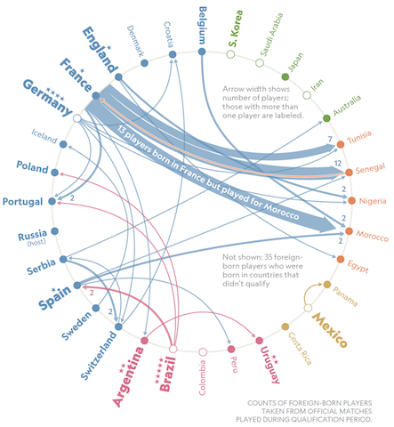
Credit: National Geographic
5. Which teams should’ve made the second round? (link)
But wait, there’s more. This is just a snippet of the projects you made. For a full rundown, including in-depth details from behind the scenes, click here. "Expected Goals provides a data point that allows us to measure how well each team should have fared, based on the chances they created and allowed.
Here’s how we turned raw data into a DDJ-piece: We used an R script to process the raw data from Opta Sports, make the calculations we needed and create an output file for each graphic we needed for the article. Most of the simple graphics in the article, i.e. mostly tables are created with our own storytelling toolbox Q, the other graphics are either handcrafted in Sketch or done in R and then polished in Sketch." - David Bauer, NZZ
But wait, there’s more. This is just a snippet of the projects you made. For a full rundown, including in-depth details from behind the scenes, click here.
Our next conversation
From football to West Africa. Next time, Will Fitzgibbon, from the International Consortium of Investigative Journalists, will be answering your questions about West Africa Leaks.
Will led a team of more than a dozen reporters from 11 countries, who painstakingly poured over 27.5 million documents from previous data leaks to reveal how the region’s elites hide billions offshore.
Until next time,
Madolyn from the EJC Data team
Time to have your say

Sign up for our Conversations with Data newsletter
Join 10.000 data journalism enthusiasts and receive a bi-weekly newsletter or access our newsletter archive here.