For years now, the gap between traditional reporting and data journalism has been shrinking. Today, statistics and figures are a common sight in reporting on almost any issue -- from local politics, to health, to crime, to education, to arts and culture.
But over-reliance on data can sometimes lead reporters to neglect the human angle of their stories. Without a direct link to people’s lived experiences, a story will feel flat and characterless. This is most often solved by bringing in photography, video or perhaps an interview. But over the past year, we’ve been exploring another approach.
Since before the beginning of recorded history, people have been telling stories with music. Music uplifts us, consoles us, excites us, scares us, and energises us. Like the best journalism, it speaks to the heart as well as the head. We’ve spent a large part of our lives immersed in music -- studying it, playing it, listening to it - and we’ve seen its powerful effects first-hand.
That’s why we believe that sonification -- the practice of turning data into sound and music -- can be a powerful tool for getting audiences to engage with a story on new levels, and even reach new audiences entirely. While your editor might not be best pleased if you turn in a concept album in place of your next reported assignment, we believe that more people should be experimenting with sound and music in their data stories.
Sonification in data storytelling is still in its infancy, but in this article, we’ll present some recent examples of journalists, scientists and civil society using data-driven sound and music to amplify their stories, talk about what we’ve learnt while making sonifications over the past year, and present Loud Numbers -- our data sonification podcast.
Sound matters
Sonification is all around us -- we hear it every day, from the “bleeeeep” of a microwave oven finishing its cycle, to the “bloop-blip” of a new message arriving on your phone, to the “crrrnk” of an error message on your laptop. It’s also a staple of TV and film storytelling, with the “beep beep beep” of an operating theatre’s EKG machine, the “pong!” of a sonar in a submarine, or the “bing” of an arriving lift providing an essential sense of place.
What’s interesting about all of these examples is that we have a very clear association with each of them, despite not actively thinking about what they mean. When you hear the sound of a message coming in on someone else’s phone, for example, you instinctively reach for your own. Our brains are wired to respond to certain sounds without thinking.
How can we take advantage of this, in an ethical way, for data storytelling? One approach, in a journalistic environment, might be to use these instinctive associations to convey emotion along with data through sonification.
Data sonification, in its simplest sense, refers to the act of turning data into sound. It includes all the examples above, but it excludes a few things too -- speech isn’t sonification (that would be too broad a definition to be useful), and neither is morse code or other systems where characters are encoded rather than data.
The pioneers of data sonification
Some of the earliest work in sonification was done by an earthquake researcher named Hugo Benioff more than 70 years ago. Benioff originally wanted to be an astronomer but switched careers when he discovered that astronomers sleep during the day and work at night. He joined Caltech’s Seismological Laboratory in 1924, and in 1932 invented the seismograph, which records tectonic activity on a roll of paper. Variants of Benioff’s original seismograph are used today all over the world.
In his spare time, however, Benioff had another hobby -- making instruments. He developed an electric piano, violin and cello, working with famous musicians to refine his designs. In 1953, he was able to finally combine his passions -- providing a series of audio recordings of earthquakes for one side of an LP record titled “Out of This World”.
But there was a problem. The human hearing range is roughly 20 Hz to 20 kHz, well above the frequency of many earthquake signals. To raise the pitch into the range of human hearing, Benioff recorded the earthquake data onto magnetic tape, then simply sped it up. The resulting tapes allowed people to safely hear and experience the Earth in motion for the first time. A liner note on the album reads: “Skipping [of the needle between grooves] is intentional and indigenous to the nature of the subject matter.”
This approach of time-stretching and pitch-shifting data to bring it into the range of human hearing is called “audification”, and it’s the first of five categories of sonification suggested by German sonification researcher Thomas Hermann in 2002. A more recent example might be “Sounds of the Sun”, which was published in 2018 by NASA using data from its solar and heliospheric observatory, which was sped up by a factor of 42,000 to bring it into the range of human hearing.
Hearing the impact of a story
Another relatively simple sonification approach is to play a sound when something happens. These sound “labels”, can then represent events in the same way that a “bloop-blip” on your phone represents an incoming message.
In 2014, Tactical Technology Collective used this approach to raise awareness of the problem of the sudden collapse of residential buildings in Egypt due to poor construction regulations. In their sonification, Egypt Building Collapses, data on these collapses is represented as the sound of a building collapsing.

The data shown above includes the number of dead, injured and homeless along with the reasons for these housing collapses and which governorates they occurred in. The data covers July 2012 until June 2013, a year that did not see large natural disasters.
The creators tried several different approaches before settling on this one. “The first was calmer and softer; it could be described as ‘relaxing’ or even ‘meditative’”, the authors told Gabi Sobliye and Leil-Zahra Mortada in 2017. “The second test featured more literal sounds of falling bricks and unstable foundations.” They chose the latter, to connect the data with the strong emotional resonance of hearing a building collapse. These two distinct approaches -- an abstract sound, versus one that sounds like the thing it represents -- are referred to by Hermann as “earcons” and “auditory icons” respectively.
Abstract earcons might be pings, boops and dongs, designed either to sound good or intrusive depending on your storytelling goal. In 2010, The New York Times published “Fractions of a Second”, a piece that uses an “earcon” approach to allow listeners to hear the difference between a gold and a bronze medal in various Winter Olympics events. In 2017, the same newspaper created a similar sonification of the rate of fire of different weapons, in the wake of the Las Vegas and Orlando mass shootings. In both cases, the experience of listening to the data delivers far more than reading the same numbers ever would.
Auditory icons, where choice of sound is connected to the data, can deliver even more emotional weight. The collapsing buildings of Egypt Building Collapses leave the listener in no doubt as to what the data represents. But this can sometimes be too much. If The New York Times had used actual gunfire recordings to sonify the rate of fire of the different weapons, it could have come across as disrespectful or in poor taste. The strong link between sound and emotion makes it important to use care and subtlety when creating sonifications on sensitive issues.
Audio choice
The final two categories of sonification identified by Hermann can be combined under the heading of parameter mapping systems. This is where parameters of a sound -- its pitch, volume, duration, tempo, and so on -- are directly mapped to data. High numbers are represented by higher notes, for example, or perhaps by louder notes. Or both!
There’s a real art to creating effective parameter mappings, and in most cases you won’t know whether something works until you try it. The sheer range of sound properties that you can interact with, as well as their combinations, make it a highly exploratory process. Some mappings are continuous, while some are discrete. Some are obvious, while some are subtle. Many connect emotionally with the listener in interesting ways -- for example, choice of instrumentation, the tempo of a track, or even the musical key are all highly emotionally charged.
The choices that you make around what sound parameters are mapped to what data make up your system. That system can be simple, with just one or two mappings, or it can be very complicated. In either case, it’s vital to be sure that your audience understands what’s going on. That might mean explaining the system beforehand, playing the different sounds that the audience will hear in isolation and explaining what they mean. Or it could be done through interactivity -- allowing your audience to turn different parts of the audio on or off, or even control the volume.
One example of effective parameter mapping in journalism is Reveal’s sonic memorial to the victims at Orlando’s Pulse nightclub.
In the latter, the lives of people killed in the shooting are represented by different bell tones, which end abruptly in June 2016. This would not make a particularly interesting visualisation, but the choice of bells as instrumentation, as well as the slow tempo, give it a strong emotional weight. “They are meant to be funereal but also celebratory,” writes creator Jim Briggs. “We find music in the moments when tones, like lives, intersect.”
Listening to the data
Over the past year of working on sonifications, we’ve found some approaches to be more effective than others. For starters, we’ve learned a lot more about which kinds of audio mappings work best with which kinds of data.
Musical pitch is often used in data sonification to communicate quantity, where notes of a higher pitch signify more of something (people, money, cars, onions). Pitch is the most common mapping used in sonification – it’s the default in free sonification app TwoTone, for example — and it’s a very useful one. Our ears are generally good at detecting small pitch shifts, which is why out-of-tune singing sounds so awful. Tiny pitch differences can effectively communicate tiny differences in underlying data values.
Pitch can slide, making it great for data that varies continuously, like height across a population or CO2 levels in the atmosphere. However, pitch slides can sound a little menacing, which is appropriate for a climate change sonification but perhaps not in all storytelling situations. An alternate approach is to use pitch in the discrete steps of a scale, which is best used to communicate data that forms ordered categories, like income brackets or age groups. In practice, most sonifications that use pitch tend to use musical scales to communicate continuous data, probably because they sound nice, as in the Financial Times’ sonification of the yield curve from March 2019.
But pitch can be ambiguous. Mapping higher pitches to larger quantities makes sense on one level: in data visualisation, higher typically means more, as in a bar chart or line chart, and in music notation notes of higher pitch are written nearer the top of the stave. Interestingly, however, this relationship does not correspond to the physical origins of pitch. In the real world, it’s smaller drums and shorter strings that make higher sounds, and larger drums and longer strings that make lower sounds. So a higher pitch could signify more or something, or it could just as easily signify less.
Fortunately, there are lots of other options. You can map quantity to relative loudness (so louder equals more), number of instruments (more instruments playing equals more data), EQ (bassier equals more), duration (longer sound equals more) number of sounds in a time period (more sounds equals more), tempo (faster equals more) and so on. Or you can double or triple-map data to more than one of these.
All of these audio parameters have unique qualities and also distinct limitations. Loudness can have a powerful emotional effect on listeners but lacks precision: it isn’t brilliant for communicating fine differences. It is also very affected by the soundsystem used for playback (especially the volume level and the bass response of your audience’s speakers) and by audio engineering techniques like compression. So we believe it is best used when double-mapped with another audio parameter like pitch or instrument, or coupled with visuals.
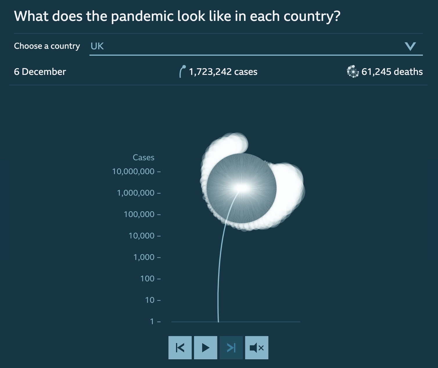
The BBC visualisation looks at the scale of the COVID-19 death toll. The length of each flower's stalk corresponds to the number of confirmed coronavirus cases in the country.
In this BBC visualisation, for example, the loudness of the music corresponds to the number of daily COVID deaths globally, but the visuals do most of the detailed data communication work, with the sonification serving as an impressionistic enhancement to them rather than something that you’d listen to for information on its own.
Instruments with different sounds lend themselves naturally to communicating data categories. In Listen to Wikipedia, a real-time sonification of Wikipedia edits, bells indicate additions and string plucks represent subtractions. Pitch changes according to the size of the edit: the larger the edit, the deeper the note. And a string swell means a new user just joined Wikipedia.
This sonification by Jamie Perera uses the number of sounds in a time period to communicate UK COVID deaths between March and June last year. Each sound represents one death, and 30 seconds of sound represents one day of data — the entire piece lasts a harrowing 55 minutes. This scale humanises the numbers, the sonic equivalent of using one dot to represent one person in a data visualisation.
Finally, one added benefit of sonification, when compared to traditional data storytelling, is that it’s more accessible to the blind and partially sighted. Over the last decade, the technology to create snazzy interactive data visualisations has consistently outpaced the technology to make those visualisations accessible to everyone.
In this regard, sonification is a tremendously useful technique. Adding a sonification component to your data visualisation can not only boost accessibility for people who are blind or partially sighted – here’s a great example of a sonification targeted primarily at that audience. But it also improves the experience for fully-sighted users who find the audio feedback helpful. As with other common accessibility initiatives, more people benefit than is often expected.
Data sonification tools and resources
Sounding it out: data storytelling
Over the past year, we’ve been working on a collection of data stories told through the medium of sound and music, using many of the techniques detailed above. It’s called Loud Numbers, and it’ll be released later this year as both a podcast and an extended play of music available on all good streaming services.
Our goal is to create something that not only tells a series of compelling data stories but is also a pleasure to listen to. We wanted to know if we could hit a sweet spot where we communicate the story and also make something that sounds beautiful, something you'd press play on more than once.
We’ve found that there’s a lot of creative space to explore in the triple point between stories, data and music. Each of our sonifications nods to a different genre of music while telling a related data story. For example, we’ve got old-skool jungle music soundtracking a story about inequality in the United States, the history of EU legislation presented as baroque counterpoint, and the media frenzy around Brexit sonified using the “news music” so beloved of TV news journalism.
Ultimately, we hope that by developing Loud Numbers we can push at the boundaries of what’s possible in data journalism and data storytelling. We believe that sound and music have the power to not only reach new audiences, but better serve existing audiences by deepening their emotional connection to the story. Next time you’re working on a data journalism project that would benefit from a little extra emotional connection, why not give it a try?

Duncan Geere is an information designer, writer, editor and data journalist with more than 10 years of experience. He covers the intersection of science, technology and culture, with a particular interest in environmental issues. He recently completed a stint as a senior editor & creative producer at Information is Beautiful, and I've done freelance work for companies like SAP, Storythings, FutureEarth, Drawdown, and publications like Wired, the Guardian, BBC Wildlife, BBC Science Focus, Technology Review, Popular Science, and Techradar.

Miriam Quick is a data journalist and researcher specialising in information visualisation. She finds facts and data and builds them into compelling stories. Then she works with designers to produce information graphics, data visualisations, data artworks and installations. Her first book, I am a book. I am a portal to the universe., written with Stefanie Posavec, was published by Particular Books (Penguin UK) in 2020. She holds a PhD in Musicology from Kings College London. Her thesis focused on performance style in recordings of the works of Anton Webern. This research involved analysing data from sound recordings and using software to visualise the results, which sparked my interest in data visualisation.


Making numbers louder: telling data stories with sound - How sonification can bring your data storytelling to life
14 min Click to comment