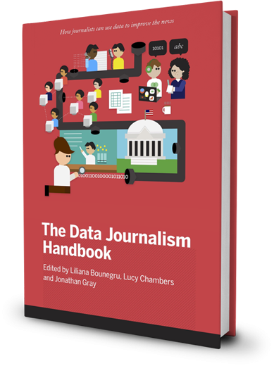
Data Handbook 1
Data visualization DIY: Our Top Tools
What data visualization tools are out there on the web that are easy to use — and free? Here on the Datablog and Datastore we try to do as much as possible using the internet’s...

Data Handbook 1
What data visualization tools are out there on the web that are easy to use — and free? Here on the Datablog and Datastore we try to do as much as possible using the internet’s...
What is data journalism? What is it for? What might it do? What opportunities and...
Written by Mohammed Haddad
Abstract How we used data about trees to create memories, promote transparency and include citizens...
Abstract How we used data to reveal illegal business practices, sustained environmental damage and slave-like...
Abstract Documenting worker deaths in Turkey to advocate for improved working conditions. Keywords: Turkey, Soma...
Written by Aika Rey
Data visualisation
Charts and maps have become ubiquitous in todays newsrooms. They convey stories with numbers much better than text alone does and they are shared easily. But not every journalist is a numbercruncher or a graphics designer. And a lot of newsrooms, especially smaller ones, don’t have the means to employ graphic journalists that can craft charts and maps. In this course we introduce and learn to use some tools every journalist can adopt to produce graphics that can support or carry a story.

Senior Lecturer
Associate Professor in the Journalism Programme at the Doha Institute for Graduate Studies

Reader
Dr. Jonathan W. Y. Gray is Reader in Critical Infrastructure Studies at the Department of Digital Humanities, King’s College London, where he is currently writing a book on data worlds. He is also Cofounder of the Public Data Lab; and Research Associate at the Digital Methods Initiative (University of Amsterdam) and the médialab (Sciences Po, Paris). More about his work can be found at jonathangray.org and he tweets at @jwyg.

Lecturer in Digital Methods
Lecturer in Digital Methods at King's College London
Johanna Wild is an open source investigator at Bellingcat and is passionate about tech and tool development for digital investigations.
Fantastic article, and a very original approach. Thanks for writing it. I just wonder how things...
I can not believe there are more comments on this. This is a a very informational article that...
Fantastic Newsletter issue. Thanks for providing all this for free.
Hi, I think it's a very good course for journalists. I only had one concern, since she says that...
Thank you for this article - it made me inspired. I'm a synesthete (seeing colours and shapes of...
Great motivational introduction.
hier steht gar nicht, wer den Artikel geschrieben hat, er war es:...
Great course! Lessons are really well organized, explanations are clear, and the exercises are...