Data visualisation has become a natural companion for journalists reporting complex data stories in both print and in digital formats. But visual cues are just one of many possible ways to encode data, and humans have been embedding data into the properties of physical objects for millennia (think of the Peruvian quipus).
Despite this ancient history, the term ‘data physicalisation’ has only just appeared in academic literature quite recently, in a 2015 paper by Yvonne Jansen, Pierre Dragicevic, and others:
A data physicalization (or simply physicalization) is a physical artifact whose geometry or material properties encode data.
What is data physicalisation?
Depending on its actual form, a data physicalisation can be seen, touched, heard, tasted, smelled, and more. Other than the artefact itself, the term also refers to the process of transforming data values into physical properties. When designing a data physicalisation, data can be used to shape the geometry of a physical object, much like how lengths, angles, and slopes are used to encode data in visualisations. Additionally, data can be encoded in the material itself and its characteristics. Texture, consistency, coldness, or weight, can all be used to both encode data and to set a specific mood and emotional relationship with the object, including by leveraging existing cultural meanings associated with the material.
Touching Air by Stefanie Posavec and Miriam Quick. Credit: List of physical visualisations.
Physical data objects can be more inclusive and intuitive than purely visual ones, and not just because they are accessible to blind people or because they have a lower tech barrier. After all, long before swipes and clicks, humans have thousands of years of experience in figuring out how to interact with the analog world through an almost infinite range of bodily motions and hand gestures.
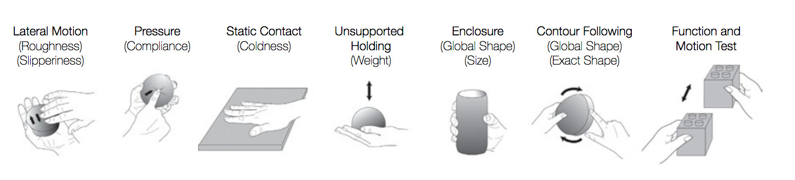
Illustrations of the exploratory procedures and their associated material and object properties, adapted and redrawn based on Lederman and Klatzky’s 2009 research, by Simon Stusak, Exploring the Potential of Physical Visualizations, in the 2015 Proceedings of the Ninth International Conference on Tangible, Embedded, and Embodied Interaction (TEI '15).
The way that we interact with an object, and the physical gestures required to do so, play a key role in shaping our experience of that object and our future modes of interaction. Studies have concluded that being able to handle and manually interact with an object aids cognition, for example in the case of letting children play with physical letters to learn the alphabet. Research specifically focused on data is still relatively new, although there are a few excellent studies in which scholars have experimented to see if this argument applies to tangible data representations. Is our memory enhanced when multiple senses work on a cognitive task? Can we remember more if data is represented on a 3D physical bar chart that we can see, caress, and touch, rather than a 2D digital bar chart? Can we retrieve information from a data physicalisation more easily than we can from a digital visualisation?
A journalistic context for data physicalisation
The potential journalistic benefits of physical data representations are not limited to how such objects perform in terms of information retrieval and memorability. Physical news installations inherently have some characteristics that make them a great complement to online journalism. For example, they can be used to deliver interactive data journalism in places with limited internet access. They can be designed to be fully accessible for the visually impaired, unlike online data viz. They are also more straightforward to interact with than rich online interactives, and can therefore be used to teach and improve the audience’s data and visual literacies. (Think: Hans Rosling’s Population growth explained with IKEA boxes.)
Furthermore, physical data installations can have a role in fostering civic engagement, as Attila Bujdosó describes in his 2012 essay, Data embodiment as a strategy for citizen engagement:
“...public data embodiment objects promise the potential of generating collective experiences in a community, which can strengthen the shared identity among its members and develop a group responsibility for collective issues.”
There is even a specific practice of data physicalisation, called ‘Participatory Data Physicalisation’, that explicitly highlights this focus on the collective experience. In such works, the data physicalisation is not an object designed top-down, but rather, in the words of Matteo Moretti, a “shared experience, where visitors [become] participants: protagonists and recipients of the visualization”.
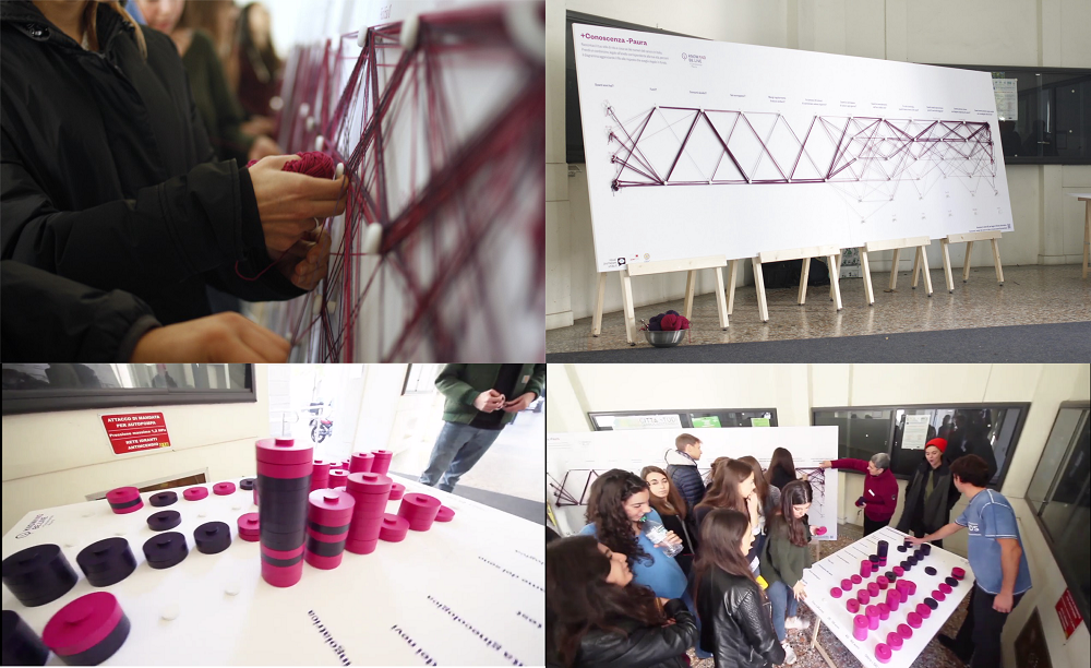
Participatory Data physicalisation @ TED Med 2017 Milan, by Know and belive, the Free University of Bozen-Bolzano, and Matteo Moretti.
The fact that a physical data representation does not need to be opened in a browser, but is somehow ‘always there’, means that it can promote an informal and casual experience, which is more inviting to novice and non-expert users. Newsrooms could coordinate with public spaces (like parks, libraries, or museums) to host events and news installations on topics of local relevance, like the local administration’s spending budget or traffic accidents. Such installations would continue to inhabit the place for defined periods of time, offering a constant visual token as people walk by it, perhaps spontaneously engaging with it and debating its message with other members of the community.
Developments in newsroom business models suggest that this path is compatible with what is working in terms of revenue. As newsrooms rely less and less on ads and more on membership models, subscriptions, and donations, there will be more room for experiments in ways to better engage the audience.
In parallel, newsrooms are increasingly grounding their practice in the community they work with. According to the Engaged Journalism Accelerator, which promotes similar initiatives, these kinds of journalistic practices have “the potential to restore trust in media, provide citizens with information they need and help establish new and resilient revenue models and enhance plurality and diversity in a crucial part of society’s information ecosystem”.
Lastly, journalism events are becoming more common and are a perfect match for physical data installations. NiemanLab’s research across Western media outlets puts physical journalism, “in the form of public meetings, festivals, events, and stage plays”, among the nine core ideas for innovative journalism. In the USA, The Washington Post, Politico, National Journal, the New York Times, NPR and others are all hosting live journalism events. The Texas Tribune generates almost as much income from events as from corporate gifts, while The Atlantic makes about 20% of its revenue from the roughly 100 live events it organises per year.
In short: it seems like a perfect time for newsrooms to experiment with data physicalisation. But where to start? The following section provides a quick primer on how to go from a .CSV or a .GEOJSON file to a 3D tactile map, all while learning the common tools and stages of a data physicalisation process using digital fabrication.
Crafting physical data objects
First, let’s look at the main steps that will allow you to transform a data file into a 3D map. As an example, we’re going to use data from the website Inside Airbnb, an independent watchdog that collects data to help researchers assess the impact of Airbnb in their city’s housing stock. We’ll focus on two European cities that symbolically sit at the opposite end of the spectrum in terms of regulation: Barcelona and Venice. On one hand, Barcelona can be seen at the frontlines of restricting touristic short-term rentals through a system of licenses and quotas, and via a direct agreement with Airbnb to access hosts’ data. On the other, Venice has very limited regulation, mostly just on tax issues. To compare these approaches, we’re going to visualise physicalise the number of entire apartment listings in a hexagon grid map. Once you familiarise yourself with this process, it can be repeated for any of the 70+ cities for which you find data on the Inside Airbnb website.
In this tutorial, we’re going to design the maps separately, so that they can be presented independently or next to each other like a series of small multiples maps. The design and fabrication of these maps has been developed by Chi ha ucciso il Conte?, an Italian designer and expert in digital fabrication and open source software.
Digital fabrication
To craft our data driven objects, we’re going to use digital fabrication techniques. Digital fabrication is a manufacturing process that uses the numerical values generated by computer software as coordinates to control machines and create objects with an accuracy that would be hardly achievable by a human being. Typical machines are 3D printers and CNC milling machines.
Not all data physicalisations are made through these kinds of semi-automated processes. For example, you could represent data through existing physical objects, or you could hand-craft data objects even out of Play Doh, Lego, or even by knitting. However, digital fabrication technologies have a series of advantages that make them a good match for our project:
- they allow for rapid manufacturing of the desired outputs
- their high level of accuracy makes them perfect to work with data
- the same design file can be repeatedly used to create reliable and consistent outputs anywhere in the world, meaning that an unlimited number of news organisations (or local units of the same news organisations) could manufacture an identical output locally, using the original design file.
A typical digital fabrication workflow starts right after the designer has clearly established the look, structure, and functioning of the desired output on pen and paper, including the definition of more technical characteristics like the dimensions of all its various parts.
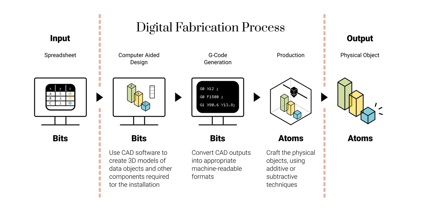
An example of a digital fabrication workflow.
The first component of a typical digital fabrication workflow is to transform these sketches and drawings into a digital, mathematical, and 3D model of all the components that need to be produced for the final output. This phase could encompass things like:
- binding the data points and spreadsheet into visual elements such as the lines, curves, lengths, and widths of the physical object that will go into production
- modeling the physical components needed to host sensors or motors to record and animate the data
- building physical boards with engraved information about the data, axis ticks, labels, annotations, titles, and so on.
Once the 3D modeling phase is complete, this visual and human-friendly design needs to be converted into a file with machine-readable instructions, so that a manufacturing machine can accurately and reliably craft the designed objects. This procedure is called G-Code generation. The G-Code file is the one that eventually gets imported into the machine.
The workflow
Now to what happens at each stage of the data physicalisation process. We’ll just be covering high-level instructions, focused on the input/output of each phase and what each intermediary step should be, rather than detail of each software’s interface or how to practically execute the commands (although we will provide links on where to find additional resources for each). If you have specific questions, feel free to contact the author.
For this example, we will only use a 3D printer, as it is the most approachable of the possible machines to build a 3D hexagonal grid map, along with entirely open source software:
Our workflow will show you how to create a single map for the city of Barcelona. Creating the second map for the city of Venice (or any other city) will require the same steps, just with different input data. I have imported all of the output files mentioned at the different stages into this GitHub repo. Feel free to download them and use them for reference, or to directly print your own versions of these two maps, skipping the preparation and modeling phase.
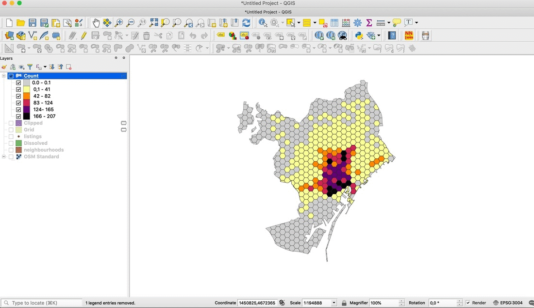
1. Prepare the data
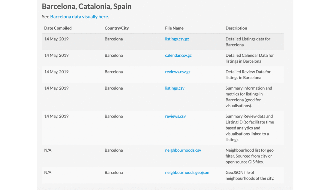
Software: QGIS
Input: Two files downloaded from the Inside Airbnb website: the ‘neighbourhood.geojson’ file and the ‘listings.csv’ file for the city of Barcelona.
Output: Two files for each city:
- One .SVG file with the outer boundaries of Barcelona. We’ll call it ‘barcelona-boundaries.svg’.
- One .SHP file with a hexagonal grid vector layer, containing the number of entire apartments in each hexagonal area. There should be a minimal buffer between the hexagons, and the grid should include only areas with one or more apartment. We’ll call it ‘barcelona-airbnb.shp’.
To create the .SVG file:
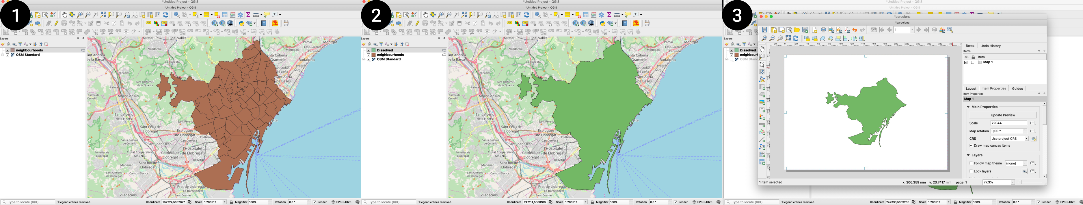
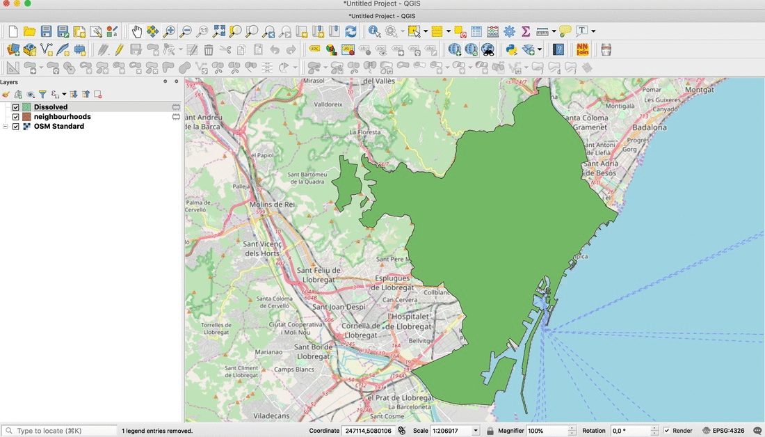
- Open QGIS and import the ‘neighbourhood.geojson’ file.
- Apply the dissolve command on the layer to delete all inner boundaries dividing the different neighbourhoods, resulting in a vector layer containing only the outer boundaries of the city.
- Use QGIS’s print composer to export the .SVG of this simplified layer. Let’s call this file ‘barcelona-boundaries.svg’.
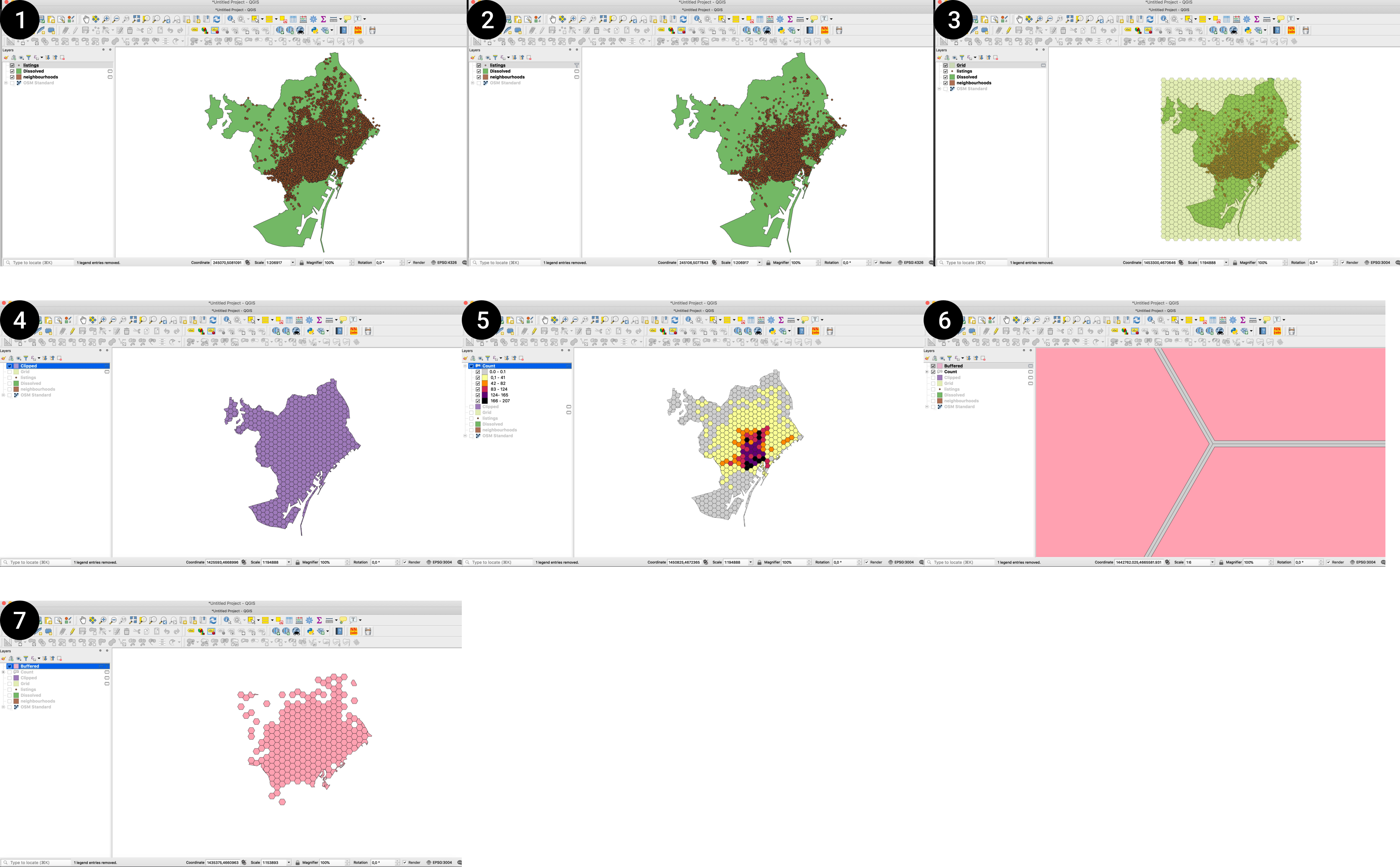
To create the .SHP file:
- Import the ‘listings.csv’ file in QGIS.
- Filter the ‘listings’ to include only entire apartments.
- Create a regular grid vector layer of 500x500m hexagons.
- Clip the hexagon grid with the dissolved neighbourhood layer.
- Count the number of points in the filtered listings layer belonging to each hexagon of the grid.
- Add a minimal negative buffer (-0.01 meters) to make sure the hexagons of the grid don’t touch each other. This is important because the 3D modeling software you will use needs to work with distinct solids without any overlapping lines, and in the default hexagonal grid created by QGIS, the polygons overlap. Giving the buffer zone a very minimal number removes any overlapping while creating a gap that is essentially imperceptible to the eye.
- Filter the buffered layer so that it includes only hexagons for areas with at least one entire apartment within it.
- Export the layer as a .SHP file, with the CRS set to either WGS84 or Web Mercator. Let’s call this file ‘barcelona-airbnb.shp’.
2.a. Create a 3D model for base of the 3D map
Software: FreeCAD
Input: The .SVG file created in the previous phase, ‘barcelona-boundaries.svg’.
Output: Two .STL files, one containing a square base; another with extruded 3D boundaries of the city. We’ll call them ‘barcelona-base.stl’ and ‘barcelona-city-map.stl’. They will be used for reference in the next step.
To create the .STL files:
- Open FreeCAD.
- Draw a 20x20cm square. This will serve as a reference point for how big the map should be. The size can depend on the printer you have access to: the bigger the building plate, the bigger you can make the map and its base.
- Extrude the square by 5mm.
- Export this extruded object as a .STL mesh (called ‘barcelona-base.stl’).
- Import the .SVG with the city’s outer boundaries on FreeCAD.
- Extrude the .SVG by 2mm.
- Export this extruded object as a .STL mesh (let’s call it ‘barcelona-city-map.stl’).
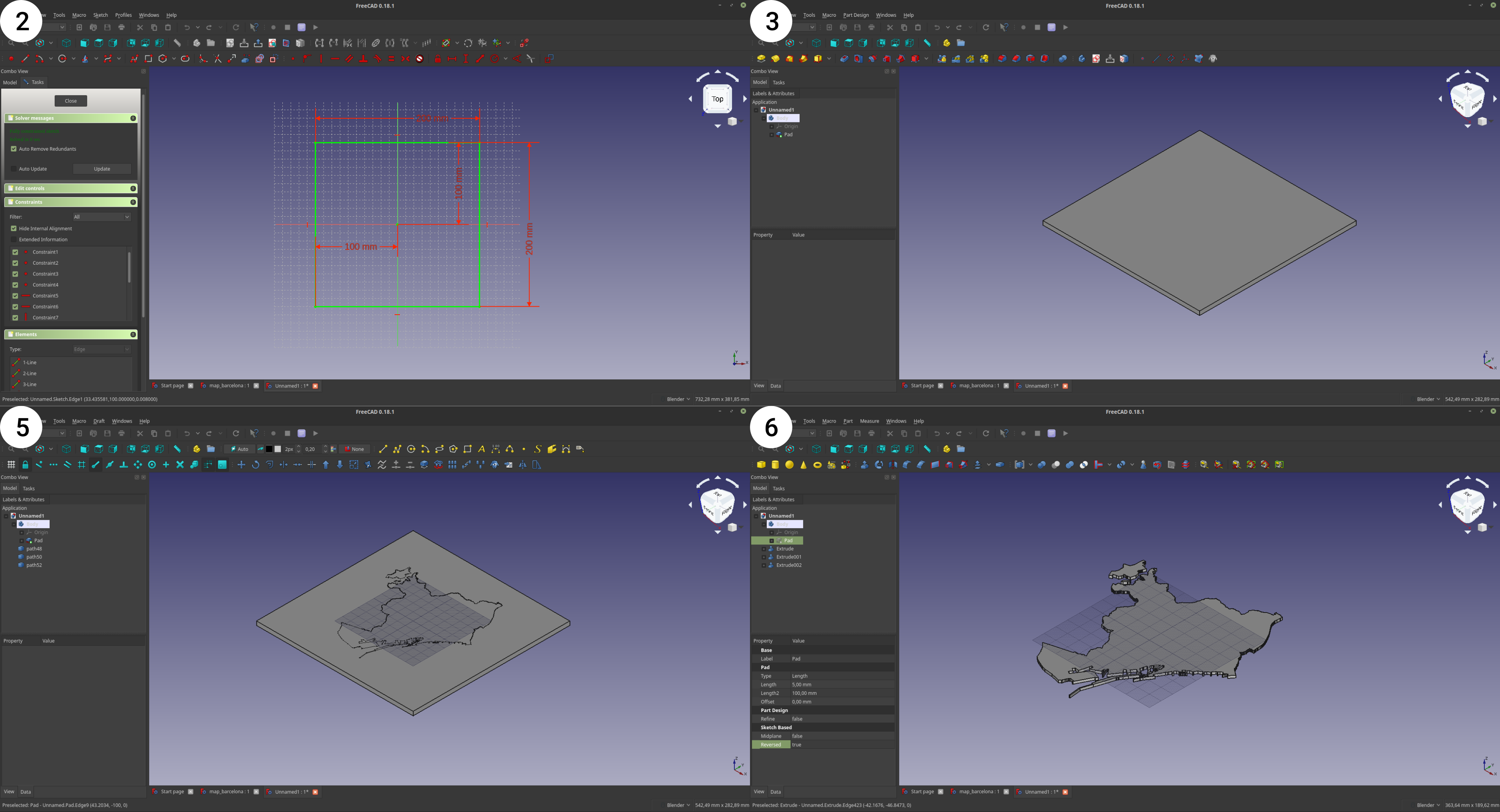
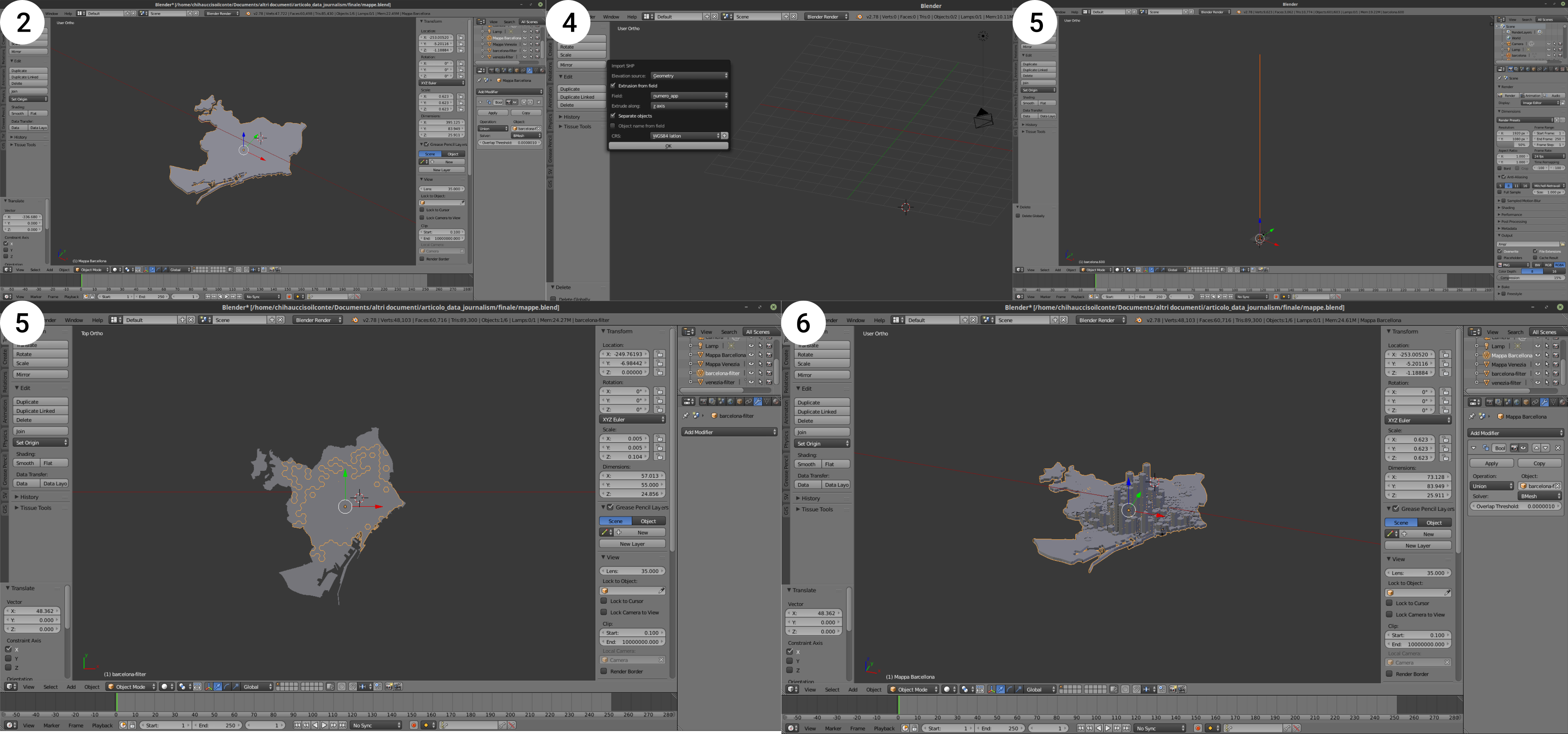
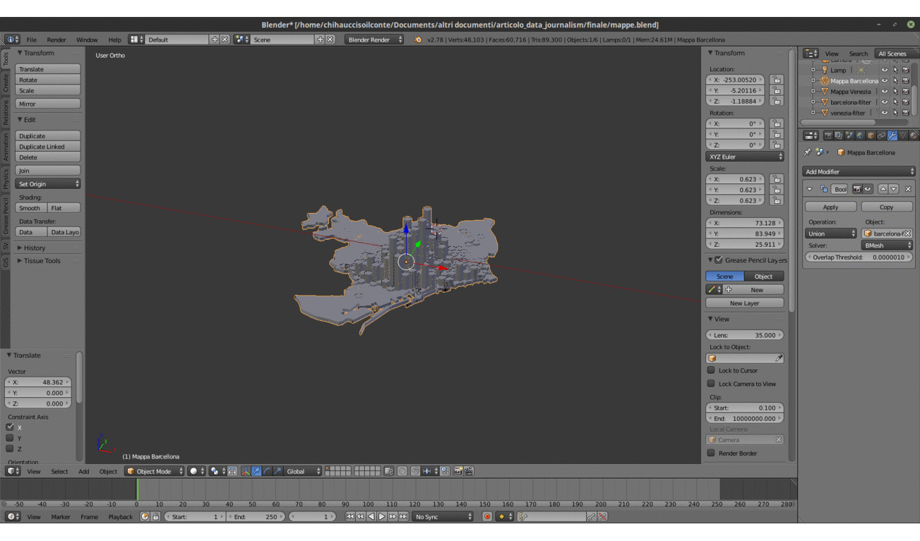
2.b. Create a 3D model of the hexagonal grid map layer
Software: Blender and the Blender GIS Add-on
Input: The .STL file with the city map created in the previous step and the .SHP file created in the first phase, for both cities. So: ‘barcelona-city-map.stl’ and ‘barcelona-airbnb.shp’.
Output: A .STL file containing a 3D model of the hexagonal maps, with the height of each hexagon defined by the number of entire apartment listings in that area. We’ll call it ‘barcelona-airbnb3d.stl’.
To create the .STL file:
- Open Blender.
- Import first the .STL file with the city map.
- Import the .SHP file with the hexagonal grid and the data on entire apartments. You will see this option only if you have installed the Blender GIS Add-on.
- In the import options, before clicking ‘OK’, make sure that you specify the following parameters:
- Extrusion from fields: tick the check box
- Field: choose the field that contains the number of apartments
- Extrude along: choose ‘Z axis’
- CRS: specify the correct CRS.
- The imported .SHP file is probably very big: resize it so that it snaps into the city boundaries of the city map .STL file.
- Perform a boolean union operation to unite the base city map to the 3D hexagons into a single solid.
- Export the solid as an .STL file. Let’s call the file ‘barcelona-airbnb3d.stl’.
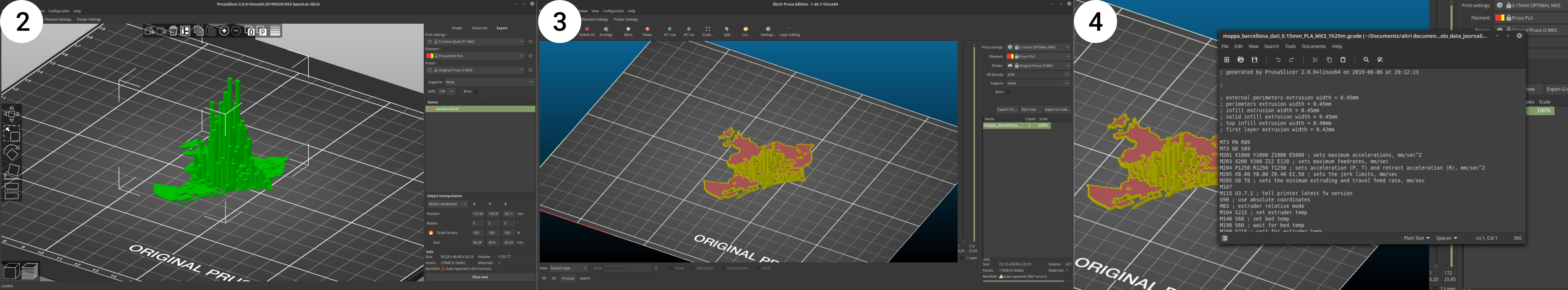
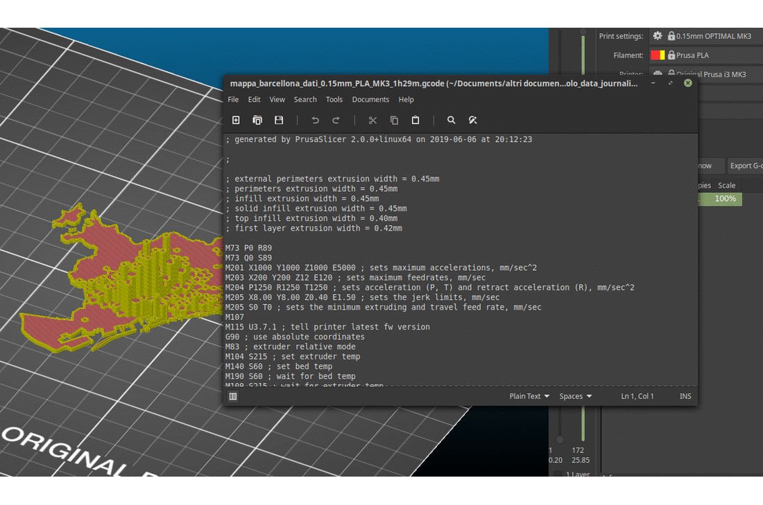
3. Create the GCode for the 3D printed hexagonal grid map layer
Software: Slic3r
Slic3r is a ‘slicer’ -- a software that processes the 3D model and generated instructions for the 3D printer, for example by slicing the volume into thin layers, creating supports for hanging elements, and so on. The version of Slic3r used in this tutorial is a custom version tailored to the 3D printer used, a Prusa i3 mk3, but you will find the same commands in any Slic3r version. If you are using a general version of Slic3r, then you will need to set the configurations appropriately for your specific 3D printer. It’s wise to talk to the owner/operator of the 3D printer in this phase.
Input: The .STL file containing the 3D model of the hexagonal maps, so ‘barcelona-airbnb3d.stl’.
Output: A .GCODE file that can be sent to the 3D printer. We’ll call it ‘barcelona-airbnb-3dprint.gcode’.
To create the .GCODE file:
- Open Slic3r.
- Add the .STL file with the 3D hexagonal grid map, ‘barcelona-airbnb3d.stl’.
- Check if the print settings are correct (the default ones usually work fine) and slice the model.
- Export a .GCODE file of the sliced object. Let’s call it ‘barcelona-airbnb-3dprint.gcode’.
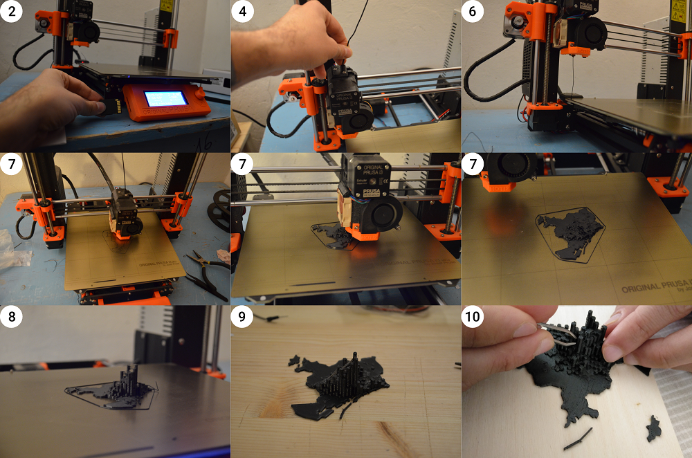
4. 3D printing the map
Hardware: Prusa i3, or other 3D printer
For this part of the project, it is advisable to first contact the person who will be operating the machine to produce your output. This because every machine has its own specs, capabilities, and possibly even software.
Input: the .GCODE file with the instructions for the 3D printer.
Output: a physical map of Airbnb entire apartments distribution in Barcelona.
To 3D print the map:
- Copy the .GCode file (‘barcelona-airbnb-3dprint.gcode’) onto an SD card/USB drive depending on what your 3D printer reads.
- Insert the SD card into the 3D printer.
- Prepare the PLA filament and insert the spool in its lodging, if it is not already in place.
- Insert the lead of the filament into the hole on top of the extruder.
- Preheat the extruder and the building plate.
- When the extruder and the building plate reach the temperature, load the filament. Check that it flows down smoothly, otherwise repeat steps 5-6 again.
- Select the .GCode file and print it. For reference, consider that it should take approximately 1 hour and a half to complete. You don’t need to sit next to your 3D printer the whole time, but it might be useful to check on the process every once in a while.
- When the piece is completely printed, delicately remove it from the building plate. The piece might be attached quite firmly, so you might need a spatula to aid you in the operation.
- Use some pliers to clean up the object by removing extra filament traces around the edges.
- PLA plastic is very easy to recycle: make sure you discard the scraps and waste appropriately, for example by bringing it to a PLA filament recycling facility or at least by throwing it away in a plastic recycling bin.
5. Assemble
You can layout your 3D maps on a wooden support, eventually adding contextual information like titles and a 3D legend. You could write them in pen, paint them, or even try to 3D print them like we did. You can repeat this process to portray multiple cities.

In these tactile maps, data patterns are communicated through multiple senses, and both sight and touch work together to show how the two cities have similarities in terms of geographical distribution -- Airbnb listings are concentrated in the central areas -- and stark differences in terms of scale.
The center of Venice has a concentration of up to 444 listings inside the area of a single 500x500m hexagon, while in Barcelona this maximum number is halved at only 207 listings. This disproportion is even more significant if we consider the population of the two cities: Venice is home to roughly 270,000 people (of which only 52,000 live in the central ‘fish’ that hosts the majority of Airbnb listings), while Barcelona is home to 1.7 million.
These types of tactile maps are a very basic data physicalisation type that can even be produced by beginners. At the same time, they are a novel and powerful way to present data beyond purely visuals cues, allowing people to interact with your data and retrieve information from it in a physical setting.

Conclusion
As software and hardware progress, the technical barriers to making data physicalisation will lower, as it did for data visualisations. But, technology aside, data physicalisation is first of all a process that begins in the mind, by thinking creatively about what can be used to encode data beyond the visual and what types of experiences you want to foster in your community. And for this, you don’t need complex technical skills, it is first of all about imagination. So, I’ll leave you with this question: What data physicalisation do you imagine for your next story?


Let’s get physical: how to represent data through touch - A tutorial in data physicalisation for journalists
17 min (2) - Click to comment