Data visualization DIY: Our Top Tools
Written by: Simon Rogers
What data visualization tools are out there on the web that are easy to use — and free? Here on the Datablog and Datastore we try to do as much as possible using the internet’s powerful free options.
That may sound a little disingenuous, in that we obviously have access to the Guardian’s amazing graphics and interactive teams for those pieces where we have a little more time — such as this map of public spending(created using Adobe Illustrator) or this Twitter riots interactive.
But for our day-to-day work, we often use tools that anyone can — and create graphics that anyone else can too.
So, what do we use?
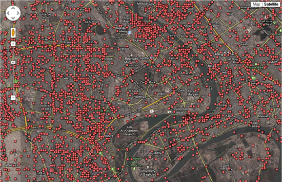
This online database and mapping tool has become our default for producing quick and detailed maps, especially those where you need to zoom in. You get all the high resolution of google maps but it can open a lot of data — 100mb of CSV, for instance. The first time you try it, Fusion tables may seem a little tricky — but stick with it. We used it to produce maps like the Iraq one above and also border maps like this one of homelessness too.
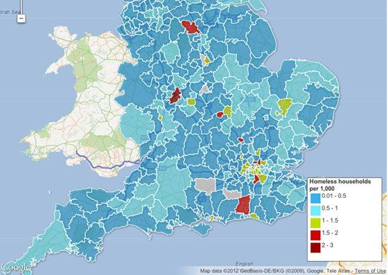
The main advantage is the flexibility — you can can upload a kml file of regional borders, say — and then merge that with a data table. It’s also getting a new user interface, which should make it easier to use.
You don’t have to be a coder to make one — and this Fusion layers tool allows you to bring different maps together or to create search and filter options, which you can then embed on a blog or a site.
This excellent tutorial by Google’s Kathryn Hurley is a great place to start.
Top tip: use shpescape to convert official shp files into Fusion tables for you to use. Also, watch out for over-complicated maps — Fusion can’t cope with more than a million points in one cell
If you don’t need the unlimited space of the professional edition, this is free — and means you can make pretty complex visualizations simply and easily with up to 100,000 rows. We use it when we need to bring different types of charts together — as in this map of top tax rates around the world, which also has a bar chart too.
Or you can even use it as a data explorer — which is what we did below with the US federal elections spending data (although we ran out of space in the free public version — something to watch out for). Tableau also needs the data formatted in quite specific ways for you to get the most out of it. But get through that and you have something intuitive which works well. La Nación in Argentina has built its entire data journalism operation around Tableau, for instance.
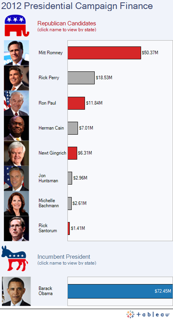
Tableau has some good online tutorials here for you to start with.
Top tip: Tableau is designed for PCs, although a Mac version is in the works. Use a mirror such as parallels to make it work
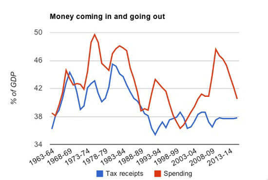
After something simple — like a bar or line chart, or a pie chart? You’ll find that Google spreadsheets (which you create from the documents bit of your Google account) can create some pretty nice charts — including the animated bubbles used by Hans Rosling’s Gapminder. Unlike the charts API you don’t need to worry about code — it’s pretty similar to making a chart in Excel, in that you highlight the data and click the chart widget. The customisation options are worth exploring too — you can change colours, headings and scales. They are pretty design-neutral, which is useful in small charts. The line charts have some nice options too, including annotation options.
Top tip: spend some time with the chart customisation options — you can create your own colour palette
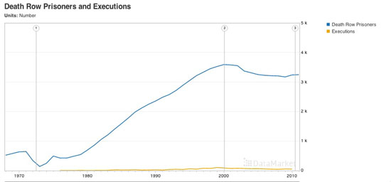
Explore this data US executions
Better-known as a data supplier, Datamarket is actually a pretty nifty tool for visualizing numbers too. You can upload your own or use some of the many datasets they have to offer — but the options do get better if you get the Pro account.
Top tip: works best with time series data, but check out their extensive data range
If ever a site needed a bit of TLC, it’s IBM’s Many Eyes. When it launched, created by Fernanda B. Viégas and Martin Wattenberg it was a unique exercise in allowing people to simply upload datasets and visualise them. Now, with its creators working for Google, the site feels a little unloved with its muted colour palettes — and hasn’t seen much new in the way of visualizations for some time.
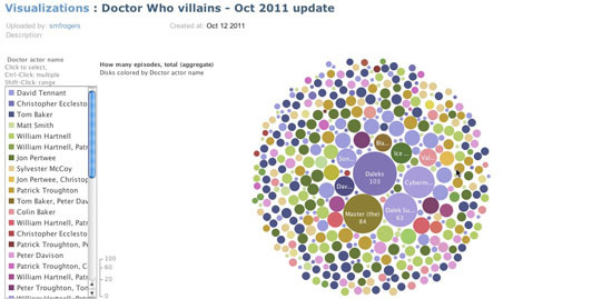
If ever a site needed a bit of TLC, it’s IBM’s Many Eyes. When it launched, created by Fernanda B. Viégas and Martin Wattenberg it was a unique exercise in allowing people to simply upload datasets and visualise them. Now, with its creators working for Google, the site feels a little unloved with its muted colour palettes — and hasn’t seen much new in the way of visualizations for some time.
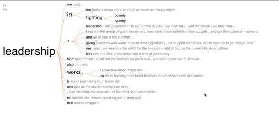
Top tip: you can’t edit the data once you’ve uploaded it, so make sure you get it right before you create it.
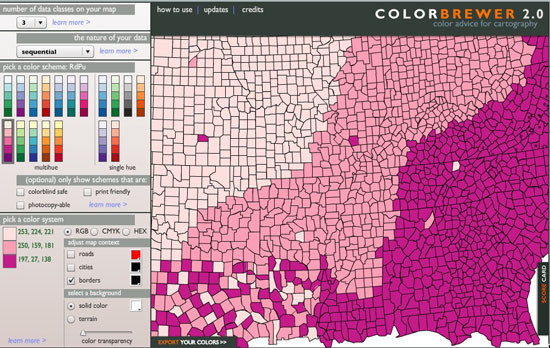
Not, strictly speaking, a visualization tool, Color Brewer — originally designed with federal funding and developed at Penn State — is really for choosing map colors, and is worth spending some time with if plan to make many more. You can choose your base colour and get the codes for the entire palette.
And some more
If none of these are for you, it’s also worth checking out this piece by EduGuide which has even more options. The ones above aren’t the only tools, just those we use most frequently. There are lots of others out there too, including:
-
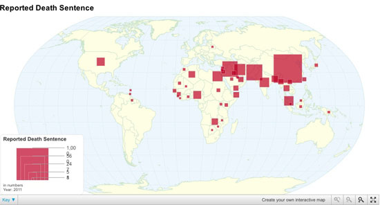
Chartsbin A tool for creating clickable world maps
-
iCharts Specialises in small chart widgets
-
Geocommons Shares data and boundary data to create global and local maps
Oh and there’s also piktochart.com, which provides templates for those text/numbers visualizations there are a lot of around at the moment.
