Data Journalism at the Zeit Online
Written by: Sascha Venohr

The PISA based Wealth Comparison project is an interactive visualization that enables comparison of standards of living in different countries. The interactive uses data from the OECD’s comprehensive world education ranking report, PISA 2009, published in December 2010. The report is based on a questionnaire which asks fifteen-year-old pupils about their living situation at home.
The idea was to analyze and visualize this data to provide a unique way of comparing standards of living in different countries.
First of all our in-house editorial team decided which facts seemed to be useful to make living standards comparable and should be visualized, including:
-
Wealth (number of owned TVs, cars and available bathrooms at home)
-
Family-situation (are there grandparents living with the family together, percentage share of families with only one child, unemployment of parents and mother’s job status)
-
Access to knowledge sources (internet at home, frequency of using e-mail and quantity of owned books)
-
Three additional indicators on the level of development of each country.
With the help of the internal design team these facts were translated into self-explanatory icons. A front end design was built to make comparison between the different countries like in a card-game possible.
Next we contacted people from the German Open Data Network to find developers who could help with the project. This community of highly motivated people suggested Gregor Aisch, a very talented information designer, to code the application that would make our dreams come true (without using Flash — which was very important to us!). Gregor created a very high quality and interactive visualization with a beautiful bubble-style, based on the Raphaël-Javascript Library.
The result of our collaboration was a very successful interactive which got a lot of traffic. It is easy to compare any two countries, which makes it useful as a reference tool. This means that we can re-use it in our daily editorial work. For example if we are covering something related to the living situation in Indonesia, we can quickly and easily embed a graphic comparing the living situation in Indonesia and Germany. The know-how transferred to our in house-team was a great investment for future projects.
At the Zeit Online, we’ve found that our data journalism projects have brought us a lot of traffic and have helped us to engage audiences in new ways. For example, there was a wide coverage about the situation at the nuclear plant in Fukushima after the Tsunami in Japan. After radioactive material escaped from the power plant, everyone within 30 kilometres of the plant was evacuated. People could read and see a lot about the evacuations. Zeit Online found a innovative way to explain the impact of this to our German audience. We asked: How many people live near a nuclear power plant in Germany? How many people live within a radius of 30 kilometres? A map shows how many people would have to be evacuated in a similar situation in Germany. The result: lots and lots of traffic and the project went viral over the social media sphere. Data journalism projects can be relatively easily adapted to other languages. We created an English language version about proximity to nuclear power plants in the US, which was a great traffic motor. News organizations want to be recognized as trusted and authoritative sources amongst their readers. We find that data journalism projects combined with enabling our readers to look and reuse the raw data brings us a high degree of credibility.
For two years the R&D Department and the Editor-in-Chief at the Zeit Online, Wolfgang Blau, have been advocating data journalism as an important way to tell stories. Transparency, credibility and user engagement are important parts of our philosophy. That is why data journalism is a natural part of our current and future work. Data visualizations can bring value to the reception of a story, and are an attractive way for the whole editorial team to present their content.
For example, on 9th November 2011 Deutsche Bank pledged to stop financing cluster bomb manufacturers. But according to a study by non-profit organzation Facing Finance, the bank continued to approve loans to producers of cluster munitions after that promise was made. Our visualization based on the data shows the various flows of money to our readers. The different parts of the Deutsche Bank company are arranged at the top, with the companies accused of involvement in building cluster munitions at the bottom. In between, the individual loans are represented along a timeline. Rolling over the circles shows the details of each transaction. Of course the story could have been told as a written article. But the visualization enables our readers to understand and explore the financial dependencies in a more intuitive way.

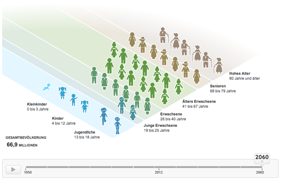
To take another example: the German Federal Statistic Office has published a great dataset on vital statistics for Germany, including modelling various demographic scenarios up until 2060. The typical way to represent this is a population pyramid — such as the one from the Federal Statistics Agency.
With our colleagues from the science department we tried to give our readers a better way to explore the projected demographic data about our future society. With our visualization, we present a statistically representative group of 40 people of different ages from the years 1950 till 2060.They are organised into eight different groups. It looks like a group photo of German society at different points in time. The same data visualized in a traditional population pyramid gives only a very abstract feeling of the situation, but a group with kids, younger people, adults and elderly people means our readers can relate to the data more easily. You can just hit the play button to start a journey through eleven decades. You can also enter your own year of birth and gender to become part of the group photo: to see your demographic journey through the decades and your own life expectancy.

