Our next Conversations with Data podcast will take place on Tuesday 6 July at 3 pm CEST / 9 am ET with Eva Constantaras from Internews and Anastasia Valeeva from the American University of Central Asia, Kyrgyzstan. During our live Q&A, they'll discuss the power of building a hypothesis for data journalism and what can be done to address inequity with data. The conversation will be our second live event on our Discord Server. Share your questions with us live and be part of our Conversations with Data podcast. Add to LinkedIn or your Google calendar now.
Introduction
2020 pulled data journalism in two drastically different directions. On the one hand, the Black Lives Matter movement forced the data journalism community to question equity in the field: who is data journalism produced by, for and about? On the other hand, the pandemic offered a plethora of opportunities to channel the firehouse of coronavirus into shiny, often impersonal, dashboards of despair and death that quantified the scale of the pandemic.
The best data-led pieces of the year married these two trends into powerful investigations into the pervasive inequities laid bare by the pandemic, transforming statistics into concrete examples of specific harm to people that could be mitigated if addressed. One word describes these outstanding investigations: intentional.
The stakes for data journalism in the face of media polarisation, misinformation and disinformation are high as it struggles to find a role in the efforts to rebuild a healthy information ecosystem for citizens. As Lisa Charlotte Rost of Datawrapper asks in her blog post Less News, More Context, "With which information can my audience navigate this world better?”
Almost 10 years of teaching data journalism has taught us that the journalists who produce the most powerful investigations are the ones who started with a powerful idea, a powerful idea formulated as a hypothesis. This method, Story Based Inquiry, pioneered by Mark Lee Hunter, has been adopted by many data journalists and refined further for data projects, for example, The Markup Method. For us, it enables journalists around the world to harness data to explore and explain the drivers of inequality undergirding the news of the day.
One hypothesis -- many stories
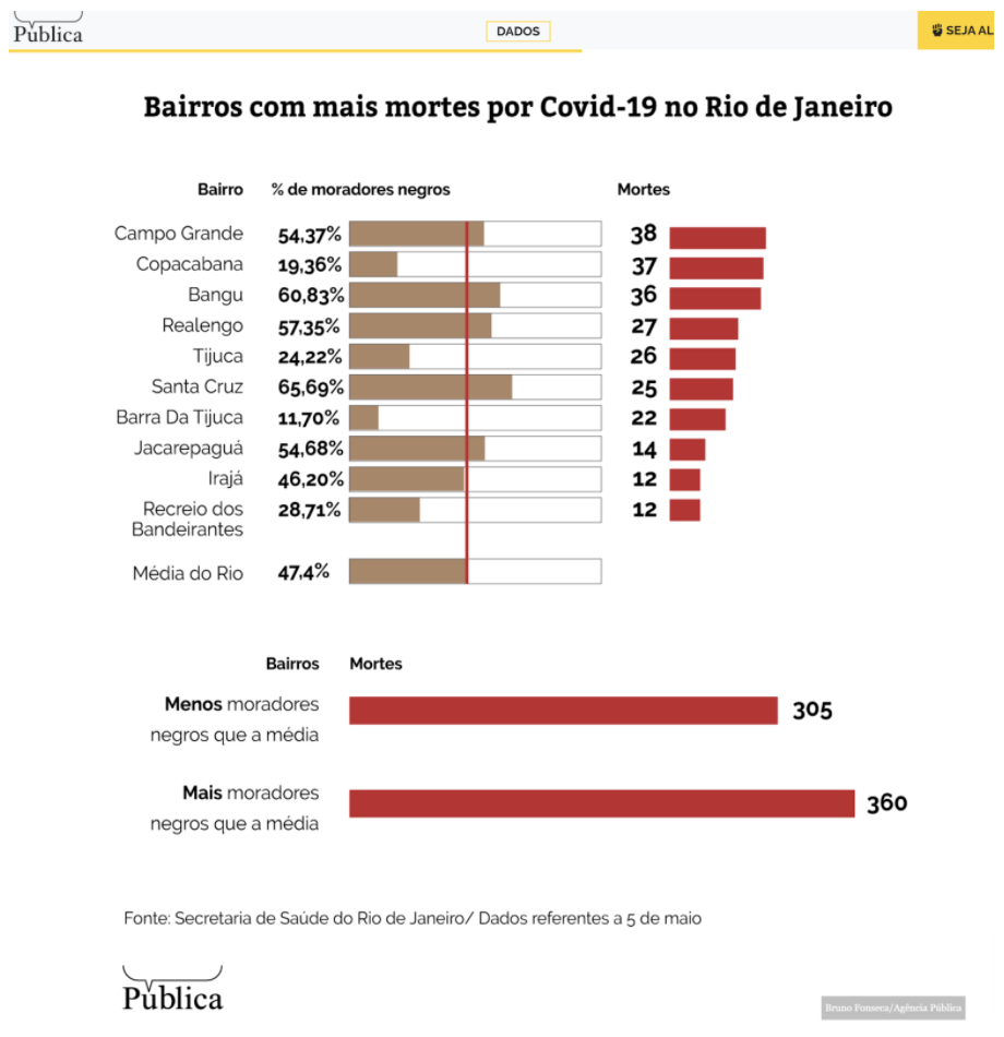
After reviewing dozens of nearly identical coronavirus dashboards, we ran across a submission for the 2020 Sigma Awards that suggested the journalists had dug into the data knowing what they were looking for. The entry on the disproportionate number of deaths among Black Brazilians, by Publica, a non-profit investigative outlet, led us to more stories published by Publica on racial disparities in vaccine distribution and access to ICU beds among indigenous communities.
Though the data behind the stories was available to readers, the focus was the story, not the data. They have built a data journalism beat around disparities in healthcare access and a hypothesis-based approach allows them to drill deeper and deeper. They began with something like “Black Brazilians, who already scored low on an overall development index, are dying at faster rates than the general population” and then set out to see whether the hypothesis was true or not. Related stories refined this hypothesis to probe related disparities in healthcare equity during the pandemic. The rest of this story explores how to apply this approach yourself.
Formulating a hypothesis
Let’s read a couple of stories and formulate their hypothesis as a statement.
Perhaps you’ve come up with something like ‘Vaccine distribution is unequal’ or something more specific like ‘Vaccines are more available for high income countries in general, and, on an individual level, for wealthy people not the poor’.
They are both right. However, to be able to use a hypothesis as a tool for your own story, the second one works better. It formulates not only the idea, but also the means of proving it. This method is borrowed from social science, like a lot of data journalism techniques.
You don’t have to show this hypothesis-as-a-tool to your reader, but you do show it to your editor: it’s basically the pitch of the article. And since we want it to be convincing, it needs to be even more specific. What are the exact indicators that you will use to answer your questions? What is the unit of measurement? What time or geographic span are we looking at, and at what level of granularity? This is called the operationalisation process.
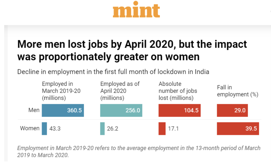
Let’s look at another story and formulate its hypothesis as a statement that is quite specific about the indicators.
You may have spotted that the text itself has both general idea (“the drop in employment is not gender-neutral”) and more specific statements which prove this idea, like this one: “The sectors most affected in the pandemic crisis--restaurants, retail, beauty, tourism, education, domestic work, and care work for the young and elderly -- have high female employment”.
Let’s write out the basic requirements for a viable hypothesis using a sample hypothesis: “Socio-economically marginalised groups are more likely to die of the coronavirus”.
- Can either be proven or disproven with data. For example, ‘Poor people are more likely to die of coronavirus than rich people.’
- Is specific about what is being measured. ‘Citizens living in areas of the city with a lower annual income according to the latest census are dying at a higher rate than those living in richer neighbourhoods.’
- The data is available. ‘Coronavirus death records and income data are available by neighbourhood.’
- The topic is important to the public. ‘Inequity in healthcare access resonates universally.’
How to avoid common pitfalls
Now, let’s look at the common mistakes for hypotheses and how we can avoid them.
- One half or both halves of the hypothesis cannot be proven with data. In many countries, neither specific geo-located data nor geo-located income data is available. For example, in the case of Brazil, only race data was available, so the hypothesis had to focus on race by geographical area, not income.
- The hypothesis is too fuzzy. The idea for a data story can often start from a broad, general idea like: ‘As the pandemic deepens, most EU countries become more pessimistic’. To make it work (and for anybody to care), you need to explain to yourself and to your audience what you mean exactly, how you will measure it and why it matters. In this Reuters story, the hypothesis may have been something like “Swedes and their pandemic policies were optimistic and open and they escaped the economic downturn that has spread across Europe”. Note, the story walks a fine line, presenting various correlations between attitude and economic indicators without making a causal claim.
- There is no data. Too many ideas for data stories die young because it turns out there is no data to prove them. A lot of great data stories have emerged from journalists being resourceful with the data they do have, making the data gap the story or creating their own data. For example, this is how journalists around the world, in India and in Kyrgyzstan tackled the global undercount in COVID-19 deaths by building hypotheses around data quality issues.
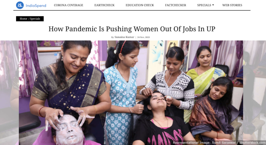
- The hypothesis is too broad. The topic is better for a book than a single story. Often, journalists try to tackle far too much in one story. It would take enormous time to explore all the variables that might influence the general problem. So why not focus on a specific aspect of your problem and explain it from A to Z? Instead of having a huge covid data dashboard with lots of demographic data but no stories, drill down and identify specific, compelling stories that justify having a database. For example, in our India job loss example, the journalist has a hypothesis focussed on job loss related to the sectors where women are employed. This story pursues a related but distinct hypothesis: care work during the pandemic is forcing women out of the workforce.
Both of these reveal specific insights into barriers to economic recovery faced by women without getting lost in obvious generalisations about gender inequality.
- The hypothesis is too narrow: it only measures how one factor influences a trend and discounts other data sources that might also contribute to it. Here is an example of how Rappler in the Philippines has dealt with the difficulty of identifying a pattern in the surge of coronavirus cases. While they start with a hypothesis about spikes in busy commercial areas, they also address the possible influence of factors such as concentration of violation of health and safety protocol.
- The hypothesis has already been proven true and is common knowledge.
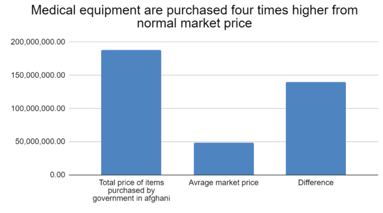
A lot of data journalists around the world have shied away from “the procurement process is corrupt” stories because of course it is! Instead, they use very narrow examples to pursue accountability on a local level. Pajwok Afghan News’ data team pursued a hypothesis related to procurement price infliction of specific medical supplies. Dataphyte in Nigeria so aggressively pursued individual contracting irregularities that they forced the government to divulge more contract details.
The good news is that you can almost always make a weak hypothesis stronger by doing the research needed to make it more verifiable, specific, interesting and concise. Another piece of good news is that even if you prove your hypothesis false, what you did find is probably still a compelling, and maybe even a more surprising, story.
From hypothesis to questions
And now let’s dive a little deeper. The hypothesis-driven approach also lends itself well to developing research questions to prove your hypothesis true or false. Sticking with research questions that probe your hypothesis serve the same purpose as writing out interview questions for a difficult source ahead of time: it allows you to organise your thoughts and ensure you get the answers you need.
Let’s read this data story and pull out the major findings. Then we will reverse engineer the hypothesis and questions:
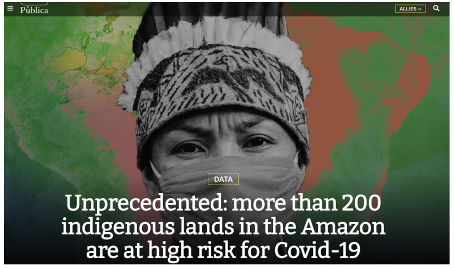
If we list the data arguments in this piece, we can get something like this:
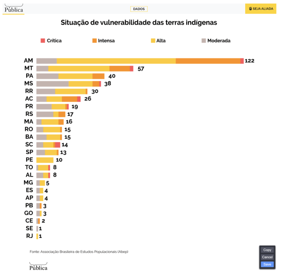
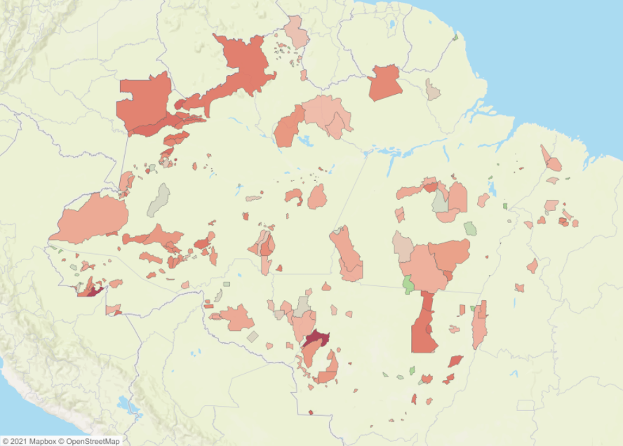
- The majority of Indigenous Lands (TIs) in the Amazon have been identified as in critical condition due to the coronavirus pandemic in Brazil.
- Of 1,228 Brazilian municipalities where there is at least a stretch of TIs, only 108 have an ICU bed, so less than 10% of Brazilian municipalities with indigenous lands have ICU beds.
- More than 80% of all TI lands in the country are concentrated in the North, precisely the region that, along with the Northeast, has the largest ICU deserts in the country.
- The maternal mortality rate for indigenous people is highest among all races, even when controlling the socioeconomic level. The deaths among those in the indigenous community are undercounted.
- Among the 10 regionals that have been identified as most vulnerable to the coronavirus, seven haven’t been officially recognised for protected indigenous status.
- About four out of five households in indigenous territories did not have a water supply and a third of households on indigenous lands did not have a bathroom for exclusive use.
- In 17 TIs, at least one-fifth of the population was over 50 years of age, which is considered a risk factor for coronavirus.
- Researchers have called for the establishment of specific strategies for the care of indigenous peoples.
- Another recommended solution is the construction of field hospitals exclusively for indigenous people.
From this list of answers, we can reverse engineer a hypothesis and a list of questions:
Hypothesis
- Indigenous communities are facing an acute health crisis during the pandemic due to under-resourced health facilities and underlying health conditions.
Problem
Are indigenous communities dying at a disproportionately high rate?
Do indigenous communities have worse access to ICU beds than the rest of the country?
Impact
What proportion of indigenous lands are considered in critical condition now?
Are indigenous communities considered to be in a more critical condition during the pandemic than the rest of the country?
What proportion of the population of indigenous communities is considered high risk?
Cause
How did maternal mortality rates of indigenous people compare to the general population before the pandemic?
How did access to clean water in indigenous communities compare to the rest of the population before the pandemic?
How complete are death records considered in indigenous territories compared to the rest of the country?
How complete are death records among indigenous communities?
How complete is the registration of Indigenous Territories?
Solution
- What strategy can be employed to close the gap in access to healthcare and mitigate the vulnerability of indigenous people?
We can see these questions touch on different parts of the problem. While some describe the scale of the problem, others focus on the impact of the problem on a particular group of people, and others dive into the causes and factors behind that. Finally, there are questions about the possible solutions or ways to mitigate these consequences.
You can apply this general list of questions nearly to every data story that dives into the roots of the problem and aims to build a concise narrative around it:
Problem:
- How big is the problem?
- Is it getting worse or better?
Impact:
- Which category of people is more likely to experience the consequences of the problem/benefit from the situation?
- How does the problem affect this group of people?
Cause:
- What are the main causes explaining why the problem is disproportionately affecting these people?
- Which factors have contributed to this?
Solution:
- What needs to be fixed for the impacted group of people to mitigate the consequences or solve the problem for them?
- How much would it cost and is there a source of money for this?
- Has anybody already tried to solve this problem, here or elsewhere?
- How can we measure the effectiveness?
These questions help the story remain focused on the specific hypothesis that the journalists have set out to prove or disprove. The questions ensure they drill deep into the issue and explain the problem from various angles using data. A great data hypothesis consists of questions that can be answered with data to prove or disprove it.
Conclusion
In conclusion, a good hypothesis can be proven with the data that exists and generated new insights into an issue. It also measures the problem, causes, impact and solutions.
A hypothesis is a great way to build up beat reporting around an issue your audience cares about. For example, check out these variations of the previous hypothesis:
- Indigenous communities are facing an acute economic crisis during the pandemic due to under-resourced economic recovery programmes and chronic lack of local investment.
- Indigenous communities are facing an acute education crisis during the pandemic due to an under-resourced education system and chronic lack of access to the internet.
Many favourite issues covered by data journalists: politics, healthcare, education, the economy, are universal. Reading how other data journalists explore and explain these issues is a way to find inspiration to generate meaningful stories about and for your community and help communities make sense of pressing issues like inequity. Adopting a hypothesis-driven methodology established a workflow to build data-driven beat reporting around complex, often misunderstood problems that are not going away anytime soon and require meaningful and informed citizen engagement to change the status quo.

Eva Constantaras is a data journalist specialised in building data journalism teams in the Global South. These teams have reported from across Asia, the Middle East, Latin America and Africa on topics ranging from broken foreign aid and food insecurity to extractive industries and public health. As a Google Data Journalism Scholar and a Fulbright Fellow, she developed a pedagogical approach and manual for teaching investigative and data journalism in high-risk environments. Follow her on Twitter: @evaconstantaras

Anastasia Valeeva is a data journalism trainer and open data researcher. She has taught data journalism in Europe, the Balkans, Central Asia and Russia and is currently a data journalism lecturer at the American University of Central Asia, Kyrgyzstan. She is also a co-founder of School of Data Kyrgyzstan. She has researched the use of open data in investigative journalism as part of her fellowship at the Reuters Institute for the Study of Journalism, Oxford. Follow her on Twitter: @anastasiajourno


A data journalist's guide to building a hypothesis - How an intentional exploration of inequity can help data journalists better serve communities
13 min Click to comment