The 2020 Sigma Awards
A brand new competition to celebrate the best data journalism from around the world.
And the winners are...
Check out the best data-driven work from 2019, picked by our international experts.
Supported by ![]()
Announcing:
The Sigma Awards 2020 winners
The Sigma Awards is a new data journalism competition which aims to celebrate the best data journalism around the world, but also to empower, elevate and enlighten the global community of data journalists. Entries have closed on 5 February 2020, with a staggering number of 510 projects, coming from 66 countries and areas.
The jury, made of 24 international experts (full list at the bottom of the page), have gone through the entries and picked ten winners as well as two honorable mentions, in 6 categories. Together, they represent the best data journalism from around the world. Team members from the winning entries will be invited to the International Journalism Festival in Perugia, Italy, in April, to present their work to the international data journalism community, and to take part in various sessions.
Winners reveal: Checkout the best data journalism projects from 2019
Here is the list of projects that have been selected as winners of the 2020 Sigma Awards:
Best data-driven reporting (large newsrooms)
Winner: The Troika Laundromat
Organisation: OCCRP, The Guardian - UK, Süddeutsche Zeitung - Germany, Newstapa - South Korea, El Periodico - Spain, Global Witness and 17 other partners who can be viewed here.
Credit: Coordinators: Paul Radu, Sarunas Cerniauskas. Reporters: Olesya Shmagun, Dmitry Velikovsky, Alesya Marohovskaya, Jason Shea, Jonny Wrate, Atanas Tchobanov, Ani Hovhannisyan, Irina Dolinina, Roman Shleynov, Alisa Kustikova, Edik Baghdasaryan, Vlad Lavrov

Jury's comment: In a field of strong entries, the substantial effort, investment and not inconsiderable risk in piecing this story together, were some of the factors appreciated by the jury in selecting the Troika Laundromat, by the Organized Crime and Corruption Reporting Project (OCCRP) as the winner in this category. This far-reaching investigation touched almost 3000 companies across 15 countries and as many banks, unveiling more than €26 billion in transfers tracked for 7 year period (2006-2013), with the main purpose of ‘channeling money out of Russia.’ The security and scrutiny undertaken for a project of this size is evident with real consequences for political leaders. The showcasing of detail in networks, locations and personalities embellished an already strong entry. This project in places read part thriller, part blockbuster, part spy movie. Do yourself a favour and dive in.
Organisation size: Big
Publication date: 4 Mar 2019
Project description: We exposed a complex financial system that allowed Russian oligarchs and politicians in the highest echelons of power to secretly invest their ill-gotten millions, launder money, evade taxes, acquire shares in state-owned companies, buy real estate in Russia and abroad, and much more. The Troika Laundromat was designed to hide the people behind these transactions and was discovered by OCCRP and its partners through careful data analysis and thorough investigative work in one of the largest releases of banking information, involving some 1.3 million leaked transactions from 238,000 companies. A video explainer: https://youtu.be/uteIMGxor0o
Impact: First published in March 2019, with stories being added on an ongoing basis, the impact of of the Troika Laundromat was immediate and widespread. Raiffeisen, Citibank, Danske Bank, Nordea Bank, Swedbank, Credit Agricole, and Deutsche Bank were all seemingly implicated, and two banks -- Raiffeisen in Austria and Nordea in Finland -- deeply involved in the Laundromat saw their shares tumble. Twenty-one members of the European Parliament demanded sanctions against bankers whose financial institutions were involved in the money-laundering scheme. They also called for an "EU-wide anti-money laundering supervisory authority." At the same time, the Parliamentary Assembly of the Council of Europe (PACE) called for swift and substantial action to strengthen anti-money laundering provisions and improve international cooperation in the fight against laundromats. The investigation triggered a major political crisis for the president of Cyprus as we revealed that a law firm he established and co-owned, and in which he was a partner at the time, was arranging business deals linked to a friend of Russian President Vladimir Putin, the infamous Magnitsky scandal, and a network of companies used in various financial crimes. It also ignited investigations into some of Russia's most powerful politicians including an investigation in Spain into the property owned by the family of Sergei Chemezov – the president of the main State owned technology conglomerate in Russia, Rostec Corporation, and a former partner of Vladimir Putin in their KGB heydays in Dresden, East Germany. More recently, Sweden's SEB bank was revealed to be caught up in the Laundromat when leaked data raised questions about its dealings with non-resident clients. Overall, the Troika Laundromat put the European banking system under increased scrutiny and is currently brought up in the European institutions as a main reason to clean up the European financial system.
Techniques/technologies: We received the data in various formats, including PDFs, Excel files and CSVs. We built our own virtual banking database, code-named SPINCYCLE. After grouping the source data by the given columns and format, we were left with 68 different structures. For each structure, we built individual Python parsing scripts that would feed data into the SPINCYCLE database. In the database, we organized the transactions so the data would link up. We used a proprietary IBAN API to pull details on banks that were missing in the data. For monetary values, we performed currency conversion at the time of the transaction, so we linked SPINCYCLE to an on-line table of historic exchange rates. We also tagged the accounts for which we had received information so that we could look at the overall flow of funds from the money laundering system. The neural net was trained using data from company registries and the Panama Papers, and it helped us to pick the names of 22,000 individuals from the 250,000 parties involved in the money laundering system. To make the data available to our members, we provided a web-based SQL interface. Later, we added a full-text search index based on ElasticSearch, which could be searched using Kibana as an interface. We also used Aleph, our home-grown open source data analysis engine. On the landing page we aimed to present an overview of the whole network with a chord diagram and a dashboard that sets the model for the whole exploration: a big graphic on top followed by a dashboard with main key points. For the data visualization section we used client side Quasar Framework over Vue.js and D3.js for the graphs, all designed in Adobe Creative Suite. The collaboration took place via the OCCRP secured wiki and Signal.
The hardest part of this project: The Troika Laundromat was born out of data work done on a large set of very dry banking transactions. We had to look for patterns in order to identify and isolate transactions that stemmed from what we later defined as the Troika Luandormat (TL). You can think of the TL as a TOR-like service meant to anonymize banking transactions. We had to look for the error, for the bad link, in order to identify who was the organizer and who were the users of the system. We finally found out through careful data analysis that the bankers putting this together made a small but fatal mistake: they used only three of their offshore companies to make payments to formation agents in order to set up dozens of other offshore companies that were themselves involved in transacting billions of dollars. These payments which were only in the hundreds of dollars each were of course lost in a sea of millions much larger transactions so we had to find them and realize that they were part of a pattern. The whole Troika Laundromat came in focus after this realization. Another hard part with this particular project was the security of the team's members. The people we reported on were very powerful in their own countries and across borders and we had to insure the communication with reporters in Russia, Armenia and other places was always done via secure channels. Last but not least the factchecking had to be done across borders and across documents and audio in many languages so this took quite a bit of time and effort to make sure we had things right.
What can others learn from this project: We learned, once again, that it is the combination between deep data analysis and the traditional footwork that makes good investigative journalism. It is the ability to zoom in and out between the data and the reality in the field that can find you the hidden gems. We had a data scientist working with the investigative teams and this cooperation proved to be a recipe for success. We also insured that journalists had multiple entry points, trimmed down to their technical abilities, with the data. The secured wiki where we shared our findings had a section where we described in detail how the information can be accessed through different systems. This was also a place where advanced journalists shared their ready made formulas so that others could apply them on top of their data of interest. We have also learnt in previous projects and applied it here that the data scientist and our data journalists need to be available via Signal to the new arrivals in the collaborative team and be ready to explain how the systems work, what we already found in the data etc. This made their integration much easier and improved efficiency as the new journalists in the project did not have to start from scratch. Another important lesson that we drew is that it is not just cooperation across countries and between very smart reporters that makes a good project but cooperation across leaks can give you a fuller picture. In addition to the new leaked files, reporters on the Troika Laundromat used documents from previous ICIJ investigations, including Offshore Leaks, Panama Papers and Paradise Papers. It's crucial that at some point in time we unify all these datasets as there are many untold stories in the current gaps between them.
Project links:
- https://www.occrp.org/en/troikalaundromat/vast-offshore-network-moved-billions-with-help-from-major-russian-bank
- https://cdn.occrp.org/projects/kremlins-laundromat/#/overview/companies
- https://www.occrp.org/en/troikalaundromat/laundromat-money-leads-to-spanish-paradise
- https://www.occrp.org/en/troikalaundromat/death-in-vienna
- https://www.occrp.org/en/troikalaundromat/prince-in-wonderland
Best data-driven reporting (large newsrooms)
Honorable Mention: Copy, Paste, Legislate
Organisation: USA TODAY, The Center for Public Integrity, The Arizona Republic
Country: United States
Credit: This is a team entry.
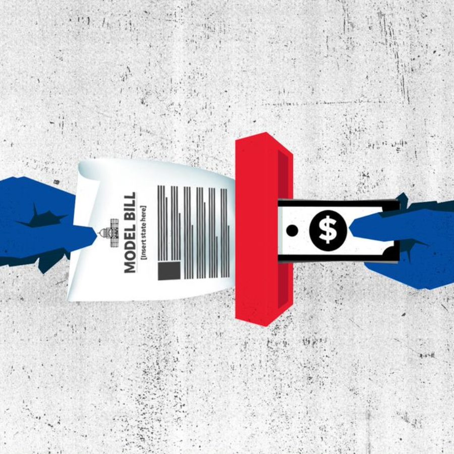
Jury's comment: The Arizona Republic, USA Today Network and the Center for Public Integrity analyzed the language of proposed legislation in all 50 states, revealing 10,000 nearly identical bills. Their sophisticated methods revealed the extent of corporate lobbyists and interest group influence on the day-to-day lives of ordinary people, all conducted behind closed doors in statehouses around the U.S.
Organisation size: Big
Publication date: 6 Feb 2019
Project description: Copy, Paste, Legislate marks the first time a news organization detailed how deeply legislation enacted into law at the state level is influenced by special interests in a practice known as "model legislation." The series explained how model legislation was used by auto dealers to sell recalled used cars; by anti-abortion advocates to push further restrictions; by far-right groups to advocate for what some called government-sanctioned Islamophobia to moves by the Catholic Church to limit their exposure to past child abuse claims. (Published February 6, April 3, May 23, June 19, July 17 and October 2, 2019)
Impact: People in various states called for legislation to require more transparency about the origin of bill language. Legislators found themselves compelled to defend their sponsorship of model bills. A public-facing model legislation tracker tool launched in November 2019, allowed journalists and the public to: --Identify recent model legislation introduced nationally --Identify recent model legislation introduced in their state --Perform a national search for model legislation mentioning specific keywords or topics --Upload a document they have to instantly identify if any language in their document matches any state legislation introduced since 2010 --Look up a specific bill by number to see all other bills matching it --Look up individual legislators and see all bills sponsored by them that contain model language As part of the project, local newsrooms were able to identify and interview major sponsors of model legislation and identified key issues that resonated in their state. Those stories explored the reach of model legislation and its surprising impact on policies across the nation. The combined national and local reporting revealed: --More than 10,000 bills introduced in statehouses nationwide were almost entirely copied from bills written by special interests --The largest block of special interest bills — more than 4,000 — were aimed at achieving conservative goals --More than 2,100 of the bills were signed into law --The model bills amount to the nation’s largest unreported special interest campaign, touching nearly every area of public policy --Models were drafted with deceptive titles to disguise their true intent, including “transparency” bills that made it harder to sue corporations --Because copycat bills have become so intertwined with the lawmaking process, the nation’s most prolific sponsor of model legislation claimed that he had no idea he had authored 72 bills originally written by outside interests.
Techniques/technologies: No news organization had attempted to put a number on how many of the bills debated in statehouses are substantially copied from those pushed by special interests. We obtained metadata on more than 1 million pieces of legislation from all 50 states for the years 2010 through 2018 from a third-party vendor, Legiscan. We also scraped bill text associated with these bills from the websites of state legislatures. In addition, we pieced together a database of 2,000 pieces of model legislation by getting data from sources, downloading data from advocacy organizations and searching for models ourselves. This was done either by identifying known models and trying to find the source or finding organizations that have pushed model bills and searching for each of the models for which they have advocated. We then compared the two data sets, which proved to be complicated. The team developed an algorithm that relied on natural language processing techniques to recognize similar words and phrases and compared each model in our database to the bills that lawmakers had introduced. These comparisons were powered by the equivalent of more than 150 computers, called virtual machines, that ran nonstop for months. Even with that computing power, we couldn't compare every model in its entirety against every bill. To cut computing time, we used keywords - guns, abortion, etc. The system only compared a model with a bill if they had at least one keyword in common. The team then developed a matching process that led to the development of an updatable, public-facing tool that reporters and members of the public can use to identify not only past bills but future model bills as they are introduced, while the bills are still newsworthy.
The hardest part of this project: It’s hard to overstate how resource-intensive this analysis was. This was our first foray into natural language processing. We had to compare one million bills — each several pages long, with some up to 100 pages in length — to each other. Computationally, scale bought with a lot of complexities. We had to go deep into understanding how to deploy some of the software we used at scale and solve the problems we faced along the way. We spent tens of thousands of dollars on cloud services. We had to re-run this analysis every time we made changes to our methodology — which we did often. The resulting analysis and reporting took more than six months to put together. We obtained metadata on more than 1 million pieces of legislation from all 50 states for the years 2010 through 2018 from a third-party vendor, Legiscan. We also scraped bill text associated with these bills from the websites of state legislatures.In addition, we pieced together a database of 2,000 pieces of model legislation by getting data from sources, downloading data from advocacy organizations and searching for models ourselves. This was done either by identifying known models and trying to find the source or finding organizations that have pushed model bills and searching for each of the models for which they have advocated.
What can others learn from this project: The power of collaboration. CPI and USA TODAY/Arizona Republic built two analysis tools to identify model language, using two different approaches. USA TODAY's efforts found at least 10,000 bills almost entirely copied from model language that were introduced in legislatures nationwide over the last eight years. CPI’s tool worked to identify common language in approximately 60,000 bills nationwide to flag previously unknown model legislation. Together the tools allowed for analysis of success from identified model bills and enabled identification of new model legislation. The computer comparisons, along with on-the-ground reporting in more than a dozen states, revealed that copycat legislation amounts to the nation’s largest, unreported special-interest campaign. Model bills drive the agenda in states across the U.S. and influence almost every area of public policy.
Project links:
- https://www.usatoday.com/in-depth/news/investigations/2019/04/03/abortion-gun-laws-stand-your-ground-model-bills-conservatives-liberal-corporate-influence-lobbyists/3162173002/
- https://publicintegrity.org/politics/state-politics/copy-paste-legislate/the-multistate-push-to-let-dealers-get-away-with-selling-you-a-defective-car
- https://www.usatoday.com/in-depth/news/local/arizona/2019/06/19/abortion-laws-2019-how-heartbeat-bills-passed-ohio-missouri-more/1270870001/
- https://web.model-legislation.apps.fivetwentyseven.com/
- https://www.usatoday.com/in-depth/news/investigations/2019/07/17/islam-sharia-law-how-far-right-group-gets-model-bills-passed/1636199001/
- https://www.usatoday.com/in-depth/news/investigations/2019/10/02/catholic-church-boy-scouts-fight-child-sex-abuse-statutes/2345778001/
- https://publicintegrity.org/politics/state-politics/copy-paste-legislate/big-tobaccos-surprising-new-campaign-to-raise-the-smoking-age
Best data-driven reporting (small newsrooms)
Winner: Made in France
Organisation: DISCLOSE
Country: France
Credit: Mathias Destal, Michel Despratz, Lorenzo Tugnoli, Livolsi Geoffrey, Aliaume Leroy

Jury's comment: “Made in France” is an investigation that proves beyond doubt that powerful journalism is born at the intersection between traditional reporting, advanced data analysis and courage. The Disclose team used highly confidential documents as a base layer to build up an exposé that brought to light the extent of France’s military involvement in the Yemen conflict. This is hard and risky work in the public interest, and it was greatly augmented by the advanced data journalism techniques that the team employed to mine, map, fact-check and display its findings.
Organisation size: Small
Publication date: 15 Apr 2019
Project description: Following six months of investigation, Disclose reports on how french made weapons sold to Saudi arabia have been used against the civilian population in the Yemen war. Disclose used an unprecedented leak of secret documents and used OSINT research and data analysis to establish French responsibility for the war in Yemen. An investigation combining both human sources, secret documents and open source information, using satellite imagery to track French weapons in Yemen and their impact.
Impact: The investigative story was published simultaneously on five media in France. The project has placed the question of France's arms sales to Saudi Arabia at the center of the political and civil debate. The Minister for the Army and the French Minister for Foreign Affairs were heard by the parliament. The information has demonstrated the lies of the French government on the ongoing arms exports to Saudi Arabia. Dozens of NGOs have called on the government to stop arms deliveries to Saudi Arabia and several public demonstration take place in France against arms deliveries. A month after the revelations, the government, under pressure from public opinion, had to cancel two arms deliveries to Saudi Arabia, for the first time since the Algerian war. In January 2020, the government suspended the delivery of bombs to Saudi Arabia.
Techniques/technologies: We used satellite images to prove the presence of French weapons used in the Yemen War. We watched dozens of videos found on official social accounts, which we then geolocated using satellite views. So we were able to prove the presence of French military equipment in Yemen. We use open data from the Yemen Data Project to know in order to know the number of civilian victims in the firing range of French hotwizer and by calculating their range from public information given by the manufacturing companies. With this information, we were able to find possible evidence of civilian deaths related to these weapons. We used satellite images, webcam and data from Marine Traffic to retrace the course of a boat carrying arms from France to Saudi Arabia. We have also analysed the details of 19,278 aerial bombing raids recorded between March 26th 2015 and February 28th 2019.The results: these show that 30% of the bombing raids were against civilian targets. The intent of the coalition was clearly to destroy infrastructures that are essential for the survival of Yemen’s population of 28 million people. We geolocated all this bombing on map and find evidence on social network of the bombing.
The hardest part of this project: The "Made in France" project had for finality to investigate a sensitive topic covered by military secret in France and whose investigation on the ground was made difficult or even impossible due to the ongoing conflict. The objective was despite these problems to conduct an investigation into the sale of weapons and their use in the war in Yemen with public data and open source information. The hardest part of this project was to verify and publish this secret documents. We want not only to publish a secret document but use the same intelligence tools used by the French military to prove the implication of our weapons in the war in Yemen. The hardest part was to disclose the route of arms deliveries by boat, the information of which is nevertheless classified as military secret. We wanted to show that only with open source information we could investigate hidden matters. "Made in France" project is an unprecedented multi-long format that brings data journalism to one of the most difficult areas of investigative journalism.
What can others learn from this project: This project is a demonstration that we can investigate on arms deliveries only with public data, that we can investigate war grounds from a computer screen. But data journalism is not a dehumanized journalism, because journalism needs sources and whistleblower to have information. Data journalism can be a powerful means of investigation also on the more sensitive topics like war and arms trade.
Project links:
- https://made-in-france.disclose.ngo/en/
- https://youtu.be/BKUi1HmaJL0
- https://theintercept.com/2019/05/17/france-takes-unprecedented-action-against-reporters-who-published-secret-government-document/
Best news application
Winner: HOT DISINFO FROM RUSSIA (Topic radar)
Organisation: TEXTY.org.ua
Country: Ukraine
Credit: Nadiia Romanenko, Nadja Kelm, Anatoliy Bondarenko, Yuliia Dukach
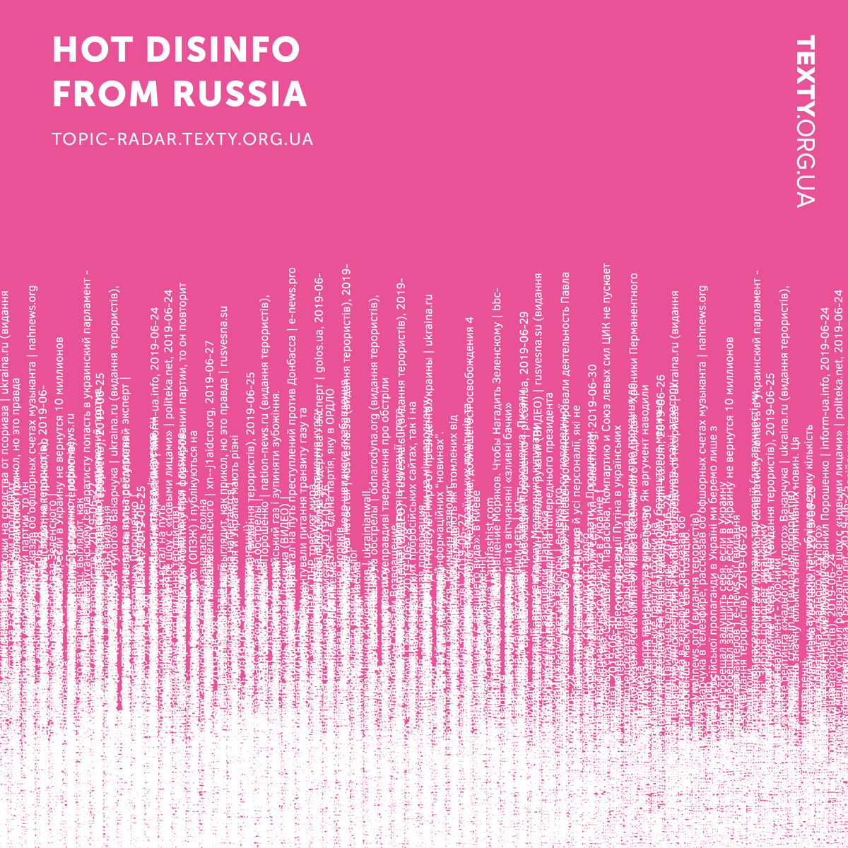
Jury's comment: Disinformation can play an important role in international politics, and more so when there is limited public awareness about the interference. The jury is delighted to find an app developed to address that in Ukraine. The tool tracks the content and intensity of Russian disinformation narratives and manipulative information in online media, and shows an overall dynamic as a result. As the first of its kind for Russian and Ukrainian languages, it allows user engagement in different ways, visually as an interactive dashboard, analytically through weekly posts, and functionally by offering a browser add-on to help individual citizens identify manipulative content. The project shows exactly what a great news app should do, which is to empower users to find their own narrative and make their own judgement within a larger dataset, and it is addressing some of the most critical challenges for journalism today.
Organisation size: Small
Publication date: 7 Aug 2019
Project description: TEXTY developed the data acquisition&analysis platform and dashboard tool https://topic-radar.texty.org.ua which shows an overall dynamics of topics of Russian disinformation in manipulative news. We are doing an NLP on thousands of news per week to detect manipulative ones, group them by topics and meta-topics to show on interactive dashboard. We also publish weekly reviews (21 so far), based on the results of analysis. In addition we developed "Fakecrunch" add-on based on the same platform (for Chrome and Firefox). It automatically signals to users about manipulative content and could be used to collect suggestions about possible low quality/fake/manipulative news items.
Impact: The project is aimed to track the content and intensity of Russian disinformation narratives and manipulative information in online media. It raises awareness of government bodies, civil society organizations, journalists and experts on major disinformation themes that are being pushed by Russia at any given week. Just one example: Dmytro Kuleba, Deputy prime minister of Ukraine, mentioned this project as an illustration of the huge level of Russian disinformation flowing to Ukraine. This quantitative approach allows us to overview and to zoom-in, from top to bottom, of the vast propaganda landscape and to track topics in different periods of time. Starting from May 2019, 21 weekly reviews, based on the project, were published. Each review illustrated key narratives of manipulations, which our application determined. Average audience engagement for each publication on texty.org.ua was about 8,000 users. Other media used to share our reviews, as well as some bloggers and influencers. Also we got positive feedback and mentions of this news application from international experts, for example Andreas Umland (German), Lenka Vichova (Czech republic). In words of Maciej Piotrowski, from Instytut Wolności in Warsaw, Poland: "Useful information. Sometimes we share it in our materials in Instytut Wolności, sometimes used for analysis. Longtime tracking is useful to see the full picture." After many requests about additional features we decided to develop version 2 of the application. It will be published in April 2020 (approximate date) and we’ve freezed data updates until the new version arrives.
Techniques/technologies: Data was downloaded from sites' RSS feeds or links on their Facebook pages. Preprocessed data about news items stored in PostgreSQL. Each text was prepared for analysis: tokenized (divided into language units — words and punctuation marks), lemmatized for topic modeling. Custom Python scripts were used to obtain (Scrapy), process and store data. Each news item was then evaluated by an improved version of our manipulative news classifier ( ULMFiT based model for Russian and Ukrainian languages, created by TEXTY back in 2018, programmed in Pytorch/fast.ai). This model is available from our github. It estimates the likelihood that the news contains emotional manipulation and/or false argumentation. Selected manipulative news, ~3,000 pieces per week on average, was broken down into topics by automatic topic modeling (NMF algorithm). We edited the resulting news clusters manually: combined similar topics, discarded irrelevant or overly general clusters. Each subtopic in our news application is also illustrated by a sample of titles from news which belong to it to let new readers know what it is about.
The hardest part of this project: For our best knowledge, this is the first such tool & whole pipeline for Russian and Ukrainian languages. The main challenge was to retrieve accurate topics and track them over time. Topic modelling was made using NMF, an unsupervised method of clusterization. Results are less accurate compared to supervised learning, when the model is trained using humal labels. But we cannot train topic classifier since we do not know all the topics in news and cannot easily update supervised model if the news agenda changes. So we have to keep using unsupervised NMF solution. Topics for the week are reviewed by analysts, as well as improved by rules to fix possible errors of unsupervised topic modelling. A lot of manual work is the hard part of this project. Because we detect topics in weekly samples of news, we have to aggregate them for dashboard to track topics for longer periods. We addressed this challenge by hierarchical NMF, namely clusterized weekly clusters. Meta-topics in the dashboard were first clusterized and reviewed by analysts so that each weekly topic relates to one meta-topic on the dashboard. Aggregation of clusters from different models is not well-studied and a great part of it is done manually.
What can others learn from this project: Long-term tracking of disinformation makes it possible to see what topics are most important for the Russian authorities, who is the biggest irritant to them, and what they plan to do in the future in Ukraine. One of the conclusions of our analysts is evidence that there are entire array of manipulative news from Russia which can be logically combined under the umbrella name of “Failed state” (related to Ukraine). The purpose of this campaign is obvious: it aims to create an image of Ukraine as a non-state, an artificial state entity that arose against historical logic. We are considering the dashboard as a usable tool for further research by analysts, and Fakecrunch add-on as a usable tool for online-readers in their everyday "life". Other journalists got the source for their materials. General public got evidence-based tool for media literacy and for self-control in social media. Lenka Vichova, Czech Republic: "Many of these messages enter not only the information field of Ukraine, but also to Czech and Slovak media sphere. So it is core to know and be prepared. I use your reviews, when working on my own analytical articles and also in comments for Czech and Slovak media."
Project links:
- https://topic-radar.texty.org.ua
- http://texty.org.ua/mod/archive/tag.php?tag=disinfomonitor
- https://fgz.texty.org/
Best visualization (large newsrooms)
Winner: See How the World's Most Polluted Air Compares With Your City's
Organisation: The New York Times
Country: United States
Credit: Nadja Popovich, Blacki Migliozzi, Karthik Patanjali, Anjali Singhvi and Jon Huang
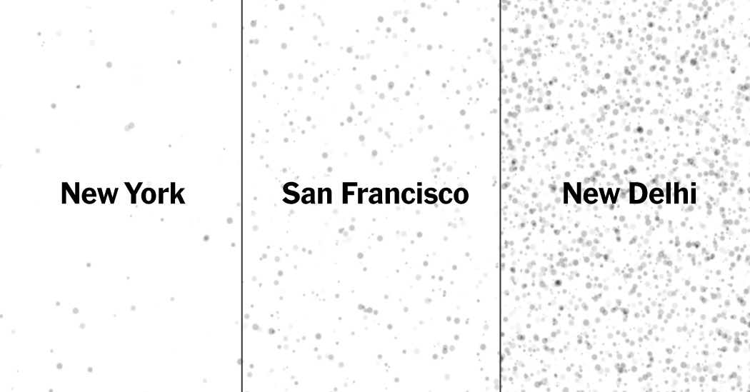
Jury's comment: This data visualization is effective and pushes the limit in explaining a complex and important topic, making it easy to understand in a detailed and granular way the public health hazard of air pollution that causes millions of deaths and illnesses worldwide. It combines the best of beauty, storytelling and interactive features. Users can learn via preset examples, or extract and produce their own stories and comparisons. In mobile, it excels, including AR experimentation that brings data to life. The visualization builds empathy through data, using case studies of polluted air that have recently made news and making visible the invisible. The combination of precision in data usage with the best of visual digital technologies and users' interaction, works perfectly to tell this complex story in an engaging and meaningful way.
Organisation size: Big
Publication date: 2 Dec 2019
Project description: Outdoor particulate pollution known as PM2.5 is responsible for millions of deaths around the world each year and many more illnesses. We created a special project that visualizes this damaging but often invisible pollution. The interactive article allows readers to (safely) experience what it’s like to breathe some of the worst air in the world in comparison to the air in their own city or town, giving them a more personal understanding of the scale of this public health hazard.
Impact: This air pollution visualization project was one of The Times' most-viewed stories of the year, garnering well over a million page views in a single day. It also had some of the highest reader engagement. Readers took to social media, unprompted, to share the air pollution averages for their own city as well as screenshots of the project’s visualizations, and to express concern over recent upticks in air pollution. Making air pollution more tangible to the general public is especially important today, as air quality in the United States has worsened after decades of gains, while much of the world’s population continues to breathe high levels of pollution. At the same time, it is becoming more clear that air pollution affects human health at ever more granular scales. Experts from the public health community, including the United Nations and WHO, have reached out about using the project for educational purposes.
Techniques/technologies: Particle visualization and charts: The data analysis was done using Python. Visuals in the story were created using WebGL and D3. Augmented reality version: The AR experience was created using Xcode and Apple SceneKit. (The AR scene being responsive to data was created using Swift in Xcode.) Please not that the AR version is only available on the New York Times app and on iPhones due to technological constraints of the Android operating system. Map: The map was rendered by converting netCDF files using R and gdal. The animation was done using Adobe's After Effects and Illustrator.
The hardest part of this project: We wanted the project to build empathy through data by connecting people's own experience (what average air pollution is like in their own city) to various case studies of polluted air that have recently made news. To achieve that, we strove to make sure the visualization had the right feeling of movement in space to evoke polluted air, while still reflecting that it a data visualization rather than an accurate reflection of what pollution might look like at a specific place and time. We went through many ideas for how to represent this pollution – as particles, as haze, etc. – and many ways to show it to our audience. The end goal: Walking the line between what is scientifically accurate while also allowing people to feel a natural connection between the viz and the subject being visualized (pollution).
To ensure scientific accuracy, we ran our visualization ideas past half a dozen experts who study particulate matter pollution in order to best decide how to show these damaging particles. In the end we settled on a deceptively simple presentation: Filling up your single screen (or room in AR) with particles as you scroll (or tap) in order to create a sense of "filling" your lungs with this sort of air. Our readers' reactions to the piece suggest that we got the balance right.
What can others learn from this project: One lesson we hope people will take away is that it is possible to create emotional connections to data through visualization. We built the story introduction so that readers become the central character, allowing them to use their own experience of polluted air as a benchmark by which to judge and understand the scale of pollution elsewhere. That builds a deeper understanding of the issue at stake than just showing data for far-away places they may have never visited. On the more technical side, many people commented on the project's innovative use of augmented reality. The Project leveraged AR to make something that is all around us but often invisible actually visible in 3D space. Previously, experiments with AR at the Times and in other newsroom mostly consisted of placing objects into space (such as the Times' Lunar landing project) or creating a novel 3D space for exploration (such as the Guardian's augmented reality project that allowed users to experience what being in solitary confinement is like).
Selected praise for the AR experience:
- "This is easily the most compelling use of augmented reality I've ever seen in a news context." – Chris Ingraham, Washington Post
- "I've been always (and I still am largely) skeptical about the application of #AR and #VR especially in #dataviz but this made me change my mind: it's all about the way it relates to our perception and experience of the world around us." – Paolo Ciuccarelli, prof at NortheasternCAMD
Project links:
Best visualization (large newsrooms)
Honorable Mention: Why your smartphone is causing you ‘text neck' syndrome
Organisation: South China Morning Post
Country: Hong Kong S.A.R., China
Credit: Pablo Robles

Jury's comment: The jury decided to recognize "Why your smartphone is causing you ‘text neck’ syndrome" with an honourable mention, based on its technical excellence and engaging use of graphics. The project's narrative was clear and easy to follow and the interactive and non-interactive images interspersed among the text meant there was always something interesting to engage the reader. There were also a wide range of visual techniques used from static graphics to interactive ones, to annotated video. While there was some debate about the data behind the "text neck" syndrome the panel recognised the excellent presentation of the narrative as a whole.
Organisation size: Big
Publication date: 25 Jan 2019
Project description: Mobile phones are now generally seen as essential to our daily lives. Texting has become the way most of us communicate and has led to rapidly increasing numbers of people suffering from 'text neck'. For our visualisation, “Why your smartphone is causing you ‘text neck’ syndrome” we researched how the angle of your neck when you look at your phone can effectively increase the weight of your head by up to 27kg. This in turn can damage posture and, if you text while walking, expose you to all kinds of dangers.
Impact: This data visualisation caused much debate on social media and was translated into Spanish and republished by Atresmedia
Techniques/technologies: We collected data about mobile phone internet access by country. Using dataviz and diagrams, graphics and our own video footage we detailed how extensive mobile phone use leads to curvature of the spine. We also recorded more than 10 hours of video to analyse how people use their mobile phones in Hong Kong when walking and crossing streets. The data confirmed the study made by the University Of Queensland. We also use data research to explore mobile phone addiction and to explain how users ‘zone out’ on their phones. We hope that our innovative storytelling will make readers aware of their own habits and understand how their actions impact those around them as well as themselves.
The hardest part of this project: We also recorded more than 10 hours of video footage of mobile phone use on the streets of Hong Kong to corroborate an academic study from the University Of Queensland. We pepper the story with short videos to demonstrate how peripheral vision is restricted when using mobile phones, how your gait changes and to illustrate the dangers people pose while texting and walking in the street and using public transport.
What can others learn from this project: We believe this data visualisation helps make readers aware of their own habits and understand how their actions impact those around them as well as themselves.
Project links:
Best visualization (small newsrooms)
Winner: Danish scam
Organisation: Pointer (KRO-NCRV)
Country: Netherlands
Credit: Peter Keizer, Wendy van der Waal, Marije Rooze, Jerry Vermanen, Wies van der Heyden

Jury's comment: Dutch journalist and data researcher, Peter Keizer places readers in the driver’s seat on a journey into the murky world of identity theft. The colourful and bold layout is clean and simple and houses a detective story that analyzes emails and websites, screens companies and traces the Danish scammers’ employees via social media to the Philippines. Keizer uncovers 134 cases of identity theft and contacts some of the victims. “It’s my photo and name, but I didn’t know anything about it. I don’t like that at all. But I wonder how I can deal with those boys now,” complains one stooge. The whodunit format resonates with the public by showing how vulnerable all of us are to being scammed unwittingly. This piece might not be what we traditionally think of as data visualization but instead broadens the remit by transforming information into a visual context to tell a compelling story.
Organisation size: Small
Publication date: 12 Jul 2019
Project description: One day in 2019, we received an obvious spam email in which we were asked to publish a guest blog on our website. Normally we would delete this, but after a follow-up email we became curious on how this scam works. We decided to find out for ourselves. With the information in the email, we searched and found an elaborate network of two Danish scammers and at least 134 persons whose identities were stolen. We made an article in which we put you in the driver seat of our lead investigator.
Impact:After our first publication and visualisation, we made a TV broadcast 4 months after the fact. We translated our online production to TV, instead of making an online production from our programme. In the TV broadcast, we also filmed our investigator’s screen and tried to do everything from behind our laptop. During this second investigation, we discovered that the Danish guys improved their scam. They AI generated faces to fake reviews, contact persons and sell their content. So we made a second visualisation in which we explain how you can recognize this more sophisticated scam. We tried to contact as many victims as possible. Most of them didn’t know their identities were used for this scam.
Techniques/technologies:We didn’t want to tell this story in a familiar way: the most exciting part is discovering the answers step by step. So we searched for a way to translate a research on desktop to your mobile screen. We used OSINT techniques like reversed image search, Wayback Machine searching, Google Dorks, searching in chambers of commerce, digital forensics to find outgoing url’s, etc. to reveal the intricate and complicated network behind this scam. We also made our own database of persons whose identities were stolen. We needed to know how many people were involved, and if they knew anything about this scam. The most difficult person to find was Martyna Whittell, the fake identity of our emailer. She used photos of an existing person. We found the real ‘Martyna’ (her name is Mia) by geolocating her photos: we found a photo on a campus in Aalborg through a Starbuck coffee cup and a concert photo through the background of a Take That reunion tour. We eventually used face recognition in Yandex to find her friend on a group photo, and searching her friend list for a photo that looked like Mia.
The hardest part of this project: The hardest part of our research was finding Mia. We could find a lot of breadcrumbs online to reveal the scam(mers), but finding our main victim was difficult. Also, making a visualisation that works on mobile and puts you in the seat of our investigator was a real challenge. We could make a direct analogue with a desktop computer, because of the orientation of your screen. Forcing users to rotate their screens would be a step in which most people would back-out and quit. We found a way in which we made our own screens with illustrations. This also works great in this example, because we needed to anonymize almost everyone. We translated the story to English because this story is not only interesting for Dutch readers.
What can others learn from this project: The most important lesson is never to take anything for granted: a good investigative story can hide itself in an ordinary spam email you get every day. Also, making your own databases and being well-versed in digital research techniques is an essential part of modern investigative journalism. The translation from desktop to mobile was a successful, in our opinion. We found that a lot of readers scrolled to the end of our story.
Project links:
- https://pointer.kro-ncrv.nl/artikelen/het-verhaal-achter-een-identiteitsroof#lang=en
- https://pointer.kro-ncrv.nl/artikelen/dozens-of-identities-stolen-by-danish-online-entrepreneurs
- https://pointer.kro-ncrv.nl/artikelen/our-tricks-for-identifying-victims-of-identity-fraud
- https://pointer.kro-ncrv.nl/artikelen/online-oplichters-gaan-vaak-vrijuit
- https://pointer.kro-ncrv.nl/artikelen/terugkijken-hoe-een-mysterieus-mailtje-ons-leidt-naar-online-oplichters-in-de-filipijnen
- https://pointer.kro-ncrv.nl/artikelen/hoe-ontmasker-je-een-online-oplichter-in-7-stappen#lang=en
Innovation (large newsrooms)
Co-winner: AP DataKit: an adaptable data project organization toolkit
Organisation: The Associated Press
Country: United States
Credit: Serdar Tumgoren, Troy Thibodeaux, Justin Myers, Larry Fenn, Nicky Forster, Angel Kastanis, Michelle Minkoff, Seth Rasmussen, Andrew Milligan, Meghan Hoyer, Dan Kempton

Jury's comment: AP’s DataKit is an innovation will change the way many data reporters/editors/teams work and will undoubtedly have a profound impact on the data journalism community at large. Not only is it a tool that can help data journalists work more efficiently more collaboratively, it is a platform that is already being extended by contributors outside of AP. If data journalism is the imposition of structure and reproducibility with a journalistic bent, DataKit promises to be the tool that enforces that structure and enables more efficiency and collaboration for data teams in every newsroom.
Organisation size: Big
Publication date: 12 Sep 2019
Project description: AP DataKit is an open-source command-line tool designed to help data journalists work more efficiently and data teams collaborate more effectively. By streamlining repetitive tasks and standardizing project structure and conventions, DataKit makes it easier to share work among members of a team and to keep past projects organized and easily accessible for future reference. Datakit is adaptable and extensible: a core framework supports an ecosystem of plugins to help with every phase of the data project lifecycle. Users can submit plugins to customize DataKit for their own workflows.
Impact: The AP open-sourced its project-management tool, DataKit, in September of 2019. Our data team has used it internally for two years now on every single analysis project we've done. Its purpose is simple, yet sophisticated: With a few command-line directions, it creates a sane, organized project folder structure for R or Python projects, including specific places for data, outputs, reports and documentation. It then syncs to GitHub or Gitlab, creating a project there and allowing immediate push/pull capabilities. Finally, it syncs to S3, where we keep our flat data files and output files; and to data.world, where we share data with AP members. DataKit's release came at ONA and attracted the attention of roughly 60 or so conference attendees, many of whom returned to their classrooms and newsrooms to try it out. It has been adopted by individual users, by the data analysis team at American Public Media, and is in use in some data journalism classes at University of Maryland and University of Missouri. We'll have another install party for interested data journalists at NICAR in March. Interestingly, the project has also had several open-source contributions from the journalism community. Several journalists have built additional plug-ins for DataKit -- for instance, one coder wrote a plugin to sync data to Google Drive. The impact of DataKit is fundamental: it allows us to move quicker and collaborate better, by creating immediate and standardized project folders and hook-ins that mean that no data journalist is working outside of replicable workflows. Data and code gets synced to places where any team member can find them; and each project looks and acts the same. It creates a data library of projects that are well-documented, all in one place and easy to access.
Techniques/technologies: DataKit is an extensible command-line tool that's designed to automate data project workflows. It relies on core Python technologies and third-party libraries to allow flexible yet opinionated workflows, suitable for any individual or team. The technologies at the heart of DataKit are: [Cliff](http://docs.openstack.org/developer/cliff/) - a command-line framework that uses Python's native setuptools entry points strategy to easily load plugins as Python packages. * [Cookiecutter](https://github.com/cookiecutter/cookiecutter) - a Python framework for generating project skeletons Through the cookiecutter templates, DataKit creates a series of folder and file structures for a Jupyter notebook or an RStudio project. It also configures each project to sync to the proper gitlab and S3 locations, and loads specific libraries, dependencies and templated output forms (such as an RMarkdown customized to match AP design style). The AP has built four plug-ins: for Gitlab and GitHub; for S3 and for data.world. Other open-source users have since built additional plug-ins to customize DataKit to their workflows, such as syncing to additional data sources (Google Drive) and outputs such as Datasette.
The hardest part of this project: The most difficult part of the project was creating clear, concise documentation that would help others use our open-source software. We had never open-sourced something so ambitious before, and were put in the position of anticipating others' uses (we created a GitHub plug-in despite our team not using GitHub regularly) and others' pain points in understanding, installing and using DataKit. We created DataKit to scratch our own itch -- to make our team work better, faster and with more precision and control. Having DataKit means we spend less time every day handling the messy, boring parts of a project -- finding old files, creating working directories -- and more time on the serious data analysis work we need to be doing. The AP is a collaborative news cooperative, and in that spirit, it made sense this year to fully open-source one of our team's most powerful tools to share it with others. One of our goals is to make data more accessible to other newsrooms, and DataKit we hope does this by taking away some of the barriers to getting to an analysis and sharing data.
What can others learn from this project: Creating standardized workflows across a data team leads to quicker, more collaborative and stronger work. Data workflows can be notoriously messy and hard to replicate -- Where are the raw data files stored? What order do you run scripts in? Where's the documentation around this work? Is the most recent version pushed up to GitHub? Can anyone beside the lead analyst even access data and scripts? -- and DataKit was built to fix that. The thing AP's Data Team would like others to come away with is that we don't all have to use these messy, irreproducible and bespoke workflows for each project that comes across our desk. Creating a standardized project structure and workflows creates sanity -- through DataKit we at the AP now have an ever-growing library of data and projects that we can grab code from, fork or update when needed -- even on deadline. We can also dip into each other's projects seamlessly and without trouble: One person's project looks like another's, and files and directories are in the same places with standardized naming conventions and proper documentation. DataKit simply lets analysis teams work better, and faster, together. One real-life example from 2019: When we received nearly a half billion rows of opioid distribution data this summer, and were working on deadline to produce an analysis and prepare clean data files to share with members, we had six people working concurrently in the same code repository with no friction and no mess. The AP landed an exclusive story -- and shared data files quickly with hundreds of members -- thanks to DataKit.
Project links:
- http://datakit.ap.org/
- https://www.rjionline.org/stories/ap-datakit-intro
- https://ona19.journalists.org/sessions/23627451/#audio
- https://www.poynter.org/tech-tools/2019/data-journalism-solves-big-problems-but-its-an-organizational-mess-a-new-tool-from-the-ap-aims-to-fix-that/
- https://github.com/associatedpress/datakit-core
Innovation (large newsrooms)
Co-winner: Zones of Silence
Organisation: El Universal
Country: Mexico
Credit: Esteban Román, Gilberto Leon, Elsa Hernandez, Miguel Garnica, Edson Arroyo, César Saavedra, Jenny Lee, Dale Markowitz, Alberto Cairo

Jury's comment: How do you measure the something that isn't happening? What if the main cause of concern isn't noise but silence? El Universal asked that question about the falling levels of coverage of homicides in Mexico, working on the hypothesis that journalists have been intimidated and harassed into silence. By comparing murder statistics with news stories over time, they were able to show where, and by how much, the troubling silence was growing.
Organisation size: Big
Publication date: 13 Jun 2019
Project description: Violent organized crime is one of the biggest crises facing Mexico. Journalists avoid becoming a target, so they choose to stay quiet to save their lives. We set out to measure this silence and its impact on journalism. To do so, we used artificial intelligence to quantify and visualize news coverage and analyze the gaps in coverage across the country. To measure the degree of silence in each region of the country, we created a formula that allows us to see the evolution of this phenomenon over time.
Impact: Something akin to a code of silence has emerged across the country. We suspected that there were entire regions where journalists were not reporting on the violence, threats, intimidation and murder that were well known to be part of daily life. This was confirmed by journalists who sought for us after the story was released, to tell us they have been facing this problems. In collaboration with them, now we are preparing a second part of this story, to focus on the patterns that lead to agressions. Hopefully this will lead us to some kind of alert when certain conditions (of news coverage and crimen) are present in regions of our country.
Techniques/technologies: Our first step was to establish a process to determine the absence of news. We explored articles on violence to understand how they compare to the government's official registry of homicides. In theory, each murder that occurs ought to correspond with at least one local report about the event. If we saw a divergence, or if the government's reports were suddenly very different from local news coverage, we could deduce that journalists were being silenced. Early on, sorting through news articles seemed impossible. We knew we needed to find a news archive with the largest number of publications in Mexico possible so we could track daily coverage across the country. Google News' vast collection of local and national news stories across Mexico was a good fit. The effort required us to identify the difference between the number of homicides officially recorded and the news stories of those killings on Google News. This required machine learning algorithms that were able to identify the first reported story and then pinpoint where the event took place. With that information, we were able to connect reported events by media with the government's reports on homicides across more than 2400 municipalities in Mexico. Finally, to measure the degree of silence in each region of the country, we created a formula that allows us to see the evolution of this phenomenon over time. The resulting data shows a fascinating mix of falls or peaks in unreported deaths, which coincide with events such as the arrival of new governments or the deaths of drug dealers. Further investigation will allow us to explain these connections.
The hardest part of this project: The hardest part was creating the "formula for silence" to measure the degree of non reported homicides along the country. There are many variables behind the reason why there aren't as much articles as homicides in each region. So, in order to be sure the discrepancy was linked to violence and killings we had to rule out or include segments of data along the way. This was extremely hard to do with machine learning, because words in spanish that are usually used to represent this kind of coverage, are also synonyms for other things. We had to validate (manually) a lot of the initial reports until we had a well validated sample of results. This took us half a year. Then we felt lost due to the amount of variables we had in our hands (disparity between events reported and published stories; matching stories reporting one single event by different websites; the uncertainty of internet penetration in all parts of the country and its evolution over time within the 14 years we analyzed...). Luckly, the interdisciplinary nature of our team (with economists, programmers, data experts, designers and journalists) helped us to find an answer that we felt was truly accurate.
What can others learn from this project: No matter how hard it is to measure a problem, there is always a way to do it, even if its not what you thought you would find in the beginning.
Project links:
- https://zonas-de-silencio.eluniversal.com.mx/
- https://www.eluniversal.com.mx/nacion/sociedad/en-10-estados-guardan-silencio-sobre-homicidios
- https://www.eluniversal.com.mx/nacion/sociedad/la-prensa-que-ya-no-habla-de-muertos
- https://zonas-de-silencio.eluniversal.com.mx/metodologia.html
Innovation (small newsrooms)
Winner: Funes: an algorithm to fight corruption
Organisation: OjoPúblico
Country: Peru
Credit: Gianfranco Rossi, Nelly Luna Amancio, Gianfranco Huamán, Ernesto Cabral, Óscar Castilla
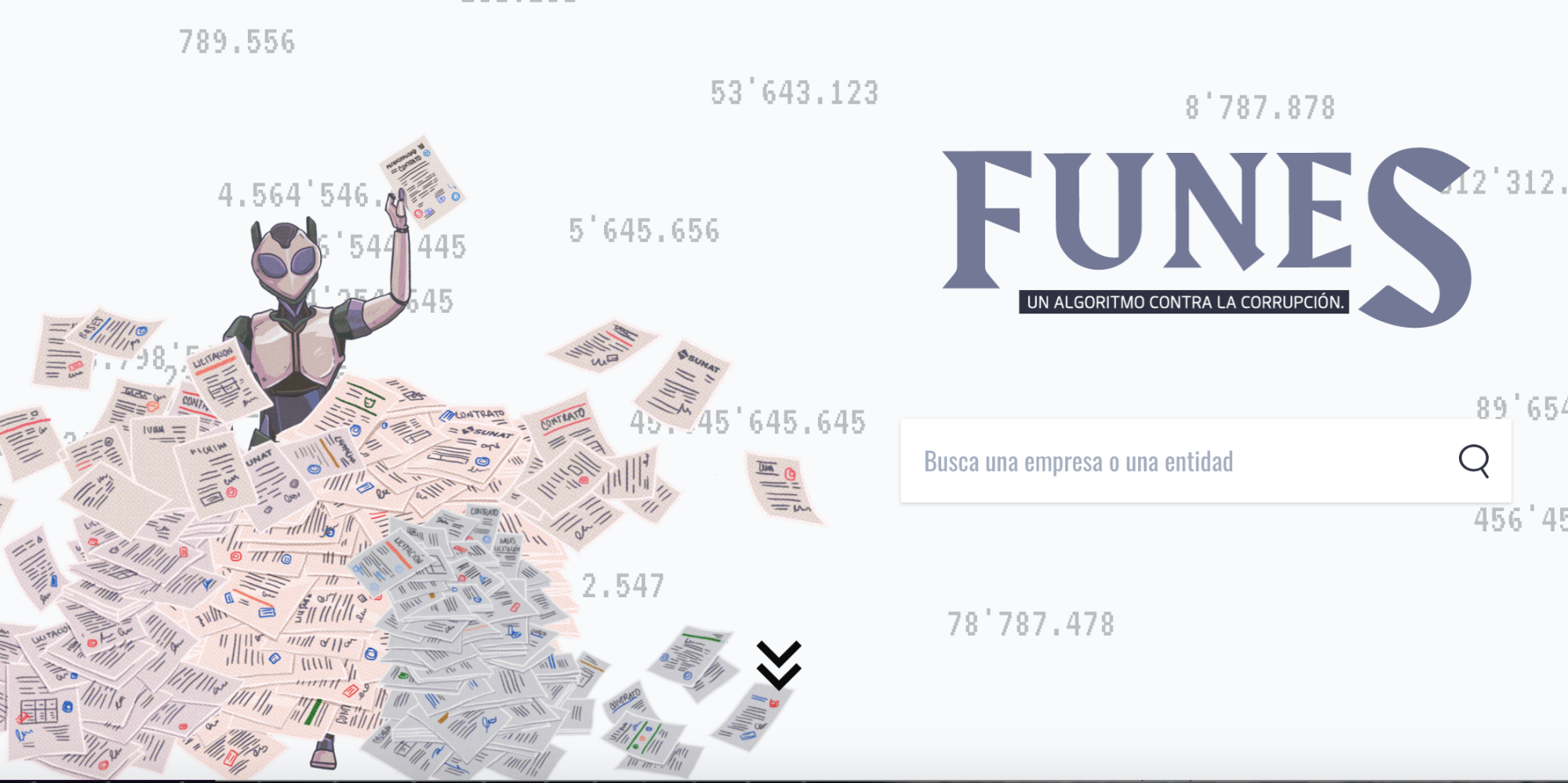
Jury's comment: As more and more potentially newsworthy documents become routinely available online as digital data, classifying this deluge and prioritising reporters’ attention is becoming one of data journalism’s major challenges. The “Funes” tool from Peru’s OjoPúblico shows that even relatively small organisations can develop algorithms to help tackle this problem for specific types of documents. Funes adapts a model a contracting risk model developed in Europe to the Peruvian context. Using data scraped from five public databases, the algorithm analysed hundreds of thousands of Peruvian public procurement documents. Using a linear model, it combines 20 risk indicators — such as recently founded contractors or uncontested bids — to flag potentially corrupt contracts. It resulted in a large volume of cases for OjoPúblico and regional media partners to investigate as well as an interactive interface for readers, providing an excellent pioneering example of the sort of automated story discovery tools several judges said they expect to become an increasingly important area of investigative computational journalism.
Organisation size: Small
Publication date: 25 Nov 2019
Project description: Funes is an algorithm that identifies corruption risk situations in public contractings in Peru. The research project began to take shape in February 2018 and its development began in September of the same year. For 15 months a multidisciplinary team - integrated by programmers, statisticians and journalists - discussed, analyzed, built databases, verified the information and developed modeled an algorithm we call Funes, as the memorable protagonist of the Argentine writer Jorge Luis Borges. The algorithm rates a risk score for each contract process, entity and company. With that information journalists can prioritize their investigations.
Impact: The project was developed in the context of the fiscal investigations of the Lavajato case, which involves the payment of bribes by the Brazilian company Odebrecht in order to take charge of public contracts for the construction of public works. FUNES analyzes the contracts, and during its launch, identified a huge number of contracts with corruption risks. Of these, several were investigated and transformed into published reports. FUNES is the first tool developed in Peru, and one of the first of its kind in Latin America, which analyzes millions of data, to grant a corruption risk score in public procurement. FUNES identified that between 2015 and 2018 the Peruvian State granted almost 20 billion dollars in risky contracts. These were delivered to a single bidder who had no competition and to companies created a few days before the contest. The amount represents 90 times the civil reparation that Odebrecht must pay for its acts of corruption. Other published reports identified acts of corruption in companies that sell milk for social programs.
The tool has a friendly interface for readers with several visualizations in which the reader can analyze the situation of public contracts in Peru. The open source tool has attracted the interest of the control and control entities of Peru, who have requested to share the methodology and possibilities so that they can implement it in their equipment. FUNES warns of risk in thousands of contracts. Therefore, and given the dimension of the findings, OjoPúblico established alliances with regional media to analyze and investigate some of the main cases. Everyone noticed the same thing: irregular public contracts that have now begun to be investigated by the authorities. The investigations continue.
Techniques/technologies: Funes proviene de una familia de algoritmos denominados modelos lineales para combinar la información de 20 indicadores de riesgo, que fueron calculados a partir de 4 bases de datos. Un modelo lineal tiene la forma de un promedio ponderado: peso_1indicador_1 + peso_2indicador_2 + ... + peso_nindicador_n = riesgo de corrupción Para aprender estos pesos usualmente se utiliza un esquema de regresión, que consiste en intentar predecir la respuesta -que en este caso, sería la corrupción- a partir de variables relacionadas -como llamaremos a los indicadores de riesgo-. De esta manera, los pesos aprendidos para cada indicador son los que mejor ayudan a predecir la respuesta para todos los contratos analizados. Sin embargo, Funes usa una variante de este esquema porque la corrupción en contrataciones públicas -denominada nuestra variable respuesta- es un fenómeno no observable: tenemos seguridad de que los contratos que han sido descubiertos por los fiscalizadores fueron corruptos; pero los que no, no sabemos si están absolutamente limpios o aún no son descubiertos, porque pueden responder a sofisticados y esquemas de corrupción más complejos como sucede, por ejemplo, con el caso Odebrecht y Lava Jato. El método de Funes parte de un esquema de proxies de corrupción, propuesto por Mihaly Fazekas, investigador de la Universidad de Cambridge, y adecuado y p al contexto peruano de l. Un proxy es una variable estrechamente relacionada a la variable no observable. Funes usa dos proxies: 1) que un contrato haya tenido un único postor; 2) la proporción de concentración del presupuesto de una entidad que tiene cada contratista. Entonces, Funes es una combinación de dos modelos lineales, una regresión logística para el único postor y una regresión beta para la proporción de concentración. El resultado de este proceso es un índice de riesgo de corrupción para cada contrato: a más alto, mayor
The hardest part of this project: The main challenges were related to the construction, access and quality of the data, the need for the team to learn new data analysis tools and the formation of a multidisciplinary team hitherto oblivious to journalistic research. In Peru there is no open data portal for hiring. For 7 months a script was developed and extracted data from a platform, which had blocked mass access through a captcha. The responsible entity blocked our IP to avoid downloading, forcing the team to reformulate the code to make extraction more efficient. To complete this information, 20 requests for access to information were also submitted. Another challenge was also the learning process on corruption theory, statistics and public procurement laws in Peru. We were not specialists in public bidding and there are 15 regulatory regimes. Meetings with experts were organized to know the process in detail, the processes were documented and each of the legal norms was analyzed.
Another of the challenges was also the definition of the concept of corruption that we were going to monitor and the model that we were going to use to develop the algorithm. Many papers were reviewed and interviews were conducted. In the end, the statistical model promoted by researcher Mihali Fazekas was chosen. The project left a journalistic team with robust knowledge in algorithms, R programming language, public contractings and predictability.
What can others learn from this project: We learned that the fight against corruption from journalism requires incorporating into its traditional case-by-case methods and massive data analysis, tools with algorithmic models that allow it to anticipate corruption. For them, journalistic teams are required to go beyond spreadsheets and open refining, and learn relational analysis technologies and R., and at the same time learn to convene and work with mathematicians, statisticians, programmers and political scientists.
Project links:
- https://ojo-publico.com/especiales/funes/
- https://ojo-publico.com/especiales/funes/rankings-de-riesgo.html
- https://ojo-publico.com/especiales/funes/metodologia.html
- https://ojo-publico.com/1499/proyecto-funes-riesgos-de-corrupcion-en-contratos-publicos
- https://ojo-publico.com/1331/familia-lechera-los-millonarios-contratos-del-grupo-niisa-con-el-vaso-de-leche
- https://knightcenter.utexas.edu/blog/00-21439-peruvian-investigative-site-ojo-publico-develops-algorithm-track-possible-acts-corrupt
- https://altec.lat/iniciativa-funes-corrupcion-en-peru-que-esta-haciendo-el-periodismo/
Open data
Winner: TodosLosContratos.mx
Organisation: PODER
Country: Mexico
Credit: Eduard Martín-Borregón, Martín Szyszlican, Claudia Ocaranza, Fernando Matzdorf, Félix Farachala, Marisol Carrillo, Ricardo Balderas and Isabela Granados.

Jury's comment: TodosLosContratos.mx is a massive open data endeavor. After cleaning and standardizing 4 million Mexico government contracts, the team built a website that provided top-line numbers and easy ways into this large database. But they didn’t stop there. They published all the data in a well-designed search engine, and a well-documented API. This project not only informed the general public but also empowered other journalists and researchers.
Organisation size: Small
Publication date: 20 Aug 2019
Project description: TodosLosContratos.mx (All the contracts) is a data journalism project that has compiled almost 4 million public contracts made between 2001 and 2019 by the Mexican Federal Government. The project mixes journalistic reports that explain cases of corruption and bad practices in the mexican procurement system, with rankings based on algorithms specifically designed for the mexican by the team. The objective of the project is to promote accountability in the contracting process in Mexico, so we published all the data in QuiénEsQuién.wiki platform and API, opened the methodology of the analysis algorithms and published a guide on how to investigate with this tool.
Impact: The publication of TodosLosContratos.mx together with the uploading of the data in QuiénEsQuién.Wiki has had three main impacts:
- Simplify the journalistic investigation of public contracts. The publication of the vast majority of contracts of the Mexican federal administration in a usable and reliable search engine has increase the productivity of the journalist, this has been expressed to us by journalists from Mexican outlets like Animal Político, Aristegui Noticias, El Universal, Cuestione, Proceso, among others, also local mexican online newspaper like Zona Docs, BI Noticias, Lado B or Cuestione, and International newspapers like AJ+ in spanish and El Faro (El Salvador).
- Promote the opening of public contracting data. Following our publication three government agencies have approached us to know how they can improve or upload new data to our platform. We have given them advice on how to improve their open data strategies; and once they publish we will update QuiénEsQuién.Wiki and our algorithmic analysis in TodosLosContratos 2020 edition.
- To increase the knowledge and interest of the citizens about the public procurement. As a result of the project, more people know how public contracting works and can easily consult it. Visits to the QuiénEsQuién.Wiki platform are increasing exponentially and every week we receive messages from people with doubts or clarifications about contracts or their participants.
Techniques/technologies: A project of this complexity has several processes and key technologies:
- Data Import: Based in the free software Apache NiFi we have developed an importer and web scraper orchestrator. This modular software allows us to have a simple setting for reusable components like the data cleaning module or the data update module.
- Platform and API: QuiénEsQuién.Wiki is based on a mongoDB+node.js, all the data is hosted in a Kubernetes cluster of MongoDB databases and then exposed through a public API which is documented both in Spanish and English. Plus a model client in node js is usable with the NPM package registry. The website consumes the API and is compatible with desktop, tablets and mobile devices.
- Algorithmic analysis: Our "groucho" engine for analyzing open contracting data in the OCDS data standard. The engine is published with a GPL license, which makes it reusable and transparent. It's written in Node.JS.
- Data analysis: In order to fine tune the parameters of the algorithmic analysis engine we have combed through the data with the help of Kibana, an open source data visualization dashboard based on the ElasticSearch database engine, which helped us to quickly recognize patterns and detect deviations.
- Data visualization: Our data is nicely presented using custom designed web-based interactive graphs and maps using primarily the D3.js library.
The hardest part of this project: For this project, our interdisciplinary team took the enormous task of automating the cleaning, compilation, transformation and analysis of 4 million contracts from 64 different tables of government-published data, a highlight of the hardest parts follows: - Data cleaning: The mexican government does not have a practice of unifying the name of the suppliers, neither they provide a unique identifier. Our "lavadora empresarial" software (also GPL) takes care of detecting duplicates with different spellings and other common errors, while avoiding to merge different but similar companies. For example, here's the page for Televisa in QuienEsQuien.wiki showing all the 23 different spellings of their name across 535 contracts. - Data transformation and compilation: Contracts from all sources are converted to the OCDS standard using specific mappings for each source, which can be very intricate with complex dependencies for the field values. 64 datasets are published in 5 different data structures, each of them requiring different pipelines in our Apache NiFi setup. These databases contain repeated contracts and several entries for the same contracting process which can only be compiled after they are transformed to OCDS standard. - Data analysis in an interdisciplinary team: Creating work tools which can be used by both journalists, programmers and analysts took several months and several long meeting until agreements were reached on the best way to capture specific malpractices in contracts or on why we could or couldn't perform specific evaluations with the available data.
What can others learn from this project: Sharing our learned lessons is one of the main goals of the project, and encouraging others to emulate this kind of project. As we have said all of our projects are based in free software solutions, our own code is published in GPL licenses, all of our data and methodologies is published in CC-BY licenses. And all our reports are properly quote their sources. Plus we have documented the usage of our tools in Spanish and English, making everything we've done entirely reusable. We think the main takeaway is that it is possible to measure corruption based on public contracting data and we are starting to see the possibility of one day no longer relying on corruption perception surveys. Having a team that is committed to making bold assumptions and running deep journalistic analysis based in data was a key asset to accomplish our impact goals and to highlight our organization as one of the most advanced in the latinamerican region.
Project links:
- https://www.todosloscontratos.mx/
- https://www.quienesquien.wiki/
- https://manualinvestigarcontrataciones.readthedocs.io/es/latest/#
- https://api.quienesquien.wiki/v2/docs/
- http://www.elclarinete.com.mx/mas-de-medio-millon-de-pesos-han-costado-visitas-de-amlo-a-aguascalientes/
- https://www.m-x.com.mx/al-dia/el-chef-de-las-estrellas-era-el-favorito-de-pena-nieto
Young journalist
Winner: Rachael Dottle
Organisation: FiveThirtyEight.com, IBM Data and AI, freelance
Country: Germany

Jury's comment: Rachael Dottle was named the Sigma’s Young Journalist in recognition of her work at fivethirtyeight.com. Rachael’s data reporting and visualizations are sophisticated and enlightening, bringing the reader along in exploration of the patterns in data. She upends preconceived notions by delving more deeply into data. An example is her work on where Republicans and Democrats live. “...just because Republicans aren’t winning in cities doesn’t mean that no Republicans live there. Much has been made of the country’s urban-rural political divide, but almost every Democratic city has Republican enclaves, especially when you think about cities as more than just their downtowns,” Rachael wrote. Then she let the reader explore exactly what she meant by digging into where the Republicans and Democrats were in metropolitan areas. She highlighted caveats in a delightfully conversational style. "You may notice that the map includes areas that you don’t consider urban. Take it up with the Census Bureau,” she wrote before explaining just how the Census has changed its definitions over time. And that was just one piece. Rachael has weighed in with a variety of political takes, from shifts in the suburbs rooted in her own family’s history to eliciting readers to weigh in with their own view on which political contenders have appeal with certain voting groups. And then there was a piece on the geographies of the most loyal college football fans. We know how deep the Rachael Dottle fan base is — and expect to see even more great work.
Journalist description: As someone new to the field of data journalism, I stand on the shoulders of those editors, data visualization colleagues, and collaborators who mentored and encouraged me in journalism and in my work. As a data journalist I collect, analyze, organize, relay and visualize data. I attempt to do so in transparent and informative ways, while stretching my reporting and visualization skills. Data journalism is essential and ever-more important, and at the same time a field that continues to surprise and grow in exciting ways that make me proud of my work on the one hand, and excited to see and learn from the work of others.
Portfolio description: My portfolio is built around the work I've done as a data journalist at FiveThirtyEight of ABC News. As a data journalist, I work on small data visualization graphics that illustrate points being represented in data, as well as build stories around data discoveries and analyses. I've presented links to projects both large and small that demonstrate my reporting range, as well as the range of my ability to present meaning from data. I work with any tool available to me, including code, reporting and design. Each piece I publish is collaborative, which is the nature of data journalism, and which makes my work stronger, more transparent, and more accessible to readers at various levels of data literacy. I work to enlighten, inform and spark a tiny bit of joy, hopefully. I believe my portfolio and the breadth of my projects speak to my skills as someone early in their data journalism career.
Project links:
- https://projects.fivethirtyeight.com/republicans-democrats-cities/
- https://projects.fivethirtyeight.com/democratic-candidate-appeal/
- https://projects.fivethirtyeight.com/college-football-ticket-sales/
- https://fivethirtyeight.com/features/a-tale-of-two-suburbs/
- https://projects.fivethirtyeight.com/2020-endorsements/democratic-primary/#all
- https://fivethirtyeight.com/features/the-movement-to-skip-the-electoral-college-just-passed-a-major-milestone/
Flashback: The Shortlist
Here are the projects that were selected as part of the Sigma Awards 2020 shortlist:
Best data-driven reporting (large newsrooms)
- Copy, Paste, Legislate
Organisation: USA TODAY, The Center for Public Integrity, The Arizona Republic (United States) -
The Troika Laundromat
Organisation: OCCRP, The Guardian - UK, Süddeutsche Zeitung - Germany, Newstapa - South Korea, El Periodico - Spain, Global Witness and 17 other partners who can be viewed here: here -
The Opioid Files
Organisation: The Washington Post (United States) -
In Brazil, at least 43 PMs are dismissed each day due to psychiatric disorders
Organisation: TV Globo (Brazil) -
The Invisible Crime
Organisation: The Age, Sydney Morning Herald, Brisbane Times, WA Today (Australia) -
Silent Cries of China's Depressed Netizens
Organisation: The Paper, Sixth Tone (China) -
The Quiet Rooms
Organisation: Chicago Tribune, ProPublica Illinois (United States) -
How top health websites are sharing sensitive data with advertisers
Organisation: Financial Times (United Kingdom) -
100 days of protests rock Hong Kong
Organisation: South China Morning Post (Hong Kong S.A.R., China) -
Opportunity Zones
Organisation: ProPublica (United States)
Best data-driven reporting (small newsrooms)
- Is There a Connection Between Undocumented Immigrants and Crime?
Organisation: The Marshall Project, published in collaboration with The New York Times's Upshot. (United States) -
Made in France
Organisation: DISCLOSE (France) -
Shared Living: Mohammed gets fewer responses than Anna
Organisation: Addendum.org (Austria) -
Privatized public spaces in Lima equals to 79 football fields
Organisation: Convoca.pe (Peru) -
Dying Homeless
Organisation: The Bureau of Investigative Journalism, members of the Bureau Local network (United Kingdom) -
Whose Home Is This? At Least 55,625 Properties Under the Hammer in Real Estate Auctions — and Counting: A data-driven research into housing financialization in Greece and the restructuring of the country by the markets, accompanied by an open dataset.
Organisation: AthensLive (English), The Press Project (Greek) (Greece)
Best news application
-
Which of these 2020 Democrats agrees with you most?
Organisation: The Washington Post (United States) -
Tuition Tracker
Organisation: The Hechinger Report (United States) -
Socios.red
Organisation: socios.red (Argentina) -
The Election Game
Organisation: The Wire (India) -
What inflation means for you
Organisation: Rappler (Philippines) -
HOT DISINFO FROM RUSSIA (Topic radar)
Organisation: TEXTY.org.ua (Ukraine) -
Can I really afford to live in this place?
Organisation: Rádio Renascença (Portugal) -
The Language of Congress
Organisation: The Pudding (United States) -
Tiger Mum’s guide to getting your 6-year-old into the ‘right’ school
Organisation: Singapore Press Holdings - The Straits Times (Singapore) -
Cook spaghetti bolognese with us: We'll show you how climate-friendly your recipe is
Organisation: Neue Zürcher Zeitung (Switzerland) -
Australia Talks news application
Organisation: Australian Broadcasting Corporation (Australia)
Best visualization (large newsrooms)
-
Key events from past four months of Hong Kong's anti-government protests
Organisation: South China Morning Post (Hong Kong S.A.R., China) -
Drowning in plastic
Organisation: Reuters (Singapore) -
Self-driving cars: Who to save, who to sacrifice?
Organisation: Radio-Canada (Canada) -
See How the World’s Most Polluted Air Compares With Your City’s
Organisation: The New York Times (United States) -
Why your smartphone is causing you ‘text neck’ syndrome
Organisation: South China Morning Post (Hong Kong S.A.R., China) -
The Millions Who Left
Organisation: ZEIT ONLINE (Germany) -
In a Notoriously Polluted Area of the Country, Massive New Chemical Plants Are Still Moving in
Organisation: ProPublica, The Times-Picayune and The Advocate (United States) -
How to Profit in Space: A Visual Guide
Organisation: The Wall Street Journal (United States)
Best visualization (small newsrooms)
-
What people in Switzerland worry about
Organisation: SRF, Swissinfo (Switzerland) -
The Unwelcomed
Organisation: Alhadaqa (Egypt) -
The Gyllenhaal Experiment
Organisation: The Pudding (United States) -
Homicides overcome crisis of 2011
Organisation: La Data (Mexico) -
Can you make AI fairer than a judge? Play our courtroom algorithm game
Organisation: MIT Technology Review (United States) -
Danish scam
Organisation: Pointer (KRO-NCRV) (Netherlands) -
Como Bolsonaro votou nos últimos 20 anos na Câmara
Organisation: Nexo Jornal (Brazil) -
Rafa Nadal's career in detail
Organisation: Mundo Deportivo (Spain) -
Is Texas really going purple? Our Heat Index shows how competitive your district was — and is.
Organisation: Texas Tribune (United States)
Innovation (large newsrooms)
-
Winnti - Attacking the heart of the German industry
Organisation: Bayerischer Rundfunk (BR), Norddeutscher Rundfunk (NDR) (Germany) -
AP DataKit: an adaptable data project organization toolkit
Organisation: The Associated Press (United States) -
Aggression Detectors: The Unproven, Invasive Surveillance Technology Schools Are Using to Monitor Students
Organisation: ProPublica, Wired (United States) -
Editorial dashboard to monitor ads spending on social media
Organisation: Sky News (United Kingdom) -
ADAM: The Automatic Data Article Machine
Organisation: RTL Nieuws (Netherlands) -
Zones of Silence
Organisation: El universal (Mexico)
Innovation (small newsrooms)
-
Chequeabot: Investing in technology that accelerates our impact
Organisation: Chequeado (Argentina) -
RAPTOR
Organisation: FiveThirtyEight (United States) -
Visualizing the local – efficient data journalism for small newsrooms
Organisation: Nyhetsbyrån Siren (Sweden) -
SHELL SHOCKED
Organisation: The Intercept Brasil (Brazil) -
Locked Out
Organisation: The Bureau of Investigative Journalism, members of the Bureau Local Network (United Kingdom) -
Funes: an algorithm to fight corruption
Organisation: OjoPúblico (Peru) -
When data meets politics
Organisation: Les Jours (France)
Open data
-
“Cocktail” of 27 different pesticides found in drinking water of 1 in every 4 municipalities
Organisation: Repórter Brazil, Public Eye, Agência Pública (Brazil) -
Facebook Political Ad Collector – joint submission (The Globe and Mail and Quartz)
Organisation: The Globe and Mail, Quartz (Canada) -
To Be Precise
Organisation: Charity Foundation 'Help Needed' (Russia) -
BBC Shared Data Unit
Organisation: BBC Shared Data Unit (United Kingdom) -
Nonprofit Explorer Full-Text Search
Organisation: ProPublica (United States) -
Sold From Under You
Organisation: The Bureau of Investigative Journalism and HuffPost UK (United Kingdom) -
Sinapsis (Synapses): Fighting corruption with open data to discover connections between illegal companies that received public resources in Latin America
Organisation: Animal Político (Mexico) -
MapMakoko
Code for Africa, The Humanitarian OpenStreetMap, The Pulitzer Center on Crisis Reporting and Agency France Press (Nigeria) -
Green Data - Establishment and Application of China Environmental Database
Organisation: Guangzhou Green Data Environmental Service Center (China) -
Database of Governments Officials Limos
Organisation: Balkan Investigative Reporting Network in Bosnia and Herzegovina (BIRN BiH) (Bosnia and Herzegovina) -
The post-conflict numbers
Organisation: Rutas del Conflicto, Consejo de Redacción (Colombia) -
Colaborabot
Organisation: Colaboradados (Brazil) -
Fogo Cruzado
Organisation: Fogo Cruzado (Brazil) -
TodosLosContratos.mx
Organisation: PODER (Mexico)
Young journalist
-
Niko Kommenda
Organisation: The Guardian (United Kingdom) -
Cristina Suárez Vega
Organisation: El Confidencial (Spain) -
Agnel Philip's 2019 portfolio
Organisation: The Arizona Republic (United States) -
G. Elliott Morris
Organisation: The Economist (United States) -
Somesh Jha
Organisation: Business Standard (India) -
Rachael Dottle
Organisation: FiveThirtyEight.com (Germany) -
Alessandro Sassoon
Organisation: Florida Today (United States) -
Ana Curic
Organisation: Balkan Investigative Reporting Network - BIRN (Serbia) -
Luiz Fernando Toledo
Organisation: Fiquem Sabendo, Estadão, CNN Brasil, TV Globo (Brazil) -
Pratheek Rebala
Organisation: The Center for Public Integrity (United States) -
Sharon Margriet Sumolang
Organisation: PT Narasi Citra Sahwahita (Narasi TV) (Indonesia)
The competition was created by Aron Pilhofer (Temple University) and Reginald Chua (Reuters), with support from Simon Rogers (Google), and Marianne Bouchart (HEI-DA). It is sponsored by the Google News Initiative and hosted by the European Journalism Centre.
Practical information
What’s the prize?
All the winning projects will win a trophy and an all-expenses-covered trip to the International Journalism Festival 2020, taking place on 1-5 April 2020 in Perugia, Italy, for up to two people from their team.
A dedicated session to celebrate their work will be set up at the festival but, more importantly, winners will also participate in and lead data journalism panels, discussions and workshops at this event.
Our mission
The mission of The Sigma Awards is:
- To highlight the very best data journalism being done around the world;
- To build programs and resources around the awards that enable people in and out of the data journalism community to learn from this work;
- To use the awards as a way to unite, galvanize and expand data journalism communities around the world.
Core to this project is The Sigma Awards team’s ambition to bring the data journalists from around the world together to share expertise and ideas, inspire each other, and build a community that endures beyond the awards themselves.
To that end, winners will be brought together at the International Journalism Festival in Perugia on 1-5 April 2020 to celebrate their work but, more importantly, to participate in and lead data journalism panels, discussions and workshops. There they will not only learn from each other, but will be reaching out to the broader community of data journalists and would-be data journalists, building relationships that will help spark better collaborations and work around the world.
Jury
The jury will be led by Reginald Chua and Aron Pilhofer, co-chairs of The Sigma Awards. We’ve also gathered an incredible group of 22 international experts to go through all the entries this year.
- Liliana Bounegru, University of Amsterdam (Netherlands)
- Alberto Cairo, University of Miami (US)
- Feilding Cage, Reuters Graphics (US)
- Sarah Cohen, Walter Cronkite School of Journalism and Mass Communication at Arizona State University (US)
- Kenneth Cukier, The Economist (UK)
- Esra Dogramaci, digital strategist and editor (Qatar)
- Steve Doig, Walter Cronkite School of Journalism and Mass Communication at Arizona State University (US)
- Amr Eleraqi, InfoTimes and the Arab Data Journalism Network (Egypt)
- Govindraj Ethiraj, IndiaSpend (India)
- Joshua Hatch, Chronicle of Higher Education and the Chronicle of Philanthropy (US)
- Scott Klein, ProPublica (US)
- Darren Long, South China Morning Post (Hong Kong)
- Shazna Nessa, WSJ (US)
- Alastair Otter, , GIJN and Passmark (South Africa)
- Cheryl Phillips, Stanford (US)
- Paul Radu, OCCRP (Romania)
- Momi Peralta Ramos, La Nacion (Argentina)
- Mariana Santos, Chicas Poderosas (Brazil)
- Giannina Segnini, Columbia Journalism School (US)
- Martin Stabe, Financial Times (UK)
- Yue Qiu, Bloomberg (US/China)
- Yolanda Ma, United Nations Development Programme (US/China)
Pre-jury
We’ve gathered a group of 10 international experts in data journalism to help us review all the entries submitted this year.
The pre-jury will be led by Simon Rogers, Google (US), also director of the competition and Kuek Ser Kuang Keng, competition officer (Malaysia).
Members of the pre-jury include:
- Gurman Bhatia, Reuters (India/Singapore)
- Eva Constantaras, Internews (Greece)
- Pinar Dag, Dağ Medya, Data Journalism Platform Turkey (Turkey)
- Peter Grensund, J++ (Sweden)
- Mohammed Haddad, Al Jazeera (Qatar)
- Marco Hernandez, Reuters (Singapore)
- Marco Túlio Pires, Google (Brazil)
- Roberto Rocha, CBC (Canada)
Categories
Nine prizes will be given in total for the first edition of The Sigma Awards.
1. Best data-driven reporting (small and large newsrooms)
Awarded to the entry that best utilizes data as part of a substantial piece of investigative or explanatory reporting. The winning entry will be a story or series that stands on a foundation of data and analysis, techniques commonly associated with precision journalism, computational journalism and/or computer-assisted reporting. Narrative, graphics, interactives and presentation will be considered, but the primary focus of this category is on the use of data acquisition and analysis to tell a story that couldn’t be told any other way.
Two awards will be given in this category: one to a small newsroom, and one to a large newsroom.
2. Best visualisation (small and large newsrooms)
Awarded to the entry that best utilizes data in visual form to tell a story around an important topic of public interest. Key considerations will be how well the visualization conveys key journalistic findings, and whether it does so in a clear, concise, engaging and methodologically sound fashion. Judges will consider the techniques used to do the data analysis and produce the visualization, although the primary focus will be on the visual narrative itself.
Two awards will be given in this category: one to a small newsroom, and one to a large newsroom.
3. Innovation (small and large newsrooms)
Awarded to entries that push the boundaries of what’s possible. This award will recognize innovation in any part of the data journalism process, from data acquisition, cleaning and analysis to design and presentation or anything in between. This award could be given to a published piece of data journalism or for the tool, technique or process used to develop it. The main criterion is that the work represents a significant improvement in process or technique that moves the practice of data journalism forward.
Two awards will be given in this category: one to a small newsroom, and one to a large newsroom.
4. Young journalist
This award honors outstanding work done by a student or early-career professional aged 27 or younger at the time the work was created. Judges will consider the quality and innovation of data use, analysis, reporting and/or presentation. The work should have been solely or principally created by the entrant. A maximum of seven examples of work per entry will be considered.
5. Open data
Awarded to the entry that best reflects a commitment to making data open, accessible and relevant to other journalists, researchers and/or the general public. This could be anything from a tool or technique to a platform to a published piece of journalism as long as the net effect was to make journalistically relevant data more open and accessible. Impact here is key, and applicants should indicate how what they did achieved that goal.
6. Best news application
A great news application is one that empowers users to find their own narrative within a larger dataset. The winning entry should stand on its own as a piece of journalism, not requiring additional reporting or explainers for context. Rather, the data *is* the journalism. This is not a visualization or data-driven reporting, although entries may utilize both. This is a stand-alone site that might provide users with the tools they need to sift through a dataset or datasets in order to discover what’s most relevant to them. Or it may be a site that covers a single theme or topic in depth -- but, again, providing users the ability to interrogate the data and find their own stories.
Criteria
- Entries must be for work published in calendar year 2019
- Entries should be submitted via our online form.
- Entries must be received by February 5, 2020 at 11:59pm ET, to qualify.
- Applicants can enter as many projects as they want to the competition. However, each project can only be entered in one category. If you are unsure which category you should pick, read the category descriptions from the above section carefully and select the one that fits best. During the jury process, if the judges consider that your application would fit better in a different category, they will reallocate your project as they see fit.
- Entries should specify if they are entering in the large or small newsroom category, where applicable. Small newsrooms are defined as those with 35 or fewer journalists (including regular freelancers/contractors), or equivalent (eg, two half-time freelancers count as one person.)
- Organizers that do not qualify under this definition but who believe they belong in the small newsroom category may petition for an exception by sending a letter from the editor-in-chief explaining his or her rationale to Marianne Bouchart, competition manager at [email protected]
- Collaborative work should be entered in the category of the larger organisation.
- Entering organisations grant The Sigma Awards the right to use their material in their entry, including the organisation's name and logo, on The Sigma Awards website and other marketing material around the awards.
Other considerations:
- In the future, our goal will be to make this award program completely language-agnostic. Because of the tight deadlines around the 2020 contest, entries in languages other than English should offer as much translation as possible.
- The judges appreciate short, concise and well-curated entries that pare the work to its essentials.
Sigma Awards Team
- Aron Pilhofer, co-chair
- Reginald Chua, co-chair
- Simon Rogers, director
- Marianne Bouchart, manager
- Kuek Ser Kuang Keng, competition officer
- Paul Steiger, adviser
Contact
If you have any questions about the competition, get in touch with Marianne Bouchart, manager, at [email protected].
You can also follow us on Twitter @SigmaAwards.
Timeline
Entries open
The first edition of The Sigma Awards opens in the new year. Entries from all over the world are welcome to enter via our online form.
Entries are now closed. Applicants had until 5 February 2020 at 11:59pm ET to apply.
Winners reveal
You had until 5 February 2020 at 11:59pm ET to apply.
The shortlist is out now and winners will be announced online by the end of February 2020.
En route to Perugia
Travel arrangements for winners, and set-up of The Sigma Awards session at the International Journalism Festival in Perugia will be arranged through March 2020.
Celebrating winners
The winners of The 2020 Sigma Awards will attend the International Journalism Festival in Perugia on 1-5 April 2020. Dedicated sessions will be setup at the festival to celebrate the winning projects so winners can participate in and lead data journalism panels, discussions and workshops

Sign up for our Conversations with Data newsletter
Join 10.000 data journalism enthusiasts and receive a bi-weekly newsletter or access our newsletter archive here.