The author Michael Lewis writes in The Undoing Project, his best-selling biography of Nobel prize winner Daniel Kahneman and Amos Tversky, that “knowledge is prediction”. When we assert that something is true, Michael Lewis argues, we are drawing on the evidence we’ve stored in our brains to anticipate the reality of a fact, event, or situation. We combine that evidence to predict (with varying degrees of certainty) that a particular phenomenon can or cannot be. To know something is to predict that it’s true -- and vice versa; to predict something is to know what makes it true.
Journalists have adopted some variation of this axiom and, in recent years, embraced predictive journalism with open arms. Most major media outlets now have dedicated data journalism teams to model data and create stories driven by prediction.
Primarily, we turn to prediction so that we can know something empirically and convey it to our readers. Social science has also given journalists the tools to independently obtain credibility for which they previously had to rely on others. Modelling data also gives way to data visualisation, a useful journalistic tool in the age of digital media. It makes sense that predictive journalism has gone mainstream. Outlets now forecast everything from the Oscars and elections, to house prices and coups d'état.
To know something is to predict that it’s true
Journalism’s increasingly empirical bent is for the better; once journalists know what makes something tick, they can tell readers why.
But forecasting is complicated. The chance that a prediction can go awry is higher than a lot of people realise. Bad data, poor modelling, and insufficient communication are all real threats to even seasoned journalists.
Minimising the risk of bad prediction is not easy. Even the best forecasting models, which may combine hundreds of variables with a variety of statistical methods, still often come up short. Modellers run into several fundamental issues with prediction: A common quip is that the past is not always predictive of the future, some outcomes are intrinsically unpredictable, and subtle differences in methodological choices can lead to big differences in results. And then there’s the rather tall task of communicating results -- including our predictions and our confidence in them -- to readers.
To predict something is to know what makes it true

It’s clear that journalists thus face significant burdens to making good forecasts. This Long Read assists the evidence-based reporter in making sense of the promises and perils of predictive journalism. We will learn a bit about prediction, a bit about statistics, and a bit about journalism.
To start, we will outline a philosophy of good prediction. We will applaud some methodological choices and decry others; only a fair accounting of forecasting in journalism can properly prepare us to do good, not harm, with the massively powerful tools that are available to scientists today.
Then, we will see how good predictive journalism draws on three factors: first, an adequately-specified statistical model; second, communication of the results and the underlying (un)certainty of the model; and third, hand-holding for the reader as they make sense of forecasting wonkery. But before we get there, let’s put ourselves in the correct frame of mind for making helpful predictions.
Thinking about prediction
On 7 September 2007, Mark Zandi, chief economist at Moody's Analytics and co-founder of Economy.com, now a subsidiary of Moody’s, told CNN he was bearish about the threat of job loss and a harsh economic recession. “I don’t think consumer spending will fall unless the job market is contracting,” Zandi said, “and I’m fundamentally optimistic we won’t see job loss”. Three months later, the global financial system entered its worst downturn since the Great Depression. How did Zandi -- and the many others who agreed with his analysis -- get it so wrong?
In his 2012 book, The Signal and The Noise, Nate Silver, the founder and CEO of data journalism website FiveThirtyEight, wrote that financial analysts made a fundamental mistake in analysing the risks of an economic crisis. Nate wrote that Standard & Poor’s (S&P), a financial company that publishes the S&P 500 stock index, based their analysis of the risks of popular mortgage bundles called Collateralized Debt Obligations (CDOs) on the chance of individual mortgage defaults. The risk of a CDO was calculated as the risk that any one consumer would default on their loan _independently _of whether someone else also defaulted.
The industry thus missed the chance that if the one person defaulted and their house payments, others in the CDO were likely to default as well, especially if everyone was facing similar effects of a contracting economy. In statistical terms, the firms failed to estimate the risks of correlated outcomes. According to Nate Silver, Standard and Poor’s was estimating the chance of default for mortgages within CDOs at 0.12%. In reality, they had a 28% default rate.
Good forecasters are forward-thinking and open-minded
Journalists can learn two things from the forecasting errors made in the run-up to the financial crisis. First, it is clear that history is not always the best guide for the future. According to a 2004 paper from the Bank for International Settlements, the correlation structure of Standard & Poor’s CDOs was based “on historically observed defaults” of American mortgages. But since the history of those mortgages did not take into account the chance of a systematic increase in rates of default, they underestimated the total risk of financial collapses. Just because there hadn’t been a great recession in their training data did not mean there would not be one in the future.
Second, the financial crisis teaches empirical journalists to take the risks of overconfidence into account when making their predictions. If a model tells you that an event has a 0.1% chance of happening, you should ask yourself about the consequences that your model is wrong, and how those consequences relate to the stated probability. In the case of the financial crisis, most investors likely did not consider that the risks of buying CDOs could be miscalculated -- and given their given risk of roughly 0.12%, that would indeed have been silly. But if S&P had told them that their CDOs would bust nearly one time out of ten (or 10%), they likely would have thought again about investing their money.
The average person -- and reader -- thinks the same way. Told that the chance of rain is 0.12%, I would never bring an umbrella with me to work. But if there were a nearly 1-in-3 chance of a downpour, I would consider putting one in my bag. “Just in case”, we might mutter to ourselves on our way out the door. But investors were given no reason to say “just in case” in 2007.
Good forecasters know their problem
Good predictions also cover all the bases of a problem. They are created by people with deep domain knowledge on the subject in question; when we attempt to answer a problem with a blind reading of the data, we may miss something crucial.
Take, for example, differences in the predictions made for the Academy Awards by TIME Magazine and those made by FiveThirtyEight.com. In 2019, TIME data editor Chris Wilson and University of Virginia statistics professor Christopher Franck declared that Roma, a moving film about a house worker in an affluent Mexico City neighborhood, was favoured to win Best Picture (it had a 46% chance, they claimed). But Roma did not win; instead, Green Book, a film about an African American pianist touring the 1960s American south, did, despite their model giving it just a 1.7% chance of victory. In their piece, the authors said that neither of them had even watched Roma. They simply turned the data over to a statistical model that plucked out winners and losers with some degree of confidence.
Chris Wilson and Christopher Franck might say that the Oscars are inherently unpredictable. But would they have created a different model if they had studied film and award shows for a living?
The Academy’s decisions take into account all sorts of variables, like the racial composition of winners and losers and the public’s demands for certain stars to win the award, and the algorithm for determining winners is opaque and complex. Yet, the fact remains that Walt Hickey, once a culture writer for FiveThirtyEight and now senior editor for data at INSIDER, devised a model in 2018 that correctly picked the winner for each of the top seven Oscar award categories. Walt nailed his predictions for best actor and actress, best animated feature, best supporting actor and actress, best director and best picture. (He ‘missed’ Icarus, the year’s best documentary, though he correctly identified the race as a toss-up). Walt may have obtained such a record because he spent the past decade predicting winners of the award. He knows which other film awards best correlate with winning the Oscar -- and perhaps more importantly, he knows why. Walt combined his own knowledge with his model to get the best predictive results.

A glimpse into Walt Hickey's model for 'best director.
Good forecasters know their tools
It is important to note that the tension between domain knowledge and data can cause problems for effective inference; knowing your statistical tools is equally as important. But in scenarios when your qualitative analysis tells you not to trust in your data, you should not default to shirking off prediction entirely. On the contrary, domain knowledge includes both the context of the data your model relies upon and the data it does not. Often, the inputs to our models are an imperfect match with the problem we’re solving, but there is nevertheless no better alternative. An embrace of other data just because our primary observations are imperfect can cause problems for inference. To see what I mean, let’s explore two prominent predictions made about the 2017 presidential election in France.
Then, Ian Bremmer, the president of a risk consultancy called the Eurasia Group, threw quite a tissy when members of The Economist’s data team predicted that Marine Le Pen, the leader of France’s populist/nationalist party, the National Front, had less than a 1% chance of becoming the country’s next president. Ian wrote that the prognostication was the paper’s “biggest mistake in decades”. He asserted that Le Pen actually had a 40% chance of victory -- about 4,000 times the newspaper’s estimates.
How did the two forecasters arrive at such a different analysis of risk? The Economist’s prediction was based on a statistical analysis of the historical relationship between French election polls and election outcomes, along with a probabilistic study of outcomes using a simulation method called Markov chain Monte Carlo. Ian Bremmer, on the other hand, asserted that popular frustration with immigration and the European Union meant the paper’s reliance on polling was flawed, and that Marine Le Pen was much more popular than the data indicated.
In the second round of the election, the polls prevailed and Emmanuel Macron, a liberal centrist, defeated Marine Le Pen by more than thirty points. How could Ian Bremmer be so wrong?
The success of The Economist’s journalists was in trusting that polls would capture any differences in support for either candidates caused by the underlying factors that Ian Bremmer identified. The new populist movement in France did not make polls less important, as he claimed, but more important. In the end, Ian’s prediction was based on a subjective analysis of unrepresentative social media data -- and was no match for the predictive power of a probabilistic analysis of political polling.
Communicating prediction
Once we have made predictions, we must communicate them to readers. This is no easy task: Most people do not understand statistical jargon like “the proportion of variance explained is x%” or “the impact of this variable is statistically significant”. These concepts must be simplified and explained to be of any use to the layperson. Journalists can follow three main steps to ensure good communication for their predictions: first, explain your results; second, communicate your uncertainty; and third, use visualisation to show, rather than tell, your reader about the predictions.
Explain the result
Although modelling can reveal causal relationships in our data, primarily, the end result of data journalism is explanatory. Our predictions are typically sandwiched between texts or highlighted in graphics that explain their significance. Through the course of those explanations, a journalist should highlight at least (a) what went into the prediction and (b) what came out, if not also (c) what happened to the data in between. We will review a few examples of this now.
The New York Times’s The Upshot blog_ _can sometimes take a hands-off approach to the data processing part of their predictions and a hands-on approach to communication. A good example of this is a 2014 story entitled How Birth Year Influences Political Views by Amanda Cox. In the piece, Amanda discusses the results of a predictive model of voter preferences put together by political scientists Yair Ghitza and Andrew Gelman. She describes the inputs and overarching formula of the model simply, but divulges enough details for the lay reader to know what’s going on:
The model, by researchers at Catalist, the Democratic data firm, and Columbia University, uses hundreds of thousands of survey responses and new statistical software to estimate how people’s preferences change at different stages of their lives. The model assumes generations of voters choose their team, Democrats or Republicans, based on their cumulative life experience — a “running tally” of events.
Then, Amanda presents the main graphic from their article:
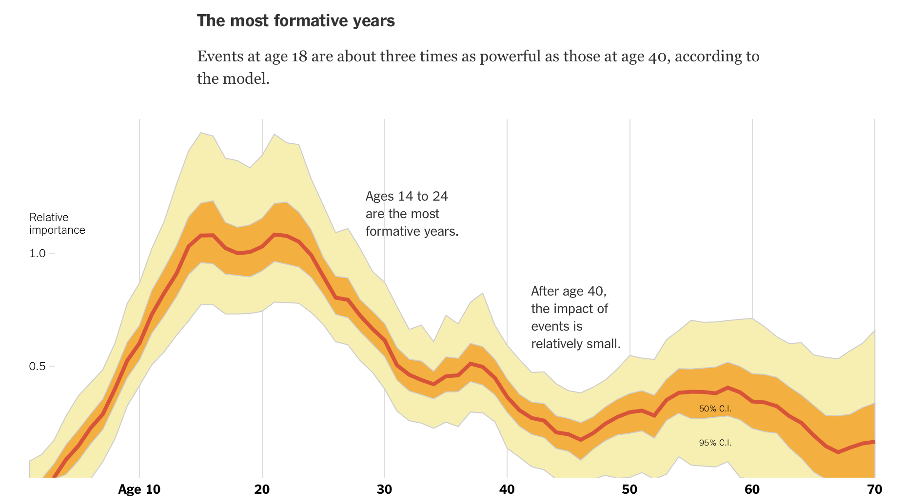
This graphic does many things right. First, it presents both the study’s prediction and confidence interval. It is also annotated to tell the reader what to take away from it, on the off chance they don’t know how to read a graph that plots a coefficient and statistical significance over time. Amanda goes big on highlighting the explanatory part of Yair Ghitza and Andrew Gelman’s work. She even goes on to graph the predictions for how loyal different generations are to either party, conveying the real-world importance of the work.
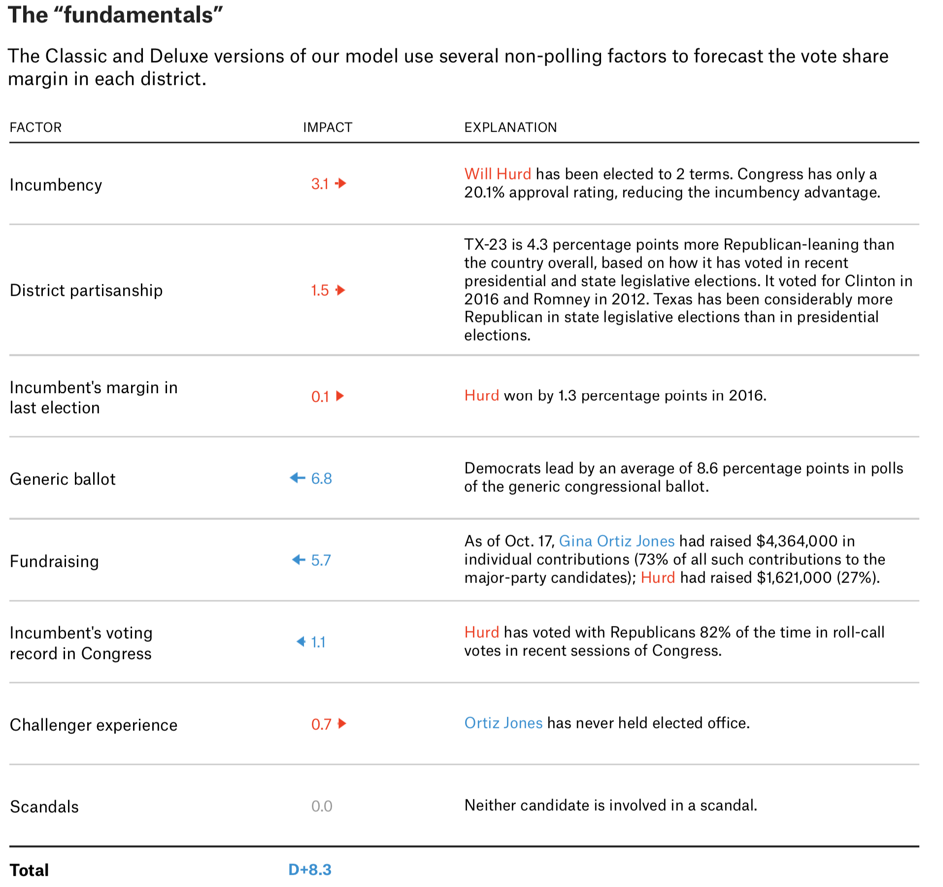
In some scenarios, data journalists will also choose to visualise ‘what goes in’ to the model. Among those that do, FiveThirtyEight’s work really shines through. In their predictions for the 2018 mid-term elections to the US House of Representatives, Nate Silver and his colleagues list all of the predictors used in their models and their values:
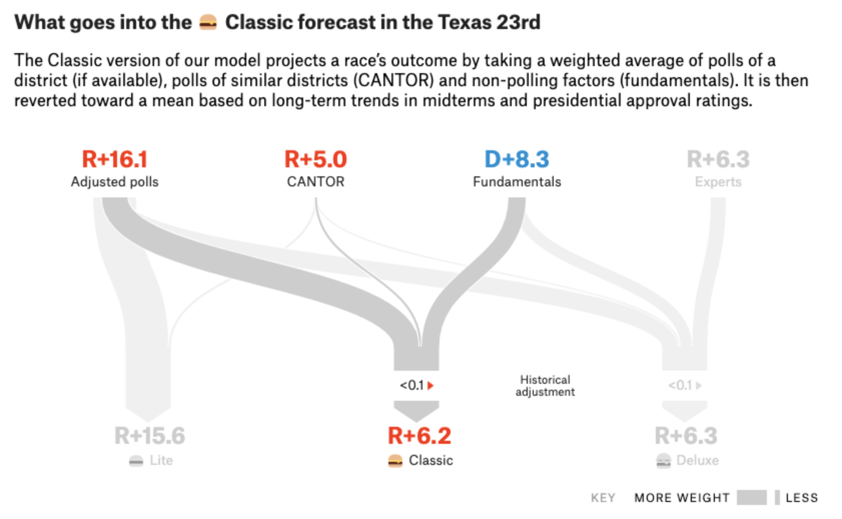
And they also show how different components of their predictions are combined in their models:
Finally, they also visualised their predictions and uncertainty!
These two approaches to predictive journalism show that there isn’t one ‘best’ way to communicate our forecasts. But there are ways that are better than others. Such is the topic of our next section.
Communicate your (un)certainty
As Amand Cox and Nate Silver et. al. show, good empirical journalists will present both their predictions and the (un)certainty with which they are made. Communicating your (un)certainty avoids both leading your reader astray and the inevitable backlash journalists receive when they predict something ‘incorrectly’. As we will see, properly accounting for communicating uncertainty may also help to avoid adverse impacts on our behaviours.
Let us again revisit American election forecasting for two prescient examples of why communicating our certainty is important. But first, it is worth noting that communicating uncertainty can only come after properly measuring the error of your model.
Measuring uncertainty: the 2016 election
As contentious as it was for the general public, the 2016 presidential election may have been even more combative for professional election forecasts. Two prominent prognosticators in particular butted heads; Nate Silver and Sam Wang, a Princeton Neuroscientist turned political statistician. Nate had been harping on Sam’s work publicly since at least 2014, when he wrote a long takedown of the professor’s methods:
[Wang’s] model is wrong — not necessarily because it shows Democrats ahead (ours barely shows any Republican advantage), but because it substantially underestimates the uncertainty associated with polling averages and thereby overestimates the win probabilities for candidates with small leads in the polls. [....] Wang projected a Republican gain of 51 seats in the House in 2010, but with a margin of error of just plus or minus two seats. His forecast implied that odds against Republicans picking up at least 63 seats (as they actually did) were trillions-and-trillions-to-1 against.
In 2014, according to Nate, Sam Wang assumed that the errors inherent in political polling were too low. In 2016, he repeated his error. The model Sam built evaluated a range of plausible election scenarios in which Hillary Clinton’s eventual national vote share was within roughly 1.6% of her vote share in the polls. But such an error margin was far too slim. Harry Enten, writing for FiveThirtyEight.com, found the margin of error for the average of national election polls going back to 1968 was closer to 5.6% -- nearly four times as large as Sam Wang’s! Such a difference has a big impact on a model’s probabilistic estimates. Had he used Enten’s calculation, his model would have indicated that Clinton had an 84% chance of winning the presidency rather than a 99% shot.
Sam Wang’s errors show the importance of a proper calibration of uncertainty in our modelling. Once we have a proper measure of the uncertainty of both our data and model, we turn to the tough challenge of communication.
Communicating uncertainty: the 2020 election
Now that election forecasting has gone mainstream -- something that associate professor of journalism at the University of Minnesota Benjamin Toff calls the ‘Nate Silver effect’ -- plenty of people are jumping into the game. One of these new prognosticators is Rachel Bitecofer, assistant director of the Wason Center for Public Policy at Christopher Newport University. Rachelhas proclaimed that Trump “will lose” re-election in 2020. As Sam Wang’s example in 2016 shows, this is misguided. But the problem is not necessarily that Rachel’s model is misspecified, as was Sam’s primary problem. Rather, the bigger issue is that she is not properly explaining the uncertainty of her predictions to readers.
The average reader would assume that Rachel Bitecofer’s language implies that Trump has no chance of winning the 2020 presidential election, but her work actually tells quite a different story. Once you take uncertainty in mind, her “will lose” looks more like a “will probably lose”, which is an important distinction.
Rachel Bitecofer’s work (graphed below) shows that the Democrats are just barely favoured to win the 270 votes in the Electoral College required to win the presidency (and that they aren’t even guaranteed to win them). Her model shows that only 197 electoral votes ‘will’ be won by Democrats (those votes that are from ‘safe’ Democratic states). The other 81 predicted Democratic votes are up for grabs with varying degrees of certainty -- from what analysts call ‘lean’ or ‘likely’ states. In fact, if you multiply the implied state-level probabilities from her model with each state’s electoral votes, the resulting prediction is 300 electoral votes for Democrats -- just 22 more than they need to win the presidency. Given that the model does not perfectly explain voter behaviour -- a similar method explained only 70% of voter behavior in the 2018 House and Senate midterm elections -- the predictions hardly say that Trump ‘will’ lose in 2020.
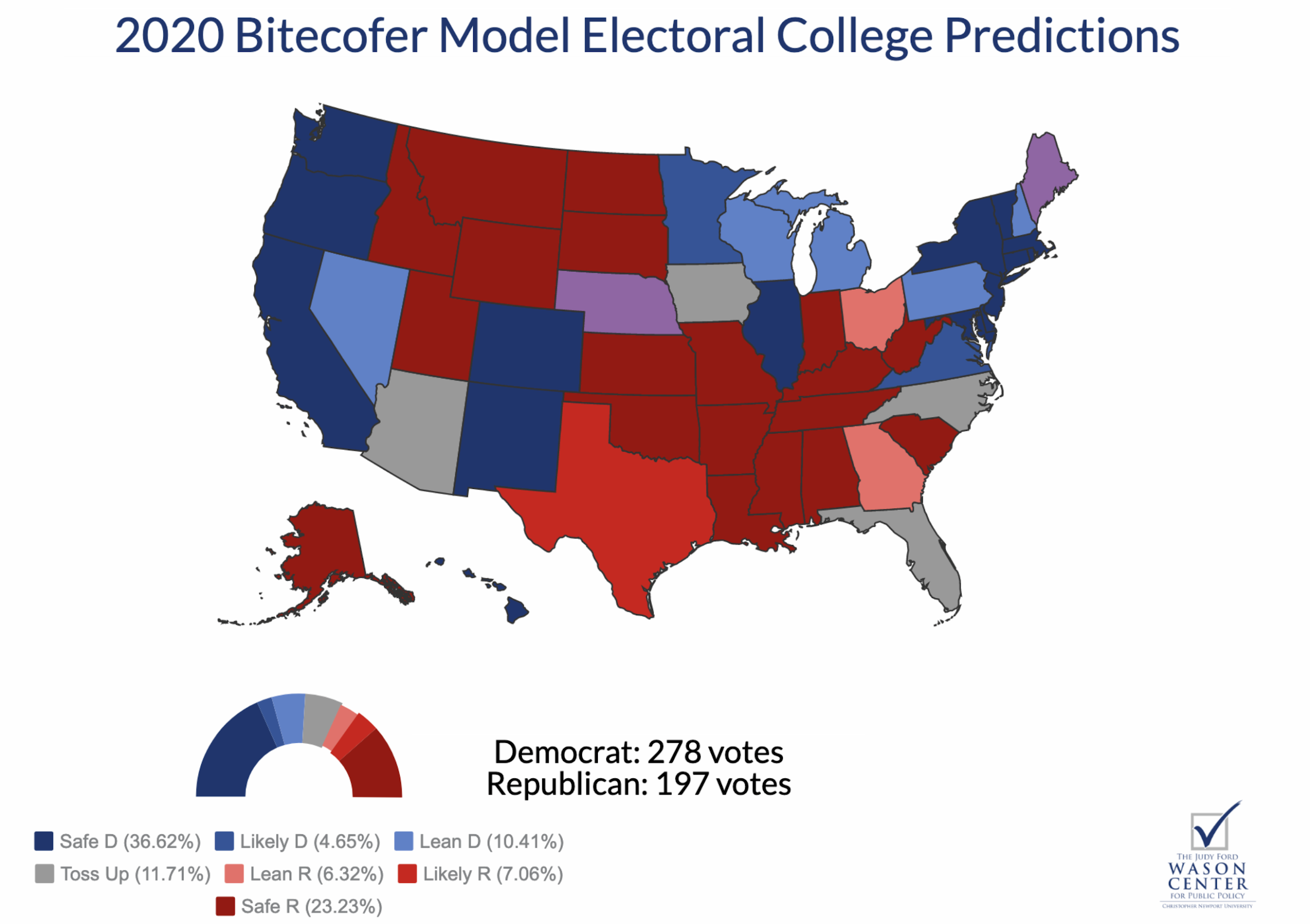
Rachel Bitecofer’s work is a good example of why properly communicating the certainty of our predictions matters. The way she does so clearly obscures the actual story of her method. But to be sure, she is not the only analyst guilty of obscuring her forecasts, especially when it comes to politics.
One problem is that Rachel Bitecofer’s electoral college map obscures the nature of the election two-fold. First, since the map is scaled by geography and not actual electoral college votes, it over-emphasises the number of electoral votes in states with smaller populations and minimises votes from high-population states. More importantly, it does not show the distribution of outcomes for her prediction. How then could we improve on a simple visualisation of predicted electoral college outcomes?
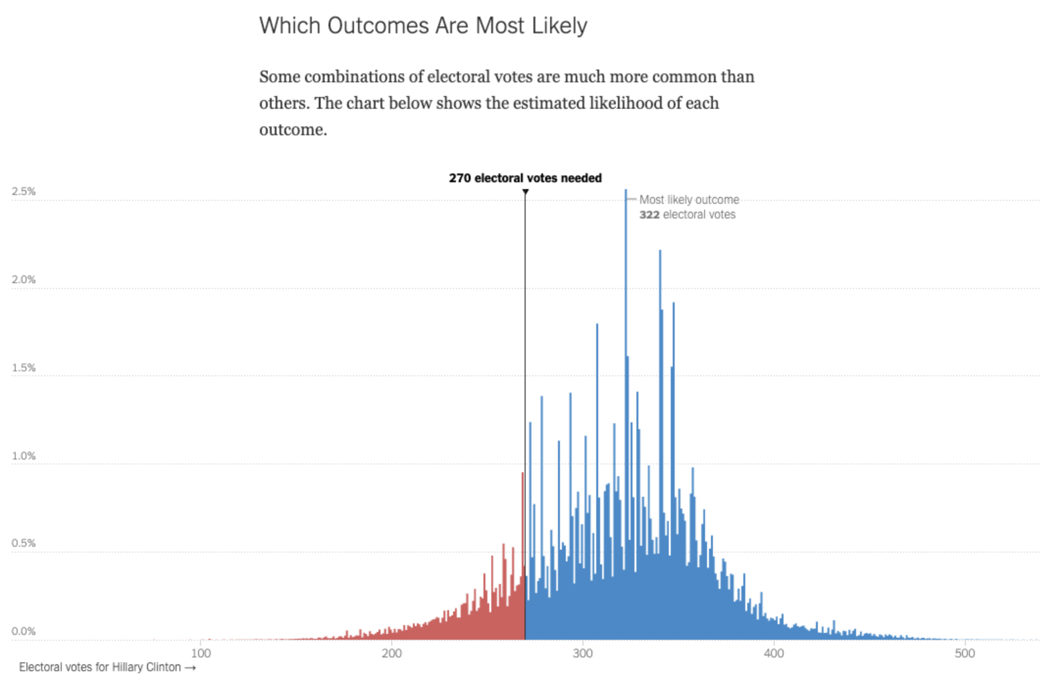
Again, The Upshot blog offers a good example of a possible solution. In 2016, the site’s authors also created their own model for the election. It was not extraordinarily different than the rest, but the way they communicated their findings sets a good example for properly communicating uncertainty.
By graphing the probability of possible electoral college outcomes with a histogram, the Upshot_ _put readers up close and personal with probabilistic thinking. Although they ultimately predicted that Hillary Clinton would win the electoral college with 323 electoral votes, displaying possible outcomes with a histogram showed that other outcomes -- including a Trump victory -- were actually very plausible. I suspect that a similar visualisation of Rachel Bitecofer’s work would reveal the actual uncertainty in her forecasts.
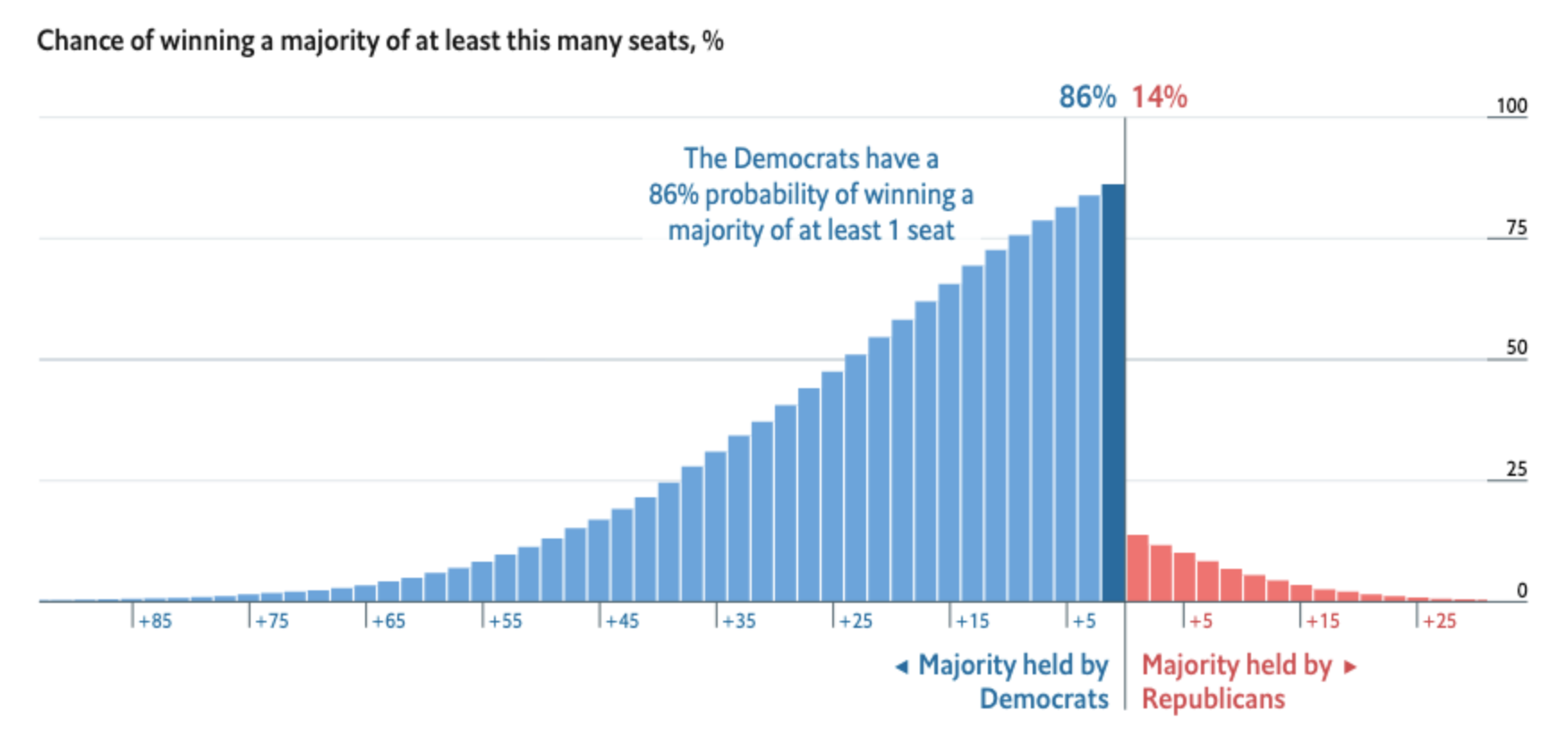
The Economist used similar visualisations to convey their predictions of the 2018 midterm elections to the US House. For their main graphic, they chose to represent cumulative probabilities of seat shares with a bar chart; each bar represents the chance that Democrats/Republicans would win the House by a certain number of congressional seats. This way, they showed there was a large range of outcomes -- that is, a lot of uncertainty! -- in their predictions. They simultaneously showed how unlikely it was for Republicans to maintain control of the chamber.
Why communicating uncertainty matters
The merits of properly accounting for and communicating the uncertainty of our predictions extend beyond simply the accuracy of our journalism. Some research shows that bad predictions might even impact our behaviours. In a 2018 academic paper, social scientists Sean Westwood, Solomon Messing, and Yphtach Lelkes suggest that the certainty of election forecasts could have impacts on who actually turns out to vote. They estimate that “divergence of 20% from even odds” in a game that simulates election forecasts “lowered voting by 3.4% (with a 95% confidence interval between 1.8% and 5.1%) and divergence of 40% lowered voting by 6.9% (CI: 3.6% and 10.2%)”. Although the game is not a perfect representation of reality, in elections when some states are decided by mere percentage points, even small decreases in turnout could have large impacts on probability.
Some predictive journalism is useful
Data journalists should be constantly considering that axiom from Michael Lewis: “All knowledge is prediction”. To know is to predict. But to predict is also to know, and to predict _incorrectly _is to know incorrectly.
This Long Read has provided some guidance on how to conduct ourselves properly when creating and refining our predictive journalism. Good forecasters should know their subject, ensure that their predictors can measure the future as well as the past, know their tools, explain the ins and outs of their predictions and emphasise the (un)certainty with which they are making their forecasts.
Journalists might also consider that famous axiom from statistician George Box: “All models are bad, but some are useful”. We must strive to ensure that we put our work in the latter category.


The dos and don'ts of predictive journalism - Journalists must be careful to avoid making misleading -- and sometimes even harmful -- predictions
19 min (1) - Click to comment