Usually, journalists conduct data analysis to provide evidence to their audiences. Whether it’s a connection between lobbying and policy or an inequity in health or education, data will help tell the story.
On the radio, presenting data analysis and having it come across as evidence by listeners can be challenging. Those of us who write for the radio know that listeners can be less than fully attentive. They’re driving, they’re washing the dishes, or, they’re listening part of the time to the story and part of the time to a conversation with someone. That’s why, in an audio piece, good storytelling is often optimised with short sentences and simple ideas, served up briefly and one at a time. And often, we tell stories through scenes, environmental sound and characters.
Data analysis, on the other hand, is dry and quantitative. It might take a few minutes to explain the results, or even just the methodology of your data analysis. A few minutes might be all you have for an entire piece.
With so much complexity at hand, how do you do that?
Let’s start with the idea of measurement, which is what data analysis is really all about. When we measure something, we believe we’re giving our audience something of value: We’re telling them how much or how many, and in comparison to what or who. That said, measurement is never a goal in itself. It’s complementary to on-the-ground reporting.
One approach to reporting data is embedding one’s measurements within the narrative of the story, by associating it with a character. Ideally, this would maintain the listener’s focus on the human element, which is likely why they care about the story.
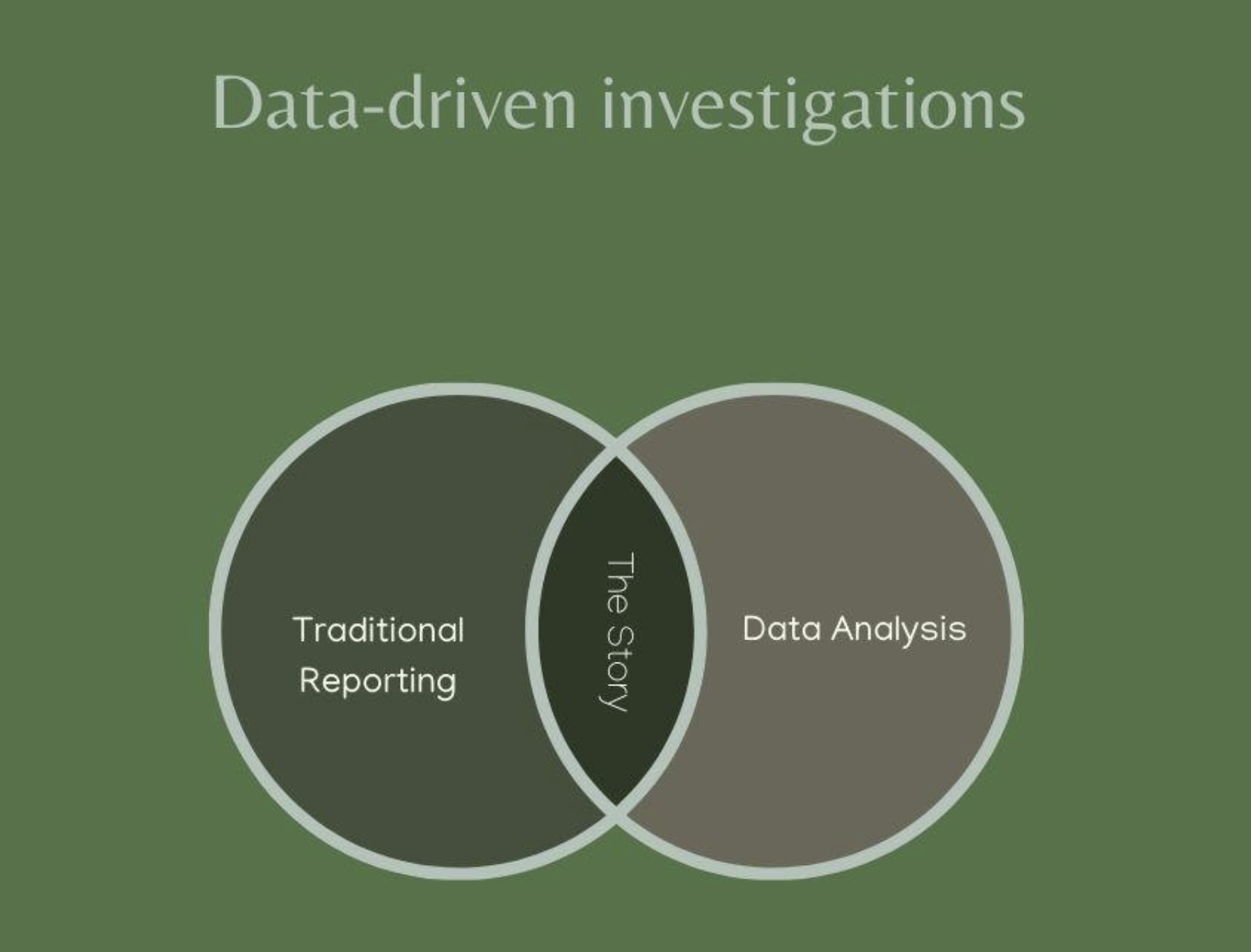
With data analysis and traditional reporting happening at the same time and driving each other, it adds up to this:
Here’s an example of how we get there:
Traditional reporting and data analysis working together to tell a story.
This story about U.S. coal mines that were delinquent on violation fines was driven by an extremely complex analysis. It involved several databases, and a multi-stage methodology for comparing injuries in coal mines with delinquent fines from violations found by federal regulators.
The complexity came mainly from making sure that safety records were analysed appropriately based on the status of fines, during periods when fines were delinquent. We also measured the severity of violations and injuries to make sure we were being fair to mine operators.
This snippet of the radio script shows how we integrated our findings into the story narrative. The data findings are embedded in a character and scene -- an interview with Mary Middleton, the widow of a coal miner who died in an unsafe coal mine:
HOWARD BERKES (NPR): The co-owner of the mine also controlled eight other mines. Federal mine safety records show even after he and his partners failed to pay the fines for the deaths at Kentucky Darby the other mines were cited for 1,300 more violations, according to Labor Department data. New fines totaled $2.4 million, which also went unpaid.
M. MIDDLETON: Where's the breaking point, you know? I mean, I know the Bible says vengeance is God's. He will repay. But you think why are they not being punished?
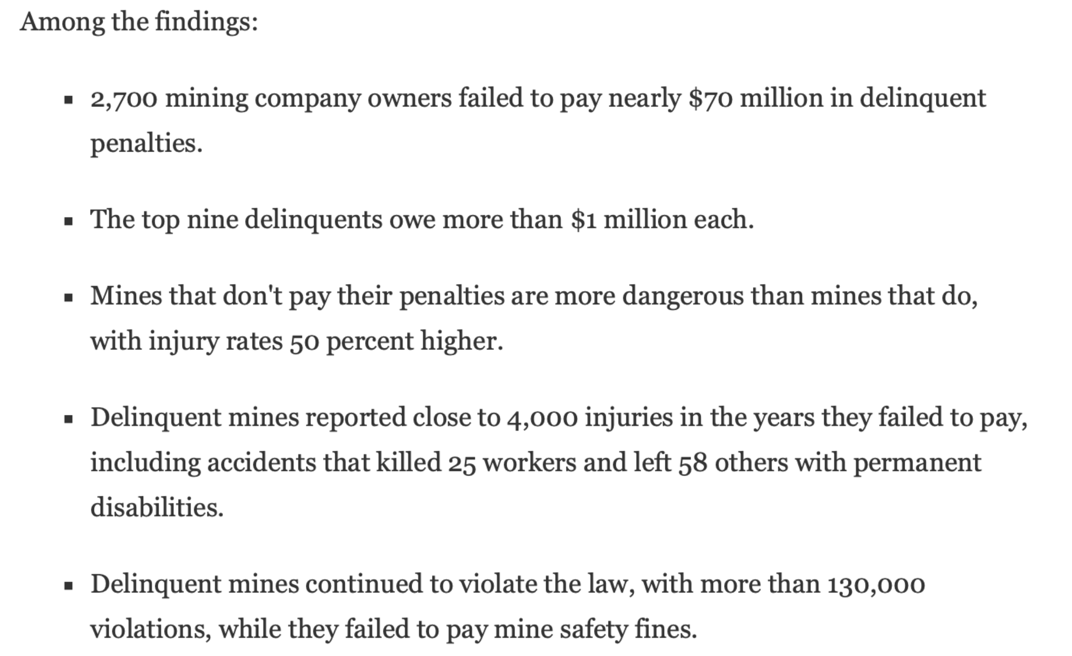
BERKES: They have plenty of company according to multiple sets of federal data and records analyzed by NPR. We obtained the Mine Safety and Health Administration's detailed accounting of mines with overdue safety fines. We then compared those records to 20 years of Labor Department data showing mine injuries and violations. And here's what we found - 2,700 mine owners owe nearly $70 million in delinquent safety fines. Most are years overdue, some go back decades. And get this - those mines with delinquent fines, they're more dangerous than the mines that do pay with an average injury rate 50 percent higher.
Middleton remembers how her family was affected by playing this old Christmas home video with a singing Elvis soundtrack.
Middleton is a compelling character and she provides a real-world anchor for the data. The alternative is to present an abstract number that asks listeners to do math in their heads.
The data findings are also presented incrementally, in small bites. Sometimes words are used “years overdue,” and “go back decades,”– instead of numbers.
And when numbers are used, they are round figures, with no decimal places.
As data analysts, our obsession with precision is admirable, but we must remember that any number we derive is an estimate, and will be imprecise by definition. When we ignore that fact and report a number carried out to two decimal places, we might be engaging in false precision.
For example, if we find that something is 64.2 percent of something else, writing “nearly two thirds,” is usually preferable on the radio. Most of us have a readily accessible idea of what two thirds means and can think about it without losing focus on the story. Also, “two thirds” is probably an appropriate level of precision.
Similarly, in a graphic, the use of decimal points on graphs, charts and maps is almost never justified by the precision – or, in other words, the error -- of the measurement tool.
On the web, there are usually more opportunities to write more complex sentences and amplify data findings graphically. And thus web and audio versions of the same story might actually be pretty different.
In the web story about delinquent coal mines, our findings were presented in a more detailed fashion, in part through a bulleted list of findings.
Teamwork makes the dream work
When you’re deciding how to present data in your story, especially on the radio, you’re generally not working alone.
More often, the story is the work of a team that might include data journalists, non-data editors, developers, visual artists and producers who focus on sound. All of them typically have some of the skills the others specialise in, so that’s a lot of potentially competing perspectives.
With all that in mind, let’s look at dialogues that took place on two different teams I worked on, developing radio and web projects at my news organisation, NPR, or National Public Radio. One project was about a connection that, at the onset, seemed to ring true.
We know generally that climate change has been making the United States hotter. We also know that more workers who labour outdoors in the heat were dying on the job. There must be, we thought, a connection - maybe even a causal one -, between those facts. We agreed to look for a link, supported by data, between hotter temperatures and rising deaths. Of course, that wasn’t the only goal of our analysis; we wanted to understand as much as possible about heat-related deaths and the climate conditions present when they occurred.
The project was a collaboration between NPR, local member stations and Columbia University, there were several reporters, data journalists and editors involved, as well as a climate scientist.
It quickly became clear that we weren’t going to connect climate change to death rates. It can take many decades of noisy weather data to detect climate change - and even if we had the data, it wouldn’t make much sense to compare deaths in today’s workplaces to those from decades ago. Still, we pursued government databases on heat-related occupational deaths, and found the highest number were in California and Texas, and in the construction and agriculture sectors.
On a Zoom call early in the reporting, some of the dozen or so team members remarked that the problem of heat-related death was “worse,” in those states and in those industries. As we each contributed to the discussion, the data people were unanimous that the data did not indicate that.
-“I’m not comfortable comparing states,” one data journalist said.
-“The comparisons don’t work,” another chimed in.
They complained that the lack of denominators – such as aggregate hours worked in each industry in each state -- did not allow meaningful comparisons of death rates across the categories.
-“OK, so how can we compare states, then?” an editor asked.
This is, in my experience, a typical problem.
“California has the most”
I’ve been in many conversations where someone utters that sentence. California has the most cancer deaths, the most tech workers, or the most cars. Then, someone will counter, “California has the most of everything, because it has the most people.”
You might think this is pretty obvious stuff. But one reason this dialogue takes place at all is that to many non-data editors, raw numbers simply indicate the volume of something, and if that something is newsworthy, so is its volume. It’s factual, unadulterated information, and it’s easy for the audience to grasp quickly. To most data journalists, though, raw numbers lack the context of denominators, study design issues, measurement errors and other factors.
To data journalists, raw numbers may be just proxy measurements for differences in the size of the population studied. So, what one journalist sees as simple, another sees as simplistic, or worse, misleading.
There’s merit to both perspectives, depending on the subject. A raw number of deaths, for example, is always significant in human terms. A life is a life, and no qualification is necessary to understand its value. That said, a death rate would be required to support a claim that some problem had increased mortality. If I had to generalise, I’d say data journalists are more caught up in the weaknesses of data analysis. Editors, on the other hand, tend to focus more on the strengths of the data, and how they can add evidence to the story.
Moving forward, the heat project group took the objections of the data people to heart and we looked for denominators showing hours worked by industry and state. What we found wasn’t robust enough for the analysis and we agreed that we wouldn’t be making those comparisons in the story.
Suggestions for your radio reporting:
Include measurements in the story's narrative.
Make use of a compelling character to serve as a real-world anchor for the data.
Don’t embrace precision for its own sake, or fall victim to false precision. Those decimal places in a number probably aren’t necessary and only slow down your readers and listeners.
Remember that raw numbers almost always need context. Typically, that means a denominator, a percentage or a proportion.
Beat the heat: Hot days and hotter days
Next, we decided to try to understand the temperature and humidity of the environment where worker deaths took place over a ten-year period. Columbia University climate impact scientist Cascade Tuholske told the team about a database from the University of Oregon called Prism.
Prism divides the country into cells measuring 4 km on a side and contains weather data for each cell. So, we placed the location of each worker's death inside the appropriate cell. After doing that, we decided to take 40 years’ worth of temperature data for the cell and the death date and determine whether it was unusually hot on the day the worker died.
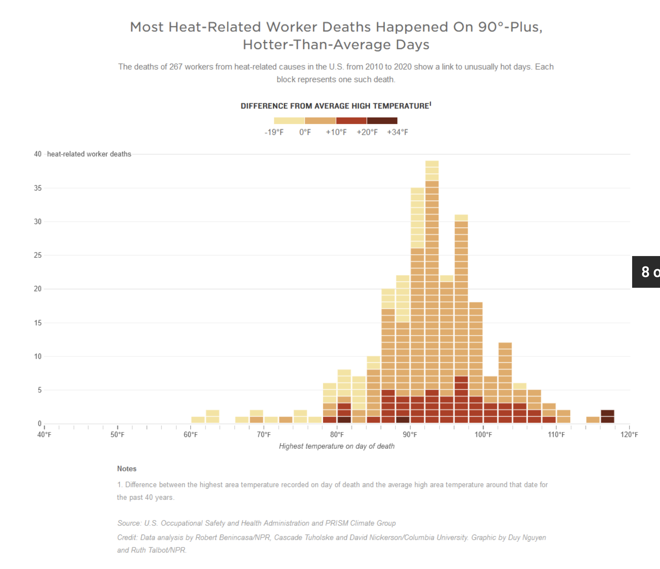
I suggested we generate a percentile rank for the high temperature on the day of death, within the distribution of high temperatures over the four decades. Most of the time, the deaths happened when it was unusually hot. Most happened when the temperature was in the top quintile for temperature for that date. There were other findings as well, including the fact that 90 degrees Fahrenheit was a tipping point in the data. Most deaths happened when the high temperature for the day was over 90.
Climate scientist Tuholske thought that wet bulb temperature readings for the day would play a big role in when deaths happened, because he was aware of other research where it was important. But our analysis didn’t find that.
Some of our findings were suited to the radio script, and others to web visuals. Some things, such as the comparisons we made about states in our discussions, would have been misleading had we included them.
Ultimately, the 90-degree inflection point in the data was used in the radio script as part of the story’s lead anecdote – a migrant worker who died in a corn field. This was written not as a sterile number, but in personal terms, as part of the experience of the worker who died.
-“It was hot. At least 90 degrees. He had one bottle of water and no shade,” we said in the script.
The distribution of temperatures on the death dates and their comparison to the distribution of high temperatures over time, was considered a bit too complex for the radio script. It became a web graphic.
And while we didn’t report comparisons of death rates by state or industry, we did decide to simply state that Hispanics made up a third of the heat fatalities we examined despite being only 17 percent of the U.S. workforce.
Disaster aid helps wealthier homeowners
In 2019, I worked on a project that analysed 40,000 homes that were bought out by the government after flood disasters.
In the course of the analysis, I found a place where buyouts were concentrated, a section of a New Jersey community called Lost Valley.
On the radio, I focused on the local effects of the buyouts: changing racial demographics and a funding shortfall for schools because fewer homeowners were paying taxes.
Lost Valley’s story was used to put our national data analysis into context.
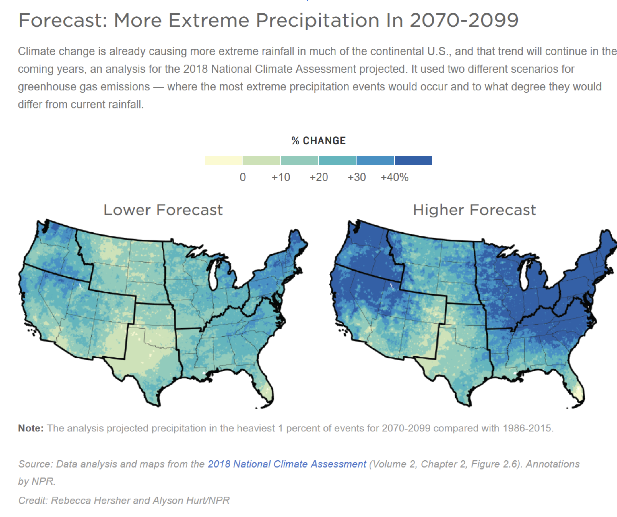
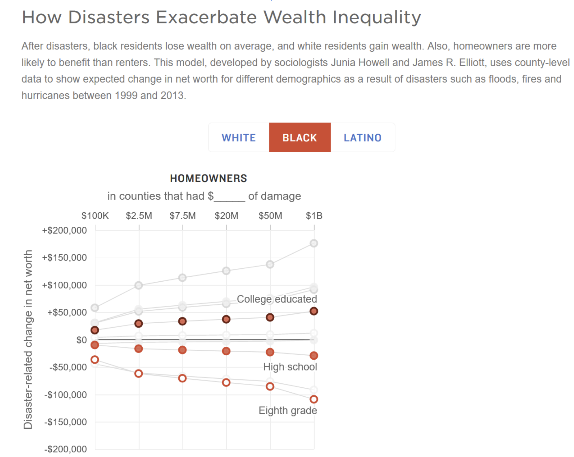
On the web, my colleague and I expanded the data storytelling with a visualisation about greater frequencies of extreme climate events and an interactive graphic about the inequities that disaster victims experience.
We also put the database itself on the web, in searchable form.
Here is a static screenshot of the interactive. Click here for the interactive itself.
Expected deaths in U.S. federal prisons
This example is an analysis done mainly by my colleague at NPR, Huo Jingnan. She was tasked with determining if more incarcerated persons in the U.S. federal prison system were dying during the COVID-19 pandemic.
One thing that was clear early on, was that while we might be able to determine how prison death rates had changed, we wouldn’t be able to tie it directly to COVID-19 mortality: the data we had was annual deaths by age with no consistent details on cause of death.
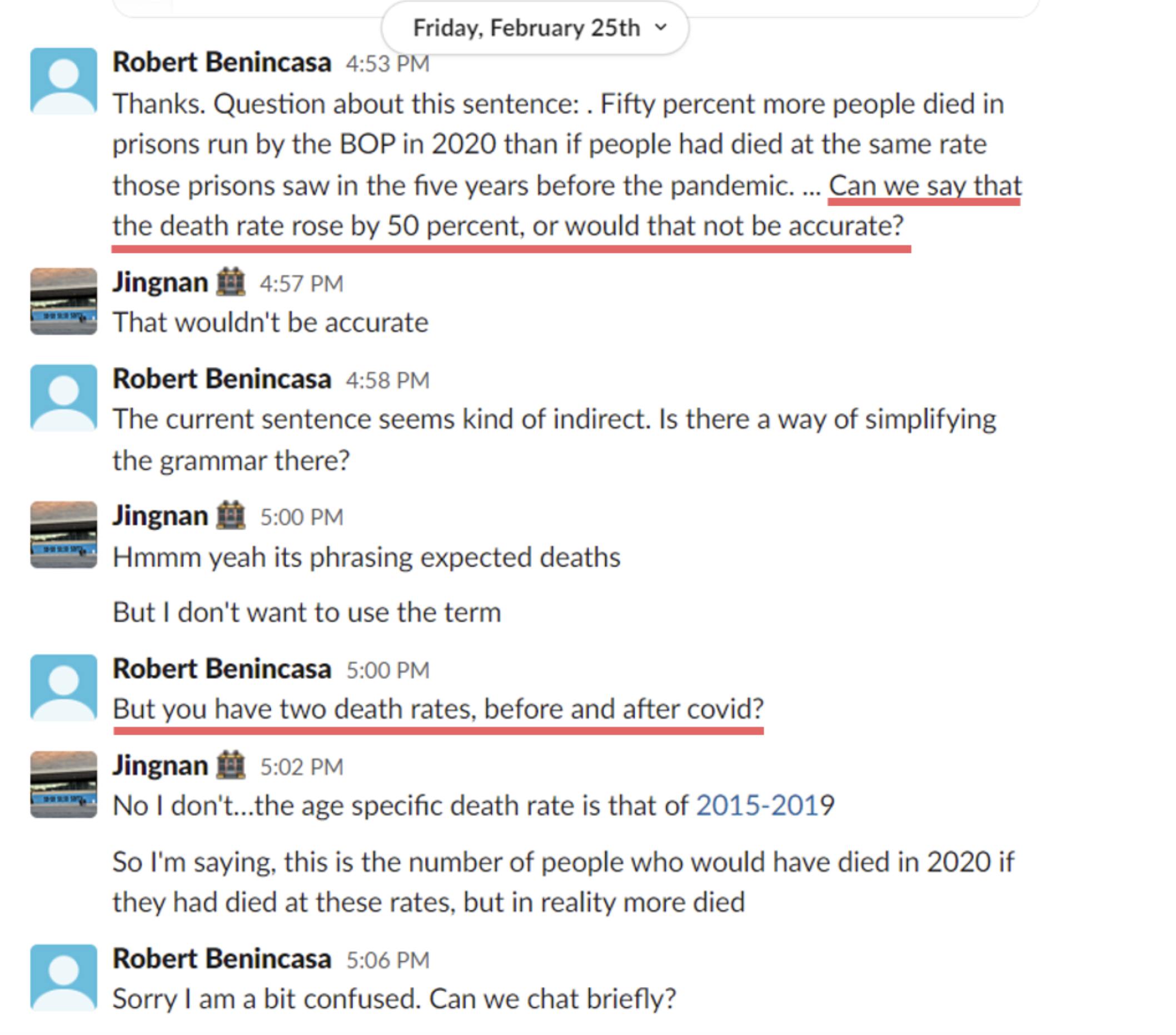
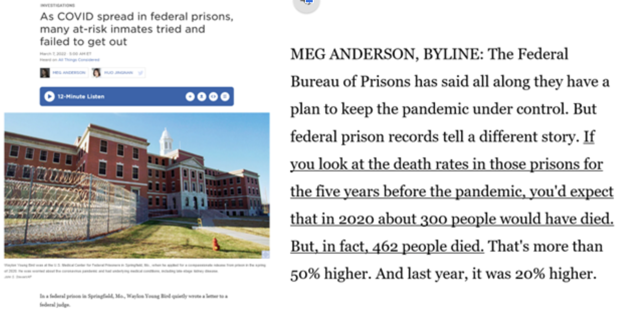
First, Jingnan looked at the death rates of prisoners by their age groups for five years before the pandemic. Then she looked at the prison population in 2020 and calculated how many people would die if the death rates stayed the same. She found that, if the rates had stayed the same, about 300 people would have died in 2020. But in reality, 462 people died.
I read her data results and sent her a Slack message about her wording. Here’s our exchange:
On the phone, she told me that she used a group of several age-specific death rates to calculate the figure for “expected deaths” in 2020. So, we explained that in the radio script:
On the other hand, the web story casts things differently, mainly because one of the editors did not like the explanation of expected and actual deaths used in the radio story. Instead, the editor wanted to use the term “age-adjusted death rate,” because she believed audiences would be more familiar with that - even if we didn’t explain it.
Jingnan had not calculated that kind of overall rate, but after some research into methods, did so by weighing the death rates by the percentage of population each age group represents, then adding up the weights. That rate also was about 50 percent higher. In the end, the web story said:
- The federal prison system has seen a significant rise in deaths during the pandemic years. In 2020, the death rate in prisons run by the BOP was 50% higher than the five years before the pandemic. Last year, it was 20% higher, according to the NPR analysis of age-adjusted death rates.
Thus: on the radio, the methodology drove the wording of our section on death rates, while on the web, the preferred wording drove the methodology.
Lessons learned
In these cases, a diversity of opinions and a willingness to tailor content to the platform made the projects better.
Here’s a Venn diagram I used in my presentation about this project at the IRE 22 conference in Denver this year. A video of the panel discussion is linked below.
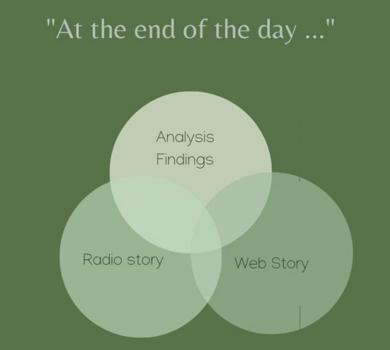
The slice of the diagram that represents analysis findings and other reporting that didn’t make it into either the radio or web stories might seem like a chunk of wasted time, but it’s not.
To be sure, data analysis aims to generate evidence and editorial content.
But it also teaches you what kinds of findings aren’t strong enough to publish. Once you know that, you’ll write with more authority and nuance. In short: knowing what you’ve left out, and why, informs your decisions for what to leave in.
When working with data visualisation artists, remember that they might see the story (and the world) differently. And, they may have strong opinions about what works visually. This can be an advantage, because it allows the possibility of another storytelling avenue that brings in audience members who think visually.
Some readers who may not have related to an audio or text story will be much more interested in exploring a data visualisation.
Putting data on the radio is only hard when you present it in isolation. When you use data to add dimensions to a well-defined story character or theme, you’re more likely to communicate your findings effectively.
Recommended resources
Book: Sound Reporting: The NPR Guide to Audio Journalism and Production, By Jonathan Kern. This book by longtime NPR journalist Jonathan Kern has traditionally been given to every new NPR reporter. It offers invaluable advice on how to craft compelling radio stories.
Howard Berkes’ radio investigations: My former NPR colleague and collaborator’s stories blend personal reporting with the results of complex and ambitious data analyses.
This American Life: The Giant Pool of Money. This series uses longform radio journalism to tell the complex story of the U.S. housing crisis of 2008.
This web database of defendants in Jan 6 Capitol insurrection defendants augments radio reporting with deeper information about the accused. It’s updated continuously to reflect ongoing news coverage and developments in their criminal proceedings.

Putting data analysis into your radio programme - Surround yourself with data
15 min Click to comment