In 2015, Jacob Harris -- who was then working for the New York Times as a software architect -- wrote about different methods of empathy used in visuals, from using people as icons instead of dots, and zooming in on a singular slice of a larger issue. He worried that standing too far from the humanity of the topic being visualised was a disservice to audiences.
“As data journalists, we often prefer the ‘20,000 foot view’, placing points on a map or trends on a chart. And so we often grapple with the problems such a perspective creates for us and our readers—and from a distance, it’s easy to forget the dots are people. If I lose sight of that while I am making the map, how can I expect my readers to see it in the final product?”
A journalist’s job is to ask questions of the world and to show the truth in their answers. In an ideal world, journalists reflect a community back to them -- yet, with slow moves towards true diversity and inclusivity in newsrooms, it is harder for all communities to see themselves reflected in their local news coverage, much less the charts and visualisations accompanying these stories. Empathy is one potential answer to bridging this gap between journalists and the communities they serve.
My prior research on empathy for the American Press Institute looked at this issue. The theory is that approaching stories -- and people -- with more empathy creates better relationships with marginalised communities, builds trust and increases diverse coverage. Empathy in this context is seeing a person’s actions and motivations from their point of view. It is not to be confused with sympathy, which is mirroring your own feelings with another’s to aid understanding.
But why empathy?
Empathy is one way for journalists to explain the world around them as it really is. While it may seem that objectivity would get one further, telling a story with empathy allows the audience to connect more closely with the human side of an issue.
People enjoy interacting with stories that push them forward and show them a different perspective. To truly understand another person’s perspective, journalists must learn to practice empathy.
“A journalist can understand what led a boy to become a violent gang member and convey that in a story. That doesn’t mean she makes excuses for his behavior. In fact, painting a fair, accurate picture of a life -- and doing so with empathy -- sometimes involves pointing out things that the subject prefers not to acknowledge.”

There are three kinds of empathy, as I outlined my research, and two of them are incredibly applicable to all kinds of journalists:
A reporter can employ cognitive empathy to approach an underserved community, using techniques that help them understand people with opposing views and from different backgrounds.
Reporters can also practice behavioural empathy by using verbal and nonverbal signals to show they’re working to understand another person’s feelings and ideas. These signals can be simple, like putting your pen down to let someone cry or looking into their eyes as they speak.
The third kind of empathy, affective empathy, is where one mirrors the feelings of another. This type makes many journalists uncomfortable. They believe sharing a source’s emotions is a sign they’ve gotten too close and jeopardised their impartiality.
But empathy can also go beyond the interviewing and reporting stage. In visualisations and data, journalists and technologists utilise these storytelling tools to put a different face to research and numbers. It’s about contextualising numbers, which are often seen as cold. Created with empathy, visualisations can provide both a close and a wide view of a particular issue or story within a community.
Reporting and storytelling methods like photos and videos, in a way, have an easier path to empathy. It is easy to try to understand another person’s motivations and perception of the world when you are reading their words, hearing them, and seeing them. What is harder is finding the people and shared experience within numbers and data. How do you get audience members, much less the journalists presenting the story to the audience, to walk a mile in the shoes of a dot? Or a bar chart?
It may take extra thinking, and more questions, but empathy can be achieved. Some journalists, like BuzzFeed’s Lam Thuy Vo, seek to humanise and find the surprising human connections within data. Lam treats data as another source, but not a pile of papers or a PDF. She is as curious and thorough with her processing of data as any reporter would be during an interview with a human source.
The humanity in data
Lam thinks of data the same way Kameelah Rasheed thinks of her art, she says. Most things tend to not follow a single line, and there are multiple ways of arriving at a story, depending on how you arrange things. In Guernica Magazine, Kameelah explains it this way:
“I reject the way that we have imagined the making of the archive as an administrative, objective, almost sterile process. I feel like archives are very dirty, very messy, really. Archiving is a subjective process; it’s a process that I hope engages and is relational and is not about someone sitting alone in an office. I have around four thousand found images of black families, and for me, making that archive is no different than creating an installation, because in both circumstances I’m collecting; I’m accumulating and I’m also trying to establish relationships between the things that I’m collecting. So in this archive of four thousand found images of black families, I’m making decisions. Do I categorize photos based upon the geographic location? Do I categorize photos based upon the year? Do I separate images of domestic settings from those of more public settings? The thought process that I go through when I’m archiving images is very similar to what I go through when I’m installing for shows: How do I organize what I’ve accumulated?”

Take categorisation, for example. Lam spent a lot of time thinking about which buckets we put people in as we explain data. People do not fit into boxes perfectly, so data can be just as malleable.
“Every categorisation is so flawed. What you need to do is understand it's limitations and the scope of the categorisation and present that fully to the audience [in a way] that is clear and somewhat easy to understand without taking away the complexity. It's this bizarre dance.”
Lam spent a significant amount of time looking at what gentrification really meant and how to define it when examining 311 calls in a particular neighborhood in New York City for BuzzFeed. It would be easy to conflate race with gentrification, assuming that a rising population of caucasian residents means gentrification is happening. This makes sense because of inequality in the United States, but then gentrification also means rising home values, and rising incomes. However, if you look at a young person whose only income is from a trust fund, that skews incomes. She looked at other research and several models of defining gentrification before arriving at one used in a particular study.
When the story published, Lam transparently laid out the methodology for defining gentrification this way: “There’s no universally accepted definition of gentrification, but BuzzFeed News used a methodology developed by Governing magazine, which in turn is similar to prior academic work. It uses Census data on income, home prices, and education -- but not racial or ethnic demographics.”
How to employ empathy in data visualisation
Approach 1: understanding fuzzy data
Gentrification is not the only categorisation that is somewhat subjective. Many of the buckets we put data (and ostensibly, people) into can be defined in different ways. For example, it took until 2000 for the US Census to include multiracial identities, while many other countries still have not, and we continue to struggle with legal identifications for transgender or non-binary communities. These are definitions that might be more subjective than journalists often think they are. Or categorisations, that might not tell the whole story. Think about a single father whose children are taken away from him: He might be classified as a neglective parent, but that could fail to show the systemic problems (like poverty or racism) which may have contributed to the categorisation.
While data may seem cut and dry, people are not. The world is not. Everything is much more complex.
Thinking back on his time working on visualizations, and now watching the journalism world as a developer in civic tech, Jacob Harris reflects in an email interview about how fuzzy data really can be.
“We rarely get data that is exactly what we want to report, and so very often this analysis involves with selecting a suitable proxy model that is close enough to what we want to measure and doing additional analysis on it. The problem is these proxies always are approximations of some sort with limitations and errors and often missing data (sometimes especially so for vulnerable populations), but putting things in a chart or as dots on a map can add an illusion of certainty and precision that isn’t there in the source data.”
Seeing these gaps and problems in your data is the first step. Representing limited or fuzzy data might mean a graphic isn’t a quick turnaround anymore, or that it requires more research. For some data journalists, it might mean going beyond percentages and using little people in visualisations.

While data may seem cut and dry, people are not.
Some questions for journalists to ask as they evaluate data:
- Who is vulnerable in this story and how would they want to be counted?
- What information would they need to improve their lives?
- Who is undercounted or possibly missing entirely?
- Who was counted? Who did the counting? Why were they asking these people?
- Who benefits if you forget the dots are people?
Approach 2: the Quantified Selfie
There are times when looking at a single data point can help. Lam calls this an expansion of the idea of a ‘quantified selfie’. The concept of the quantified self comes from the mid-2000s, as use of personal tracking exploded. Fitbits, hydration counters, GPS trackers, and other methods of creating more and more data about ourselves became available. A quantified selfie takes that data and turns it back on ourselves (like a selfie does).
For Lam’s quantified selfies, she uses a single person’s experience as a prototypical experience for a trend. It’s a way of countering a lack of precise data and statistical relevancy -- a way to tell stories that are data driven and emblematic.
“We frontload our stories with that statement: It's not representative but it's emblematic. You can redo this, and we're happy to help.”

Screenshots from one of Lam’s Quantified Selfies, called Forget Me Nots, which explores the concept of relationships through the data in one person’s inbox.

Quantified selfies are particularly strong storytelling mechanisms when it comes to social media and allowing audience members to see themselves in the data. The technique might also have an app or quiz that lets people put their own data through the process used for the story, literally allowing themselves to empathise with another person’s experience.
Jacob provides an example of how quantified selfies and similar visualisations use “statistical methods and animation to provide personal perspectives of macro population trends that aren’t data about individuals per se”. He points to the New York Times’ popular income mobility visualisation as an example that uses empathy in data. The visualisation allows people to see how experiencing income inequality as a child affects the experience of income inequality as an adult. It also allows people to make their own comparisons using different races and income grouping.

The New York Times interactive tool lets you make explore income inequality for virtually any combination of race, gender, income type and household income level.
Approach 3: showing the chart isn’t enough -- empathetic stories need people
In an era where graphics and visualisations no longer always live next to stories, journalists have to think about how each disparate piece of their work might be interpreted. It is easy to display empathy in a 2,000-word piece where a journalist has sought to understand another person’s motivations and how they came to be.
But a standalone graphic is a much more difficult thing. Wee people can distort an image of a person as much as it can help display it. In these cases, transparency can help remind the audience of what each dot or each tick means.

“The way in which we collect data, is kind of like a fly frozen in amber. It’s a direct reflection of the values in that point in time and what we deem is important.”
-- Lam Thuy Vo
“The best thing news orgs can often do in some circumstances is just to reinforce the human basis of most metrics we hear on a regular basis (like how is the unemployment rate defined, what does it mean that it ticked up a little, what is not being counted), but that only gives a limited amount of empathy,” Jacob said.
It’s also worth looking at whether representations of little people can be given more humanity. Ari Melenciano, a creative technologist and researcher, has been exploring empathy and its ties to graphics representing social justice as part of her 2018 Processing Foundation Fellowship. She was interested in how to make people care more about the social justice stories that data can tell, like about racial profiling and the high incarceration rate of minorities in the United States.
“I knew I wanted to explore different ways I could explicitly implement human aspects to the designs,” she wrote on Medium. “I felt that if my audience was able to associate a face or human element with designs that portray a social justice issue, the numerical facts would then be associated with an actual human life, and not just serve as a statistic.”
She looked at different ways of bringing a more human element into her visualisations, for example adding in celebrity faces rather than using small representations of people. Her concern was that in the end, even little people are just symbols and shapes that are there to represent human lives.
“Even the human symbol is an icon, maybe it needs a face on it maybe it needs a different style of drawing,” she said.
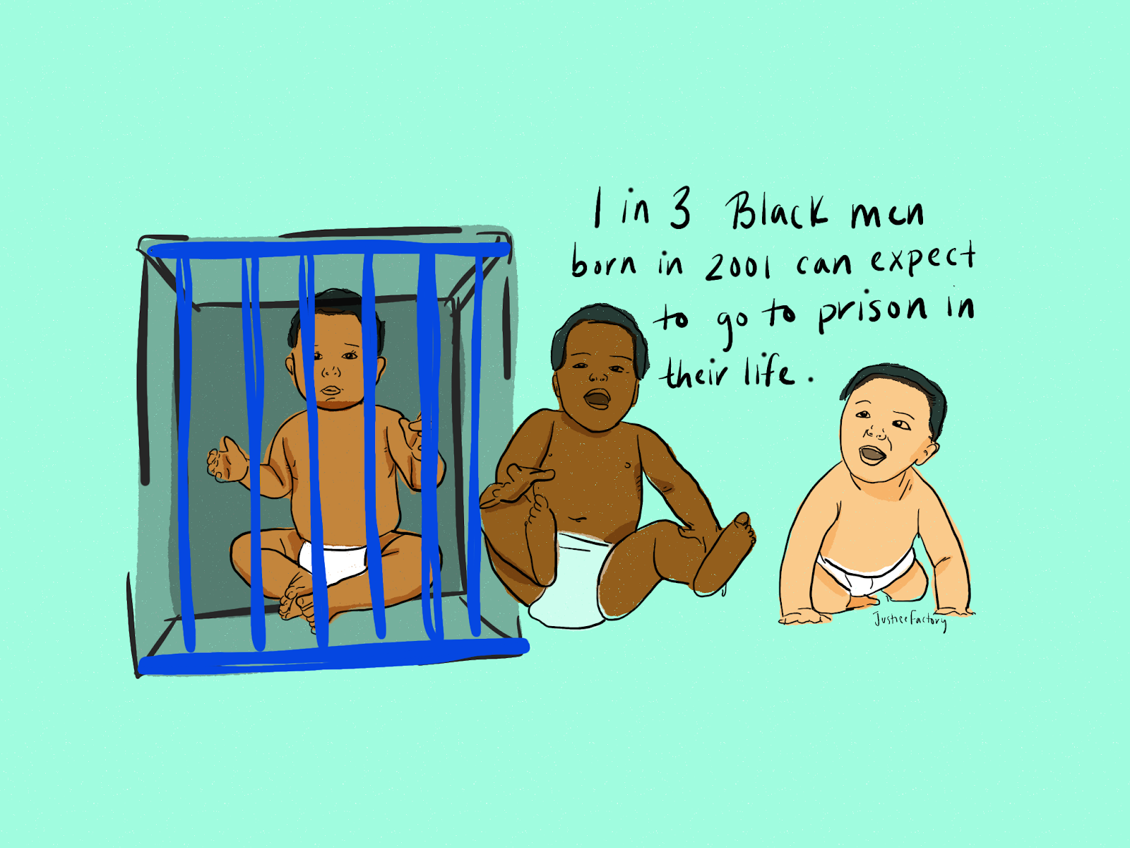
She ended up with illustrative drawings that put faces on top of statistics, like how many black men go to prison, or how often black drivers get pulled over compared to white drivers. The drawings weren’t always precise, but as a standalone graphic, they told more of a story. Illustrations, she said, are a little less abstract than icons and people likely identify with them more.

Illustrations can be one tool for promoting empathy in data visualisation. Credit: Ari Melenciano.
She also examined her own bias and mission as she created each graphic.
“(I explored] finding ways to make sure I was as even as possible, to not look for things that were answering my question. Sometimes it’s not telling the story I want it to tell, so maybe not ignoring that.”
Ari is continuing to explore different ways of bringing humanity into visualisations, thinking about finding ways to allow people to dive deeper into a topic, or using sound as a way to bring people into a scenario.
In 2017, data artist Giorgia Lupi gave a TED talk that focused on the question of how small pieces of data might show empathy. She described a piece she worked on featuring Italian astronaut Samantha Cristoforetti. The app she built allowed people to say hello to Cristoforetti as she passed by on the International Space Station. Those ‘hellos’ were shown together, hundreds of individual people saying hello to a single person high above their heads.
Showcasing our own curiosity brought many different people together, Lupi said. “Data powered the experience, but stories of human beings were the drive.”
How data gets displayed and how it is powered are two ways of drawing lines between an individual and a data point. It is perhaps that while narrative stories transport the audience into the shoes of another person, empathetic data journalism and visualisation brings a different person’s shoes to the audience.
Giorgia describes the interaction of understanding and empathy with data as a conversation: “I'm asking you to consider data -- all kind of data -- as the beginning of the conversation and not the end.”
Conclusion
Finding empathy in data visualisations and presenting it to the audience requires as much forethought as it does in reporting, but the questions are often the same. Data is part of the larger conversation we have with our audiences. As much as the words we use and the questions we ask in reporting matter, so does the way we represent people and the categories we choose to put them in.

Learn more about the human side of data in:
- Putting data back into context by Catherine D'Ignazio
- Automating Inequality by Virginia Eubanks
- Simon Rogers on empathy and data
- Enrico Bertini on anthropographics and data visualisation
- Jacob Harris’ 2014 essay on connecting the dots.


Designing data visualisations with empathy - "While data may seem cut and dry, people are not"
14 min Click to comment